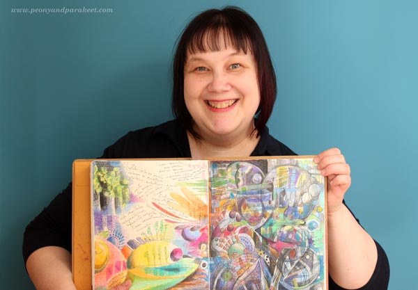
Organizing Art Supplies with Konmari Method
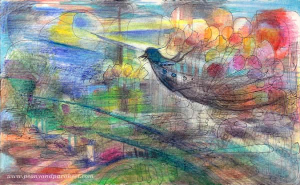
This art journal page is about how less stuff can uplift us. I feel like a bird with balloons after I sorted out my art and papercrafting supplies.
The Life-Changing Magic of Tidying Up
It all started from a book: The Life-Changing Magic of Tidying Up – The Japanese Art of Decluttering and Organizing. It is written by Japanese professional organizer Marie Kondo and she calls her method “Konmari”, which is an abbreviation of her name.
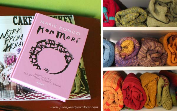
The Konmari method is fairly simple. First you get rid of all the stuff you don’t use or enjoy, and then you store them by type. The process is explained more in detail in the book. The book recommends starting with clothes so I organized my sweaters first. Most of them are my own handknits. Marie Kondo explains how to fold each type of clothing and recommends storing things so that you can see them in a row. I have always believed in little joys in life. However I had never thought of how much joy seeing those sweaters can bring. Each time I open the closet, it joyfully reminds me how much I enjoy both knitting and colors!
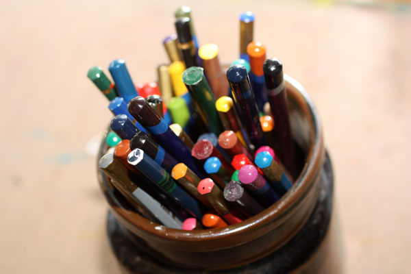
Art Supplies that Spark Joy
Marie Kondo believes in handling each object separately and considering if it sparks joy. These spark most joy to me: colored pencils and watercolors! These most simple art supplies delight me more than any new product on the market.
If you have followed this blog for a longer time, you might have noticed that the variety of mediums that I use in my art has been reduced gradually, especially during the last year. I noticed that I had bought many of the products believing they would solve my creative problems. I thought they would make me create better art faster and make creating more fun. But when experimenting with new products I forgot how little ingredients are actually needed for creating meaningful art. Nowadays I feel sad when I see beginners reading instructions that involve a huge variety of art supplies. The long lists of supplies are overwhelming and prevent many from start creating.
I believe we should focus less on things and more in our inner world. And Marie Kondo thinks exactly the same! She believes that when we are surrounded by fewer things, we can treat them better and start thinking what we really want to do in life. I believe that when you use fewer supplies, a lot of energy is saved from picking and choosing for the actual creating. You will also grow attached to the supplies and start displaying them and taking care of them more often.
Working Area Before and After
Even if I organize my creative space regularly, I felt it was the time for a bigger change. I had already started re-organizing my creative space before reading Marie Kondo’s book, so it felt natural to continue that process.
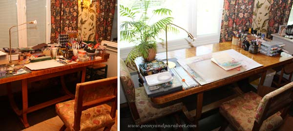
The photo on the left has been taken some time ago. After that I had already cleared the view to the window. But I had not actually got rid of anything, I had just removed some of the stuff to the nearest shelf unit. This time I picked out every single object and decided to give away or throw away those that I had not used for a long time. The photo on the right shows how the table looks like now!
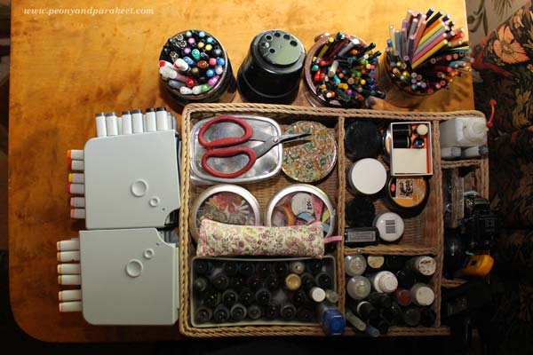
Konmari Method Applied to Art Supplies
Marie Kondo suggests not to put items on the top of each other. That is quite difficult to achieve with art supplies. I managed pretty well though. Jars and boxes help with that.
My creative space also includes shelves. Here organizing was a bit more challenging and the end result might not be how Marie Kondo had done it. She would probably group all the paper booklets, albums, and magazines together. However, I quite like it as there’s enough logic in how everything is located. As one of my hobbies is scrapbooking I have a large collection of stamps. I was able to put them all in one place on the upmost shelf.
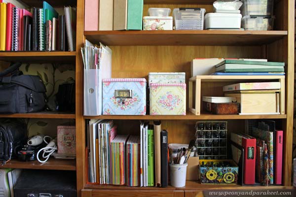
Marie Kondo believes that we should take time to consider which is the best way for storing each item. I found that odd bottles of ink are much happier in spray bottles with other liquid inks. Paints are now in boxes on the right side of the middle shelf. I love how easily accessible all the supplies are and how my art journals and inspiring magazines fitted there too.
How to Prevent Decluttering?
According to Konmari method the secret of staying organized is this: once you have dramatically reduced the amount of stuff and organized by type, you will consider buying new things much more carefully. When you group items by type, you will remember what you already have. When I saw what I had bought during the years, I thought that many times I could have just left the store early and put the time in creating. Focusing on fewer art supplies has reduced my yearn for shopping, so I do believe what Marie writes about.
Make your colored pencils spark joy!
Buy my e-book Coloring Freely
Using Molding Paste in Collage Art
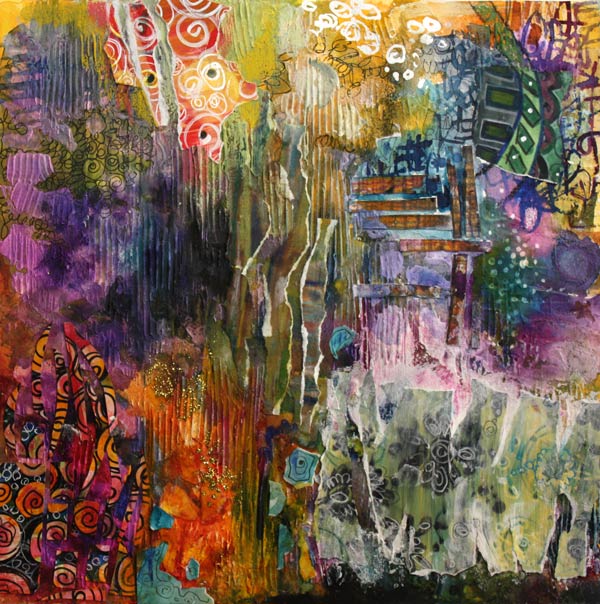
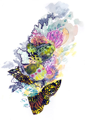
I have had the idea for this painting for a long time: to mimic fabrics including their surface structures. I wanted to combine watercolors and decorated papers with the structures I also had a deeper theme: being open for combinations. Fabrics in a quilter’s stash have no hierarchy between each other. Similarly, we can accept different sides of ourselves and our lives and make them work together.
Creative Process with Molding Paste
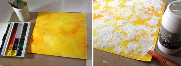
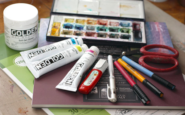
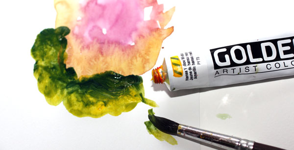
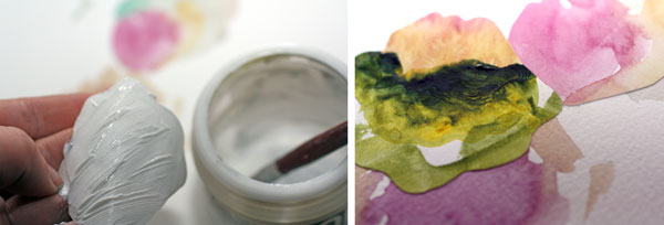
I began the artwork by painting a watercolor paper yellow. I love my White Nights watercolor set, its colors have such a great intensity! After the watercolor background, I added splotches of molding paste and made it look like corduroy by drawing straight lines. My paste is a Danish product, Schjerning Smooth Structure Paste, but if you are going to purchase some, I would recommend Golden Molding Paste.
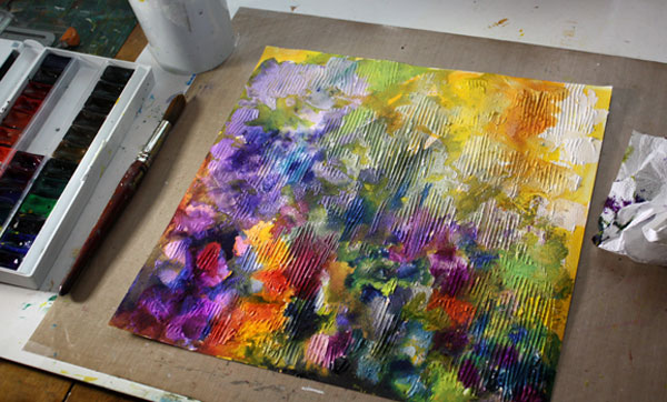
The great thing about molding/structure paste is that, after it dries, you can watercolor on it.

You can also paste extra layers.

It is difficult to doodle on the layers but if you leave some areas free of paste, you can doodle there. The combination of the structured surface and doodled areas create great contrast.

You can also add decorated papers and achieve a more detailed look that way. I tore most of my papers by hand so that their soft edges remind from the softness of fabrics.
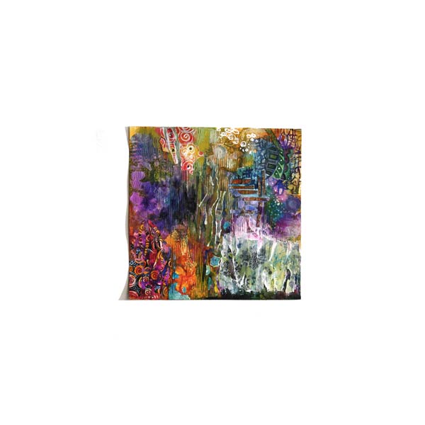
I do not usually look my paintings from the distance before they are almost finished. I feel it is unnecessary to try to balance an unfinished work. The last little details are added based on what I want to emphasize. In this work, I wanted to create a composition of several equal areas. The final step was to add the little turquoise pieces in the lower part of the work. Working as a contrast color, that made the weight of the orange equal to the other bigger areas.
Have you ever used surface structures in your art or craft? How? Which do you enjoy more: structure or color?
Let me be your mentor in art: Subscribe to my weekly emails!
Tribute to the Old Watercolor Set
I loved my old watercolor set. I bought it at the time I thought I should learn how to use watercolors. I also bought a book about watercolor painting. It would explain to me how to do it in correct way. That meant: merrily paint those landscapes and still lives in a row like all watercolor artists seemed to do. Soon I realized that even if I admire all those great artists I got nothing out of painting like that myself. Partly blaming my watercolors for it I put them away.
They must have been sad. All those beautiful things that they held inside was in the dark for years. How happy and thirsty they must have been when they were finally able to see the light again. They persuaded me to give them another try. They promised to be ready what ever I would assign them to. “Come on, stroke us with those soft brushes you have”, they pleaded.
I gave them a stroke, and another… After many long and hard discussions I realized that all I had to do is to let go. Not only put away my assumptions about their purpose but also their nature. These were social guys. Ready to talk not only with me but also with my color pencils, acrylics, inks, markers, you name it.
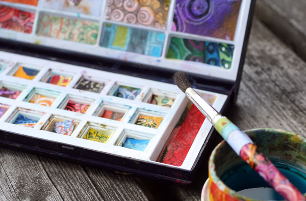
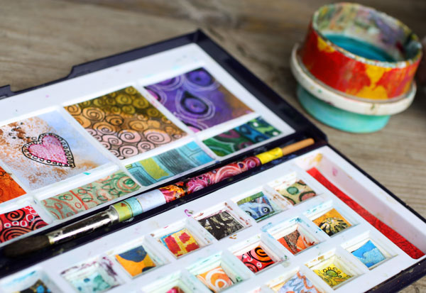
Now the pads are all gone. But even if the tray is empty, the beloved colors can be found in my art journals and display books. I kind of think that I have set them free. To celebrate their freedom and the happy moments spent with them I made a tribute for them. I even dressed their favorite brush and their water cup.
With this tribute I let my watercolors speak to you: use your art supplies and let them show you where art can take you. Art is not a competition, neither any other predefined experience. Art is not too noble or too serious. You have the privilege to fly to the world of imagination and your art supplies crave to help you with that!
Let me be your art teacher: Subscribe to my weekly emails!
What Art Supplies Do I Need?
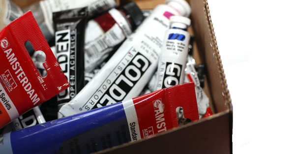
One of the most popular questions that I get is: What art supplies do I need? What brands to buy? Here are my favourite principals in purchasing art supplies and the products that I most often buy.
Use What You have
My first advice would be: before investing a lot of money use the stuff that you already have as long as you can. Creating art should not create more chaos and clutter. It should make you feel more content with your life. If you need to buy something, buy quality. That sends you the message that you value what you do. And you get better intensity of colors and most out of the various techniques.
Background Papers
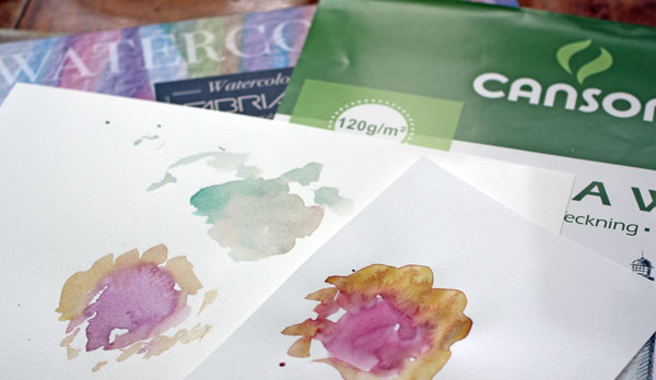
If you make collages like I mostly do, most of your papers should be fairly thin. It is easier to cut and paste thin pieces of paper. The background that you are using can be canvas, watercolor paper, cardboard or any thicker surface. I often use acid-free Canson Drawing paper (thickness 120 g/m2, 80 lbs). And my favourite background paper is Fabriano cold pressed fine grain watercolour paper (thickness 200 g/m2, 90 lbs).
Journals
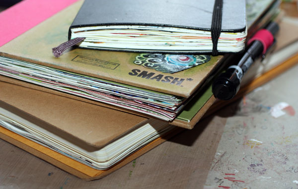
I also recommend that you buy a sketch book and make it your art journal. You can use a journal page as a background or glue or tape the background paper to the page. With the journal your creativity and self-acceptance grows page by page. Constantly getting back into what you have created enforces your style and makes you love what you do. I like the size of the bigger Dylusions Creative Journal. I also love Moleskine books and Smash books.
Colors – You Can Mix Them!
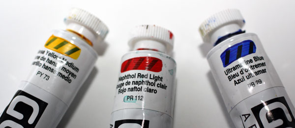
I want to give general advice on colors first before digging deeper into various qualities and brands. If you have a fixed budget, use your money on quality instead of quantity. With three primary colors, yellow, red and blue, you create a pretty wide range of other colors and hues. If you only afford one, buy yellow. If you only afford two, buy yellow and red or blue considering which one you like more.
If you can afford five, buy white, black, red, blue and yellow. With that amount, you’ll survive a long time. When you mix black with the primary colors, you get beautiful melancholic muted shades. And with white, more cheerful pastels. If you can buy some more, buy another set of primary colors just different hues. If you have warm and cold yellows, reds and blues plus black and white, you can create a huge colour palette.
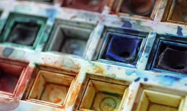
Watercolors
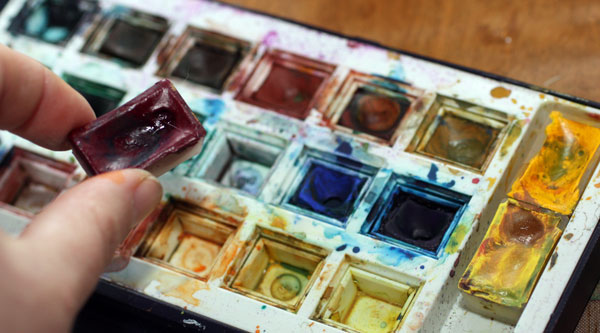
I love using watercolours and combining them with other materials like colour pencils. My watercolor set is an old Windsor & Newton set (pretty similar to this one). I have complemented that with some new White Nights pans. I love the quality of White Nights watercolors and recommend it for those who hate watercolor painting just because they use pans that do give the intensity needed. I also have gouache tubes but no not use them often. I love my little pans! For those who really want great pigments and less opacity, I would highly recommend Schminke gouache paints or watercolors in tubes.
Acrylic Paints
I know many people that hate acrylic paints. The reason is usually that they have poor quality paints that they try to use like watercolors. Low-quality acrylic paints have poor intensity and gloss and coarse structure instead of smooth. While watercolors represent everything light weighted, acrylic paints are heavy and strong. Better than mixing them with plenty of water is to use little water or gel mediums (introduced later in this post).
My favorite brand in acrylics is Golden. They have affordable introductory sets that I highly recommend. Use very small amounts of color at a time. The color pigments are great, and the set will last for a long time. If you find it hard to squeeze small amounts and tend to use a lot of acrylic paints, Amsterdam has big economic tubes of acrylics in their standard series.
Gel Medium
I use gel medium to glue the pieces of my paper collages. I also use it with acrylic paints to give them more elasticity. For me, gel medium is a must have. I have tried several brands and spent plenty of time to find what I like most. My favourite is Golden Soft Gel Gloss. I also like the matte version of it.
Brushes
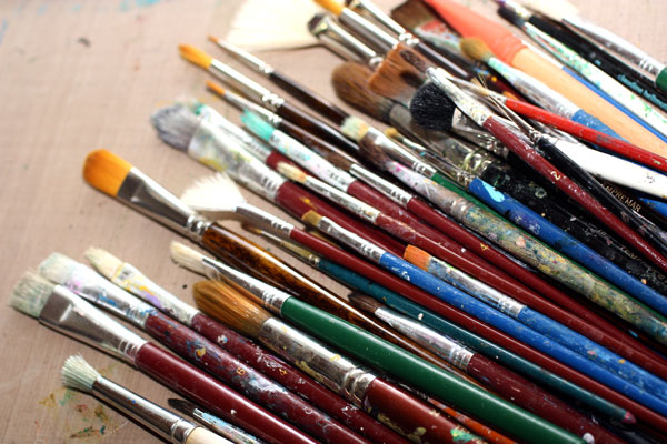
After preaching about quality over quantity I must admit that I do prefer to have a lot of brushes. And many of them are low-quality cheap brushes. I have come to this situation for two reasons. First, in the heat of creating I often forget to put the brush into the water and it gets ruined. Second, the more you vary the size and quality of the brush the more interesting your artwork will look like. So when buying your first brushes, buy a set that has both flat and round brushes in various sizes.
Colored Pencils
Colored pencils have come a long way since I was a child. They used to be hard and many times they tore the paper when trying to get something out of them. Nowadays there are wonderful colour pencils that everybody should use, including children! Caran d’Ache Pablo pencils have wax-like finish; I adore them! I also love Derwent Colorsoft and Derwent Inktense pencils. Inktense pencils are water soluble, and you can use them instead of watercolors in small areas.
Markers
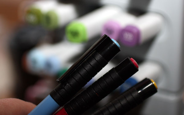
Some people prefer markers over colour pencils because markers are easier to use. I use both. I often combine them so that some layers or areas are colored with markers, some with color pencils. My ultimate favorite is Faber-Castell PITT Artist Brush Pen. They can be used on almost any surface. They can be bought in small sets or separately so you can acquire only a few ones first. I also have a collection of Copic markers. They are high quality and serve me well as they can be filled again and again. But if you start small, get few PITT pens, and you will be happy.
Bright White
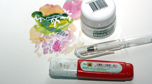
If you have followed me, you know that I do not make white art. I do not create white areas or spend a great deal of time creating romantic scenes like putting off-white tulips on a white background. But having something bright white is essential for me. I love to put some white spots and then color them with markers or paints. That makes colors shine! I take my bright whites very seriously and have spent too much money to find the ones that work for me.
In gel pens, Uniball Signo is my favorite. I also use correction pens and Copic’s Opaque White that comes in small jars. You can replace these with white acrylic paint using a thin brush, so nothing to worry if you do not purchase any of these.
So – What Art Supplies Do I Really Need?
If you have read this far, it might feel like you need plenty. But really, you only need some pens and paper to get started.
Few pans of watercolors, maybe a couple of color pencils or PITT markers and you are good to go. Supplies do not make you an artist. The constant practice does.
Let me be your art teacher: Subscribe to my weekly emails!