Following the Inner Color
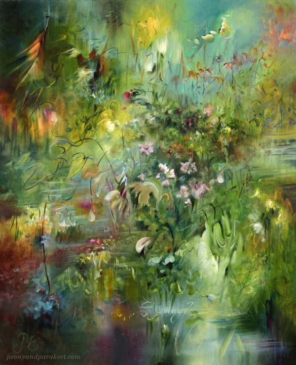
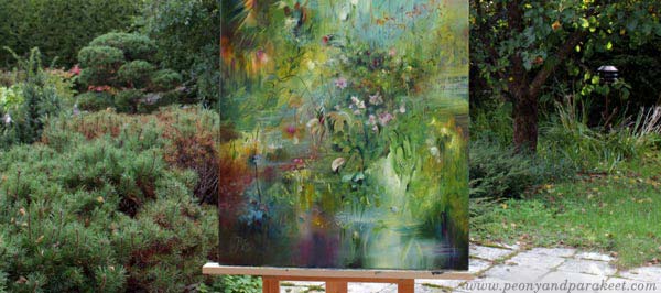
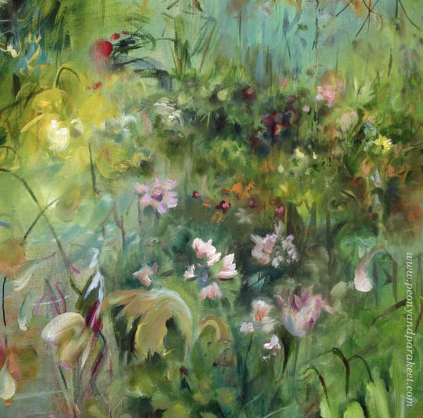
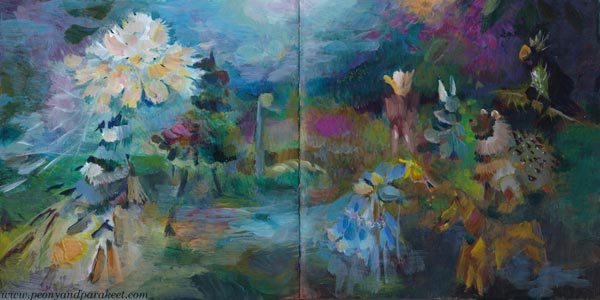
Here is my latest completed oil painting “Elixir.” I start my abstract paintings with the idea that I follow an inner color.
Color Chooses Color
The inner color is the color I feel drawn to, so I tend to pick and mix the first colors intuitively. And then, they wish for other colors to accompany them.
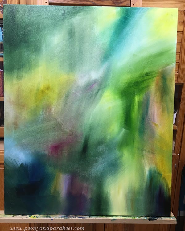
Colors also evoke shapes, and the shapes bring in more colors. A raw and bright color selection changes slowly to a more sophisticated one. In this color-driven technique, the inner color changes as the painting matures.
I try to give my painting enough time to find its own soul and paint several sessions, letting the paint dry between them.
First a Child, Then a Teenager
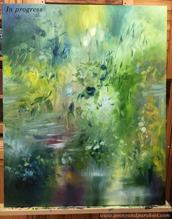
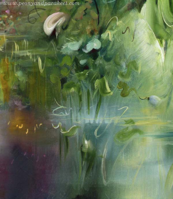
When the painting is only a child, I don’t care about the composition or what it will represent. I don’t want to force a short childhood or early adolescence. When puberty begins, it’s tempting to call the painting finished. But only then does she begin to find her own, unique mission and get prepared for a long life.
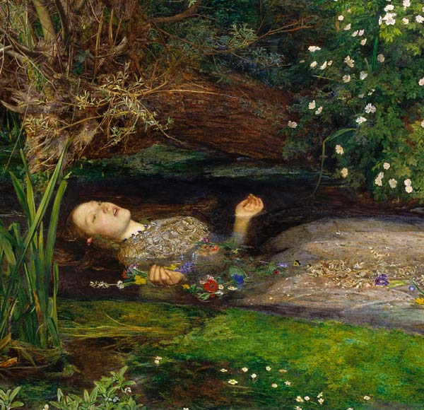
Teenagers often tell how they want to be called. When this painting was still unfinished, she was Ophelia because she saw herself as John Everett Millais’s painting from the 19th century.
I usually give the final name only when the painting is almost finished. Then I know what I want to emphasize with the name. Maybe we humans should get our final name a little later too?
Early Goodbye
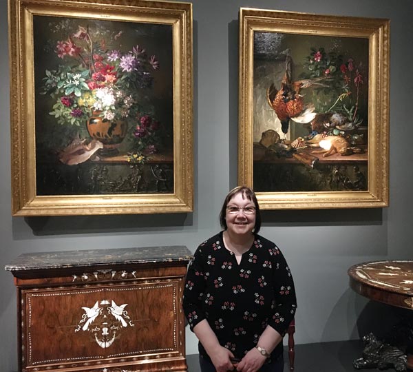
I take pictures of my canvas paintings outside if possible, because that’s where the light is most natural. My husband often acts as my assistant and holds the painting against the wind. Most of the time, I end the photoshoot by saying to him, “Hey, come take a picture of us together!”
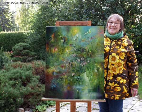
Since I sell all my paintings, this is the moment when I’m saying a mental goodbye to them. I assure them: “You’ll be fine. Everything’s going to be fine.” Even though I often miss my paintings, I don’t tell them. I feel like their mission is bigger than mine, and my job is to deliver all this for others, not for myself.
I have practiced most of my oil painting techniques in a quicker medium, so in watercolor!
Wild Garden – You Can Still Hop in!
In Wild Garden, we will paint freely, intuitively, and expressively in watercolor from Sept 22 to Nov 14. We will begin with floral greeting cards and gradually move forward in expression.
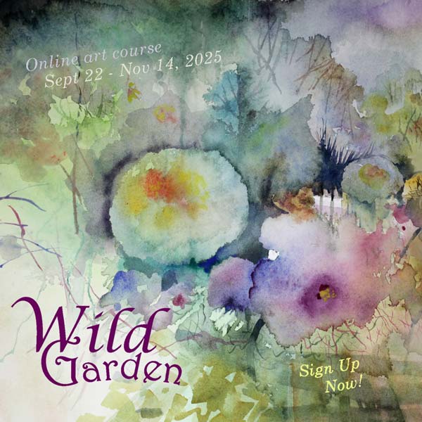
The course has just started but you can still hop in!
>> Sign up now!
Painting a Mystery
This week is about painting a mystery and entering another world through art-making. My paintings are in an art journal and made with a loose touch.

It All Started from a Withering Bouquet
“The Midsummer bouquet has withered. I have to throw it in the trash,” I said. “But the setting is just like those old masters’ paintings,” my husband replied unexpectedly. And so I remembered this once again.

Once Upon a Time
Once upon a time, there was
and there still is a world that you can get to from anywhere.
At first, it’s dark, but you can hear a woman reading a letter to someone.

You hear a clock ticking backwards, generating more time.

Then you know that it’s time to take a brush in your hand.

Squeeze the handle firmly and hear the trees moaning as their trunks slowly sink to the ground.
First, it feels silly to paint because there’s nothing to see.

But the darkness gradually disappears, and you realize that you are not alone.

Those strange creatures are all familiar to each other and, in a strange way, to you too.

In this world, everything has been mixed up.
You are the wind that shook the flower, and in blowing the petals back, you lost your soul to it.

You are the chair for which the imagination built a room to rest.

In this world, everything is unfinished. But if you are willing to hear and feel instead of only seeing what’s expected, everything is ready enough.

Painting a Mystery – Background Story
The idea of this blog post came from that short conversation with my husband. Then I had to take a photo of the bouquet and make it in the style of old masters.
After that, I remembered taking a photo of a painting called “Woman Reading and a Man Seated at a Table” at the exhibition of the H’Art Museum in Amsterdam. The painting is by Frans van Mieris from 1676.
While browsing my image archive, I was drawn by another photo, taken in the same trip to Amsterdam. It was a decorative mantel clock from 1782 in the Rijksmuseum.
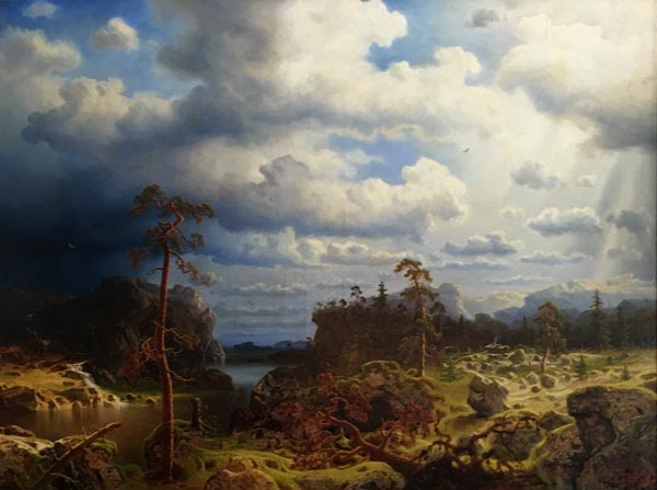
The clock took my thoughts to a more recent visit in Porvoo, Finland, where my husband and I went to see Johan Ludvig Runeberg‘s home. The lovely interior was from the 1860s, and there was a big painting that I really liked. I took a photo, but haven’t succeeded in finding out who painted it.
After gathering the photos, I picked up my art journal (Dylusions Creative Journal Square) and started painting. I didn’t copy the photos, but let them soak in freely. I was just inspired by the atmosphere they evoked in me.
Hopefully this blog post inspires you to paint freely without strict plans and definitions. Painting a mystery is both fun and addicting – I am already eager to create more!
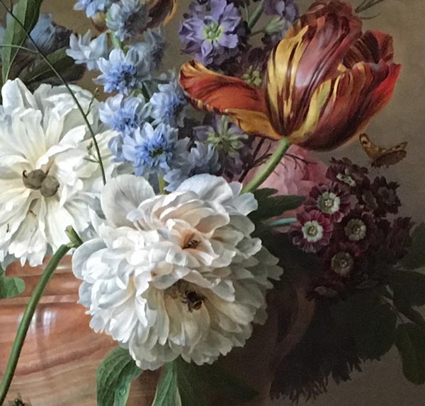
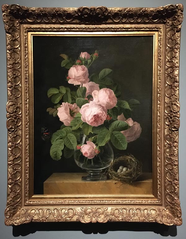
Flower Paintings at Rijksmuseum
Charming and necessary for any artist. Let’s admire the flower paintings at Rijksmuseum!
This week, I had a lovely time in the Netherlands, where my husband and I spent a few nights. The highlight of the trip was the visit to Rijksmuseum. It’s a huge museum in Amsterdam, and it takes many hours to see even a glimpse of all the artworks. For this post, I took some flower photos for you, as you may, like I do, love flower still lives.
Flower Paintings at Rijksmuseum with Some Notes
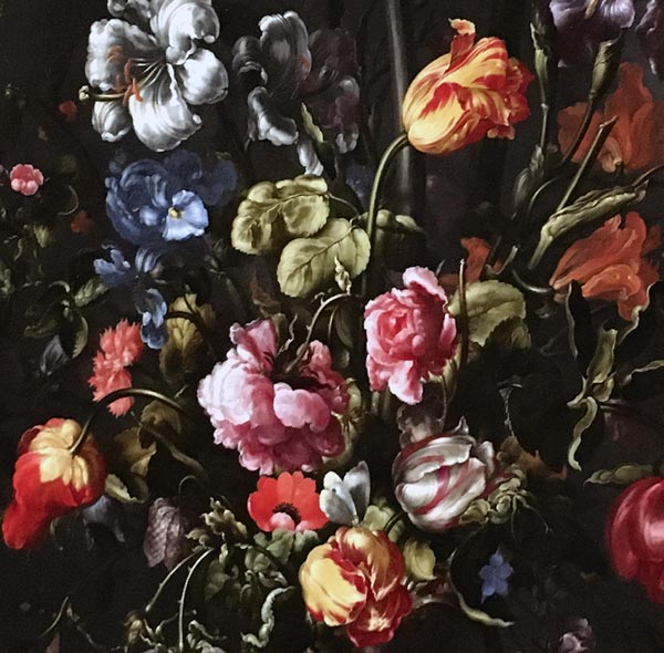
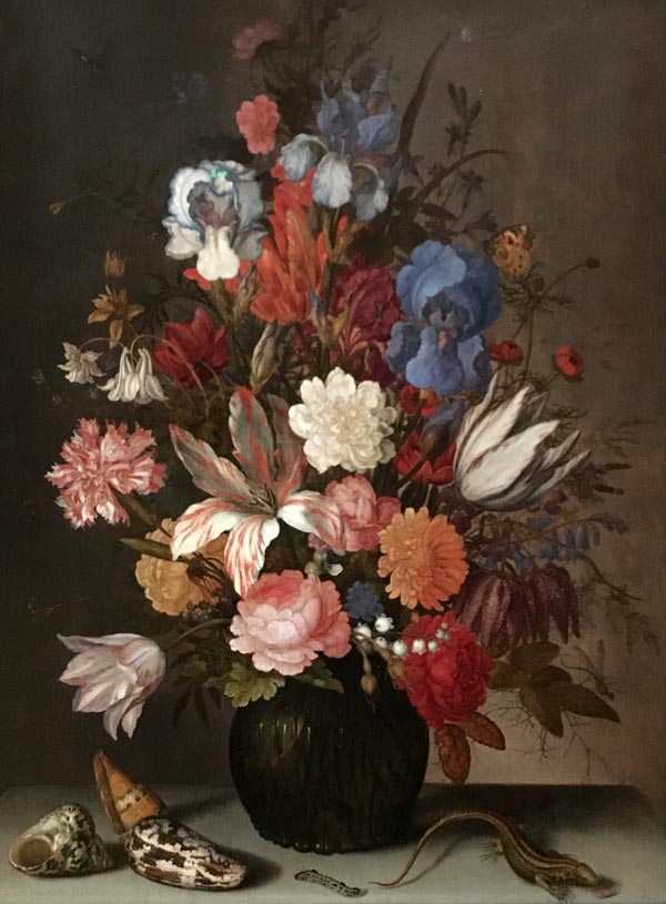
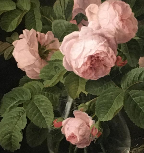
I love these paintings because the flowers are not isolated, but layered, giving a rich effect. Remember, you can paint just part of a flower and then another right next to it.

We can learn from Rachel Ruysch that part of the flower can be in the shade, making the most important flowers stand out even more.
Animals are often included in old flower paintings. You can create a miniature world in one flower piece!

The dead frog here represents the cycle of nature. Some of the flowers may also be pointing downwards and appear withering.
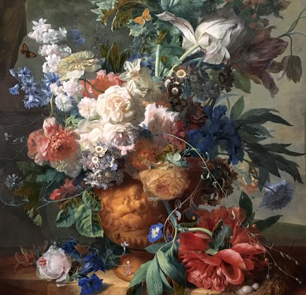
I am also fascinated by the backgrounds of old flower paintings. Even if their color is dark or neutral brownish, the variation in darkness or tone makes the painting feel natural.
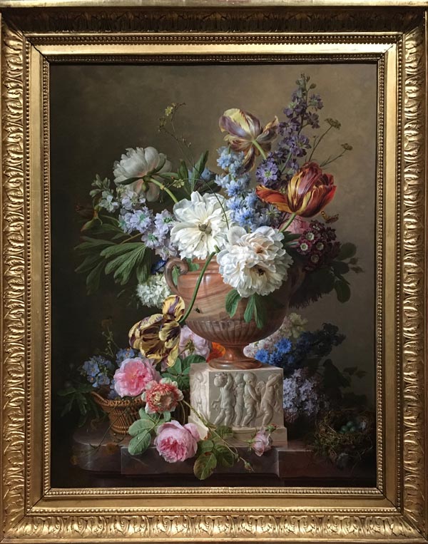
The abundance of details is a challenge for a busy contemporary artist. But on the other hand, one painting can be the source of inspiration for many pieces!
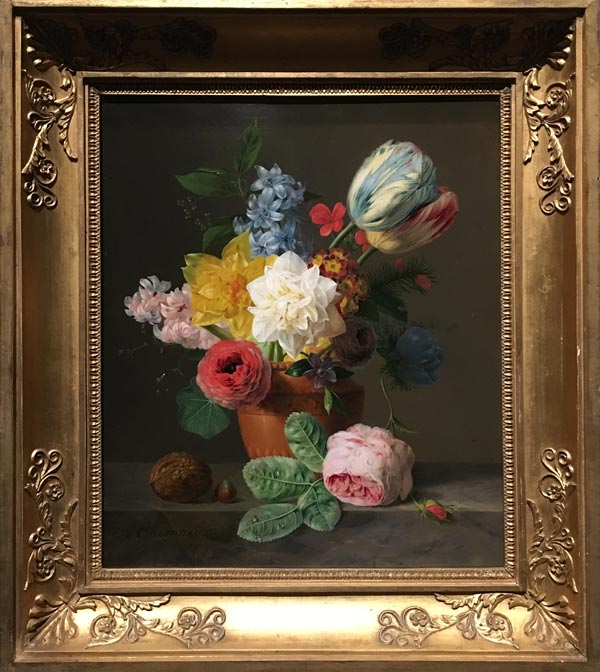
Did you notice that we started in the 17th century and gradually moved forward in time? The colors and their durability increase, while on the other hand the detail and abundance of flowers decrease.

But no matter what century, such beauty is not only charming, but also necessary. When everyday life slowly creates an empty hole inside me, I call the feeling “old art hunger”.
Now the hunger is gone and the hole feels filled again for a while. Seeing these flower paintings at Rijksmuseum was both a grounding and spiritual experience.
Let’s Paint Flowers – Inspiration for Art-Making
I am obsessed of painting flowers and this whole blog is full of inspiration for that. Here are some top picks for old-world-floral style:
- Flower painting comes to Life (2025) – Watch the video of finishing and exhibiting a floral oil painting
- Flower for Your Art Journal and the sequel Expressive Watercolor Flower Collage (2025) – A video and flower painting inspiration for art journalers
- Watercolor Flower Obsession (2024) – Watch the video of painting a flower card and see me talking about my love for old flower paintings
- Watercolor Greeting Card (2023) – Watch the video of painting a flower card
- Paint Beautiful Decorative Flowers (2023) – Old-world florals transformed to a more decorative art style
- Gelli Plate Meets Fine Art (2018) – A video and step-by step pics for two projects, one of which is a floral still-life
Vermeer Girl With Heart – Draw With Me!
Draw a Vermeer girl by following my formula!

This drawing is a modern version of the painting “Girl with a Pearl Earring” by Johannes Vermeer. Here, the earring is not the center of the attention, but a heart and flowers steal the show. I have made a simple formula to draw and color the girl’s face, and then you can put your own twist on the head and add whatever decorations you want there.
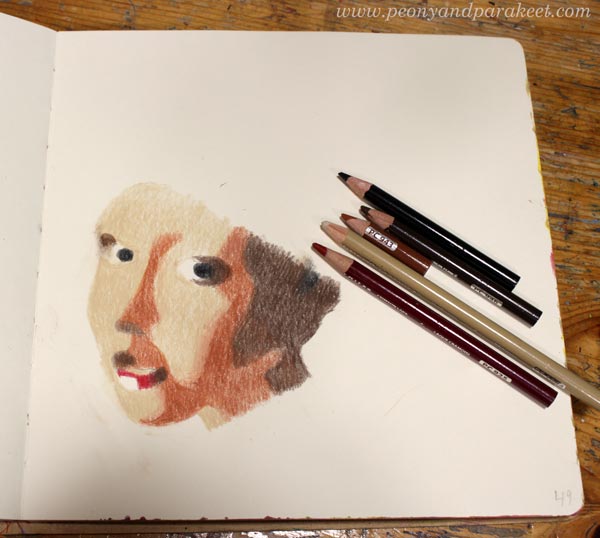
Supplies
You can use colored pencils, watercolor pencils, watercolors, acrylic paints, oil paints – or any medium that has a possibility to create color mixes. My example uses colored pencils. For the face, you need three browns: one dark, one middle, and one very light brown. You also need a little bit red for the lips and black for some small details. White is optional. When working on white or almost white background, you can just leave the white areas uncolored as I do in my example. I do use a little bit white to blend the red of the lips into paper white.

I created my Vermeer girl directly on an art journal page. My art journal is Dylusions Creative Journal Square. Pick a journal or a paper that works well with your supplies.
Vermeer Girl – Shape by Shape Formula
To succeed you have to trust this formula. Don’t look at the original painting, follow the picture below only. Copy the shapes as accurately as you can, and don’t think about drawing a face. The girl will appear when you have all the puzzle pieces in place!
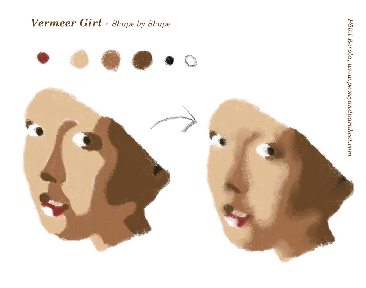
Start from the first picture and color the shapes so that they have sharp outline edges. Then blend the skin colors so that the transition from one shape to another is softer.
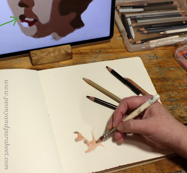
Starting the Drawing
If you want to put all kinds of fun stuff on the girl’s head, place the face on the left bottom corner. I marked the spot where I started the drawing with a green arrow on the photo below.
At first, the face doesn’t look like one at all. But this kind of abstraction will bring out the realistic look. Reality is always more abstract than we think.
Drawing Sharp Shapes
Human faces are very organic, so the shapes are too. Examine the curves of the formula in detail, and avoid straight lines. The more beginner you are, the more you are tempted to draw too straight, avoid that!
Once all the pieces are in place, the face makes sense. Take the image in front of the mirror to see if there are any distortions. If the mirror image looks wrong in some way, get back to the formula and check your shapes!

When you are satisfied with the sharp shapes, go to the second step of the formula: blending.
Vermeer Girl – Achieving the Old World Look
Old paintings have softness that our photo-oriented era doesn’t often express. We prefer sharpness over blurry. However, life is often blurry and your Vermeer Girl will look much more alive if you soften the edges of shapes, especially on the skin.

Color on the top of the shape with the neighbor color so that the shapes integrate and look less separate. Now you can also adjust the shapes a bit more freely. I lengthened the big dark brown shadow because my face became a bit longer than in the formula.
Small changes in faces can change the personality quite a lot. I think that’s fascinating! You can start from the Vermeer girl, but then end up with a character of your own.
Drawing Decorations
First, think about the size of the decorations: do you want plenty of small ones or only a few large ones. Beginners easily draw something between, but I think this portrait will look better if the decorations are either a bunch of small ones or a few large ones. I chose the latter and placed a couple of big flowers and a heart on her head.
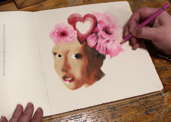
I colored the decorations freely and used no references for these. I like the contrast between the face’s carefully constructed softness and the free coloring of the flowers.
I move on to color the background just before I am finished with decorations. This way I can still change them a bit if needed. The background often gives life to the whole image and brings in more ideas for the drawing.
Starting the Background
Not only the girl’s face is composed of shapes, the background can be like that too. The only difference is that now you can freely improvise the shapes. Start with one color and sketch by coloring!
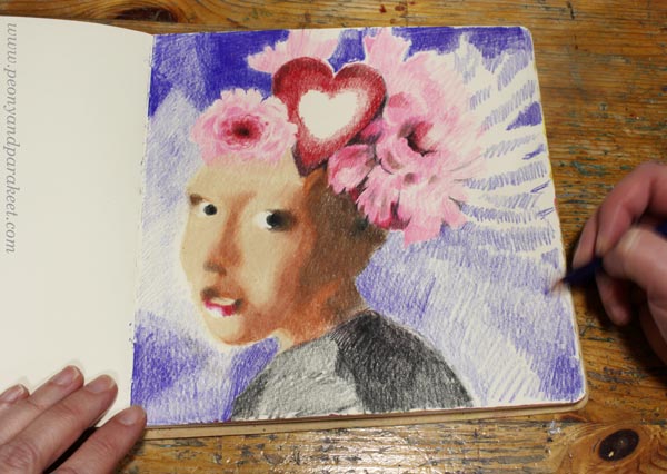
Think about the streams of air and imagine how the girl moves when she is posing in front of you.
Building the Color Scheme
To make the portrait look unified, you need to repeat the colors. My background started as blue, but in the picture below, it has started to get more brown tones. The pinks of the flowers also blend into blue. Color several layers and use a lot of blending near the edges.
I added the surrounding colors to the center of the heart like it would be a mirror. This also helps in harmonizing the atmosphere.
You can also play with patterns: color small shapes inside a bigger one! When located in the background, the patterns can be subtle and muted, so that they don’t steal the whole show.
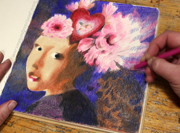
Finishing the Vermeer Girl
When you are close to finishing, look at the original Vermeer painting and see how she partly disappears in the background. Especially the dark brown in the neck area can be blended with the background.

Dark background looks great with the lit face. Vermeer girl with a heart makes a wonderful Valentine’s day page in any art journal!

I hope this project made you grab your pencils and other art supplies!
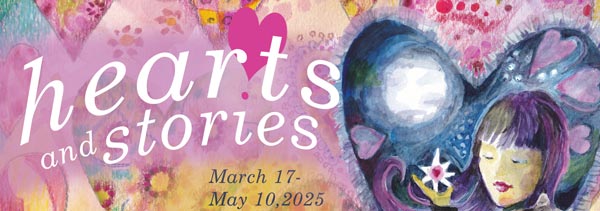
Hearts and Stories – Sign up Now!
Come to play with hearts and other simple shapes! We use colored pencils, felt-tipped pens, and watercolors. Sign up for Hearts and Stories!