
The Power of Positive Self-Criticism in Art
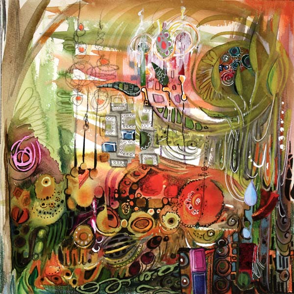
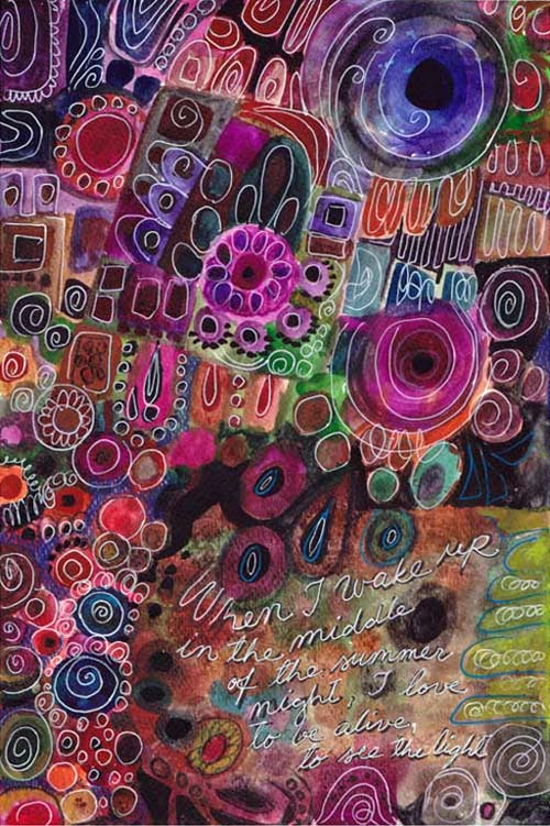
My latest mixed media artwork is called “Positivity Grows”. It is dedicated to all of you who have a strong inner critic. If you want to improve, it is essential to evaluate your own work. But sometimes the self-criticism can have too negative tone. Have you experienced any of these?
1) Big Picture Panic
The artwork gets evaluated as a whole in a too early stage. It is like making a meal and after tasting the raw potatoes, you’d decide that it’s not going to succeed. “I must have done something wrong when peeling those potatoes!”
2) Overclean Obsession
You take the safe way: you don’t mix colors, don’t let anything intersect, draw sloo-owly, keep everything plain, simple and controlled. This reminds me of a tadpole (a baby frog) which I got from my friend when I was a child. The tadpole lived in a jar filled with muddy water. I picked a clean vase, poured plenty of tap water and put the little frog there. It did not live long. I did my best to take care of it but did not understand that for the tadpole, there was nothing to eat, nowhere to hide. So – Mix those colors! Add diversity! Give some nourishment to the growing artist in you!
3) Mistake Hunt
If you focus on the things that “went wrong” instead of those which “went right”, you are playing the wrong game. Art is in small nuances, it requires sensitivity and openness. If your self-evaluation is too negative, you do not notice the beautiful little details that appear in your art. They are often lucky accidents if you take care of the diversity. When enhanced, those details can take over and bring your end result to the new level.
Positive Self-Criticism
You can get cured of any of those diseases with a healthy dose of positive self-criticism. From the moment you make the first brush stroke, focus on the details and look for beautiful and interesting areas. I will show you how I did that while creating the artwork of this post.
Phase 1 – Watercolors
When I began the artwork of this post, I just made a mess with watercolors. I kind of made the muddy jar for tadpoles to prosper!
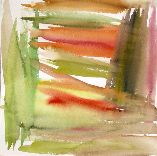
After painting this, I could have just quitted and called it ruined. Or I could have tried to make that dark muddy area brighter. But instead, I began to investigate the painting closely.
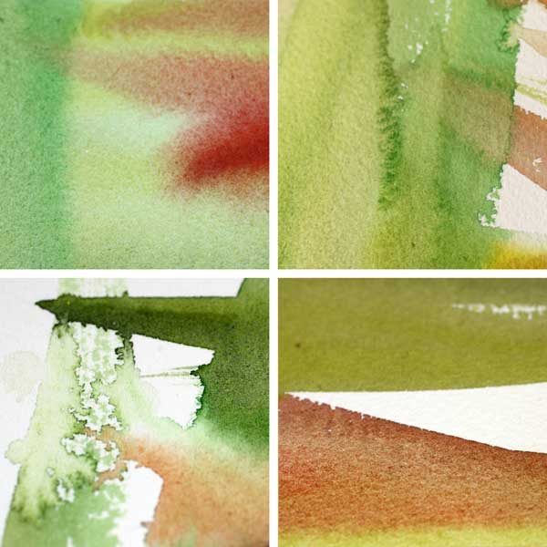
My inner critic pointed the little details with so much beauty that I began to feel confident and excited. The whole process of making this artwork began to feel like an adventure. Instead of mistakes, I was hunting treasures!
Phase 2 – Watercolors
Next, I continued with watercolors and created new layers of elements. I took care of the diversity: there’s a lot of various hues and shapes. And even more important: the layers intersect so that they create new happy accidents.
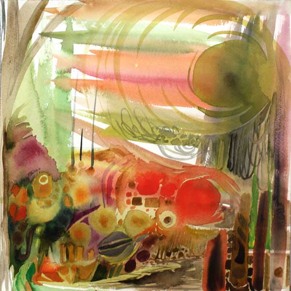
After painting this, I enjoyed this tiny detail: a yellow spot. It was like a little star! I felt I was lucky and genius at the same time.
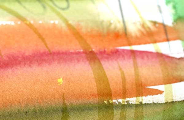
I spent some time searching for more beautiful areas and enjoying them. With watercolors, the edges of brush strokes are often really beautiful.

Phase 3 – Colored Pencils
To keep the diversity level high, I changed watercolors to colored pencils. I also changed the music I was listening to. Working from a small area to another, I enlarged the beautiful details found after another.
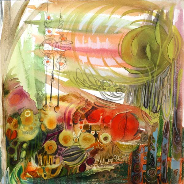
In this phase I realized that the main theme of the artwork would be growth. I searched for the details that would express the theme. I found several and they made me happy!
Phase 4 – Pens
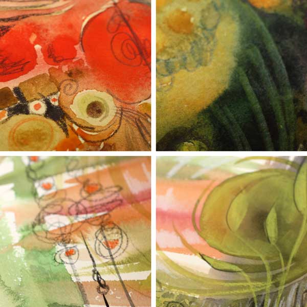
New music and new supplies! This time I picked a black PITT Artist Brush Pen and a white gel pen (Uni-Ball Signo). I was encouraging myself to create strong contrasts. They would make the pretty details really pop. Again, I was not worrying about hiding the not-so-pretty details but enhancing the good ones.

In this phase I began to look the artwork as a whole. However, instead of correcting the poor composition, I analyzed which of the details looked most appealing and how they were located.
Phase 5 – Finishing
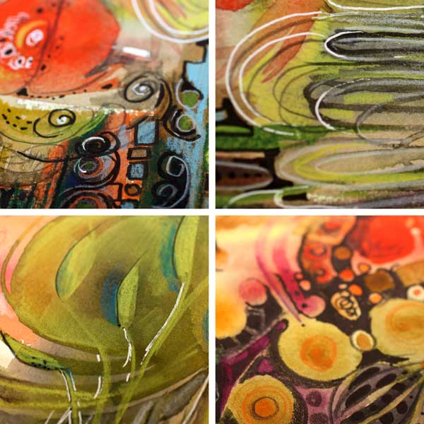
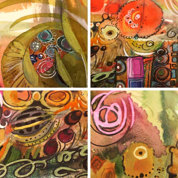
When finishing, I like to listen to the rhythmic music which gives me the confidence to carefully adjust the balance of the work. I picked a white correction pen and a box of hand decorated papers. By doodling and cutting papers, I changed the composition so that the eye would find all the pretty little details one by one.
The Summary
You can be analytical and critical when making art. You can also be strict: mix the colors, change the tempo, keep the image alive! But maintaining the gentleness and sensitivity is crucial too. Let the little details that appeal to you be the foundation for your self-expression!

Blank Page Syndrome before Big Picture Panic?
Buy the video “Watercolor 101 for Intuitive Painting” where I will show you how you can get a fast start and keep going! Click here for the preview!
Artistic Embroidery with Pens and Paper
I am so excited!

I will be teaching an online class as a part of 21 SECRETS Spring 2015! The class is called Artistic Embroidery with Pens and Paper.
Class Description
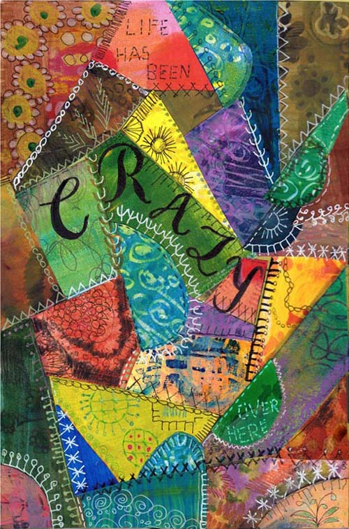
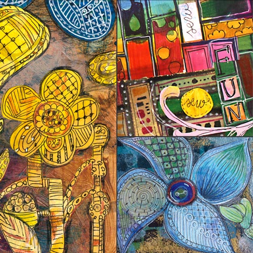
Let the long history of textiles show up in your art journal! For hundreds of years people have created textile art to express themselves. In the workshop we will discover ways to imitate embroidery and quilting using paint, pen and paper! No actual sewing needed!
We will find inspiration from various stitches and techniques like crazy quilting, silk ribbon embroidery and modern patchwork. These art journal pages don’t only make you feel warm and welcomed, but also let you express the luxury only handmade can offer. After the workshop you will look at the family heirlooms in a new way!
21 SECRETS – 21 teachers!
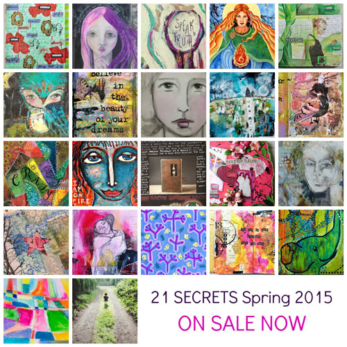
By purchasing the class you will not only get that but also 20 other online classes from 20 other great artists!
Starts in April – Now available for preorder!
21 SECRETS Spring 2014 starts at 1st April and it is now available for preorder. Once the workshop starts in April, you will get a downloadable PDF including all 21 classes. It is packed with videos, full color photos, printouts and instructional content. You will get unlimited access to all 21 classes and a membership to the private Facebook community where you can discuss with me and the other teachers and participants. If you want to learn or boost your art journaling, this is the workshop to choose!
Why preorder now?
I am a big believer of looking further ahead than to the next month. When you will see the spring light and start to wait for the summer, April is the perfect time to get something new for your journals and your skills.
And here’s another good reason to pre-order! The regular price for the 21 classes is 98 USD, if you preorder now it is only 69 USD! But be quick, the lowest price is available for the first 150 participants only!

I hope to see you at Artistic Embroidery with Pens and Paper! Click here to read more and preorder!
How to Imitate Glass with Paint
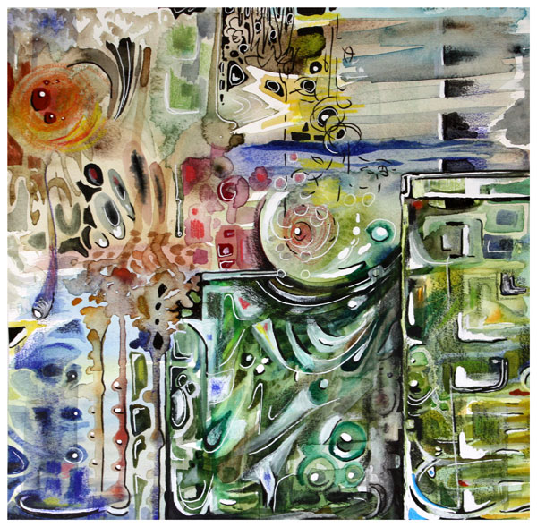
For this painting, I learned how to imitate glass. It is called “We Will Protect You,” and it’s about parents trying to protect their children. The parents have good intentions, and they do their best, but in the end, they have to let the child step into the world. I have painted two glass vases to represent the parents. The child sees the world through the parents, and even if they want to protect the child, they are fragile too.
Artistic Inspiration from Glassware
The idea for the painting began last Saturday when I went to the local library to get some ideas for the future blog posts. I saw the book called The Art of Glass. It was about Kaj Franck, a Finnish designer who was extremely skillful in designing glassware.
 Most Finns have Kaj Franck’s glassware. He didn’t design unique pieces only, but everyday glass as well. My most precious glass item from him is this red “Goblet” which was originally owned by my aunt. She passed away ten years ago, and the color of this Goblet reminds me of her vivid character.
After browsing few pages of the book, I knew I had to make something glass-related. It’s not the first time the glass has inspired me: see the collage inspired by Nanny Still, and I have also knitted a folk bag inspired by Oiva Toikka. Both Nanny Still and Oiva Toikka are Finnish glass designers as well.
This time, I wanted not only to find out how to imitate glass but to explain it to you too. Before beginning the bigger painting, I painted few circles on a small paper and tried to make them look like glass.
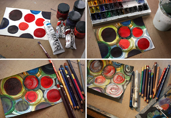
I used acrylic paints to paint the circles and then watercolors to add more circles around the previous ones. The shapes were softened with colored pencils. Then I added white with acrylic paint and a gel pen, and black with a PITT Artist Pen.

I made each circle a bit different. I was not fully satisfied with them, though. The center circles were too solid in color. I decided to start the bigger painting with watercolors as they are easier for making transparent layers.
8 Tips on How to Imitate Glass

1) Paint several transparent layers which intersect each other. Use a lot of water to create thin layers.

2) Use a lot of hues and shades of the same color. Mix colors to get new tones which have slight differences from each other. Use small spots of other colors too as glass reflects its surroundings.

3) Paint geometric shapes like circles, squares, half-circles, and triangles.

4) Add white with acrylic paint. When painting the white shapes, soften one side of them by adding water.
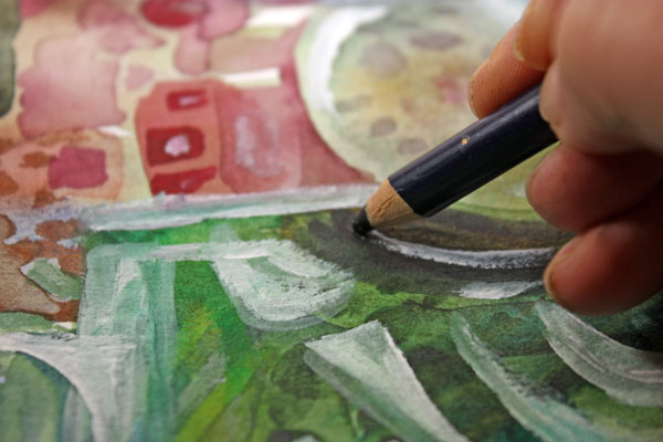
5) Use a black colored pencil to add dark near the sharp edges of white areas. Make the dark areas soft too.
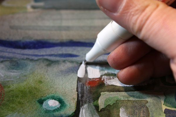
6) With correction pen, add brilliant white to highlight parts of the white areas.

7) Add jet black with a black marker (I used a brush tip PITT Artist Pen) to make dark areas pop as well.
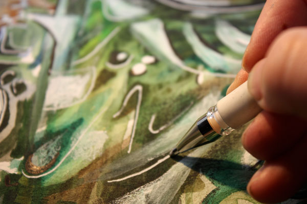
8) Finish with thin lines using a gel pen and a black marker. It will make your glass look a bit thinner and more elegant.

What kind of glass do you like the most? Does mimicking materials interest you too?
Let me be your mentor in art: Subscribe to my weekly emails!
Art Journaling with Still Lives
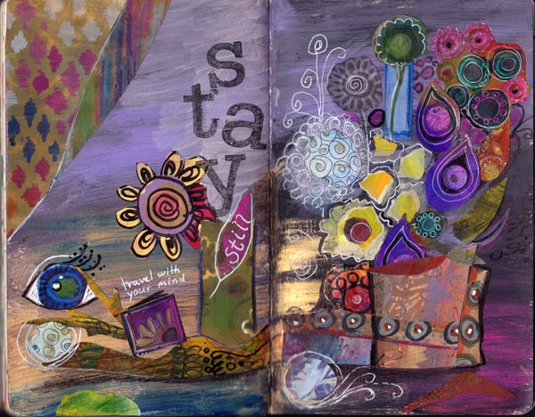
For the last couple of years, I have felt drawn to still lives. I even have the Pinterest board of the ones that I especially like. I used to think that old still lives are very conventional but they really are not! There can be anything happening in the painting, like a squirrel running on the table, and there can be a wide variety of objects too. And even the flowers look magical! Art journaling has a lot to learn from the old masters.
So, I thought it could be a fun concept to create still lives by applying the tips from the previous blog post. I could combine odd paper pieces and doodles with text and create surreal art journal pages.
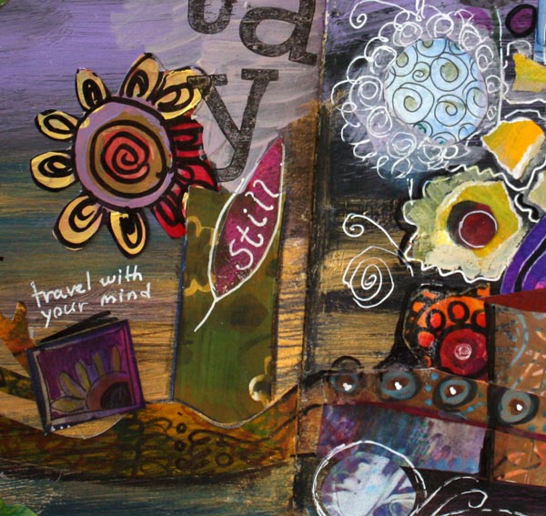
I kind of like how this first still life combines conventional elements like flowers with the more surreal ones, like the eye. The same contradiction is also seen in the color scheme: bright purples look mystical when combined with olive greens and warm browns.
Group the elements!
The principal of composition in still lives is simple. Just group the elements closely together!
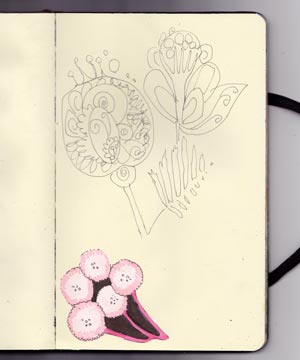 My art journals often have unfinished pages with elements here and there. This page had some doodles and a small illustration that I had drewn for a surface pattern. I often glue odd pieces to my art journals to save them. A page like this can be a great starting point for a still life!
I started working this page by adding the text so that it creates the vase for the flowers. I emphasized that with colored pencils. Then I colored the soft background with colored pencils. The softness is a great contrast to the graphic element on the bottom.
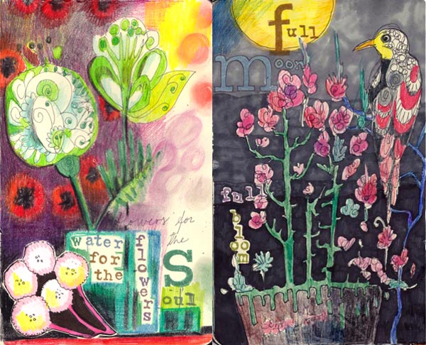
The third still life is formed around a doodle found on another page. It included just the bird and the flowers. I added the pot, stamped the text, colored the doodles with colored pencils and finally created the background with markers.
Why Are These Pages So Fast and Simple?
1) The starting point does not have to be grand, just some doodles, or paint, or odd pieces of paper.
2) Stamping few words tie the oddly placed elements easily together.
3) Coloring does not have to take a lot of time when it adds something new to the page.
More Still Lives
Watercolor 101 for Intuitive Painting – my video introduces an easy method which is especially suitable for surreal still lives and landscapes
A Formula for Composition – another way for creating a still life
Stretch Your Style – instructions to step out of the comfort zone, showcasing one of my favorite still lives