Can Playful Art Be Serious?
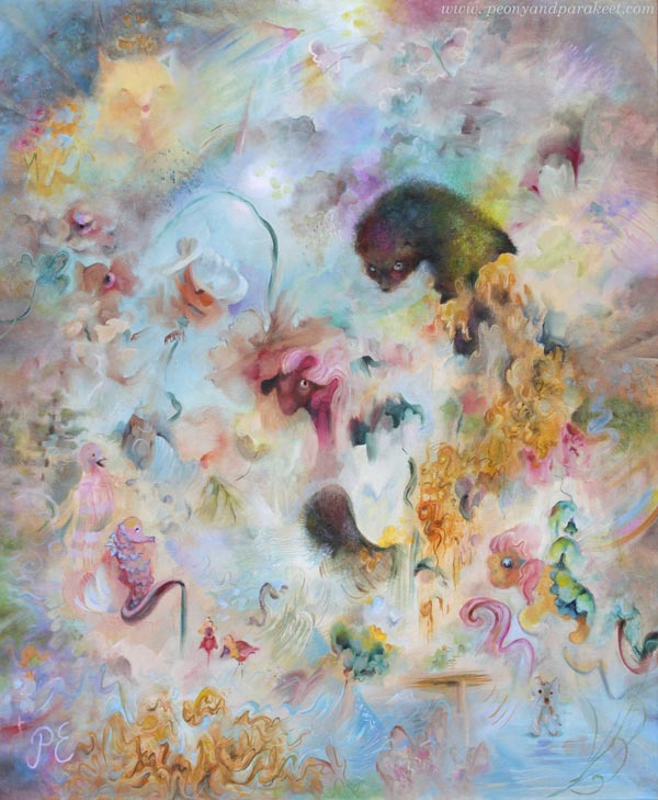
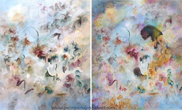
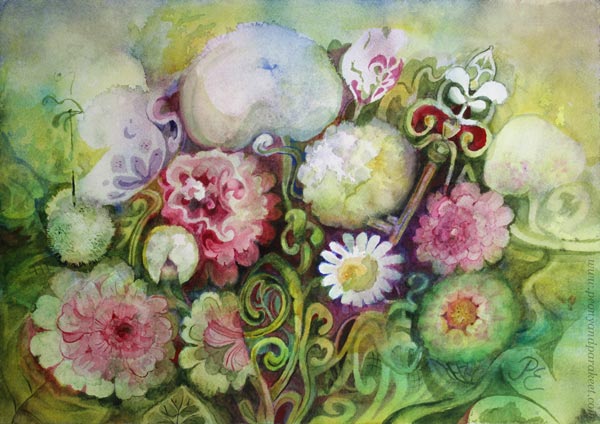
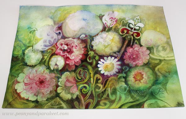
This week, I want to talk about my newly finished painting titled Fauna. This is one of my most peculiar pieces, filled with strange ideas. With this, I want to challenge us to ponder the question: Can playful art be serious?
Ideas Have a Mental Age
This painting combines many ideas. I tend to come up with all sorts of ideas quite easily, and I usually try to categorize them: some make it here to the blog, some become sketches in my planner, and others turn into courses. Only the most mature ones are usually included in the paintings.
But let’s think about this word: mature.
Ideas have a mental age. Some ideas are like those of a five-year-old, while others contain ancient wisdom. For a long time, I have tried to ensure that my best ideas are “sensible adults”.
Fauna’s Ideas
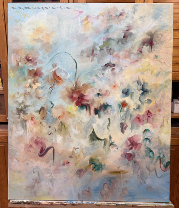
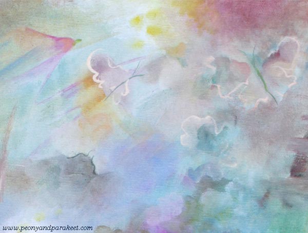
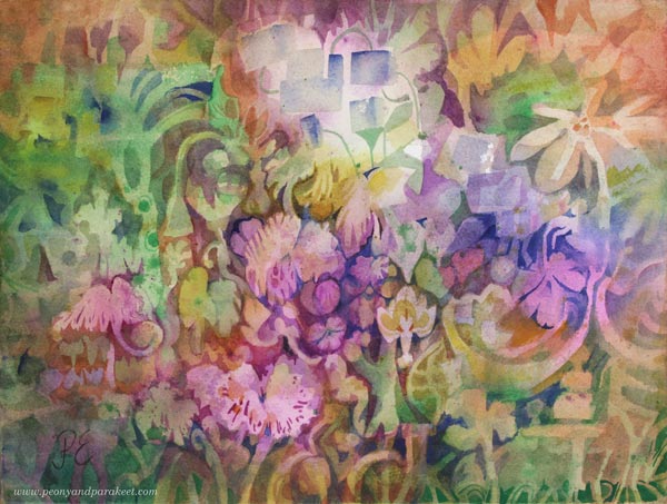
Fauna started from an old idea: the Baroque style and historical ceiling murals. So I thought that the painting could feature flowers and have plenty of light blue. Here’s how it started:
But then I heard my inner child whisper that I should include an animal: “Fur is so wonderful to paint. Let’s include something like a ferret!” The adult me wondered, “Who would want a painting featuring a weasel?” But you know, some ideas are like tiny butterflies that appear and vanish in an instant, while others are like moose that take over your entire mind. And this was a “moose idea.” It wouldn’t leave me alone, so fine —let there be a weasel of some kind!
But what else could be included?
Words help when I am brainstorming. I read through various word lists and wait for the moment my intuition says “Bingo!” That’s how I found the word “hunaja” – honey. I thought about the intricate swirls of the Baroque style and the way honey drips, and I boldly added them to the painting.
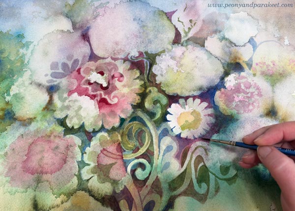
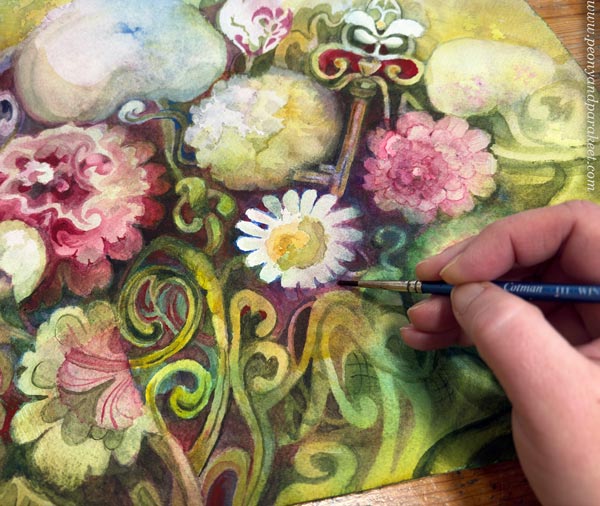
Here I am painting the fur. I use not only short strokes, but also paint small patches with different tones. Layering is the key!
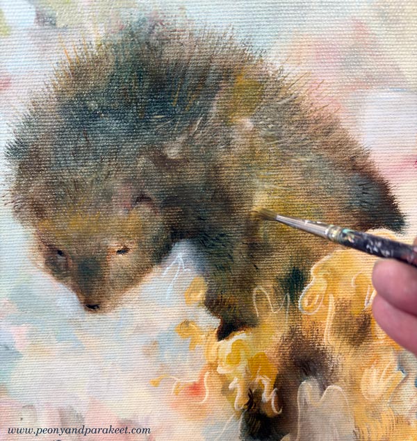
In the final version, the fur is softer and shorter, and lit by a rainbow. It took some time to decide whether the fur should be spiky or softer.
With the idea of painting honey, I found myself on a “mad path” where I stopped categorizing my ideas and challenged myself instead: could I create a painting that looks like a floral piece from a distance, but reveals a more playful character upon closer inspection? Could the animal theme lead toward animal figures—even toys? I wanted to achieve a purity of style that isn’t tied to a single era, but rather to my own way of dealing with shapes and lines.
Here you can see the beginning and the end side by side.
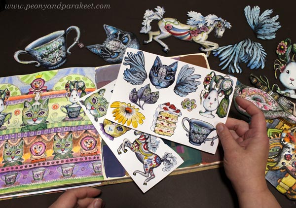
Playful Art – Drawing Animals
I have always loved animals and have drawn them a lot. Drawing with a pen is much easier than drawing with a brush.
Animal Inkdom and Magical Inkdom have been highlights of my course creation because, while making them, I decided to believe that everyone wants to draw animals. That mindset brought a lot of confidence and joy to the process, which also translates into the atmosphere of the courses.
I have had so much fun with all the animals drawn in those courses. My father used to draw with quite a similar technique, so I have continued on his path here.

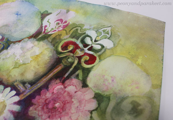
The Playfulness is in the Details
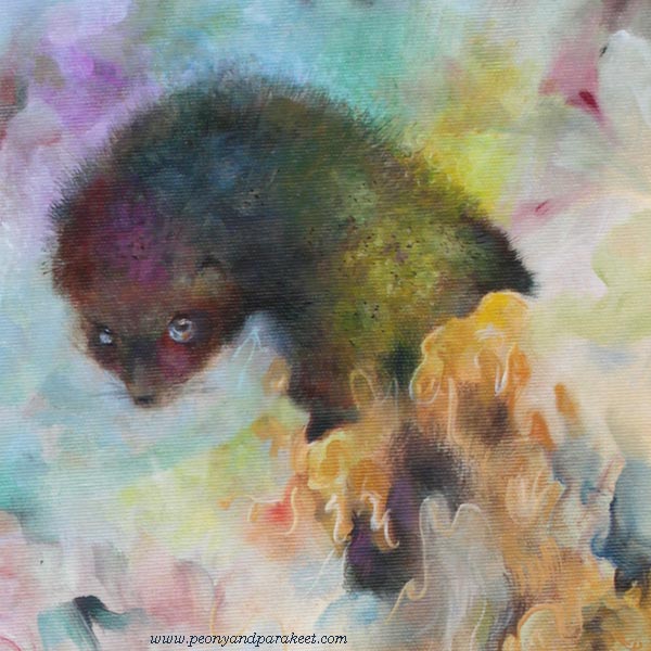
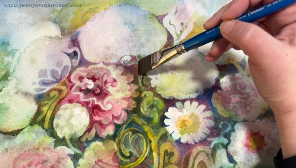
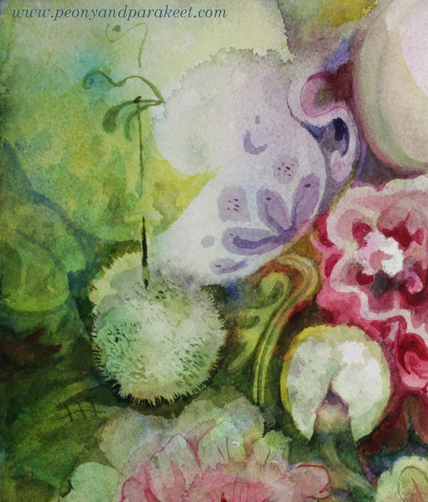
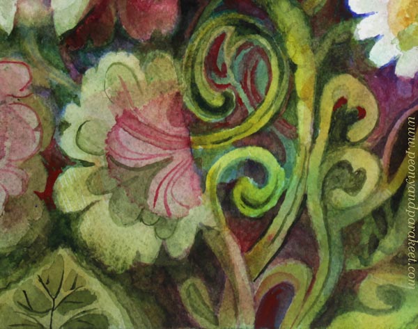
Fauna is full of playful details. Many of them are quite subtle, barely noticeable. Here are some detail pics.
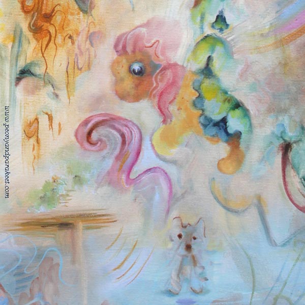
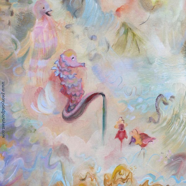
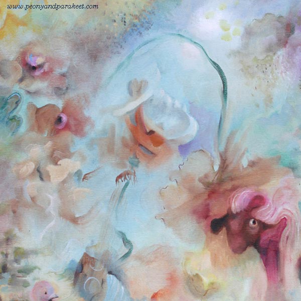
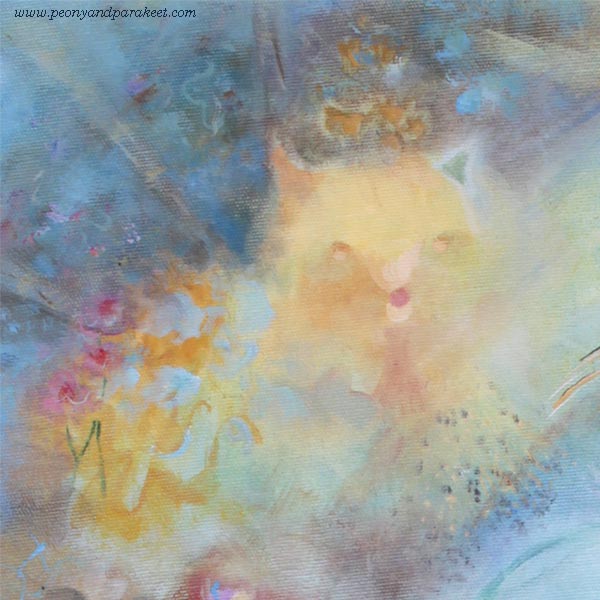
I see myself in this painting—all the versions of me at different ages, with ideas of all ages.
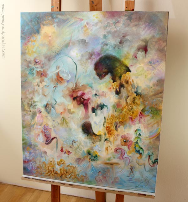
Even if Fauna was a challenge to create, it was also fun. I think I will create more of this kind of playful art.
Age of Ideas – Just Playing or Only Focusing on the Serious Side
This painting process made me reflect on how people who start making art often fixate on the “age” of their ideas. Some decide they are just having fun and playing. Others believe that skills—and thus art—can only be born through realism. But as artistic thinking and skills develop, there is an opportunity to combine the playful with the more serious. It is possible to be a child, an adult, and an elder all at once. Art doesn’t need to be narrowed down, because creating is a search not just for oneself, but for a broader understanding of humanity.
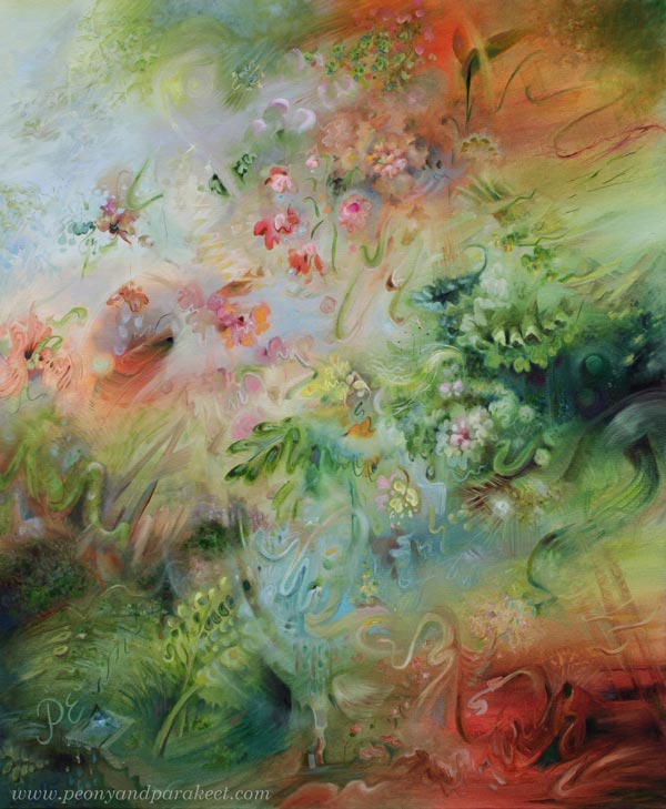
Fauna is a bit different from Halo – the painting that I showed last week.
See the blog post about creating this painting
See more pics and a video at Taiko Finnish Online Art Store
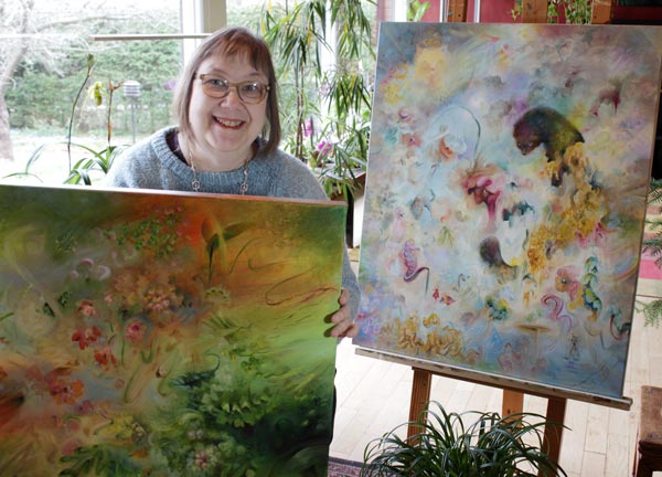
Which one do you like more – Halo or Fauna?
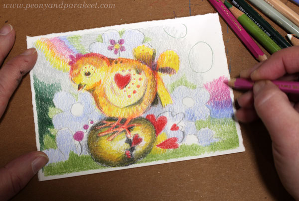
Easter Chick Art – Draw Step by Step!
Let’s draw more than just a little chick—let’s create Easter chick art! By adding details bit by bit, you can turn even a small drawing into a picture full of atmosphere.
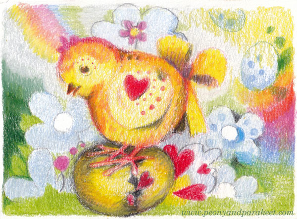
You only need colored pencils and paper. My drawing is about 10 x 14 cm (4 x 5,5 inches).
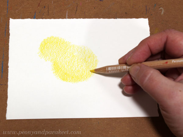
Step 1 – The Shape of the Chick
Color two circles that blend into each other.
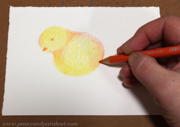
Step 2 – Features of the Chick
Use a darker color to add shadows so that the head and the body are distinct from each other. Then, add the eye and the beak.
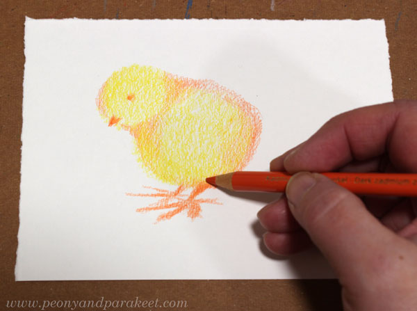
Step 3 – The Chick’s Legs
Draw large legs that attach to the body at an angle.
Step 4 – Decorations
Get creative and decorate your chick! Notice that decorations can extend outside the body. For example, I added a bow.
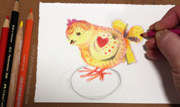
If you draw an Easter egg under the chick, sketch it at this stage. This way, you can add decorations so the chick looks balanced on top of the egg.
Step 5 – The Egg
Color the Easter egg. Use your imagination – what happens to the egg when the chick stands on it? My egg has opened, and hearts are bursting out into the air.
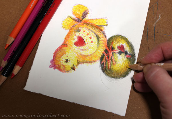
Rotate the paper to adjust the shape of the egg.
Step 6 – The Background
Add decorations, grass, and colorful lights to the background.
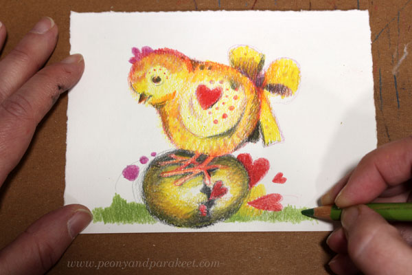
Keep the background light so the chick stands out. Color lightly and soften the colors with white and light gray.
Continuity helps create a balanced look. In my drawing, the rainbow in the background continues on the other side.
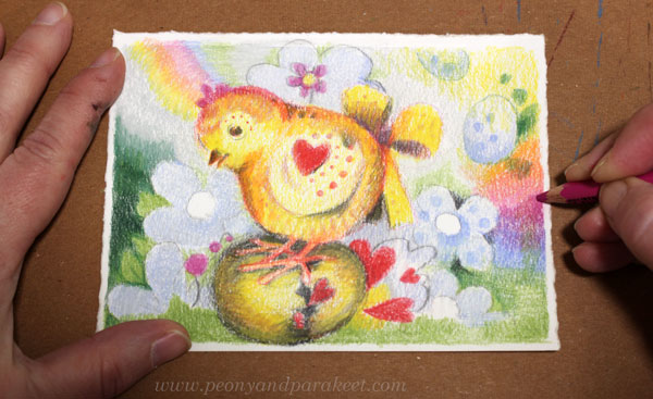
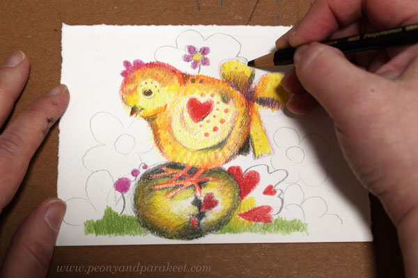
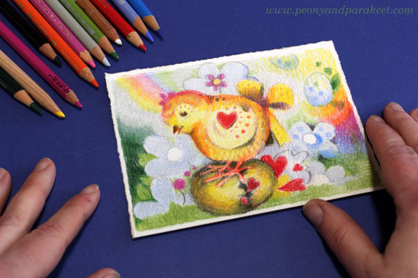
Step 7 – Finishing Your Easter Chick Art
Spend some time finishing your drawing. Color carefully to ensure full coverage where needed so that the chick’s colors are bright and no paper shows through near the outlines.
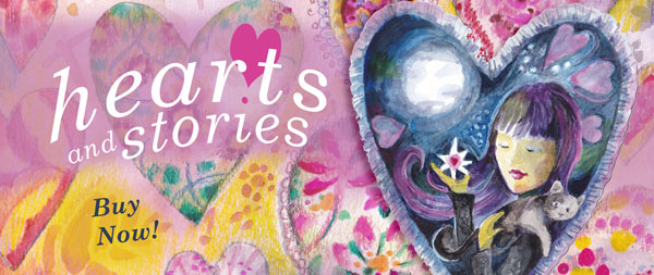
Hearts and Stories!
I like drawing hearts. They are so simple and direct, yet they make the drawing feel warm-hearted. I also have a course about them: Hearts and Stories!
Let’s keep drawing!
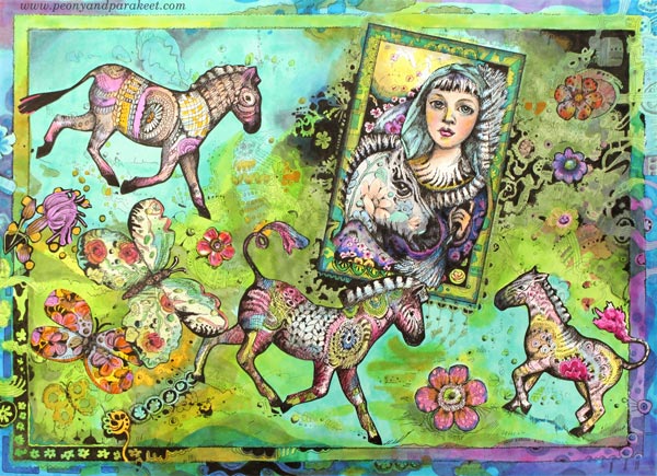
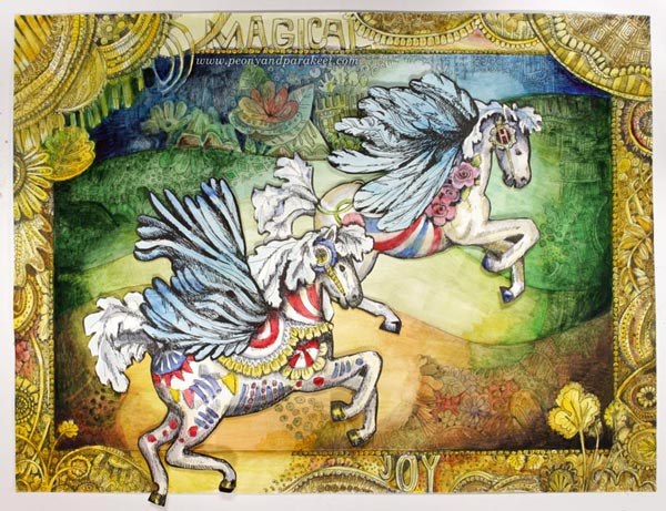
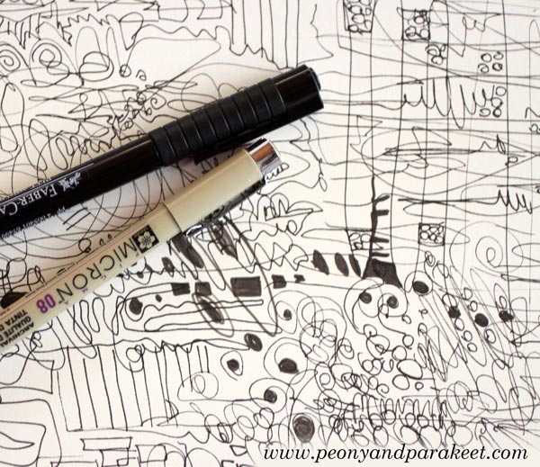
Crazy about Ornaments!
I believe that in every artist’s journey, there are moments when you feel you’ve hit the core—or at least, you’re getting very close. For me, many of those moments have been about ornaments. I simply love drawing and painting decorative lines.
>> See more pics and a video at Taiko Online Art Store
This week, I share a recent watercolor painting that is full of ornaments and how I fell in love with ornaments in the first place.
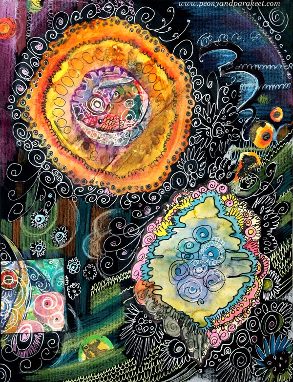
Ornaments in Watercolor

This is how the watercolor painting started.
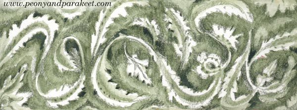
Ornamental shapes are much easier to draw than paint. In 2020, I made this watercolor painting.
I can now paint much more elegant shapes.
I have been after this skill for so long.
Ornaments – Are They Scary or Harmless?
An ornament is an animal. At first, it’s like a fox that is a bit too tame. You meet it on an evening walk and feel like shouting: “Don’t follow me, I’m not giving you a home!”
Then someone says, “It’s just an ornament, a harmless little decoration. It’s not a fox, it’s a bird.” And that’s when I realize I am dreaming about a magpie, picking only the oldest and most beautiful spoons from the pile.
But when I go to my imaginary pile of spoons, I see snakes. I can only catch the slowest and clumsiest one. My line was quite ugly for a long time, yet it has been my mascot for years. For just as long, I have been searching for the core of my expression.
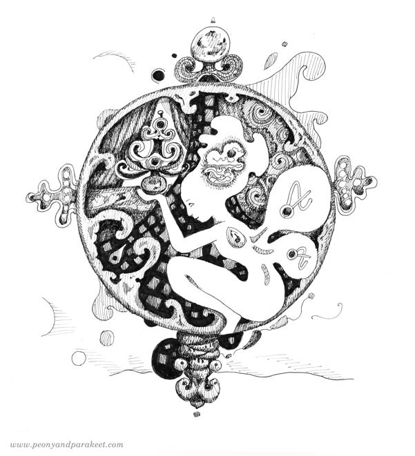
In 2018 and 2019, my drawing skills took a jump, and I was able to incorporate more and more ornamental expression into my drawings. I participated in Inktober and built two drawing courses: Animal Inkdom and Magical Inkdom.

Looking Through The Lens
Lately, I’ve read many descriptions of artists—both by the artists themselves and by critics. It felt as if I were forcing myself to read tiny text through a small lens, all while swallowing an ornament-shaped lump in my throat.
I believe the most accurate descriptions of how art is born are linked to childhood. My love for ornaments comes from my own.
Our family wasn’t wealthy, but we were dreamers. We followed the lives of European royalty with admiration. The large yard of our old wooden house, with its meadows and little woods, turned into a queen’s castle in my mind. I imagined grand halls, furniture, and a magnificent atmosphere. Nature became my palace once I understood that a plant should be looked at as a structure, not just a decoration.
From a Clumsy Snake to Expression
In the process of making art, however, the ornament is not a child, but an old soul. When a line is still young, it has no idea of the wisdom and beauty it can eventually store within its curves.
I believe that anyone who has the patience to feed their “clumsy snake” will eventually be rewarded. This madness—this love for ornaments—begins to transform from simple decoration into pure expressive power.
Almost all of my drawing courses are about developing a living line that can then transform into an ornamental one. A great courses to start are the colored pencil courses, especially Mystical Minis.
Painting Ornaments
It has taken me a long time to paint more ornamentally. I have had to learn to imagine an ornament as a 3-dimensional structure rather than just a decoration.
Now that I can paint like I used to draw, I can add many things that I have missed from that era, for example, tassels.
I can now also include what I learned from decorative painting when creating the course Decodashery.
There is a sense of the medieval and the Baroque here, blended with the historical fantasy and folklore.
I have also worked in this ornamental style not only in watercolor, but also in oil, but I will share those projects later.
In the world of ornaments, every line has its own age. Is your line still a curious child, or is it beginning to store the wisdom of an ‘old soul’? Tell me about your process in the comments!
Hand-Drawn Oracle Cards
This year has been rough, and I have been thinking about the next year for many months already. So, I decided to draw some Oracle cards for the new year. I want the new year to bring us hope, light, and connection to our inner being.
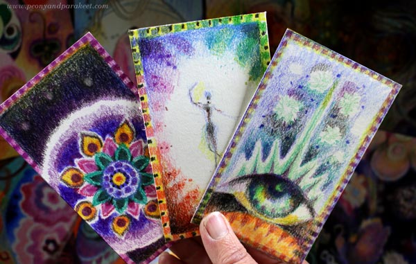
I don’t have any Oracle or Tarot decks, but I could still drew some cards. So, not drew like randomly from a pack, but really drew. I believe that by creating hand-drawn art we can explore our inner wisdom more actively than just picking the cards someone else has created.
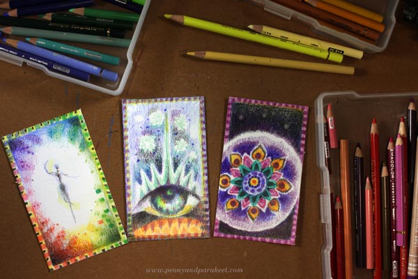
You only need some paper and colored pencils to make these hand-drawn Oracle cards. I also colored the backsides of the cards, each differently, expressing the idea of each card, but in a simpler way.
These cards are very small, only 2.75 x 4.75 inches (7 x 12 cm), which is a common size for Oracle and Tarot cards.
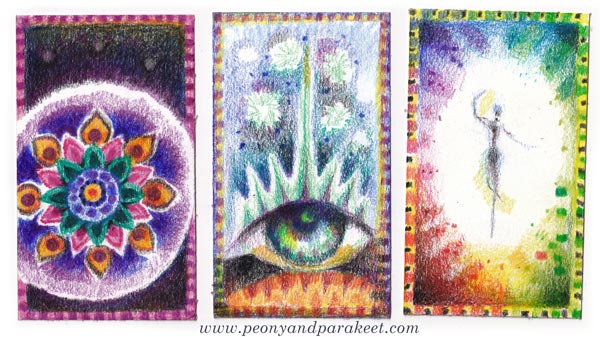
Notice the simple but decorative borders that make the drawings look like a real Oracle card!
P.S. Remember the big sale! All classes are 20% off.
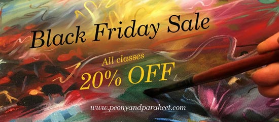
>> Shop here!
The sale ends on December 1, 2025, at midnight PST.