
Libraries, Trees, Skies and Seas – This Year so Far
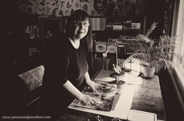
While building new classes and updating the web site (see the new Create page!), I realized that I have over 450 blog posts in this blog. I have been blogging for a long time, but still, it’s a big number! While going through those posts, I realized that more than a diary, this blog is like a manual, lot’s of instructions and tips on how to start creating and keep on creating. I have no intentions to change it. However, I feel I have left out many things that have happened during the spring, so this post is a bit different.
Libraries
As I work from home, most days during this spring have been spent in the library room of our house. While creating new mini-courses for Imagine Monthly Spring 2016, I have also visited public libraries examining art history where I get most of my ideas from. This “library time” is one of the best things in my job as an art teacher. I love the feeling of control that I get from seeing all the books around me. It’s very different from browsing information on the internet. Internet is like a tube or a bunch of tubes, while libraries are like arenas, bringing more information visible at the same time.

I have not only visited the usual local libraries, located near my home, but “the library”, National Library of Finland.
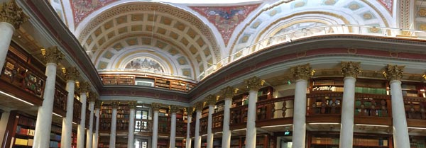
I tried to capture its’ beauty to one panorama photo but it doesn’t quite show all the wonderful details the building has.
Trees
When working from home, garden views become important. Our back garden has old trees that had grown too big and they had to be cut. We hired arborists to do that and the trees looked like sculptures first, now there’s lot’s of green already.
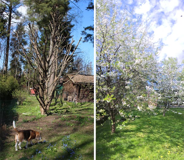
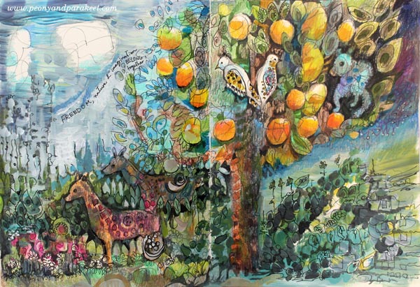
Another tree-related event was when our apple and cherry trees blossomed. It was more beautiful than ever before, the spring had been so warm. Like creating this William Morris inspired spread for one of the mini-courses, would predict a warm weather to Finland!
Speaking of trees, I visited the center of Helsinki to see a famous Japanese artist Yayoi Kusama‘s instalaltion. Again, I tried to get a panorama photo of it!

Small and Surreal
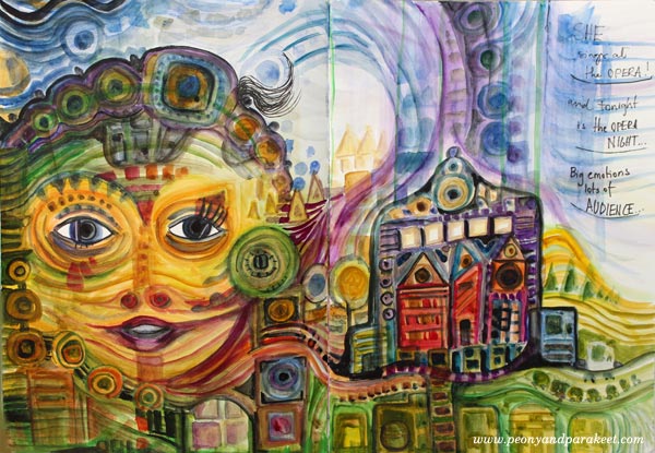
Spots came to my mind already earlier in the spring when I spent a lot of time examining Hundertwasser’s surrealistic way to build big pictures from small structures.
No wonder I have not only taken panoramas, but used macro lense too. When we took care of our long spruce fence, I saw small dew drops that looked like mini worlds! Who wouldn’t want to go there and see what treasures they carry!
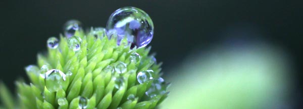
Taking photos is really important part of my creative process. The camera challenges me to see further than the obvious.
What a Movie!
In May, after publishing the mini-course on Claude Monet’s style, I went to a movie theatre to see a special documentary. It was called Painting the Modern Garden: Monet to Matisse. Anybody who likes flowers, gardening and painting should see it!

Mid-Century Magic Box
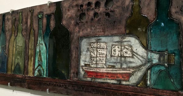
June’s highlight was Rut Bryk’s exhibition Magic Box and the inspiration I got from it.
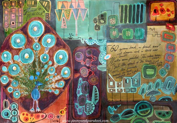
Earlier in the spring, I had already examined mid-century modern designs. My mini-course for Imagine Monthly Spring 2016 was about how to make your own mid-century modern art journal page.
From Expressive Skies to Seas
After examining Claude Monet’s style, I became more and more aware of how beautiful skies can be. There were some beautiful sunsets this spring.

These glowing sunsets made me think about landscapes and how expressive they can be – how we can create fantasy landscapes and use them as a tool of self-expression! Then I saw a couple of art exhibitions that had seascapes and felt drawn to them more than ever before. So the last mini-course of the spring is about seascapes.
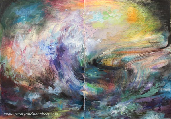
When I make recordings for my classes, I must confess that it’s terribly exciting. It requires extreme concentration to produce the artwork in front of the camera and take care of all the little things that make a good video. Every brush stroke has to be educational as well as exact. I intend to get better and better at this, showing how you can create with less fuss and more expression!
Cosmo – My Dog
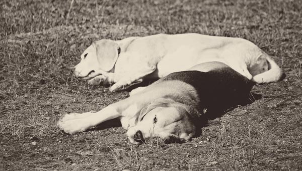
My beagle Cosmo has had health issues for the whole spring. It has been stressful and I have worried about him a lot. He is already 11 years old so I have feared for the worst. But luckily the cure was found finally and he is now happy and healthy again, enjoying the beginning of summer.
Imagine Monthly Continues
Imagine Monthly Spring 2016 closes in the end of June. Before that you can still sign up and receive all the 6 mini-courses immediately after the purchase + get access to the discussion group to see what other students have been creating! These courses will become for sale individually sometimes in July-August, but as self-study classes, without the access to the discussion group.
Imagine Monthly Fall 2016 will start in August 1st! Get 5 new mini-courses, 1 per month from August to December, sign up now!
Messy Backgrounds – How to Create Art on Them?
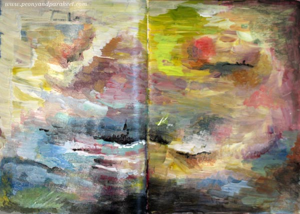
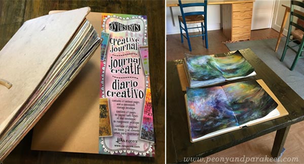
Here’s my latest art journal spread called “Explorer’s Destination”, based on a messy painted background. The spread is a bit rugged looking in the photo as it’s made on my older Dylusions Creative Journal. The journal is getting really full and the spread is in the end of the book so it was a bit difficult to photograph.
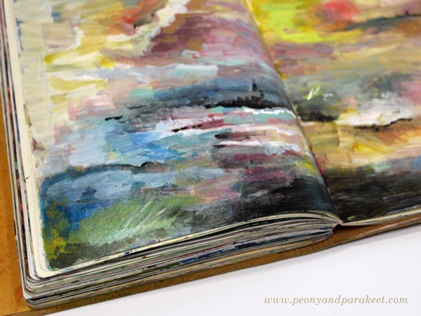
I remember when this journal was brand new and I was afraid of ruining it. Now all those filled pages, some messier than others, make me happy! Am I the only one who loves journals that are worn and full, I wonder!
Messy Backgrounds – Do You Have Them Too?
My very unintentional mess was created by just using up extra paints left on a palette. I know that many of you have these kinds of pages or canvases that are more like messy backgrounds than finished paintings. They are supposed to be finished someday but don’t look very inspiring after some time has gone by.

So to help you make the most out of your messy backgrounds, I made a video about creating “Explorer’s Destination”. Hopefully, it will help you to turn some of your messy backgrounds into more expressive pieces.
Watch the Video
Imagine Monthly – Sign Up Now!
Create art journal pages with techniques that grow your skills! Sign up for my art journaling master class Imagine Monthly Fall 2016!
Let art journaling be the channel to grow your skills!
>> Sign up for Imagine Monthly Fall
Painterly Collage in Rut Bryk’s style

Here’s my recent art journal spread, inspired by a Finnish ceramic artist, Rut Bryk (1916-1999). The Espoo Museum of Modern Art is currently showing her work, and as a big fan of her work, I had to see the exhibition!
Rut Bryk
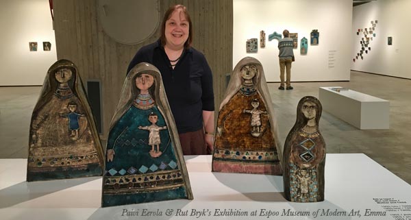
Rut Bryk is very well-known in Finland but not so famous worldwide. However, you might know her husband, the skillful designer and sculptor Tapio Wirkkala. Rut Bryk was an illustrator who got a job at the Finnish ceramic factory Arabia in the 1940s. Her early work was fairly naive and illustrative. But after working with ceramics for some time, she began adding textures to her work. Her 50s pieces were very mid-century modern.
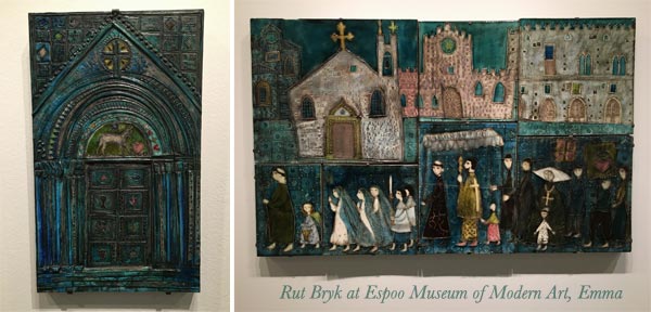
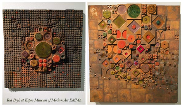
In the 1960s, her work grew more dimensional and abstract.
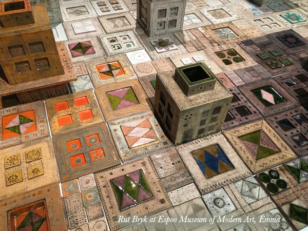
The abstract pieces she made are stunning.
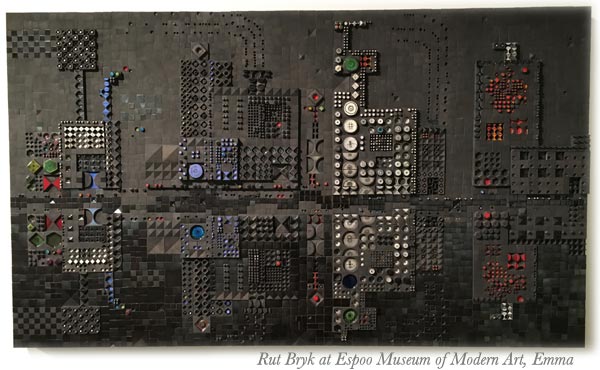
This black city view is one of my favorites.
Many of Rut Bryk’s artworks are composed of small ceramic pieces. They look like quilts or crocheted blankets to me.
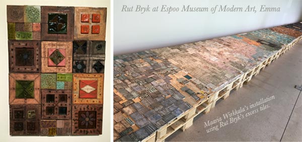
Rut Bryk’s and Tapio Wirkkala’s daughter Maaria Wirkkala is also a well-known artist. She had made an installation of Rut Bryk’s excess tiles for the exhibition.
Create a Paper Collage in Rut Bryk’s Style!
Get inspired by Rut Bryk’s brilliance and create a paper collage with these step-by-step instructions!
You will need hand-decorated papers, acrylic paints, marker pens, and gel medium or paper glue. See ideas for hand-decorated papers: Basic Instructions, Frugal version, Kiwi, Arboretum, Spring Flowers (PDF download)
1) Paint the Background
Paint the background black.
2) Cut Collage Pieces
Cut collage pieces to simple shapes like rectangles, triangles, diamond shapes, and circles. Cut big, small, and medium-sized pieces. To make the pieces look like handcrafted ceramic plates, round the corners and soften the straight edges so that they are slightly wavy. Don’t worry about the colors too much, as you will be painting over them.
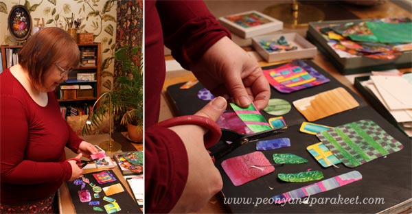
3) Glue the Pieces
Using gel medium or paper glue, begin gluing the pieces on the black background.
Pile up pieces so that some of the smaller pieces are glued to the bigger pieces. Before gluing, add black paint so that the piece on the top will have soft black borders. This will make your work look more dimensional.
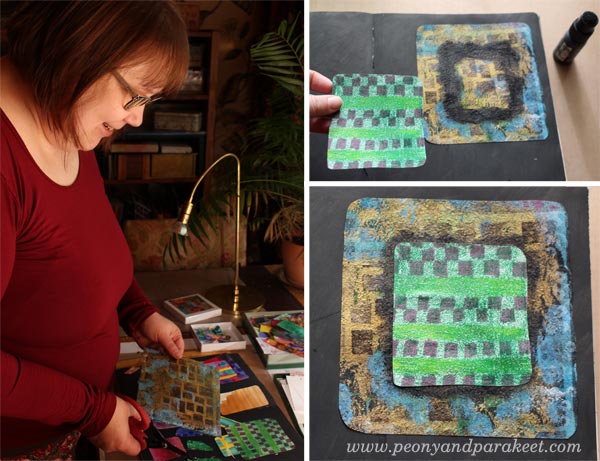
Don’t fill the whole background but leave some of it black.
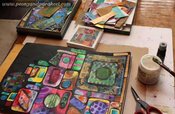
4) Paint Lightly Over the Pieces
To make the pieces look softer and to mute down their colors, add thin layers of acrylic paint over them.
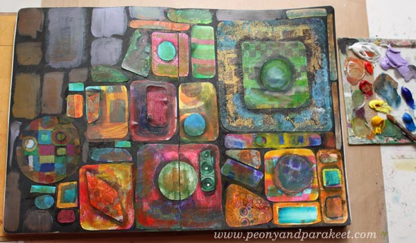
Paint blocks where the black background is visible. Use neutral, fairly dark colors that suit well with the black background.
5) Draw Spotted Grids and Frame Collage Pieces
With marker pens or felt-tip pens, draw spots so that they form grids. These grids can continue over the blocks. The size of the spots can vary. I use Faber-Castell Pitt Artist Pens as they work well on acrylic paint.
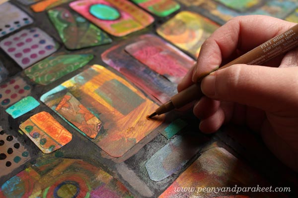
Frame the painted blocks and collage pieces with a black marker so that they look firmly attached to the background. I also used white Chinese marker to add few white lines here and there.
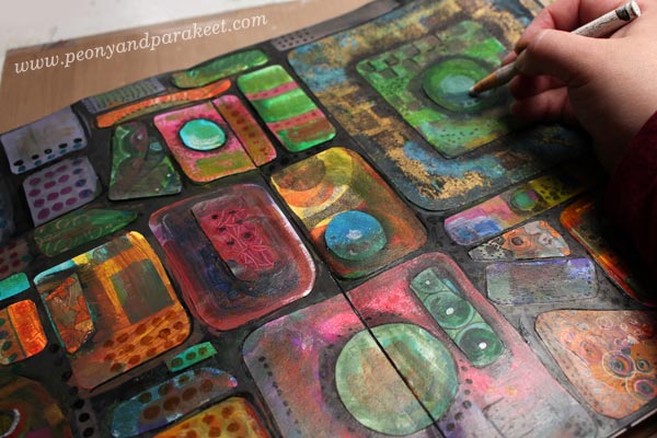
6) Paint Slightly Over Some Areas
To finish your work, add thin layers of paint to some areas. These painted areas represent light and shadows over the overall composition.
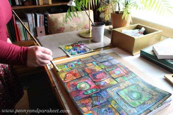
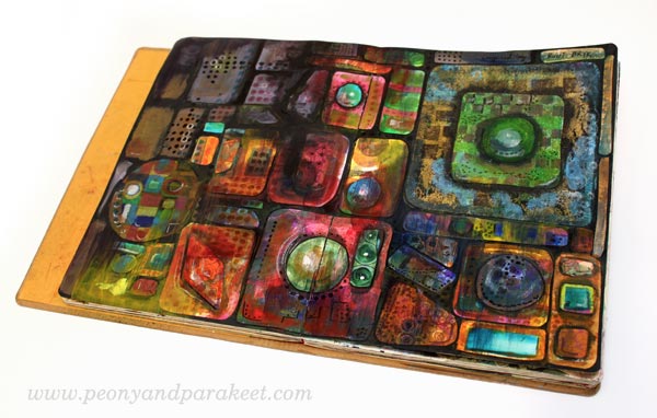
Here’s my finished spread again.
Extra Project – Decorating a Box
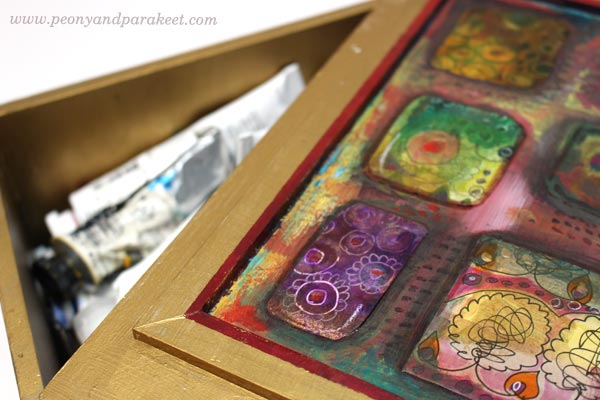
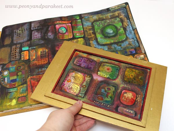
My husband has made a wooden box for my paint tubes. I have painted it golden, but the bottom part of the lid needed some decoration. I had already painted the framed area red, so I just added black paint to the collage pieces.
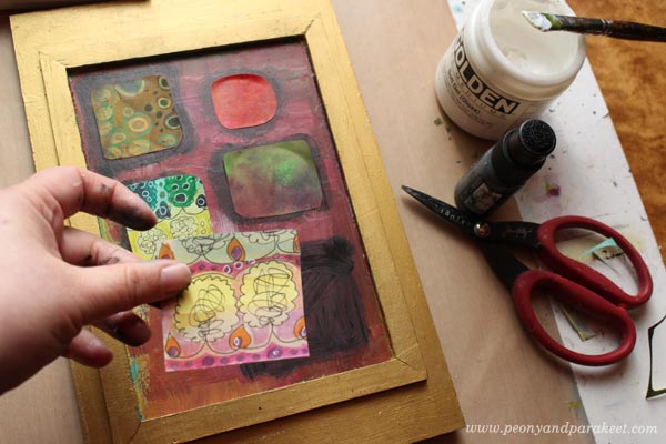
Then I continued the process like in the instructions. Finally, a layer of gel medium was added to protect the paper pieces.
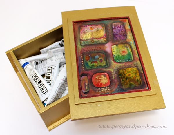
I like the idea of opening the lid and seeing the collage.
Thank you, Rut Bryk!
Expand Your Artistic Imagination!
This blog post is an example of how you can learn and get inspired by famous artists. This is how I see it:
– If you want to find your own uniqueness, examine all kinds of artists and styles!
– If you have already found your style, keep on experimenting and expanding your skills!
Create Internal Seascapes!

This is my latest mini-course for Imagine Monthly. It’s last of the six mini-courses of the spring season. The theme, a stormy sea, is so expressive that I included a special mental coaching session for each step in the video.
Inspiration for Seascapes
My main inspiration for the course came from the two famous painters: Joseph Mallord William Turner and Ivan Aivazovsky, both masters of expressing storm and water. I also studied contemporary artists, one of which is from my home country, a Finnish painter Petri Ala-Maunus.
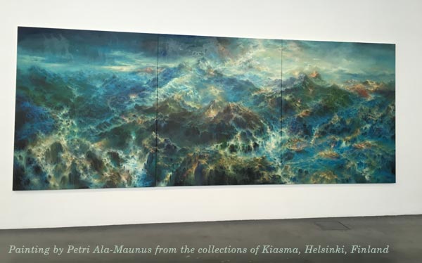
One of his masterpieces can be seen at Kiasma, which is a museum of contemporary art in Helsinki. Just went there a few weeks ago and will again, the main reason is just this gorgeous painting!
For me, Petri Ala-Maunus’s work is an internal landscape. It’s like a view to the inner world with valleys and mountains, seas and storms, ready to be explored and seen again and again. I would like to see a painting like this on the evening of a rough day and then again in the morning, to get my energy flowing.
So, aren’t powerful seascapes a perfect theme for creating art journal spreads? See my Pinterest board Internal Seascapes for more inspiration!
My Versions of Internal Seascapes
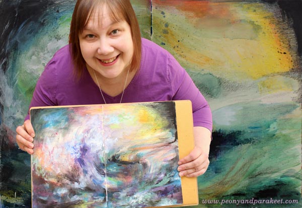
I made the first version before recording the process in the video. I am also talking about the details of this one on the mini-course.

The next one is the mixed media painting that I create in the course video. It has six steps, and it’s very easy to start! I also explain how to get connected with your emotions when creating the painting. The mindset changes, as the painting progresses. This way you will get the expressive and layered result in the end. The mini-course also gives a lot of guidance on how to finish your work.
Imagine Monthly – From Fine Art to Art Journaling
The community of Imagine Monthly has meant a lot to me this spring. A few years ago, I really missed talking about fine arts and how to apply them to art journaling and mixed media. It feels amazing that I have now found so many like-minded people through my classes. So this last mini-course of Imagine Monthly is partly my gift for the participants. I have put my truly best effort to make the best class possible. It also has a longer video, 45 minutes instead of the regular 30 minutes.
Create Internal Seascapes!
Imagine Monthly Spring is over, but you can buy it as a self-study class! >> Buy Imagine Monthly Spring Bundle
Stormy Scenery is also available as an individual mini-course! >> Buy Stormy Scenery