Summer Sale Begins!

It’s time for the annual summer sale! All classes are 20% off.
The sale ends on July 20, at midnight PDT. >> Buy Now!
Painting a Mystery
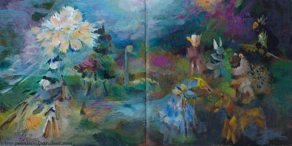
This week is about painting a mystery and entering another world through art-making. My paintings are in an art journal and made with a loose touch.

It All Started from a Withering Bouquet
“The Midsummer bouquet has withered. I have to throw it in the trash,” I said. “But the setting is just like those old masters’ paintings,” my husband replied unexpectedly. And so I remembered this once again.

Once Upon a Time
Once upon a time, there was
and there still is a world that you can get to from anywhere.
At first, it’s dark, but you can hear a woman reading a letter to someone.

You hear a clock ticking backwards, generating more time.

Then you know that it’s time to take a brush in your hand.

Squeeze the handle firmly and hear the trees moaning as their trunks slowly sink to the ground.
First, it feels silly to paint because there’s nothing to see.

But the darkness gradually disappears, and you realize that you are not alone.

Those strange creatures are all familiar to each other and, in a strange way, to you too.

In this world, everything has been mixed up.
You are the wind that shook the flower, and in blowing the petals back, you lost your soul to it.

You are the chair for which the imagination built a room to rest.

In this world, everything is unfinished. But if you are willing to hear and feel instead of only seeing what’s expected, everything is ready enough.

Painting a Mystery – Background Story
The idea of this blog post came from that short conversation with my husband. Then I had to take a photo of the bouquet and make it in the style of old masters.
After that, I remembered taking a photo of a painting called “Woman Reading and a Man Seated at a Table” at the exhibition of the H’Art Museum in Amsterdam. The painting is by Frans van Mieris from 1676.
While browsing my image archive, I was drawn by another photo, taken in the same trip to Amsterdam. It was a decorative mantel clock from 1782 in the Rijksmuseum.
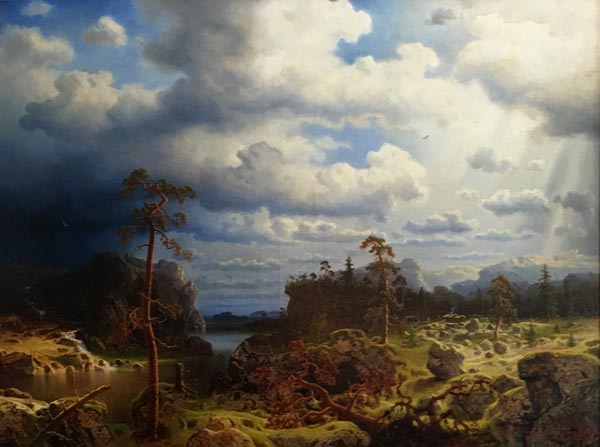
The clock took my thoughts to a more recent visit in Porvoo, Finland, where my husband and I went to see Johan Ludvig Runeberg‘s home. The lovely interior was from the 1860s, and there was a big painting that I really liked. I took a photo, but haven’t succeeded in finding out who painted it.
After gathering the photos, I picked up my art journal (Dylusions Creative Journal Square) and started painting. I didn’t copy the photos, but let them soak in freely. I was just inspired by the atmosphere they evoked in me.
Hopefully this blog post inspires you to paint freely without strict plans and definitions. Painting a mystery is both fun and addicting – I am already eager to create more!
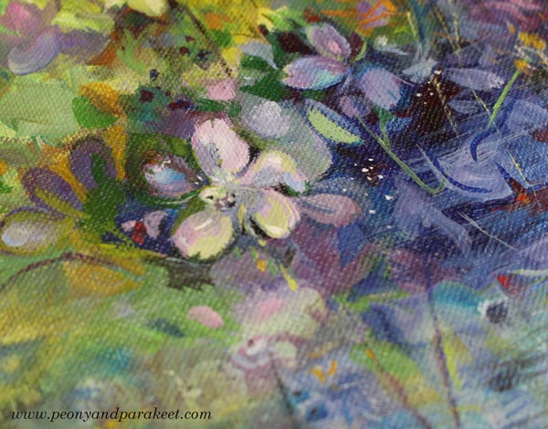
Painting Small Wildflowers
This week, we explore the beauty of small wildflowers and find what we can learn from nature when painting them.

>> See more pics at the Taiko Online Art Store!
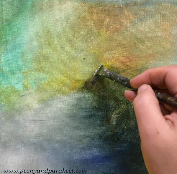
I had a small blank canvas that I wanted to paint on before Midsummer. I did it with acrylic instead of oil because acrylic paint dries faster and you don’t have to wait days for the layers to dry.
My idea was simple: wood geraniums – or do you call them cranesbills? In Finnish the plant is called “metsäkurjenpolvi” and they bloom everywhere now in June. We have them in our garden too, but I mostly study them on morning walks. As a child, they were my favorite flowers when it comes to wild flowers.

Even if I sometimes take photos of small wildflowers, I don’t want to paint from reference pictures, but freely. I can check the structure and shapes of flowers or leaves from photos, but if I start copying the exact detail, my expression stiffens. It’s like my head begins to ignore my heart, and that’s never good for art-making.
Starting with Big Brushes
At the beginning of the painting process, I don’t even know exactly what I want to express. The mood of the painting grows little by little and when I start, I’m clumsy and quite careless.
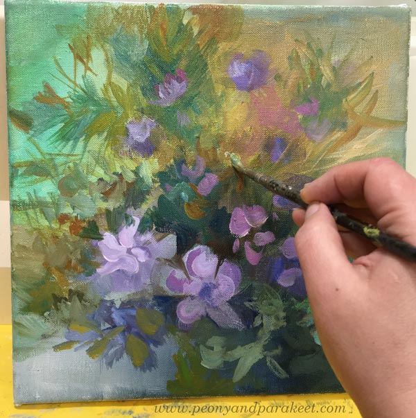
It’s actually pretty quick to make a nice little flower painting if you only think about one plant and don’t aim for anything else. But these days, I don’t want to leave any painting at that level. I want to offer more to look at and combine many observations in the same painting.
Here’s my painting from Day 1 to Day 2. The right lower corner didn’t change much, but the center and the right upper corner changed a lot. And the painting became more detailed.

Some paintings are great with the more abstract and loose touch. But here, I wanted to express the delicacy of small wildflowers and honor their tiny details. I also wanted to make the painting look more natural.
Beautiful Mess with Thin Strokes
Nature is wild and messy. We easily overlook that beautiful mess when we look at wildflowers in a meadow. Our eyes pick out our favorite flowers, and we don’t see all the other plants that are trying to get in the way. Grasses come to the front of the flowers and intersect everywhere. There are endless layers of plants if you look at the view as accurately as possible. Even when looking at this photo, did you notice all that layering?
It seems contradictory that the more romantic and spiritual I want to paint, the more I have to open my eyes to the reality. I need to paint those hays over the pretty wildflowers and let the nature make a beautiful mess in the canvas too.

Small Doses of Conflicting Colors for Flavor
In nature, the colors also get mixed with each other, and there are reflections and conflicting tones. So, even if the number of colors in the painting is limited, you always have to find a small dose of some different tone to spice it up. For example, add some bright red to make the purple flowers delicious! Similarly, cold greens need brownish tones.

In Finland, Midsummer is a big celebration. The nights are white now in the end of June and you can admire the flowers without going to sleep at all.

Paint abstract florals in acrylics with me: >> Buy Floral Freedom!
With these pictures, I wish you a wonderful Midsummer and lots of joy in observing and painting tiny treasures – small wildflowers!

Painting small wildflowers – Could this be your next art project?
Coloring an Intuitive Selfie
This week, we draw an intuitive selfie, so without a camera or a mirror. Let’s pick the colored pencils and create a self-portrait freely and intuitively!
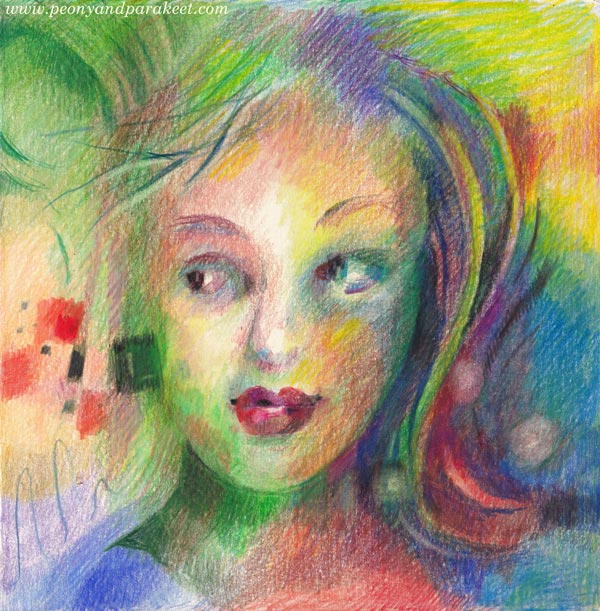
We use the pencils as a camera and draw the face as it’s a photo taken from the inner world’s view. At the same time, we explore blurriness, freedom, and asymmetry. Watch the video!
Coloring an Intuitive Selfie – Watch the video!
I am creating my page on the Dylusions Creative Journal (Square, 8 by 8 inches) but you can use any paper and any size.
In the video, I talk about the difference between doing coloring pages and coloring a blank page, and how I have processed my word for the year “Release”.
Inner vs. Outer Selfie
It would be great to hear your thoughts on becoming freer and making an imperfect intuitive selfie. Leave a comment below!