
9 Collage Ideas from the Students of Peony and Parakeet
This spring, I have seen gorgeous pieces of art made from the mini-course Doodled Luxury and I want to share some of them with you. There were so many great pieces that choosing was difficult but this time I thought to share pieces that are very idea-driven. You can never have too many collage ideas, especially if you process several at the same time!
1) Many Variations of One Shape
Gina Meadows shows beautifully how hand-drawn elements are all like from the same family when created by the same person. I also love how it’s full of feather-like shapes. They repeat the idea of a free, observing bird.

2) Solid Ground
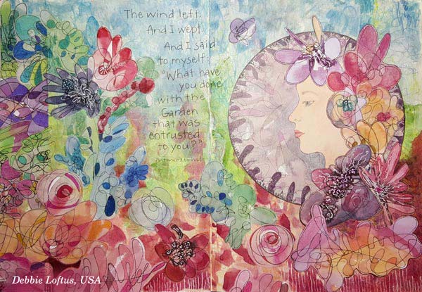
The second art journal spread that I want to show you is by Debbie Loftus. Her work is a wonderful illustration of the quote she has picked. This piece also reminds me of how we can create very free-flowing, beautiful mess that still speaks harmony. This can be done by simply making the bottom of the page strong and solid. This piece communicates how we as humans see nature. It’s full of weeds and still so beautiful!
3) Mystery That Can Be Revealed
Mary Werner’s lady looks a bit mysterious here – but wait until you see the second picture!
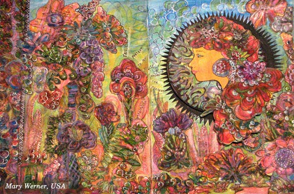
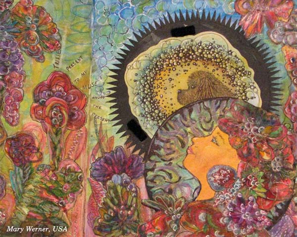
The lady has a secret, a dog who is her muse, making her to relax and take in much more than when walking outside alone. Mary has used velcro to attach the lady above the muse. Isn’t it a great idea to include a hidden mystery!
4) Spiritual Softness
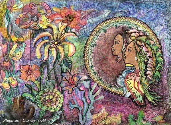
Speaking of true friends, Stephanie Carney has illustrated two sisters. I love the way they look at the flowers, sharing the same experience. Examine how softly the round frame has been decorated and compare it to others! These kinds of little nuances can communicate a lot visually!
5) Real Person in a Fantasy
Terry Whyte made her granddaughter the central person. Isn’t this spread a treasure? Combine your hand drawing with the photos and start building your own fantasies!

6) Many Sides of One Personality
Satu Kontuvuori included her cat who is a very wild character. Even if she stays still in the image, it’s like the wildly flying bird is one of her many lives. If you are expressing a personality or any subject that has many sides, you can scatter it into various elements of the same piece. That way you will focus on one theme but still express it in a free-flowing and rich manner.

7) Focal Point Balances Richness
Speaking of focus … Christie Juhasz has a trick for creating a clear focal point. See how her mermaid is sitting on a white frame! Even if the work has full of details, white circle makes sure that the main character gets noticed.

8) Movement + Space to Breathe
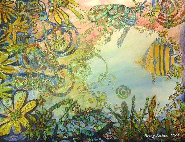
Another great example of using circles: look at Betsy Eaton’s fish and how there’s a circular space around it. Brilliant! Another thing which makes this so appealing is the movement of elements. That dynamic feel has been created by adding swirly shapes.
9) Rainbow Softness
Kathy Lewis (a.k.a KjAllison) made a gorgeous spread full of multicolored elements, like mini-rainbows. This makes me think about macro photography and dew drops! Soft transitions of colors – why not use them in your next art journal page?

Doodled Luxury
This mini-course, Doodled Luxury, was published as a part of Imagine Monthly Spring 2016 art journaling class. It’s now available individually as a self-study class – Buy here!
You can also buy all the 6 monthly classes as a bundle. I will also release the other 5 classes individually one by one later this summer, and show more ideas on how to apply them.
Start doodling and collaging, right now!
Video: Full Art Journal Flip Through!

There are two special moments in art journaler’s life: starting a new art journal and finishing one. As the latter is much rarer, I am happy to announce that I have just finished this journal! I truly feels a small victory!
From Decorative to Expressive
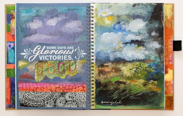
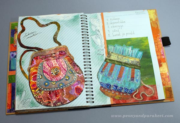
I purchased this Smash book in 2014 and intended to make it fashion and textile oriented. It has a lot of those, but also other stuff like little paintings, a few cards that I have wanted to save, and some collages that include photos. When I started this journal, I was very much into decorative style and the book has a lot of hand-decorated papers in it. Now, when I look back, I no longer see decorations as a self-purpose but a channel to move forward. Once I have got my imagination going, I have been able to move to create more expressive art.
Art Journal Flip Through
Many pages of this art journal are a bit clumsy but I still wanted to celebrate the finished journal. I also think that this kind of “collage book” contains quite a lot of ideas that you can use in your art journal too. So I created a flip-through video for you to watch. Hopefully it will inspire you to art journal every week, even if it’s just one little circle on the corner of a page.
Go deeper into art journaling …
Imagine Monthly – Sign Up Now!
Create stunning art journal pages with techniques that expand your possibilities!
>> Sign up for Imagine Monthly Fall 2016
Libraries, Trees, Skies and Seas – This Year so Far
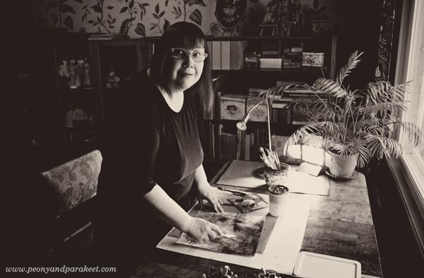
While building new classes and updating the web site (see the new Create page!), I realized that I have over 450 blog posts in this blog. I have been blogging for a long time, but still, it’s a big number! While going through those posts, I realized that more than a diary, this blog is like a manual, lot’s of instructions and tips on how to start creating and keep on creating. I have no intentions to change it. However, I feel I have left out many things that have happened during the spring, so this post is a bit different.
Libraries
As I work from home, most days during this spring have been spent in the library room of our house. While creating new mini-courses for Imagine Monthly Spring 2016, I have also visited public libraries examining art history where I get most of my ideas from. This “library time” is one of the best things in my job as an art teacher. I love the feeling of control that I get from seeing all the books around me. It’s very different from browsing information on the internet. Internet is like a tube or a bunch of tubes, while libraries are like arenas, bringing more information visible at the same time.

I have not only visited the usual local libraries, located near my home, but “the library”, National Library of Finland.
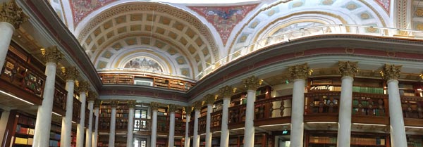
I tried to capture its’ beauty to one panorama photo but it doesn’t quite show all the wonderful details the building has.
Trees
When working from home, garden views become important. Our back garden has old trees that had grown too big and they had to be cut. We hired arborists to do that and the trees looked like sculptures first, now there’s lot’s of green already.
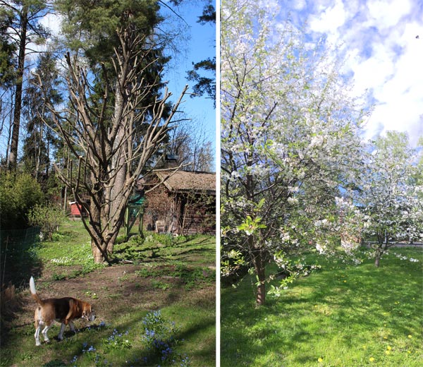
Another tree-related event was when our apple and cherry trees blossomed. It was more beautiful than ever before, the spring had been so warm. Like creating this William Morris inspired spread for one of the mini-courses, would predict a warm weather to Finland!
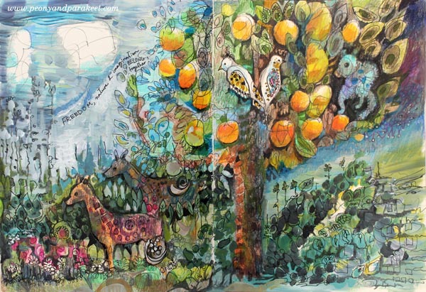
Speaking of trees, I visited the center of Helsinki to see a famous Japanese artist Yayoi Kusama‘s instalaltion. Again, I tried to get a panorama photo of it!

Small and Surreal
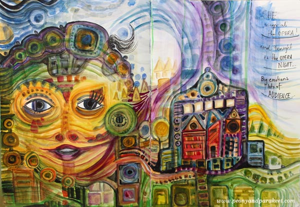
Spots came to my mind already earlier in the spring when I spent a lot of time examining Hundertwasser’s surrealistic way to build big pictures from small structures.
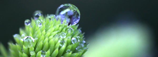
No wonder I have not only taken panoramas, but used macro lense too. When we took care of our long spruce fence, I saw small dew drops that looked like mini worlds! Who wouldn’t want to go there and see what treasures they carry!
Taking photos is really important part of my creative process. The camera challenges me to see further than the obvious.
What a Movie!
In May, after publishing the mini-course on Claude Monet’s style, I went to a movie theatre to see a special documentary. It was called Painting the Modern Garden: Monet to Matisse. Anybody who likes flowers, gardening and painting should see it!

Mid-Century Magic Box
June’s highlight was Rut Bryk’s exhibition Magic Box and the inspiration I got from it.
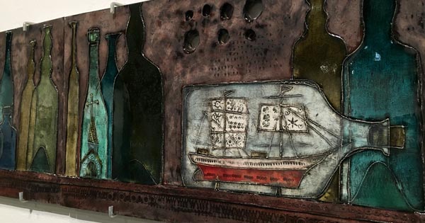
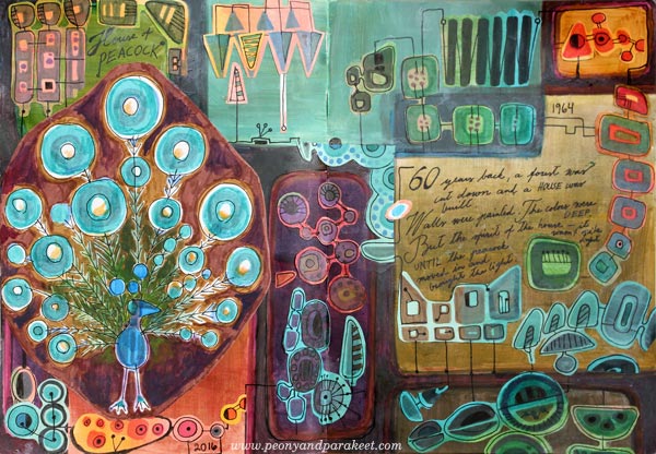
Earlier in the spring, I had already examined mid-century modern designs. My mini-course for Imagine Monthly Spring 2016 was about how to make your own mid-century modern art journal page.
From Expressive Skies to Seas
After examining Claude Monet’s style, I became more and more aware of how beautiful skies can be. There were some beautiful sunsets this spring.

These glowing sunsets made me think about landscapes and how expressive they can be – how we can create fantasy landscapes and use them as a tool of self-expression! Then I saw a couple of art exhibitions that had seascapes and felt drawn to them more than ever before. So the last mini-course of the spring is about seascapes.
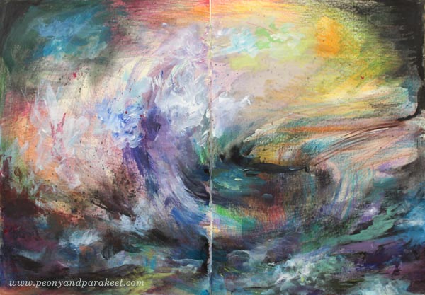
When I make recordings for my classes, I must confess that it’s terribly exciting. It requires extreme concentration to produce the artwork in front of the camera and take care of all the little things that make a good video. Every brush stroke has to be educational as well as exact. I intend to get better and better at this, showing how you can create with less fuss and more expression!
Cosmo – My Dog
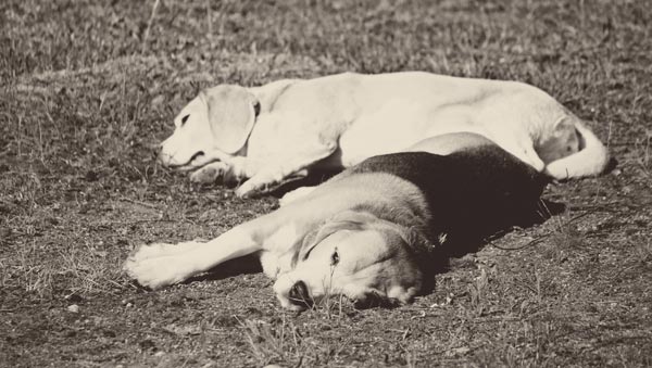
My beagle Cosmo has had health issues for the whole spring. It has been stressful and I have worried about him a lot. He is already 11 years old so I have feared for the worst. But luckily the cure was found finally and he is now happy and healthy again, enjoying the beginning of summer.
Imagine Monthly Continues
Imagine Monthly Spring 2016 closes in the end of June. Before that you can still sign up and receive all the 6 mini-courses immediately after the purchase + get access to the discussion group to see what other students have been creating! These courses will become for sale individually sometimes in July-August, but as self-study classes, without the access to the discussion group.
Imagine Monthly Fall 2016 will start in August 1st! Get 5 new mini-courses, 1 per month from August to December, sign up now!
Messy Backgrounds – How to Create Art on Them?
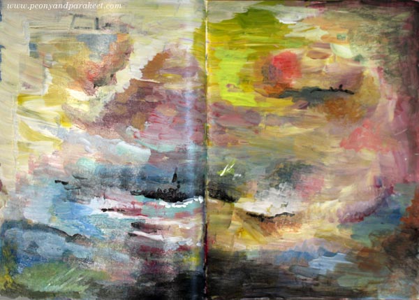
Here’s my latest art journal spread called “Explorer’s Destination”, based on a messy painted background. The spread is a bit rugged looking in the photo as it’s made on my older Dylusions Creative Journal. The journal is getting really full and the spread is in the end of the book so it was a bit difficult to photograph.
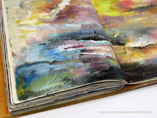
I remember when this journal was brand new and I was afraid of ruining it. Now all those filled pages, some messier than others, make me happy! Am I the only one who loves journals that are worn and full, I wonder!
Messy Backgrounds – Do You Have Them Too?
My very unintentional mess was created by just using up extra paints left on a palette. I know that many of you have these kinds of pages or canvases that are more like messy backgrounds than finished paintings. They are supposed to be finished someday but don’t look very inspiring after some time has gone by.

So to help you make the most out of your messy backgrounds, I made a video about creating “Explorer’s Destination”. Hopefully, it will help you to turn some of your messy backgrounds into more expressive pieces.
Watch the Video
Imagine Monthly – Sign Up Now!
Create art journal pages with techniques that grow your skills! Sign up for my art journaling master class Imagine Monthly Fall 2016!
Let art journaling be the channel to grow your skills!
>> Sign up for Imagine Monthly Fall