
Make Samplers to Save Bits and Pieces

My sampler madness began when I found an unfinished embroidery project. I had started it two years ago on an online course called Happy-Go-Lucky Stitchalong. It was led by Amy Powers and the goal was to embroider a sampler showing all the things that make you happy.
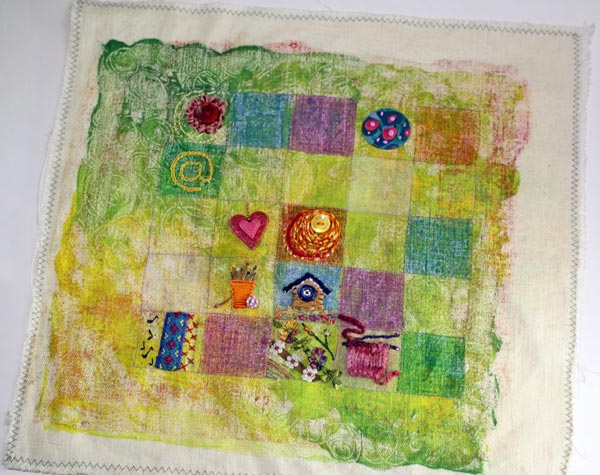
It was only a two-week course and I got some more squares done than what is shown here but there was still plenty to go. I had dyed the fabric with monoprinting method and quite liked it. I was not happy with all the embroidery that I had made but I felt compelled to finish this project. The embroidery floss I had to finish this looked so tempting!
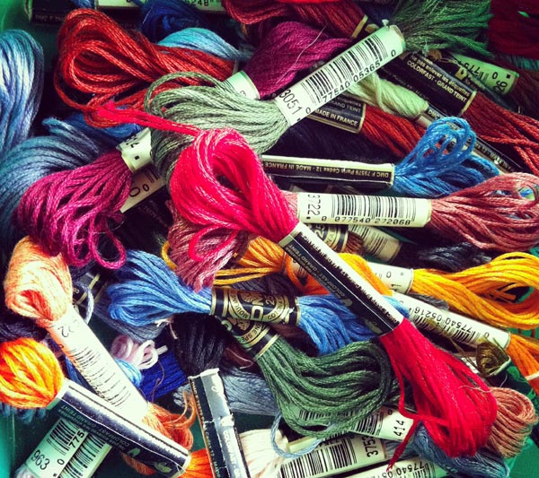
So I began to work little every day for a couple of weeks. Some of the squares were remade and some were complemented with extra stitches.
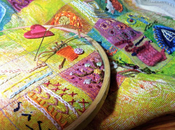
In the end I added some more details to the background fabric using the same method than in the beginning. By using a glass plate and textile dye I was able to prints some more color and doodling to make the result even more interesting.

I painted the frame with bright coral red to create an athmosphere of hot summer days (which I love and which are all too rare in Finland).
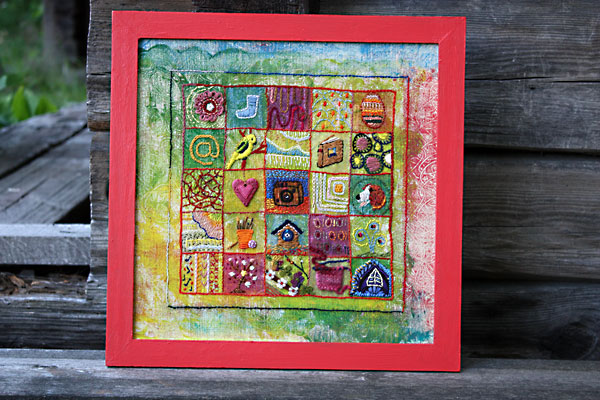
I am pretty happy with the finished piece. Can you spot a peony and a parakeet there?
While stitching the sampler, I was thinking about samplers in general. They can be really handy of saving things. Even virtually! Isn’t Pinterest like a big sampler too?
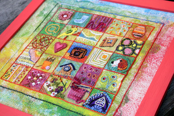
I chose not to spend an extra hour at Pinterest but make a stamped sampler showcasing some of my favorite stamps.
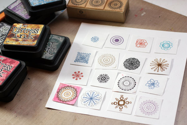
Folk style suits well to samplers so I decided to make a sampler that reminds me of folk costumes. I doodled around the stamped images to get extra details. Then I colored them with colored pencils and markers.
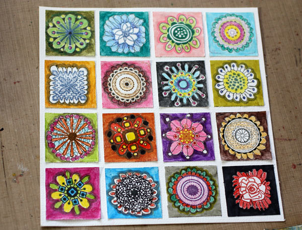
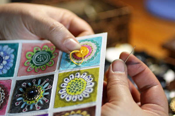
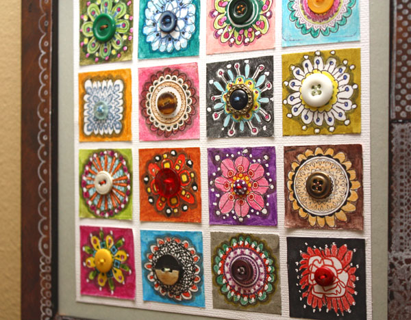
Thinking of folk costumes, I got the idea of adding buttons in the middle of each square. They all had to be different, of course. That way they would repeat the idea of a sampler too.
Before sewing the buttons I had painted the frame with faux antique paint. Many folk costumes use a lot of lace and ribbons so I picked all the stamps which were like them. Luckily I had so many that I was able to use each once and get the decoration around the frame.
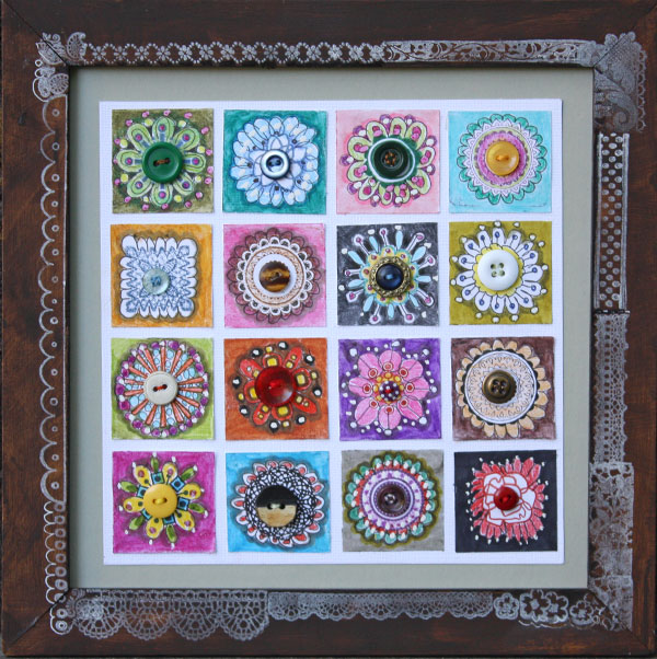
While making this sampler I got the idea of a sampler made from handdecorated papers. Wouldn’t it be cool to have an art journal page showcasing the scraps of papers? Or just coloring and drawing 9 squares while on vacation, one per day and then gather them into a sampler. Or giving each family member a square … The possibilities are endless!
Let me be your art teacher: Subscribe to my weekly emails!
Stretch Your Artistic Style
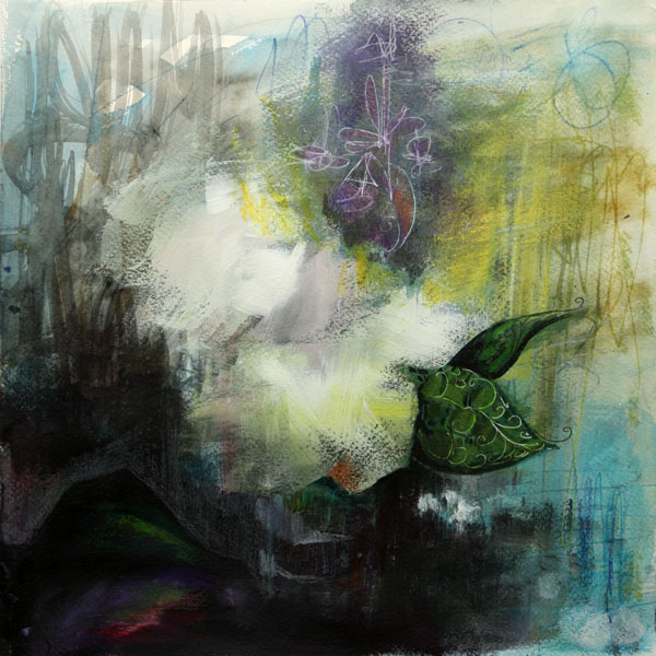
In art, I am fond of thin strokes and decorative details. I have often thought that blurry painting is like a bad photo – in need of sharpening. But slowly I have begun to get interested in blurry paintings. Those wide strokes have begun to feel tempting. The concept, where colors can take the leading role, has been sneaking into my thoughts. So, when I wanted to express something very familiar to my home country, I thought that the impressionistic style would go well with the theme.
The theme was melancholy and for me, it’s all about white flowers. In general I do understand the beauty of white, but personally, I see it as a symbol of loss and emptiness. The painting called “Condolences”. I wanted to give both white and black the position where they can be heart-breakingly beautiful. I wanted to treat them as real colors, not only as the elements to create contrast or compositional space.
Taking a New Route in Painting
Before I began to paint, I spent weeks of pondering the idea in my mind. After I had got hold of the feeling I wanted to express, I felt unsure of how to master the technique. Then I realized: if you want to stretch your style, you need to take a new route at some point in the creative process.
My new thing would be the way I used the acrylic paints. But I could start with familiar things: watercolor the background and set the basic color scene.
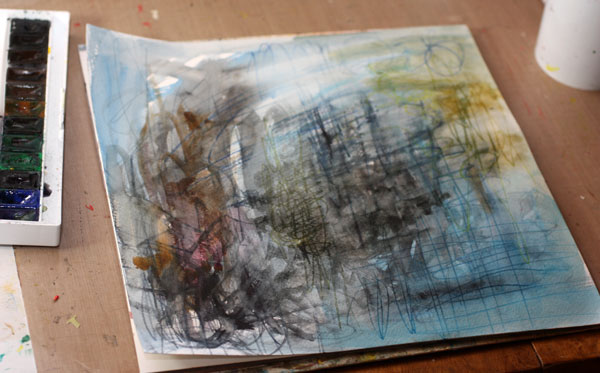
After creating this background, I felt comfortable: same old, same old! Then, with the help of Coldplay’s best hits, I got into the mood where I felt no uncertainty. When I have a clear theme in mind, I prefer to listen to the music that is pompous and not too deep. Then the music helps to improve my self-esteem without taking the focus away from the theme.
After few moments of walking around the room – that is a great way to boost your creativity too – I took the step. I mixed the paint, picked the broadest brush and dipped it into the paint. Then I began to brush boldly and very fast.
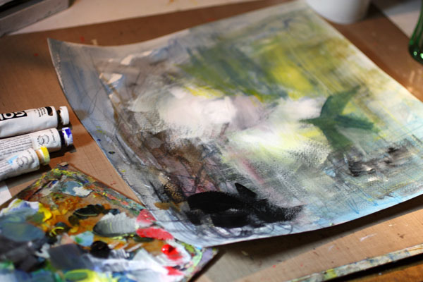
If you want to accomplish something new: think before you do it, not while you do it. Let your reason go through what you should create. But while you are creating, work very fast so that you reach the pace of your creativity. If you have some kind of image in your mind about the end result, it is important to focus on the feeling you want to express. The feeling should overcome the image while you are working.
Finishing Touches with Colored Pencils
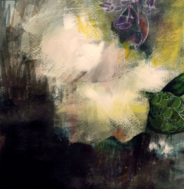
There is something quiet and covered in the way the people grief, so I added a lot of blacks and other dark tones. After passing the most exciting phase, I became worried about the lack of depth in dark areas. After working with acrylics, I added details with colored pencils. The white lines were made with a white gel pen.

I made the final touches with colored pencils by picking complimentary colors or colors very near their complementary.
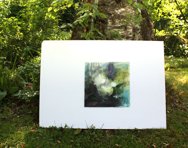
It felt somehow controversial to create this melancholic piece when the Finnish summer is at its best. But this was a good experiment. It raised an important question: Have I limited myself too much? Without too much questioning, could I try to create whatever comes to my mind?
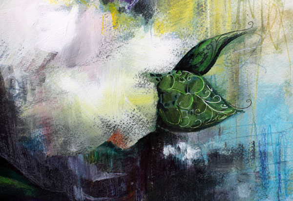
Stretch Your Artistic Style!
Give yourself permission to experiment! Here are my tips:
1) Pick the direction to go! When stretching your style, remember to pick something you kind of like, but still have reservations about it.
2) What are the factors the new style has? Using a dry brush and only a few strokes were essential for my experiment. Think about techniques, colors, composition and pick the things that are essentially different than your ordinary methods.
3) Which the step in your process is the one where you take the new route? When will you start incorporating those new things? In my process, it was after making the background. Preferably start with the familiar way to get into the flow of creating.
4) Get emotional so that your emotion leads the way while creating. Think about the stories behind the emotion. Get into the state where expressing the emotion is more important than mastering the new method. Turn the music on if you need some courage to express your emotion.
5) Work fast without too much thinking. If you need to think, interrupt your work. Stand up and move around. Never forget the feeling you want to express.
6) Sleep overnight and finish your work on the next day. Embrace the good and fix the bad. Do not make major changes anymore as there will be a new day, a new blank paper, a new play, a new chance!
Stretch your artistic style
and get inspired by the world of art: Sign up for Imagine Monthly Fall 2016
Mimicking Embroidery with Colored Pencils
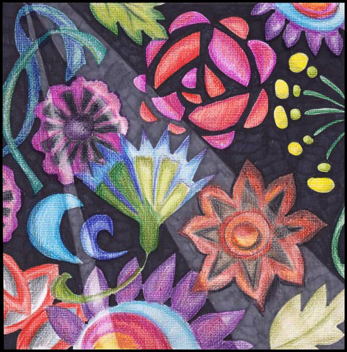
With summer, I have had more time for hand embroidery. After holding a needle in my hand, I got the idea to embroider with the colored pencils too.
Mimicking Embroidery – A Rough Sketch
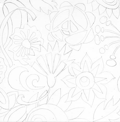
I began with white 8-by-8 inches sized cardstock. If you look closely, you can see some texture on the surface. I used a white weave textured cardstock turned upside down so that the surface is smooth enough for colored pencils. Before picking up the colored pencils, I made a rough sketch of the shapes first.

Coloring the Shapes with Colored Pencils
Remember these when using colored pencils:
1) Keep the direction of the strokes the same. Especially if you want to mimic embroidery as I have done here.
2) Control the color intensity with the number of strokes. When coloring, press lightly and create thin layers of color.
3) Mix colors by adding thin layers of various colors. Mixed colors always look better!
4) Keep your pencils fairly sharp. If you have an electronic pencil sharpener, use it to make your pencils last longer.
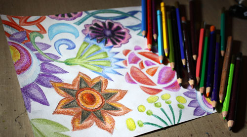
I have tried several brands of colored pencils but here are the ones that I like most at the moment:
1) Garan d’Ache Pablo (soft waxy finish)
2) Derwent Colorsoft (work great on watercolored surface)
3) Derwent Inktense (water soluble)
I have also heard that Prismacolor colored pencils are great.
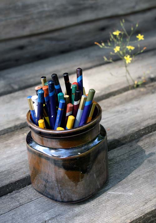
I store my pencils in a jar. Whatever brand they are, they all go into the same jar. This way they take very little space and I can keep them visible all the time. When I see them, I will use them!
Coloring the Background with Markers

After coloring the sketched shapes, the background was colored with black and dark gray markers. To emphasize the fabric look and to make the background interesting too, I created lined areas for the shades. I aimed for an impression of the light shining on the fabric cloth. Using markers created a contrast between the soft colored shapes. (Copic markers used: 100 black and C7 Cool Gray)
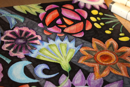
Darkening the Shapes
After creating the background, I began to darken the areas of the shapes that were on the black background. The darkening shows well in this second artwork which I made after the first one.
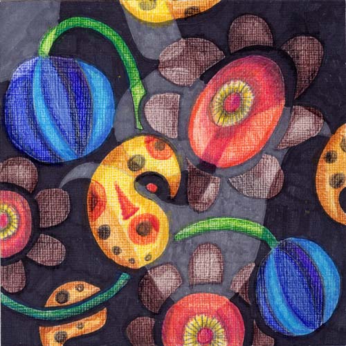
After finishing this, I realized that my recent activity of picking up lily leaf beetles from my garden had lurked into my art. Oh, my! There they are, those orangy yellow swirls!
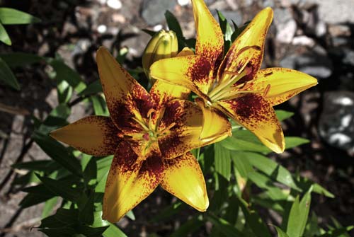
The first lilies have just opened… Hopefully, my subconscious will replace the images of the leaf beetles with the lily flowers!
Express more with colored pencils: Buy my e-book Coloring Freely!
The Art of Finishing

This collage is called Dawn of Change. It is inspired by the history of art. There was a time when I preferred modern art. If I went to an exhibition showing older than 20th century’s art, I used to yawn and think how pretentious it was. But the more I have examined art, the more I see in the old art. I see colors and concepts that can be reproduced in many different angles. Also, seeing good art makes me think of finishing – how much it affects the experience of the viewer.
The Creative Process
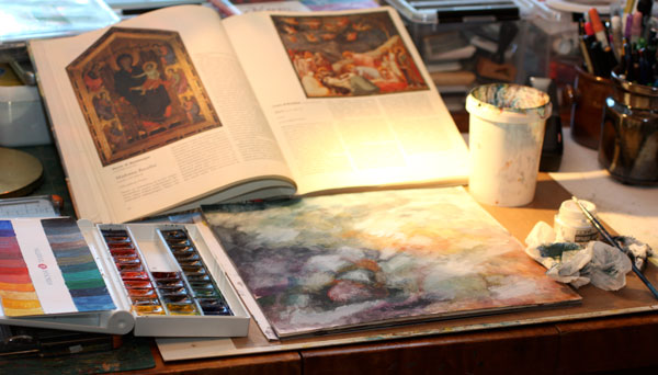
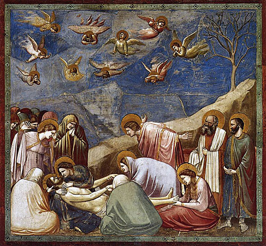
When I began to create Dawn of Change, I kept the painting of Giotto di Bondone visible on the table. I did not copy the image; I just kept it as a reminder of what to aim for.
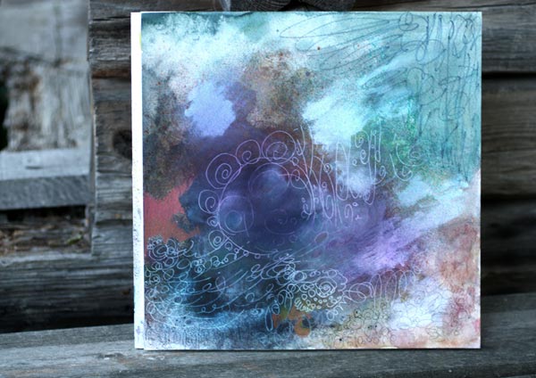
The first layers were painted with watercolors. Then I added some Copic Opaque White to create lighter areas. The white layers were rubbed so that they shined vaguely on the watercolored surface. I also sprayed some Dylusions mists to make the background even foggier.
After a little bit of doodling with colored pencils, black marker, and white gel pen, the background started to show the guidelines for collage pieces.
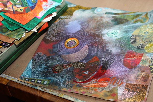
Then I picked up the box of hand decorated papers and began to attach the paper pieces. In this phase, I always get surprised how well the papers fit the artwork even if they are all different. Creating your own papers will bring you that happiness! Try to avoid using same papers many times in the same artwork. That way the result looks more interesting.
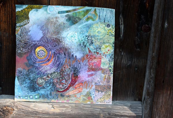
After a little bit of doodling, I was getting tired and decided to end my session. Even if the composition was accomplished and nothing major decisions left to make, I felt that the work was incomplete. I needed to ponder how I was going to finish it. Over the years I have noticed that finishing does make a difference. In arts and crafts, the finishing rarely alters either the message or the use of the work, but still has a high impact on how appealing we will find it. Sometimes that extra addition of quality will change entirely what we think about it.
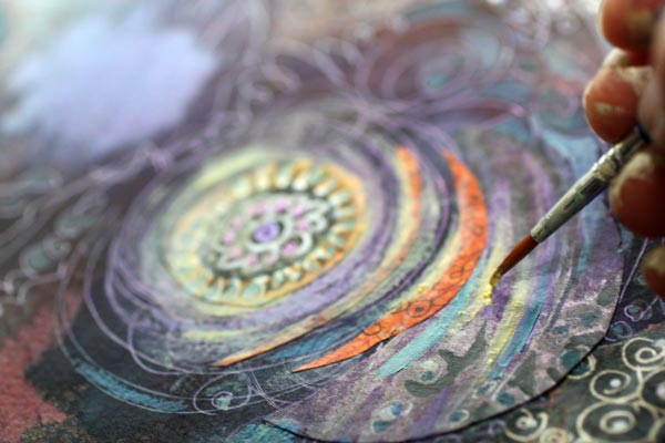
So, if you want to improve your results, get into the habit of taking breaks. I like to have a good night sleep, walk the dogs or work in the garden. Especially physical activities make the subconscious work best. Then, when I grab the thin brush I know exactly what I want to achieve and how to do it.
Finishing Art – Making Subtle Changes
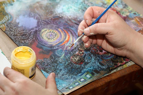
In this piece, I wanted to increase the impression of the colors fading together. The acrylic paints were the best to accomplish that. I added small strokes of various shades of grays to create a more muted look. Then I also added some pale yellow and off-white to create the fading in lighter areas.

The difference between before and after is not big. When placing the two pictures side by side, you have to search for the differences. But I claim that the overall experience of the quality is better after finishing.
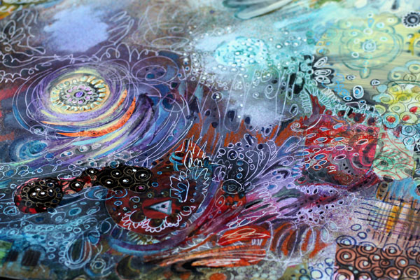
So I challenge you to finish your work – even if it already feels finished!
Let me be your mentor in art: Subscribe to my weekly emails!