
Selling Watercolor Paintings as Gifts
This week, I talk about making and selling watercolor paintings as gifts. At the same time, we celebrate the playfulness of watercolors.

See more and bigger pics at Taiko (online art store)
I love gift shops. My dream for a long time has been that, in addition to large oil paintings, I could sell smaller pieces as gifts. Recently, this has come true. I have sold many of my watercolor paintings not only directly but also via the Taiko online art store and the Gumbostrand Konst & Form gallery.
Art as Gifts vs. Art for Homes
An art buyer never buys art just for need. The work must appeal to the buyer on a deep level. Still, large paintings are chosen more according to the interior, and smaller ones are purchased as gifts. Sometimes a small painting is a gift to the buyer himself, often to someone else.

As a professional artist, I am more known for oil paintings, but I have dreamt that also my watercolor pieces would be in demand. I love to paint them and the idea of a perfect gift inspires me. However, it has taken time to grow my vision of how they should look.
Because I have grown many of my general painting skills with watercolors, my watercolor paintings have quite a similar style to my oil paintings. But with watercolors, I step in a slightly more illustrative direction. I want my watercolor art not to be too abstract, but approachable and atmospheric. See a collection of my recent watercolor paintings here!
Flower Art But With a Playful Attitude
My watercolor pieces usually have flowers. However, I don’t paint just static and spiritless flower arrangements. I see flowers as adventurous human or animal figures and get playful with them. On the one hand, the flowers are like dolls and teddy bears, and on the other hand, they are imperfectly perfect, feeling natural and real.
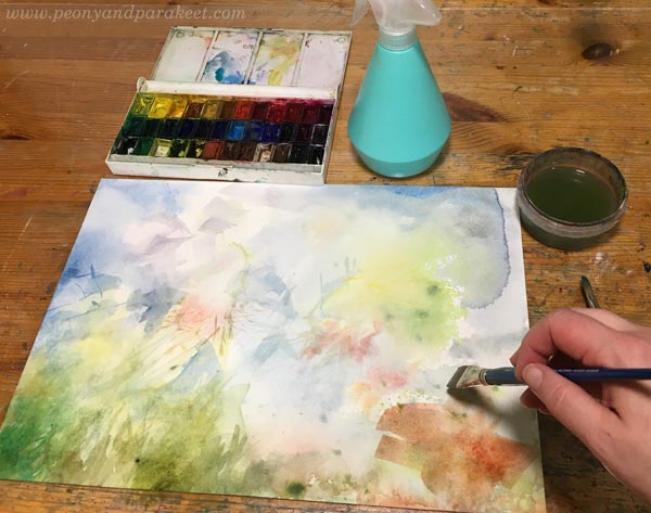
When the playfulness really kicks in, painting is fun.
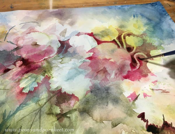
I love to discover plants in the middle of random watercolor spots. I have also a course called Freely Grown about this kind of process.
Taking Several Sessions to Grow the Idea
Usually, the first layers of the painting are fast and only take an hour or two. But that’s when the painting is just a regular flower painting, not a special piece that has a special appeal. Within a couple of hours, there’s not much time to grow the idea further or adjust the details.

I usually paint in several sessions where the first one or two lay the foundation and produce the basic painting, and where the next sessions (usually 2 to 4) grow the story and produce the finished look.

For example, for this painting, I took walks to see flowers and to add some more to the painting. But after a while, that felt too traditional and then decided on the gold mining theme.

The further I go, the smaller the brush strokes become.
Working with a Progress Photo
I find it helpful to take a photo of the unfinished piece, and then use it as a reference. The small-sized picture makes it easier for me to spot the areas that still need adjusting.

Looking at the photo also helps with distancing myself from the actual piece. I can ask: Do I love this? Would I buy this? When selling watercolor paintings as gifts, never underestimate the quality, always try a little higher.
Color over Color
Pigments are very different from each other. Some colors require many layers, and others can be used very thickly. Most artist-quality yellows have good coverage and work well for the finishing touches.

I have recently used smooth (hot press) watercolor paper because it’s best for tiny details.
Gentle Breakthroughs
I want to break boundaries with all my art, but in watercolor, I try to do it more gently than usual. In this painting, the flowers have caught Hokusai’s great wave from Japan and taken it to Lapland to pan for gold. And so it happened that the gold and the flowers started a decorative baroque party and everything small became surprisingly big and grand. Despite all this, this is a flower painting where the viewer can relax and enjoy the joyful atmosphere.

But whatever the story is, I try to express it so that it can evoke different memories and associations in different people. Somehow, the painting must make a gentle breakthrough in the eyes of the viewer – find a soft spot where the immersion can begin.
See more pics of “Kultaa huuhtoneet – Gold Panners” at the Taiko art store!
Freely Grown – Paint Watercolor Flowers with Me!
In the course Freely Grown, I walk you through my watercolor painting process. Because the finishing touches with a small brush are the most challenging, we take the easier route and do them with colored pencils. In Freely Grown, you paint flowers freely without reference photos and create a unique painting from the given techniques and guidelines. >> Buy here!
How to Add Depth When Coloring Freely
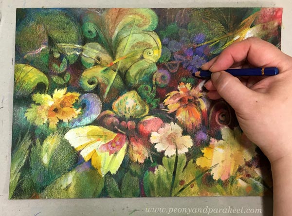
This week, we will color freely on a watercolor background and learn about adding depth to our colorings. I am using regular colored pencils, but you can also use watercolor pencils.

My drawing is inspired by the garden and the ornamental shapes of the plants, insects, and birds. So, let’s go deep in the garden and create lushness!
Quick Start with Watercolors
Blank paper can feel intimidating, but if you fill it first with watercolors, coloring is fun.
I was going through my paper pads when I found an unfinished watercolor painting.

It was just a background with random spots but the paper was smooth, just perfect for colored pencils. I think the paper is Arches Aquarelle Hot Press, nice and sturdy, 300 gsm/140 lbs thick.
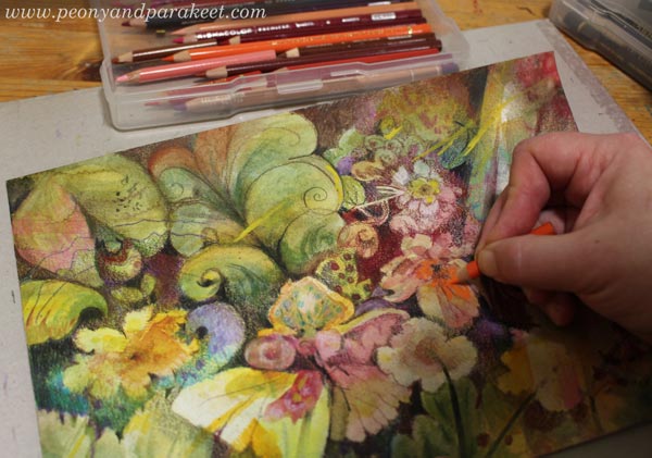
I picked up my pencils and started drawing and let my inspiration come from the painted shapes.

I drew flowers, leaves, swirls, and all kinds of odd organic shapes that I would then later adjust.
Add Depth – Expand the Outlines!
When you draw, don’t just outline, but broaden the lines to form larger areas. For example, a black outline can be broadened so that it gradually gets lighter (“shadowing”) or so, that it remains dark and solid but expands to a larger and exciting shape.
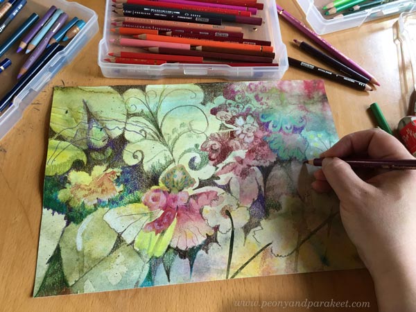
Dark and light should have clear differences so that you can point out separate areas: here’s dark, here’s light, here’s dark again, and so on.
Adding Depth is a Slow Process
When you are working without any references, you are on an adventure! What first looked like a flower, can become a butterfly after a while. Art is a shy fairy and it takes time to attract it.
In this intuitive coloring style, adding depth is a process where you slowly brighten or darken different areas. Start with a transparent layer, then add another one. When you have areas that haven’t been worked on with colored pencils yet, you can also use watercolors for layering.

Compared to accurately replicating a photo, this kind of free coloring may first feel much faster. But if you aim for depth, it’s not!
Add Depth – Find the Spirit!
At some point, your piece feels full and finished. But at this point, let me ask you a question:
Have you found the spirit of your piece?
Have you found something soulful that seems too gentle for this world?
Or is there something that cuts your heart and feels painful?
The depth in art is not only visual but something that evokes emotion.

In my piece, I discovered a spirit in the right upper corner. It’s not a flower or anything recognizable, but I felt it strongly.
After you have found the spirit, give more visibility to it. Make it so that it impacts the overall piece.
You Are the Sun
In your art, you are the sun. First, you can bring warmth to the piece by adding yellow. If you have areas that still take in watercolors, add a yellow wash over the greyish tones and let the warmth in.

Second, remember that you really are the sun. So, you can decide how the light travels and where the shadows are. You don’t need to calculate how the shadows should go like there would be one correct solution. Start deciding who deserves the sunshine, and who doesn’t! Who gets more color, and who will stay more in the shadow?
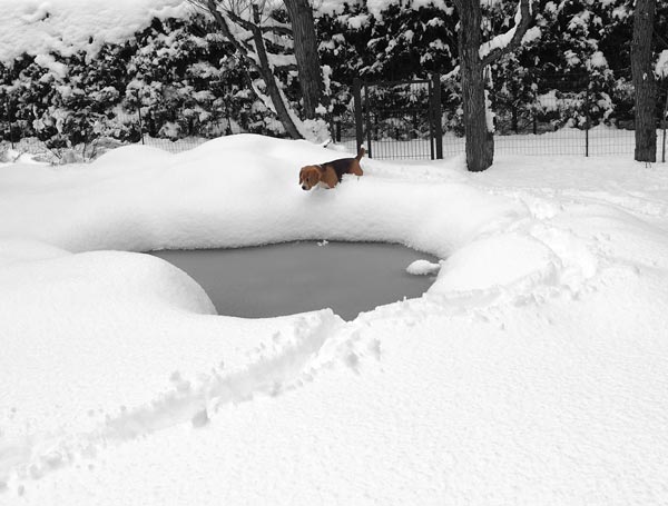
In nature, there are all kinds of reflections, and I find them artistically inspiring. Look at this photo that I took today from our garden pond!
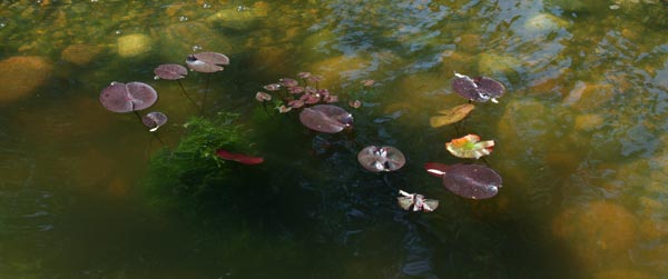
Playing with light, shadow, colors, and reflections is a lot of fun when you are creating freely. Remember that there’s no “shadow judge”, only “sun goddess” – you!
Add Depth – Force Yourself to Choose the Winners
Some people think about the composition all the time when they are creating, but I try to push that urge away as long as I can. You may have a lot of stuff on paper, but if you only highlight your favorites, balancing is easy. The problem is that you really have to choose!
Here, I have turned the paper upside down to get a different view of my work. That yellow flower looks very pretty, but the yellow butterfly shape near it is maybe even more attractive. Decisions, decisions!
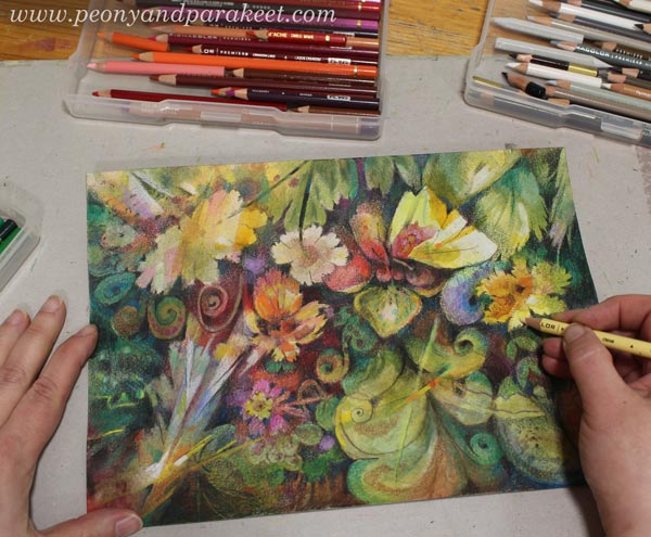
When I was at this point, I thought this was finished.
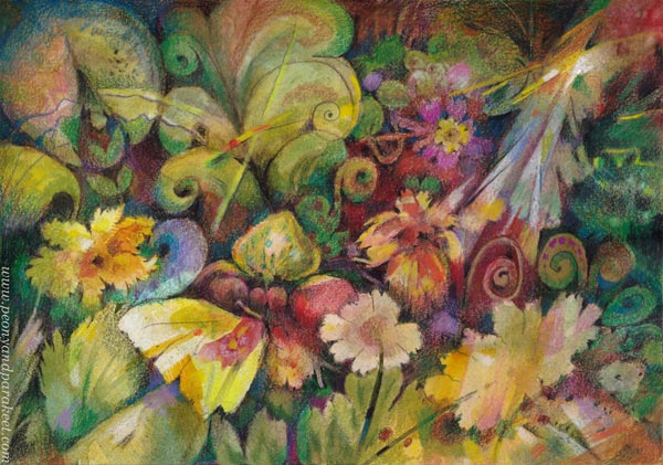
But when you want to add more depth, you want to reduce the competition for attention. I wanted to make the spirit in the upper right corner and the yellow butterfly clear winners even if it meant I pushed back many pretty things.
For example, the pink rose got toned down.
Room for Imagination
Things that are further away are blurry, like whispers, and things that are close, are sharp and louder. If everything shouts, and nothing whispers, the viewer will likely turn away. And vice versa, if everything only whispers, the viewer easily walks by.
If depth is lacking, you look at a wall and can’t see further. Depth is not only the impression but the imagination. With depth, you begin to imagine what more could be there. That’s especially why I want to add depth to my art whatever the subject is.
Learn more about watercolors and colored pencils together: See my course Freely Grown!
Using White as a Color in Painting and Drawing
In this post, we explore the color white and find ideas on how we could change the way we use it in art-making.
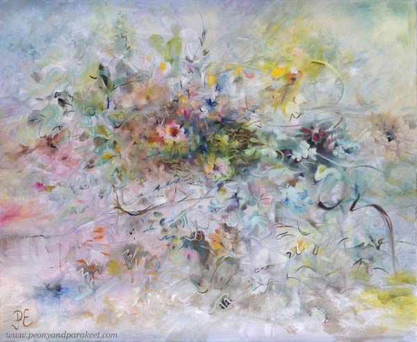
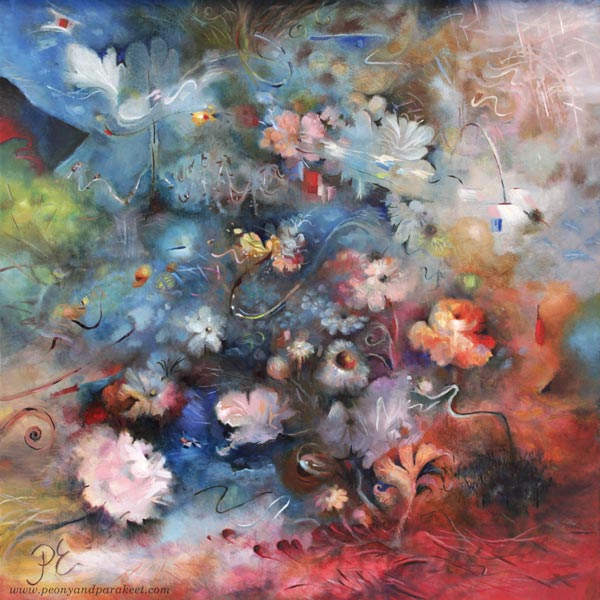
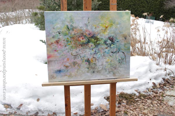
I posted this painting about a month ago, but I still had to fix it! You might not notice the difference, but it matters to me. I have changed the center of the painting so that it is more abstract.
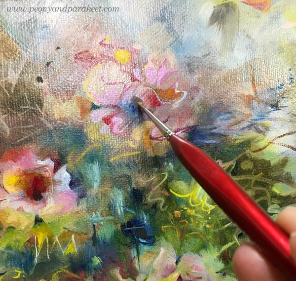
A long time ago I thought that it doesn’t matter if I don’t like some detail of my work or if I don’t like some of my work in general. I thought there would always be someone who would like it.
But the longer I’ve been painting, the more important it has become that I have to be a fan of my own work. When you are a beginner, quantity is more important than quality. But I’ve been working for a long time and the equation has thus turned the other way.
I know some would prefer the more realistic flowers, but I don’t! I have too much reality around me, especially now when the weather has been too cold to be spring.
Living in a White Country
This painting is also special because it has so much color that is difficult for me – white! There is far too much white here in Finland. Even if now is the end of April, we got a lot of snow a couple of days ago!
I think white is a terrible color because it is full of emptiness.
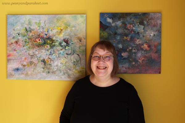
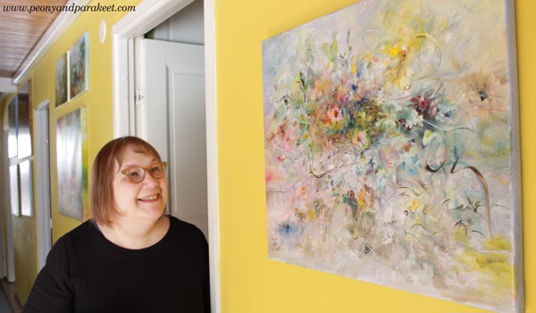
Finnish people usually have white walls and white furniture, but our home is full of colors. I love to display my paintings on this yellow wall.
Not One White But Many Whites
In the recent painting, I wanted to play with pastels and show the side of white that is often not talked about.
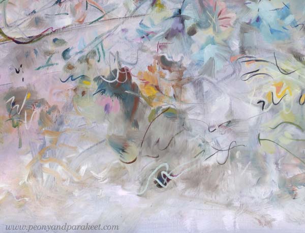
For an artist, there is not just one white. There is a warm white that holds the promise of the sun. There is a purple-toned white that falls in love when it sees a deep cold red. There is a white that allures you with a hint of sweet mint. So, many whites, not just one Finnish white!
It’s exciting to mix various whites and then see how the pastel colors slowly begin to appear. You need a lot of white and just a little bit of color to get the toned whites and pale pastels.
Titanium or Zinc White?
The most common white in paint tubes are Titanium White and Zinc White. In oils, you have to be careful with zinc white because it can cause crackles. I mostly use only Titanium White. I would love to use Zinc White because it’s more transparent. In this painting, I have tried my best to bring the soft transparent effects mostly with Titanium White, but it’s not easy!
In acrylics and gouache paints, you can use Zinc White more freely.
When White is Not Needed
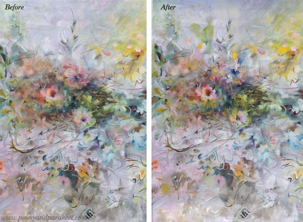
Beginners think that adding white on top can fix everything. Ten years ago, I was madly doodling with a white gel pen. What went wrong, got covered with white circles. But white also can make the piece busy and destroy depth. Here’s a quick example of the small collage piece that I made in 2014 (here’s the old blog post with the video too). The first is the old piece and the second is a photoshopped version showing how I would fix it now.
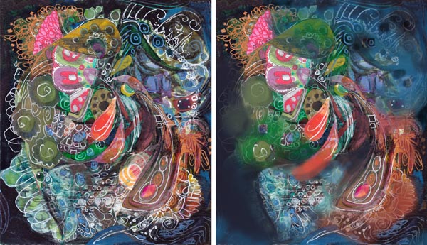
When I tone down the white, the image gets clearer and the depth grows. The highlights in the central parts get more attention and it’s easier to know where to look. I wish someone would have pointed this out to me back then. It took a lot of time to realize this!
If White Were a Person …
I am pretty sure that if White were a person she would say: “I have much more potential than you think. Stop seeing me as a blank background or a quick fix to a piece that lacks contrasts!”
What’s your relationship with White?
Ninety-Ninety Rule for Art-Making
This week, we talk about the agony that’s associated with finishing.

Last fall, I had a turning point when I started making digital art. I’m not giving up painting, though. There will be just fewer oil paintings this year.
New Start
This year’s first oil painting started already in October last year. First, I made a mess with pastel hues. Then I began to figure out what kind of personality the painting could be.

This kind of intuitive painting is wonderful and for example, my latest course Liberated Artist Revisited is based on it. Instead of the model, we study the painting itself and let it go in its own direction.

When I paint, I often listen to some talk or music program at the same time, that’s why the iPad is also visible in these pictures.
Ninety-Ninety Rule
Programming and painting have a lot in common. One of those is definitely the ninety-ninety rule. It states that 90 percent of the work is done effortlessly and takes only 10 percent of the time. And the remaining 10 percent is difficult and takes 90 percent of the time!

For example, in this part of the painting my intuition was working fluently, and finishing these details was also easy. I especially like that beige flower near the edge.

But the further the painting progressed, the less often I worked on it. I wasn’t satisfied with the center and the soul of the painting was missing. I looked at it every day, but all my ideas seemed too ordinary.
Then when I finished the video artwork last week, I suddenly got ideas for the painting. First, I brought similar greenish tones and then, by keeping my mind on the video, I solved the puzzle stroke by stroke!

The name was now easy to find: Käännekohta – Turning Point.

The ninety-ninety rule applies to the fond factor as well. It’s easier to like an unfinished painting than one that is close to a finish. When under 90 percent, you can see the potential and ignore the unpleasant parts by saying that the piece is not ready yet. When working on the last 10 percent, things get more complicated and there are times when you hate the piece!
Old Supports New
During big changes, I have often thought that I leave the old completely and jump fully into the new. But this time I feel that the old and the new support each other.
Life is an interaction between the past and the present and that applies to art-making as well.
Liberated Artist Revisited
With the newest course Liberated Artist Revisited, I invite you to paint with me – to follow directions from Paivi many years ago, and then create more with the current Paivi. At the same time, you can ponder, how your art-making has changed and will change.
Liberated Artist Revisited is a limited edition – only available for purchase until the end of March 2024! >> Buy Now!