Technique, Style or Identity? Which comes first to you?
I re-wrote an old blog post because this is the subject that’s close to my heart!
Technique
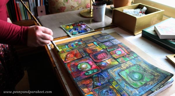
During the past ten years, I have wanted to learn and experiment with art techniques. It has been fun to combine all kinds of supplies and see what comes out. It has often felt that after I have learned the technique, I can then do whatever I want with it. But many times, adding a new technique to my repertoire has just grown more doubts about my style.
Style
Style means something that you are comfortable with doing, and that makes your work recognizable. When I have been unsuccessful in finding my visual style, I have had too much focus on the result and too little on the play. Techniques may change, but discovering the how you can process inspiration and what inspires you, and then connecting all that with shapes and colors and compositions, produces style.
Identity
Even when working full-time as an artist, I sometimes still have problems in calling myself an artist. I wonder, why there’s so much talk about finding your style and so little about finding your identity as an artist? It includes me too. I often talk and think about style issues when I should think about identity issues. It’s easier to analyze the line, the theme, the mark making, than talk about things that go deeper.
Things like:
1) Why do you make art?
2) How do you define the quality of your art?
3) What’s your role in the art community?
4) What’s different with you from the artists that you admire?
5) When and how do you know that you have succeeded as an artist?
Most of these questions are valid whether you are a beginner or more advanced. The answers change when your journey progresses.
When your order is 1) identity, 2) style, 3) technique
your art becomes more expressive because you allow more play,
you take on new challenges because your art has a purpose,
and you connect more with people because you have a natural urge to share.
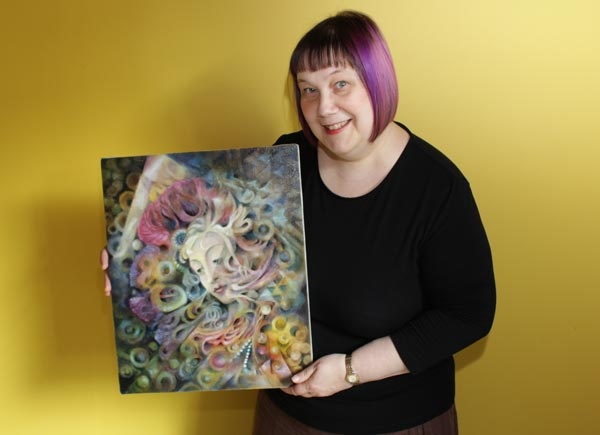
The Exploring Artist – Few Spots Left!
In The Exploring Artist, you will grow your artistic identity in a small and tight-knit group. I will personally help you to put your passion into words and visual insights. We will work together to discover what you want to change in your art, where you want to move forward and how to do it. The registration closes on Sunday, Sept 9 (midnight PDT).
>> Sign up now!
Take Your Art to a Passionate Level
What Does “Passionate” Mean to You?
This week, I had a free live webinar of how to conquer the excuses and become more passionate about art. I asked what does “passionate” mean to you and then divided it into four categories. After that, I re-phrased five excuses so that you see them from a new perspective. It may sound theoretical, but you also get ideas of how to apply these things in practice as well. I hope you will enjoy watching the recording below!
Take Your Art to a Passionate Level – The Recording of the Webinar
The Exploring Artist Begins on Sept 10 – Sign Up Now!
The Exploring Artist is a 12-week group coaching program for artists, between Sept 10 – Nov 30, 2018. This coaching is for you who wants to get clear about your artistic passion and become more open about your art, for example, share your art in social media, blog about art, sell your originals and prints, teach classes, etc.

In The Exploring Artist, you will get coaching as a part of a small and tight-knit group. I will personally help you to put your passion into words and visual insights. We will work together to discover what you want to change in your art, where you want to move forward and how to do it.
The maximum number of the participants is 12,
and the early-bird sale ends on August 19 (midnight PST), so sign up now!
Discover Your Style by Building Your Visual Dreamland!
This week, I talk about how you can change your mindset so that you really feel like you are heading towards the style that fits you. I show examples of my work and share how I have built my visual dreamland. I also tell more about the new class Collageland. Watch the replay of Thursday’s live broadcast!
Visual Dreamland – Watch the Recording!
Collageland is a class for you who loves decorative textiles but wants to save time and effort by creating with pens and paper. Rather than trying to succeed and capture your style through a single project, start exploring your creativity as a process, designing your visual dreamland one stroke at a time! >> Buy Collageland!
Coming Up!
Next week, there will be a written blog post! If you haven’t yet, subscribe to my weekly emails so that you won’t miss the blog posts and there’s also a bonus – a free mini-course Loosen up!
Subscribe to my weekly emails – Get a free mini-course!
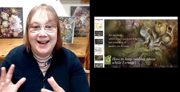
Finding Visual Voice – Prepare for the Free Webinar!
What to Think About Finding Visual Voice? – Watch the video!
Currently, I look at my art with a different point of view than when I created it. Non-art-related things in the past can also get integrated into art. Watch the video to dive deeper into these insights and to see examples!
Free Webinar – Save Your Spot!
Let’s meet! I am broadcasting live from my studio and talk about finding your visual voice. I have a subtitle: “How to start the journey?” because I think it’s a thing we need to rediscover again and again!

When you register, enter your time zone, and you will see when the webinar begins where you live. Save your spot even if you couldn’t come just at that very moment. You can then watch the recording later that week! >> Register here
Draw and Paint Flowers Like Never Before – Sign up for Floral Fantasies!
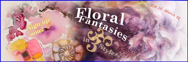
I am rerunning my best technique workshop so far, Floral Fantasies in 3 Styles. It’s about taking the best tricks from three visual approaches and immersing into the beauty of flowers. The workshop is now in the early-bird sale, so reserve your spot!