
Painting Seascapes – Making The Scenery Look Bigger
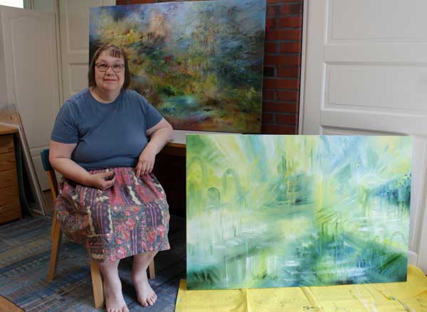
This week, we dive deeper into painting seascapes and other big sceneries. In spring, I thought my painting Atlantis was already finished, but after seeing the ship paintings in the Rijksmuseum in Amsterdam in May, I realized that I had made my seascape painting too simple and small-scale, and went back to working on it. Now it’s finished!
Painting a Bigger Sea
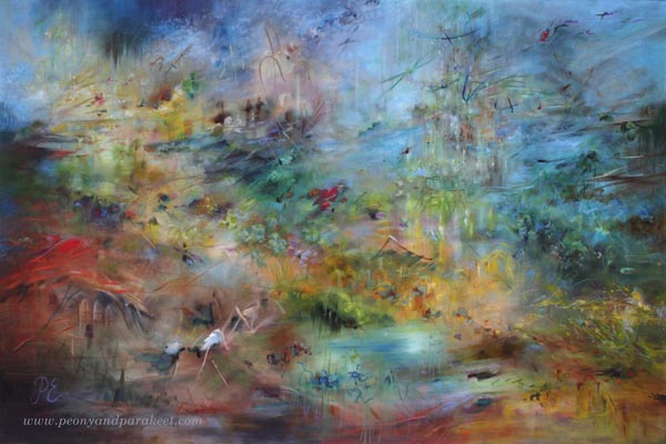
Despite the size of the canvas, you can make the seascape or any scenery look larger by adjusting the composition and the size of the brushstrokes. Compare the finished version with the one below!
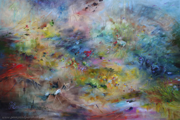
When you want to make a seascape look bigger, add tiny strokes, especially near the horizon, and adjust both left and right edges so that it looks like the seascape continues outside the painting.
The changes may look small when you look at the small photos, but in reality, they make a big difference. Here’s a close-up photo of before and after.
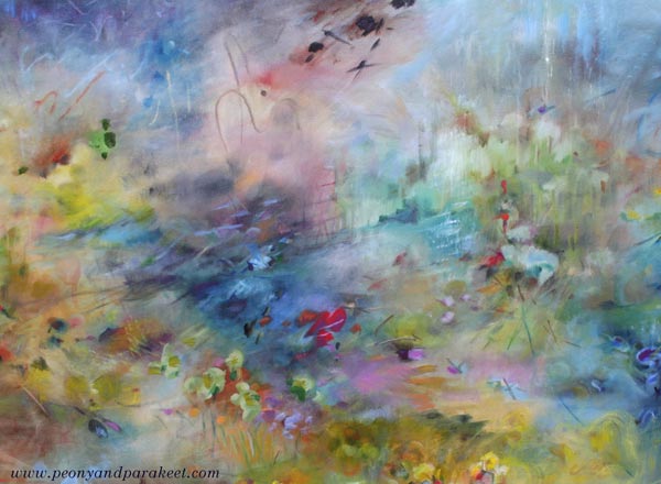
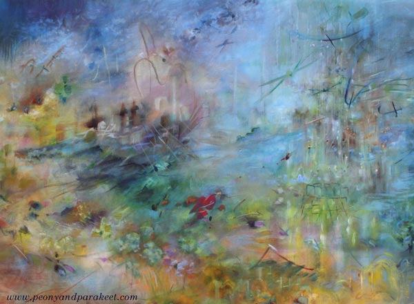
There are so many details that it was easier to make a short video instead of sharing more pics.
Seascapes don’t have to be boring and all blue. They can include all kinds of events and creatures, even buildings like in my painting.
A Series of Big Sceneries in Progress
It’s been a hot July in Finland, and my little studio is really warm in the afternoon. But I have big canvases in a queue, and the next one is already in progress.
New Course Is Coming Up!
Painting seascapes and other sceneries is exciting, but as you know, I also love flowers. I will be running a new watercolor course called Wild Garden from 22nd September to 14th November. Here’s a small teaser pic …
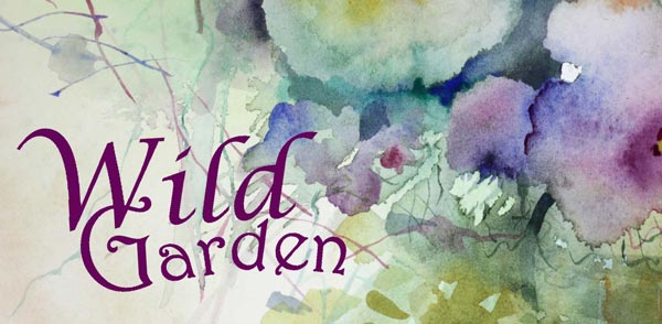
The early-bird sale of Wild Garden will start next week, so stay tuned!
Creating Menagerie
This week, I share a recent acrylic painting called Menagerie and talk about the process. This is an example of making the most of the rich visual vocabulary – the topic that I talked about in last week’s video, but now we focus more on the idea of the piece rather than the style.

Recently, I have been thinking about the news feeds and their many truths. Although things are presented in beautiful phrases and pictures, the truth is much more complicated, and there are layers behind them. The same applies to people. Even though we try to be human, we are still animals, too.
When I paint, I struggle with the same thing: should I paint a flower or a soul?

I want to create beautiful paintings, but on the other hand, a painting is like a person. If you treat the painting superficially, you don’t get to see its true beauty.

I seem to paint better if I can partly focus on something else!
My goal is to give my paintings the freedom to be themselves and this painting really revealed its heart to me.

However, my task is not only to reveal the wild nature of the painting, but also to gently train it.

Menagerie is sold already. I hope it will bring joy to its new owner.
Details of Menagerie
Here are detail pics of the finished piece. I like how the style of this painting is partly illustrative. It looks like it’s partly drawn with a brush.

I wanted to create an impression that the animals are captive but still wild and strong enough to break free.

This painting has many layers and details.

I tried to bring up the similarity between flowers and animals.

Here you can see the big flower up close. The brush strokes are loose, but still, I painted them with a lot of thought and care.

I hope this inspires you to create too!
Visual Vocabulary First, Style Second
This week is about visual vocabulary and how to widen it.
I often hear the worry about finding the style, but more rarely about widening the vocabulary. Style is a quality word, but vocabulary is more about quantity. Still, it’s as important, and you can’t find the style without growing the vocabulary!
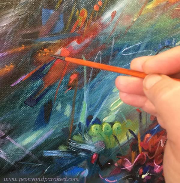
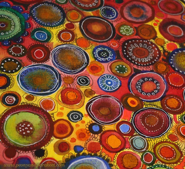
Often when we create art, we use a limited variety of shapes and lines and often the most ordinary ones. For example, your strokes may be quite straight and have very little variety in thickness. Or your shapes can be mostly basic geometric shapes. When I started, I mainly drew circles and my pieces were very symmetrical in general.
Forget the Style, Grow the Visual Vocabulary!
When you want to widen your visual vocabulary, look at the details of your work. There are seeds that can grow into great things. For example, could you repeat a random spot that almost disappears into the background and build a subtle texture from it?
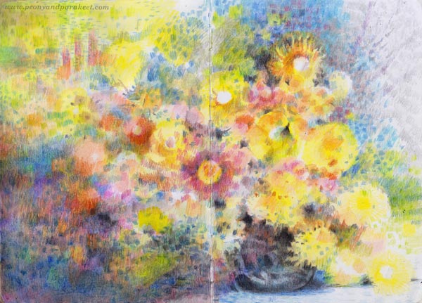
Look at your drawing line and think about whether it could deviate slightly from its path. Could you make a notch somewhere and thus make the shape more interesting?

Imagine you are a child who knows only a few words. Then it’s not important to question what the topic should be, but to find more words to tell any. Stop worrying whether you should create faces or landscapes and make a wide range of art to grow the visual vocabulary.
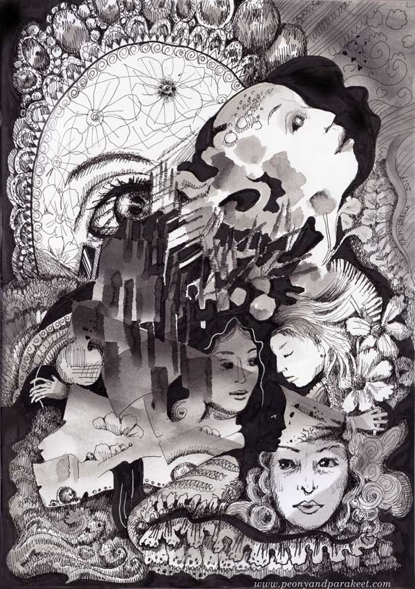
When you can draw a wide range of shapes, curves, lines and have many ways to color, repeat, break up and assemble them, you can produce visual stimuli on the paper that makes your imagination work. From this collaboration, art is born.
Outer Inspiration – Borrowing “Words” from Others
By looking at art, you can find words, i.e. shapes, that you want to incorporate into your own vocabulary, i.e. style.
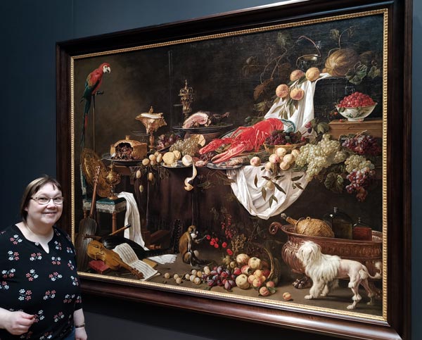
Art history is like an encyclopedia where we can pick what we like. Any art can be seen as abstract – just focus on finding a variety of shapes and colors.


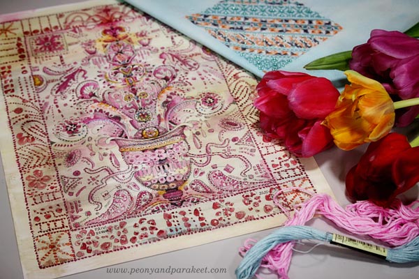
Your vocabulary can be inspired of not only fine art, but crafts as well.
Imagination Sets Who You Are
Too much outer inspiration causes copying, so don’t leave your imagination out of the equation! Imagine you are a singer who takes a popular song into your repertoire. Then you enter a singing competition and are told: “You sound a lot like the original singer of the song, but we want to hear who you are.”
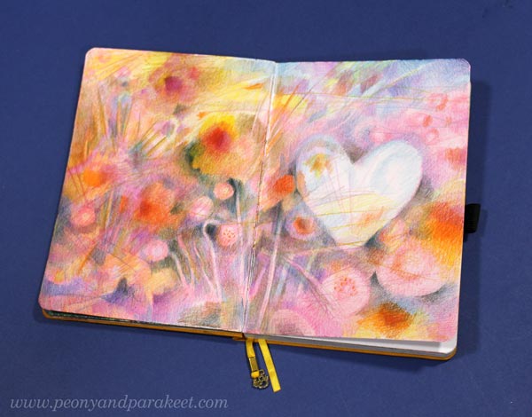
So we need not only to expand our expressive language, but also to develop our imagination. Visual vocabulary and imagination are a pair, and art needs both.
For example, you can draw a circle and give it a meaning, but can others see it? With imagination alone, the expression remains hidden. With a rich expressive language, we can make art enjoyable for others as well.
Welcome to My Courses + What I Want to Teach
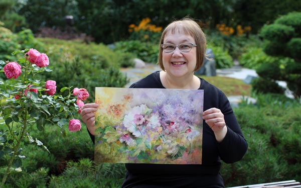
The goal of my courses is to develop both your visual vocabulary and imagination.
First, I want to get you to draw something a little differently than you have done before and thus enrich your visual vocabulary. Second, I want to make a crack in your everyday thinking and plant imagination in it. I want you to ask: “What if?” and to respond with something completely crazy – something that makes you feel free to tell completely new kinds of stories.
When art emerges from this starting point, richly and vividly expressing itself, you will find your style.
Using Up Old Crayons
This week, we use up those old crayons: oil pastels, soft pastels, Faber & Castell Gelatos, Derwent Artbars … whatever you happen to have!

This piece is made of Faber & Castell Gelatos and oil pastels. I used oil pastels a little more than gelatos. The paper is thick mixed-media paper. You can see in-progress photos in the video.
In the video, I talk about old crayons and show several examples of how to use them.
Using Up Old Crayons – Watch the Video!
Here’s the link to the course that I mention in the video: Innovative Portraits
Let’s keep creating art!
