Altering a Flower Painting – Inspiration from Vatican Museums

About three weeks ago, I quickly painted a small flower painting while sharing my thoughts about painting softly (see this blog post, which also includes a video).
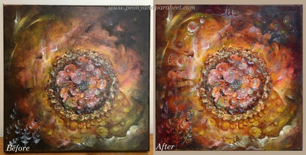
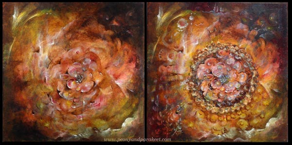
During the past weeks, I have been wondering what to do with the painting. I thought it could be a little more detailed and tell a bit more glorious story. So this morning, I decided to work more on it. Some artists are always afraid of “over-working” their paintings. But I belong to the group who thinks that the painting is almost never fully finished. There seem always to be more ideas I could add and more adjustments I should do.
1) Painting a Decorative Frame
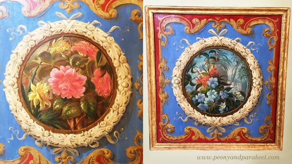
This time I decided to use a selection of old decorative art as an inspiration source. I picked photos that I took from the visit to Vatican Museums in June. I often work like this: letting images spark ideas that I will add to my work. It’s not so much “copying” but picking concepts or generic ideas. My first inspiration came from these decorative panels.
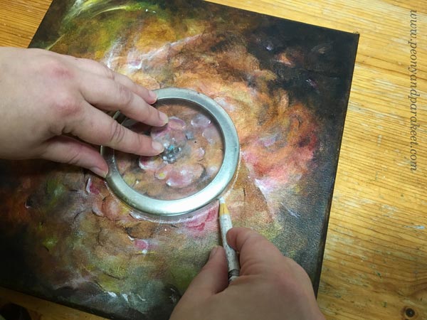
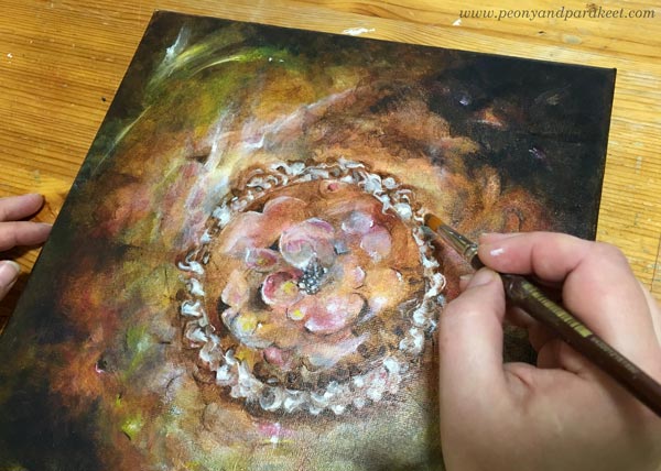
By using a Chinese marker, and a lid of a jar as a template I drew a circle on the center.
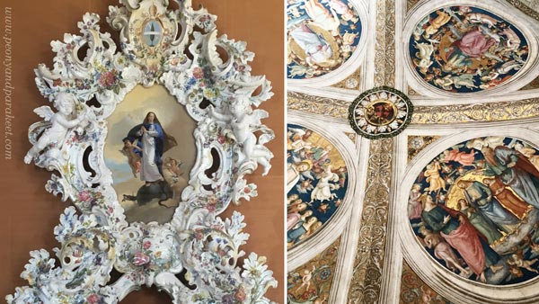
A huge porcelain piece and a beautiful ceiling inspired me to paint a frame with lots of swirls.
I just added some burnt umber around the drawn line and then painted the swirls in white. I added several translucent layers to make the shapes look more three-dimensional.
2) Playing with Colors and Shapes
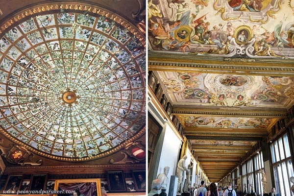
The next ideas came from this picture. It’s one of the many beautiful ceilings, so full of images and details that it’s almost overwhelming.

The ceiling inspired me to add more color variation to the painting. I used mostly ultramarine blue, ochre, and cadmium yellow on the center, and quickly some elements with white on the bottom left corner. While waiting for each thin color layer to dry, I pondered what to do with the rest of the painting.

I almost heard a voice saying: “Stop right here, don’t ruin the painting!”
3) Letting Go – More is More!
While browsing the photos taken from Vatican Museums, I remembered the astonishment that came from the number of visitors there were. It was Friday afternoon, but the area was packed. Each huge corridor was filled by us, tourists walking and staring at the beautiful ceilings. The Sistine Chapel was even more crowded. Frescos, mosaics, statues, paintings and decorative textiles covered the surfaces. Everything was full in every possible way. And now in Finland, I was sitting in my half-empty studio with my half-empty painting.
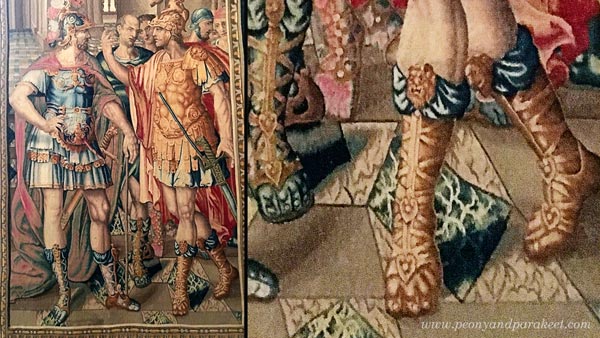
So I said to myself: “Go for it!” And took some extra boost for my confidence by examining a photo of a wonderful wall textile. If men can be this decorative, why not just continue the painting!
I worked more with the center of the painting, making it grow towards the edges.
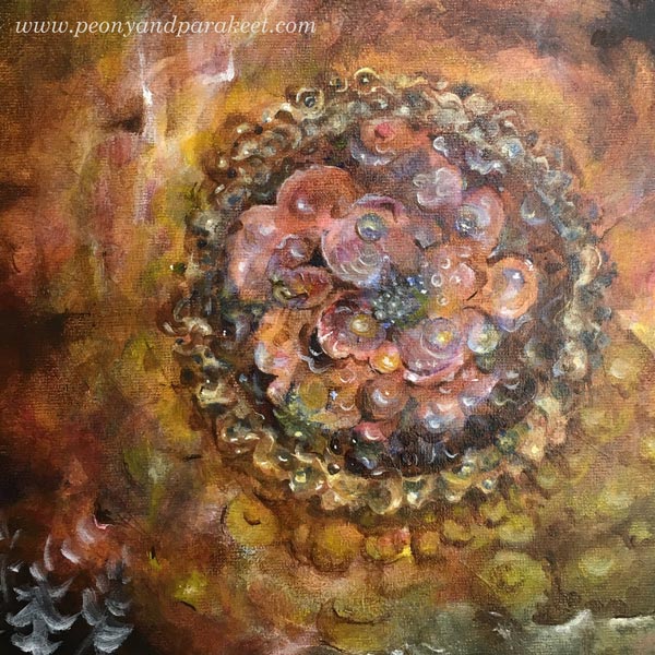
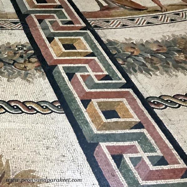
A detail of a mosaic floor gave me an idea to combine geometric shapes with curvier lines.
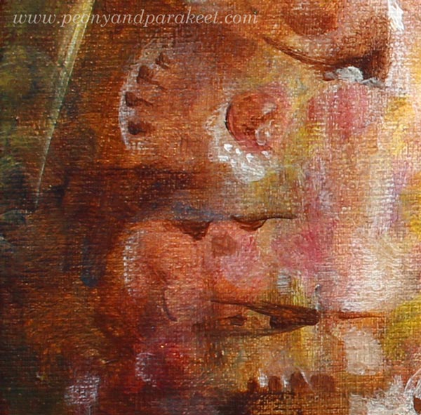
Here’s a close-up showing tiny additions on the left:
4) Bringing up the Expression – Highlighting the Visual Message
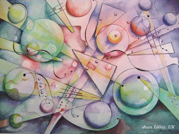
Before the final touches, I still had some stiffness in expression. To me, it’s often difficult to fully trust my intuition unless I know what I am expressing. I was almost finished when I realized that my painting is about being a queen of the fantasy, ruling every little detail, making ships change their direction on the sea, and wearing a crown that shines further than anyone could imagine.
Some Close-Up Photos of the Flower Painting
Ships sailing:

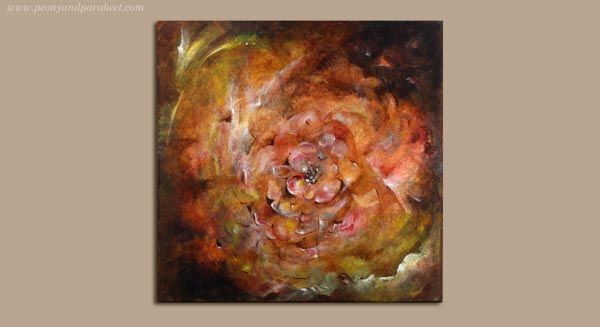
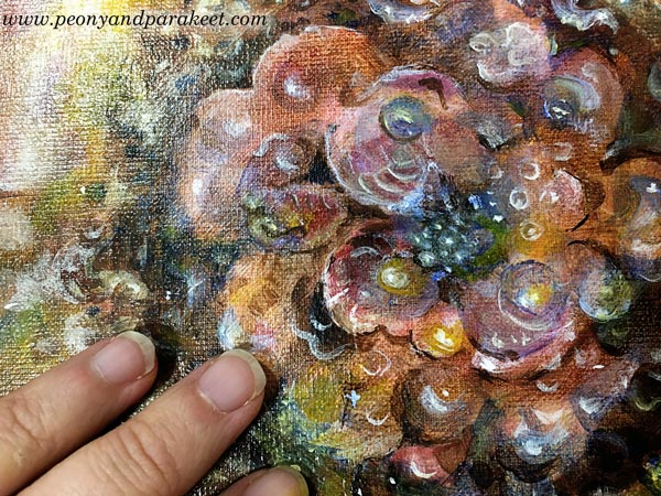
The center. This is a very small painting, only 12 by 12 inches total:
Floral Fantasies
Lately, I have been more and more aware of the fact that I want to paint fantasies. To me, the first version of the painting was too bland. I dress modestly, I hate wearing too much jewelry, my home is not full of stuff, and still, I want my art to be full, to go beyond what’s expected and accepted.
I am currently preparing a new online workshop about painting flowers … If all goes well, it will take begin in October.
Let me be your art teacher: Subscribe to my weekly emails!
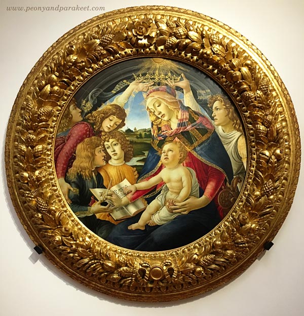
The Inspiring World of Details – Ideas from Uffizi Gallery
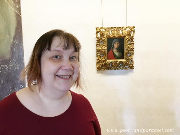
If you have followed my blog for some time, you know that this photo is very meaningful to me. It was a hot day in June when I visited Uffizi Gallery in Florence, Italy. The huge old building was filled with world-class art. But I wasn’t just going to look at the famous masterpieces like Botticelli’s Primavera or Birth of Venus. I was searching a small painting of Boccaccio Boccaccino.
Meeting Boccaccio Boccaccino at Uffizi
Boccaccino’s painting made my heart bounce when I saw it on Google at the beginning of this year. I made my version of it during the spring.

After finishing the painting, Boccaccino’s Gypsy Girl continued to fascinate me so that in June, I traveled to Italy with my husband to see the original painting. I tried to prepare myself for the situation that I wouldn’t see it. Sometimes museums lend paintings for other exhibitions or don’t have everything on display. But my journey wasn’t wasted: I got the chance to admire the painting, so tiny that I couldn’t believe my eyes. Namely, the whole spring I had tried to capture the gentle features for much bigger size, and it felt challenging!
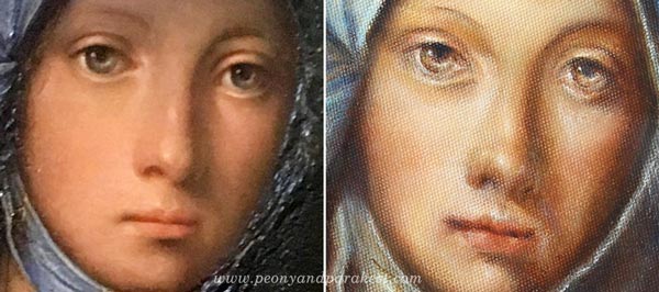
Now when I compare the details, I see many differences. My gypsy girl is not the same person than the original, but it’s ok. I feel that it resembles me and especially how I would like to be seen: gentle but observing, always protecting what’s precious.
Wouldn’t it be if I could tell my story to Boccaccio Boccaccino? I would tell him how I saw his painting on the Internet, in a big catalog that anyone can browse. I would tell him how I examined the images of the painting and painted a bigger version of it. He would probably wonder how I could afford for all the paints for the big version, and who had ordered such a large painting of a modest gypsy girl. “It’s just for me,” I would say, “this painting is so special that I don’t want to sell it.” “You must be a wealthy woman,” he would probably say and then continue: “Where did you say you come from?”. I would tell him about Finland, an area in the far north and show it on a map. Then I would tell him about airplanes. He wouldn’t probably believe anything!
But at the end, all I would like to say to him is this: “People from all over the world come to see your painting. They buy the ticket in advance. They queue. They sweat. They book the hotel based on its location. They take pictures of it. They examine them when they are back home.”
Isn’t that something any artist would like to hear?
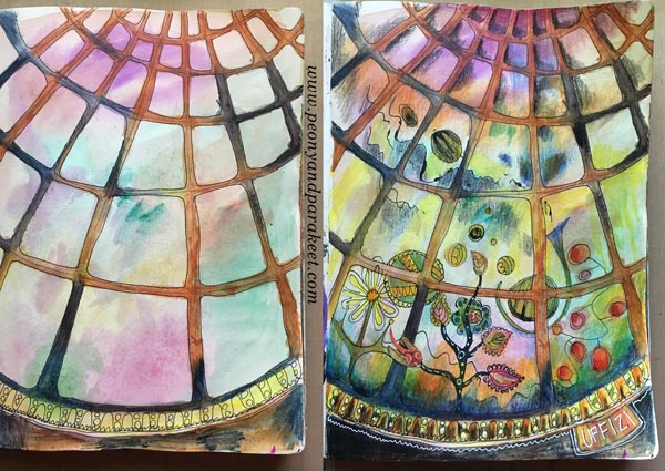
More Uffizi – Some Ideas for Your Art Journals
1) Fresco Pages
Like any museum in Florence, Uffizi Gallery’s ceilings had a lot of frescos. The long hallways were full of illustrations.
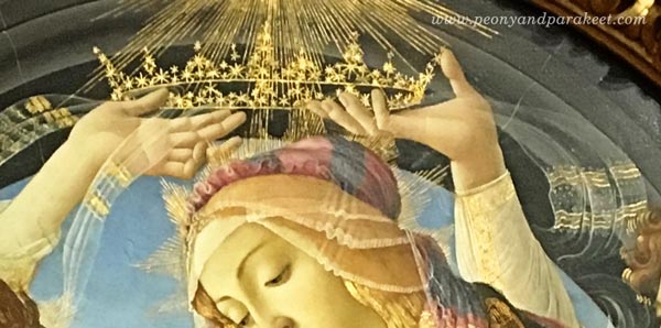
The round ceiling is so brilliant that I have to show you a close-up photo:
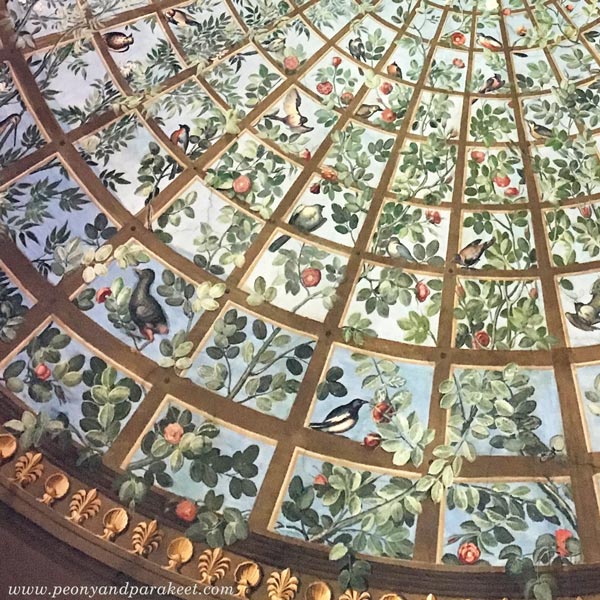
I love how the branches go to the back and to the front of the bars, and how the color changes in the background. It’s such a great idea that I also quickly recorded it onto my art journal!
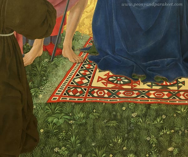
2) Delicate Patterns Filling Solid Areas
Another idea is to see the possibility of a solid or dull area. See how the grass can be more than just green color or green strokes. I saw quite a many paintings that had this:
3) Translucent Elements
I am fascinated by the number of veils in Renaissance art, and especially how they are painted.
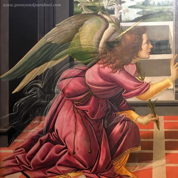
They are like abstract art if you look at them closer! See how the line changes in strength and how a little bright spot makes the fabric look shiny!
I also loved how the veil was painting in this painting:
Another idea: add stripes on those translucent elements!
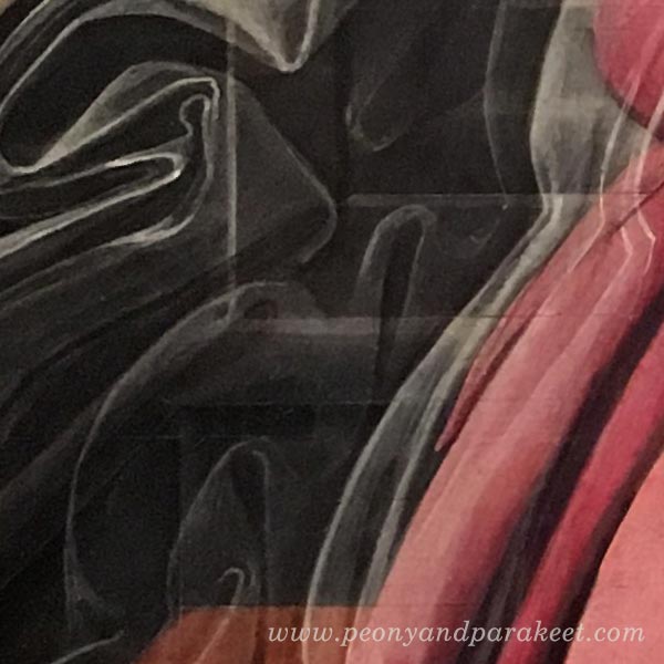
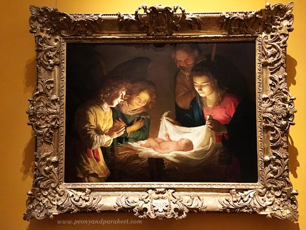
4) Light on the Center
I end this blog post with the simple idea that came from a stunning painting. Create a very bright element in the center and then add dark shadows around the painting!
As you can guess, it was an inspiring visit, and I could easily write and show more. Hopefully these inspired you, and hopefully, I will see you in the classes this fall.
Coming Up!
Online classes
Aug/Sept Collageland – a self-study class (textile-inspired collages)
Aug/Sept Inspirational Drawing 2.0 – available as self-study (drawing from imagination)
Oct/Nov Flower-themed online workshop (not your regular flower art class!)
Local workshops in Finland
Sept 9-10 Draw Freely – Piirrä vapaasti 1-2 (Suomeksi! – in Finnish)
Other news
I am planning to offer a free live webinar in September if I can just fit that into my schedule. Many have asked about my coaching program The Exploring Artist. I will rerun that at the beginning of next year.
Stay tuned and if you haven’t subscribed my weekly emails yet, subscribe here!
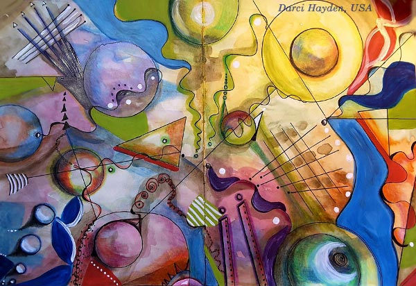
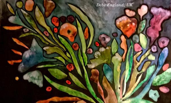
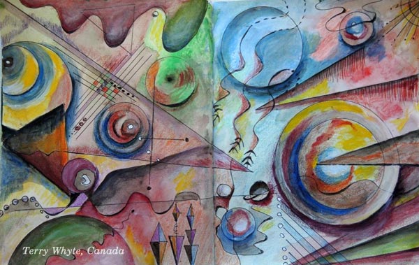
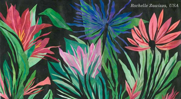
13 Prompts for Expressive Art – Illustrated by the Students of Peony and Parakeet

When you wonder what to create next, here’s a list of prompts for expressive art! Use these for art journal pages, drawings, paintings, mixed media, even for creative writing. The inspirational quotes from famous artists complement each of the short prompts. The students of Peony and Parakeet created the beautiful pieces that illustrate the prompts. They are based on the mini-courses “Botanical Discovery” and “Romantic Geometry.” These mini-courses are included in Imagine Monthly Art Journaling Class Bundle 2.
1) Living Colors
Claude Monet: “I perhaps owe having become a painter to flowers.”
2) Dreamy Sharpness
Rene Magritte: “If the dream is a translation of waking life, waking life is also a translation of the dream.”
3) Speaking with Shapes
Vincent van Gogh: “The emotions are sometimes so strong that I work without knowing it. The strokes come like speech.”
4) Composition of Absurdness
M.C. Escher: “Only those who attempt the absurd will achieve the impossible. I think it’s in my basement… let me go upstairs and check.”
5) No Stereotypes!
Henri Matisse: “There is nothing more difficult for a truly creative painter than to paint a rose, because before he can do so he has first to forget all the roses that were ever painted.”
6) Bring in The Sun!
Pablo Picasso: “Some painters transform the sun into a yellow spot, others transform a yellow spot into the sun.”
7) Taking Flight
Michelangelo: “I saw the angel in the marble and carved until I set him free.”
8) Blue Escape
Wassily Kandinsky: “The deeper the blue becomes, the more strongly it calls man towards the infinite, awakening in him a desire for the pure and, finally, for the supernatural… The brighter it becomes, the more it loses its sound, until it turns into silent stillness and becomes white.”
9) Nature’s Mystery
Francis Bacon: “The job of the artist is always to deepen the mystery.”
10) Colors of the Night
Vincent van Gogh: “I often think that the night is more alive and more richly colored than the day.”
11) Strong but Gentle
Paul Klee: “One eye sees, the other feels.”
12) Explosion
M.C. Escher: “We adore chaos because we love to produce order.”
13) Panorama of Your Inner World
Wassily Kandinsky: “To create a work of art is to create the world.”
Buy Botanical Discovery!
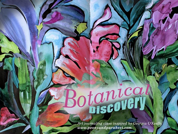
Georgia O’Keeffe: “I decided that if I could paint that flower in a huge scale, you could not ignore its beauty.”
Botanical Discovery is a mini-course inspired by the famous American artist Georgia O’Keeffe and botanical art. Create beautiful collages from hand painted papers – Buy here!
Buy Romantic Geometry!
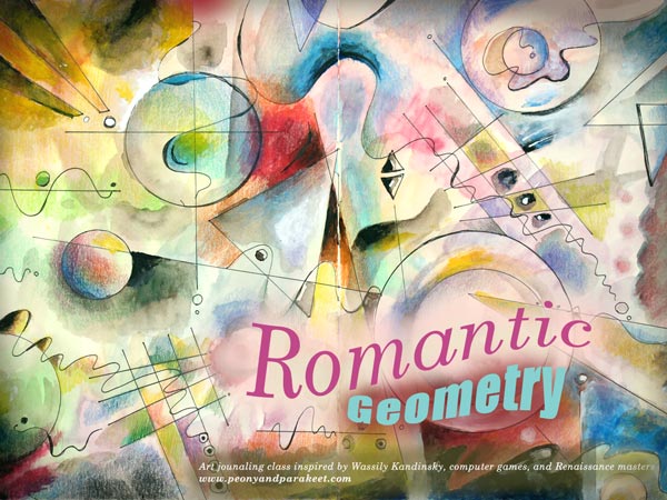
Wassily Kandinsky: “Everything starts from a dot.”
Romantic Geometry is a mini-course inspired by the famous abstract artist Wassily Kandinsky, Renaissance masters and computer games. It’s a journey through centuries and especially suitable for you who want to make your art more dynamic! – Buy here!
Let me be your art teacher: Subscribe to my weekly emails!
Consistency and How to Get Inspired by It

When artists say that they need to focus and find their style, a big part of the problem is the lack of consistency. To me, “consistent” used to be a negative word meaning “boring,” “predictable,” and even “unimaginative.” But during the recent years, I have realized that there can be a lot of freedom in the consistency.
Here’s an example. Last Sunday, I wanted to do some art journal pages inspired by my recent trip to Italy. I was already heading towards my paints and brushes when something else came to my mind. It hit me that I have art supplies I haven’t used for a long time. One of them was Faber-Castell Gelatos. They weren’t very cheap, but I had only used a little of them. They were too clumsy and creating with them felt like painting with lipsticks. These were definitely a wrong choice when thinking about old master paintings and the era of Renaissance.
But now the challenge of using Gelatos started to intrigue me. The idea of bringing those crafty sticks to the past felt like turning on a time machine. For some artists, it would be a sign of inconsistency not to stick with particular art supplies only. But when my goals are to bring people with different skill levels together, reveal the treasures of art history, and regularly offer new ideas for creating art, it’s very consistent. So I didn’t unnaturally have to limit myself but was able to enthusiastically create the art journal pages and write this blog post.
Inspiration: Palazzo Doria Pamphilj, Rome

My favorite place in Rome was a private art museum Palazzo Doria Pamphilj. It was located in the busy center, but after entering there, I was in a peaceful and beautiful world. There were a lot of inspiring paintings, but Jan Brueghel was a new artist to me, and his landscapes were unbelievably detailed. These paintings could have been huge, and they would still look detailed. But they weren’t very big; the length was under 1 meter in the painting below.

Another interesting thing was that Jan Brueghel collaborated with another artist Hendrick van Balen, who was specialized in painting figures. No wonder, the quality of these paintings is amazing! The painting above belongs to the series of four allegorical paintings, expressing the elements of water, fire, earth, and air. What a great theme for today’s artists too! And speaking of consistency: painting a series can also enforce that.
Abstract Landscape with Faber-Castell-Gelatos
I usually create art journal pages when my ideas are not mature enough for bigger paintings. Documenting these ideas in an art journal keeps the creative process flowing and maintains one aspect of consistency: the regularity of creating.
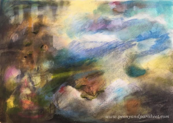
Experimenting with Gelatos was fun, and I especially enjoyed inventing ways to add details with those clumsy sticks. By building layers, I was also able to achieve a color scheme that brings old paintings in mind. The consistent inspiration from the many styles seen in the history of art sets me free. It goes so deep into what I ponder the most: how things change all the time and how timelessness can still be present.
3 Technique Tips for Art Journaling with Faber-Castell Gelatos
One way to be consistent is to develop techniques that are reusable. Often when I invent a technique for a specific media, it can also be applied to a variety of supplies. I will now show you some ideas for working with Faber-Castell Gelatos. You can adjust these for many other art supplies as well. I begin a second art journal page to demonstrate the techniques.
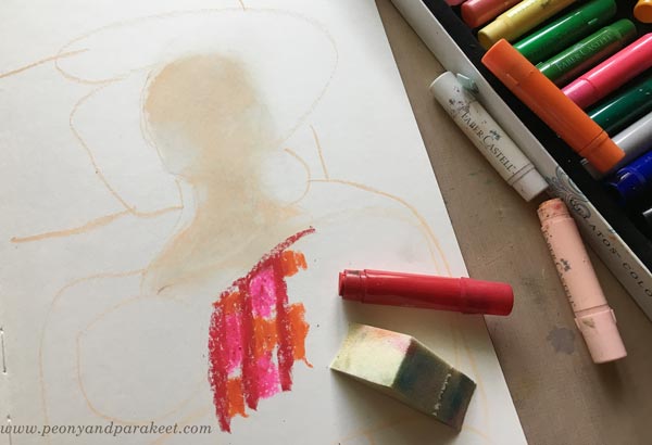
1) Blending and Softening
The more I have studied Renaissance art, the more I have been into creating soft color transitions and muted colors. When beginning a new painting, I like to blend and soften a lot. With Gelatos, the best way to mix the colors is to use a sponge. In the photo below, you see that I have mixed white and pale pink for the face but haven’t blended reds and oranges together yet.
2) Adding Details
Thick sticks don’t work very well for details. You can use the edge of the stick and get fairly thin lines, but to me, they weren’t thin enough!

However, I discovered that by using water, it’s possible to draw thinner lines with a brush. By adding water and rubbing gently, you can also remove some color and make tiny decorative spots that way.
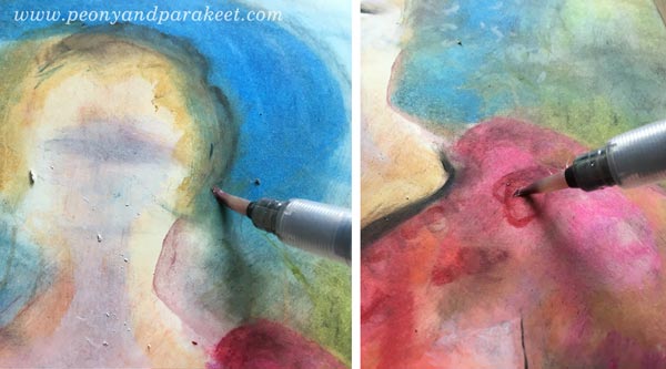
When painting with watercolors or acrylics, I like to work similarly: add a splotch of paint in one area and then quickly use it for details in other areas. It’s a fast and handy way to color details that need only a tiny portion of color each.
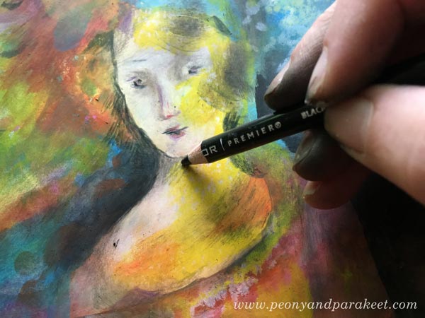
When finishing the face, I used colored pencils to draw the tiniest details. When keeping the Gelatos layers thin and smooth, it’s easy to add other media on the top.
3) Keep on Adding Layers!
When I started making the art journal page, I only had an idea of a lady or a Madonna because that would complement the landscape. I rarely use reference photos when creating art journal pages. To me, it’s more about getting in touch with vague ideas and then process them to express something that’s deeper and more defined. When I was in the middle of making the page, I was pretty clueless about what to express. But I kept on adding layers and slowly improving the image. One way to practice consistency is to keep on working with the same piece even if it looks like crap. See how much my page changed – examine the phase photos below!

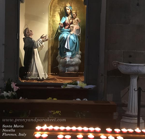
In phase two, I remembered the atmosphere and the candles of Santa Maria Novella, a huge church in Florence. After finishing the page, I went to my photo archive and found an image that looks very similar to my page. It’s so surprising how many of its elements exist on the page even if I didn’t look at the photo at all!
Regularly taking photos and browsing them is one way to add more consistency to the creative process.
Consistency is In the Way You Adjust the Nuances
After I had created the page, I felt that the opposite page should continue the same atmosphere. So I quickly made an abstract landscape there. Now when I open the spread of the journal, it feels more intense.

However, there are many things in these two pages that I don’t like. First and foremost, I don’t like the color scheme. It has too many bright colors and too few muted colors, and thus, it looks more modern that I would like it to look. I would like a color scheme that would be more like this:
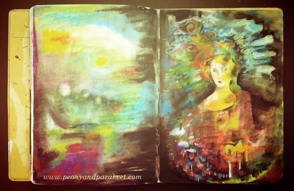
Also, if my art journal spread would be a big painting instead, I would make the face much more detailed. It’s simplicity, and the 2-dimensional look bothers me! By self-evaluating your work, you can also increase the awareness of the nuances you like. Adjusting the nuances, in turn, results in more consistency. Because many times consistency is more in the way you work with the nuances than how you select the themes and choose the supplies.
Let me be your mentor in art: Subscribe to my weekly emails!