5 Reasons Why I Love Colored Pencils
This week’s post is an affectionate thank you to my colored pencils.

Here’s why I love them so much!
#1 Colored Pencils Add Magic to Everyday Moments
Colored pencils are quick and easy for everyday use. Whenever I write, I can quickly pick a few pencils and color a part of the text or make a small illustration.
Planners, shopping lists, and any notes become more cheerful when I add some colored pencils to them.
#2 Colored Pencils Change a Journal to a Treasure
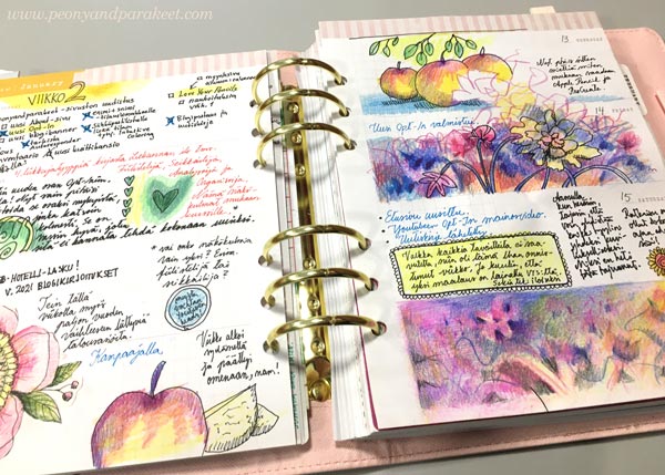
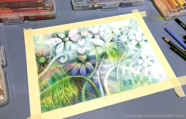
Colored pencils are perfect for small journals. When I started my colored pencil diary last year, I wasn’t sure how long the inspiration would last. But the small size felt so easy that the pages kept coming, and I love to browse the journal often. It’s my inspiration book and one way I do “research” – search for ideas that reappear more freely in my paintings.
This spread is a part of a new class, Fun Botanicum, where we make a set of plant-inspired pages. The idea of making chapters and different types of pages in a journal is so inspiring. One small journal can be like a library that has many collections!
#3 It’s Enjoyable to Paint with Colored Pencils
After painting a series of oil paintings, I am usually exhausted. Then my pencils feel a refreshing approach to painting. When I “paint” with colored pencils, I press only lightly like holding a brush, make soft and blurry shapes, and create color mixes by layering. This way, I fly to my imagination without making a mess or worrying over things like drying time or fluency.
I feel a similar softness to using a brush when smooth hot press watercolor paper meets a wax-based pencil. Gentle strokes don’t hurt but nurture the hand, and the overall experience speaks self-love: “Be gentle, focus on the good in the world.”
#4 Colored Pencils Love Lines
I love drawing lines, and fortunately, my colored pencils love them too. I can draw straight lines, curves, continuous mesh, outline – all my pencils require is sharpening now and then!
I love the willingness of my pencils to work until they are too short for the extender. I try to treat them as well as I can, no matter how short they are and what brand they represent. Old pencils can do lines too!
#5 Colored Pencils Can Take a Break
My oil paints are like afghan hounds. They require a lot of care and attention, and they always look appalled if I stop too soon. But colored pencils are like little parakeets. They sing when I am with them but are happy to fall asleep when nothing is happening. So I can color just a bit and then leave the project to wait for the next free moment. My pencils are ok with that – Every Single Time!
For example, this week’s work was made in several sessions. Watched the news and colored some. Listened to an audiobook, and colored some. Walked by and decided to color some. Unlike my oil paints, colored pencils never complain about what I listen, and they don’t get jealous if I watch tv at the same time.
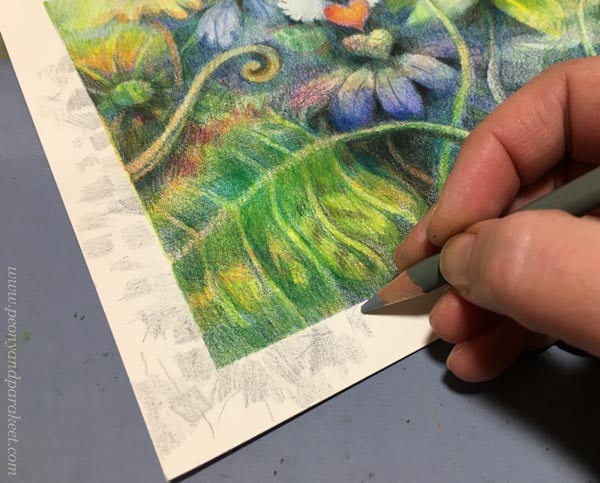
First, I didn’t intend to color the border, but then I couldn’t help myself to spend a little more time with the pencils.
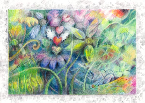
Hearts make this piece a bit cutesy, but colored pencils always make me more playful than paints.

I love this system of color-coordinated boxes!
Having Good Time with Fun Botanicum
Let’s gather colored pencils and get inspired by plants, crazy lines, delicious colors, and the freedom of imagination.
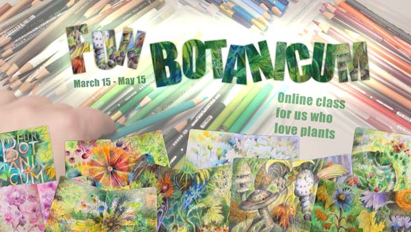
Fun Botanicum begins on March 15. Sign up now!
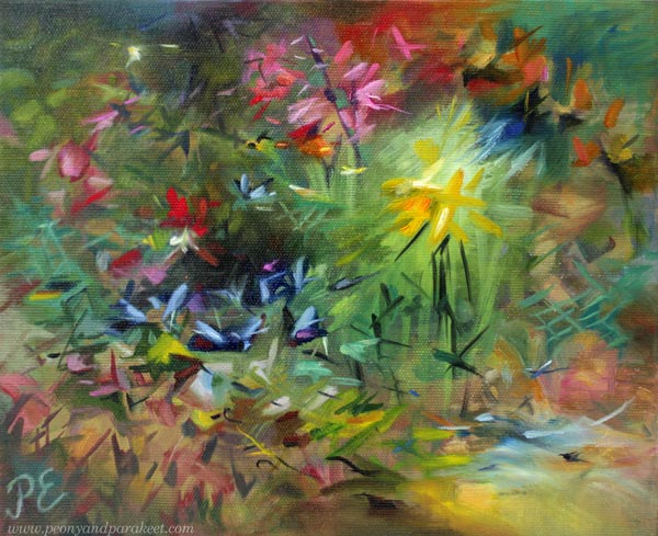
Creating Hope – Artist’s Mission
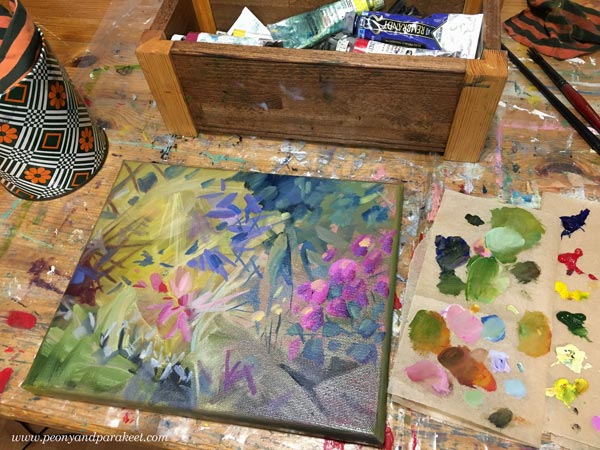
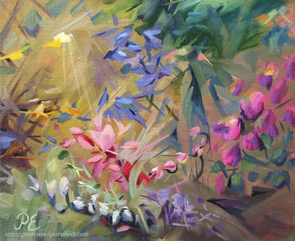
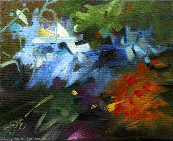
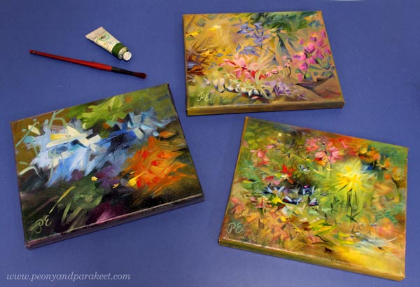
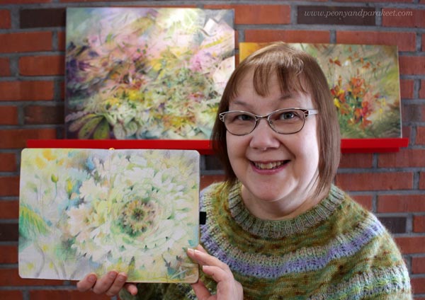
This week, I show three small paintings and talk about my mission of creating hope.
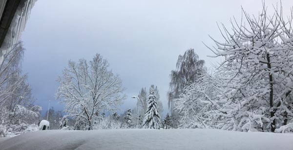
Even if we have had some winter wonderland sceneries recently, the weather hasn’t been so great in Finland – icy roads, rain, darkness … And now, the horrendous news came about the war in Ukraine.
But this post is not about war, but the opposite. Namely, a long time ago, I realized that my word is “hope”. Here’s the story:
I visited a hospital to see my old ant, and another old woman grabbed my hand. She wanted me to say something that would take her pain away.
I still remember her desperate eyes begging for consolation.
We discussed shortly but then I ended the conversation by saying that I am quite young and I don’t have all the wisdom. She nodded, turning off the glimpse of hope she had got when I entered the room. At that moment, I knew that I wanted to do more of that hope thing, but how.
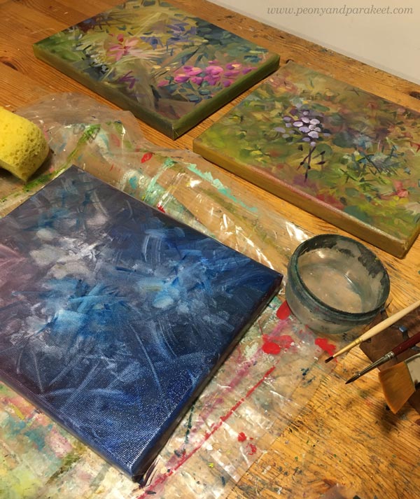
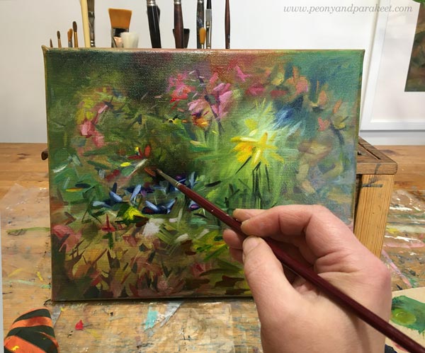
Nowadays, I try to transfer hope to every painting, and to every class as well. Yesterday I dug out small canvases that looked quite hopeless. I had started them last year and used leftover paint from bigger paintings. Then they had looked just ugly paintings that might not ever get finished. But now, all they missed was some hope!
So I painted hope: saturated colors over muted ones, light glow over heavy shapes, rising wings on the top of descending petals – signs of life.
I wanted to remove the harshness and replace it with gentleness.
I also added the much-needed drop of utopia as well.
After leaving the hospital, I cursed myself for not giving the old woman what I called false hope. But now I think that the correct word is fantasy.
We all need fantasy to keep going.
Fantasy didn’t come to my young engineer’s mind, and it would have required the kind of bravery I didn’t have. But now, when I paint, I can do brave too.
The qualities that don’t seem to be a part of me, can still exist in my art.
It gives me hope as a human.
Whether I use oils and canvases or colored pencils in a journal, all I create is hope. A gift that was initiated by a stranger in a hospital bed.
I am looking for March when the new class will begin!
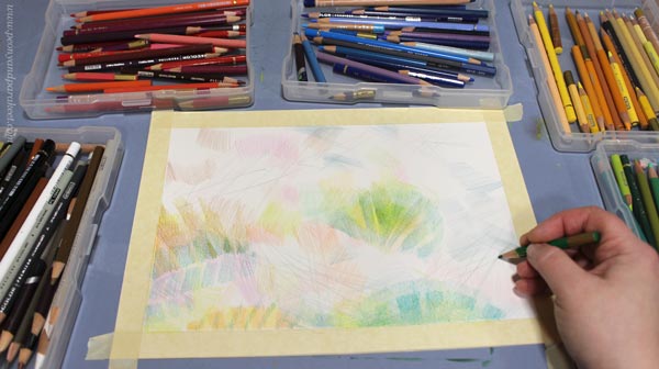
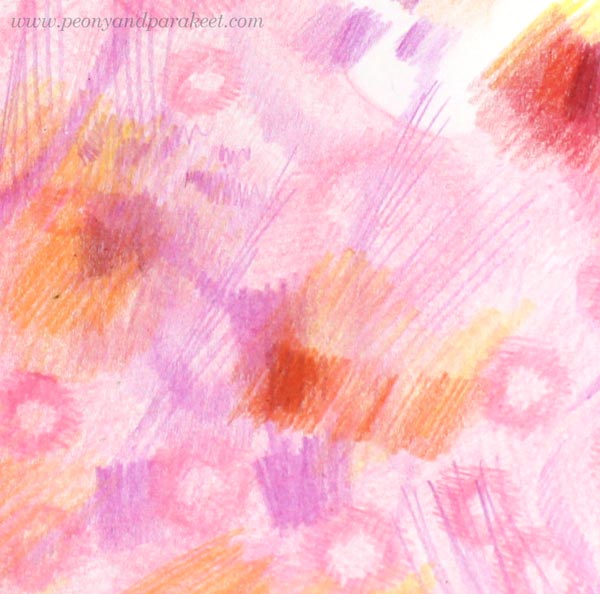
Layering Colored Pencils – Magical Effects Step by Step
This week, I have a new spread for my colored pencil journal, and it’s based on layering colored pencils. I share detailed photos so that you can try this too!
This coloring technique creates magical looseness, even if it begins with very stiff shapes. Because layering the colored pencils is the key here, it’s important to keep the layers light because paper can’t hold color endlessly.
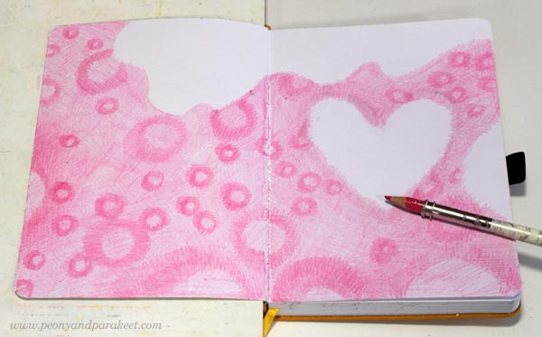
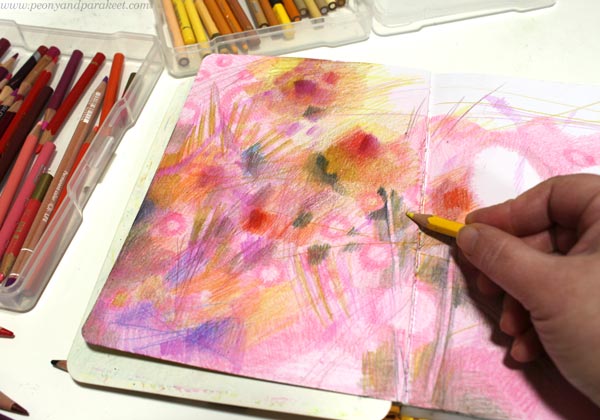
Step 1 – Set Atmosphere
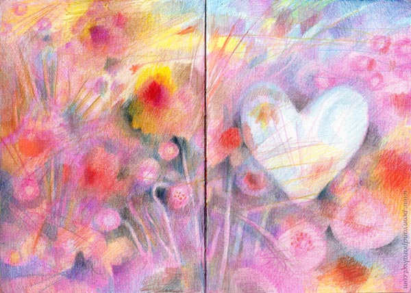
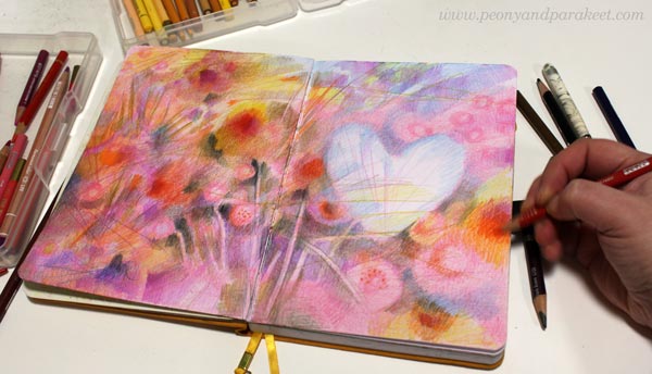
Choose a color that sets the mood for the image. My choice was pink.
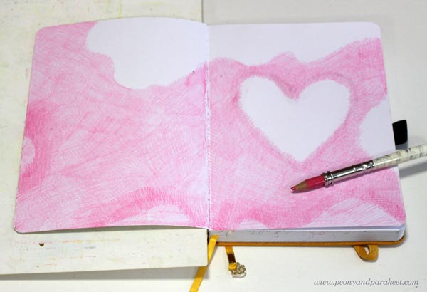
Color the background lightly, but leave some blank areas near the edges and where you want the focal point to be. The heart is my focal point.
The blank parts will allow you to include lovely color variations in the last layers. Color softly and avoid outlines so that the overall feel is magical from the first layer.
Step 2 – Add Pattern
Stick with the same pencil and continue the monotone look by coloring rings on the colored area.
Make sure that the rings are different in size and spread a little unevenly so that the result looks natural and interesting. Think about fabrics but not the easiest polka dots, but a bit more intricate design.
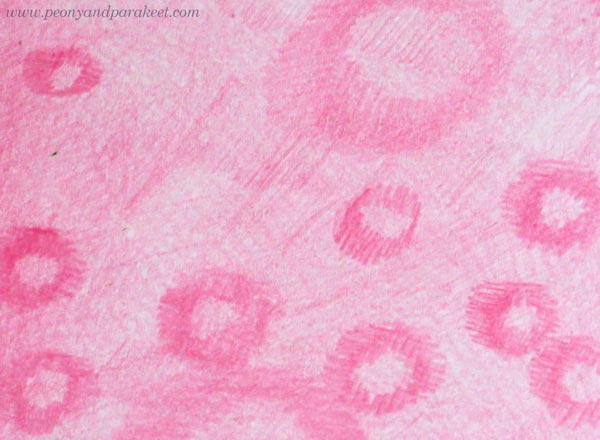
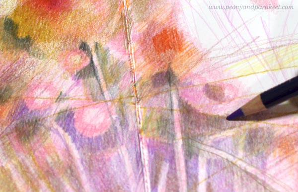
Here’s a closeup of my rings. Again, I don’t use outlines but color them with short strokes that go in many directions.
Step 3 – Destroy
This step could be called “destruction” because now we color random shapes that don’t follow the previous layers at all. Bring in new bright colors. Color stripes, rectangles, random shapes, and lines freely.
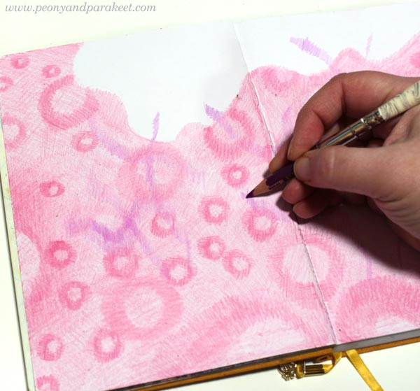
You can go over the blank parts too but keep the focal point a little less untouched.
The idea is not to cover previous layers fully but to destroy their rhythm.
Here’s a closeup of my work. The new shapes and lines have taken over, and the rings are not so well visible anymore.
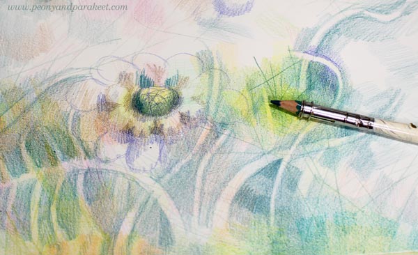
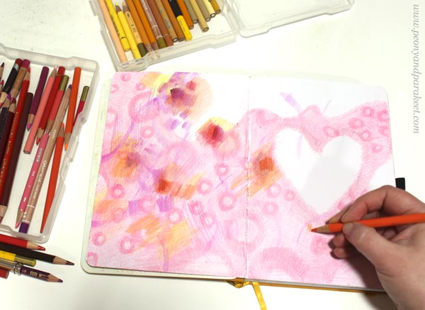
Step 4 – Discover
Keep coloring, but now bring in darker tones too. Keep the layers light and shapes soft, but when you discover something that you like, highlight its edges with a darker color.
I didn’t use any green pencils in my spread, but it does have some green shades. Mixing black and yellow makes lovely olive green.
Now it’s also the time to bring some rings back to the foreground!
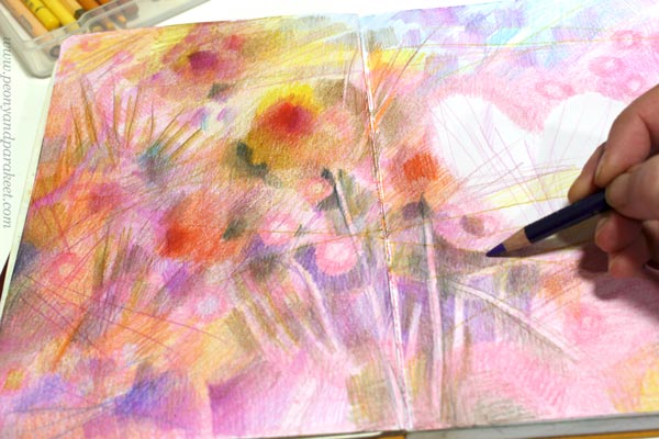
These rings remind me of perennial Bellis flowers!
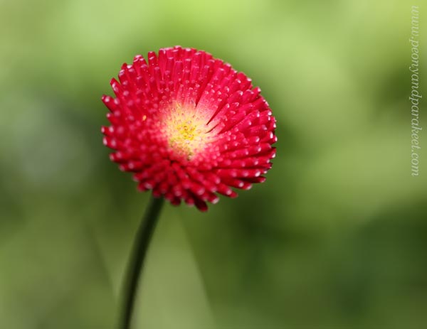
Here’s a closeup of digging out the rings – now flowers – with dark colors.
I don’t bring up all the rings, just some! This makes the layered look: some elements are covered and located further in the background, some come up to the foreground. The stiffness of the background pattern looks attractive when it’s combined with looser coloring.
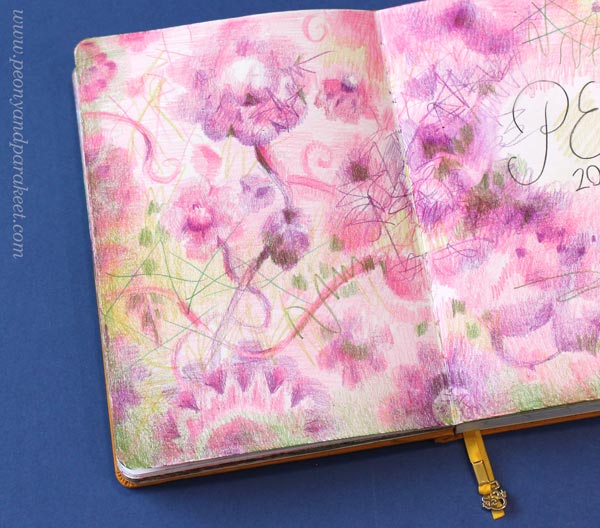
Step 5 – Finish with Message
Your work will be finished when it delivers a message. The focal point, the heart in my case, is essential for achieving this. I like to work intuitively so that I don’t try to define the message right from the beginning but let the insight grow with the coloring. Here, I left the heart light and made it look icy and magical.
First, I thought about this winter, how tough it has been to walk the dogs on icy roads, and how much I want spring to come. And then it hit me how ice must mourn when its life is coming to an ending. How between the first flowers, there’s a little block of ice, looking around, feeling isolated.
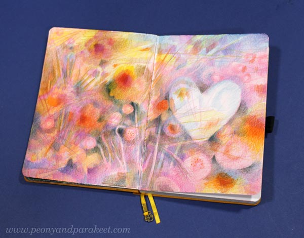
This little frozen heart is like a rare unicorn – reflecting the surroundings, introvertedly, like we all do when we are creating.
I find this kind of pondering an important part of art-making. That’s why I always try to end with a message even if viewers can freely find their explanations as well.
Fun Botanicum – Sign up Now!
From March 15 to May 15, 2022, I run an online class for us who are inspired by nature and fantasy and love plants. The class is called Fun Botanicum and we will draw fantasy plants by scribbling, doodling, and layering with colored pencils. Join us!
The early-bird sale ends soon! Early-bird price: 59 EUR, now 49 EUR. >> Sign Up Now!
The sale ends on Feb 20, 2022, at midnight PST.
Wild Botanical Art – Create with Colored Pencils and Watercolors
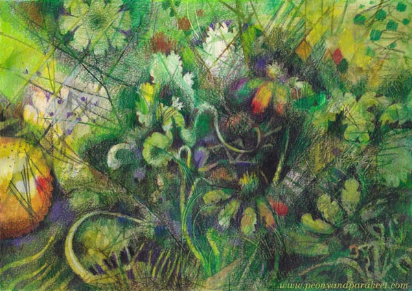
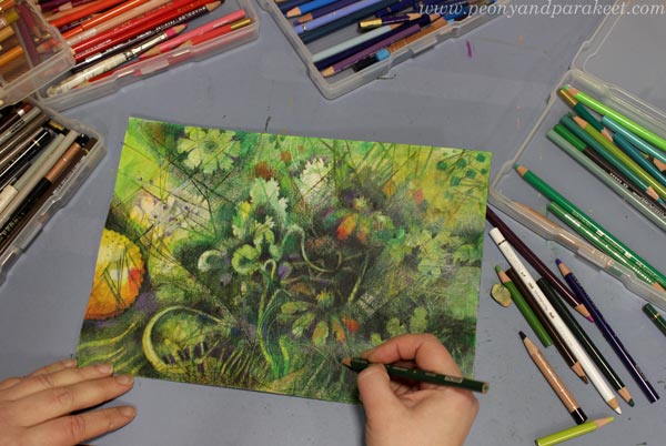
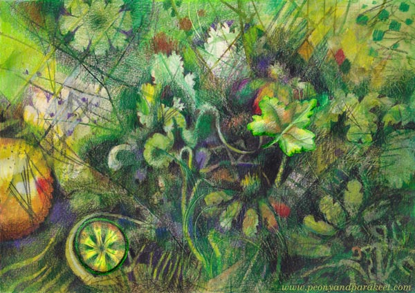
This week, I created wild botanical art. I drew plants with delicate details like in botanical illustrations, but with a few differences. My plants are not any real species, and the jungle where they grow is more like my inner world at its best, not a real location on the planet.
Watercolors First!
Before putting colored pencils into work, I made some backgrounds with watercolors. I had very smooth watercolor paper – hot press quality. My friend Eeva Nikunen recommended Arches Hot Press paper that she has used for detailed graphite drawings. It’s a bit pricey but so smooth and lovely for colored pencils too. However, any smooth watercolor paper would work with this technique.
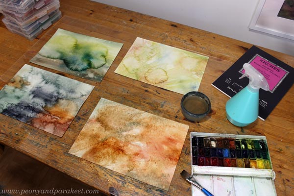
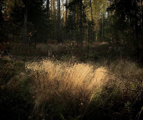
I used a lot of water for the first layer and made random splotches with a spraying bottle. This kind of wild watercolor painting is fun, but when I tried to pick one of the four experiments for colored pencils, I found the results uninspiring. So I asked myself what kinds of nature’s shapes or colors would I want to see more, and answered: “All kinds of hays inspire me a lot!”
Love for Sharp-Shaped Botanicals
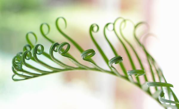
We have lots of house plants that have sharp leaves.
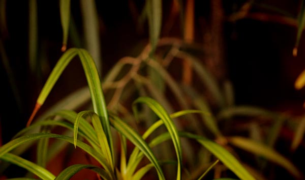
And when I walk in nature, I always look for hays and how light hits them.
So, then after some drying time, I made thin lines that went wildly here and there.
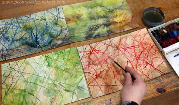
After the lines, I found the green one on the bottom left very inviting, so I chose that for coloring.
Coloring Freely and Wildly
Colored pencils work well on the watercolor background and smooth paper. It was enjoyable to color freely. I didn’t follow the shapes or lines painted in watercolor but created new layers.
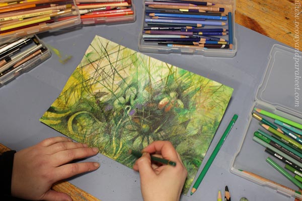
I have started to store my colored pencils in shallow plastic boxes grouped in color families. This way, every pencil gets seen, and the differences between tones are easy to identify.
Should Plant People Draw Plants?
My husband and I are plant people. Our home is filled with house plants and we have all kinds of plants in our garden. It has been quite a job to save the plants from our new puppy Saima!
Plants have also always been present in my paintings. But recently, I have thought that maybe I could focus more on them with colored pencils too. It often feels that I come home when I am inspired by plants and travel abroad when I am creating something else. I want to challenge myself out of my comfort zone, but if there’s a strong resonation, like a secret companionship, should I listen to it?
More Wild Botanical Art – Playing Mode On!
It was so much fun to work on this project that I wanted to do more. So, I colored these small scraps – a fruit and a leaf!
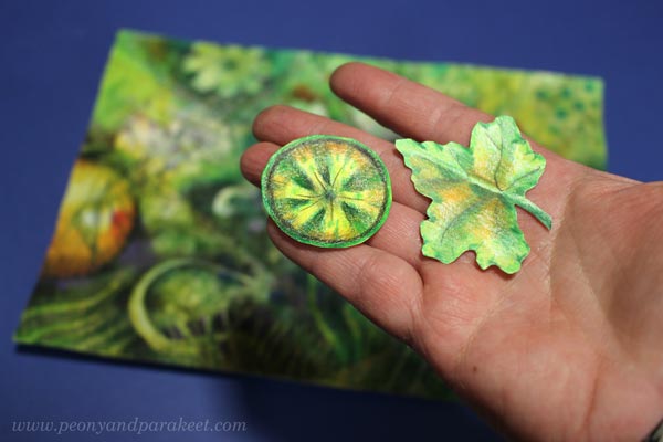
And then it was playing time. How wild can this go?
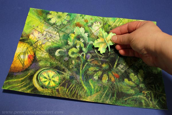
Create Wild Botanical Art – Five Tips!
- Start by creating a wilderness that calls you.
- Color layers of random shapes and lines. When you see something that could be a plant, turn it into one!
- Don’t worry about identifying the plants – treat them as rarities that only you can find!
- Make detailed a little more detailed – botanical art goes crazy with details!
- Revamp – Add some plants from your box of joy!
- Bonus tip: Nature is full of curves, so make sure you also have some.
Botanical Art by Ernst Haeckel
Many years ago, a blog reader mentioned Ernst Haeckel’s botanical art. Since then, I have admired his work. Here’s a part of his illustration from 1904. Lots of greens spiced with warm colors and so many details!
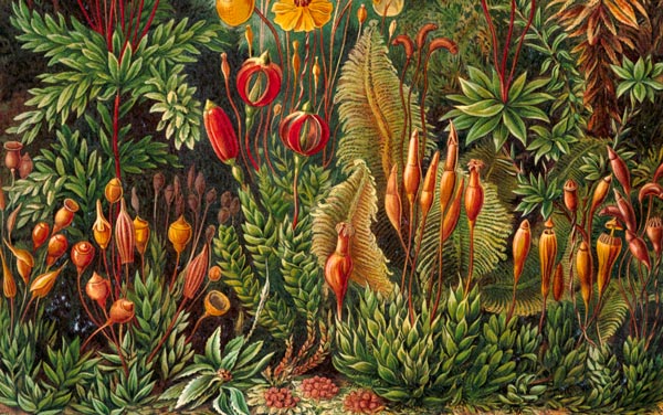
Mine is not nearly as sharp and detailed as Haeckel’s, but I approve it anyway. Plants have different personalities, and so do their interpretations!
Tell me, do you like drawing plants? What kinds of plants especially?