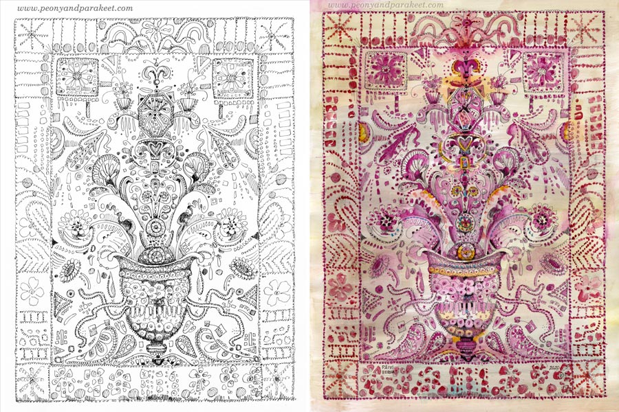
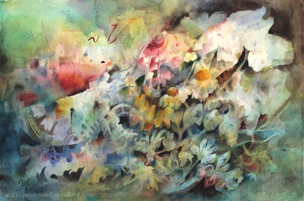
Doodler’s Sampler Step by Step
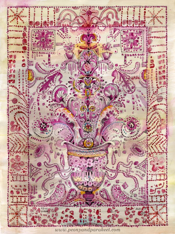
I have always loved antique embroidery, and it inspires my art too. This week, I invite you to treat your pen as a needle and doodle the look of the precious hand-stitched fabric. My drawing – I call this Doodler’s Sampler – is 9 by 12 inches but you can make a smaller or bigger piece with these instructions. The best paper for this is Bristol paper. It’s smooth and nice to color with watercolors.
Step 1 – Draw a Grid
Because we aim for ornamental stiffness, a grid helps to place the elements. Use a pencil so that you can erase the lines before coloring. Start by outlining a space for a frame. Then divide the rest of the paper so that they help to place the main elements.
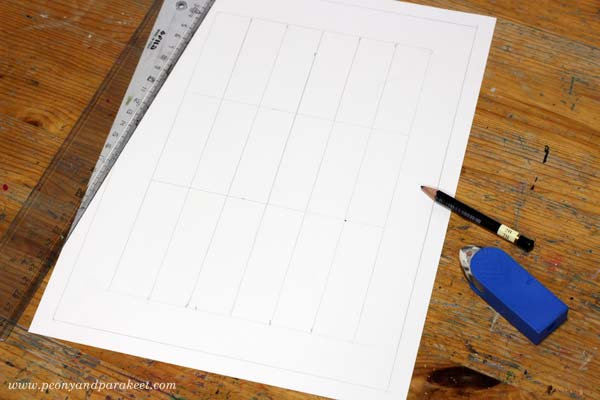
I wanted my Doodler’s Sampler to be symmetrical, so I drew a vertical centerline, and then divided the two halves into three parts. Another idea that I had was to have a vase of flowers. So I drew horizontal lines that mark each third, and the lowest third is reserved for the vase.
Step 2 – Sketch the Structure
Old samplers are filled with decorations but at the beginning, it’s enough to sketch the places for the biggest elements and their shapes.
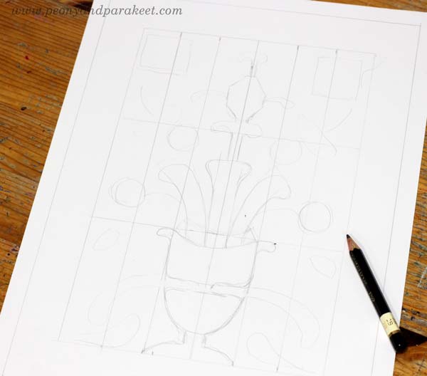
I wanted to have something rectangular on the top corners, the vase on the bottom, plant-like organic shapes coming out of the vase, and then an angular jewel-like thing on the top of the ornament.
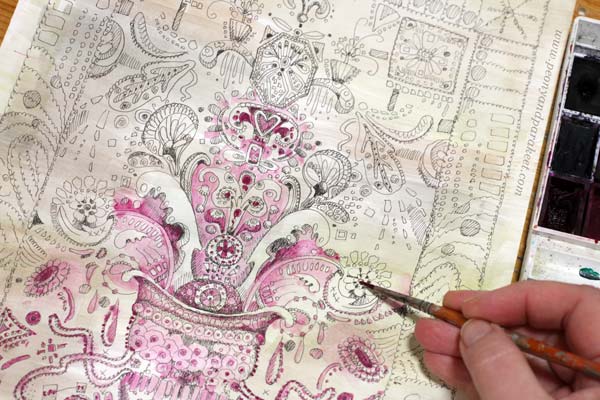
Step 3 – Doodle and Decorate
Pick a thin-tipped drawing pen, that has permanent ink, and start doodling! Make more shapes and fill them with circles, rectangles, flowers, hearts, anything you can think of!
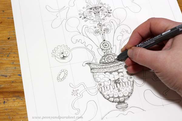
My pen is Copic Multiliner, tip size 0.05. I add shadows to my doodles so that they don’t just outline the shapes but there are darker parts too.
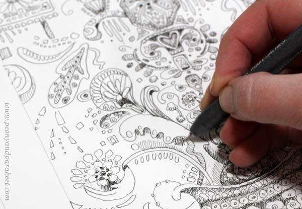
I make the decorative border simpler so that it doesn’t take the power away from the centerpiece. Trembling lines look more decorative than straight ones.
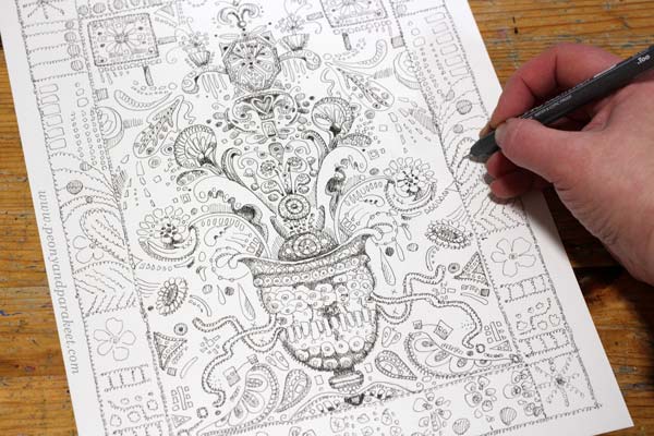
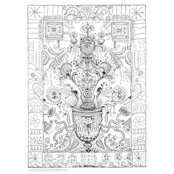
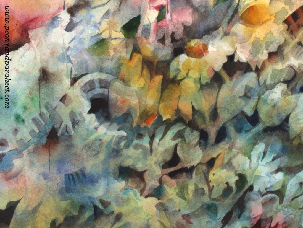
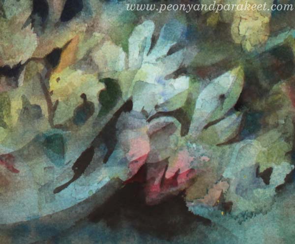
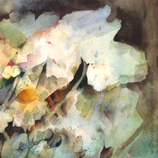
Here’s my Doodler’s Sampler after Step 3, ready for coloring.
Step 4 – Color the Background
You can use any supplies for coloring, but in my opinion, the softness of watercolors complements the sharp black lines best. Start the coloring by adding some color to the background.
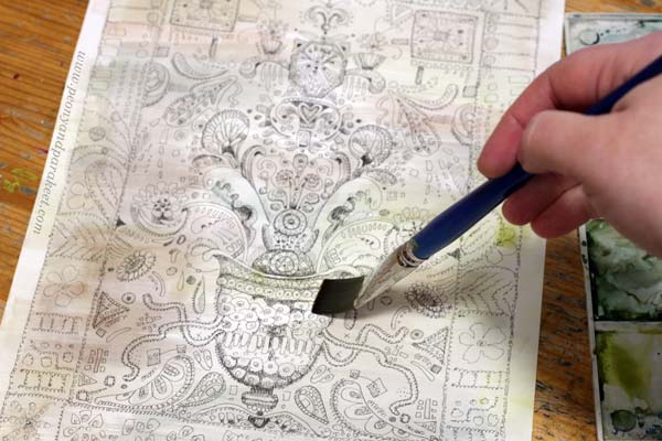
I use very little pigment and many tones so that the background looks like old antique linen.
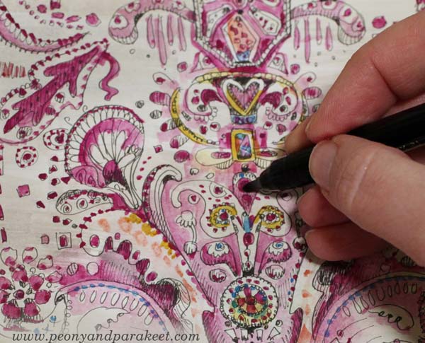
Step 5 – Color the Doodles
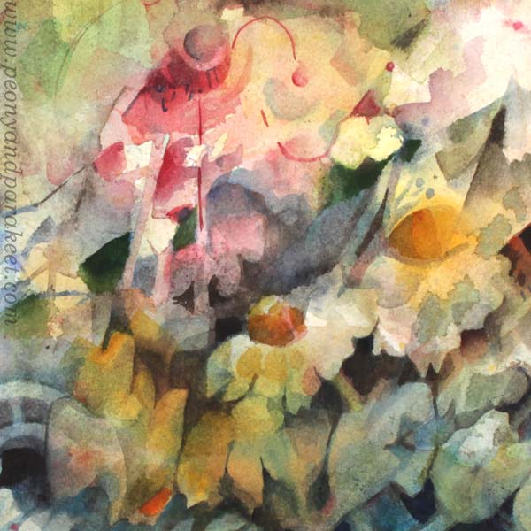
Pick one main color for the sampler. My choice is cool carmine red. When coloring, add more decorations like dots and other decorative shapes. You can also color around a shape instead of inside the shape.
Pick slightly different tones for the frame. I use warmer red and a little bit of orange.

When you have colored the sampler with a very narrow color scheme, make it more lively with some new tones.
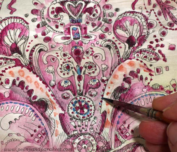
I added blue and yellow, but very sparingly.
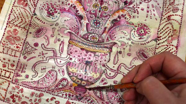
You can also highlight the main elements by making the darkest areas pitch black.
Here are the black and white version and the colored version side by side. Click the image to see it bigger!
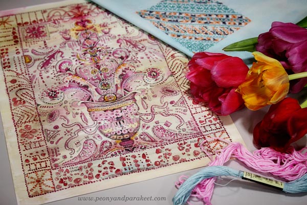
Doodler’s Sampler – For the Love of Flowers and Hand-Stitching
Henri Matisse has said: “I don’t paint things. I only paint the difference between things”. I think that to me, it goes like this: “I don’t paint things. I only paint the similarities between things.” So here’s for the love of flowers and hand-stitching!
Draw more with me – Check the courses Animal Inkdom and Magical Inkdom!
Happy Valentine’s Day!
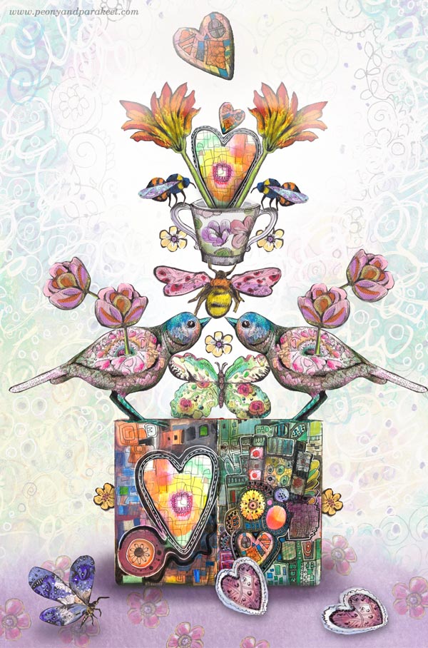
When like-minded hearts gather together, life feels wonderful.
What starts from a simple circle can grow wings,
and then support others.
Isn’t that what creating is all about?
Happy Valentine’s Day!
Start drawing your world of fantasy! – Subscribe to my weekly emails and get a free mini-course!
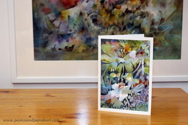
Expressive Watercolor Card – Free Video Tutorial

This week I have a video tutorial for you. We’ll paint an expressive watercolor card that connects several artistic approaches together.
Fine Art, Illustration, or Design?
Visual art is often divided into categories like fine art, illustration, and design. I am not a one-category artist, but interested in all of them. I need to do fine art to let go and feel free. Illustrating connects me with the outside world and other people. And I have started creating surface designs again because simplifying is a game that keeps fascinating me, and I love to develop products.
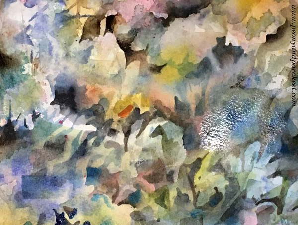
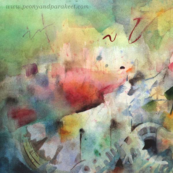
This week, let’s create a card – you could also say “a product.” It has a clear structure, so “a design,” but it can also be an illustration with a message. My card is about a house filled with plants, and I think I am illustrating my home. Visitors sometimes comment: “Wow, you have a lot of houseplants!” Almost every room in our house has plants, and their welfare constantly worries us, especially during winter when there’s less daylight.
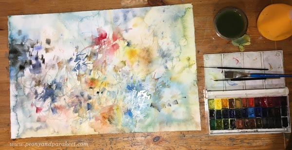
But this card is not an illustration at all when thinking about how it started. The way it’s created makes it fine art. I painted freely and didn’t have any pre-defined images or ideas for it. However, I had a method that can produce many kinds of images. So, the method gives practical guidelines for painting, but the result can be different each time.
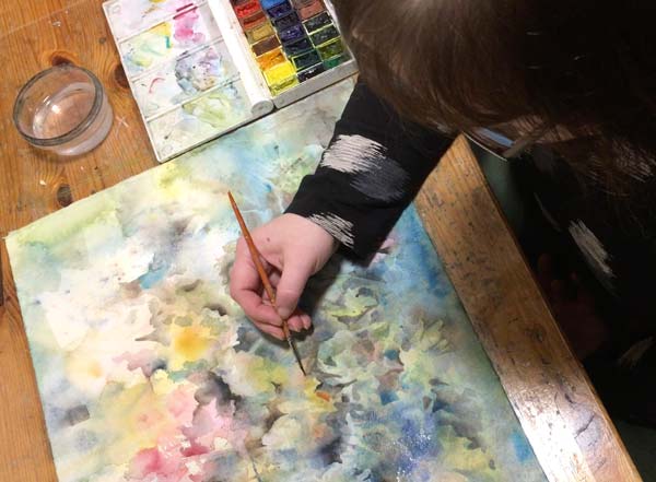
Expressive Watercolor Card – Paint With Me!
Watch the video and start painting!
In the video, I use the negative painting technique a lot. Even if you can use any technique that suits you, negative painting is the best technique when you want to make lines and shapes more elegant and the painting more finished. Dive deeper into this wonderful painting technique in the class Magical Forest.
Magical Forest – Dive Deeper into Expressive Watercolor Painting

Learn essential watercolor techniques like negative painting and layering, and express with light! In Magical Forest, we paint magical nature sceneries with flowers, trees, water, and fantasy.
Hop along! The class ends as late as at the end of April, and you will get the published lessons right after the registration. >> Sign up here!
5 Ways to Love Yourself When Painting

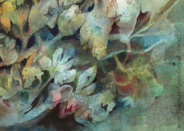
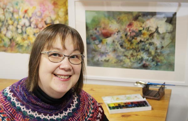
Here’s my recent watercolor painting. It’s called Icebreaker, and can I publicly say that I love it? Love, love, love. So this week, I daringly blog about how to selfishly love yourself when painting.
This is not my typical post. I would normally post things like “11 Ways to Make Your Painting More Abstract” or “7 Reasons Why Negative Painting is the Best Technique” or “3 Tips for Getting Closer to Your Style”. But after painting Icebreaker, I kind of melted. It became more true to me than ever before that we paint because we want this special kind of acceptance – the acceptance from ourselves.
When I whole-heartedly accepted what I had created, I didn’t just receive love from myself. I saw a long row of people congratulating me. All deceased, unfortunately, but still! There was my mother, saying that she knew I could do it. There was my father, looking away so that he could hide his smile. I saw my grandfather, a creative person I never met, congratulating me generously. And my dear aunt Rauha (which means Peace in English) was waving, looking just as lively and restlessly happy as she used to be. Now, this kind of love is what I want more and also spread more!
So this post is about turning your inner critic to your best fan. It’s not easy, and it may take like a lifetime, but it’s worth trying, so let’s begin!
1) Love Rises from the Mess
As a former engineer, I feel drawn to two-state things. Zero or one, yes or no, black or white, thick or thin, geometric or organic, the list is endless. But when painting, I like to be in the grey area, especially in the beginning. After the horrifying view of blank paper, my watercolors are sighing with relief: “She sprays and splashes so she must be having a good time.” And yes, I usually am.
But this mess is not just any mess to me. It’s a sign of hope. I hope to figure out what to do with it …
Let’s love this hopefulness in us! It’s a superpower that keeps us not only dreaming but creating too.
Yes, this superpower can look like a bad thing. It can keep us awake too late at night. It can make us buy too many brushes and focus on insignificant details like wallpaper when watching a movie. But our life is never boring or lonely when we get hopeful just by making a mess.
So, make a mess, accept the mess, fall in love with the mess! The more time you spend with the mess, the more likely you will figure it out.
2) Love What Is Secondary
Ideally, I would always know what to do next. Practically, I often have moments when I have no clue. Hope seems lost. I feel fake.
The best cure that I have found is to seek secondary things. They can be tiny spots or pretty accidental shapes, or sometimes I only admire how wet paint glows. It’s like filtering out 95 percent of the mess and seeing a few single things that look fascinating. Lovable.
I call these elements secondary because often they are just parts of the background. But by toning down the obvious and bringing up the less apparent, I can change the direction of the painting. What anyone can see is no longer my norm. I have moved on to what only I can see.
There’s so much more in us than what other people can see. Some skills and characteristics may seem secondary to others, but every one of us is allowed to love and grow them whole-heartedly.
The hierarchy of the outer world doesn’t exist when you are in your inner world. You are free to appreciate discoveries that look secondary to others.
3) No Words, Just Color
It’s not easy to write about love. Love feels more like a combination of changing colors than a sentence with specific words. So when painting, let’s feel the love through color. When dipping your brush first to the paint and then to paper, exhale color. Next, put your face close to the paper and look at the spot so that it fills your view. Inhale. It’s your color. No one can take it from you. Love, love, love.
4) Love the Vagueness
Yes, we want to find our style, our visual voice, our true self. But our boat is moving. We are changing, our life is changing, the world is changing. Everything is unsure and insecure. That also makes everything possible.
I like to build my paintings so that I leave this vagueness/possibility alive. Maybe there’s a flower, maybe not. Someone sees some triangles only, while others see a rosebud. There can be plenty of interpretations. I am vague, and everything is all right. My painting is a living organism, partly defined by the vague me, partly by the vague you.
Today we might love the current painting less than tomorrow. And our art may tell a different story after a couple of years. That’s ok.
No, that’s not ok. That’s fabulous!
5) Break It!
I admire brave people. I adore Tracy Chapman singing without a band. Her voice is not faultless, and many of her stories are not relatable to me. But I feel her honesty being present right there when I am listening to her through the headphones.
But for me, it’s often the fear that’s speaking. I hear myself shouting, “NO!” and that’s when I know that the answer should be “YES.” I know I am not alone here. We are often afraid to touch the painting even if we know it lacks something. The risk is real, but worth taking.
In this painting, it would have been so much easier not to paint that dark brown around the white area. But the ice wouldn’t start breaking otherwise.
Let’s love this creativity that wants to break what’s almost working. Let’s cherish this wild force that we have in us.
Let’s love who we are when we paint, and when we are surrounded by our paintings!
Icebreaker and other watercolor paintings are for sale at paivieerola.com
I currently teach an online watercolor class Magical Forest with themes hope, spirituality, flow, and curiosity. You can still hop along! The class ends at the end of April, so there’s lots of time to catch up! >> Sign up here!