
From Intuitive to Intentional Painting
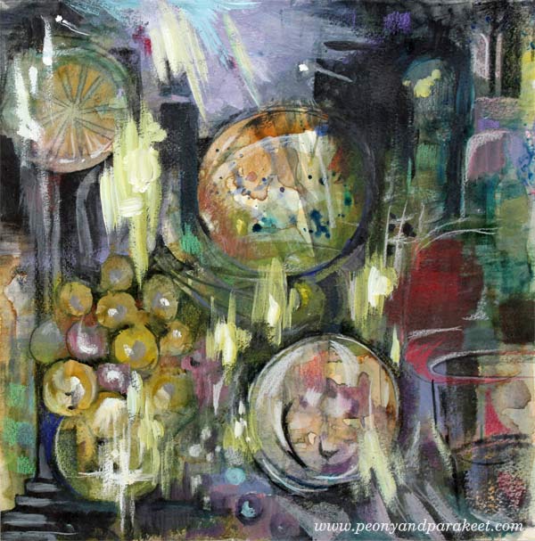
This is my latest mixed media painting called “The Phantom of the Opera.” Just saw the musical in The Finnish National Opera! I don’t know about you, but when I go to see a performance like that, I know that it will appear in my art one way or another. With this blog post, I want to challenge you to think what is intuitive and what is intentional in art. And – can they be combined?
Day 1 – Watercolors
It was a sunny winter day when I started the painting. A friend from the UK was visiting me, and we were chatting while I painted the first layers. With watercolors, like many times before.

I love how well watercolors support intuitive painting. You can just splash here and there and then get inspired by the result. In this phase, I tend to choose the colors quickly, based on what feels good. I would call this phase very intuitive also because I don’t usually have no idea about how the result would look.

After splashing watercolors on the paper, I tried to get something a bit more intentional out of it: distinct shapes, strokes and color areas.

The painting looked like it could be a still life with wine grapes and some fruits. But I did not have more time to continue with the painting, so I saved it in my album. I love to create 12 by 12 paintings as they fit on a regular scrapbooking album. I also love the square shape as it is easy to change the orientation of the picture in the middle of the process.
Day 2 – Acrylic Paints
About a week later I picked out the painting again. This time, I wanted to add some acrylic paint to it. I find the combination of transparent watercolor and non-transparent acrylic paint very attractive. When touching the acrylic paint tubes, I get ideas about color mixes that would work with the watercolor background. I would call this pretty intuitive step too.

As I am a very detail-oriented person when painting, I try to be bold when painting with acrylics. Broad strokes add more interest to detailed paintings.
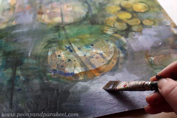
In the end, the painting still looked like a still life, but I wasn’t quite confident about the orientation of the painting.

Here you can see the difference between the end of day 1 (watercolors) and the end of day 2 (acrylics).
Day 3 – Colored Pencils
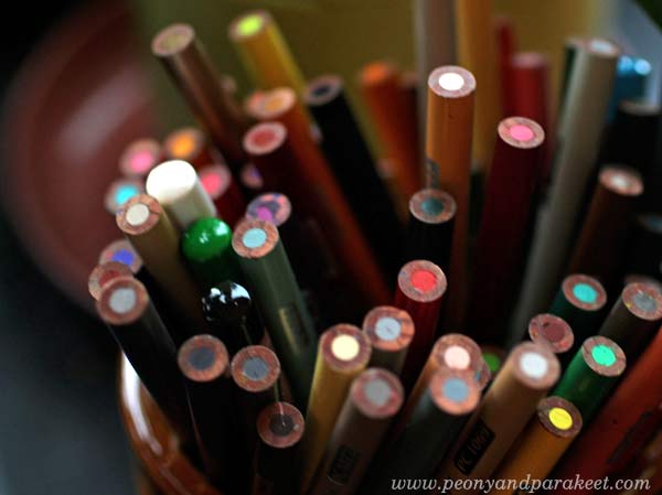
Because I love details, I also love to use colored pencils. With colored pencils, it’s easy to add little nuances here and there, and I also like the look of pencil strokes on the painting.
Day 3 was a day after day 2, but it was still before I had seen the musical. When I work with colored pencils, I am often very intentional. First, I had an idea to create wine glasses of the two round elements, but then I changed the orientation of the painting and saw lamps in the ceiling!

Which one do you like the best: the wine glasses or the lamps?
Day 4 – Acrylic Paints + Colored Pencils
Day 4 was after the musical. I got an idea from one of the scenes. The painting continued with acrylics expressing the famous chandelier crash!

So far I had been pretty intentional but then changed to intuitive. I played the music and tried to get into it as much as I could. I used both acrylic paints and colored pencils.
Here’s the result again:

Intuitive Painting – Guess What!
The story doesn’t end here! While photographing the finished painting, I glanced at my feet and saw the same color scheme in my socks! I had just finished them before Day 1 and worn them ever since. So, this painting actually started when I was picked the yarn from my stash for the socks. No, wait – it began when I bought the wool that I spun to the yarn …!

Combining intuitive with intentional is a lot of fun! It’s the best cure for getting rid of stiffness in the result. The intuitive parts allow you to feel free when painting; the intentional parts bring more clarity to the painting.
Get a Free Mini-Course: Subscribe to my weekly emails!
What Acrylic Colors to Buy?
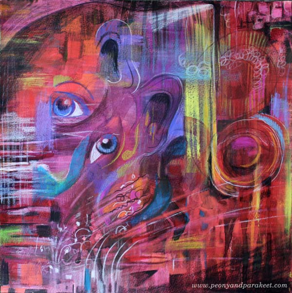
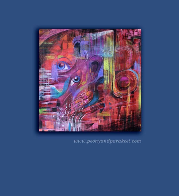
This is a very practical blog post but let’s start it with my recent artwork, called “Tosca.” It is inspired by Giacomo Puccini’s opera. I went to see the opera last week and it was an experience that I wanted to communicate visually. The drama has always appealed to me and the contrast between the most beautiful sounds and the big emotions, often agony, was unforgettable.
Before the evening at the opera, I had just realized that I need to buy some more acrylic paints. I had run out of almost all the basic colors. I love Golden Heady Body Artist Acrylics, so I went to a local art supply store to get some. I know there are lists of what colors you should buy when buying the basics, but as my selection is a bit different, I thought I might not only share it but also give some general guidelines of what acrylic colors to buy. These can be applied to colored pencils and watercolors as well.
Guidelines that I Follow when Choosing Acrylic Colors
1) Always buy basic white and black. They give contrasts and are great for color mixes.
2) Never underestimate the number of yellows you need. I use yellows for everything. I love the color itself, and use it a lot for color mixes as well. I often make a mistake of adding too much another color with yellow and then I need to add some more yellow to get the right tone. So I need a lot of yellows!
3) Warm and cold tones of each primary color are usually enough. I don’t buy browns and greens unless I find a specific tone that I fall in love with.
4) Always include some personal favorites. When I open the box where I store the tubes, I want to become happy. Cerulean blue reminds me of the time when I painted icons. I think of the sky when I see it and it makes me feel creative and happy. Whatever the current color trends are, cerulean blue always feels great. When I buy colors, I think about creating as an experience and don’t just focus on what is generally recommended.
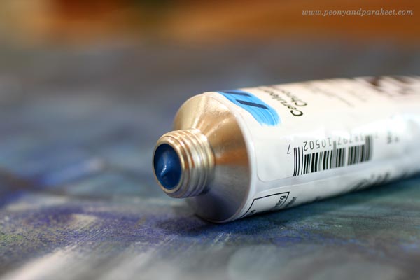
My Basic Collection of Acrylic Paint Colors
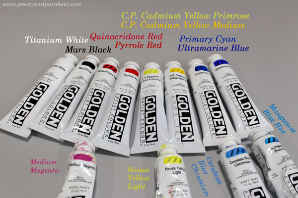
Basic Colors:
1) Titanium White – because it’s basic white
2) Mars Black – because it’s basic black
3) Quinacridone Red – because it is great for mixing pinks and purples
4) Pyrrole Red– because it’s fiery and pure warm red
5) C.P. Cadmium Yellow Primrose – because it’s ideal to get beautiful greens but it is still a strong pigment, not a mix
6) C.P. Cadmium Yellow Medium – because it’s the most beautiful warm yellow I know
7) Primary Cyan – because it’s basic and more affordable than many other blues
8) Ultramarine Blue – because I have used to using it for decades
Extra Colors:
1) Medium Magenta – because I like pinks
2) Hansa Yellow Light – because it is an affordable extra yellow
3) Cerulean Blue Chromium – because it makes me happy
4) Manganese Blue Hue – because I like turquoises
I also have some special effect tubes, for example, gold and silver and some odds and ends. The more I paint, the more I rely on basic pigments and don’t like to spend money buying color mixes in tubes or jars.
A Red Day
Sometimes one color seems to be more appealing than the others. This happened to me last week; it was “red red red” that I thought all morning.
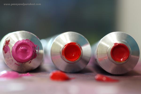
Even if I had the new tubes and all, I started with watercolors and 12-by-12 inch watercolor paper. Playing with water is so liberating!
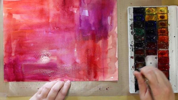
Then I changed watercolors to acrylic paints and turned the music on.
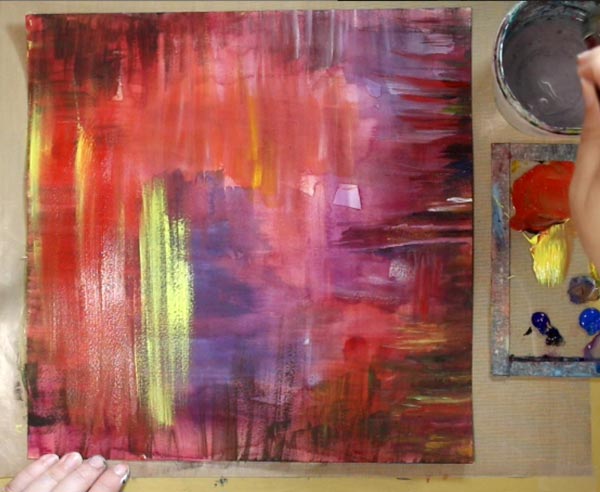
Puccini’s Tosca was playing in the background but as I had not visited the real performance yet. So I put this away to wait for the more detailed insight.
Colored Pencils Make the Details
A couple of days after seeing the opera, I was ready. I continued with colored pencils. They are wonderful art supplies. They are brilliant with watercolors, but they are ok with acrylics too of you create thin and even layers.
Subscribe to my weekly emails! Get a free mini-course Loosen Up!
Find a Focus for Your Art
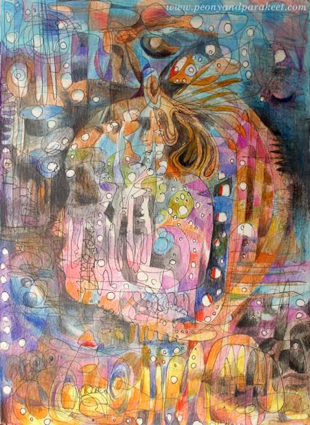
Here’s my latest art journal page with colored pencils. It is called “I Am Listening.”
Drawing Process
I knew that it would be a good moment to create art when I heard about a live broadcast of an opera La Traviata. To enhance the atmosphere, I adjusted lighting and closed sliding doors in the room where I was creating.

When I started drawing, I had no idea what the final result would represent.
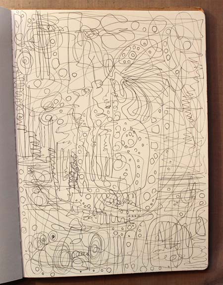
And even when I began coloring the page, I had no clue.
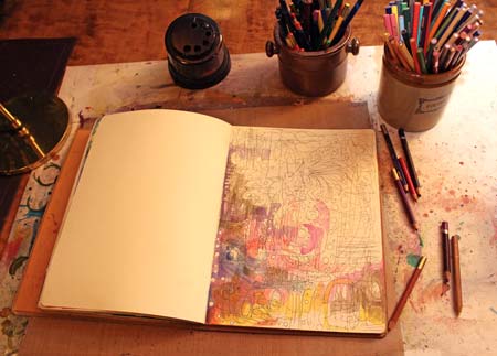
But once I had worked for a while, I saw the face appearing on the page. Soon I knew that the drawing would be about listening to music and how it activates the whole brain. I have experienced that personally, but Finnish researchers have proved it scientifically too.

Focus Sets You Free!
I used to hate people who repeated: focus, focus, focus! I questioned back: “Isn’t experimenting an essential part of creating art? Shouldn’t art set us free, instead of steering us to a narrow path?”
But after finding my focus, I realized that I had had misconceptions. The focus should not be a single subject like “birds” or “faces,” certain supplies like “acrylics” or certain style like “cubism”. The focus should not come from outside, but inside. It should answer the question: “When thinking of self-expression, where are you best at?” This kind of focus will lead you to see more possibilities. You will experiment more and you will broaden your perspective.
I did not mistakenly listen to dramatic music in the suitable surroundings. I used it as a tool to bring out where I am best at – visualizing experiences, systems, and transformations. That’s my focus. Whatever I doodle, I can feel free as I do not have to worry about what will appear. My focus will feed my subconscious and my imagination.
For some of my students, the focus has been “feelings in relationships”. For some, it has been “fairy tales” or “mysteries.” Some have been skillful in seeing “the beauty of everyday life,” others thrive on “atmospheres of dimensional spaces.”

Subscribe to my weekly emails – Get a free mini-course!
Overcoming Predujices: Small Change, Big Results
Sometimes it seems that big life-changing thoughts do not happen. But when looking back, there can be little things that we have almost forgotten. That moment, when you did something differently, opened the door that you normally would not open – that can be the trigger for new kind of inspiration. Here’s my story about a small unselfish act that has given me a lot of artistic inspiration, and made me overcome some prejudices.
You can also read this story in a written form at Medium.com!
Subscribe to my weekly emails – Get a free mini-course!