
Art Inspiration from Flowering Trees
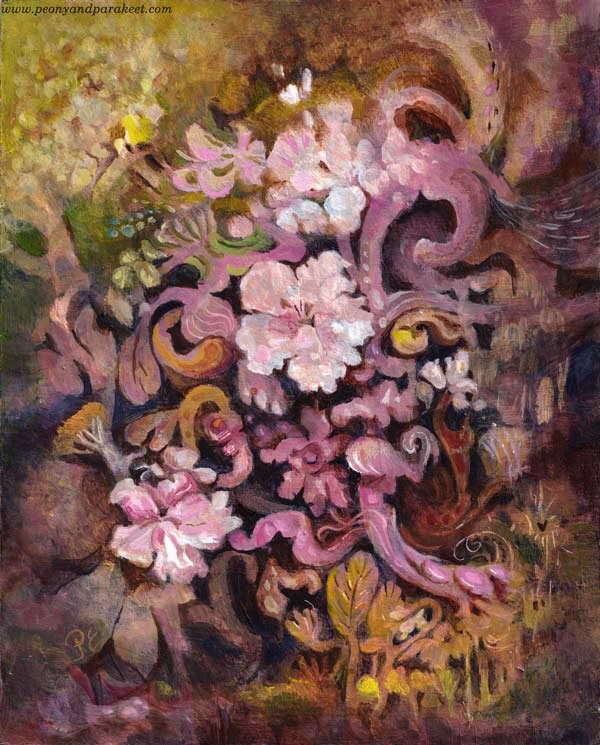
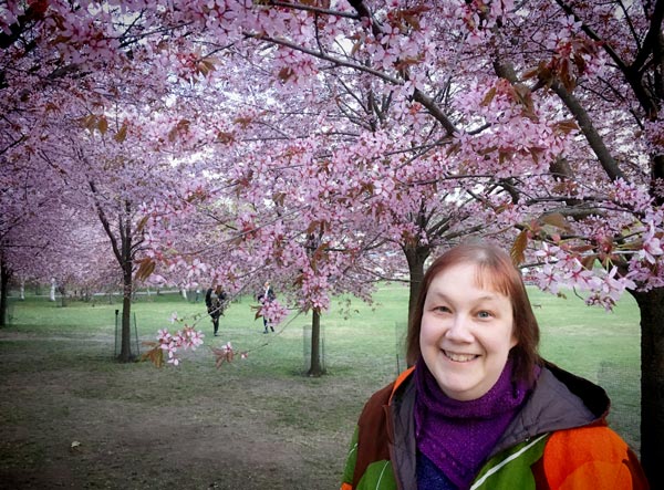
Here’s my latest painting, “Dulciana.” It’s inspired by flowering trees and their power to bloom year after year. This spring was special because I got to see blossoming cherry trees in a park that was filled with them.
Embracing the Decorative Side of Art
This spring has also been different concerning my artistic endeavors. I have been building a new class, but a little slowlier than what I usually do. I have been really intentional about what I include in the class and how the class is structured. It’s has felt like it’s my life’s work even if it’s still a very light-hearted and fun class.

The class is called Decodashery, and it dives deep into the decorative side of art. The projects that I have made for the class have given me new skills and ideas about including decorative elements in my intuitive paintings too.
Light Paints the Flowering Trees
Now when summer has come to Finland, I have also spent more time in the garden. I wouldn’t really have to because my husband is crazy about gardening. He has found his passion, and I am so happy for him.
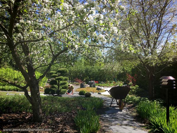
But when I look out of the window, and the sun is shining, I can’t help going there, walking and weeding, taking photos, and admiring how light paints the view.
And when I start a painting, I can’t help thinking about light, and how essential it is for the magical atmosphere.
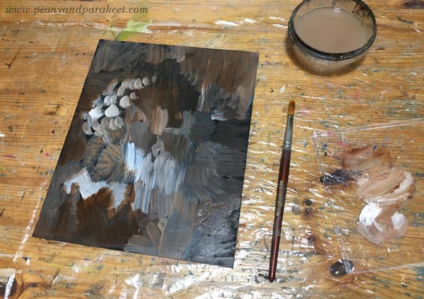
So most times, when I paint freely, I start with random strokes expressing light and shadows.
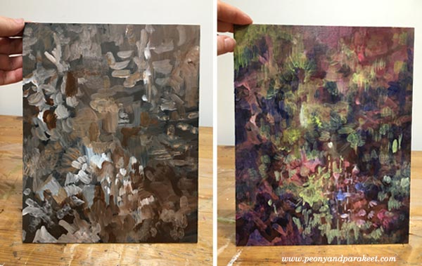
Art, Cembalos, and Flowering Trees
To make the painting shine softly, I like to add washes whether I paint with acrylics, watercolors, or oils. Washes have just a small amount of pigment and plenty of painting medium. For washes, I use water in watercolors, water and glazing gloss in acrylic paints, and the mixture of dammar varnish, french turpentine, and linseed oil in oils. This one is an acrylic painting.
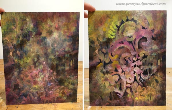
When I paint without any assignment, I usually do it late at night. I listen to cembalo music when I start digging out the elements from the mess. Cembalos sound like the light I want to capture in my paintings. The sound is pompous and full of energy, and still, there’s something so delicate and vulnerable that it almost shatters.
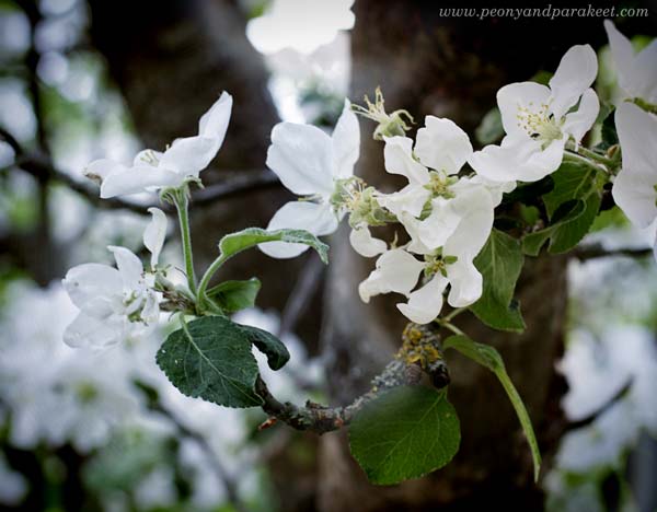
The vulnerability is also in the flowering trees. They seem sturdy and unapologetic, but they know how bypassing the blossoming is. It looks like they miss the flowers already, and the dark trunks feel heavy and burdened by the upcoming work of making fruits of them.
I try not to make one painting at one go but take several sessions. Like trees, the painting also has seasons. It needs time to grow, and time to rest.
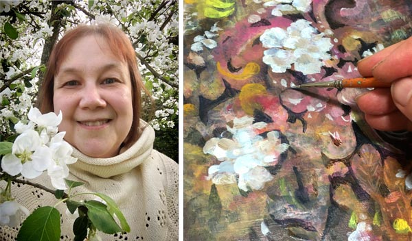
Often it feels that when I am not painting, the painting progresses best. Ideas come when I get out of the studio and talk to the trees.
Endless Flow of Swirls and Ruffles
After making the projects for the new class, Decodashery, I have enjoyed painting decorative shapes than ever before. I especially like swirls and ruffles.
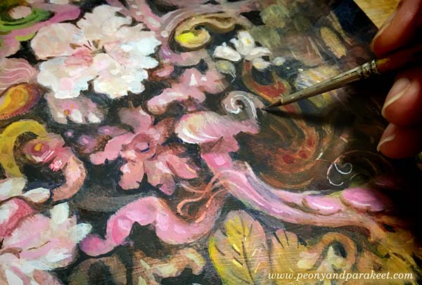
Similarly than old cembalo music sounds like a melody that never ends, all kinds of little curves can make even a small painting feel like it’s a world of its own. The eye travels from one place to another so that there seems always to be something to discover.
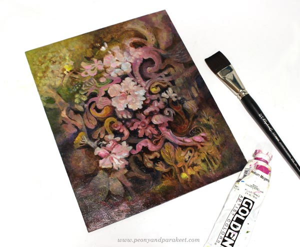
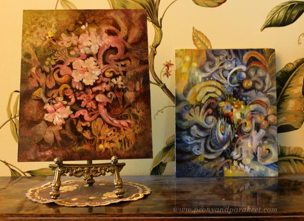
Here’s “Dulciana” with the last week’s painting “Ceruleana.”
Decodashery – Registration Will Open Next Week!
The registration for the new class Decodashery will open next week, and the class begins on June 29.
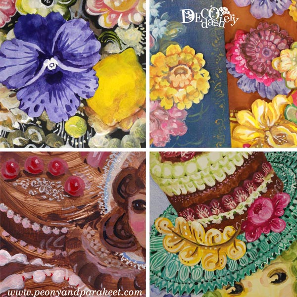
In Decodashery, we will create a beautiful and comforting world that has some jazz too. We will enjoy painting flowers, lace, cakes, dollies, and break the border between vintage and modern art. When building it, I have been inspired by Jane Austen movies, old jazz clubs, Russian handpainted floral plates, and skillful crocheters and cake makers around the world. I hope you will join us! Until next week!
Abracadabra – Magical Watercolor Effects

My latest painting called “Abracadabra” is a big one, 56 x 38 cm or 28 x 15 inches. It was a lot of fun to create so I want to dedicate this post to the magical effects that water creates when painting with watercolors.
Magical Mess
Right from the beginning, this painting had a mind of its own. And as you can see from the photo, I also used a lot of water to make the process even more uncontrollable. The more I paint this way, the more boring all the other mediums feel. Watercolors are magical companions, introvert when in pans but extrovert on paper!
Tip: Start with a plenty of water!
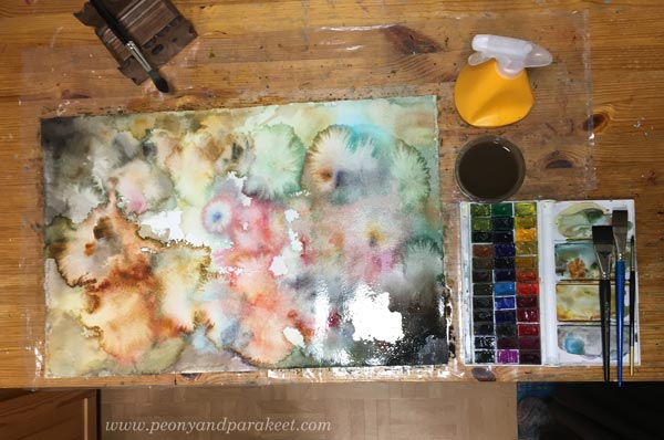
In this project, I was testing Arches Cold Press watercolor paper, new to me. It has a weird smell when it’s wet but other than that I quite like it!
Fun Appearances
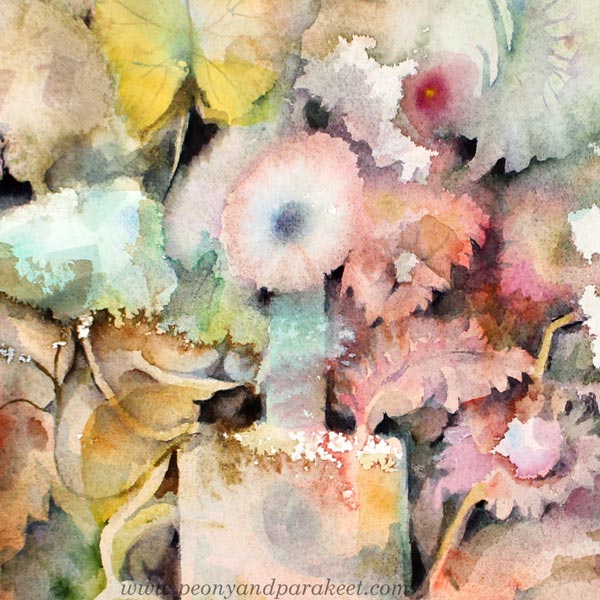
When I add some sharpness and control, I try to do that gently so that I don’t put too much burden on flowers that have born naturally. The idea is to bring out the best details.
Tip: Add dark shapes to bring out the magical watercolor effects!
Fascinating Translucency
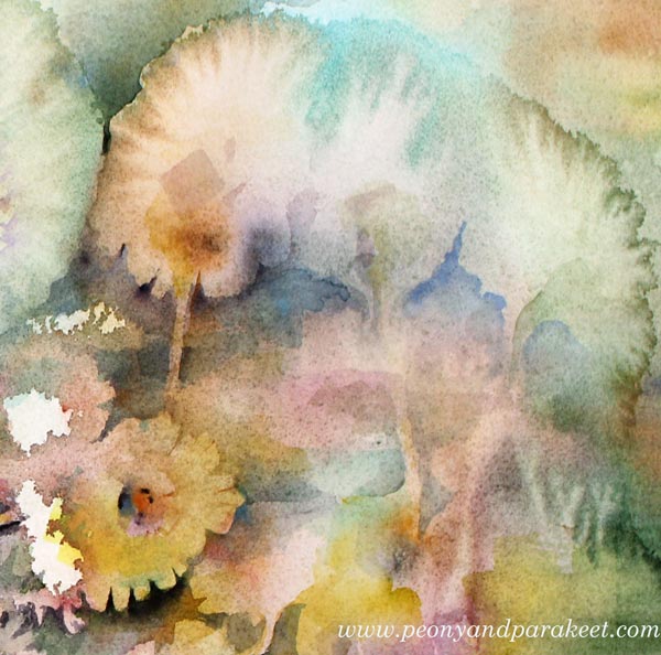
When painting with a lot of water, watercolor becomes magically transparent. I love how the colors get mixed when they are layered.
Tip: Let each layer dry properly!
Watercolors Can Draw!
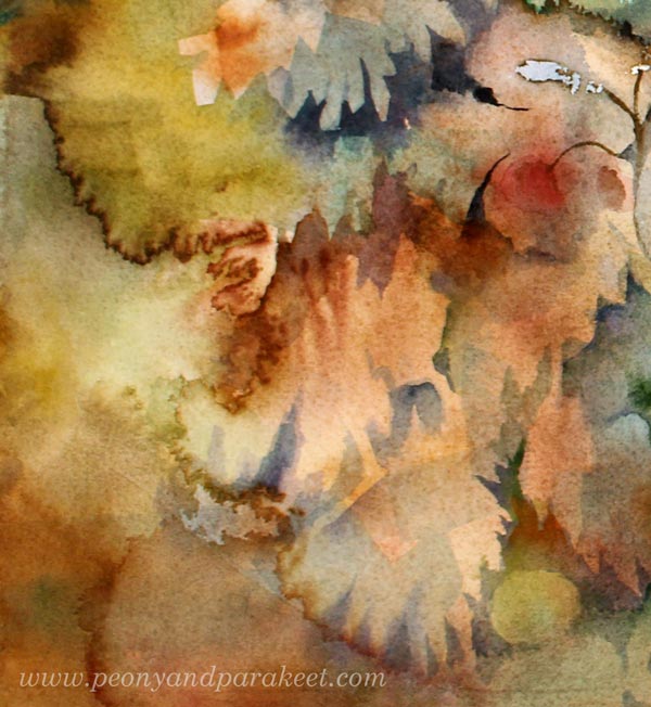
I also like to think that watercolors can draw. When applying water, watercolor blooms with sharp frilly edges. These lines can be more than just lovely outlines. In the detail below, I used one to make a stem!
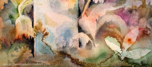
Tip: Use your imagination to make the most of what you have on paper!
Flow and Melody in the Safe Haven
I have had mixed emotions this spring. I have lost some old birds and my oldest dog has been sick. It’s been something that I have found difficult to share, it’s still so recent. But in the middle of all the worries, my studio has become a safe haven where I have been painting in the late evenings. The colors of the 16th-18th centuries and the pop songs of the 1980s have inspired me. Do you still remember Abracadabra by Steve Miller Band? A very superficial hit song but it has such a flow in the melody that it goes well with magical watercolor!
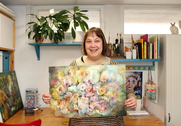
Come to draw and paint flowers with me – Sign up for Floral Fantasies in 3 Styles!
3 Weird but Working Tricks for Portraits
Here’s the replay of yesterday’s free webinar “3 Weird but Working Tricks for Portraits”. There was a slight delay with some pictures, but I have edited the recording so that it won’t show there. I hope you will enjoy these ideas and mindsets!
Drawing Faces – Refresh the Way You Make Portraits!
In my new upcoming class Innovative Portraits, we will discover new paths to painting and drawing portraits. We will gather ideas, make sketches to process them and find solutions to the problems that have caused frustrations. This class also includes a 3-month membership in my art community Bloom and Fly so you will also get monthly live sessions and weekly feedback Tuesdays.
Innovative Portraits – Reserve Your Spot Now!
The early-bird price is available when you sign up before Sept 16, midnight PDT.
>> Sign up NOW!
Intuitive Painting with a Reference Image
Intuitive painting with a reference image – can it be possible? Let me show you how!
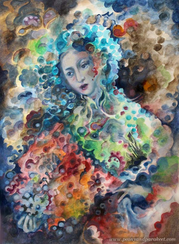
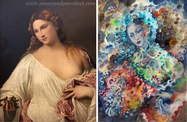
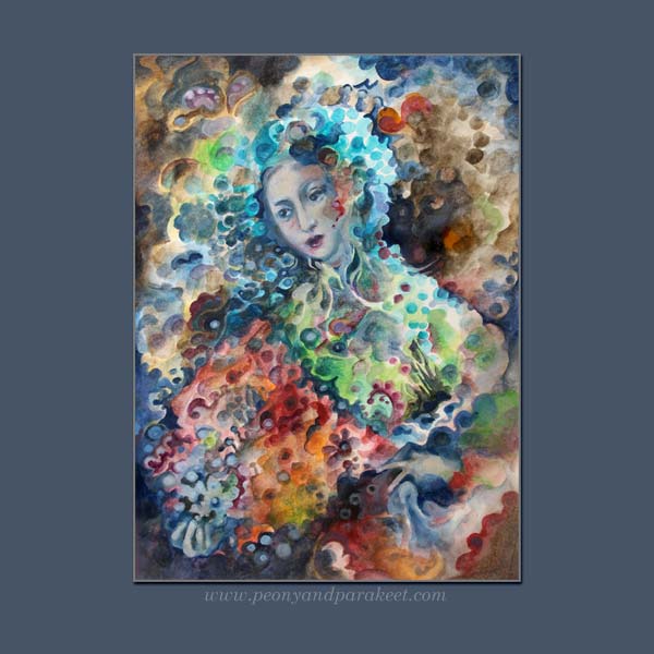
Here’s a painting from my sketchbook. It’s called “Madama Butterfly.” My reference image was this Renaissance painting called “Flora” by Tiziano Vecellio, 1515-1520. I took the photo last summer when visiting Uffizi Gallery, Florence, Italy.
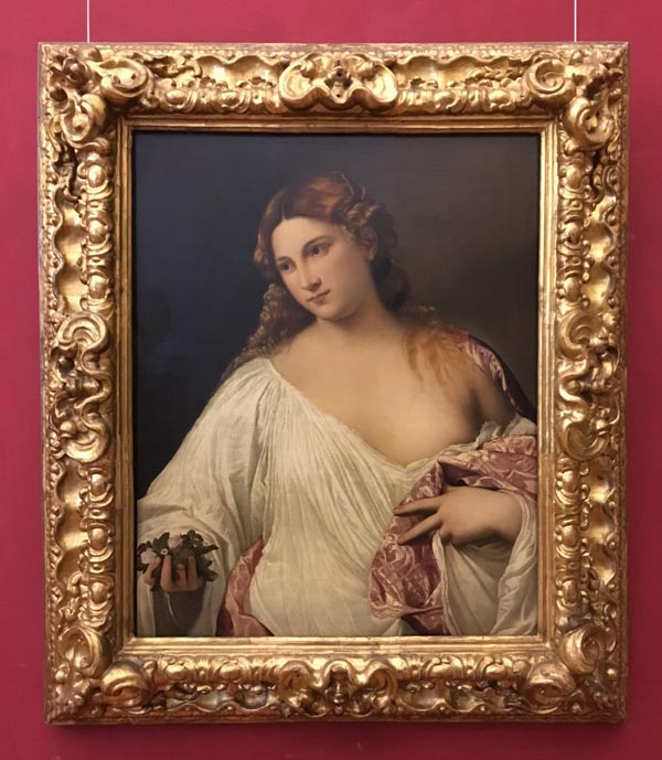
There are very little similarities in these two pieces. The pose is fairly similar, the composition and the facial features have some similarities, but that’s it. The style, the theme, and the technique are all different.
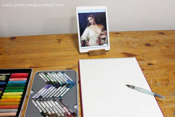
The Supplies And the Setting
I like to do fairly quick paintings on my big A3-sized sketchbook. For this sketchbook, I often use Derwent Artbars, a water brush, and Faber-Castell Gelatos because they are easy to layer and I am more relaxed than when working with tube paints. I use acrylic or oil paints for canvas paintings, and working with them is more serious. This time I wanted to demonstrate a concept or a method rather than creating a 30-hour painting.
1) From Intentional to Intuitive Painting
The first idea was to pick the pose and the composition loosely from the reference image and then add geometric shapes to fill the space.
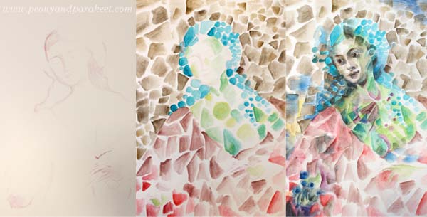
After sketching the foundation of the figure, the triangles, rectangles, and circles were fun to paint without looking at the reference at all. I painted the face roughly, and then I used the reference image as a guide. But because at this early stage, I didn’t know what I want to express and what kind of person the figure could be, I didn’t bother to spend time perfecting the facial features. At this point, my painting resembles cubistic pieces from the early 20th century.
2) Changing the Style
When creating art for the sketchbook, I like my style to be a bit more illustrational than when I make bigger paintings. Even if I love cubism, I wanted my piece to be a bit more current.
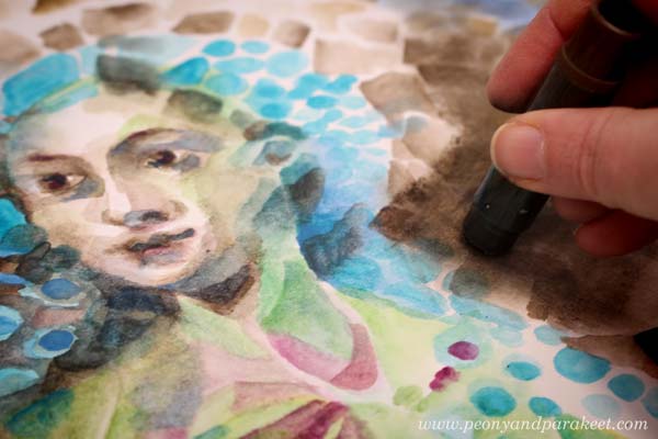
Nowadays, illustrations often use geometric shapes but rather than triangles or rectangles, the shapes are often round, and scallop edges seem to be a bit hit. So I started changing the painting by altering the shapes. This routine work gave me plenty of time to connect with my inner world and work intuitively from one association to another. I tend to be both nostalgic and romantic, so I thought how portrait painters often spend time with the clothing even if they are just a shell. Why not use it as a canvas for the memories, the ideas, and the achievements of the person?
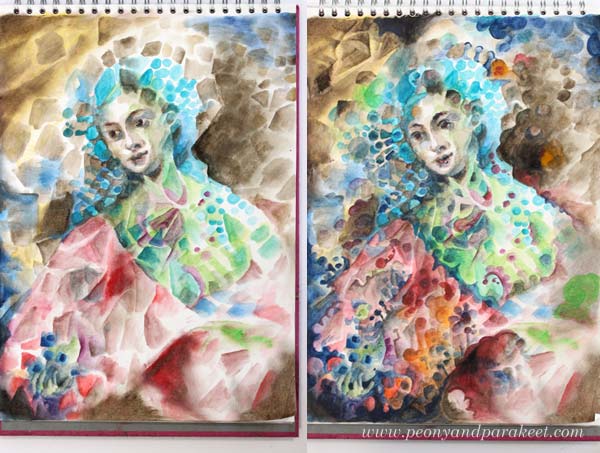
3) From Intuitive to Intentional
After rounding hundreds of triangles and rectangles, I realized that I was painting Madama Butterfly, the opera that I just saw last Saturday! I finished the face after this realization and adjusted other elements so that they fit with the theme.
More Intuitive Inspiration from Opera
This is not the first time I have been intuitively inspired by opera!
>> Tosca
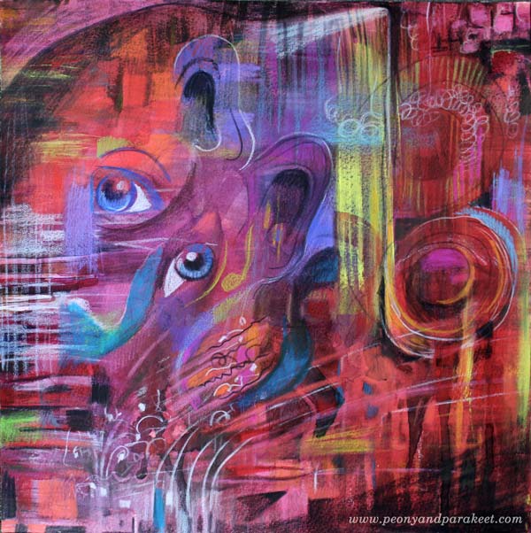
>> La Traviata
And there’s also a video about
>> Kaija Saariaho’s Emilie
More About Simple Shapes
>> What to create from simple shapes – 6 ideas
Self-study classes:
>> Planet Color – release your mind by focusing on color!
>> Modern Mid-Century – put a modern twist to simple shapes!
Let me be your mentor in creating: Subscribe to my weekly emails!