Drawing Swirls with Colored Pencils
This week, let’s make a summery drawing by coloring ornamental swirls!
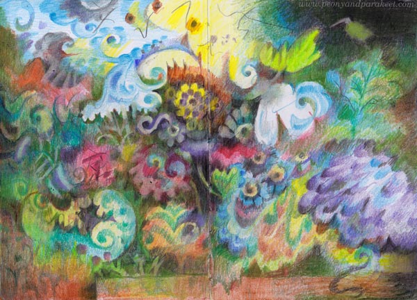
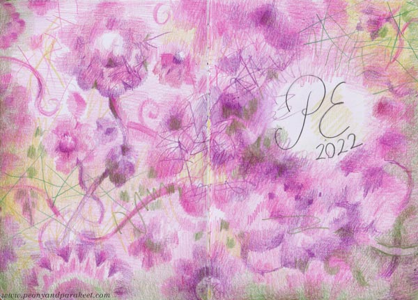
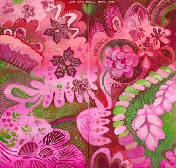
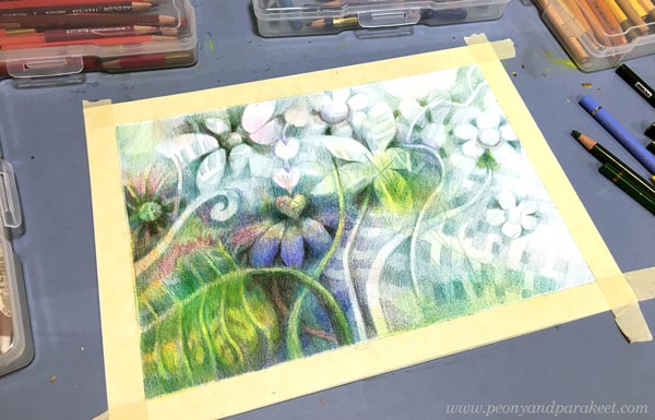
Here’s the latest spread in my colored pencil journal. I have been recovering from painting a big series of oil paintings, so I wanted to create something small and experiment with the idea that I got in mind while cleaning the studio for the next paintings. Because I like to create freely and intuitively, my colored pencil journal is not a direct sketchbook for paintings, but more like a study book of ideas – a place to ponder and practice at the same time. This time, I wanted to focus on ornamental swirls so that they flow freely on the page. The elements themselves have stiffness but the overall impression is dynamic when the ornaments are layered on top of each other.
Drawing Swirls is a Good Art Practice
Practicing swirls makes all your drawings more beautiful because it develops both the hand and the eye. Try to make a perfect curve that ends with a perfect little circle, then widen parts of the curves so that they grow broader gradually. Observe not only the swirl itself but also the shape that it creates besides it.
If you tend to place the swirls stiffly row by row, draw some free lines as guides for their placement. You can also turn the page in different directions and color ornaments that are directed differently from each other.
Shadows Can Be Swirls Too
I like to color many layers and make some swirls disappear into the background. When layering, you can make everything ornamental: the background, the shadows, and the actual elements.

There are lots of swirls in my drawing but I also included some simple scallop shapes and circles to make the visual language more diverse.
Darkening a Little More Than You Would Normally Dare
If you want to make your drawing atmospheric, cover most of the white spots.

Darken the drawing gradually by coloring thin layers over most of the elements.
Add Something Angular to Go With Swirls
When my drawing progressed, it started to remind me of old still live paintings, for example, those that Riks Museum in the Netherlands has. There the vase was often placed on a tabletop. The rectangle on the bottom works as a contrast to the organic flowery shapes.
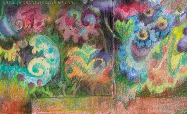
Add some shapes that break the rectangle, like the leaf-like one in my drawing. This way the result looks less strict and more layered.
Summer Coloring – A Little Bit Now and Then
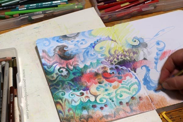
I like and need this easiness of colored pencils when I slowly rebuild and restrengthen my creative core. Colored pencils are easy to grab for short sessions and you can color outside too. It’s now summer in Finland, and the weather has been fantastic. I think it shows in my drawing.
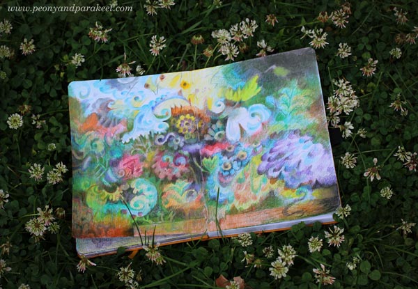
This journal has quite many colored pages already. It brings me joy to browse them. I am dreaming of the day when the journal is full even if it may be far away.
P.S. Check the class Fun Botanicum for more journal inspiration!
Pink Inspiration
This week is full of pink art inspiration. I hope that this post will get you to find your pinks and start creating sweetness!
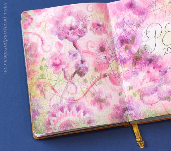
Dreamy Pinks in Colored Pencils
First, one of the journal spreads that we will create at Fun Botanicum, the newest class.
The softness that you can create with colored pencils is divine and you can highlight that with sharp strokes. The versatility of colored pencils always amazes me. With one pencil you can create the whole value range from light to dark so a few pencils go a long way. I like those shelves of individual pencils in art supply stores because it’s like picking candies!
Pink Handdrawn Playing Cards
These cards are from the class Magical Inkdom. They are drawn with a black pen and then colored with watercolors.
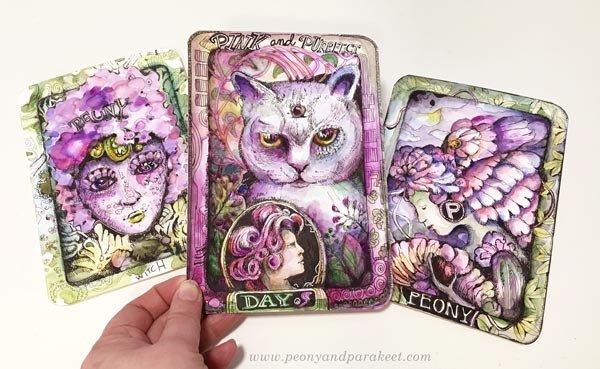
My husband asked when he saw me drawing these:
– “Playing cards? What’s the game?”
– Well, these are like collector’s items! And you can invent the game yourself!
Because if you make more than one, isn’t that like a little oracle deck? You can ask yourself how you feel by picking a card that reflects your mood.
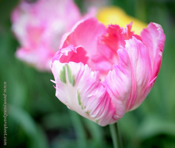
Lots of Pink Petals
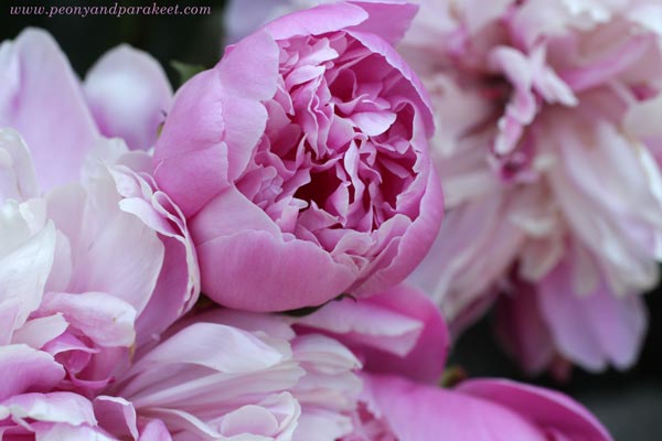
I am already waiting for summer and see my pink peonies bloom in June. If I was a small fairy, I could live in those petals!
Petals, petals, more pink petals – that’s how the flowers are constructed! These are from the class Decodashery.
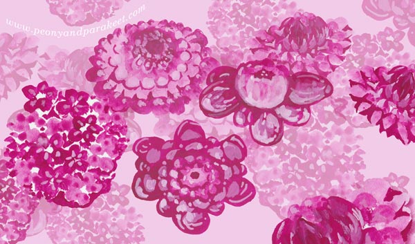
Pick a small brush, some pink gouache paints or watercolors, and paint small spots in layers!
Red and Green are Pink’s Best Pals
Here’s more pink gouache art – a small journal cover that also has reds and greens.
I love this color combination. Each color makes the other shine brighter. I can almost taste the colors when I look at them.
Pink Glow in the Dark
Pink is also a wonderful color with darks. You can paint a pink glow that makes the image look romantic.
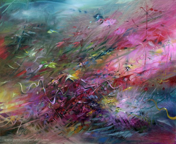
Here’s a blog post where you can see process pictures of this painting.
Powder Pink Inspiration
One night my husband showed me new Swatch watches. I wasn’t so interested at first, but when I saw the photos and got the concept, I got so inspired that I am using that inspiration for the new series of oil paintings!
Here’s the new pink Swatch called Mission to Venus. I am definitely going to somehow incorporate all this into a painting! Not literally, but conceptually.
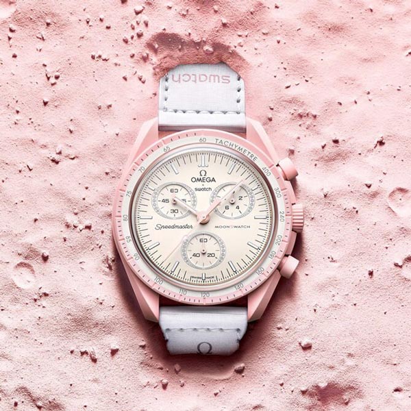
The powder pink with decorative details speaks of a beautiful adventure to me.
This watercolor painting has powder pinks too.
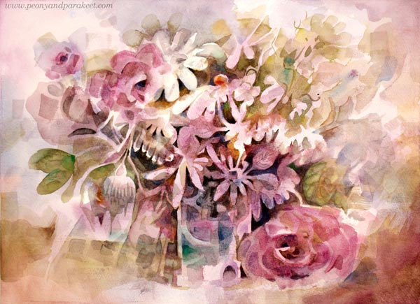
I painted this one a few years ago when my mission was to find the best way to paint flowers freely in watercolors without using a reference. I have a class about it too Floral Fantasies – Watercolor Edition!
Pinks and Other Pastels
What about selecting some acrylic paints and going wild on an art journal?
Add darks on the bottom and let dry. Then mix white to the colors and have fun with pastels. Use different brushes to have some variety in strokes as well.
You can be rough like above, or go in a more delicate direction with thinner brushes.
Black with pink is also a great color combination!
Pink Inspiration – How to Go Deeper
If you are a color-oriented artist as I am, pink is never just one pink. Challenge yourself to make all kinds of pinks from light to dark, from warm to cool, and use them all in one painting. Nature doesn’t select just one pink, so why would you?
The same goes for shapes, lines, and ideas. The more you embrace the variety, the more exciting the art-making becomes, and the more you create. Restrict supplies and increase imagination!
I hope you have an adventurous Pink Inspiration Day!
P.S. You can still sign up for Fun Botanicum and make wonderful colorings of plants!
5 Reasons Why I Love Colored Pencils
This week’s post is an affectionate thank you to my colored pencils.

Here’s why I love them so much!
#1 Colored Pencils Add Magic to Everyday Moments
Colored pencils are quick and easy for everyday use. Whenever I write, I can quickly pick a few pencils and color a part of the text or make a small illustration.
Planners, shopping lists, and any notes become more cheerful when I add some colored pencils to them.
#2 Colored Pencils Change a Journal to a Treasure
Colored pencils are perfect for small journals. When I started my colored pencil diary last year, I wasn’t sure how long the inspiration would last. But the small size felt so easy that the pages kept coming, and I love to browse the journal often. It’s my inspiration book and one way I do “research” – search for ideas that reappear more freely in my paintings.
This spread is a part of a new class, Fun Botanicum, where we make a set of plant-inspired pages. The idea of making chapters and different types of pages in a journal is so inspiring. One small journal can be like a library that has many collections!
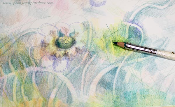
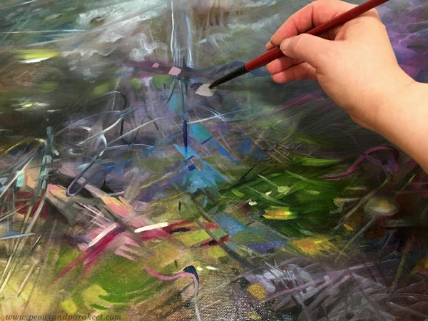
#3 It’s Enjoyable to Paint with Colored Pencils
After painting a series of oil paintings, I am usually exhausted. Then my pencils feel a refreshing approach to painting. When I “paint” with colored pencils, I press only lightly like holding a brush, make soft and blurry shapes, and create color mixes by layering. This way, I fly to my imagination without making a mess or worrying over things like drying time or fluency.
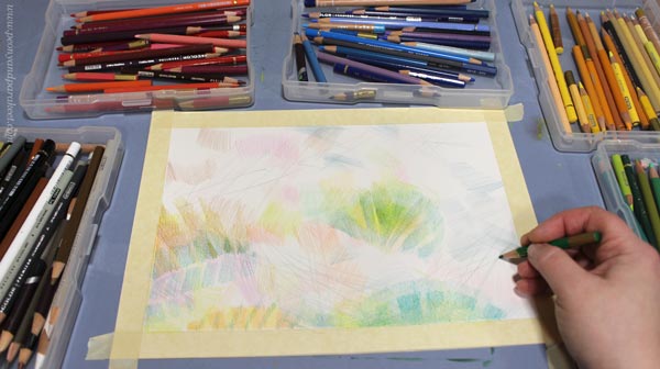
I feel a similar softness to using a brush when smooth hot press watercolor paper meets a wax-based pencil. Gentle strokes don’t hurt but nurture the hand, and the overall experience speaks self-love: “Be gentle, focus on the good in the world.”
#4 Colored Pencils Love Lines
I love drawing lines, and fortunately, my colored pencils love them too. I can draw straight lines, curves, continuous mesh, outline – all my pencils require is sharpening now and then!
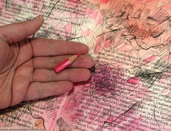
I love the willingness of my pencils to work until they are too short for the extender. I try to treat them as well as I can, no matter how short they are and what brand they represent. Old pencils can do lines too!
#5 Colored Pencils Can Take a Break
My oil paints are like afghan hounds. They require a lot of care and attention, and they always look appalled if I stop too soon. But colored pencils are like little parakeets. They sing when I am with them but are happy to fall asleep when nothing is happening. So I can color just a bit and then leave the project to wait for the next free moment. My pencils are ok with that – Every Single Time!
For example, this week’s work was made in several sessions. Watched the news and colored some. Listened to an audiobook, and colored some. Walked by and decided to color some. Unlike my oil paints, colored pencils never complain about what I listen, and they don’t get jealous if I watch tv at the same time.
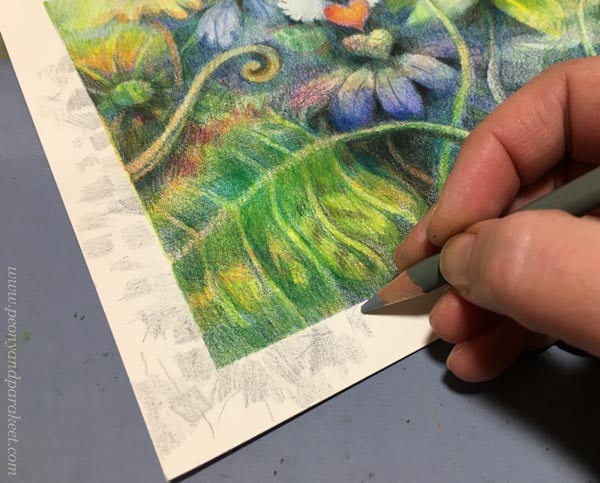
First, I didn’t intend to color the border, but then I couldn’t help myself to spend a little more time with the pencils.
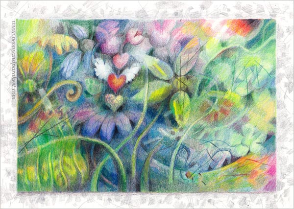
Hearts make this piece a bit cutesy, but colored pencils always make me more playful than paints.

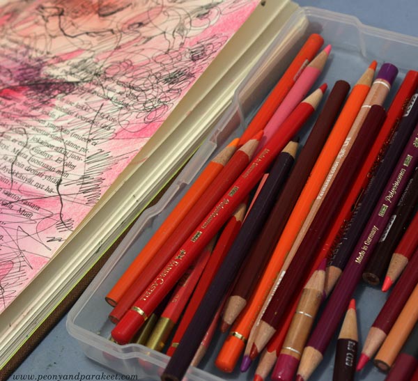
I love this system of color-coordinated boxes!
Having Good Time with Fun Botanicum
Let’s gather colored pencils and get inspired by plants, crazy lines, delicious colors, and the freedom of imagination.
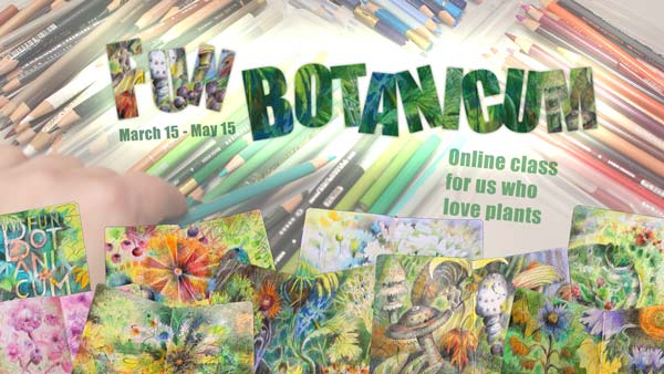
Fun Botanicum begins on March 15. Sign up now!
Pop Music in Art Journal
This week – turn some pop music on and start art journaling!
Since I started working full-time as an artist in 2014, my taste for music has gone wider. Listening to different genres has enriched not only my life but also my art. Music has taken me to all kinds of visual worlds. Even one sound can bring color or a shape to mind.
I have an old book as a music-inspired art journal. I like how the variety of music is shown on its pages. Now I wanted to make a spread inspired by Asian pop.
Sometimes Music is a Human, Other Times a Machine
Asian pop music is fun to listen and very easy-going – like an acquaintance who is always ready for a visit to a candy shop and to have a light conversation about current movies.
But when I paint big paintings, I prefer music that’s more like a vehicle – no melodies, only interesting sounds that make me go deeper and deeper in concentration.
Without a repeating chorus and clear rhythm, I don’t feel the need to express the music or paint at its speed. That’s how I have become a fan of contemporary classics that I used to find too boring.
Pop Music in Art Journal – Playtime with a Friend
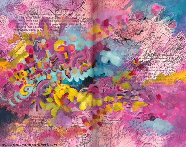
But this week, I wanted my friend back. I went to the Finnish radio website and turned on the newest of “Papananaaman K-Pop Show” which plays current Asian pop. My candy store was the box where I keep my red, pink, purple, and orange colored pencils.
My music-inspired pages are in the “beautiful mess” style that I show step-by-step in an art journal mini-class called Music. It’s relaxing to create step by step and not worry too much about the “proper” supplies. I played with black pens, stamping inks, and the shortest pencils.
When I create canvas paintings, I use oil paints, but acrylics are great for this kind of messy play.
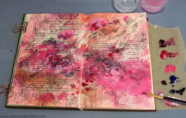
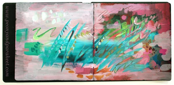
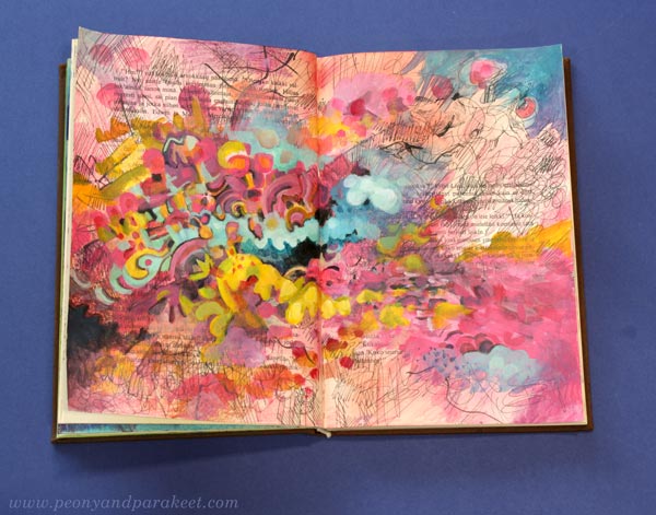
The spread started as red, but I then introduced a wider range of candy colors gradually. This mono-tone approach is great when you want to keep things simple first, and then splash the colors in.
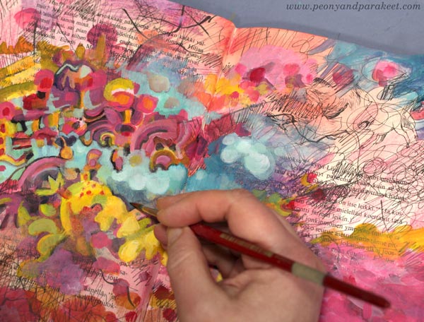
I like the candy colors and the informal look of the finished spread – pop music in an art journal!
I showed the spread to my Blythe dolls and they also gave their approval: “If that’s how you see Asian pop, we can live with that.”
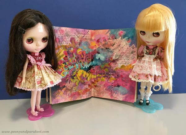
Maybe these dolls have made me listen to Asian pop in the first place! One thing so often leads to another.
Music in Art Journal – Step by Step!
The art journal mini-class Music is now available as an individual class. But you have to be quick – it will go away on Feb 7! >> Buy here!