
Finding Balance through Journaling Practice

Here’s an art journaling spread that I created for December’s mini-course at Imagine Monthly Fall. The mini-course is called Romantic Geometry, and it’s about creating abstract art and traveling through the history of art and design. It’s a perfect example of what journaling has brought to my life: a sense of freedom and limitlessness. When you paint, draw or write, you are limited only by your imagination.
Everybody is an Introvert
I want to dedicate this blog post to introvert in us. They say that most people have some introvert characteristics in them. To me, very little needs to happen and I get a lot of ideas, associations, and thoughts to go through. It feels like a curse sometimes. If I don’t get enough time to be alone, I become unhappy and everything feels overwhelming. We in Finland, have the most forests in Europe. For many Finnish introverts, forests are the places to go to process the thoughts. I do like to spend time in nature with my dogs, but it’s not the same as spending time with my journals. I need to get out what’s inside me and even more: use my imagination to create something playful, no matter how childish or stupid that might feel first.
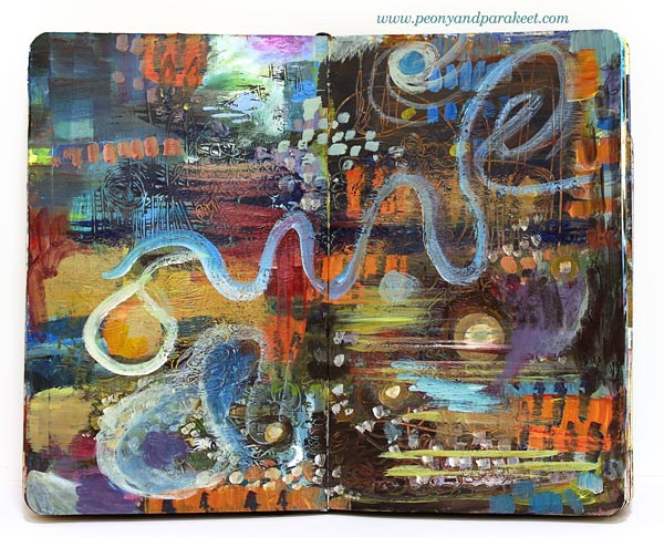
My art journals contain a lot of painting and drawing, but I also like to write down my thoughts, especially after I have created the image. I also like the practice where I write a question, then answer it, and then find a new question related to my answer. These kinds of internal conversations fill me with positive energy. I also like to analyze what I did wrong but have found a positive way to do that. I look back, pick things where I succeeded and then make notes how I can still improve.
Everybody Needs “Me-Time”
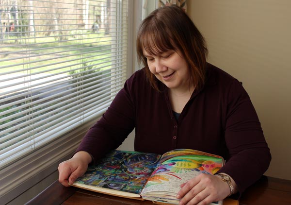
When I browse my journals, it’s easy to feel grateful and forgiving because the pages complement my life’s story. I fill them randomly, and in many sessions but try to do that as regularly as I can. When I start to journal, I often don’t feel particularly inspired, but after a while, I am fully enjoying the creative challenge. I have never been an introvert in the sense of being a quiet person. But when they say that introverts live in a world of their own, I recognize the habit through my journaling practices. My journals are like mini-worlds with limitless possibilities.

Everybody Needs a Place to Experiment
Behind every bigger art piece that I create, there are plenty of art journal pages where I have experimented with the ideas. This possibility of experimentation also happens with my writing. I don’t always write about myself but empathize with a fantasy character. This fall I wrote a haiku poem with the help of my husband, also an introvert.
I think that many who haven’t fell in love with their journal yet, forget to experiment. They drool over beautiful notebooks at bookshops or pin colorful art journal pages at Pinterest. But when they begin a journal, they feel they need to make decisions and stick with those. They pick the supplies they should use, or the style they should follow, and then get bored or disappointed with how the pages look. But you can change the direction as many times as you want, explore what excites you today, and cherish all that diversity. The more I have journaled, the more I feel the calling to show how paper books can balance your life. Life is less mess when you save some time for journaling.
Classes for Art Journaling
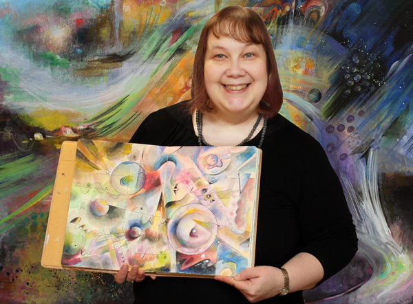
Romantic Geometry guides you to create dynamic abstract art from simple shapes. It’s the last mini-course of Imagine Monthly for now.
I will be running a new class “Inspirational Drawing 2.0” in spring 2017. Like Imagine Monthly, it will also have a monthly format. Inspirational Drawing 2.0 is about drawing from imagination and inspiration. It’s a skill-oriented, excellent class when you want to free up your expression and add more abstract ideas to your journal. This class will be all new content. If you have attended Inspirational Drawing previously, you will still want to sign up!
Moleskine Sketchbook – Another Full Art Journal!

I just finished my red Moleskine Sketchbook. It always feels like an accomplishment when an art journal gets full. So I’m happy to show a couple of photos and a flip-through video of all the pages!
Moleskine Sketchbook as an Art Journal
Moleskine Sketchbooks are one of my favorite books for art journaling. The paper is sturdy, and it can be used with a variety of supplies. I use mostly watercolors, acrylic paints, colored pencils and PITT artist pens. But I also use inks, gel pens, hand-decorated papers for collages, etc. The small size is handy for quick pages and easy to put in a bag. However, sometimes the size is a little bit too small, especially for acrylic paintings. So I also use other journals, especially large Dylusions Creative Journals. The paper is very smooth, so it’s not ideal for watercolors. But I don’t mind that too much, I use a little less water to make watercolors work with the paper. Some prefer coarser paper for colored pencils but I love how effortless it is to color the pages in Moleskine Sketchbook.
The Purpose of an Art Journal
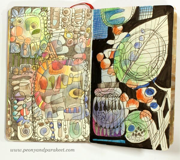
For me, art journals are little more than just sketchbooks. I like to call them “idea books” as I often process my ideas further when I am working on the page. I don’t always make one page on the same go, but work with it several times, adding more ideas as the page progresses. However, I have quite low expectations on how my pages will look. They are not pieces of art but more like collections of ideas to me.
As you can see from the flip-through video, my ideas are often connected to art history and different styles. The first photo of this blog post shows a spread inspired by Rococo. The second photo shows a spread that I made after browsing designs from the 1960s. Even if I sometimes write short stories or make notes about my current thoughts, I mostly write about beautiful things that I have seen and visualize the ideas I have gotten from it.
My art journals are not chronological diaries but random visual notes that I process to full images. I can make a quick sketch of a rose one day and then continue the page with painting on the other day. When I am working with a new art class, I use art journals to record my visual ideas and practice the techniques. I also see creating art journal pages a route to bigger paintings. When I paint on canvas, I use the ideas that I have come up with when making the pages. Every artist should also be an art journaler!
Flip-Through Video
Create Step by Step!
I have gathered all the most popular free step-by-step instructions and all my flip-through videos on a separate page. Go to Create Step by Step!
Video: How to Move from Figurative to Abstract Art?
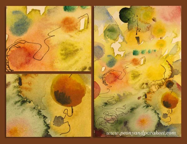
I made a video blog post again. This time I answered to a reader’s question about how to open up to create unique and abstract art. This video is especially for you who wants to move from figurative to abstract art.
In the end of the video, I paint an abstract-themed postcard with watercolors. Hopefully, you’ll enjoy it!
How to Move from Figurative to Abstract Art?
Start Drawing from Stick Figures!
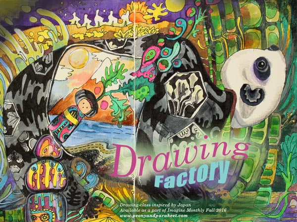
If you browse my blog posts this fall, you would think that I have been painting only. But no, I have drawn too! I’m really happy about my recent mini-course that is available as a part of Imagine Monthly! It’s called Drawing Factory as it’s about drawing efficiently no matter what your current drawing skills are. Plus it’s inspired by Japan, the land of high-production factories and fascinating culture.
Drawing ATC Cards
I got the idea for the mini-course in summer when I got the urge to draw a series of ATC cards.
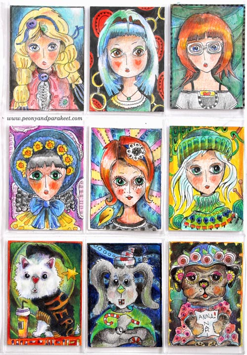
I had so much fun drawing these! While drawing, I thought about how much people use stamping instead of drawing in ATC cards. I felt liberated without them, drawing freely. How could I make hand-drawing more attractive and enjoyable?
Drawing with the Help of Stick Figures
Along drawing this big bunny art journal spread, I developed a series of tips and tricks about how you can create imaginative line drawings without tedious sketching.
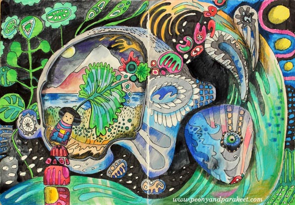
My method is based on stiff lines as people often say: ” I can only draw a stick figure!” But sticks can be an answer, not a problem!
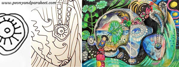
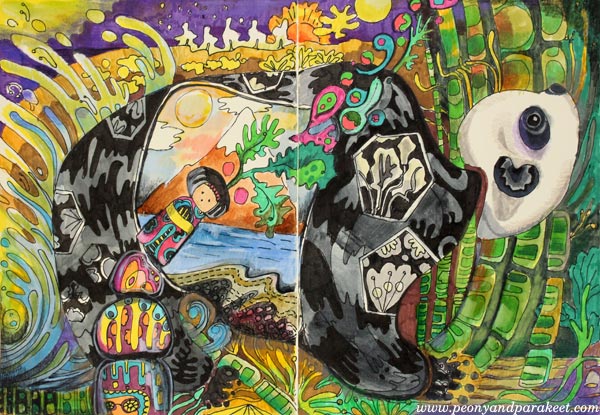
The panda is the project that I am creating in the class video. The video also includes a drawing lesson where I show how to build drawings, or should I say rich illustrations, based on simple lines.
Buy Drawing Factory!
Drawing Factory is now available as an individual self-study class: Buy Now!