
What’s in a Good Composition?
Quick question:
When you create art, how much time do you spend for composition?
I mean: trying to make it work, trying to balance it, trying to make it look more eye-catching?
For me, finishing the composition can take as much as 50% of my creating time! Some years ago, it was easily 75 % … I don’t find adjusting the details particularly relaxing. I take photos, use a mirror, and change the orientation of the piece to see if I have missed something. Sometimes I sleep overnight and make the last adjustments in the morning.
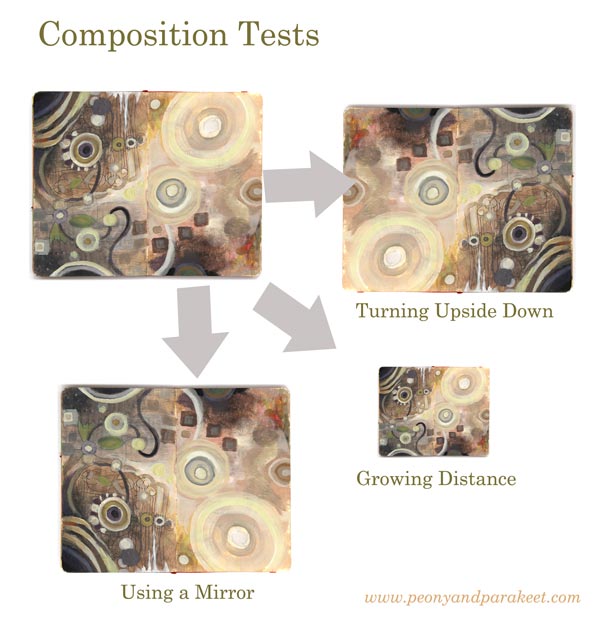
But teaching art has had some benefits here. I get to help people to make better compositions and thus, I have become faster. Namely, the two top requests that I get in my classes are: 1) How can I make this look finished? 2) What more could I add here?
So when I created a new class, Planet Color, I wanted to build a step-by-step creative process so that when you add elements, you don’t have to worry about the composition so much. I wanted to find ways that support you so that you can release your mind and fully enjoy working with colors.
What’s in a Good Composition?
Here’s my conclusion. A good composition has elements that a great party has:
1) concierges who invite the viewer to the painting
2) a star singer who takes the viewer’s attention
3) clear routes and breathing space which make wondering around easy
4) good food and good company which makes the viewer stay in the party
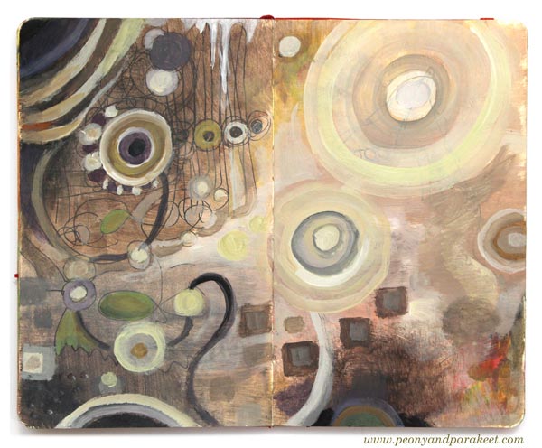
I have built all these elements in one 7-step process. It doesn’t mean that this process produces identical paintings. It means that when you enter the finishing phase, you have already done most of the work you should do anyway. But without all the agony and with all the creative enjoyment! That’s why my workshop Planet Color is as much about composing elements as about releasing your mind with colors.
And again, if you have problems in making the final adjustments, I am there to help for all the 14 days.
See you there!
How to Transform Ideas into Paintings
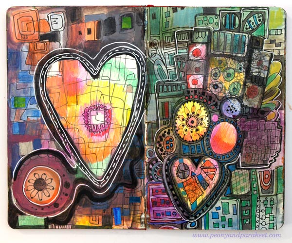
I am an idea person. When I get exposed to new things, my mind fills up with new ideas. Most of the ideas that pop into my mind are not that good. They are either too conventional or too radical. Some ideas are impossible to implement, and some have nothing to take on.
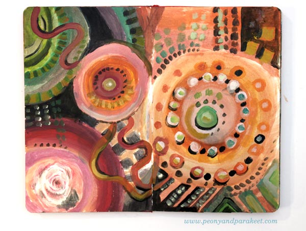
When I was a child, I happily filled the days playing with what came to my mind. But when I was studying computer engineering at a university, I became a master in shooting down my ideas. It may sound depressing, but it has led to a brilliant realization for me: the number of ideas doesn’t equal to the number of projects. When you have limited creative time, you don’t have to divide it with all your creative ideas.
Raw Ideas – Bad that Produce Good
When a new idea comes to your mind, call it “a raw idea.” If you get visual ideas, quickly sketch them on your journal. If they are more words than images, write them down. Don’t over-analyze your sketches, treat this just a routine that makes you move on and continue producing new ideas.
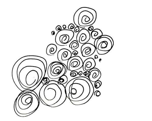
Raw ideas are often not so great, and you have to be careful not to spend too much time in implementing them. Raw ideas are like raw potatoes. Add some rosemary, salt, pepper, olive oil, carrots, onions, and zucchini and put them all in the oven for 30 minutes, and you will have a brilliant idea.
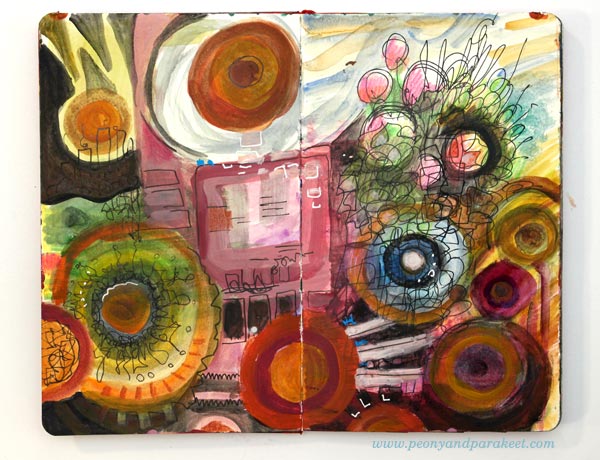
Many believe that getting new ideas is the thing. They fall in love with their raw ideas and then get disappointed with how they look on paper. But the essence of creating is in the processing. It’s about combining tens of ideas into one focused idea.
Record Everything!
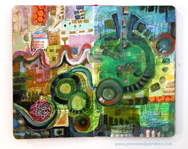
We humans are very similar to computers in one aspect. We have a limited capacity of processing unsaved ideas. If you never draw or paint or write down your ideas, the processing of them becomes difficult, almost impossible.
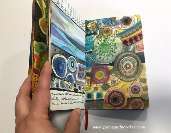
I often have an illusion that if I just think a little bit longer before I begin painting, l can start with better ideas. But then I remember that it’s just the opposite: when you see your raw ideas on paper, you can make them better. When you use the raw ideas to create the new painting, you can then visualize stories instead of creating single conventional elements.
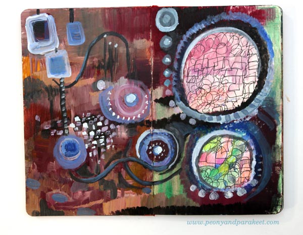
From a Disappointment to a Happy Art Journal Page
Here’s an example of how a conventional raw idea can turn into an expressive story.
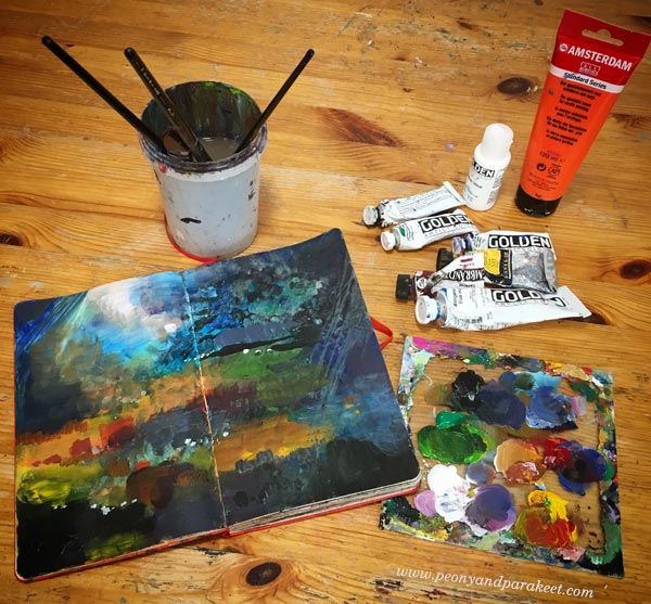
When I am finishing a painting session, there’s always the same problem: I still have paint on my palette. Have you confronted this too?
It doesn’t feel good just to wash it away, so I take one of my art journals, and use it up. I often feel tired already, and painting isn’t particularly inspiring, especially when there’s a limited amount of colors left on the palette. I made this gloomy landscape on one of those moments. The painting looked sad and empty. It felt like I had wasted my time for a lousy raw idea. But then, another day came, and I got the idea to add pastel elements in the dark painting.
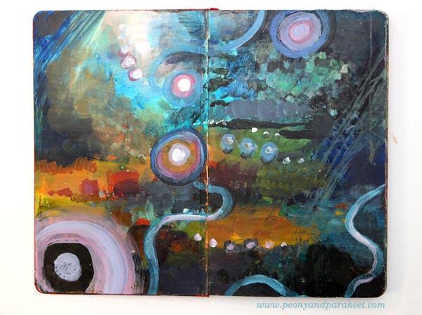
While painting, I remembered a television series, The X-files, that we used to watch with my boyfriend, now a husband, a long time ago. When an episode began, I always whistled the tune then grabbed my knitting. Although the episodes were terribly exciting, we always laughed at the whistling. The same mixture of suspense and happiness entered my spread after adding the pastel elements. The painting that had no real emotional connection became a reminder of a happy memory.
Ideas that Keep Coming Back
When you sketch ideas, you will also notice that most of them are very not different from each other.
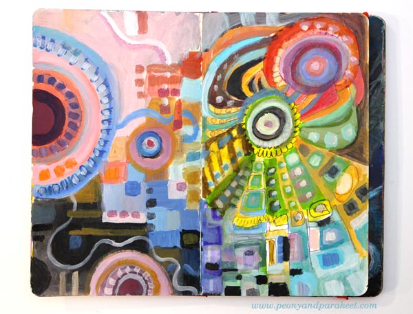
This similarity of ideas is fascinating. When I come up with the same idea again and again, I have to find out what’s behind it. Why does my mind repeatedly travel to the same place?
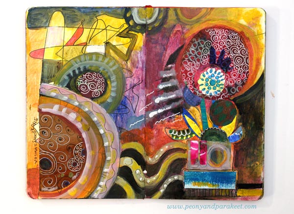
When preparing for the fall, I was about to release only one new painting workshop: Nature in Your Mind. It’s an online class where I have processed a lot of technique ideas to give you the very best experiences and results in painting. But while working with Nature in Your Mind, I had one more idea that I kept shooting down again and again. No matter how much I did that, it always came back. I saw color. I saw circles. And yes, I sketched them hundreds of times just to get rid of them! But then one day I said to myself: “Ok let’s find out what behind this idea.” So I discovered a compelling formula for creating abstract paintings so that you can fully enjoy painting with colors.
Planet Color – Get the 7-step Formula!
With the 7-step formula, you can release your mind and focus on color. You can create unique paintings while experimenting with unique color combinations. You can work with your raw ideas and combine them to a bigger picture. The workshop is called Planet Color, reserve your spot now!
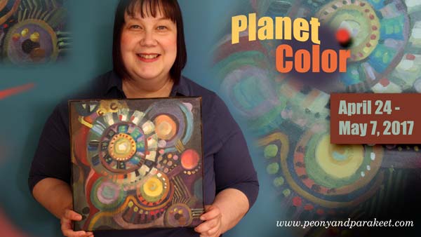
Enjoy colors and release your mind!
>> Sign up for Planet Color!
A Decorative Pattern for Art Journals and Beyond
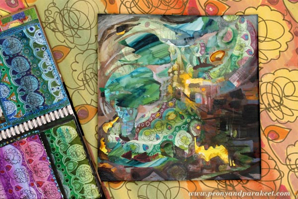
A couple of months ago, I made a flip-through video of a full art journal. Many noticed a spread that was made from decorative papers mostly. I remembered that I took some photos while making the papers and I will share step-by-step instructions here. This pattern is good practice for motoric skills and drawing, but it can also go beyond! I used it for a more expressive purpose, for a collage art piece.
1) Paint Stripes with Watercolors
Use a fairly thin paper and paint it with watercolors. Use a selection of colors to create stripes or curves.
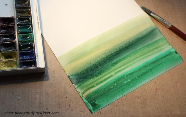
You can add drops of water if you want to make the background more interesting with bleeds.
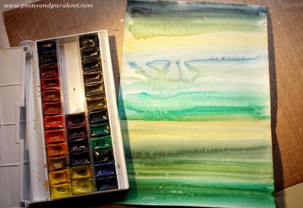
Let the paper dry properly.
2) Decorate the Stripes with a Simple Loop Pattern
Using a thin-tipped black drawing pen, draw a simple loop and end it with a curve upwards. Without lifting the pen off the paper, add a bunch of loops on the top of the curve. Then continued by drawing a curved line downwards. Repeat and draw the whole row on the same go. Work fast and don’t worry too much about the symmetry or similarity of the loops.
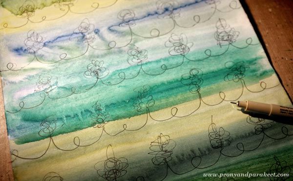
After drawing the rows, frame the loops to make them more distinct. I used simple shapes to create flowers and leaves.
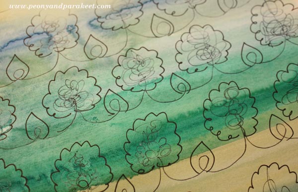
3) Color the Background and Add More Decoration
To make the watercolored layer look more lively, use felt-tipped pens (marker pens) and color the background around the doodled shapes. You can also add more color to doodled details and use a white gel pen to add more decoration to colored areas.
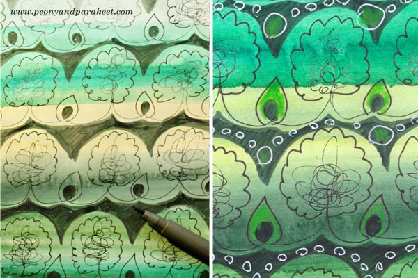
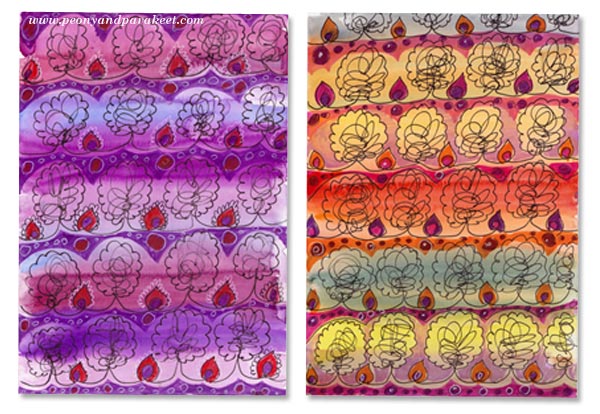
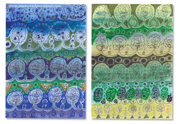
Decorative Pattern in Many Colors
This pattern looks luxurious when you make many papers in many colors with slightly different decorations.

Here are some that I made!
Decorative Pattern in Collage Art
I am fascinated by the interface between art, design, and crafts. The idea for the pattern came from knitting. I wanted to find a similar relaxing circular motion using a pen instead of a knitting needle. So that’s how a craft transformed into a design. But design can also be a part of a more expressive piece.

In this collage, I use decorative paper pieces with paint. My starting point was a watercolor background, acrylic paint, and a piece of decorative paper.
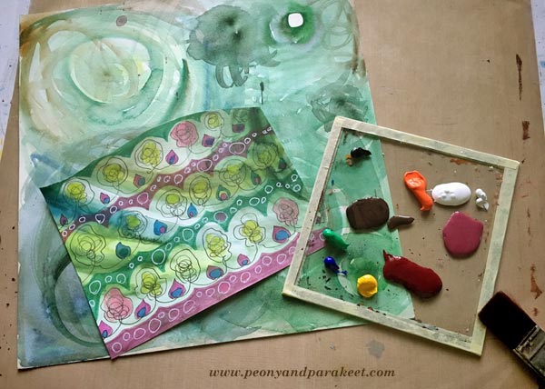
I cut a couple of decorative shapes and glued them on the background with gel medium.
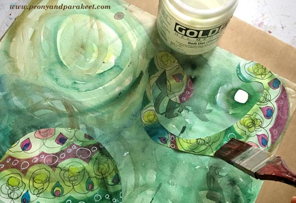
Then I continued with painting using acrylic paints. In the finishing phase, I also used some more paper pieces and few colored pencils. A week or two ago, I heard the geese flying over our house. They were leaving Finland, going to a warmer place for a winter. Their sounds made me think how limited we people are, not being able to fly so freely, not always being able to stick so tightly together. The screams of the geese felt bright yellow and for a short moment, I wanted to join them and not stay in Finland, waiting for snow …
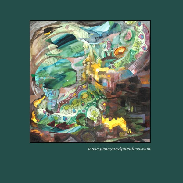
Get step-by-step instructions for doodled collage art – Buy Doodled Luxury!
What to Create from Simple Shapes? 6 ideas
When I catch myself building a visual image in my mind, I say to myself that my hands have to process the idea first. The idea can be a decorative design or a new painting or anything visual. When my mind is vigorously trying to create images that I would be happy with, my hands don’t understand my mind at all. My mind is a fool and my hands are ruthless.
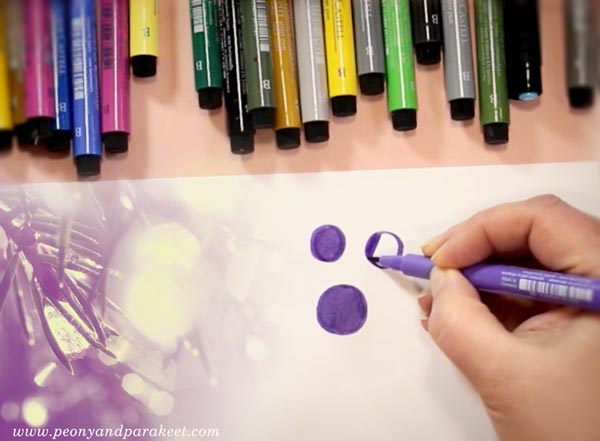
In my mind, I can easily miss the elements that are needed for building the beautiful image. If I imagine a scene, the details that make the scene look so wonderful, are not all there. My mind only has a glimpse. The connection from the mind to the hands feels easier if it’s the other way around. The hand draws a couple of circles and the mind gets creative with them. This way building the bridge from my mind to my hands seems to work much better. Big pictures, personal stories, attractive designs are not born in my mind first. They are born in a conversation that is led by my hand drawing with pen on paper.
But hands don’t decide when to get started, the mind does. This is why I will give you few ideas to start the conversation between your hands and your mind. Like this, this and this post, this blog post is illustrated by my students. The art journal pages that you see here have been made at Modern Mid-Century art journaling class.
1) Build ornaments by grouping simple shapes.
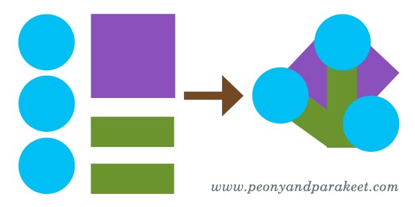
Nel Wisse has created colorul clusters and then grouped them to bigger ornaments.

2) Create a surface pattern and cut a shape from it.
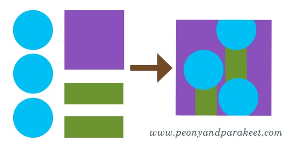
For example, see Darci Hayden’s cat and the stairs! Shapes that include patterns look always fascinating. (More patterned paper ideas)

3) Play with Sizes and Layers
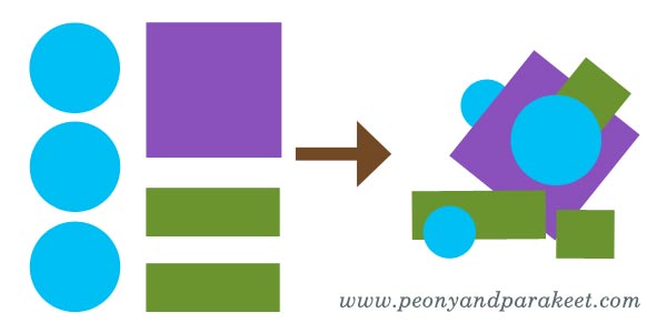
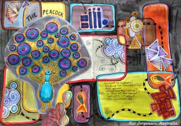
Cut some elements smaller and add dimension to your page by playing with layers.
Sue Jorgensen has a good variety of both large and small elements.
4) Build a map, a house or a room plan
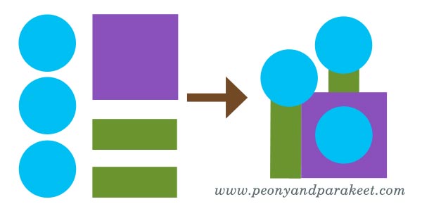
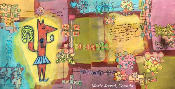
A clear hierarchy between the elements pleases also your left brain.
Marie Jerred’s fox is in the middle of an adventure!
Stephanie Carney’s Flamingo is just entering a house of dreams.

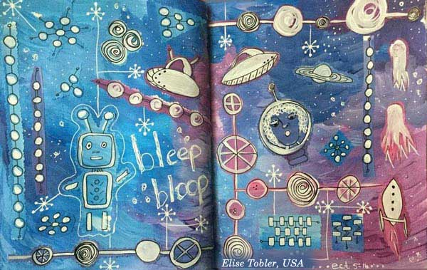
5) Express Micro or Macro World
Both micro and macro biology deal with basic shapes. Explore either molecules or satellites!
Susan Prothero’s micro world is captivating.

Elise Tobler‘s space is full of life!
6) Find a connection to a story
Explain what you associate with the shapes and then move on to a more illustrational approach. Elaine Wirthlin’s spread is an awesome example!

Buy the class: Modern Mid-Century!
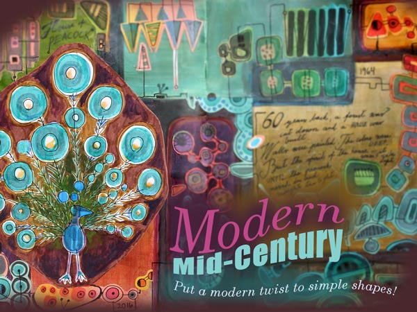
Designers in 1950s and 1960s (like Annikki Hovisaari from Finland and Lisa Larsson from Sweden) truly knew how to play with simple shapes. Modern Mid-Century is a self-study art journaling class where I am inviting you to my living room and showing inspiring examples from the middle of the 20th century. Then I will help you to design your own unique motifs and build a collage that is both decorative and expressive.
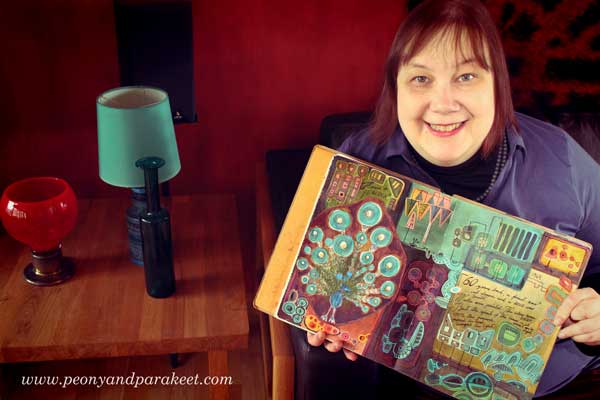
Modern Mid-Century
Start playing with simple shapes! >> Buy Now!