
Using Fabric on Art Journal Pages
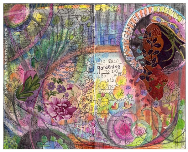
At this time of the year, at the beginning of summer, there’s a lot to do in the garden. I started early this year, but recently there has been so many activities that I feel I have neglected the garden. This guilty feeling also showed up on my latest art journal page!
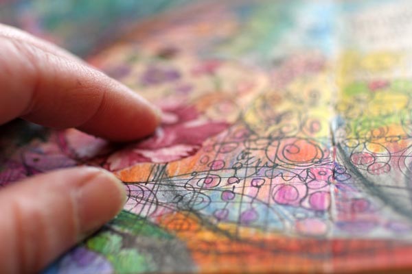
This page is made on a spread of Moleskine Sketchbook, so the image is fairly small, about 10 inches in width. A special feature here is that I have added two small cotton fabric pieces to boost my imagination. Using the technique of fabric collage was just a sudden idea, but I love how the page feels when touched!
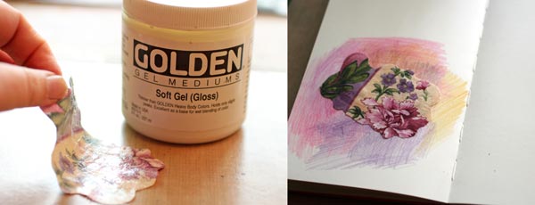
I attached the first fabric piece at the early stage. Golden Soft Gel Gloss Medium was used for attaching the fabric.
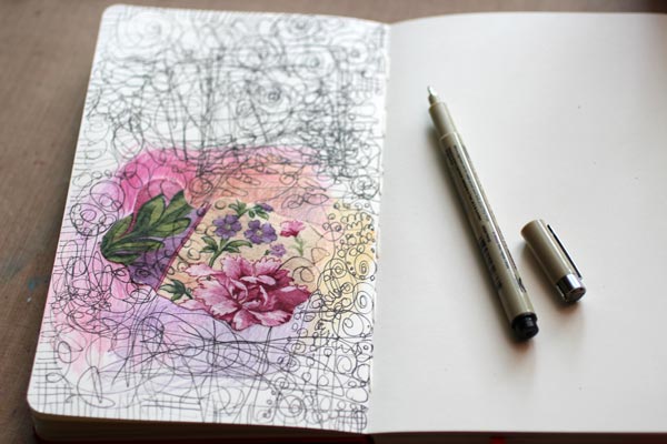
After attaching the fabric, I doodled with a black drawing pen to get the creativity going.
When I began coloring, I realized that I want to create a spread instead of a page. So I attached another fabric, purposefully a bit different from the first.
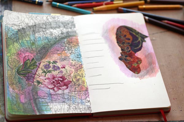
While coloring the page, I added more details. As my garden looks wild at the moment, I wanted to show the growth on the page too.
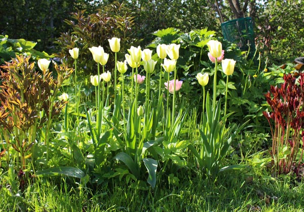
Here’s one corner of our front garden. Tulips bloom beautifully, and peonies (my favorites, of course!) grow fast. Lots of weeding to be done!
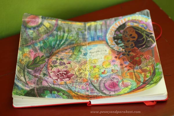
Why not try some fabric collage in your journal?
Let me be your art teacher: Subscribe to my weekly emails!
Simple Shape, Plenty of Expression
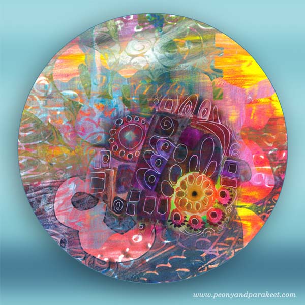
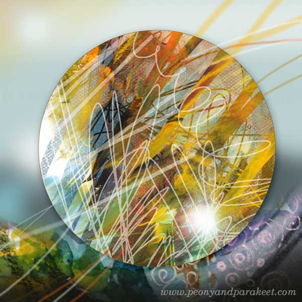
I began to create these circles a while ago. They have been created in Photoshop but they use scanned elements of my hand drawn art. The message here is: don’t wait for a major inspiration or grand idea! Your starting point can be one simple shape. Self-expression does not require complex sketching.
Simple Art Journal Page
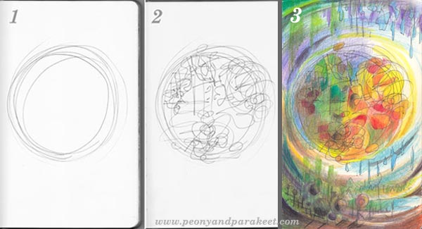
Creating an art journal page is easy:
1) Draw a circle.
2) Doodle inside it.
3) Color the page. You can add more details while coloring.
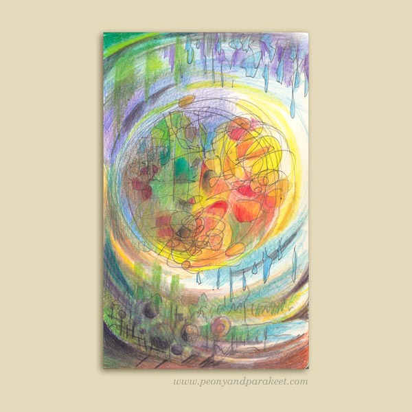
When creating this page, I was thinking about spring. It is amazing how the sun and rain take turns and make everything flourish.
More Inspiration


More fun projects with colored pencils – Buy Coloring Freely!
Organizing Art Supplies with Konmari Method
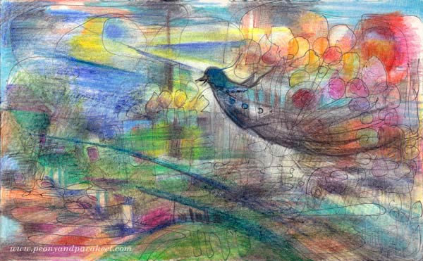
This art journal page is about how less stuff can uplift us. I feel like a bird with balloons after I sorted out my art and papercrafting supplies.
The Life-Changing Magic of Tidying Up
It all started from a book: The Life-Changing Magic of Tidying Up – The Japanese Art of Decluttering and Organizing. It is written by Japanese professional organizer Marie Kondo and she calls her method “Konmari”, which is an abbreviation of her name.
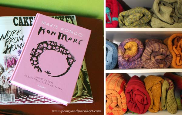
The Konmari method is fairly simple. First you get rid of all the stuff you don’t use or enjoy, and then you store them by type. The process is explained more in detail in the book. The book recommends starting with clothes so I organized my sweaters first. Most of them are my own handknits. Marie Kondo explains how to fold each type of clothing and recommends storing things so that you can see them in a row. I have always believed in little joys in life. However I had never thought of how much joy seeing those sweaters can bring. Each time I open the closet, it joyfully reminds me how much I enjoy both knitting and colors!
Art Supplies that Spark Joy
Marie Kondo believes in handling each object separately and considering if it sparks joy. These spark most joy to me: colored pencils and watercolors! These most simple art supplies delight me more than any new product on the market.
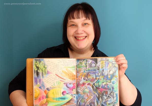
If you have followed this blog for a longer time, you might have noticed that the variety of mediums that I use in my art has been reduced gradually, especially during the last year. I noticed that I had bought many of the products believing they would solve my creative problems. I thought they would make me create better art faster and make creating more fun. But when experimenting with new products I forgot how little ingredients are actually needed for creating meaningful art. Nowadays I feel sad when I see beginners reading instructions that involve a huge variety of art supplies. The long lists of supplies are overwhelming and prevent many from start creating.
I believe we should focus less on things and more in our inner world. And Marie Kondo thinks exactly the same! She believes that when we are surrounded by fewer things, we can treat them better and start thinking what we really want to do in life. I believe that when you use fewer supplies, a lot of energy is saved from picking and choosing for the actual creating. You will also grow attached to the supplies and start displaying them and taking care of them more often.
Working Area Before and After
Even if I organize my creative space regularly, I felt it was the time for a bigger change. I had already started re-organizing my creative space before reading Marie Kondo’s book, so it felt natural to continue that process.
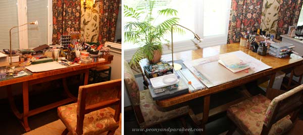
The photo on the left has been taken some time ago. After that I had already cleared the view to the window. But I had not actually got rid of anything, I had just removed some of the stuff to the nearest shelf unit. This time I picked out every single object and decided to give away or throw away those that I had not used for a long time. The photo on the right shows how the table looks like now!
Konmari Method Applied to Art Supplies
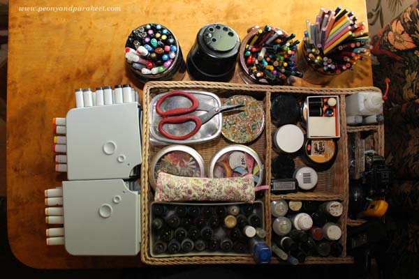
Marie Kondo suggests not to put items on the top of each other. That is quite difficult to achieve with art supplies. I managed pretty well though. Jars and boxes help with that.
My creative space also includes shelves. Here organizing was a bit more challenging and the end result might not be how Marie Kondo had done it. She would probably group all the paper booklets, albums, and magazines together. However, I quite like it as there’s enough logic in how everything is located. As one of my hobbies is scrapbooking I have a large collection of stamps. I was able to put them all in one place on the upmost shelf.
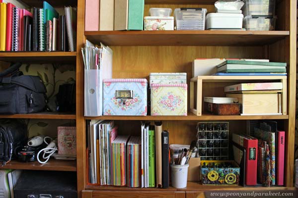
Marie Kondo believes that we should take time to consider which is the best way for storing each item. I found that odd bottles of ink are much happier in spray bottles with other liquid inks. Paints are now in boxes on the right side of the middle shelf. I love how easily accessible all the supplies are and how my art journals and inspiring magazines fitted there too.
How to Prevent Decluttering?
According to Konmari method the secret of staying organized is this: once you have dramatically reduced the amount of stuff and organized by type, you will consider buying new things much more carefully. When you group items by type, you will remember what you already have. When I saw what I had bought during the years, I thought that many times I could have just left the store early and put the time in creating. Focusing on fewer art supplies has reduced my yearn for shopping, so I do believe what Marie writes about.
Make your colored pencils spark joy!
Buy my e-book Coloring Freely
Find a Focus for Your Art
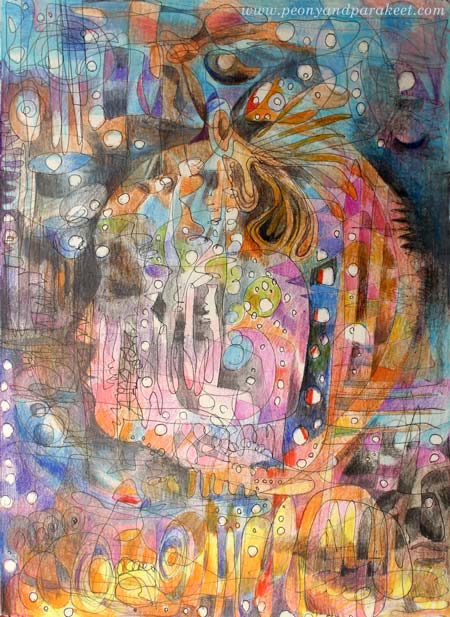
Here’s my latest art journal page with colored pencils. It is called “I Am Listening.”
Drawing Process
I knew that it would be a good moment to create art when I heard about a live broadcast of an opera La Traviata. To enhance the atmosphere, I adjusted lighting and closed sliding doors in the room where I was creating.

When I started drawing, I had no idea what the final result would represent.
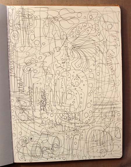
And even when I began coloring the page, I had no clue.
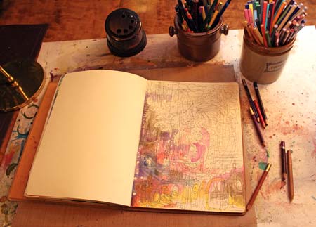
But once I had worked for a while, I saw the face appearing on the page. Soon I knew that the drawing would be about listening to music and how it activates the whole brain. I have experienced that personally, but Finnish researchers have proved it scientifically too.

Focus Sets You Free!
I used to hate people who repeated: focus, focus, focus! I questioned back: “Isn’t experimenting an essential part of creating art? Shouldn’t art set us free, instead of steering us to a narrow path?”
But after finding my focus, I realized that I had had misconceptions. The focus should not be a single subject like “birds” or “faces,” certain supplies like “acrylics” or certain style like “cubism”. The focus should not come from outside, but inside. It should answer the question: “When thinking of self-expression, where are you best at?” This kind of focus will lead you to see more possibilities. You will experiment more and you will broaden your perspective.
I did not mistakenly listen to dramatic music in the suitable surroundings. I used it as a tool to bring out where I am best at – visualizing experiences, systems, and transformations. That’s my focus. Whatever I doodle, I can feel free as I do not have to worry about what will appear. My focus will feed my subconscious and my imagination.
For some of my students, the focus has been “feelings in relationships”. For some, it has been “fairy tales” or “mysteries.” Some have been skillful in seeing “the beauty of everyday life,” others thrive on “atmospheres of dimensional spaces.”

Subscribe to my weekly emails – Get a free mini-course!