
See What You Think!
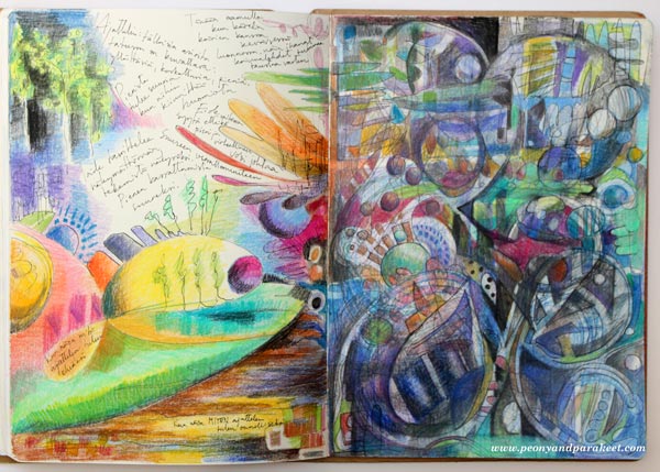
Here’s an art journal spread that I created from two little incidents: the intellectual and the emotional.
Visualizing an Intellectual Incident
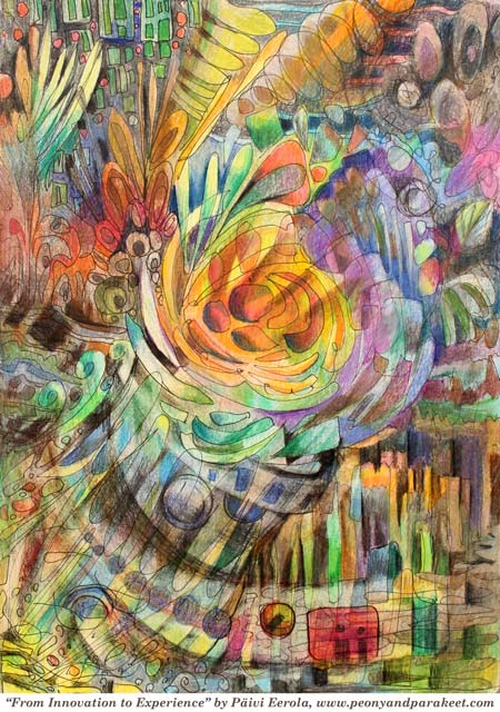
Last week I went to an art gallery to see Ola Kolehmainen‘s photography exhibition. I often get very emotional when I see art, but this time I was more intrigued by structures and concepts. Ola Kolehmainen’s photo collages had a cubistic touch. They inspired me to experiment with squares and arches.
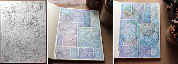
The art journal page looked pretty stiff and formal at this point. But also I felt excited about how it would direct my thoughts when continuing drawing and coloring.
Perfection Needs Order
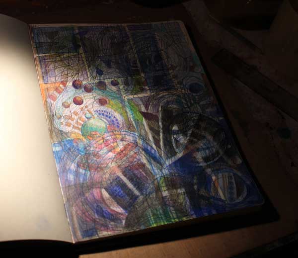
Working intuitively means that I do not always know what ‘s going to appear next. I just focus on a small area at the time. While listening to some opera pieces, I remembered how close mathematics and music were in the 18th century. One of the great mathematicians Leonhard Euler was also extremely interested in music. I feel that similarly, drawing can be an experience where we use the intellectual side. By drawing we can find out new solutions, practice nuances and fine-tune shapes until everything seems to be in its place. Like Euler said: “… in any thing where there is perfection, there is necessarily also order.”

Visualizing an Emotional Incident
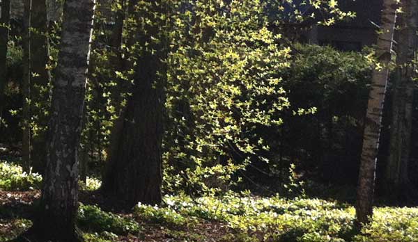
But then, when we aim for perfection, we often miss the experience. Like the exhibition last week – I went out without noticing any particular change in my feelings. Then, this morning when walking the dogs, I saw the growing leaves and how they glowed against the sun. The sight was so beautiful, although pretty ordinary at this time of the year. Nevertheless, it felt like opening the door to a great gallery – to nature’s supreme art exhibition!
Combining The Intellectual and Emotional Incidents
When I got back home, I thought that it would be interesting to express the controversy of the intellectual and the emotional on the same spread. First, I drew my nature experience with careless lines but with clarity. Then I made it work with the page that had become very detailed but pretty complex.
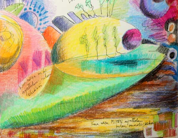
I wrote: “When I see what I think, I become whole” and “When I see HOW I think, I become happy”.
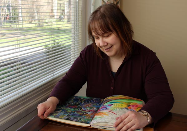
This page spread is not only about going to the art gallery last week and walking the dogs this week. It is what happened inside me and how these incidents were combined. They continue my story as an artist and help me to stay in touch with myself.
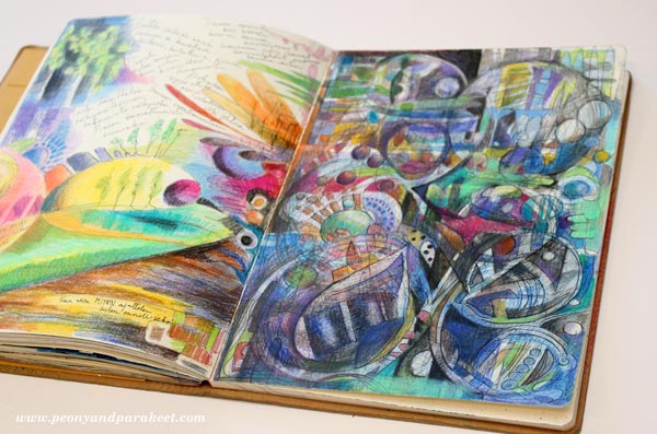
Visualizing thoughts and experiences bring it all together. There’s a lot of inner power in seeing what you think.
Subscribe to my weekly emails – Get a free mini-course!
Stop to See Your Inner World!
If you watched my recent video interview, you know that I love technology and innovations. People often say that technology is a tool. I do understand that phrase and agree with that to a certain point. But if I had to define technology, I would say that like art, it’s an experience. Whether I read about innovation in technology, or see an interesting artwork, I like to stop and think how I feel about it.
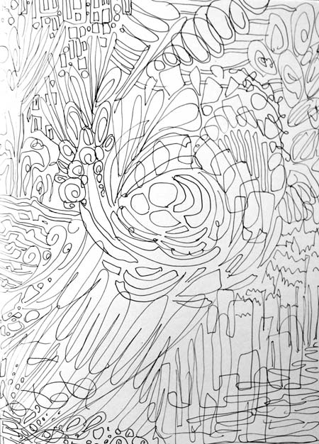
Now you might ask: “Why would I take any abstract concept or inanimate object and add emotion to it?”
My answer is: “Because that’s how you boost your imagination!”
When we see technology as a crowd in a concert or a tea cup as a gentle old lady, we will open the door to our inner world.

Often it requires that we stop. Stop taking in universal generalizations, and start adding our associations. It does not mean that you should do it all the time, but in small moments, every day. Because like Terry Pratchett has said: “Humans need fantasy to be human.”
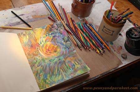
By drawing, we can work our fantasies so that they become insights. Instead of continuously searching inspiration from outside world, we can take time for processing information inside. When we integrate our past experiences with new ones, we can have an improved view of our life as a whole. As visual people, we can produce images that have that unified vision. These kind of holistic visions are almost impossible to express with words, that’s why they are called “the big picture.”
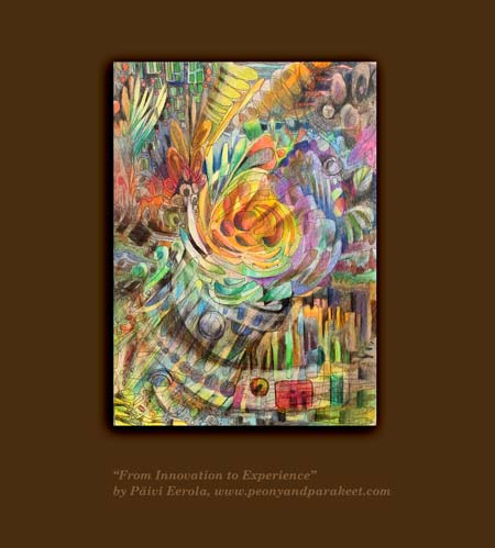
Sign up for Inspirational Drawing 2.0!
You will learn not only practical ways for processing inspirational material
but also how to let your subconscious take control.
Produce “the big pictures” of your experiences!
>> Sign up now!
Intuitive Start for Art Journaling
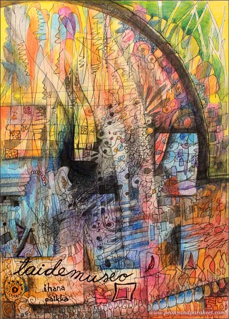
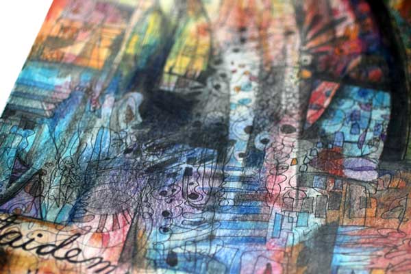
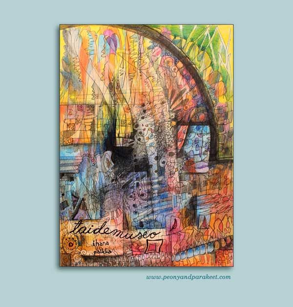
My latest art journal page is about one of my favorite places: art museums. On the page, I have used both organic and graphic shapes to express the interaction between art and architecture. That interaction is something I enjoy examining when handling art museum inspiration.
Inspiration
Last week I went to Kunsthalle Helsinki to see an exhibition of Erling Neby Collection. Erling Neby is a Norwegian businessman who collects concrete and geometric art.
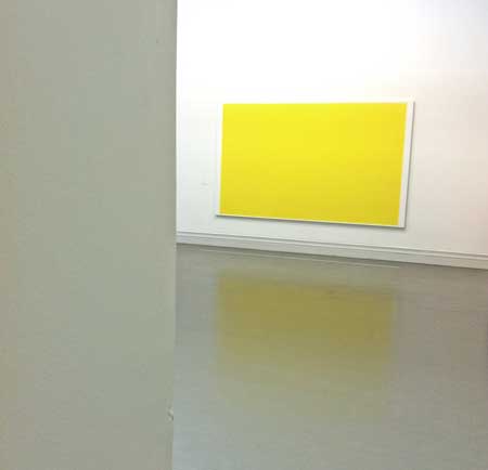
This kind of art makes me remember the time when I was in my 20s and very certain of what kind of art I like and what I don’t like. Simple-shaped abstract paintings were in my comfort zone back then – it was “good art” that I was excited to see and experience although I have never been able to stretch my personal style to that.
At the exhibition, the reflection of the yellow painting was especially inspiring. It made me think how art is never disconnected from its surroundings, whether physical or mental. Thus, an illustration about art museum would not need to separate artworks from the architecture but express the holistic feeling of the experience.
Techniques
I used a couple of black pens and colored pencils for creating the page.
1) Free doodling and coloring.
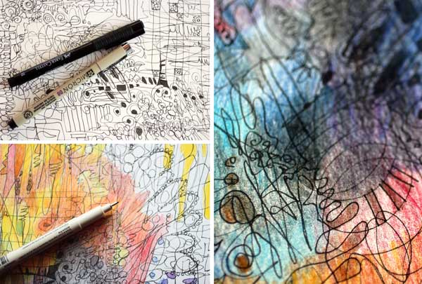
2) Drawing sharp graphic shapes with the help of a ruler and a round object. 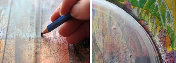
Emotional Connection
When I draw, I always want to get an emotional connection with the subject. Without that, I start to worry about the result before the first stroke! When making this page, I did not think about art museums in general. Instead, I thought about tiny details that I saw and tiny moments that I remembered from my last visit in Kunsthalle Helsinki. I focused on the feeling and let my imagination work with that.
Inspirational Drawing
Working from tiny details towards the big picture is something that is not easy to explain in a single blog post. To explain it shortly, it is starting with an intuition and then slowly bringing the page towards the intention. This way of working is in the main role in Inspirational Drawing.
Inspirational Drawing is built so that you can enjoy developing the three dimensions of drawing:
1) increasing your imagination
2) improving your technical skills
3) using inspirational source material.
You will learn a creative process in detail through art journaling exercises. Course videos will not only show you how to do, but I also talk about the emotions and the inspiration behind them. I will answer your questions and help you adjust the process so that it will work for you. You can start enjoying free drawing without questioning what to draw or how the process itself will take care of that!
Why History, Computers and Art Belong Together
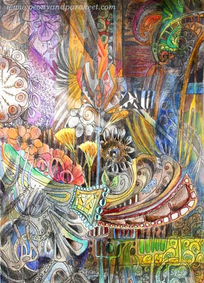
This art journal page is about two things that are close to me: art nouveau and computer engineering. With my background in technology, many find it surprising that historical styles like Art Nouveau fascinate me so much. And vice versa: why someone so interested in history, has studied and worked with computers.
Inspiring Periods of World History
For me, history, computers, and art have a natural connection. Think about the era of Art Nouveau: the end of 19th century and the beginning of 20th century. It was the era of the industrial revolution when many technical inventions were born. Also, at the same time, new kind of art was emerging. For example, Virginia Woolf wrote books using the stream of consciousness, Vincent van Gogh painted Starry Night, and Charles Rennie Macintosh designed a grand building for Glasgow School of Art. After inventing computers, we are experiencing another great era with a lot of innovations, the internet, and smartphones among others. I am certain that it will be seen as one of the most exciting time in the world history. We have new tools for art and design and we if any can use art to look at what the future could hold.
The Stream of Consciousness – Creating a Coloring Page
When I started to create the art journal page, I thought about the two eras and their similarities. With a black drawing pen, I began drawing art nouveau style shapes. It was exciting to think about modern things while drawing in the old style. It is very inspirational to stay focused on two things that have both similarities and differences.

It is relaxing to draw like imitating Virginia Woolf: using the stream of consciousness. Rotating the page makes it easier to keep the stream flowing.
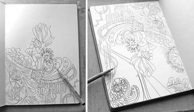
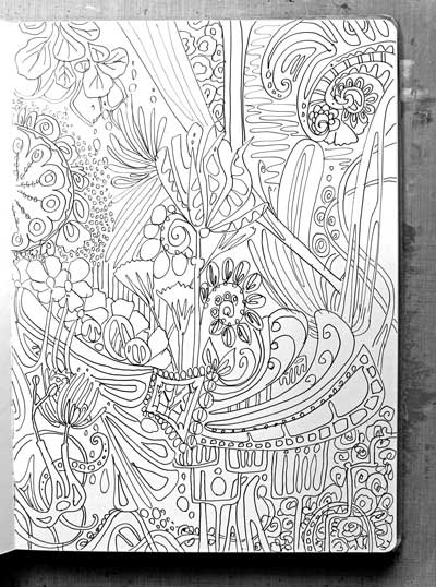
Coloring books seem to be popular at the moment. We art journalers can make our own! Here’s my page before coloring.
Past, Present, Future – Art Is an Equation
When I studied computer engineering, I had to understand a mathematical equation that was used widely to control technical systems. It was called Kalman filter and it was composed of three parts: past, present and future. I found the philosophy behind the equation most fascinating: to get better at what we do, we must understand the past, stay grounded to the present and be brave enough to predict the future.
Art can be our equation. We can use art to ponder on what has happened to us. We can use art to record the present. But most importantly: art can make us get off the ground. We can predict what the future will hold by taking old and current stuff and create new combinations. We can imagine what Virginia Woolf would do in the 22nd century and illustrate it. There are no limits and we already have most of the information.
That’s why I think that history, computers and art belong together. They are all parts of the same equation.
Adding New Dimensions by Coloring
To bring today’s graphic shapes to the work, I drew rectangular areas on the top of the drawing. Then I colored them with a different color scheme.

Finally, I expressed how past can bring us the future by erasing color with a light strokes. The light comes from the past. With the past, we can see the future.
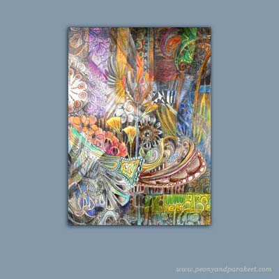
Tell me, what have you picked (or would like to pick) from the past to your art?
Create your own colored version of this page!
>> Buy Coloring Freely!