
Remembering Collageland
With this spread, I say farewell to a course called Collageland.
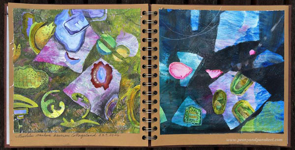
Yesterday, when I was making backgrounds and decorating handmade papers for this spread, I looked back on my artistic journey.
Three Stages
Stylistically, my artistic journey can be divided into three main stages. The first stage began around 2010 when I created decorative collages. My thing with collage art has always been to create every piece of paper myself and not cut anything from magazines or such. This approach requires more work, but it also grows your drawing skills. And most importantly, you can proudly say that you did it all yourself.
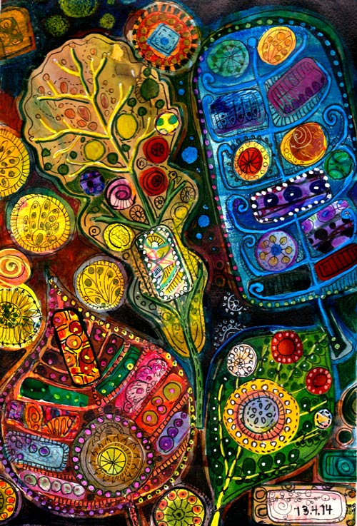
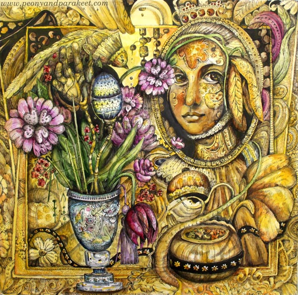
From 2016 to 2017, I gradually shifted toward a more illustrative style, drawing and painting representational fantasy art that often featured human or animal figures. I was highly influenced by art history and fantasy artists.
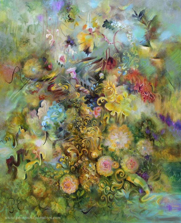
In 2020, I found my current painting style and focused on freely painted abstract landscapes and floral still lifes.
Considering I started my career as a full-time artist in 2014, you could say I moved forward in three-year leaps.
After the first stage, in 2018, I wanted to create one last course on decorative collages. It got the name Collageland. I felt that moving on is like leaving one place and founding another.
Remembering Collageland
Yesterday, I watched Collageland again. The course videos and the written materials evoked two strong emotions.
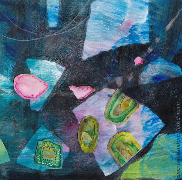
First, I felt tremendous inspiration. I just had to do those exercises one more time! I painted papers with watercolors, made prints on paper using a Gelli Plate, and decorated the papers with pens. One of my art journals now has a farewell to Collageland, where flags fly, sending prayers and good wishes to all artistic souls.
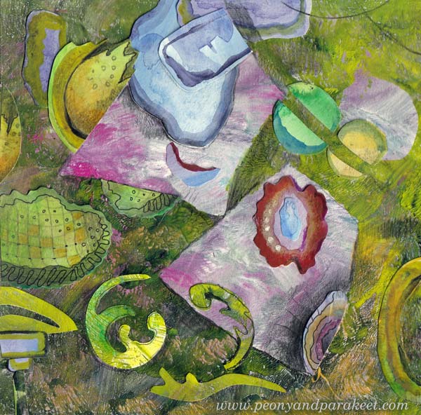
I used torn papers over the Gelli Plate and I think the backgrounds are really cool. It looks like the “flags” are glued, but they are just layers of paint!
Originals and Prints
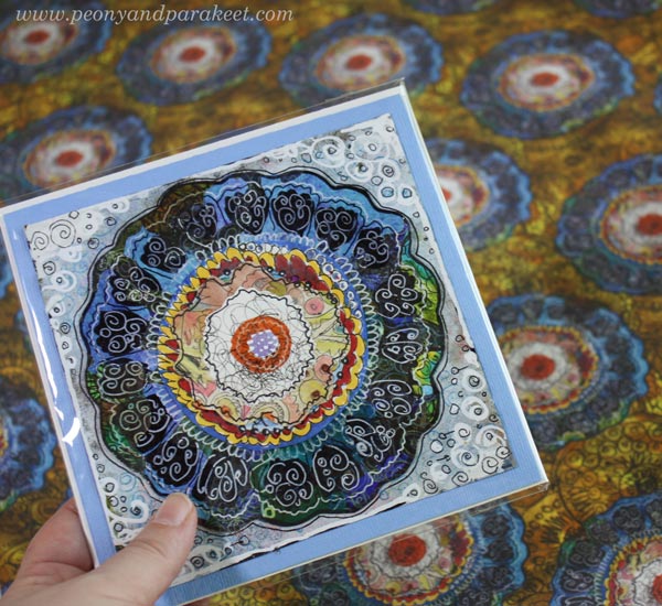
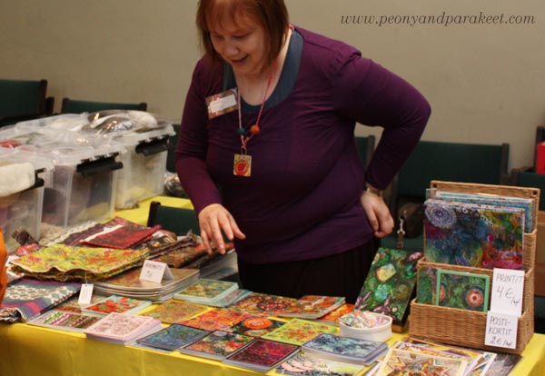
Viewing the first stage of my artistic journey from a distance was exciting. I didn’t remember how much inspiration is packed into the course, and I had forgotten surprisingly many techniques too. In Collageland, I share not just collage art made over the years, but also prints and fabrics created from them.
Changing the Needle to Pens
In Collageland, I also show inspiring needlework projects, as my drawing originally grew out of them.
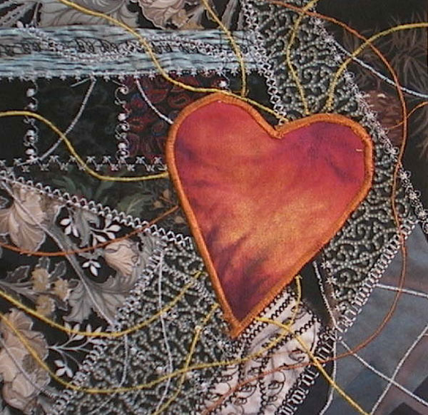
Embroidering with a needle, or even with a machine, eventually felt too slow, so I switched to a pen.
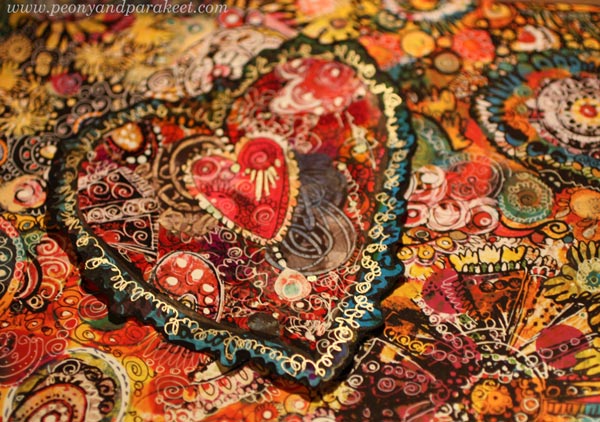
So, the subtitle of Collageland is “Artistic Embroidery with Pens and Paper.”
Collageland Is Retiring – Buy Now!
Yesterday, when the final video ended and my art journal spread was finished, I was moved to tears. “Hey Päivi,” I wanted to say, “hey younger Päivi, I want to become you again!” But at the same time, I felt that I was already living in a third, even more wonderful land, and that there is no turning back.
So, it is time to retire Collageland. If you haven’t taken it yet, I warmly recommend it! There are still a few days left to purchase, and the price is 50 % OFF! >> Buy Now!
The course videos are available to you for at least six months after purchase. And if you download all the course material, the course is for your personal use as long as you keep it on your device. >> Buy Now!
Collageland is no longer on sale after Sept 27, 2026, at midnight PDT.
Three Design Styles, a Gelli Plate, and a Brush
One of my goals for this year is to learn surface pattern design. I want to move back and forth between art and design, and add more design to this blog as well. This week, I picked three of my favorite designers and played with Gelli Plate to imitate their style. These don’t replicate any of their work, just their style.
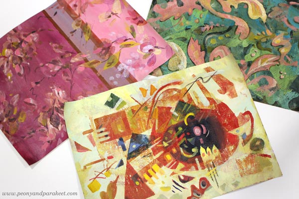
Three Designers from Three Centuries
My three favorite designers are Tricia Guild, William Morris, and Wassily Kandinsky.
Tricia Guild a designer from the UK, and she has a company Designer’s Guild, and I have been her fan since the 1990s when I discovered her book Design and Detail. It’s been my interior design guide for 30 years, and all my homes have got ideas from that book.
William Morris is also English, but he lived earlier, in the 19th century. Two rooms of our home have curtains designed by his company, and I regularly admire their clever repeats and ornamental shapes.
Wassily Kandinsky was more of an artist than a designer, but he taught designers in a famous Bauhaus art school in the early 20th century. For me, he is the father of modern design. I see his paintings in the works of most midcentury modern designers. Lately, he has felt even closer, when I have been built a class Floral Freedom that is based on his and Paul Klee’s teachings.
Who are your favorite designers?
Three Designers – Three Color Palettes
I have always liked making hand-decorated papers. Actually, my most popular blog post is this ancient one: How to Make Your Own Patterned Paper from 2010. So let’s get back to basics and make some!
First, I painted the backgrounds with acrylic paints and a flat brush. This set a color palette for each paper.
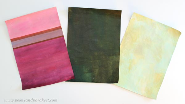
Muted pastels and rich darker tones remind me of Tricia Guild. She often uses stripes or checks too. William Morris has greyish colors and many of his designs have dark backgrounds. Wassily Kandinsky often had a very light background in his paintings.
Three Design Styles – Three Kinds of Shapes
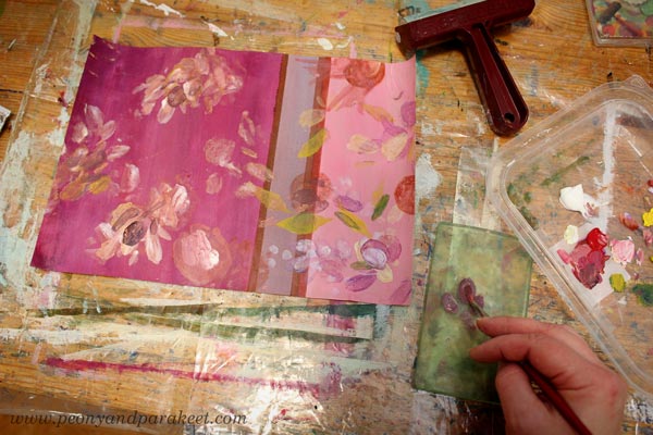
I continued each of the papers by mono-printing motifs with a Gelli Plate. For Tricia Guild’s style, I used a small plate and painted the motifs with a brush on a plate, then pressed the plate on the paper. Because Tricia’s style is often quite relaxed, there was less pressure for perfect outlines.
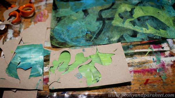
William Morris’s designs are very sharp and ornamental. I cut out ornaments freehand from paper and used both negative and positive shapes. I used both a big Gelli Plate and a small one.
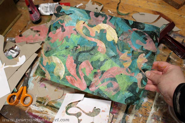
Here’s how the paper looked after mono-printing.
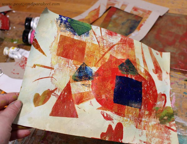
Wassily Kandinsky’s shapes are mostly geometric, so I cut templates that had circles, lines, squares and triangles.
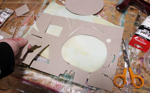
Here’s how the paper looked after mono-printing.
Three Design Styles – Three Levels of Detail
After mono-printing, I finished the papers by painting. I used a narrow brush and made small tweaks only.
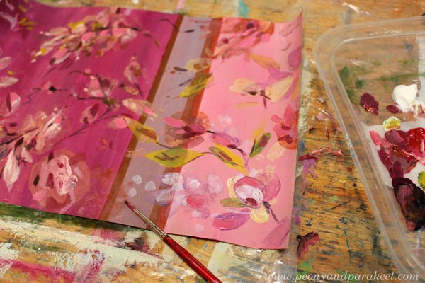
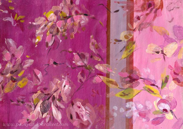
I like Tricia Guild’s designs because there modern meets classic and historical. They feel luxurious, but still comfortable. They don’t require similar perfection from the space than William Morris’s designs. So I didn’t perfect every shape or line, just added a bit more realism to the floral motifs. Here’s the finished paper.
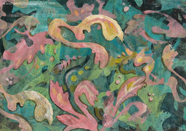
William Morris’s designs are full of outlined motifs, and I connect them with books. “For people who have a library,” I wrote in a notebook that I keep for studying. But I quite liked my mono-print, and didn’t want to stiffen everything. So I only outlined a part of the motifs, and added some small dots and thin lines inside the shapes.
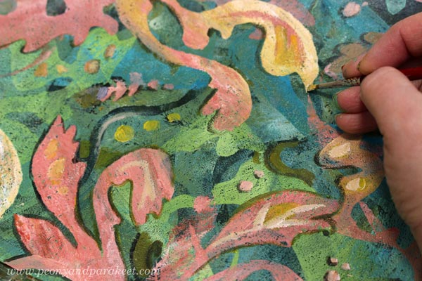
Here’s the finished paper. I really like the big yellow motif! Maybe that could be a part of my future designs.
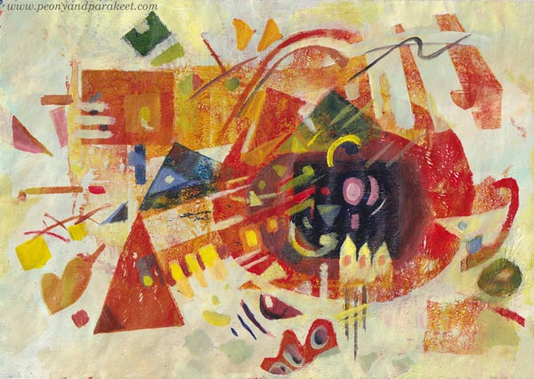
Wassily Kandinsky’s work didn’t lack details either. But if William Morris is for bookworms, then maybe Wassily is for systematic thinkers – for more scientific than humanistic introverts, and for those who love mathematics.
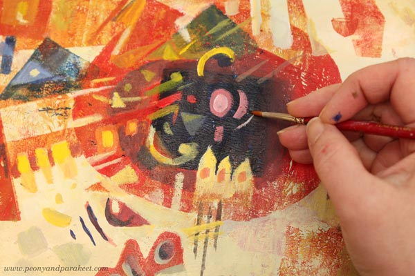
I used the monoprint as a foundation for the composition of shapes and followed Wassily’s advice and ideas from his book Point and Line to Plane, the book that I teach in the class Floral Freedom as well. Here’s the finished paper.
Three Wallpapers
I wanted to see how these papers could work as repeats. I didn’t have time to play with the repeats properly, but here are some quickly made images to demonstrate how the motifs would look in a smaller scale, for example, as a wallpaper.
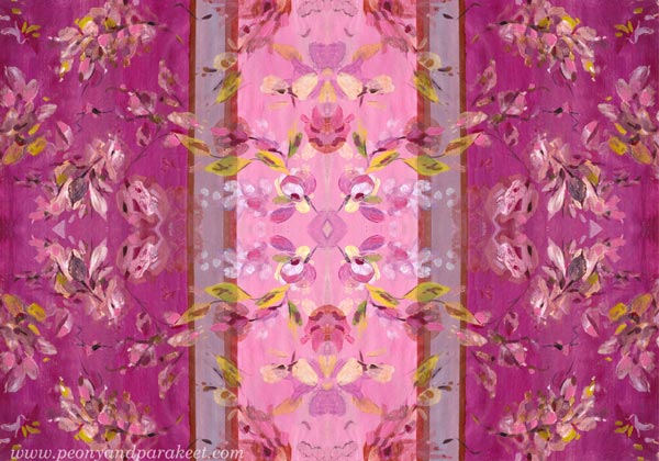
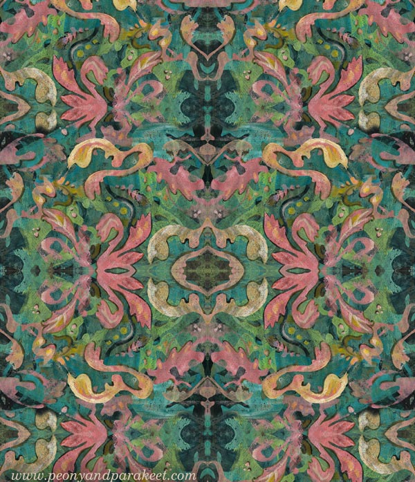
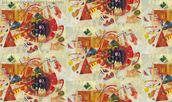
It was a full day, but I had fun making these! Tell me, which three designers would you pick?
Gelli Plate Meets Fine Art – Monoprinting Ideas for Art Lovers
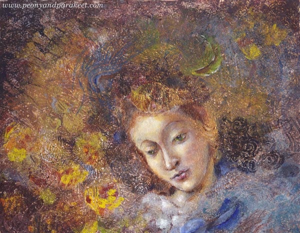
Old paintings are full of nuances and flow that we often don’t see when focusing on the subject only. This week, I am a rebel and use a Gelli plate for bringing up those elements. The Gelli Plate, like any mono-printing tool, is a bit clumsy for adding details. But also full of potential because you can easily produce repeated motifs that are not exactly similar. It enables you to add diversity and uplifting rhythm to your art without extra efforts.
Gelli Plate Meets Fine Art – Watch the Video!
This video is a replay of a live broadcast where I am sharing my secrets about the process.
I also include the images and the summary here in this blog post so that you can more easily refer back to these instructions.
Project 1 – Expressive Portrait on White Background
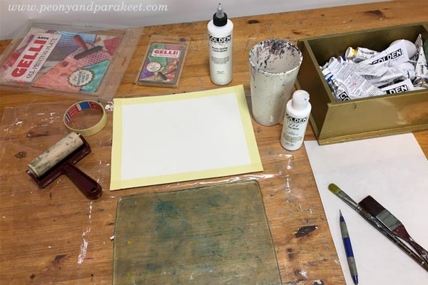
Supplies: Gelli Plates (mine are 8 x 10 and 3 x 5 inches), watercolor paper, brayer, brushes, any blunt stick, acrylic paints, glazing liquid (or gel medium).
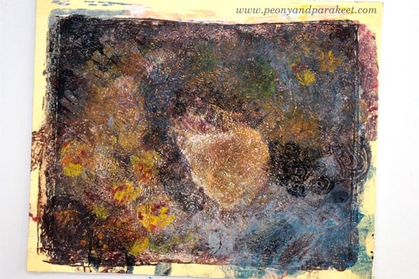
This project started by intuitively adding layers with a Gelli plate on a white watercolor paper.
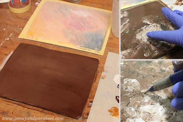
My only intention was to make a mess that has enough diversity so that I could see something appearing.
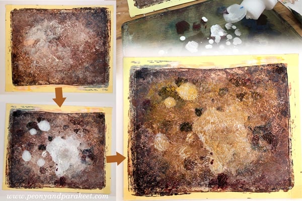
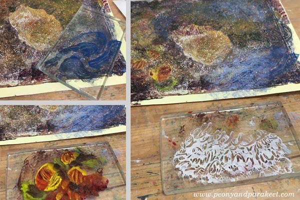
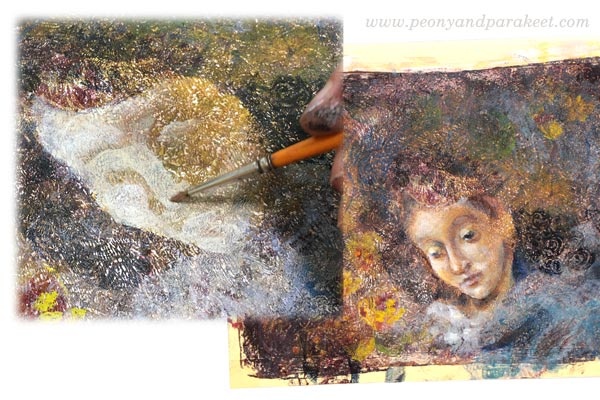
The big spot looked like woman’s face to me, so I made a stencil by quickly sketching one on paper.

I added more elements and shadows, so that worked one area at the time.

When the big elements were in their places, I changed to a smaller plate and added more details.
Here’s the monoprint before I changed to painting with brushes.
Using Botticelli’s Madonna of the Book as a loose reference, I painted the face and some details with fine brushes and thin layers.
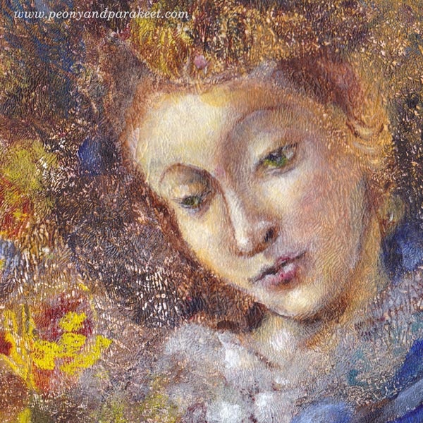
Here’s the close-up of the face. I realized that the eyes look to a bit different direction, but I didn’t want to change that because this piece is called Nostalgia. I think it’s a mixed feeling because then we are admiring the past, but at the same time, being sad that there’s no way to travel back in time.
Here’s the full painting again.
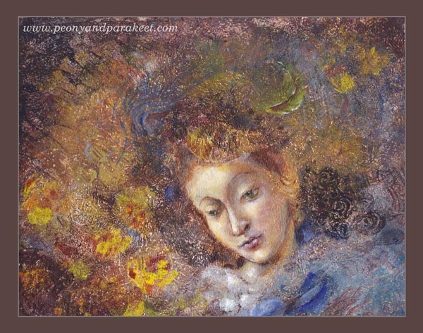
Do you like this one? The original piece is for sale in my shop!
Project 2 – Floral Still-Life on Black Background
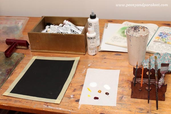
This piece started by adding a layer of black gesso on a watercolor paper. I had a clear goal from the very beginning – to create a floral still-life honoring Dutch Golden Age paintings from the 17th century. I also wanted to use Gelli plates only and see if it’s possible to create a detailed piece by mono-printing only.
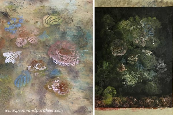
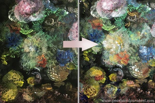
The first layers were very subtle and translucent. The idea is to build depth by slowly increasing the brightness of the mono printed layers.

Like in the previous project, many layers only had few elements. I like how detailed they look when adding lines with the stick on the plate.
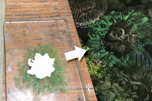
I also made a paper stencil for this project. At this point, I changed to a smaller plate.
I used paler and darker tones of pink to make a flower. It’s also handy to stamp the same flower several times.
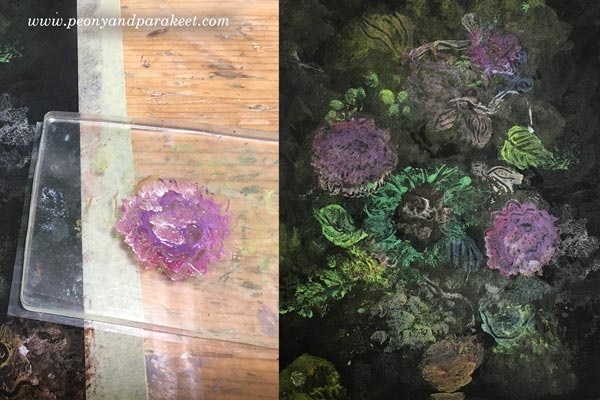
Dots and splashes of paint all add up. I also like to use cotton cloth for making a sharp edge to a free-form shape.
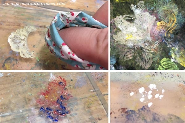
When using a little too much paint, it forms “skins” that look like intricate leaves. It was also fun to add a surface pattern to a vase.
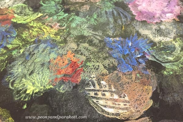
I used dark browns and black to tone down some elements, and white to highlight others.
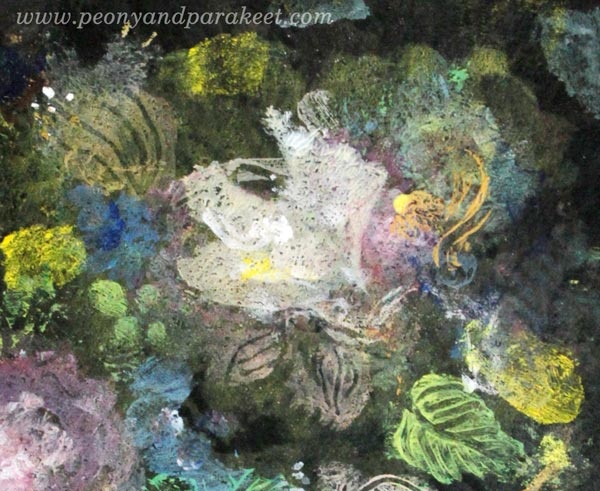
Here’s one of my favorite details:
Another one, showing how the vase glows.
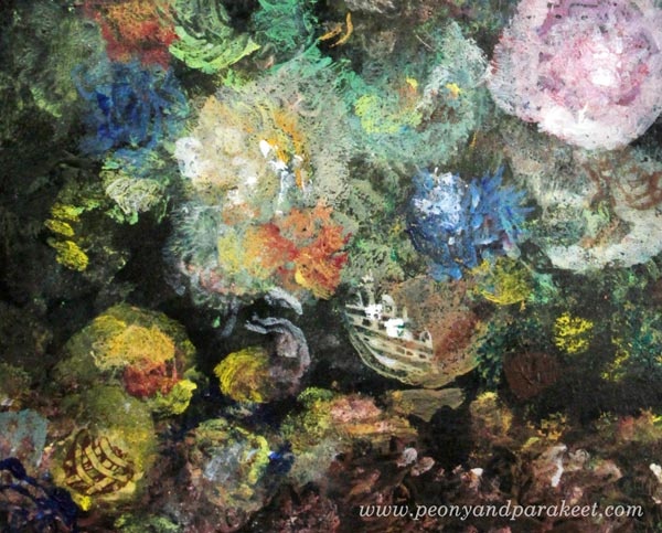
Here’s the finished piece in full size:

What next?
Continue to create with Paivi: Subscribe to my weekly emails
Learn the basics of mono-printing and create your visual wonderland: Buy Collageland
Stop the stiffness – let Paivi help you to move forward: Join Bloom and Fly
Subscribe to Paivi’s weekly emails – Get a free mini-course Loosen Up!
Coming Up: Fine Art Monoprinting!
I am running a free live broadcast Gelli Plate Meets Fine Art on Wednesday, May 23, 9 AM BST (London), 6 PM AEST (Sydney). This session is for you who loves old paintings from Renaissance to Impressionism but who also likes to play with Gelli plate or other mono-printing tools.
Inspiration from Historical Paintings
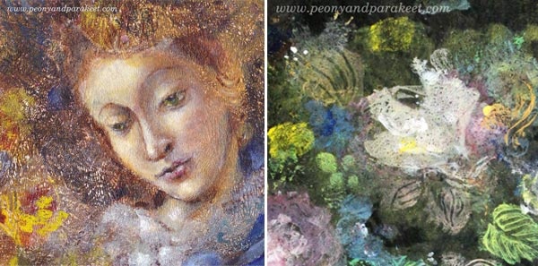
Old art is full of nuances and inspiration. I will show you how you can get more out of old masterpieces and apply the lessons to your art too. I will use two pieces as an example of how you can stretch Gelli plate’s limits. The first one has brushwork in addition to printed motifs. The second one is a still life that was made with a Gelli plate only. The pics of this post show some details of them.
Gelli Plate Meets Fine Art – Come Along!
Reserve your spot here: https://www.crowdcast.io/e/gelli-plate
You can watch the replay via the link or here on my blog if you can’t make it.