
Making the Most of Visual Nuances
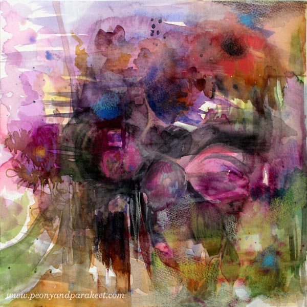
This is my latest mixed media painting “Summer is Coming”. It has been exceptionally warm weather in Finland and all that sunshine has brought summer not only to my mind but to my painting too. I tell you now how I created the painting!
First Layers: Having Fun with Watercolors
The painting began with watercolors. I made a mess that didn’t look so good when looking at it from a distance. But it looked wonderful when taking close-up photos!

After splashing the first couple of layers with a big brush, I changed to a smaller one. I painted simple shapes with soft edges and thought that maybe this will be an abstract piece.
Is This a Still life – Again?
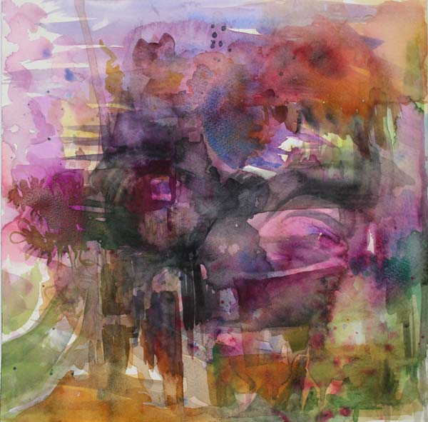
But after a while, it looked like a still life! I must admit that I have developed some kind of obsession for still lives. I have loved them for a long time already. But recently it has begun to feel that anything could be expressed with them. Well, a Finnish artist Miina Äkkijyrkkä has painted and sculpted cows for all her life, so still lives might not be so bad …
More Details with Colored Pencils
With colored pencils, I made the flowers more distinct. I wanted to work as softly as I could so that the delicate look of watercolor paint would still be dominating.
Almost There – Visual Nuances
Then I entered the actual finishing phase. This is what I call “Almost There” phase. It is the point where many just call the painting finished, and they try not to think about it too much. But if I am teaching a class, I encourage people to continue. One way is to show them what they can do next. So I open the photo of the painting in Photoshop and make little adjustments. With these suggestions, I try to add more visual communication and interest to the painting. Sometimes a little spot of color can make a big difference! See what kind of suggestions I made for my painting!
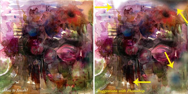
What’s the Magic of Using Photoshop for Suggestions?
One thing is that I can zoom as far as I can. Another thing is that I can try out different kind of adjustments without making a mess. I don’t do this often for my paintings, but I wanted to show you how little guidance can take the image to the next level. This is one thing that an art teacher can do: show you how you can fine-tune your work so that it has those visual nuances that make the painting more dynamic and alive.
Finished Painting
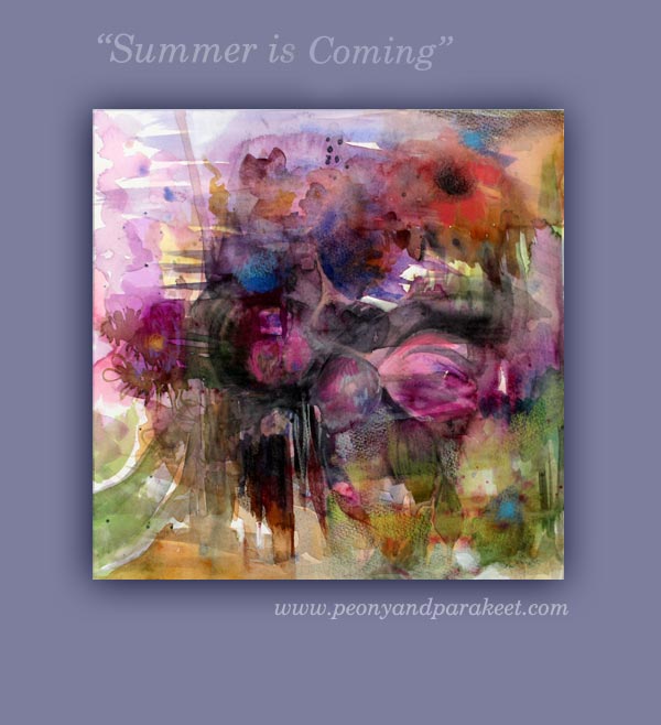
Here’s the painting after finishing it according to the suggestions. I used colored pencils and white gesso for the final details.
Subscribe to my weekly emails – Get a free mini-course!
Painting in Liberated Style
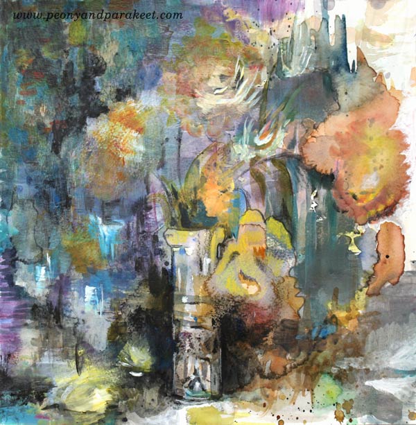
Welcome to my creative space to see how I create this mixed media painting “March Still Life”!
Watch the video and listen to my thoughts about creating and teaching art while I paint in a liberated style.
Liberate Your Art!
The workshop mentioned in the video is currently unavailable
but come and join me on the course that is based on it:
Liberated Artist Revisited – Buy Now!
Step into Hundertwasser’s Ecstasy!
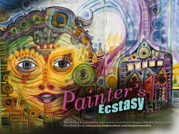
An Austrian architect and artist Friedensreich Hundertwasser inspired me to create this art journaling mini-course. Painter’s Ecstasy has just been released as a part of Imagine Monthly.
Getting into Hundertwasser’s Head
Creating the mini-course took a lot of time. I didn’t want to just paint something in Hundertwasser’s style. I wanted to find the elements in his style that support intuitive painting. I wanted to discover the essentials that allow anyone to produce their own work, not just copies. I also wanted to point out the most important nuances that make his paintings so appealing.
Even if Hundertwasser’s paintings (go check my Pinterest board: “Hundertwasser Hunger”) are so clearly shaped and striking, getting into his head wasn’t easy! I made a lot of sketches and experimented with various art supplies. These art journaling pages are some of the sketches:

Structures from Buildings and Maps
Hundertwasser’s education in architecture affected the way he painted. He used structures from buildings and maps to express himself. His paintings tell stories about how humans relate to their environment. It made me think how my desire to paint glassware and ceramics is due to my studies in industrial design. However, I truly enjoyed the techniques discovered from Hundertwasser’s paintings! I am definitely going to continue using those! It’s mostly just watercolor, isn’t it amazing?!

3 Months, 3 Artists
Each of the mini-course has now presented an artist. I must admit that I have been a bit selfish here, picking out artists that truly inspire myself. Luckily I have been blogging for a long time. It hasn’t probably been any surprise that January’s artist was Alphonse Mucha and February’s William Morris. But my love for Hundertwasser’s paintings might have been a bit hidden. Now when I have found out how he created his paintings, it won’t be a secret anymore!

Have Some Hundertwasser in Your Art Journal!
You can still hop on Imagine Monthly and get all the 3 mini-courses right after the purchase. There are three more mini-courses to come and the community is just wonderful to be in! It is so delightful to see everybody’s unique versions of the techniques shown in the class. Purchase here!
From Intuitive to Intentional Painting
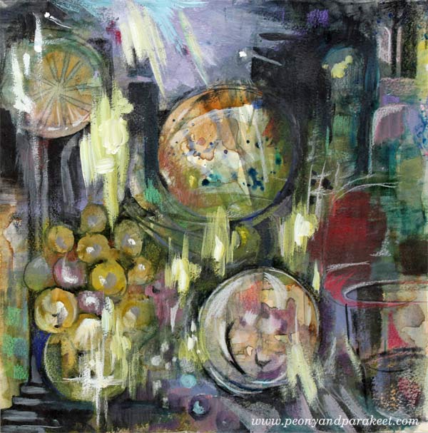
This is my latest mixed media painting called “The Phantom of the Opera.” Just saw the musical in The Finnish National Opera! I don’t know about you, but when I go to see a performance like that, I know that it will appear in my art one way or another. With this blog post, I want to challenge you to think what is intuitive and what is intentional in art. And – can they be combined?
Day 1 – Watercolors
It was a sunny winter day when I started the painting. A friend from the UK was visiting me, and we were chatting while I painted the first layers. With watercolors, like many times before.

I love how well watercolors support intuitive painting. You can just splash here and there and then get inspired by the result. In this phase, I tend to choose the colors quickly, based on what feels good. I would call this phase very intuitive also because I don’t usually have no idea about how the result would look.

After splashing watercolors on the paper, I tried to get something a bit more intentional out of it: distinct shapes, strokes and color areas.

The painting looked like it could be a still life with wine grapes and some fruits. But I did not have more time to continue with the painting, so I saved it in my album. I love to create 12 by 12 paintings as they fit on a regular scrapbooking album. I also love the square shape as it is easy to change the orientation of the picture in the middle of the process.
Day 2 – Acrylic Paints
About a week later I picked out the painting again. This time, I wanted to add some acrylic paint to it. I find the combination of transparent watercolor and non-transparent acrylic paint very attractive. When touching the acrylic paint tubes, I get ideas about color mixes that would work with the watercolor background. I would call this pretty intuitive step too.

As I am a very detail-oriented person when painting, I try to be bold when painting with acrylics. Broad strokes add more interest to detailed paintings.
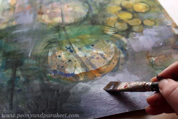
In the end, the painting still looked like a still life, but I wasn’t quite confident about the orientation of the painting.

Here you can see the difference between the end of day 1 (watercolors) and the end of day 2 (acrylics).
Day 3 – Colored Pencils
Because I love details, I also love to use colored pencils. With colored pencils, it’s easy to add little nuances here and there, and I also like the look of pencil strokes on the painting.
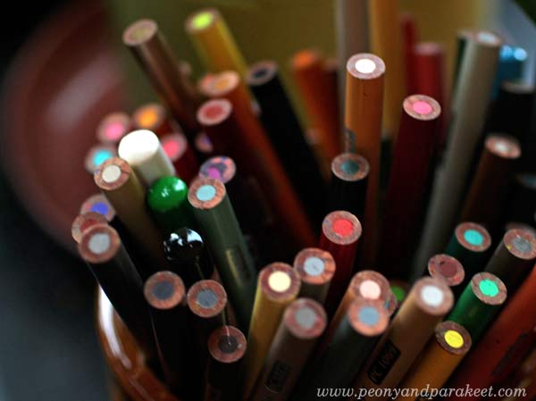
Day 3 was a day after day 2, but it was still before I had seen the musical. When I work with colored pencils, I am often very intentional. First, I had an idea to create wine glasses of the two round elements, but then I changed the orientation of the painting and saw lamps in the ceiling!

Which one do you like the best: the wine glasses or the lamps?
Day 4 – Acrylic Paints + Colored Pencils
Day 4 was after the musical. I got an idea from one of the scenes. The painting continued with acrylics expressing the famous chandelier crash!

So far I had been pretty intentional but then changed to intuitive. I played the music and tried to get into it as much as I could. I used both acrylic paints and colored pencils.
Here’s the result again:

Intuitive Painting – Guess What!
The story doesn’t end here! While photographing the finished painting, I glanced at my feet and saw the same color scheme in my socks! I had just finished them before Day 1 and worn them ever since. So, this painting actually started when I was picked the yarn from my stash for the socks. No, wait – it began when I bought the wool that I spun to the yarn …!

Combining intuitive with intentional is a lot of fun! It’s the best cure for getting rid of stiffness in the result. The intuitive parts allow you to feel free when painting; the intentional parts bring more clarity to the painting.
Get a Free Mini-Course: Subscribe to my weekly emails!