
Drawing in Art Nouveau Style
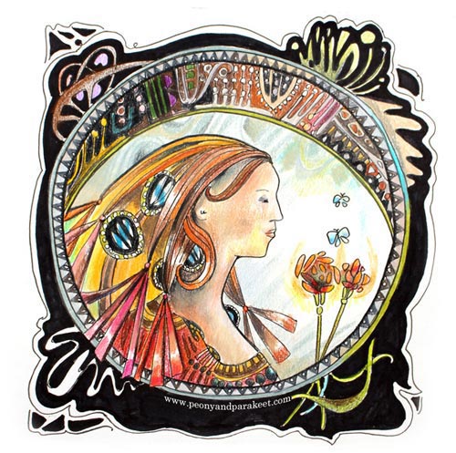
If I had a time machine, I would have no doubt where to go first. I would press the buttons and whoosh … enter the beginning of 19th century. First I would want to meet one of my favorite authors, Virginia Woolf, then have an evening with Charles Rennie Mackintosh and his wife Margaret. Maybe another brilliant architect Frank Lloyd Wright could join us. Then I would spend a whole day with Alphonse Mucha, another with William Morris … There are so many to talk to and so many places to go. I would need weeks for my visit!
From Arts and Crafts movement to Art Nouveau and Art Deco – my love for art and design is mostly originated in those historical periods. I often try to hide it and be open to new ideas and various styles. But if I just need to draw something quickly or if I can choose freely, I am all for Art Nouveau.
Art Nouveau Drawing – Watch the video!
I am passionate about drawing and styles. I believe that finding your own style, increases the joy of creating. Last week I wrote that down and then began to ponder: could I share more Art Nouveau in this blog? So, here you are, in the middle of Art Nouveau themed post and at the beginning of the video blog post where I will show you how I draw in Art Nouveau style. But more than about Art Nouveau, this video is about the importance of doodling and sketching. Promise me, never stop doodling!
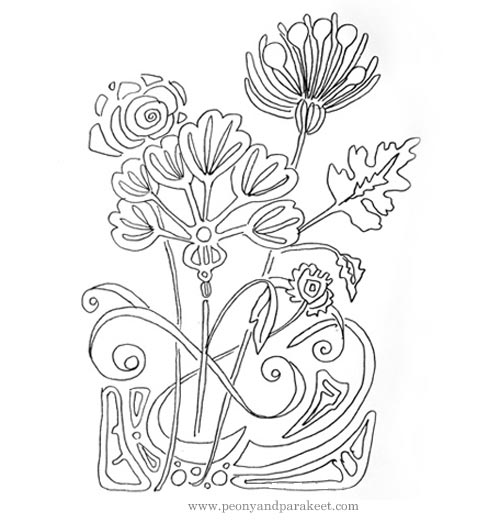
Did you notice my William Morris curtains at the beginning of the video? Tell me, what are the styles and artists from the past, that you admire?
Doodle with Art Nouveau in mind: Buy Doodled Luxury!
Color my Art Nouveau drawings: Buy Coloring Freely!
Find Your Hidden Inspiration for Drawing Details

This colored pencil drawing is an art journal page. It is called “Growing Towards Light.” It’s inspired by the beauty of tiny details found in plants.
For a long time, I have wanted to write about looking at tiny treasures for drawing inspiration. It is the subject that I might have mentioned, but not put fully in focus. Last week two things happened that made me decide to bring it up.
Blooming Houseplant
First, one of our houseplants blossomed. The plant is probably a prayer plant, and it has such modest flowers that we almost missed the whole thing. But once I took few photos and examined them more closely, I was in awe of the blossom’s beauty.

I admire the shape of the stem, how beautifully angled it is, the sharp buds, dark seeds, and the delicate flower. It all looks like perfect, well-thought, well-executed combination of aesthetics and science. I feel not only inspired by the little details but how it also makes me think of the quality of my art: I should continuously raise the bar a little bit higher, work more carefully, become more patient and get further in my thoughts. It sounds a bit harsh as I am writing this, but when watching the nature, it is very inspiring. Maybe we all should sometimes follow the prayer plant: use the time to create a smaller work but take more care of the details!
Mr. Mac and Me
The second thing that is related to the subject of the post is the email that I got from Claire, one of the readers. One of the best things about writing the blog is the interaction. My favorite thing is when I get ideas and suggestions about what to examine next. Claire remembered that I am a big fan of Charles Rennie Macintosh and his wife (see this post when I visited Scotland to see their art). She sent me a link to the review of a newly published novel. The novel is Esther Freud’s “Mr. Mac and Me, “ It tells a story about Charles Rennie Macintosh through the lens of a 13-year-old boy who gets to know him. Very interesting! I added the book immediately to my wish list.
At the end of the review, there’s a quote from the book where the young boy talks about Macintosh’s flower drawings: “I go closer. I look at everything for what else is hidden. There’s the head of a duck folded into a sunflower’s stem …” For me, that implies how the beauty can be the result of many little details. That challenges us to build our art from well-formed shapes, no matter how small they are, and believe that each of them will increase the beauty of the whole artwork.
Drawing Details
Like said, the perspective in decorative art is in the details and their perfection. Instead of sketching something grand, the decorative artwork starts small and gets bigger by adding tiny details one after another.
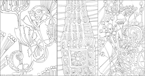
These are some of my unfinished art journal pages. I love to draw with a thin black permanent pen. The inability to erase anything makes me start small! If a blank paper feels scary for you, create a watercolor painting first and then start doodling. My video “Watercolor 101 for Intuitive Painting” presents the method how to get started without any specific pre-thought idea in mind.

More Skills and Inspiration!
Grow your skills in creative coloring >>Buy the e-book Coloring Freely!
The Essence of Your Art
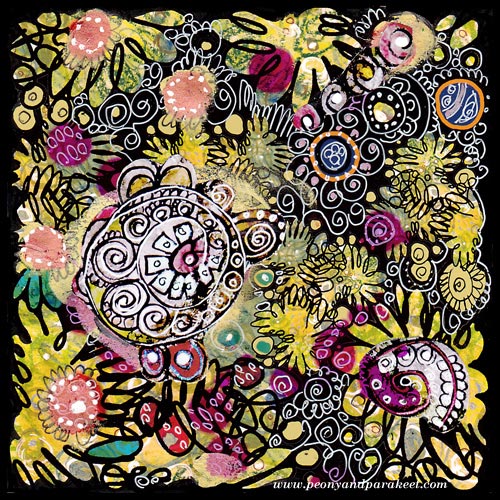
I found this old collage piece when I organized my archives. It is a design that I have used as a part of the fabric called Flow. As art journaling cute little girls with lovely little animals, is so popular nowadays, this made me think: what’s the essence of art is for me. And also, I would love to hear what it is for you!
For me, it’s not the play, even if I love playing. It’s not the colors even if I am totally for them. It’s not even the circles, my favorite shapes. I might aim for the certain styles, I love art nouveau and expressionism, for sure. But the essence of everything is that I want to create “everyday icons”, the images that make me stop, drop everything mundane and get in touch with my the inner thoughts.
Technically compositions, colors, shapes, styles, etc. create that. But when I am happy with the result, I do not think about those anymore. I think about what I feel and think right now and where it can take me.
The best thing is that everybody can create their personal icons, sacred images, mandalas, whatever you want to call them. They don’t need to be connected to any religion. They can just be connected to experiences, moments or beauty which uplift your spirit.
This is what I thought when I saw this old artwork. And now I wonder, what can I do better. How can I make this blog be the place for anyone to stop, then start creating – the essence of their art!
Subscribe to my weekly emails – Get a free mini-course!
From Movie Posters to Art Journal Pages
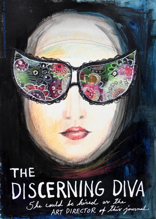
“The Discerning Diva – She could be hired as the art director of this journal.”
This page is my version of the poster for the movie “The Big Lebowski”. I have borrowed the concept of weird glasses and the composition from the poster, but it is still a separate artwork, not an exact copy.
The Discovery of Movie Posters
After learning that I like to use alphabet stamps in the art journal pages, I had been thinking about the next step in journaling. Last week I watched the poster artist James Victore‘s course Bold & Fearless Poster Design on Creative Live. His style has very little to do with mine, but I became fascinated by the visual concept of posters.
Last weekend I found a book about 1990’s movie posters at the local library. I became fascinated by the compositions used in the posters. Then it hit me: maybe I could replace the main elements with my own and apply the visual concept of the poster to my personal stories!
How to pick ideas from movie posters?
I will show you how to make your own “Discerning Diva” (very easy) but before that, I want to show you another poster-inspired page.

The page on the left is inspired by the poster for the movie “The Matrix”. I picked few main elements and the general atmosphere from the poster. The page on the right is made a long time ago, but I like how the two pages tell the story about being inside someone’s brain.
Four tips for picking ideas from the movie posters:
1) Composition: Examine the placement of the title, the grouping of the main elements and the most noticeable color contrasts.
2) Subject: Think about how your life could be applied to the movie.
3) Process: Examine the poster carefully but when you start creating, focus on your page and make it your own.
4) Imagine: Remember that you can replace the elements of the poster with whatever you like. For example, a person can be replaced with a vase of flowers.
Create Your Discerning Diva!
1) Paint the background of the page.
I used acrylic paints to make the background strong and heavy-looking. Leave an unpainted area for the face. Add water to the paint and gently brush the area around the face. Wet strokes create the impression of a thin scarf and add dimension.

2) Color the face.
I used colored pencils to maintain the big contrast between the background and the face. Add some color to the skin. Draw a mouth and a nose.

3) Add glasses.
Go to your box of hand drawn papers. Cut two lenses. Attach with glue or gel medium. Add frames with pens. Make the glasses as decorative as you like!

4) Add text.
Pick a color that has a high contrast with the background and journal on the bottom of the page. I have used a correction pen for the title and a white gel pen (Uni-Ball Signo) for the text below the title.

5) Add finishing strokes.
With colored pencils, add some strokes below the face to represent a scarf.
Add few strokes to outline the scarf near the forehead.
More Ideas for Compositions

Believe or not, this page is inspired by Austin Powers movie poster and hand embroidery! I think that hand embroidery has a lot in common with hand drawing.
Learn to draw from imagination and inspiration!
>> Buy Inspirational Drawing 2.0