
More Time, Better Art?
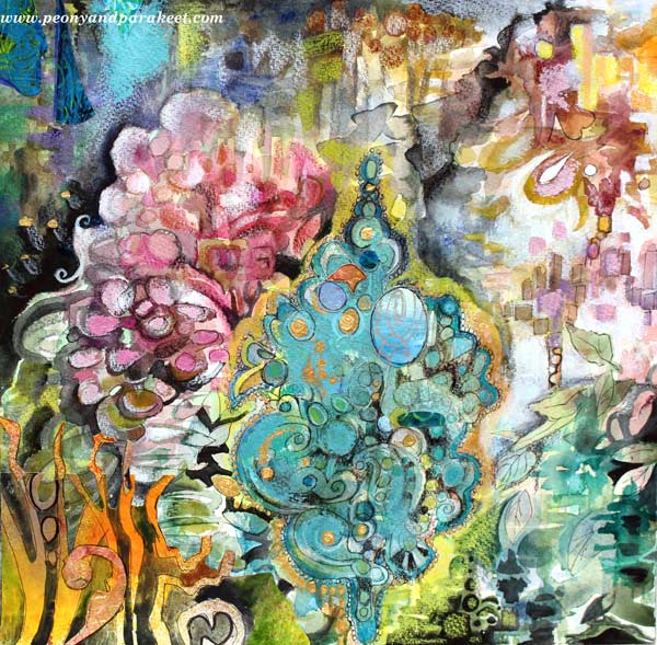
This artwork was inspired by Rococo, the 18th-century-period style with curves, asymmetry, gold, and ornaments. When I think of Rococo, I think of time. How long did it take to sew those elaborate women’s dresses? What about the porcelain table clocks, how many people, how many months did it take to get one finished and working?
The time we are living now is totally different. Not that I want to spend half of my life embroidering one chair. But I cannot help thinking: sometimes we create quantity but not quality. We get frustrated with our lacking skills and weak artistic vision, but often, there’s a simple solution: time. So, instead of creating three pages in a week for your art journal, make one!
Creativity needs time. The first thoughts are often the least innovative. When we take time to dig deeper, we reach not only frustrations but also new solutions.
Working in Short Periods of Time
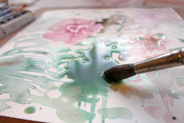
I used to have a difficult time working in several sessions. I wanted my work to be finished in one go. Leonardo da Vinci certainly did not have problems like that! He spent over ten years painting Mona Lisa. Of course, he did not dedicate all of that time to one painting; he did other things too. But he let his subconscious work during the breaks. So I did da Vinci – while waiting for the watercolor to dry, I engaged myself in other activities.
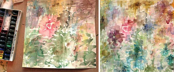
I built the foundation for this work with several thin layers of watercolors. Then I worked with colored pencils and watercolors to add details. A small flat brush is my favorite when adding details with paint.
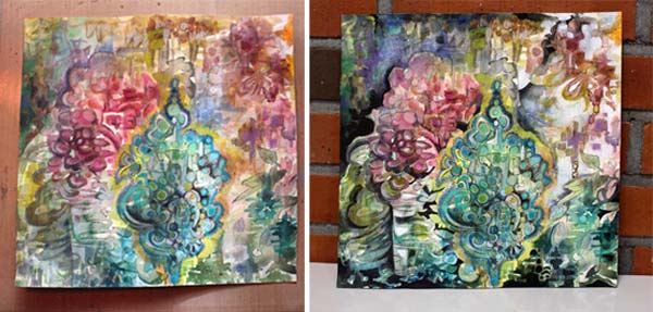
Some might call it finished at this point, but I wanted to add tension and interest. As this was about Rococo, some shimmer seemed appropriate!
Rococo Glitter!
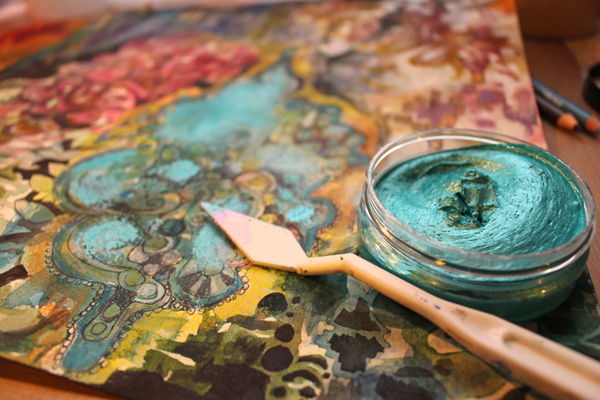
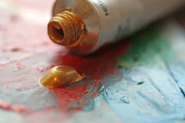
I have a few jars of Inka Gold, beeswax-based metal paint. They seemed just right for this artwork. And speaking of Rococo, some gold would be appropriate too. I love Golden brand’s gold acrylic paint.
Finishing
Some hand-decorated papers added richness and variation. Then I continued completing the tiny details.
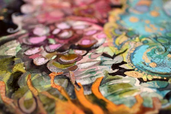
The size of the artwork is 12 inches by 12 inches. It took about three days from start to finish.
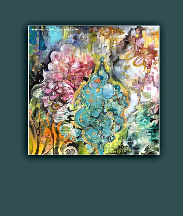
The quality of one artwork cannot be measured by the time the artist spent with it. Great art can be born quickly when skills and creativity meet. But on the other hand, if you want to improve your art and increase your creativity, why not focus on one artwork for a bit longer time.
What do you think? Can you make time work for you?
Let Unconventional Inspire You

You know I love beautiful and decorative things. But the more I create, the more I feel that creating art should be expression first, aesthetics second. This watercolor collage is called “Leftright Wrongright” and it is about how sometimes the old wrong and unconventional can be the new right.
Rubber Stamp Art
If you think of experimental and avant-garde, would you ever consider using rubber stamps? In that context, they are the most boring thing. They are the absolutely wrong choice when you want to create unique and advanced art. But as my mission was to express how wrong can be right, I just could not resist taking the risk and using them! I painted the background with watercolors and then started stamping.
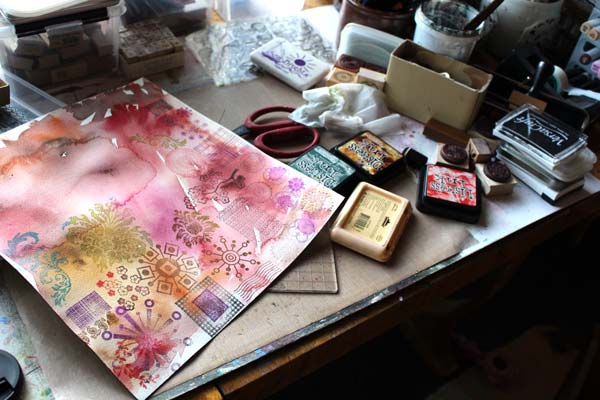
I only stamped once with each of the stamps. That way they were seen as individuals, not as a bunch of clones. I have used this principal before too, see Can Rubber Stamping be Art and Make Samplers to Save Bits and Pieces.
Watercolors
Watercolors are my trusted friend. They make the best backgrounds but also, they make rubber stamps look much more interesting. After the whole background was covered with stamped images, all different from each other, I added water and brushed the water-based ink to blend with watercolors.

With the big brush, I doodled this and that thinking fierce fully about destruction and bravery.
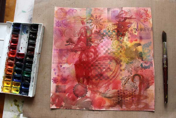
With a smaller brush, I added details and enhanced them with colored pencils.
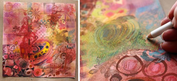
Imitating Rubber Stamps
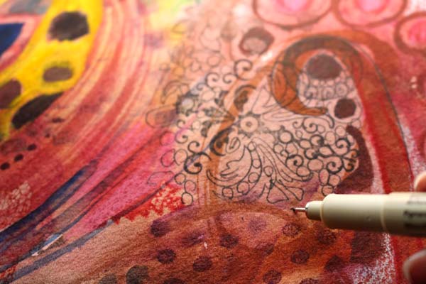
To make the stamped images even more individual, I added hand drawing to make few of them bigger and more handmade. A thin drawing pen is great for imitating rubber stamps that have delicate details.
Finishing
When I worked with this artwork, it became clear to me that the final touches are crucial here. I should not only do what I usually do but add something that is against the rules, disrespectful even. First, I doodled with a white gel pen and let the doodling look a bit dreadful. Then, I grabbed a piece of paper, painted red and yellow with heavy acrylic paint. The unsophisticated color and the clumsiness of the shapes when I cut it made it look so wrong.
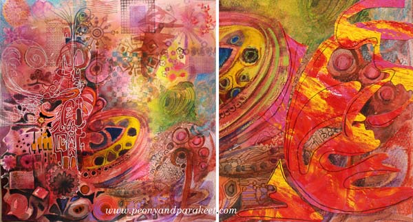
But I finished this artwork with a new attitude. As I wanted to express that sometimes we need to do things that make us feel uncomfortable, I needed to break my ordinary rules. I added few rough elements without over-decorating them. They are the wrong that makes the right spin. They make me ask: do right and wrong exist at all when creating art? If we think that unconventional is wrong, are we denying the true power of art and where it can take us?

Hopefully, this inspires you to add something wrong to your art, and make it right!
Let me be your art teacher: Subscribe to my weekly emails!
Intarsia in Watercolor
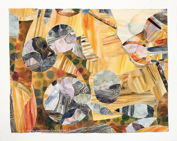
Last week I visited a fascinating exhibition. The gallery displayed Yoshinobu Nakamura’s wood intarsia art. Yoshinobu Nakamura is a Japanese artist living in Finland. He creates masterpieces by combining tiny wooden pieces. I was deeply impressed how the characteristics of various tree species and specimens showed in his work. I wanted to try the subtle color scheme and some kind of intarsia myself. And I did, only using watercolors and watercolor paper instead of natural wooden blocks!
Love for Tiny Pieces
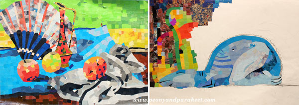
Speaking of tiny pieces of paper, I have always loved them. When I was a teenager, I cut the pieces from magazines and made a mosaic type of work. Some of them never got finished as they were painfully slow to create!
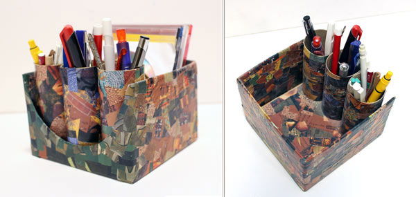
Years later, I made a pen holder for my husband using paper scraps cut from magazines. I carefully covered every surface that could be reached and finished the penholder with gel medium. It has survived at least ten years!
Watercolor Paper Intarsia
But this intarsia project was going to be different from mosaic work. I would not only cut the paper into small pieces but also adjust each piece in line with others! I started the project by painting the papers. For some of the painted areas, I also added lines resembling wood grains with a black drawing pen.
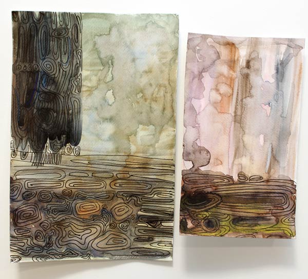
Next, I tried cutting the pieces. I discovered that they have to be put on top of each other, right side up. The cut line will then fit perfectly.
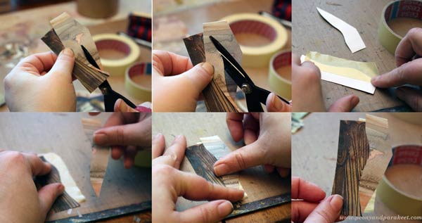
I used masking tape to attach the cut pieces together.
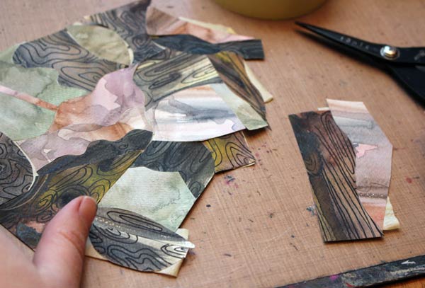
The big piece that I made looked pretty interesting. But it looked even better when the geometric shapes were cut out of it!
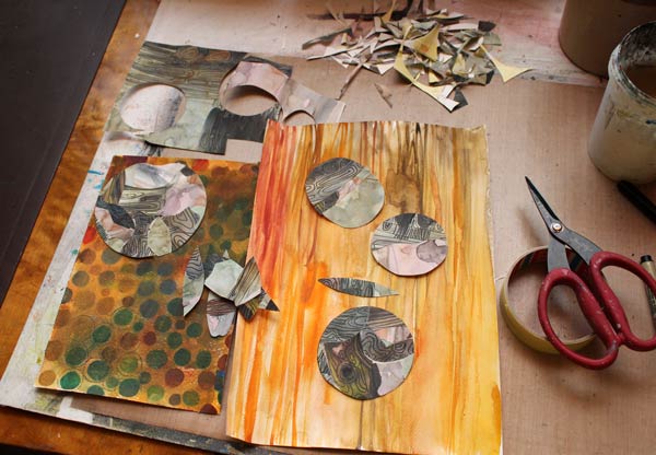
I painted one watercolor paper to look like pine wood. The spotty paper was found from the stash. After hours of cutting and adjusting, the artwork was finally finished. See, all the papers are on the same level, not on top of each other! With intarsia technique, you can use thick papers for collage art!
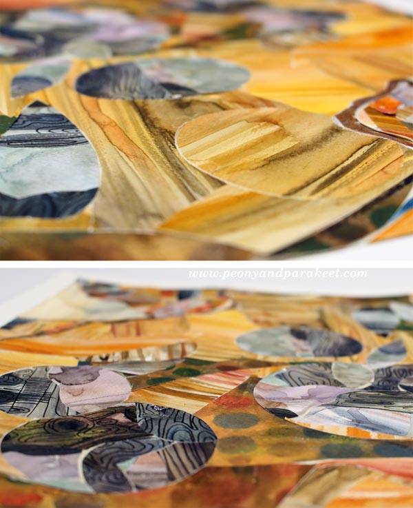
My belief in watercolors continues to stay strong. I love how easy it was to imitate wood with them!

Once the artwork was put together, I attached the piece, with masking tape background and all, onto a white watercolor paper using gel medium. I think I call it “Rolling Stones.” Have fun with this technique!
Let me be your mentor in art: Subscribe to my weekly emails!
Paint Your Mental Images!
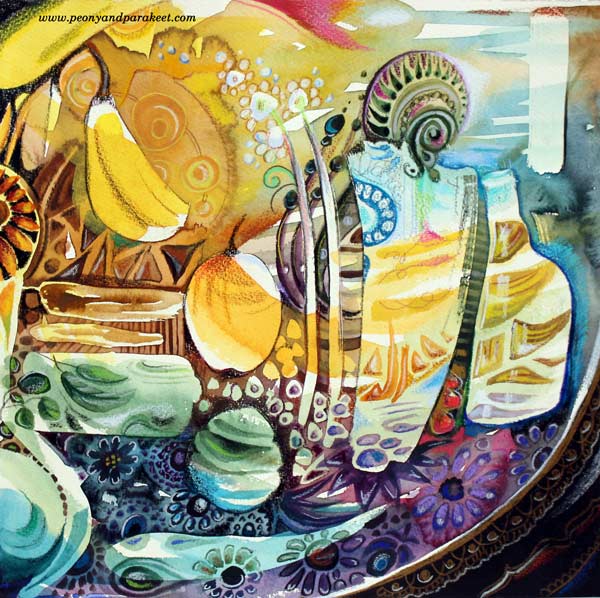
This artwork is inspired by the subject that keeps on fascinating me: beautiful objects like Russian handpainted plates! My admiration for them began many years ago, and only got stronger when I saw them in 2013 at St. Petersburg, Russia.
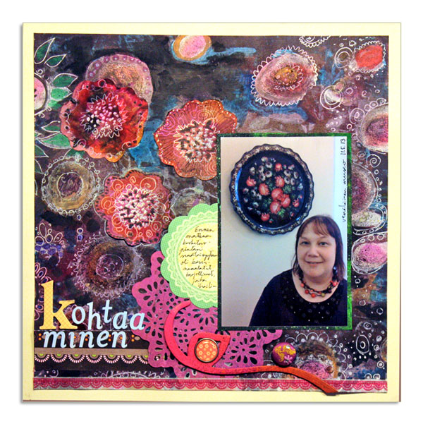
Here’s a scrapbook page which I made back then. My husband took the snapshot in The Russian Museum. Even if I look a bit worn out from the amount of walking we did during our travel, I love how my clothing and the plate match up!
We also bought one plate as a souvenir. I placed it on the table near me while finishing the painting. Just to keep me inspired to fine-tune all the details. But let’s not go that far yet! Before that, a lot happened, in my mind at least!

From Photos to Mental Images
Before starting the painting, I spent quite a lot of time thinking what to paint and how. I feel that it is easiest to think while walking, so I took the dogs out to the snowy nature. Then I took some photos, which is also a great way to observe and examine things.
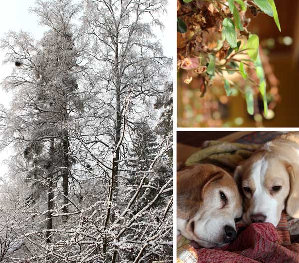
After my beagles had fallen asleep, I browsed the photos. “There’s a difference of how I those subjects in my mind,” I thought. If I think of a Russian plate, I might see one detail of it, then other images come to the mind, then the fraction of a Russian plate again. The thoughts move so quickly that the images seem to get mixed up and change.
I could not help looking up what psychology says about it. Yes, there’s a concept called mental image and several theories about how mental images are formed in the mind.
What I find fascinating is, that when creating art, we tend to pick one photographic image instead of a mental image. Then we get disappointed when the artwork does not represent the realistic, photographic image. Replicating the photographic image to the mental image is extremely hard. Let’s try! Look at any of the photos above, then close your eyes and imagine every little detail of the image – impossible! Similarly, if you read a story for the first time, then try to repeat it exactly from word to word, you will certainly fail! But could we paint what we remember and see in our minds, like Edward Munch said: “I painted only memories, adding nothing, no details that I did not see.”
Using Mental Images in Art
I thought it would be both philosophically and practically interesting to use the mental image as a starting point for a painting. So, I decided to paint the mental image of my souvenir, the decorated plate. I forcefully thought about the plate for few minutes. But at the same time (as focusing on one thought is so dull), I was also cleaning. When I grabbed the morning newspaper to put it away, I saw an article of Paul Gauguin‘s artwork being sold at a high price. Just when I had gathered my thoughts around the Russian plates, there it was, a picture of Gauguin’s art! Whoosh … my mental image changed to a mixture of a decorative plate and Gauguin’s art, not just that specific one but many others too that I have seen!
While walking towards the room where I create art, I saw a banana on the kitchen counter, then thought about the wine we are going to taste to celebrate my coming birthday. My mind wondered towards glass objects – how I love them and how I should really paint only them … Before I began painting, my mental image had grown into a huge collage!
The complex thing in mental images is, that if you think very visually, holding the static view is difficult. Instead of trying to focus on one thing only, let it go and replace it with a more general subject. I chose my love for decorative art, beautiful concrete things and how they are at their best when they represent the beautiful shapes and shades from nature.
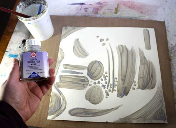
Instead of trying to build one controlled mental image first, accept the short-term, fractional nature of them. My artwork could be a collection of mental images appearing while I work. To emphasize that, I decided to start the painting with masking fluid. That way I could not even start building one complete image.
Masking Fluid
… or liquid masking film as my bottle says creates a rubber-like surface which you can remove afterward. You can add as many layers of paint as you like, then remove the masking fluid and you still have white areas to fill – or you can pick a colored area which you want to preserve and cover it with the fluid. It is a great way to obtain a layered look without too much thinking. Just remember to let the fluid dry properly before moving forward.
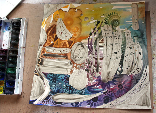
You can remove the dried fluid easily just by pulling it off with your fingers. With the help of the fluid, I was able to create very detailed areas before focusing on bigger objects so that they still look very sharp.
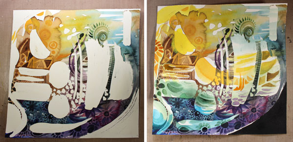
The painting was finished with colored pencils. The process was very similar to the one I teach in the video “Watercolor 101 for Intuitive Painting“, I just added the masking fluid before starting to paint with watercolors.
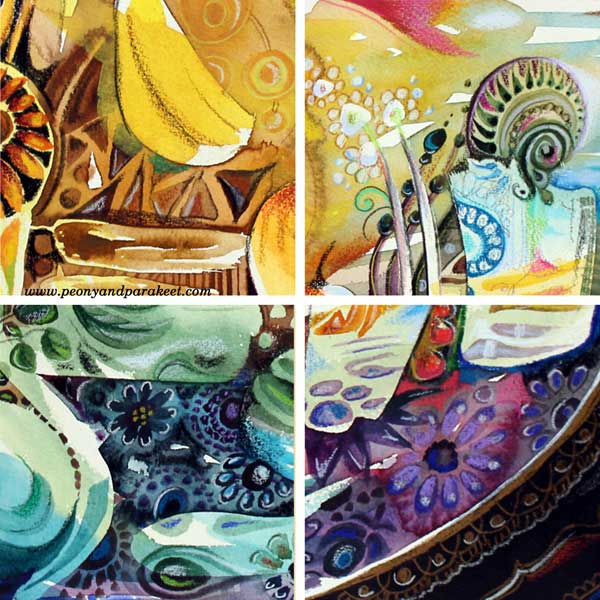
Here are some details of the finished piece:
And here’s the painting again:
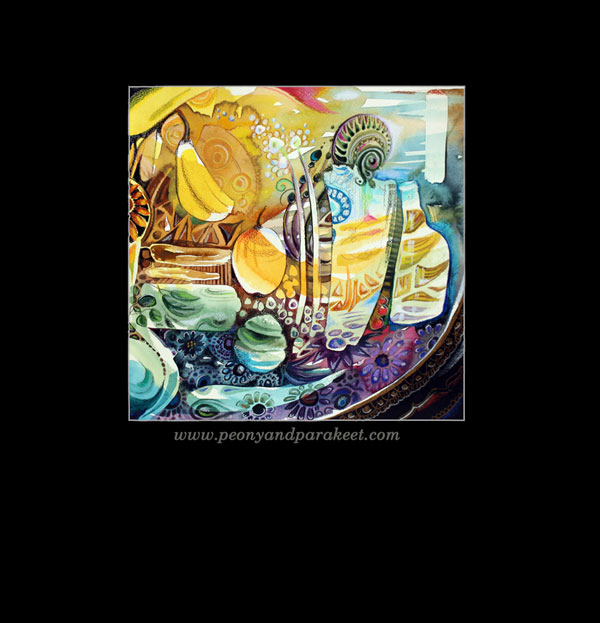
Before finishing, I realized that the banana from the kitchen counter had made it’s way to the painting. It seemed awkward at first but then, why not accept it to be the part of this surrealistic still life, surprisingly exact copy of the collection of my mental images!
What do you think? Could increasing intuition and including mental images improve your art?
Combine ideas with techniques – Buy Imagine Monthly Art Journaling Bundle!