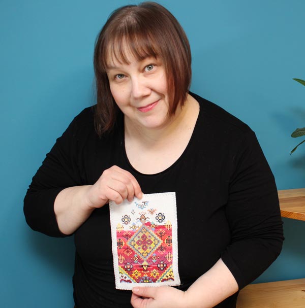
How to Freely Express Sunshine
This week is about the sun! Let’s dive deeper into how to express sunshine when you want to create freely without reference photos. My example is an oil painting, but you can apply the tips to any supplies.
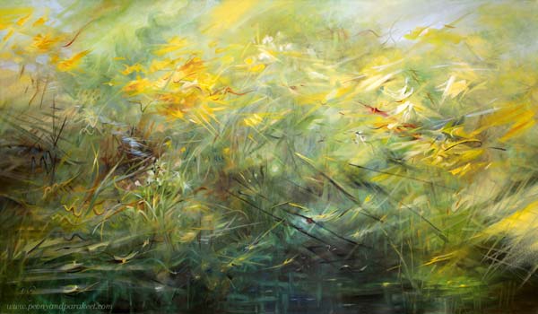
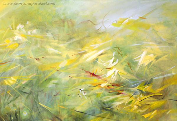
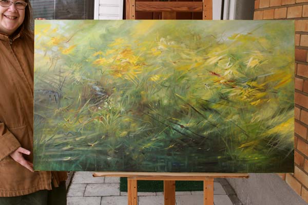
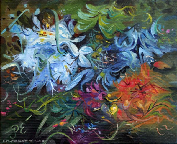
Here’s my newest painting that begins the new series where I explore the stars and planets of the Milky Way. The subject of the first one is, of course, the sun! I named the painting “Runaway Sun” – “Karannut aurinko” in Finnish because I wanted to express sunshine in a dynamic way.
Closed or Open?
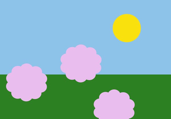
Often we paint or draw the sun as a static yellow spot in the blue sky, but I feel that the sun is different. It’s not a closed circle but a very open one. It’s radiating and moving, making things appear and disappear.
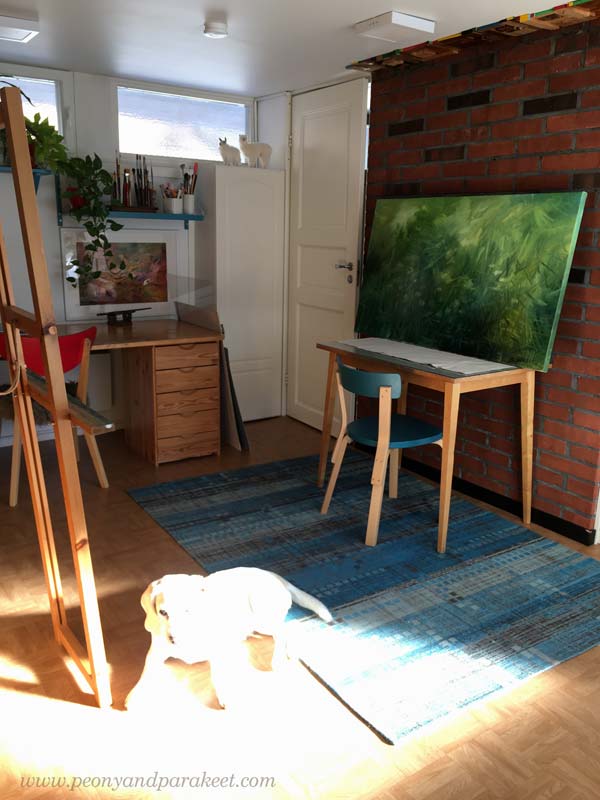
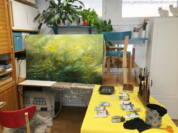
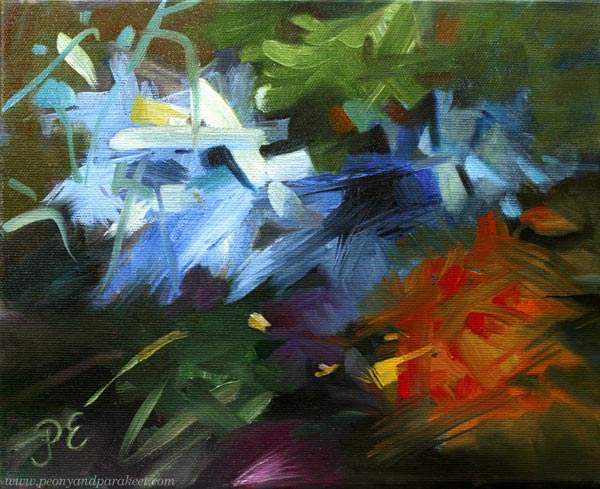
The painting was only a green mess when I took the picture above. “Oh no, the photo of Stella failed badly!” I thought when looking at it. But then, bad photos are the best. They challenge us to see what the world really looks like. Here, the sun has swallowed Stella and entered the room like a giant animal, so it’s not a little closed spot at all.
Isolated or Impactful?
The sun is the star, and the earth belongs to its solar system. The earth could be seen as a toy and the sun as the one who plays the game.
But in our art, the sun often has very little effect on its surroundings. We isolate the sun and keep it far away. For example like this:
But the sun impacts everything. It travels in the scenery like a runaway that goes here and there, but it’s impossible to catch as a single being.
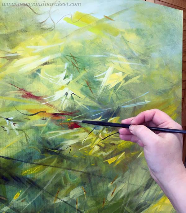
When my painting progressed, it got strong differences between light and darkness. The sunny look requires shadows too!
Is the Sun a Thing or a Person?
Art is only a technical skill as long as you think about drawing or painting things. But if you treat the elements as living beings of some kind, the game changes. When your paper or canvas is filled with people or animals, not just shapes or flowers, everything gets more exciting and it’s easier to express sunshine too.
So, ask: Who is this person called Sun? How does she impact everybody in this piece?
Some will love it, and some will escape from it.
Yellow or White Sunshine?
Some people get any yellow for the sun, and some select their yellow carefully. But I think that one yellow is never enough, and without white, the sun doesn’t shine.
I usually work with a limited set of colors, but I change the tubes every session. So, if I use Indian Yellow in one session, for example, I switch to Lemon Yellow in the next. I do the same for other colors as well. When I create new color mixes from different base colors, my paintings will get a huge variety of tones and look more natural.
I try to always mix some color to most whites so that the variety of pastel tones is present too.
I also add color to blacks or make my own blacks. Browns and blues make wonderful darks!
Does It Express Sunshine? Test!
I like to do a test for all my paintings where I lay them on the table, walk away from the room, and then get back.
I wrote about the test in this blog post too.
By resetting my mind, I try to get an immediate impact of how the painting affects the surroundings and whether it’s captivating enough. The sunny painting should draw attention and warm the room.
Here’s my little studio one night with other paintings that are still in progress.
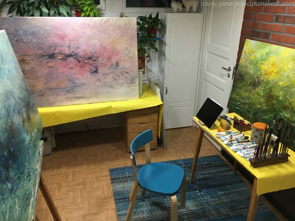
The paintings are too big for my little studio, but I have decided to manage!
Sunshine to Your Weekend!
I hope this post inspired you to bring more sunshine to your art!
Happy Easter!
Art Inspiration from Period Dramas
This week, I am sharing art inspiration impacted by period dramas.
Visual Deliciousness of Period Dramas
I am a fan of period dramas. Recently, I have been watching Gilded Age and Bridgerton. Both of them have beautiful outdoor and indoor scenes, and dresses too, of course! My eyes like the delicious visual world they illustrate and my heart always feels a bit lighter after an episode or two.
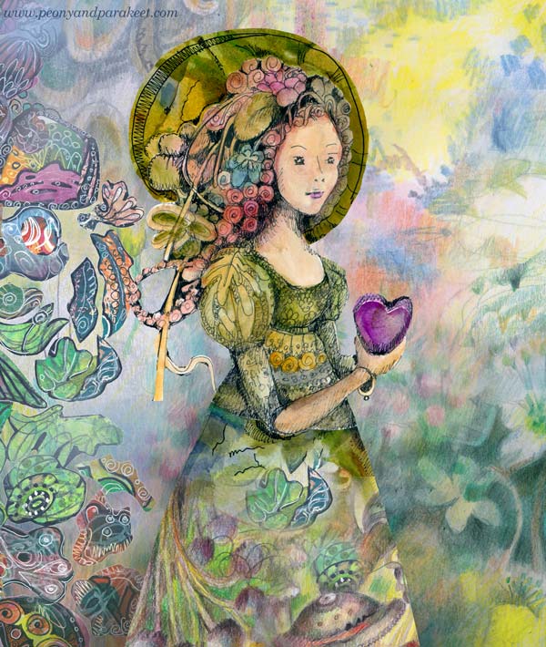
Even if the dramas have historical settings, their colors are not dull at all. A picnic in the forest looks vibrant and is full of sunlight.
I like how flowery everything is, and how the jewelry frames the faces of young ladies.
Being so inspired by period dramas, it’s no wonder that my art is full of romantic and old-fashioned elements. They speak fantasy to me.
Fantastic Old-World Impact
I think that every artist needs to find their approach to fantasy and fairytales – how to use imagination and what to express with it?

I am fascinated by the power of the inner world and all my pieces are inner sceneries in one way or another.
Pablo Picasso has said: “Art is a lie that tells the truth.” Similarly, I would say that art is a fantasy that gives us what we need.
Bringing Fantasy to Life
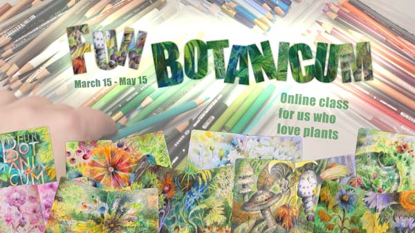
I often talk about seeing art as a story or a collection rather than a single piece. In the new class, Fun Botanicum, we create a set of illustrations that are all unique but still a part of the series. This is a great project for setting a style and bringing different coloring techniques together.
Plants are a fun theme to explore what you can do with colored pencils and imagination!
>> Sign up here!
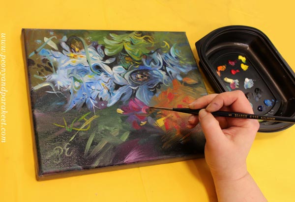
Before and After – Which Painting Style Do You Prefer?
This week, I share a revamp of a small painting and talk about painting style.
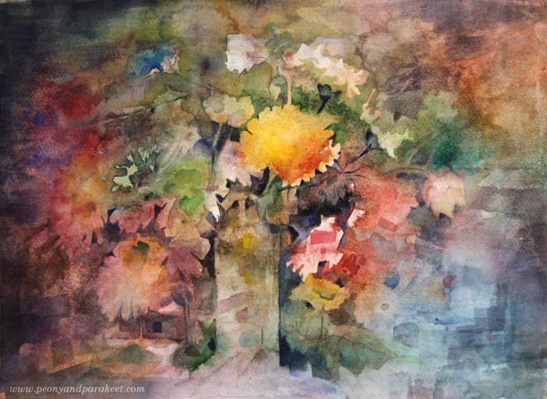
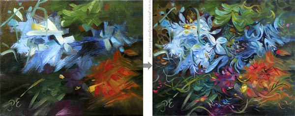
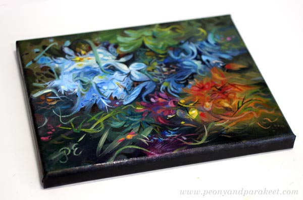
Here’s my newest piece that I am quite fond of. But wait! This isn’t totally new, but a revamped one.
Husband Didn’t Approve
Earlier this month, I made a small painting that didn’t get approval from my husband.
– “Unfinished,” he said.
– “No, it’s just loose and abstract,” I claimed.
But soon after, I considered adjusting something a little. My husband has good taste, and I appreciate his opinion. Like most Finns, he is brutally honest, and often that’s what I want to hear, even if it would hurt a bit.
But what to do with this one? Maybe just make a couple of clumsy shapes a bit curvier. But after having a wonderful conversation about conventionality with a friend who is also an artist, I felt that I could do it – go from one extreme to another.
Several Levels of Style
During the last couple of months, I have been trying to define my approach to art as levels of some sort – when should I go abstract, when do I want to make illustrations, and when my style needs to be decorative or design-oriented.
I have always thought that these levels are connected to what supplies I use. Like this:
If I paint, I am more abstract.
If I draw, I go in the illustrative direction.
And if I embroider, it’s just decorative work for relaxation.
But it shouldn’t always have to be like that. The opposite could happen too.
Untraditional Use of Supplies – Mixing Levels of Style
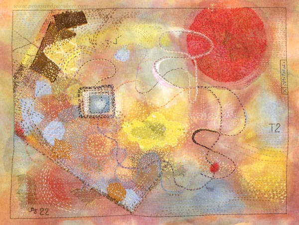
Last summer, I started to do slow stitching – random simple stitches on fabric. Surprisingly, what first felt like decorative needlecraft started to produce abstract art. This piece is not traditionally decorative at all.
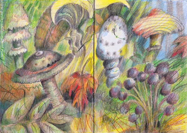
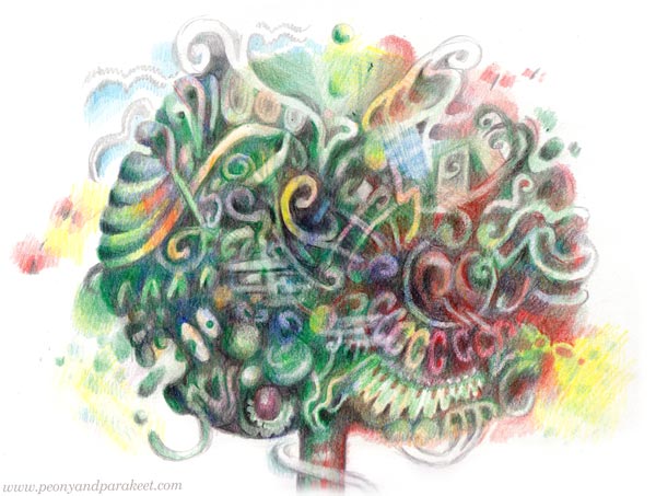
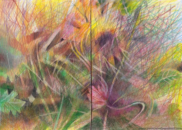
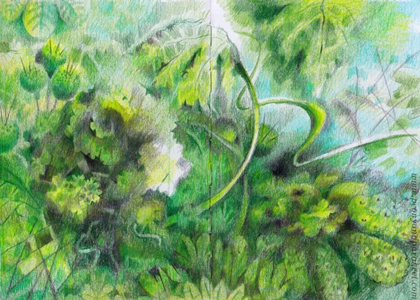
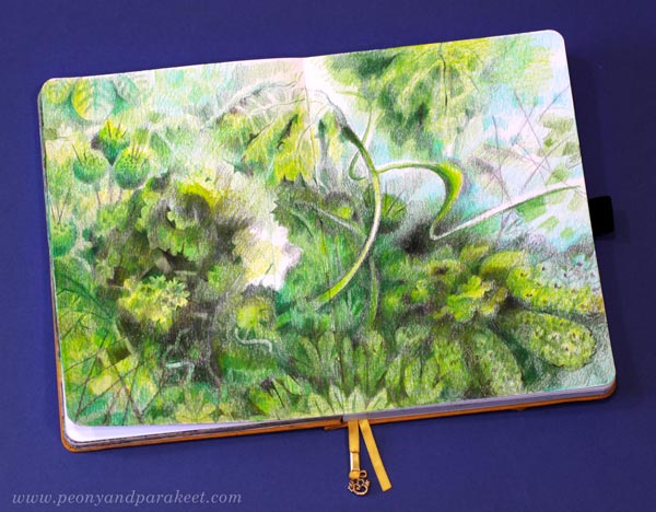
And many of my recent images in colored pencils have been quite abstract and painterly, like this spread from my colored pencil journal.
The art world is full of presumptions based on supplies.
Colored pencil artists replicate photos.
Watercolorists throw water on the paper and wait for the landscape to appear.
Abstract painters do it for interior design.
Decorative is reserved for folk artists.
And so on!
But I have come to the conclusion that supplies don’t define the levels of my style. I can freely choose how much I want to show each level of style in one piece.
So, we can break what’s expected and do what we want!
Inspiration from Many Styles
The same unrestricted approach applies to inspiration.
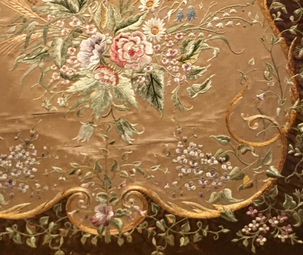
I went to Sinebrychoff Art Museum to see floral paintings, but the most inspiring piece was a traditional textile – what??? When I looked at the photos taken from the exhibition, it felt like a dirty secret.
There were many old masterpieces in oil, but a small traditional textile captivated me.
“How can I be so inspired by that?
I shouldn’t think about that anymore.
At least, don’t tell anyone!”
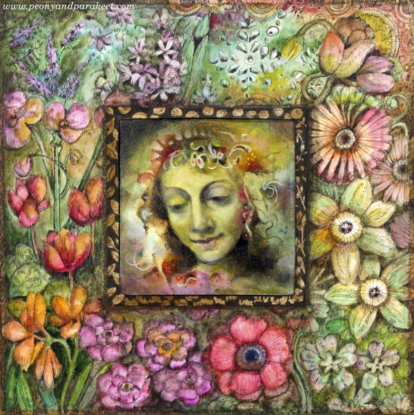
But my creativity has a mind of her own when it comes to inspiration. If I look at my Instagram saves, sometimes I like to see old palaces or churches, and other times I find simple and rural terribly inviting. I love old portraits, but I am not particularly fond of painting humans myself. I consume all kinds of kitsch – banal florals, round-eyed dolls, plastic horses – like crazy, but I also love modern and straightforward that’s not similarly pretty at all.
And now, my creativity told me to revamp that abstract painting and go wild with decorative strokes.
“Take it to the Kitsch goddess,” she shouted.
“No one will like it,” I heard myself saying. But then it hit me that maybe we could do it together. I asked my inner Kandinsky: “Would you go decorative with me?” He nodded quietly but without hesitation.
And so it happened that Mrs. Decorative, Mr. Abstract, and Miss Illustrative all painted together. It was a lot of fun!
Which One Do You Like Best – Before or After?
Which painting style do you prefer? It would be interesting to hear, leave a comment!
I have no regrets and my husband approved too. While I am waiting for the painting to dry, I glance at it frequently, smiling.
The painting follows a tradition but still feels like a breakthrough. I can now see further and wider. I could mix different painting styles in one big piece and bring a wider variety of inspiration into one work. So often, I have tried to move to the next level in technique, but now it feels that I need to level up artistic thinking!
News from My Little Studio
I have lots of painting work to be done in April. My private exhibition in June is still half-empty, but that’s partly a happy problem. My paintings have sold well, and I have a new prestigious gallery representation. The gallery is called Gumbostrand Konst och Form. I think it’s a great fit for my art because they also sell design pieces. Here’s my page on their website.
My home feels like a work in progress.
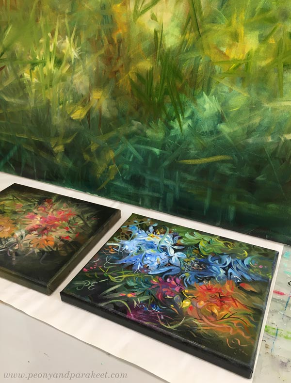
The little studio space has unfinished paintings, and big blank canvases are waiting in the library room.
I also have a new online class going on – Fun Botanicum!
It’s so wonderful to see work from the students and have conversations about art. It makes all the other work less lonely, and I feel blessed to lead the lovely community. Especially now, when most of my spare time is spent worrying over the world situation, it feels good to be connected and also, serve others.
You can still hop in, sign up here!
Green Flowers in Colored Pencils
This week is about embracing green flowers and making your art stand out.
Last month, my husband let me choose flowers for my birthday. I picked green roses that had a hint of pink on their petals. Of course, there were plenty of colors available, but green ones touched my heart. I have always liked old romance novels where the emotions are kept under the surface, and I see a similar kind of suffocation in this bunch.
A rose dreams about becoming pink but sadly realizes that her petals are not much different from her leaves.
I feel a strong bond with green flowers because my art is very similar to their petals, only a slightly improved reflection of the ordinary self. My art goes only as far as I can imagine, and the imagination is often limited.
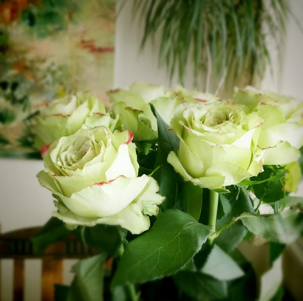
But green flowers can be enough. So, grand innovations can be replaced by many small tweaks.
Traditional or Not – Let’s Look at Jacob Marrel’s Flowers
Last week, I went to see old floral still lives at Sinebrychoff Art Museum. Still lives from the 17th century, like this one from Jacob Marrel, were my favorites. The subject is not creative: flowers in a glass vase, but small additions to a stereotypical interpretation make the painting stand out: butterflies and dragonflies, drops of water, red currants on the tabletop, black leaves that are easy to miss because they express the lighting so naturally, and the roses that sadly hang down, ready for withering.
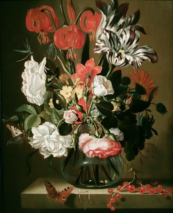
The best floral still lives from the 17th century are often Dutch, but Jacob Marrel (1613-1681) was German. He was a teacher, too, running a school for floral painters. I would love to turn back time and participate in his lessons! I would also have a question:
“Do you, Herr Marrel, think about the plant’s personality when you are painting it?”
Flowers Are Free Souls
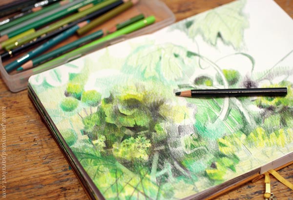
When I started this spread in my colored pencil journal, I felt that I just needed to let the flowers dance the way they wanted. So I didn’t sketch the big picture but worked little by little and endured the chaos, trusting that the flowers and leaves would find their natural gestures.
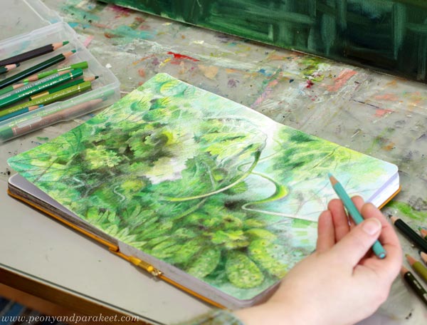
I want to let my art express itself as freely as possible.
How to Free the Flowers – 5 Tips
- Don’t make every flower similar, but let the diversity capture the viewer.
- Don’t differentiate flowers only with color but with shapes and lines too.
- Color a spot and ask what it wants, and allow green flowers – so, odd variations!
- Get inspired by the imperfection of reality! It’s natural to grow curvy, wither, have texture on the leaves, and get really dark or bright.
- Allow shapes and colors to breathe. You don’t have to know what every element in your drawing represents.
From Drawing to Painting
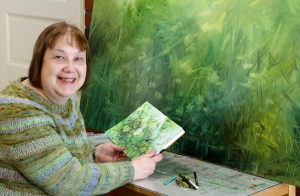
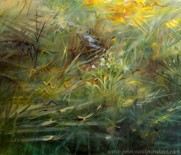
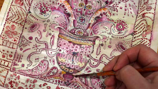
The first quarter of the year has been full of drawing and building the new class Fun Botanicum. But now a new series of paintings have started, and I have lots of big canvases to paint before the solo show in June. In the photo above, you see the first painting still in progress. My journal pages and my paintings live separate lives, but still, they inspire each other. It’s exciting to translate illustrative journal pages to more abstract paintings, and vice versa. I like this way of working a lot.
Now, when Fun Botanicum has started, I am also looking forward to seeing art from the participants: flowers, hays, fruits, berries, mushrooms … in all colors!
The new class Fun Botanicum has just started. You can still hop in and sign up!