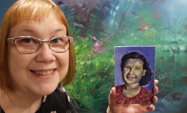
Three Design Styles, a Gelli Plate, and a Brush
One of my goals for this year is to learn surface pattern design. I want to move back and forth between art and design, and add more design to this blog as well. This week, I picked three of my favorite designers and played with Gelli Plate to imitate their style. These don’t replicate any of their work, just their style.
Three Designers from Three Centuries
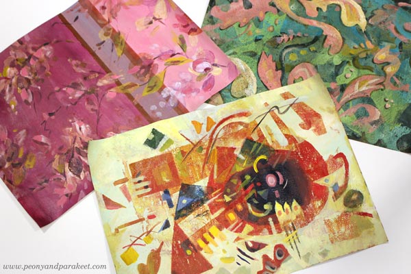
My three favorite designers are Tricia Guild, William Morris, and Wassily Kandinsky.
Tricia Guild a designer from the UK, and she has a company Designer’s Guild, and I have been her fan since the 1990s when I discovered her book Design and Detail. It’s been my interior design guide for 30 years, and all my homes have got ideas from that book.
William Morris is also English, but he lived earlier, in the 19th century. Two rooms of our home have curtains designed by his company, and I regularly admire their clever repeats and ornamental shapes.
Wassily Kandinsky was more of an artist than a designer, but he taught designers in a famous Bauhaus art school in the early 20th century. For me, he is the father of modern design. I see his paintings in the works of most midcentury modern designers. Lately, he has felt even closer, when I have been built a class Floral Freedom that is based on his and Paul Klee’s teachings.
Who are your favorite designers?
Three Designers – Three Color Palettes
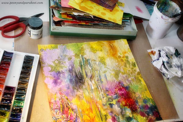
I have always liked making hand-decorated papers. Actually, my most popular blog post is this ancient one: How to Make Your Own Patterned Paper from 2010. So let’s get back to basics and make some!
First, I painted the backgrounds with acrylic paints and a flat brush. This set a color palette for each paper.
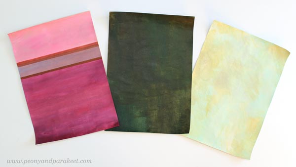
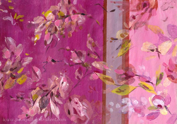
Muted pastels and rich darker tones remind me of Tricia Guild. She often uses stripes or checks too. William Morris has greyish colors and many of his designs have dark backgrounds. Wassily Kandinsky often had a very light background in his paintings.
Three Design Styles – Three Kinds of Shapes
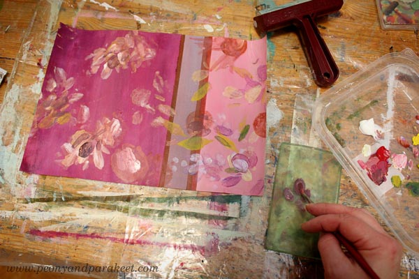
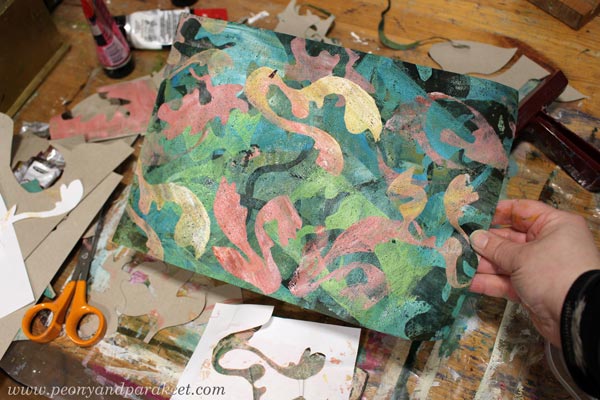
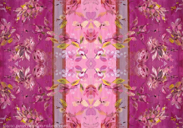
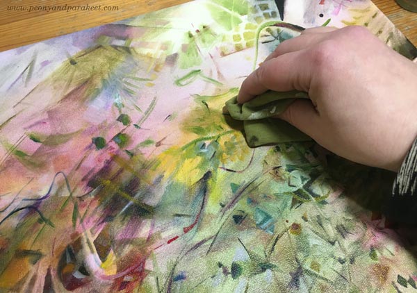
I continued each of the papers by mono-printing motifs with a Gelli Plate. For Tricia Guild’s style, I used a small plate and painted the motifs with a brush on a plate, then pressed the plate on the paper. Because Tricia’s style is often quite relaxed, there was less pressure for perfect outlines.
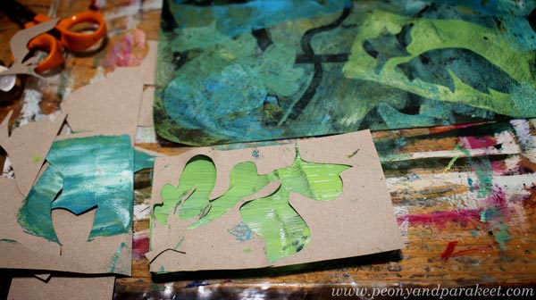
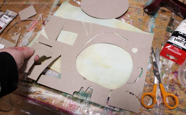
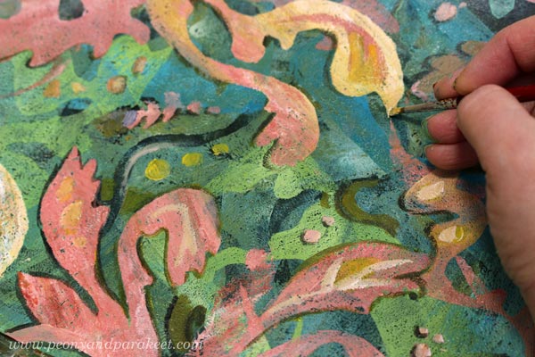
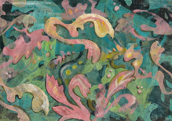
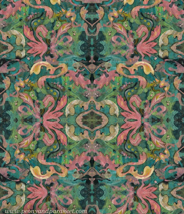
William Morris’s designs are very sharp and ornamental. I cut out ornaments freehand from paper and used both negative and positive shapes. I used both a big Gelli Plate and a small one.
Here’s how the paper looked after mono-printing.
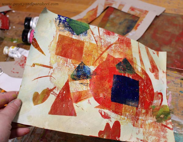
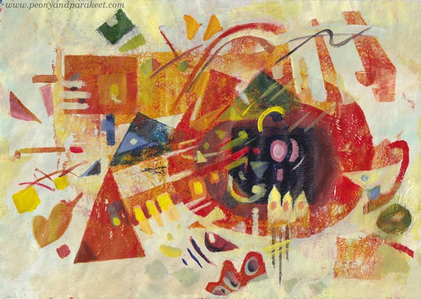
Wassily Kandinsky’s shapes are mostly geometric, so I cut templates that had circles, lines, squares and triangles.
Here’s how the paper looked after mono-printing.
Three Design Styles – Three Levels of Detail
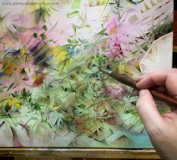
After mono-printing, I finished the papers by painting. I used a narrow brush and made small tweaks only.
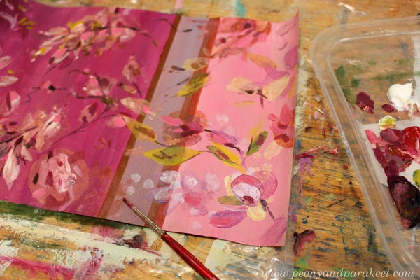
I like Tricia Guild’s designs because there modern meets classic and historical. They feel luxurious, but still comfortable. They don’t require similar perfection from the space than William Morris’s designs. So I didn’t perfect every shape or line, just added a bit more realism to the floral motifs. Here’s the finished paper.
William Morris’s designs are full of outlined motifs, and I connect them with books. “For people who have a library,” I wrote in a notebook that I keep for studying. But I quite liked my mono-print, and didn’t want to stiffen everything. So I only outlined a part of the motifs, and added some small dots and thin lines inside the shapes.
Here’s the finished paper. I really like the big yellow motif! Maybe that could be a part of my future designs.
Wassily Kandinsky’s work didn’t lack details either. But if William Morris is for bookworms, then maybe Wassily is for systematic thinkers – for more scientific than humanistic introverts, and for those who love mathematics.
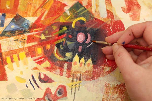
I used the monoprint as a foundation for the composition of shapes and followed Wassily’s advice and ideas from his book Point and Line to Plane, the book that I teach in the class Floral Freedom as well. Here’s the finished paper.
Three Wallpapers
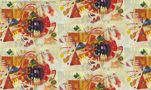
I wanted to see how these papers could work as repeats. I didn’t have time to play with the repeats properly, but here are some quickly made images to demonstrate how the motifs would look in a smaller scale, for example, as a wallpaper.
It was a full day, but I had fun making these! Tell me, which three designers would you pick?
Artistic Growth – From “Huh” to “Wow”
This week, we’ll talk about changing artistic direction and how the first reaction doesn’t always matter as much as the second one.
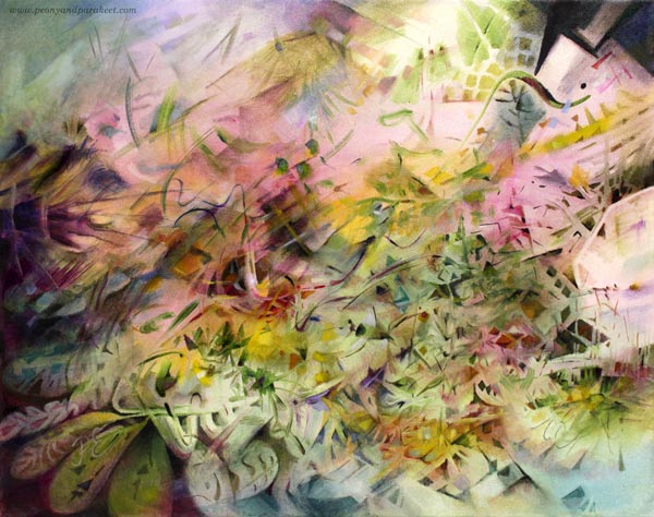
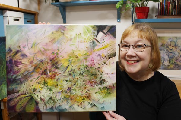
My seed idea for this painting was slightly different from usual, and I wanted to see how it would grow on canvas. It took many sessions and lots of struggles with finishing. “There’s still something wrong with this painting, Paivi,” I said to myself after correcting a couple of shapes that my husband pointed out. Last night, I had a dream that I walked an ugly dog on a thin leash. The breed was an odd choice, but the dog was still mine.
“Huh” and “Wow” – First and Second Reactions
Isn’t it so that we want to change, but as soon as we begin to see the results, we are likely to bounce back? It’s so easy to say: “No, this is not for me, I’ll try something else. I’ll try a different style, a new technique, another art class, or find other artists to follow and admire.” And this is not only a bad thing. In the long run, bouncing back is about integrating the new stuff into our natural self. But in the short run, it can prevent the growth we want and need.
I have been reading James Victore‘s Feck Perfuction as an audiobook. It’s a book about creativity and easy listening about things that are really tough in practice. It’s more like a two-hour inspirational speech than a down-to-earth guide, but it feels current with this painting. In the book, James Victore refers to an American pop artist Edward Ruscha. He has said: “Good art should elicit a response of ‘Huh? Wow!’ as opposed to ‘Wow! Huh?'”
This week, my favorite video podcast, One Fantastic Week, talked about “Instagram art” – pictures that the Instagram algorithm likes. It’s colorful, easy to consume and comprehend, but its exposure doesn’t ensure the artistic quality.
Artistic Growth and New Truths
When a painting is not for a class or a specific exhibition, I try not to think about the audience too much. I trust that you will pick what you like, and forgive me those you don’t.
But with this painting, I realized that I have played in the “Wow! Huh?” category, and this one tries to be more “Huh? Wow!” And that change makes me uncomfortable. It’s like I have been written a revealing story but in a code language, being afraid that anyone who stops to look will see to the core of me. And at the same time, worrying about that anyone who doesn’t, only sees a mess.
An Outside View to the Inside World
Teaching art has helped me to grow as an artist a lot. For example, when I get to see a student sharing a wonderful painting saying: “I don’t know about this one,” my gut reaction is then: “What!? This is beautiful!” But what’s “huh” for them is “wow” for me because I see the painting in a context that’s still new to them. They haven’t got used to seeing themselves like that. They are in the middle of a change, and it’s tempting to get back to the same old thing.
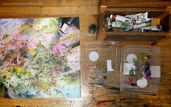
I recycle plastic lids and use them as palettes.
But when we do something regularly, it’s natural to miss the change. Floating on the surface isn’t enough anymore, and we get curious what’s deeper – “behind the glass” as we say in Floral Freedom, referring to Wassily Kandinsky‘s teachings. Then we need to learn, stretch, and redefine. Accept new truths.
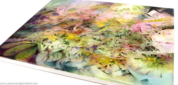
When looking at the mirror, I see more wrinkles than before. What was “huh” some years ago would be “wow” now. But with this wisdom, I hope long life for this painting. That the “huh” that it causes now will be “wow” someday. Maybe after I have fully accepted that my artistic growth is towards more and more abstract art.
It’s also good to accept that some paintings are just “huh-huh” and a few manage to be “wow-wow,” and what’s “huh” for some is “wow” for another. What do you think?
About Playfulness and Spirituality in Art
This week, I talk about spirituality in art and claim that you also need humor and playfulness to become a spiritual artist.
I like to gather my work – big and small – together and mix and match them like they would be pieces in a puzzle. It also helps me to see if my classes support each other and ponder if I have approached imagination and art-making from all angles.
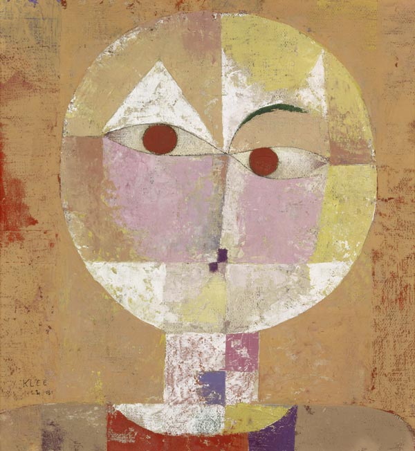
Paul Klee and The Power of a Child
My newest class Floral Freedom is the most schoollike of all. It is based on Paul Klee’s and Wassily Kandinsky’s teachings of abstract art. In the class, I have tried to focus on two books – Paul Klee’s Pedagogical Sketchbook and Wassily Kandinsky’s book Point and Line to Plane. But the books’ teachings have inspired me to search for background stories – find what enabled these artists to invent the abstract methods and theories.
One of the things that needed an explanation was that Paul Klee’s book is full of diagrams like it would be written by an engineer, and yet, his artworks are often playful, some even childish. Look at this painting, for example!
During the first world war, Paul wasn’t a soldier for a long time but transferred to a safer job where he was in the middle of aircraft engineers. But earlier, when he started a family, Paul wasn’t very successful in art at all. His wife worked to support them, and Paul practically took care of their only child, Felix. It wasn’t usual to be a stay-at-home dad in the early 20th century!
When Paul was taking care of Felix and struggled with art-making, he found humor and playfulness that later became a part of his signature style. But it’s not only that! When Paul became close friends with the masterful Wassily Kandinsky, he also made Wassily less serious and more playful. So here’s to all stay-at-home dads and mums!
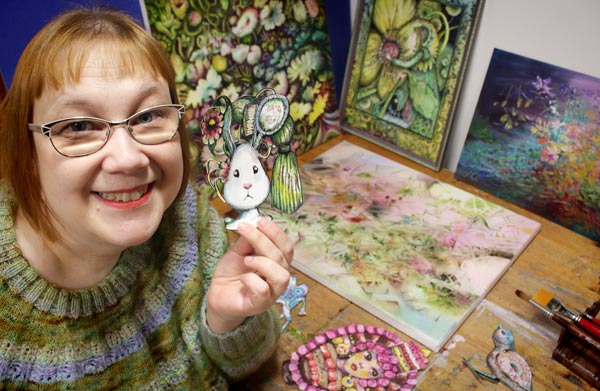
There’s a recent finished painting in the background.
From Product Play to Spirituality
I believe that art happens when one extreme meets another. When my organized mind watches the snowstorm. When I want my art to be about happiness and life and realize that taking it deeper requires confronting fear and death.
In my experience, when you want your art to be more serious and spiritual, humor and playfulness must have some role too. And vice versa, the longer your walk in the path of play, the more serious and spiritual it gets.
When I started my blog over ten years ago, my art-making was very product-based. I bought new supplies almost weekly and experimented with all kinds of techniques and effects.
But the more I created, the more I wanted to move from materials to ideas and imagination. Instead of discovering ten new ways to produce circles on paper, I wanted to learn how to make the circles interact and transform into other shapes. This way, my art has gradually become not only more playful but more spiritual as well.
Paul Klee said:
“Art does not reproduce what we see; rather, it makes us see.”
Rethinking Spirituality in Art
Nowadays, I connect playfulness with spirituality. It has also made me rethink how I approach spirituality in general. Here’s what I wrote this week on Peony and Parakeet’s Facebook page and on my Instagram feed:
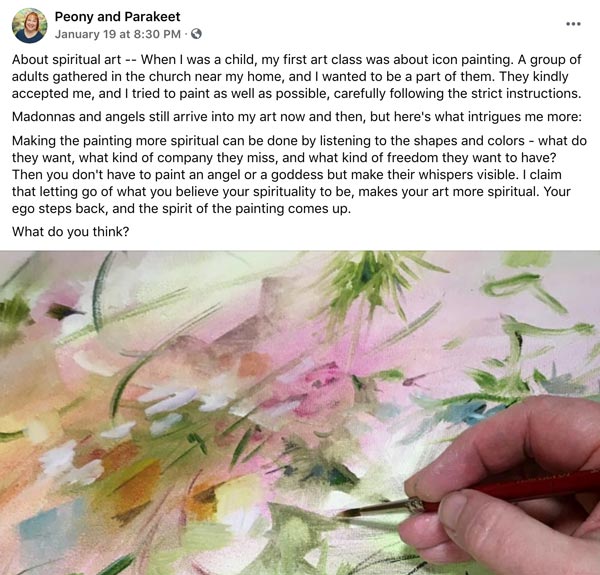
It would be interesting to hear what do you think. Does spirituality have a role in your art?
Art Plans for the New Year
The year 2020 was so different from the expected that it feels odd to make any plans for 2021. But I love planning and have some exciting art plans that I want to share with you!
Getting Further in Fabric Design
My education is in design, and I have designed fabrics now and then, mostly for my own needs for quilting (one of my dear hobbies). But in 2021, I really want to dive deeper into designing surface patterns.

I want to start selling my designs, but also share them and the creative process with you. I want to create a class that uses those ideas, maybe a Gelli printing class, or a class for making patterned papers, or a class for enriching expressive paintings with fashionable pattern repeats. I will take some time to learn more about fabric design, and it’s exciting to see what will come out!
Painting with Confidence
Last year, my art got a new kind of freedom. I started trusting myself more and my inner world became much larger. The size of the paintings and the speed that I made them also grew.

I want to continue in this path, making even bigger and bolder pieces, and more importantly, feeling confident yet open. I want to be open so that I express my sensations with all my senses, not only what I see. I want to honor my idols Paul Klee and Wassily Kandinsky like I have already done in the class Floral Freedom.
Writing about Art
It has taken a long time for me to realize that my job is not only to paint but also to write. I write these weekly blog posts, weekly and monthly newsletters, short stories to my Facebook page, and scripts for videos. It’s often more than a thousand words per day. Even if I am a visual person, I like to find words for what I do and see. It also makes me a teacher, I think.

For a long time, there’s been a battle in my mind related to writing. “People like to see, not read,” I have said and tried to get away from writing. Being a bad reader myself, I know! But words don’t leave me no matter what I tell them. So, let it be so. I will continue to write about art in 2021, and I want to grow as a writer as I have grown as a painter and a teacher – get more confidence and skills so that the result is both unforgettable and refreshing.
Art Plans – Change in Identity
Art plans always hold the change in identity. In my plans, I am not only a painter and teacher, but also a designer and writer.
What art plans do you have for the new year? What kinds of titles does your plan give to you?