Painting My Mind’s Eye – Abstract Color Fun!
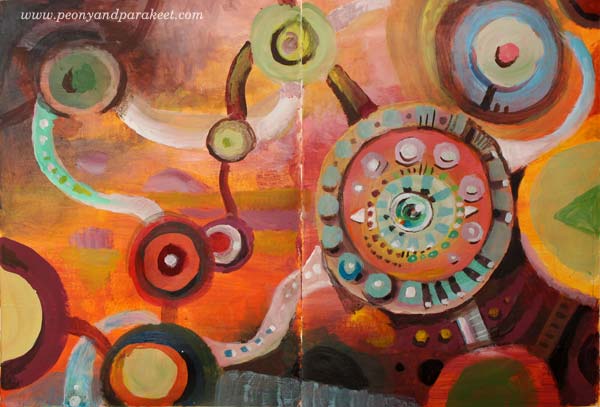
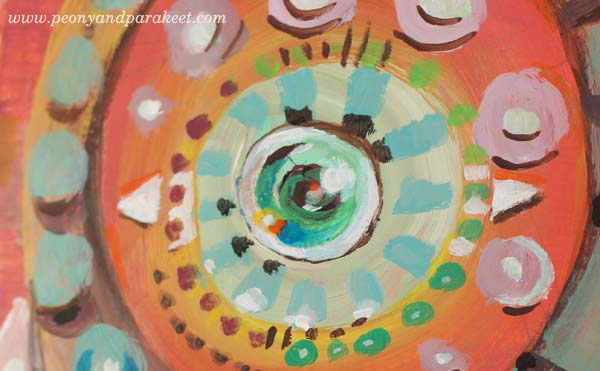
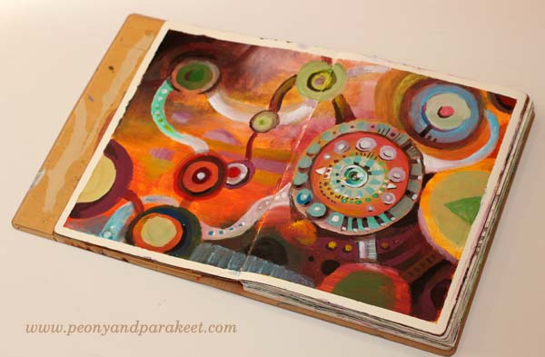
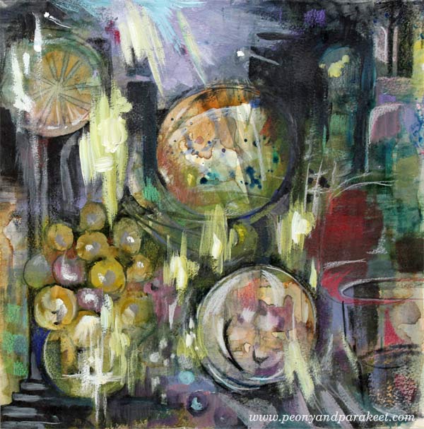
I call this art journal spread “My Minds Eye.” It has one central element that resembles both an eye and a compass. Isn’t that how things are for visual people: seeing interesting things evokes all kinds of thoughts and lead to all sorts of paths? Like this morning when I had to stop on a walk to admire fragile ice on water puddles. When I was standing there, I wished that nobody sees my weirdness. I was staring at the ground, holding a phone to get photos, with two beagles that were very impatient, eager to move forward.
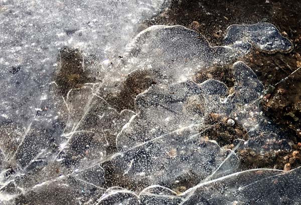
Maybe the beginning of the spring made me paint with hot tones, and the ice most probably inspired me to include a similar translucent element in the painting.
7-step Method of Planet Color Used for Abstract Color Fun
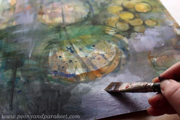
I created the spread by following the 7-step method that I developed for the class Planet Color. I have repeated this process many times because it’s a fun and worry-free way to paint unique abstracts. For example, see the blog posts What’s in a Good Composition?, Using Color Schemes for Home Decor, and How to Transform Ideas into Paintings. I know I am not the only one who worries about the composition while painting and the 7-step method makes everything fall into place effortlessly.
Masking tape was used to frame the piece. I haven’t done that a lot in my journals, but I like the result.
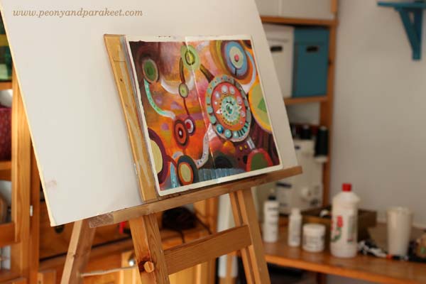
My husband made me a new easel from an upright support of a shelving unit. It’s so handy and adjustable that I have started to use it a lot. I can use it even for art journal pages, not only for canvas art.
Planet Color – Sign up Now!
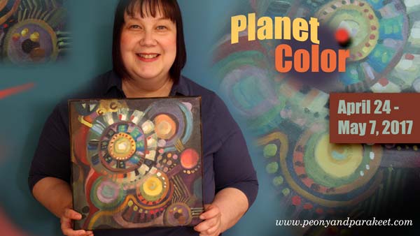
I ran Planet Color for the first time last fall, but it’s coming back now! Whether you want to paint art journal pages, thick paper or canvases, this is a fun online workshop. It’s suitable for beginner painters and all who struggle with color compositions. >> Sign up here!
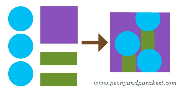
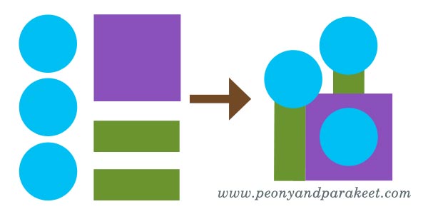
What to Create from Simple Shapes? 6 ideas
When I catch myself building a visual image in my mind, I say to myself that my hands have to process the idea first. The idea can be a decorative design or a new painting or anything visual. When my mind is vigorously trying to create images that I would be happy with, my hands don’t understand my mind at all. My mind is a fool and my hands are ruthless.
In my mind, I can easily miss the elements that are needed for building the beautiful image. If I imagine a scene, the details that make the scene look so wonderful, are not all there. My mind only has a glimpse. The connection from the mind to the hands feels easier if it’s the other way around. The hand draws a couple of circles and the mind gets creative with them. This way building the bridge from my mind to my hands seems to work much better. Big pictures, personal stories, attractive designs are not born in my mind first. They are born in a conversation that is led by my hand drawing with pen on paper.
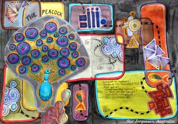
But hands don’t decide when to get started, the mind does. This is why I will give you few ideas to start the conversation between your hands and your mind. Like this, this and this post, this blog post is illustrated by my students. The art journal pages that you see here have been made at Modern Mid-Century art journaling class.
1) Build ornaments by grouping simple shapes.
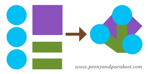
Nel Wisse has created colorul clusters and then grouped them to bigger ornaments.

2) Create a surface pattern and cut a shape from it.
For example, see Darci Hayden’s cat and the stairs! Shapes that include patterns look always fascinating. (More patterned paper ideas)

3) Play with Sizes and Layers
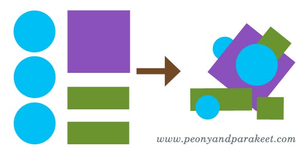
Cut some elements smaller and add dimension to your page by playing with layers.
Sue Jorgensen has a good variety of both large and small elements.
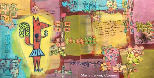
4) Build a map, a house or a room plan
A clear hierarchy between the elements pleases also your left brain.
Marie Jerred’s fox is in the middle of an adventure!
Stephanie Carney’s Flamingo is just entering a house of dreams.

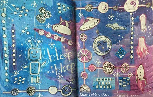
5) Express Micro or Macro World
Both micro and macro biology deal with basic shapes. Explore either molecules or satellites!
Susan Prothero’s micro world is captivating.

Elise Tobler‘s space is full of life!
6) Find a connection to a story
Explain what you associate with the shapes and then move on to a more illustrational approach. Elaine Wirthlin’s spread is an awesome example!

Buy the class: Modern Mid-Century!
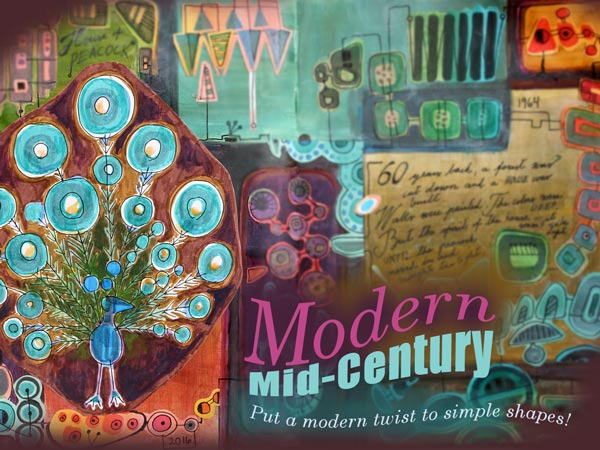
Designers in 1950s and 1960s (like Annikki Hovisaari from Finland and Lisa Larsson from Sweden) truly knew how to play with simple shapes. Modern Mid-Century is a self-study art journaling class where I am inviting you to my living room and showing inspiring examples from the middle of the 20th century. Then I will help you to design your own unique motifs and build a collage that is both decorative and expressive.
Modern Mid-Century
Start playing with simple shapes! >> Buy Now!
Coloring Abstract Art – Watch the Video!

Coloring abstract art on a blank page is so much fun. Layering colors and discovering new shapes is like an adventure!
I created this freely colored abstract art piece onto my biggest art journal and recorded the process and some thoughts about coloring on a blank page. The video also introduces my newest e-book Coloring Freely.
Start your journey with colored pencils: Buy Coloring Freely!
From Intuitive to Intentional Painting
This is my latest mixed media painting called “The Phantom of the Opera.” Just saw the musical in The Finnish National Opera! I don’t know about you, but when I go to see a performance like that, I know that it will appear in my art one way or another. With this blog post, I want to challenge you to think what is intuitive and what is intentional in art. And – can they be combined?
Day 1 – Watercolors
It was a sunny winter day when I started the painting. A friend from the UK was visiting me, and we were chatting while I painted the first layers. With watercolors, like many times before.

I love how well watercolors support intuitive painting. You can just splash here and there and then get inspired by the result. In this phase, I tend to choose the colors quickly, based on what feels good. I would call this phase very intuitive also because I don’t usually have no idea about how the result would look.

After splashing watercolors on the paper, I tried to get something a bit more intentional out of it: distinct shapes, strokes and color areas.

The painting looked like it could be a still life with wine grapes and some fruits. But I did not have more time to continue with the painting, so I saved it in my album. I love to create 12 by 12 paintings as they fit on a regular scrapbooking album. I also love the square shape as it is easy to change the orientation of the picture in the middle of the process.
Day 2 – Acrylic Paints
About a week later I picked out the painting again. This time, I wanted to add some acrylic paint to it. I find the combination of transparent watercolor and non-transparent acrylic paint very attractive. When touching the acrylic paint tubes, I get ideas about color mixes that would work with the watercolor background. I would call this pretty intuitive step too.

As I am a very detail-oriented person when painting, I try to be bold when painting with acrylics. Broad strokes add more interest to detailed paintings.
In the end, the painting still looked like a still life, but I wasn’t quite confident about the orientation of the painting.

Here you can see the difference between the end of day 1 (watercolors) and the end of day 2 (acrylics).
Day 3 – Colored Pencils
Because I love details, I also love to use colored pencils. With colored pencils, it’s easy to add little nuances here and there, and I also like the look of pencil strokes on the painting.
Day 3 was a day after day 2, but it was still before I had seen the musical. When I work with colored pencils, I am often very intentional. First, I had an idea to create wine glasses of the two round elements, but then I changed the orientation of the painting and saw lamps in the ceiling!

Which one do you like the best: the wine glasses or the lamps?
Day 4 – Acrylic Paints + Colored Pencils
Day 4 was after the musical. I got an idea from one of the scenes. The painting continued with acrylics expressing the famous chandelier crash!

So far I had been pretty intentional but then changed to intuitive. I played the music and tried to get into it as much as I could. I used both acrylic paints and colored pencils.
Here’s the result again:

Intuitive Painting – Guess What!
The story doesn’t end here! While photographing the finished painting, I glanced at my feet and saw the same color scheme in my socks! I had just finished them before Day 1 and worn them ever since. So, this painting actually started when I was picked the yarn from my stash for the socks. No, wait – it began when I bought the wool that I spun to the yarn …!

Combining intuitive with intentional is a lot of fun! It’s the best cure for getting rid of stiffness in the result. The intuitive parts allow you to feel free when painting; the intentional parts bring more clarity to the painting.
Get a Free Mini-Course: Subscribe to my weekly emails!