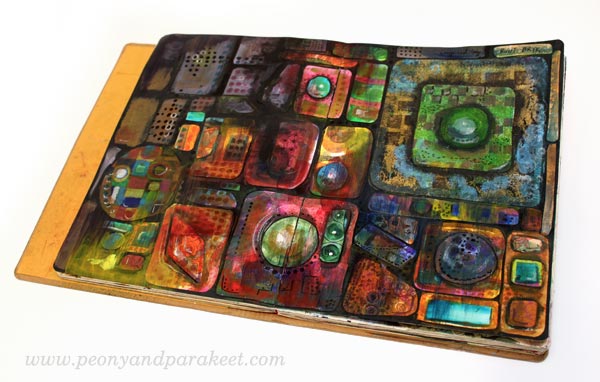
Painterly Collage in Rut Bryk’s style

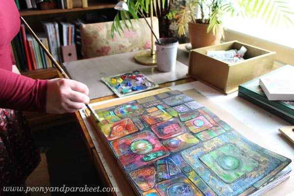
Here’s my recent art journal spread, inspired by a Finnish ceramic artist, Rut Bryk (1916-1999). The Espoo Museum of Modern Art is currently showing her work, and as a big fan of her work, I had to see the exhibition!
Rut Bryk
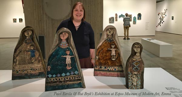
Rut Bryk is very well-known in Finland but not so famous worldwide. However, you might know her husband, the skillful designer and sculptor Tapio Wirkkala. Rut Bryk was an illustrator who got a job at the Finnish ceramic factory Arabia in the 1940s. Her early work was fairly naive and illustrative. But after working with ceramics for some time, she began adding textures to her work. Her 50s pieces were very mid-century modern.
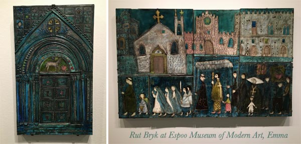
In the 1960s, her work grew more dimensional and abstract.
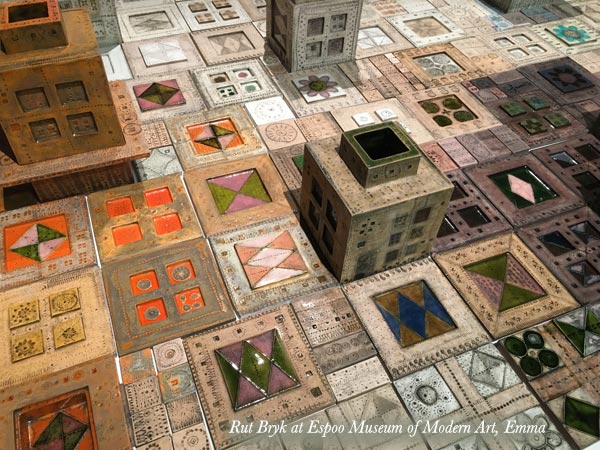
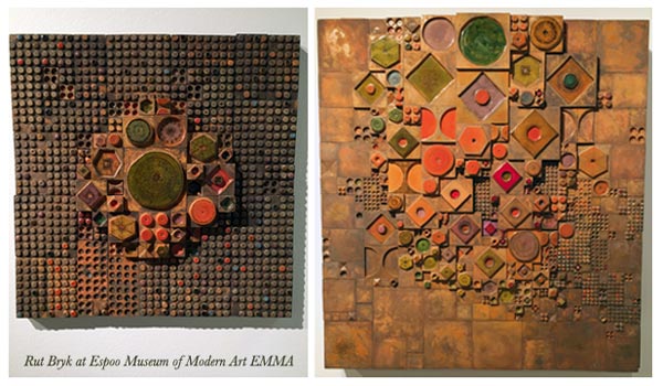
The abstract pieces she made are stunning.
This black city view is one of my favorites.
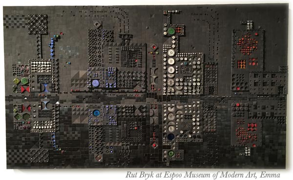
Many of Rut Bryk’s artworks are composed of small ceramic pieces. They look like quilts or crocheted blankets to me.
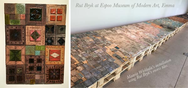
Rut Bryk’s and Tapio Wirkkala’s daughter Maaria Wirkkala is also a well-known artist. She had made an installation of Rut Bryk’s excess tiles for the exhibition.
Create a Paper Collage in Rut Bryk’s Style!
Get inspired by Rut Bryk’s brilliance and create a paper collage with these step-by-step instructions!
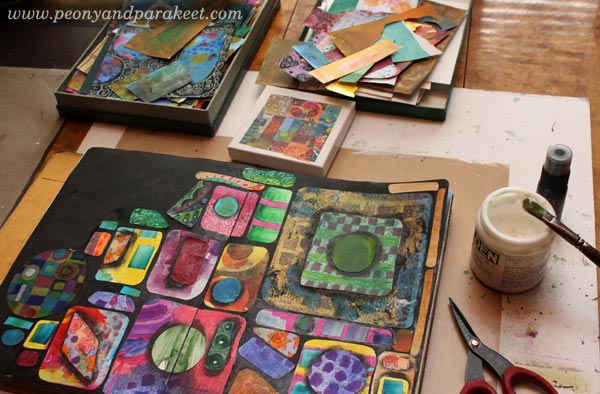
You will need hand-decorated papers, acrylic paints, marker pens, and gel medium or paper glue. See ideas for hand-decorated papers: Basic Instructions, Frugal version, Kiwi, Arboretum, Spring Flowers (PDF download)
1) Paint the Background
Paint the background black.
2) Cut Collage Pieces
Cut collage pieces to simple shapes like rectangles, triangles, diamond shapes, and circles. Cut big, small, and medium-sized pieces. To make the pieces look like handcrafted ceramic plates, round the corners and soften the straight edges so that they are slightly wavy. Don’t worry about the colors too much, as you will be painting over them.
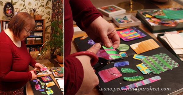
3) Glue the Pieces
Using gel medium or paper glue, begin gluing the pieces on the black background.
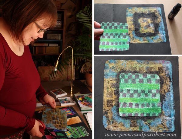
Pile up pieces so that some of the smaller pieces are glued to the bigger pieces. Before gluing, add black paint so that the piece on the top will have soft black borders. This will make your work look more dimensional.
Don’t fill the whole background but leave some of it black.
4) Paint Lightly Over the Pieces
To make the pieces look softer and to mute down their colors, add thin layers of acrylic paint over them.
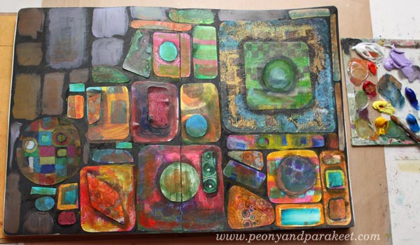
Paint blocks where the black background is visible. Use neutral, fairly dark colors that suit well with the black background.
5) Draw Spotted Grids and Frame Collage Pieces
With marker pens or felt-tip pens, draw spots so that they form grids. These grids can continue over the blocks. The size of the spots can vary. I use Faber-Castell Pitt Artist Pens as they work well on acrylic paint.
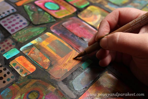
Frame the painted blocks and collage pieces with a black marker so that they look firmly attached to the background. I also used white Chinese marker to add few white lines here and there.
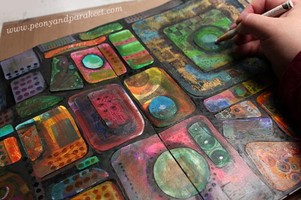
6) Paint Slightly Over Some Areas
To finish your work, add thin layers of paint to some areas. These painted areas represent light and shadows over the overall composition.
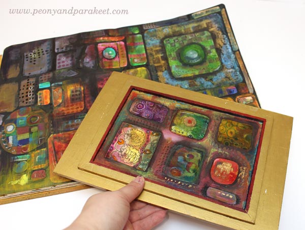
Here’s my finished spread again.
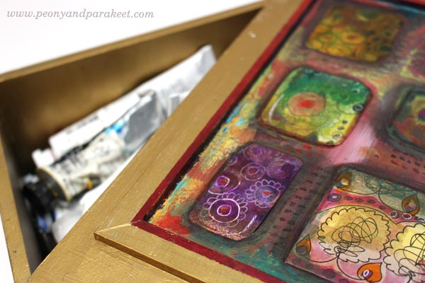
Extra Project – Decorating a Box
My husband has made a wooden box for my paint tubes. I have painted it golden, but the bottom part of the lid needed some decoration. I had already painted the framed area red, so I just added black paint to the collage pieces.
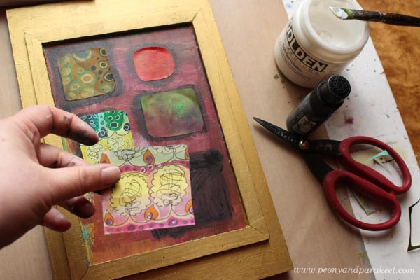
Then I continued the process like in the instructions. Finally, a layer of gel medium was added to protect the paper pieces.
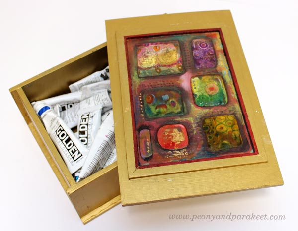
I like the idea of opening the lid and seeing the collage.
Thank you, Rut Bryk!
Expand Your Artistic Imagination!
This blog post is an example of how you can learn and get inspired by famous artists. This is how I see it:
– If you want to find your own uniqueness, examine all kinds of artists and styles!
– If you have already found your style, keep on experimenting and expanding your skills!
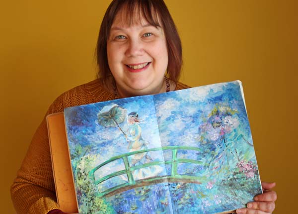
Monet’s World of Energy
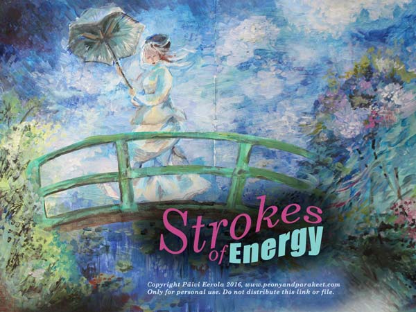
The famous impressionistic painter Claude Monet inspired me to creates this art journaling mini-course. Strokes of Energy has just been released as a part of Imagine Monthly.
Calmness vs. Energy
When I examined Monet’s painting style, I spent a lot of time with calming blues and greens.
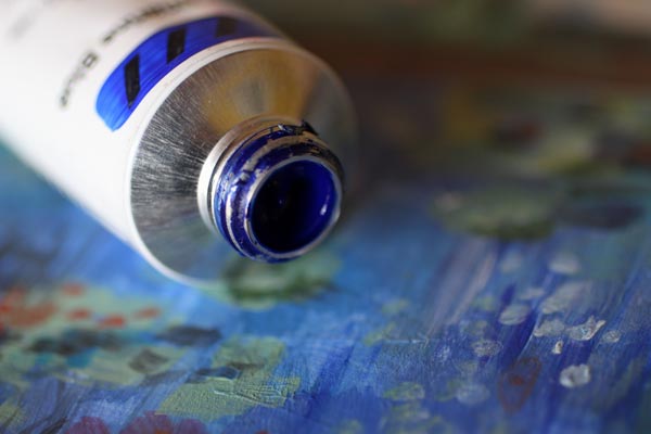
But the more I painted, the more I brought energy into the painting. Even if you feel calm when watching Monet’s paintings, his painting style is much more than just lightly caressing the canvas. Directional strokes and plenty of colors are essential in Monet’s impressionistic style. The most fun part of using the active energy is creating all the juicy details with short strokes of paint.
Monet’s Fresh Air to Your Art Journal
A big part of art journaling is about making sketches, experiments and building the collection of pages. But every art journal needs also pages that you want to watch again and again. They are like a breath of fresh air among all not so finished pages.
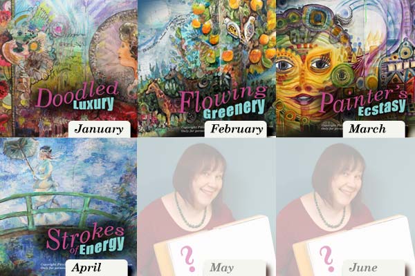
4 Published Mini-Courses, 2 More to Come
Alphonse Mucha, William Morris, Friedensreich Hundertwasser and Claude Monet have been my inspiration for this spring. When you sign up for Imagine Monthly, you will get all these 4 mini-courses right after the purchase and 2 more in the coming months.
Also, you will get to be a part of a great community! Every week, when I look at the unique versions my students have made from the exercises, I am in awe. I feel extremely lucky to be part of the group and wish all those masters could still be alive and participate the conversation!
>> Imagine Monthly – Sign up here!
Step into Hundertwasser’s Ecstasy!
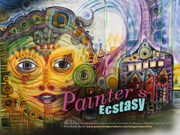
An Austrian architect and artist Friedensreich Hundertwasser inspired me to create this art journaling mini-course. Painter’s Ecstasy has just been released as a part of Imagine Monthly.
Getting into Hundertwasser’s Head
Creating the mini-course took a lot of time. I didn’t want to just paint something in Hundertwasser’s style. I wanted to find the elements in his style that support intuitive painting. I wanted to discover the essentials that allow anyone to produce their own work, not just copies. I also wanted to point out the most important nuances that make his paintings so appealing.
Even if Hundertwasser’s paintings (go check my Pinterest board: “Hundertwasser Hunger”) are so clearly shaped and striking, getting into his head wasn’t easy! I made a lot of sketches and experimented with various art supplies. These art journaling pages are some of the sketches:

Structures from Buildings and Maps
Hundertwasser’s education in architecture affected the way he painted. He used structures from buildings and maps to express himself. His paintings tell stories about how humans relate to their environment. It made me think how my desire to paint glassware and ceramics is due to my studies in industrial design. However, I truly enjoyed the techniques discovered from Hundertwasser’s paintings! I am definitely going to continue using those! It’s mostly just watercolor, isn’t it amazing?!

3 Months, 3 Artists
Each of the mini-course has now presented an artist. I must admit that I have been a bit selfish here, picking out artists that truly inspire myself. Luckily I have been blogging for a long time. It hasn’t probably been any surprise that January’s artist was Alphonse Mucha and February’s William Morris. But my love for Hundertwasser’s paintings might have been a bit hidden. Now when I have found out how he created his paintings, it won’t be a secret anymore!

Have Some Hundertwasser in Your Art Journal!
You can still hop on Imagine Monthly and get all the 3 mini-courses right after the purchase. There are three more mini-courses to come and the community is just wonderful to be in! It is so delightful to see everybody’s unique versions of the techniques shown in the class. Purchase here!
Create Doodled Luxury!
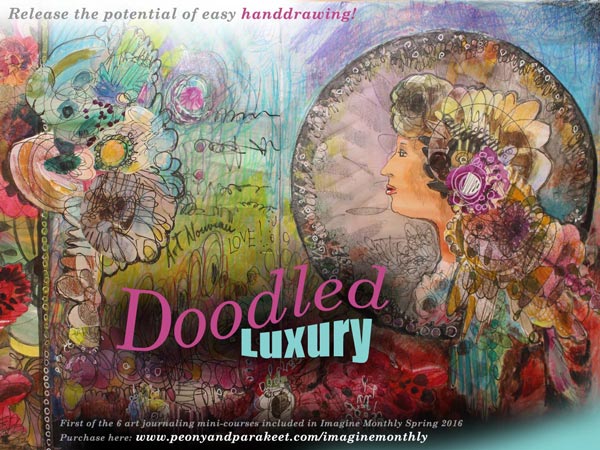
Happy New Year everyone! With the new year, a new class has started. Imagine Monthly is a series of 6 mini-courses, released one by one from January to June. Imagine Monthly is a bit different than my other online workshops. It has a slower pace and you can sign up even if the class is already running. January’s mini-course “Doodled Luxury” has just been released. You will get it right away after signing up!
Why This Course?
I wanted to start the series of 6 mini-courses by showing the potential of free hand drawing. For many, drawing is about being able to copy something realistic but there’s so much more that you can do with flowing lines. I think drawing should be redefined and enabled for everyone. It’s my mission to enable you to enjoy drawing and have a great time with your growing imagination! (Want to ponder more about the ability to draw? Read this blog post: “Can You Draw?”)
Creating with Luxury in Mind
When developing “Doodled Luxury”, I spent a lot of time thinking about the concept of luxury. I think it’s not just something to buy, it’s more about creating something unapologetic and self-sufficient. Something which makes you feel rich in a way that has very little to do with money.

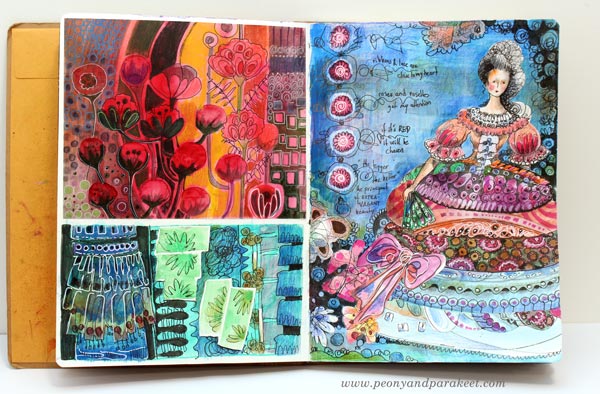
While experimenting with the techniques used in “Doodled Luxury”, I created an art journal spread that summarizes the ideas that I had in my head: bringing a clear focal point, getting inspired by the many layers of luxurious clothes, letting quantity increase the quality.
The spread above is just a background study for the course, but I wanted to show it as an example of how your art journal can contain “idea boxes” which in turn can lead to more advanced ideas like this one:
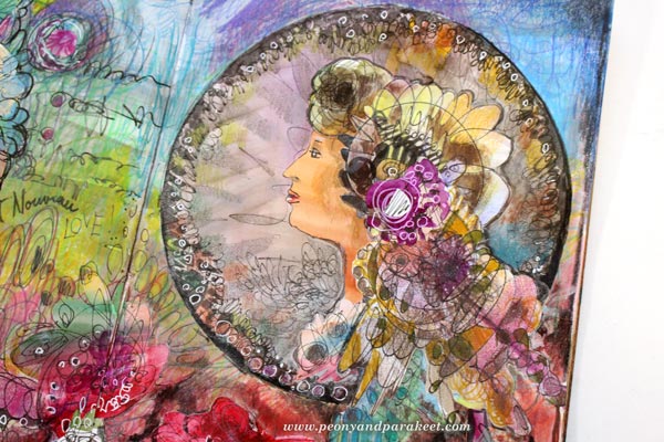
This Alphonse Mucha inspired collage has influences from Marie Antoinette’s period. Can there be anything more luxurious than art nouveau combined with rococo, expressed by hand-drawn elements? Doodling truly can produce luxury when there’s more than enough of it!
Experience the power of simple handdrawing and other easy techniques
Buy Imagine Monthly!