Colored Pencils – Ornamental Approach
This week, we take an ornamental approach to colored pencils! We will color freely, but so that we don’t start with a blank paper.

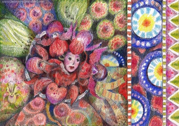
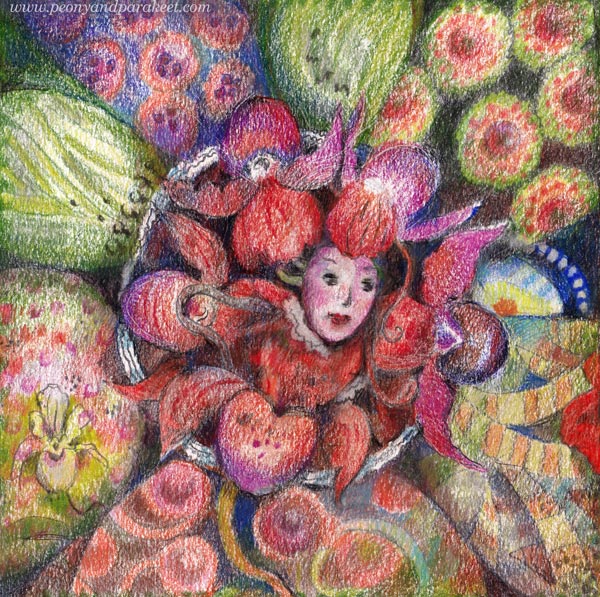
This is the piece I am creating in the video. The process is fun and the result is ornamental.
Ornamental Approach – Watch the Video!
To get started, you will need drawing paper, pencil, eraser, ruler, and round templates, for example, plates or lids will do.
I hope this kind of ornamental coloring inspires you to start and keep going!
Joy of Nature in Colored Pencil
This week, we learn from nature and bring its joy to our colored pencil art.

It makes me sad how colored pencils are used only for replicating photos, and how little there is room for free expression. Nature grows freely, so why not give our art the same opportunity? I hope this post inspires you to do more intuitive coloring!
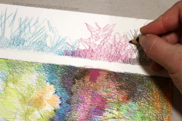
Joy of Nature: Patchwork
Think about nature sceneries as crazy quilts that have fabrics and seams! The fabrics are larger areas and the seams are lines. Patchwork has short seams, so keep your lines quite short too.

When you walk in nature, stop, and see the quilt by searching for the mesh of trees and bushes. Observe how twigs cross over each other and form nature’s patchwork.
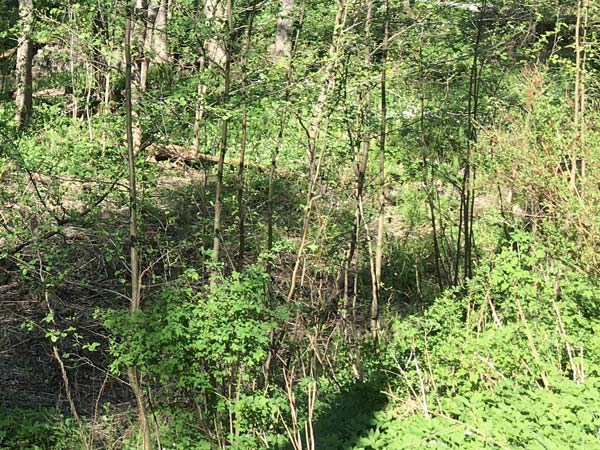
Then when you start coloring a blank paper, focus on building the asymmetric and abstract style quilt, rather than thinking about trees and such.

I find this kind of “patchwork coloring” a lot of fun. Many call this mark-making, but I like to think about creating a patchwork instead. Marks are a more abstract term but textiles connect me to the creative world that is full of ideas.
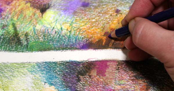
Joy of Nature: Harmony
Despite its patchy structure, nature sceneries have harmony that our art often lacks. When you walk in nature, step back to admire the big picture and point out the areas by their dominating colors. You could think that the sky and earth both have a few quilts: patchwork areas that mostly have similar colors.
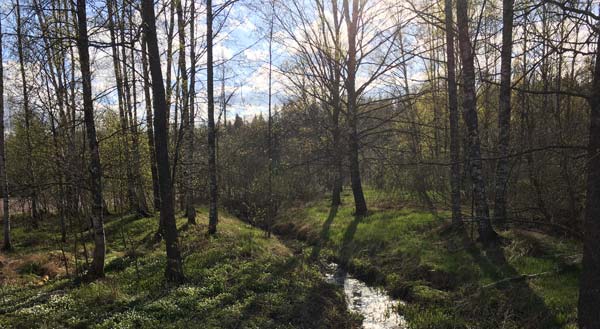
So, when your paper has all kinds of patchwork, compose larger areas by coloring over them so that they get a stronger identity in color. For example, you can have a couple of green areas, a dark area, a more neutral brown area, and one with very light colors.

So, first, you start coloring gently with a wider color scheme and then add larger unified layers over the colorful patchwork.
Joy of Nature: Spirit
I like to think that light is nature’s spirit. When you walk in nature, seek for this spirit. You miss the spirit, if you only point out the big concrete things in the scenery like bushes, trees, water, and sky. To see the spirit, you have to step into the abstract world and look for the light: odd shapes on the trunks of the trees, pattern play on the leaves, and in general, all kinds of small reflections.
For me, it’s helpful to think that the spirit has twins. One is the light and the other is the shadow. When you want more light, you will also get stronger shadows.
Light and shadows add contrast and scatter. When you add them to your piece, it becomes less harmonic, but also less boring.
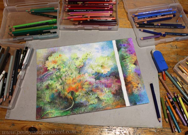
Joy of Coloring Small
Recently, my colored pencil pieces have been quite small, and the paper has been divided into smaller pieces.
Coloring can be a bit like weeding: you can do it little by little.
First, the result is nothing, but it will bloom over time.

Colored pencils beat other supplies when we are creating this kind of small joyful art.
Here one A4-sized paper has two pieces of colored pencil art. So, you can take short walks or long walks to express the joy of nature in colored pencil.
Mother Nature is the best art teacher. That’s why most of my classes are about what I have learned from her.
Getting More into Drawing and Coloring
This week, I share a method that is helpful when you want to get more into drawing and find your style. It is called “topic-spirit-story-abstract.” With this method, art can open to you step by step!
For me, everyday life experiences, illustrations, creative writing, and abstract art are all connected. If I take something away, the chain breaks and my expression stiffens. Most of my creative work follows this “topic-spirit-story-abstract” method. I don’t always have to draw a spirit, but recently I’ve spent time in such abstract dimensions when creating computer art that I have wanted to play with the spirits with colored pencils.
Start with Template!
When you want to practice the method, start by making a template! Divide the paper so that you have a part for the spirit and another part for more abstract coloring. You can just draw a line or be more creative and make a circle for the most figurative part, and several other divisions for more abstract ideas.
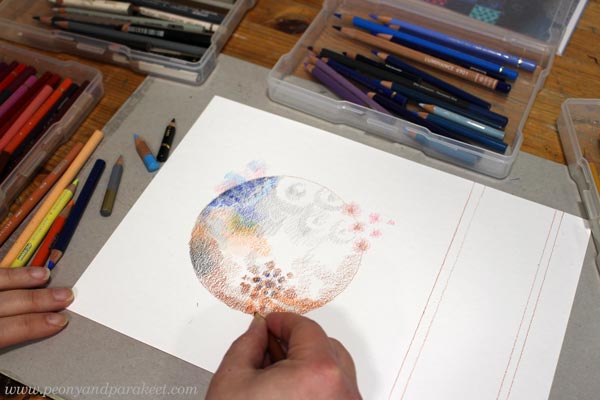
Do some intuitive coloring with a light touch as a warmup before proceeding.
Method: Topic-Spirit-Story-Abstract
After the warmup, find a simple topic that you want to explore.
Think about your recent experiences and find something small and concrete there.
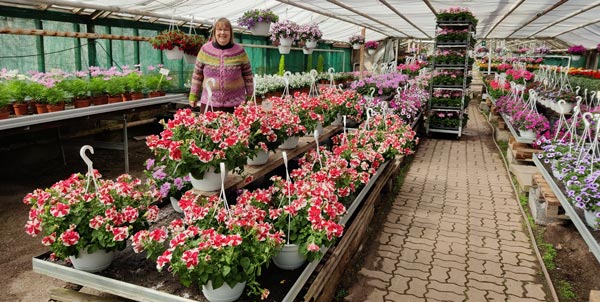
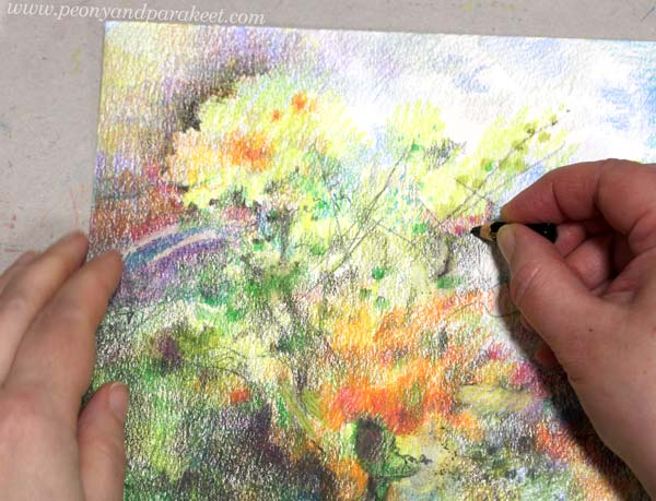
In the example, my topic was a recent visit to a garden center. My husband bought me a beautiful venus slipper orchid there.
Second, imagine a spirit that symbolizes the topic.
Use your imagination – anything contains a spirit!
In the example, I was thinking about the venus slipper and how mysterious and exotic it looks for a Finn.
Third, let the spirit tell a larger story.
What other associations come to your mind when you think about the spirit? Think about literature, music, food, movies, places – what comes to your mind that enlarges the original topic. What is the world that the spirit can open?

In the example, I started thinking about the Queen of Hearts in Alice in Wonderland and Asian culture: sushi and rice bowls. I also had just browsed Kaffe Fassett‘s quilting books and thought about the richness that can be achieved with colors and simple shapes. I slowly enlarged the mixed yet curated world that I was able to reach through the spirit.
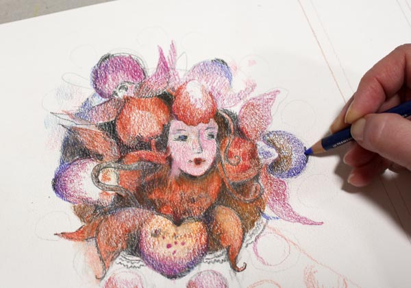
Fourth, explore more the abstract side of the discoveries through the story.
Play with the basic shapes and make decorative borders, ribbons, and patterns.

I find it easier to draw abstract motifs, ornaments, and patterns after finding the spirit than if I start from a blank paper.
Optional: Write the Story!
After making the image, I like to put stories to words. This helps me to get even more into drawing and makes my work as an artist more meaningful.
Art is like a venus slipper. It’s like a plant in the back corner of a garden center. Those who only look at traditional roses won’t even notice it. But whoever dares to bend over the shy plant and curiously fit her mind to the shoe, becomes a master in a game where basic shapes break everything and then build a new whole. This way, the beauty of art is limitless, and not only on the surface.
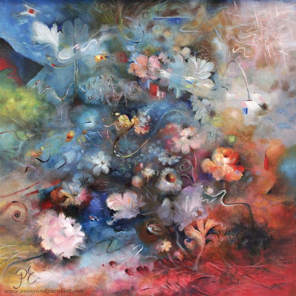
Here’s another example that I made last week. Here, the center is reserved for the quote from the story, and the spirit and the motifs are in the frame.
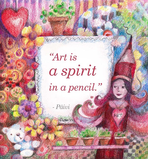
Art is a spirit in a pencil. A single pencil is nothing. It doesn’t cost much, takes up very little space, and you don’t even notice it if it’s at the bottom of your bag. But still, a pencil can connect us to art. When I was a child, I played with pencils while my big sister was coloring. Every pencil had a personality and while I was watching my sister draw, my herbs grow, and my teddy bear rest, I had no idea that those little moments would dictate my future. Art back then was only a spirit in a pencil. When art is a spirit in a pencil, we say yes to a journey that takes us closer to who we are. We say yes to expression that has no limits. This freedom is why I want to support creating.
Getting More Into Drawing Frames and Borders
Decorative art is a bridge between illustration and abstract expression.
Reality consists of both organic and geometric shapes. The question is: how can you bring both of these worlds into your art and use them in a creative way?

I hope you find all this inspiring and helpful to get more into drawing and coloring.
Using White as a Color in Painting and Drawing
In this post, we explore the color white and find ideas on how we could change the way we use it in art-making.
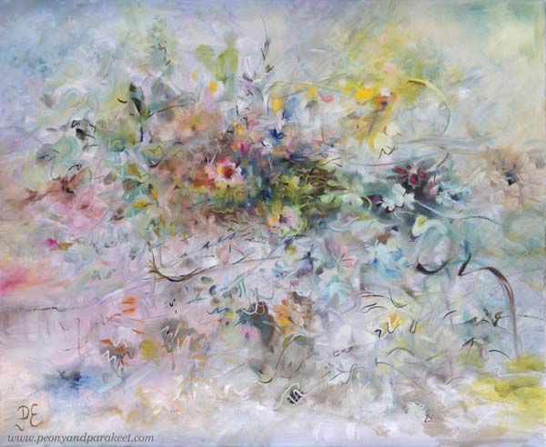
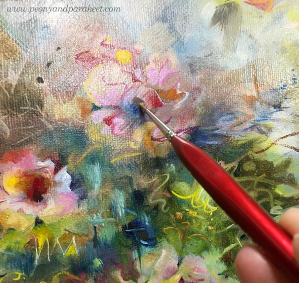
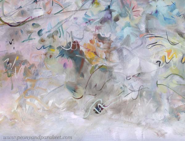
I posted this painting about a month ago, but I still had to fix it! You might not notice the difference, but it matters to me. I have changed the center of the painting so that it is more abstract.
A long time ago I thought that it doesn’t matter if I don’t like some detail of my work or if I don’t like some of my work in general. I thought there would always be someone who would like it.
But the longer I’ve been painting, the more important it has become that I have to be a fan of my own work. When you are a beginner, quantity is more important than quality. But I’ve been working for a long time and the equation has thus turned the other way.
I know some would prefer the more realistic flowers, but I don’t! I have too much reality around me, especially now when the weather has been too cold to be spring.
Living in a White Country
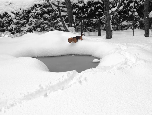
This painting is also special because it has so much color that is difficult for me – white! There is far too much white here in Finland. Even if now is the end of April, we got a lot of snow a couple of days ago!
I think white is a terrible color because it is full of emptiness.
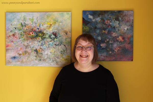
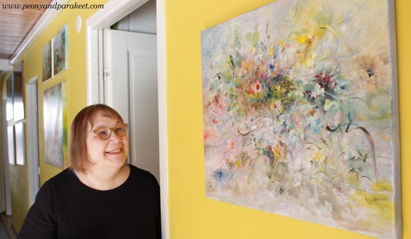
Finnish people usually have white walls and white furniture, but our home is full of colors. I love to display my paintings on this yellow wall.
Not One White But Many Whites
In the recent painting, I wanted to play with pastels and show the side of white that is often not talked about.
For an artist, there is not just one white. There is a warm white that holds the promise of the sun. There is a purple-toned white that falls in love when it sees a deep cold red. There is a white that allures you with a hint of sweet mint. So, many whites, not just one Finnish white!
It’s exciting to mix various whites and then see how the pastel colors slowly begin to appear. You need a lot of white and just a little bit of color to get the toned whites and pale pastels.
Titanium or Zinc White?
The most common white in paint tubes are Titanium White and Zinc White. In oils, you have to be careful with zinc white because it can cause crackles. I mostly use only Titanium White. I would love to use Zinc White because it’s more transparent. In this painting, I have tried my best to bring the soft transparent effects mostly with Titanium White, but it’s not easy!
In acrylics and gouache paints, you can use Zinc White more freely.
When White is Not Needed
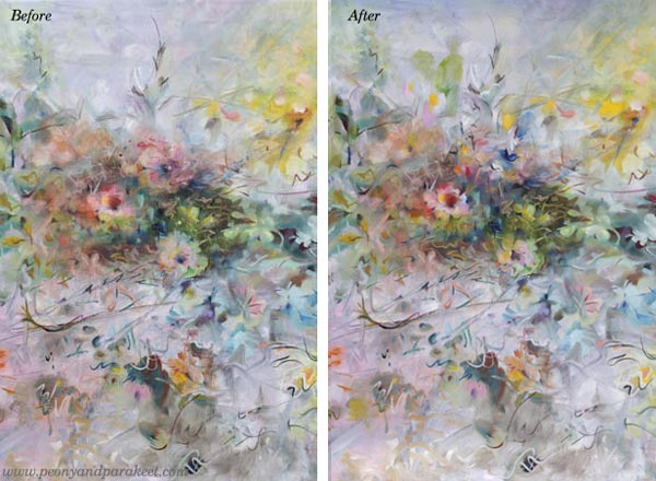
Beginners think that adding white on top can fix everything. Ten years ago, I was madly doodling with a white gel pen. What went wrong, got covered with white circles. But white also can make the piece busy and destroy depth. Here’s a quick example of the small collage piece that I made in 2014 (here’s the old blog post with the video too). The first is the old piece and the second is a photoshopped version showing how I would fix it now.
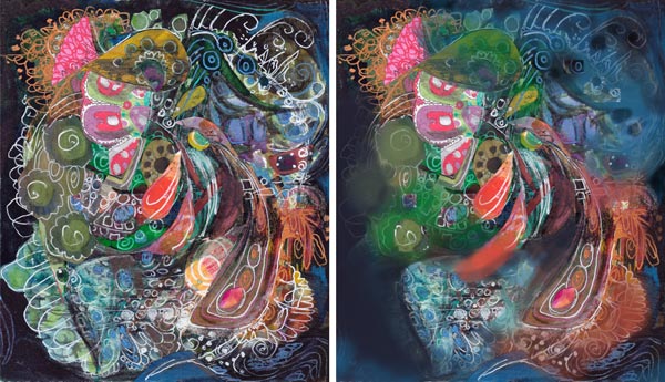
When I tone down the white, the image gets clearer and the depth grows. The highlights in the central parts get more attention and it’s easier to know where to look. I wish someone would have pointed this out to me back then. It took a lot of time to realize this!
If White Were a Person …
I am pretty sure that if White were a person she would say: “I have much more potential than you think. Stop seeing me as a blank background or a quick fix to a piece that lacks contrasts!”
What’s your relationship with White?