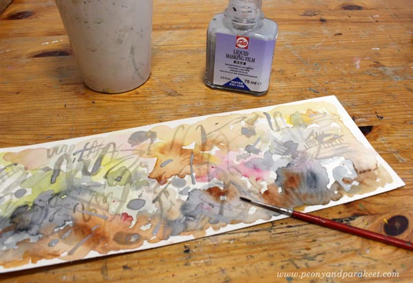
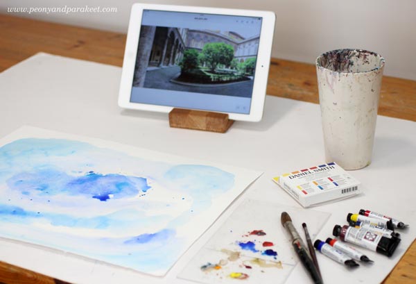
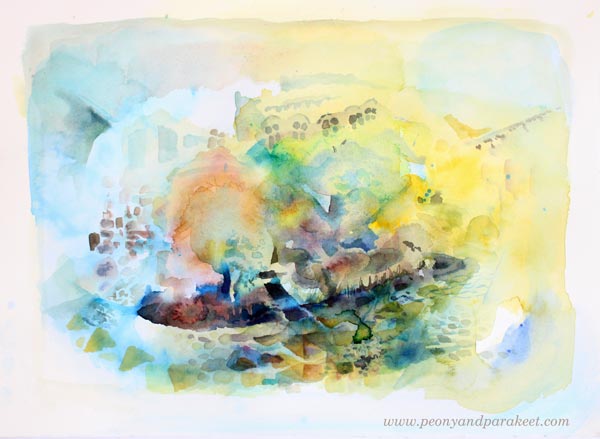
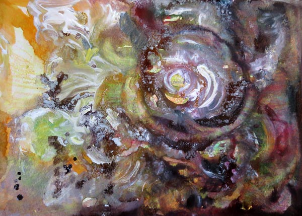
Facebook Live Watercolor Painting
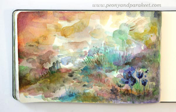
Here’s the watercolor painting that I painted yesterday on Facebook Live while chatting away. You can find the recording on Peony and Parakeet’s Facebook page, go to Live Videos!
I had a wonderful audience, and many have posted their versions too in the thread, so it’s definitely worth checking out!
Watercolor Journey begins on July 1st!

My online class Watercolor Journey will begin on Sunday, July 1st. If you want to fall in love with watercolors, you don’t want to miss this class! Sign up here!
Watercolor Panoramas to Express Travel Memories
I try to have a wide range of topics on this blog, but now I am posting watercolor sceneries again! (See the last week’s post). I have quickly become addicted to them! It all started with buying Daniel Smith watercolors and realizing that many members of my community Bloom and Fly love watercolors. I try to grow my skills in most of the media that the members use. Then I can give advice that’s not only great in theory but also works in practice.
Not So Traditional Landscape Painting
A lot of reasons were needed for landscape painting because so far, it has been one of the most boring genres of visual art to me. I haven’t ever been the kind of person who travels with a tiny watercolor kit and sits down near the sights to paint the surroundings. I do usually carry a camera – often just my phone – when traveling or walking in nature but never before have I understand the fascination of the traditional landscape painting.
But last week, I realized that because art is freedom, I can be as wild and expressive as I want. That made the landscape painting a fun game. It gives me the opportunity to re-live the travel memories, get lost in the process, and then come out with a piece that’s like a souvenir from that creative experience.
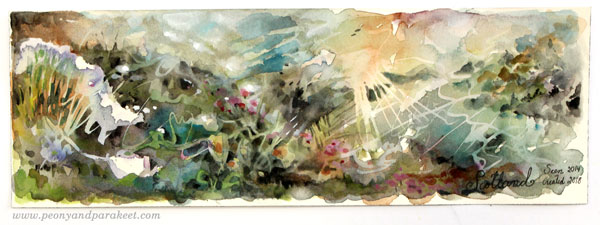
Watercolor Panoramas – Playing with Expression
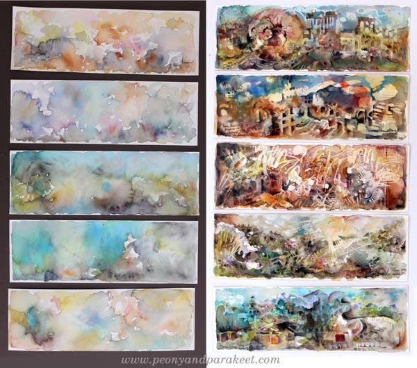
This time, I was not painting just one piece like last week, but five small panoramas at one go. I carelessly chose the reference photos for the last part of the process. I will talk about the process later in this post, but let’s talk about the expressive ideas first.
A) How Would The Place Currently Look?
When painting watercolor panoramas, it was interesting to see what travel memories come to mind and how they got merged with the current life.
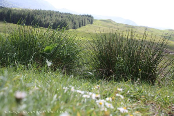
When we were in the Scottish countryside in 2014, it was a sunny day in June. The heat felt very similar to Finland’s summer. It was pleasant, not suffocating at all, and remembering it made me ponder how the spring would look there now – perhaps quite similar to Finland too.
This was the photo that I used as inspiration when finishing the painting.
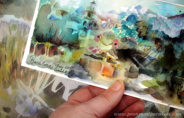
B) The Chain of Memories
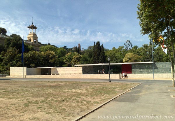
Barcelona was my husband’s suggestion in 2009. I wasn’t excited until I remembered Mies van der Rohe’s Barcelona Pavilion. And of course, the pavilion was also the first thing that came to my mind when I painted the panorama. But I also remembered Catalonia’s National Art Museum, Gaudi’s architecture, the mountains that surrounded the valley, the sea views, a lot!

The long chain of memories and locations started from this (not so artistic!) snapshot showing Barcelona Pavilion.
C) The Emotional Experience
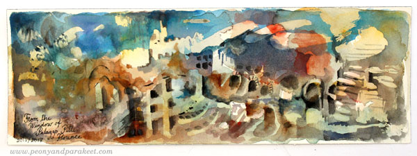
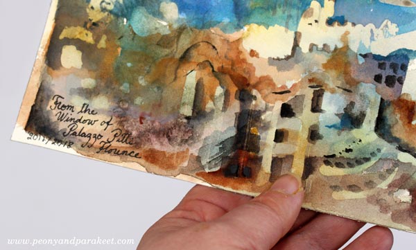
Last summer, we visited Palazzo Pitti in Florence, Italy. The place has inspired me ever since. I remember entering the museum and seeing the first room filled with chandeliers. It was a hot and relatively quiet evening in Florence, but my mind was buzzing. It’s like I was trying to get exposed to as much art and beauty as I could.
Here’s the photo that I had in hand when finishing the watercolor panorama above.

D) Being Far, Seeing Far
When being far away from home, it’s possible to see the life from a different perspective. It’s like rewriting some parts of the personal story. In the brilliant Palazzo Pitti, I had the same experience than when visiting Hermitage Museum in St. Petersburg, Russia: I should trust my points of view more, and not hold back. When I looked out of a window of Palazzo Pitti, it didn’t matter what other people saw there. I saw what I saw, and that’s true to me.
Here’s the reference photo that I almost deleted when I came back from the trip because it wasn’t so pretty. While painting, I realized that good reference photos are not only those which show the best scenes. The ones that remind from the best moments are also worth saving and painting.

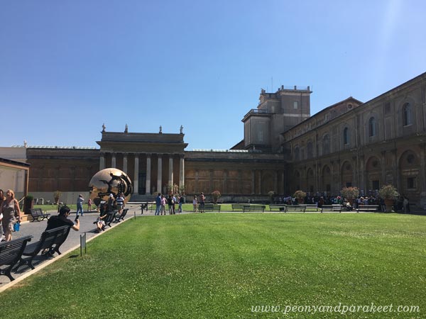
E) Highlighting What Matters
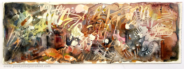
While traveling in Italy last summer, we visited Vatican Museums too. Some of the things that stuck in my mind were the huge maps on the walls and the incredible number of tourists. While painting, I thought how the old maps could be seen as symbols for the curiosity to know the globe.
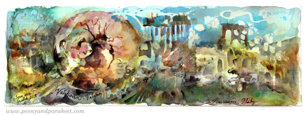
The statue of the reference photo (Arnaldo Pomodoro’s Sphere within a Sphere) expresses the complexity and fragility of the world. I made it dominate the scene in the watercolor panorama and made it look a bit like a round map. To me, it’s much more important than the buildings!
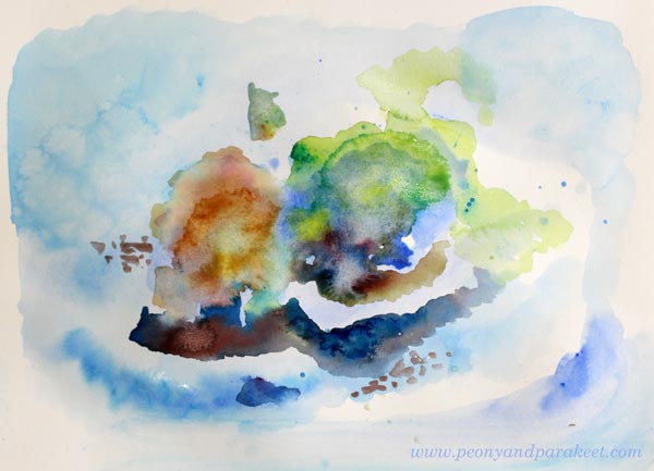
Watercolor Panoramas – My Process
The idea for panoramas was accidental. I happened to find oblong pieces when going through the watercolor papers. I often like to paint a square, so I had cut away the excess of a blocked paper. I don’t usually work in this small scale. However, using a thin water brush most of the time, made it quite easy.
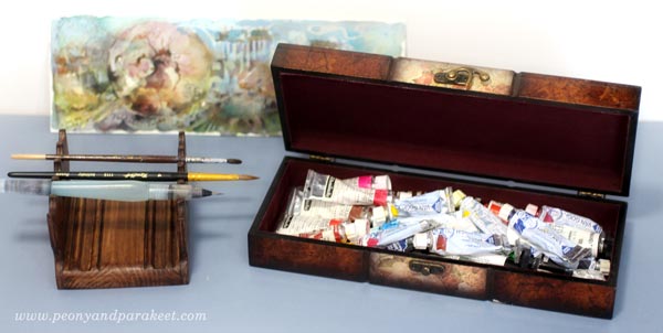
For the colors, I used a mixed collection of watercolor and gouache paints.
1) Background – Traveling to the Mind
The fact that I didn’t use any reference photos until in the end, made the painting fun. The first layers were splashing and blending. I had no idea about the scene or the location that would appear on paper!
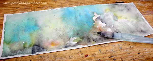
I took a photo of the backgrounds and then another one when the paintings were finished. Can you recognize which belongs to which?
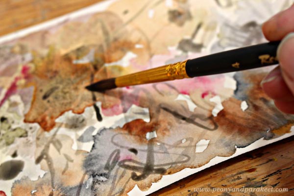
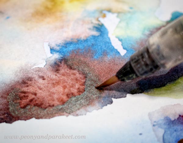
2) Doodling with Watercolor and Masking Fluid
After I had painted the background, I started doodling. Working with five watercolor panoramas at the same time was handy. I could work with one painting while others were drying. I used both pigments and masking fluid for doodling. Some backgrounds had watercolor doodles first. Others went straight to masking.
At this point, I started thinking about a reference photo that could suit the painting. For some panoramas, I found the picture quickly. But there were a couple that raised no memories at all, so I just doodled this and that!
After the masking fluid had dried, I was having fun again. I splashed the paint and enjoyed the wonders of watercolor.
After the topmost layers had dried, I removed the masking fluid. Here’s “Scotland.”

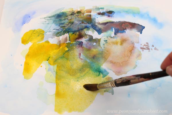
3) Finishing the Painting with a Reference Photo
When aiming for an expressive and loose image, the reference photo is more like an inspiration photo. I can glance at it, pick some ideas and elements from it but I don’t follow it to the detail. I let my associations and memories override the photo and build an inner vision of the place. (My class Inspirational Drawing guides you to master this process more in detail.)
Why I Have Never Learned Watercolor Painting from the Books
Some elements of the panoramas are more abstract, some more recognizable. It’s important to cherish the abstract nature of art when making room for expression.
I must confess that during the years that I have experimented with watercolors, I have found the books and videos difficult to comprehend and adapt. Watercolor tutorials usually follow the reference photos very carefully. To me, it doesn’t make sense. I need to know “the code” – the logic and the principles behind the image, not just the image. After you’ve got the code, you can express much more!
As an artist, I have always been more interested in what something expresses than how it looks. I have often felt disappointed by the lack of the expression part in tutorials, so I try my best to focus on the expression when teaching others.
The Magic of Finishing Touches
To me, the most challenging step in creating is finishing. The first two steps are usually just happy happy happy, but then there is a danger that the project becomes sad sad sad.
The watercolor panoramas were quite easy to finish, but if I have bigger struggles, I use the camera for the whole creative process. Then I take a photo of my work and look at it in several ways, enlarge it, make it smaller, etc. It’s fast and makes the finishing much easier than just staring at the actual piece. In May at Bloom and Fly, I will show how to use a camera and other digital tools to make the most out of your art, even if the actual creating would happen manually.
The Summer Season (July-August) of Bloom and Fly is Watercolor Journey
>> Sign up here!
Painting a Loose Scenery with Daniel Smith Watercolors
Last week, I did it. I bought some Daniel Smith watercolors because I had heard about them so much and for so long that I had to try them too. I bought the “Watercolor Essentials” set of 6 small tubes and a tube of Iridescent Scarab Red – a brownish red that has a green glow. Exciting!
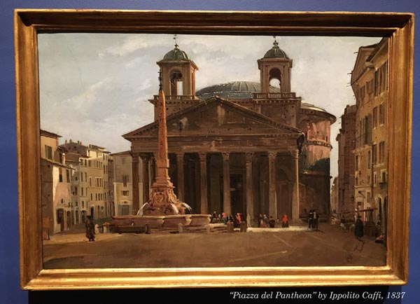
Inspired by Ippolito Caffi
But what to paint? The idea came this week when I went to see Ippolito Caffi’s architectural paintings and landscapes at Sinebrychoff Art Museum in Helsinki. It’s the kind of art that I personally don’t like to create, but I enjoyed the exhibition. Here’s Piazza del Pantheon by Caffi, an oil painting on cardboard.
As said, realistic architectural urban scenes and landscapes are not what usually come to my mind when I start creating. But after watching a lot of scenes from Italy brought memories from my trip to Florence and Rome last summer. So why not pick a random photo of the trip and start painting?
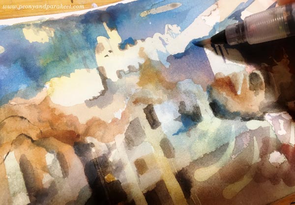
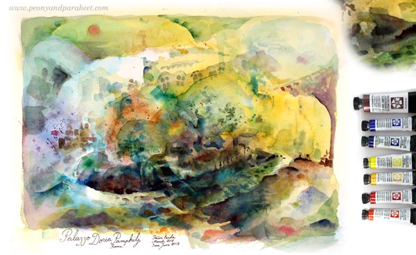
Palazzo Doria Pamphilj
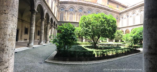
The photo that I quickly chose was taken at the inner court of Palazzo Doria Pamphilj, Rome. The palace has a wonderful art museum that I blogged in July 2017. I thought that I could use it as a loose reference and create something totally different, abstract perhaps. Painting a scenery with watercolors felt too traditional to me. So I just started splashing water and blue paint.
Scenery with Daniel Smith Watercolors
Daniel Smith watercolors are lively. Not only colors are lively but the pigment seems to travel quickly, and it creates wonderful effects.

Here’s my painting after playing with big brushes and water.
Then I changed to a water brush that is quite narrow. I love using this brush. It’s so easy to paint small details with it.
Iridescent Scarab Red looks interesting! Very different from any of the watercolors that I know. At this point, I thought about making a fantasy scene of some kind.

Time to loosen up!
The more I painted, the more tempting it became to paint Palazzo Doria Pamphilj as I experienced it. It was a really hot summer day when I visited it. It’s located in the middle of busy Rome, yet its thick walls seem to isolate the museum from the city.
I let the image be visible while I was working but did not follow it to detail.

I found Daniel Smith’s watercolors easy and fun. I don’t like the color selection of the Essentials set so much, and the paints are really expensive compared to any other brand. The owner of the art supply store said that he likes to sell the essentials set at a fairly low price because once you try them, you are hooked and need some more. He may be right! But because I spend quite a lot of money in top quality oil paints, I might not buy more Daniel Smith shortly.
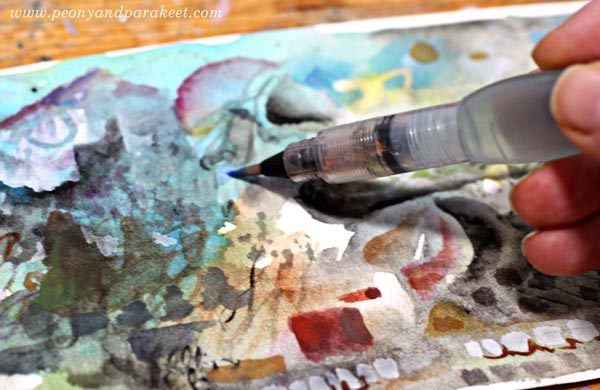
Finished Painting and Signature
The painting of Palazzo Doria Pamphilj became quite loose, but it’s ok. I enjoyed connecting with the memories, and this is a bit like a souvenir from the place.
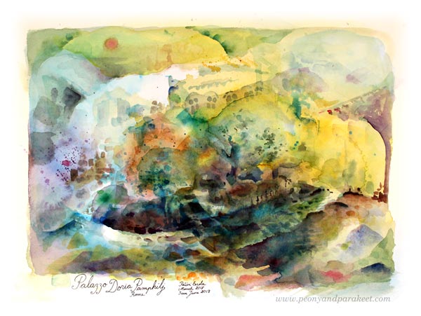
At my recent visit to the museum, I also saw Giovanni Battista Piranesi‘s amazing graphic works. They had beautiful signatures, so I also added one to the watercolor painting. I think it finishes the painting nicely.
This project is a perfect example of how being a bit adventurous can open new ideas. Landscape and architectural painting don’t feel so boring to me anymore! I have ideas for next quick paintings too. This kind of exploration is not only fun but also important for the creativity. If you limit yourself to one theme, to one type of work, creating becomes tedious. To me, this kind of small and quick projects give ideas and energy to bigger paintings.
Create with an Inspiring Community – Join Bloom and Fly!
When you have been creating art for a while, it’s time to let go of step-by-step instructions, get a little looser, and explore the opportunities that art has for you.
Bloom and Fly is a community for you who wants to explore visual and adventurous ideas, get feedback and suggestions for your art, and connect with like-minded art enthusiasts. We have a private Facebook group, monthly themes, live sessions, and weekly opportunities for practical help and feedback.
Registration is now open for Spring season (April – June 2018): Sign up here!
Mixed Media Seascapes – 5 Tips for Expressive Art
Notice the new, useful categories for the blog posts, see the sidebar “Posts by Theme” or if you are in mobile, see the end of the page!
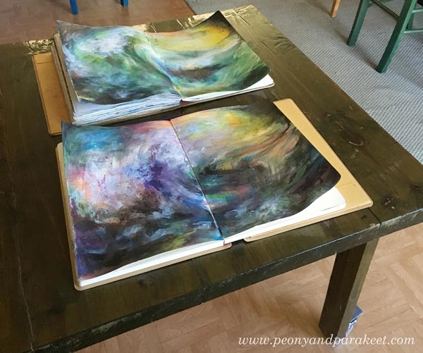
Sometimes I regret creating my art on the journals. When I created these mixed media seascapes for the mini-course Stormy Scenery, I wanted to keep the journals open and visible for days just to get back with the process and look at all the colors. And when I saw what my students had created, I secretly wished the same – that not so many weren’t in journals but frames. I want to share some art made from the mini-course and share some tips for expressive seascapes.
1) Play with Colors!
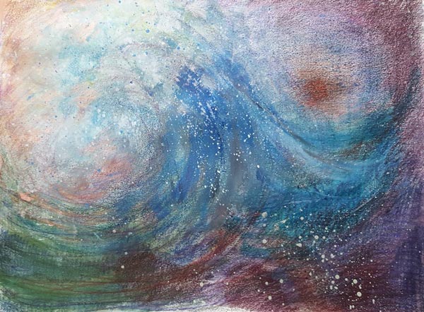
When creating the waves, show how the water reflects the colors of its surroundings. When there’s a storm, there will be a lot that’s moving, and it will affect the colors too. You can show your current state of mind as the sea and bring out the variety of thoughts and feelings. See how Claudia Watkins has made a row of waves with various colors.
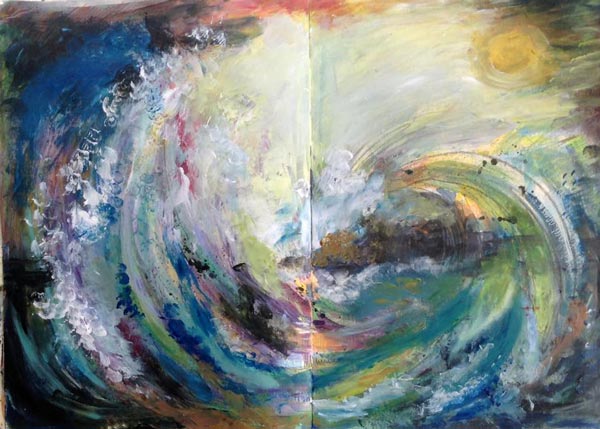
2) Create a Connection Between The Sky and The Sea!
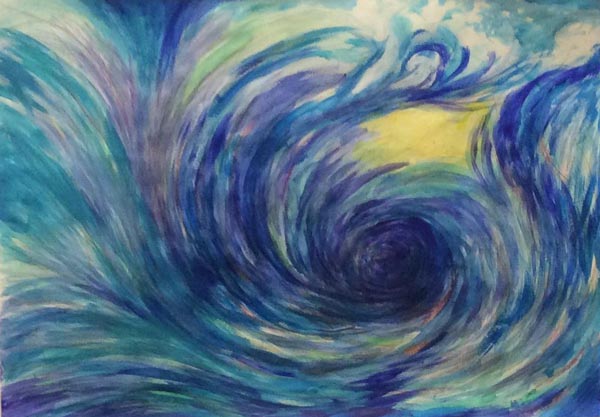
If the sea represents you and the sky represents the outside world, how do they interact? Susan Rajkumar has expressed the connection in a brilliant way. It looks like the sea is willing to hug the sun and the overall feeling of the piece is warm and happy.
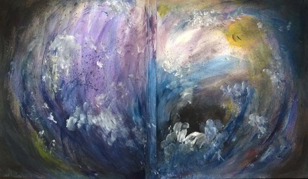
Sheila McGruer’s sun has left the sea, and it has caused an explosion of energy.
Sheila’s piece also has the softness which takes us to the next tip …
3) Express the Softness of Water
Cheryl Rayner shows the softness with both long strokes and splashes of water. With softness, you can practice gentleness towards yourself and others.
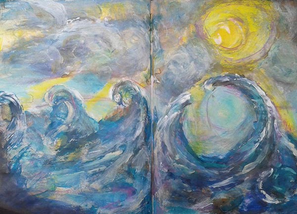
4) Show The Movement of The Waves
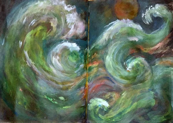
Enjoy the transformation that happens when you focus on creating art! Strokes and lines express the movement. Lorraine Cline’s green sea is captivating because it’s wonderfully dynamic!
Terttu Laitinen has the great eye of the storm.
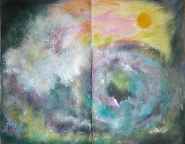
5) Make The Scene Look 3-Dimensional!
In any scene and any mind, some things are closer, and some things are further away. Add more 3-dimensional look to make some elements more blurry and some sharper than others. Satu Kontuvuori has a striking focal point where sharp white waves are on the top of the blurry black eye of the storm.
Mackie d’Arge also has a clear focal point and lots of less defined splashes around it.
Internal Seascapes – Connect with Your Internal Energy!
The mixed media seascapes shown in this blog posts are made from the mini-course Stormy Scenery which was part of my Imagine Monthly Spring series last year. You can now purchase it individually too. When creating Stormy Scenery, I was inspired by the long chain of seascape painters, especially by J.M.W. Turner and Ivan Aivazovski. I also have a Pinterest board called Internal Seascapes where I have collected inspirational sea paintings.
But in Stormy Scenery, more than just to paint the sea, I coach you through the process of opening up and bringing out your expression. With the mini-course, you are not so much mimicking the sea outside but expressing the power inside. I believe that every artist has a unique power as well as every day has a unique energy.
Create Mixed Media Seascapes!
Use colored pencils, watercolors, and acrylic paints to create expressive mixed media art!
>> Click here to buy Stormy Scenery!
