Filling an Art Journal
One of my projects this summer is to fill one of my art journals – Dylusions Creative Journal Square. I hope that these pics from my current in-progress journal, inspire you to start filling your art journal!

Reaching Saturation Point in Filling Art Journal
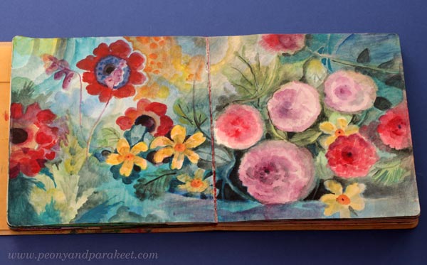
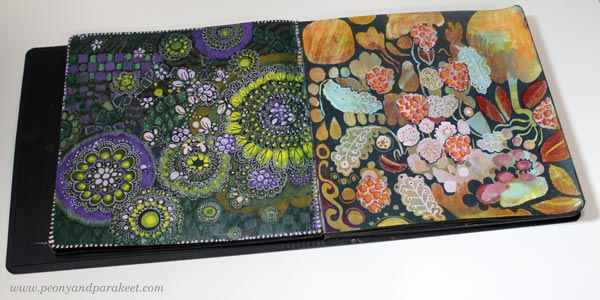
I think art journals have a saturation point. When most of the pages are full, you have to give the book a little more attention than usual. This journal was started in 2020, and I have filled it here and there over the years.

One spread can have things done in many different years. So the book is full of temporal layers, and I think they make the best art journal.

and finally added a zebra made in the style of Animal Inkdom.
Magical Inkdom also has fun projects for these kind of small drawings.
Practicing in an Art Journal
My courses appear a lot in my art journal, because I often practice on the pages or later glue pictures I made for the courses into it. I hope my course participants do the same!

and then added some more painted petals in acrylic.
Journaled “Sweet” with watercolors.
Part of being an artist is to be happy with your own development, and also to be interested in what you have done before.
This and That Will Magically Come Together
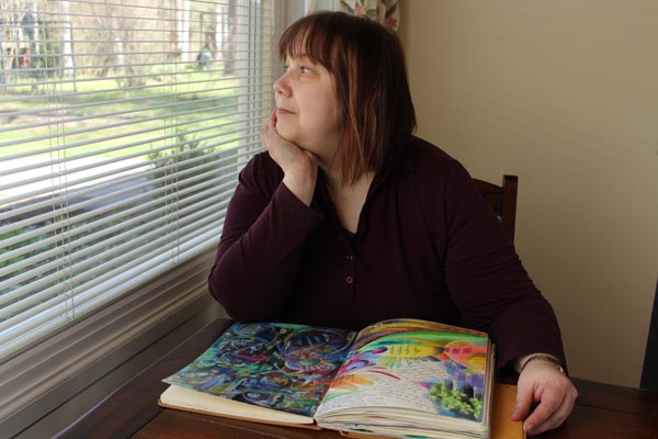
When my art journal is full, I will make a video of it, where I go through it and talk about each spread. I also know that when the journal is finished, the flow of the spreads feels much more coherent than when I was filling them.
In the style of Freely Grown.
One thing that applies to all art journals, sketchbooks, and notebooks is that they are most beautiful when full. When you purchase one, it looks too beautiful to fill, but once you hold a full one, it feels much more valuable. I am looking forward to that!
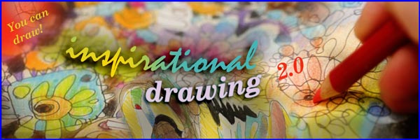
Inspirational Drawing Changed My Life
This week, I share a story about how drawing changed my life – how art can start from discovering your living line and then drawing it over and over again.

Now is also the last chance to buy my course Inspirational Drawing!
The course will go away on April 21st at midnight PDT. >> Buy Now!
Are You Waiting for Your Moment in Art?
10 years ago, I definitely was waiting for my moment. I had dreamed about art all my life. I wanted to find what kind of artist I am and wanted to do it in practice, by creating. So, not be the one who only dreams about art or who only buys art supplies and says: “one day”.
I didn’t want to be remembered as a creative stamper or any other kind of crafter. I wanted to find my way in art-making and art world – not by questioning if I could do it, but simply by drawing and painting so much that I would get my moment.
And I did find my way, and many moments have come. But when things happen for the first time, you don’t quite know it right away. You will recognize the moment that changed your life later. For me, it was when I got the idea of the course Inspirational Drawing.
Over time, the course has had three versions:
- A pilot in Finnish (2015)
- The first version in English (2015)
- The second and the current version in English (2017)
Inspirational Drawing has been my most popular course when counting all the versions together. You could say that my story as an artist started with this course. Now when it’s time to expire the last version, I want to celebrate it by telling its story, which also is a big part of how I found my artistic style and became a professional visual artist.
From Art Journaling To Drawing Freely
Before the deep dive into drawing, art journaling had been my hobby for many years. Here’s a spread from 2013 where I reflect on who I am. The title says: “Kehitä ja sä saat sen” – “Develop and you will get it!

Since my background was in design and IT, I didn’t think I would ever be accepted into art circles. But because I had previous experience in teaching adults, I knew that there are always people who are on your path, but little further behind. And I had many who read my blog. So I started creating online courses in 2014.
I had left my day job, and practiced drawing full-time. The more I drew, the more I noticed how I mostly created circles only.

After making a couple of short courses, I knew I wanted to teach myself to draw and others too. But how to break that habit of drawing closed lines?
I got the idea of long lines that wandered freely on the paper. Some call this method contour drawing, I learned later. But I don’t think contour drawing is quite the same thing, because my method breaks many of its principles. And most importantly, in my method you explore the inner world instead of the outer.

Glimpse into the Past – Watch the 2-minute Video!
In 2015, I held a pilot course on drawing for Finns. It was called “Inspiroidu piirtämisestä” – get inspired of drawing. Here’s some samples from that course in a 2-minute video. This was me 10 years ago – A glimpse into the past!
The Finnish pilot went well and there were also enthusiasm on my blog, so it was clear that I should make the next course in English and make available for art journalers around the world.
Develop and You Will Get It!
I started calling my method “inspirational drawing” because once you get started the drawing itself offers inspiration to draw more.

Even before the first English course was born, an American publishing company offered me a deal to write a book about my method with the title “Drawing Freely.” I declined. I don’t know if it was a wise decision, but I was extremely excited to teach courses and see how the method worked with the course participants.
The first Inspirational Drawing course was published at the end of 2015. Many people got excited about drawing – especially those who wanted to draw freely without models.
>> See this blog post of student work from 2015!
In the first version, I included decorative drawing, but in the second version, I wanted to go even more in an expressive direction. So, in 2017 the first version was archived and the second version, Inspirational Drawing 2.0, was introduced. The core idea of the free-flowing line remains the same, but all the projects were new.
The method of Inspirational Drawing also includes how to collect inspiration from pictures. Choosing images and being inspired by them is part of loving art, and I wanted to build a connection from drawing to it. In Inspirational Drawing, photos and other images are not used as direct references, but as a source of individual ideas such as colors, details, and concepts.
Drawing Changed My Life
You could say that although my current style is best visible in my paintings, it’s largely based on what I have found in the Inspirational Drawing method: the ornamentation of lines, dynamic expression, the freedom to break reality and build a new one.

And today I have been accepted into art circles. I belong to professional artist organizations, collaborate with galleries, and make a part of my living by selling my paintings. I have received grants and don’t feel like an outsider anymore. Drawing truly changed my life.

This change started with the urge to free my pen from drawing just closed circles. When my line opened up, so did my inner world, and finally, the outer world as well. The idea of Inspirational Drawing is summed up in the phrase “You can draw!” With this mindset and enthusiasm for drawing, you can break your mental boundaries. You can question the old answers about how and what to draw.
You Can Draw!
Since 2017, technology has developed, and I have grown as a teacher and artist. Every now and then I remove old courses, and now it’s time to archive Inspirational Drawing.
Inspirational Drawing will go away on April 21st at midnight PDT, but before that, you can purchase it at a sale price. The original price was 109 EUR, but now you can buy the course for only 49 EUR! >> Buy Now!
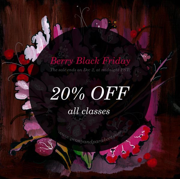
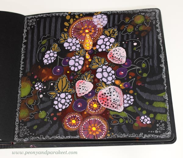
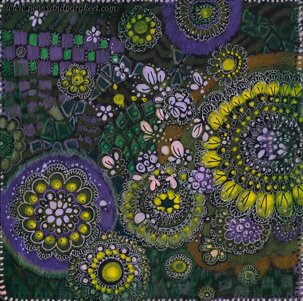
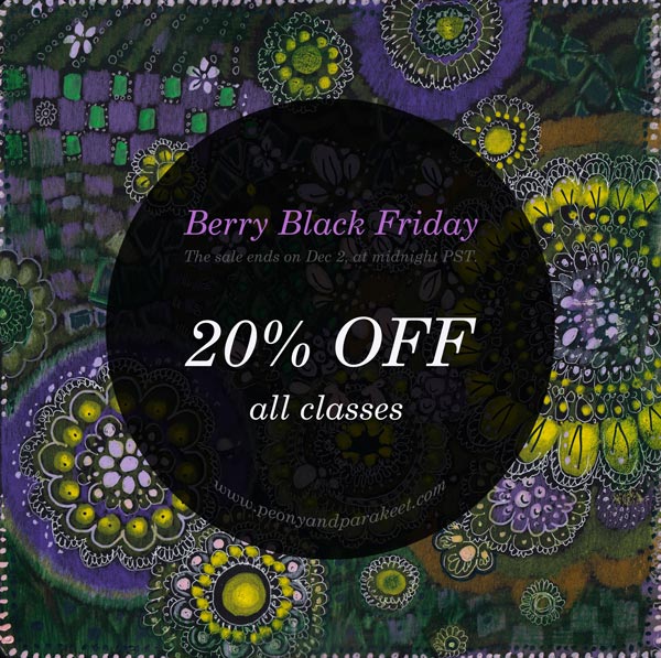
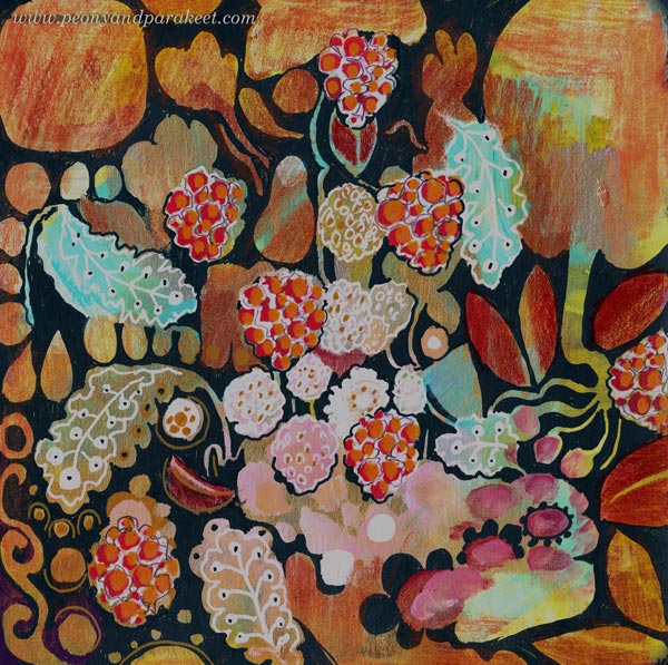
Black Art Journal Pages as Banners
I want my Black Friday campaigns to be inspiring for art-making, and this year my theme is “Black Berry Friday.” It means juicy art journal pages on black paper. I am pretty sure you have one like my black and square Dylusions Creative Journal (affiliate link).
I use my black art journal for using up old supplies that don’t inspire me anymore. And if I have leftover paint on a palette, I make a few brush strokes on a page rather than toss the paint away. This floral page was born from those kinds of careless strokes and now, much later, I finished it with paint markers.
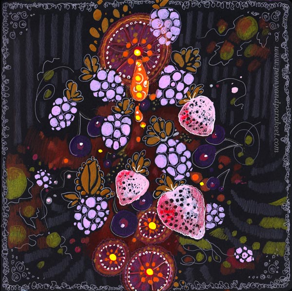
Edges and Banners
Usually, the center of the page is the most important area, but for banners, the edges need to draw attention. Here, the circular floral design, enhances the center text area beautifully.
I made the banner in Photoshop, and boosted the colors a bit.
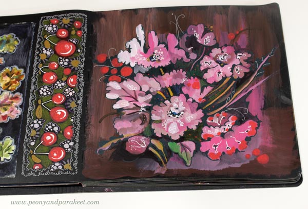
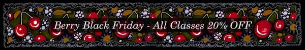
I also drew a long rectangle of cherries that not only makes a great banner but also looks great on the journal. I think we treat art journal pages too often as one unit when a page could be divided in sections and thus bring more variation to the journal.
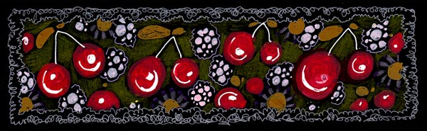
My banner wasn’t long enough for all the purposes, so I made it longer by duplicating the design in Photoshop.
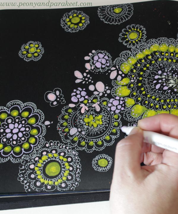
Colored Pencils on Black Art Journal Pages
I like to use colored pencils with paint markers. Marker pens produce thick and opaque shapes but colored pencils are softer and more translucent. Colored pencils are great for backgrounds. Look at these stripes!
I also used gel pens to add thin lines.
Again, I became more interested in the background than the center. The center is not very elegant, but here, in the banner you mostly see the edges.
Doodling on Black Art Journal Pages
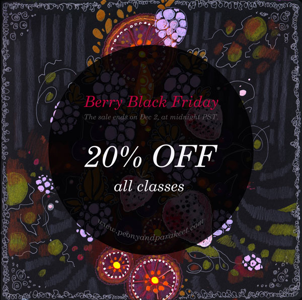
My Black Friday offer is simple: All classes are 20% OFF. So I wanted the banners have some simplicity too. Doodling circles is easy and doesn’t require much thinking.
I got a bit carried away though!
I was talking on the phone and watching a movie while doodling, and once I stopped, I thought that I doodled too much. But the banner looks great and of course, there can’t be too much of anything in art!
Designs for Fabric
I got so inspired making these pages, that I had to play with Photoshop a bit more than necessary. I combined many pages into one design and I think something like this would make a great fabric.
Black Over Painted Background
I have been contemplating whether I should use both sides of the pages on my black art journal. Using only one side would give a blank page to protect the art on the opposite page. But the journal looks much more inspiring when both pages are covered!
Here’s one more idea for an art journal page, and this works on any journal. When you have painted backgrounds, use dark marker or paint on top to make shapes from the background.
I wanted to make one banner that has fall and thanksgiving themes with berries. The page became a bit busy, but again, the banner is ok, I think!
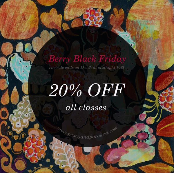
And now: it’s time to shop the sale!
The Black Berry Friday sale ends on Dec 2, 2024, at midnight PST.
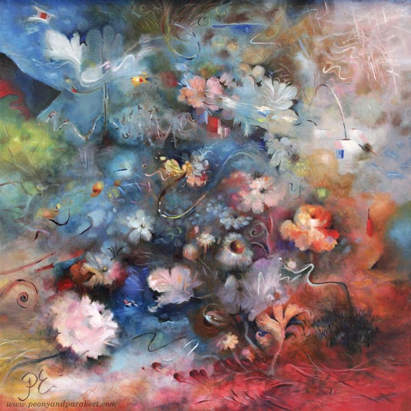
Using White as a Color in Painting and Drawing
In this post, we explore the color white and find ideas on how we could change the way we use it in art-making.
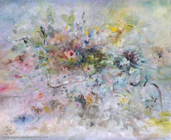
I posted this painting about a month ago, but I still had to fix it! You might not notice the difference, but it matters to me. I have changed the center of the painting so that it is more abstract.
A long time ago I thought that it doesn’t matter if I don’t like some detail of my work or if I don’t like some of my work in general. I thought there would always be someone who would like it.
But the longer I’ve been painting, the more important it has become that I have to be a fan of my own work. When you are a beginner, quantity is more important than quality. But I’ve been working for a long time and the equation has thus turned the other way.
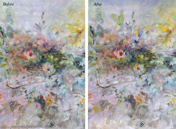
I know some would prefer the more realistic flowers, but I don’t! I have too much reality around me, especially now when the weather has been too cold to be spring.
Living in a White Country
This painting is also special because it has so much color that is difficult for me – white! There is far too much white here in Finland. Even if now is the end of April, we got a lot of snow a couple of days ago!
I think white is a terrible color because it is full of emptiness.
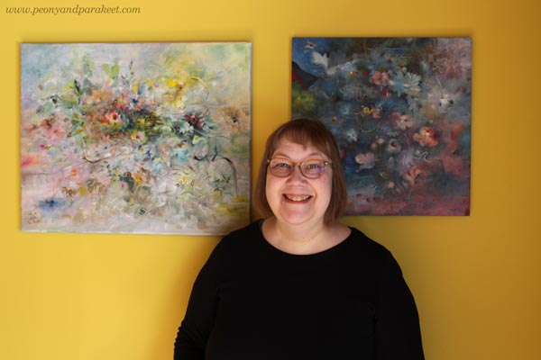
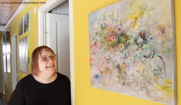
Finnish people usually have white walls and white furniture, but our home is full of colors. I love to display my paintings on this yellow wall.
Not One White But Many Whites
In the recent painting, I wanted to play with pastels and show the side of white that is often not talked about.
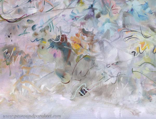
For an artist, there is not just one white. There is a warm white that holds the promise of the sun. There is a purple-toned white that falls in love when it sees a deep cold red. There is a white that allures you with a hint of sweet mint. So, many whites, not just one Finnish white!
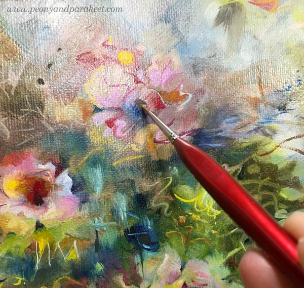
It’s exciting to mix various whites and then see how the pastel colors slowly begin to appear. You need a lot of white and just a little bit of color to get the toned whites and pale pastels.
Titanium or Zinc White?
The most common white in paint tubes are Titanium White and Zinc White. In oils, you have to be careful with zinc white because it can cause crackles. I mostly use only Titanium White. I would love to use Zinc White because it’s more transparent. In this painting, I have tried my best to bring the soft transparent effects mostly with Titanium White, but it’s not easy!
In acrylics and gouache paints, you can use Zinc White more freely.
When White is Not Needed
Beginners think that adding white on top can fix everything. Ten years ago, I was madly doodling with a white gel pen. What went wrong, got covered with white circles. But white also can make the piece busy and destroy depth. Here’s a quick example of the small collage piece that I made in 2014 (here’s the old blog post with the video too). The first is the old piece and the second is a photoshopped version showing how I would fix it now.
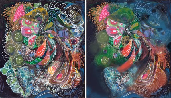
When I tone down the white, the image gets clearer and the depth grows. The highlights in the central parts get more attention and it’s easier to know where to look. I wish someone would have pointed this out to me back then. It took a lot of time to realize this!
If White Were a Person …
I am pretty sure that if White were a person she would say: “I have much more potential than you think. Stop seeing me as a blank background or a quick fix to a piece that lacks contrasts!”
What’s your relationship with White?