Mixed Media Painting Idea – Revisiting Your Old Style
Between 2010-2014 I was enthusiastic about decorative art. I called myself as a “decorative artist” and saw myself more as a designer than as an artist who focuses on expression. My upcoming class Collageland (thank you, everyone, for the feedback you gave in the last blog post!), is a retrospective to that period in my life. While editing the videos, I have been pondering about what inspired me back then and how it’s different from what motivates me now.
Some themes and styles often feel too familiar to me. They don’t seem to challenge me anymore, so I have moved on. But now it hit me how harsh it sounds and how unnecessarily harsh it sometimes also is. So when creating the pieces shown in this blog post, I gave myself permission to take it easy and get decorative. I also became curious about comparing my past decorative work with the pieces that I would produce today.
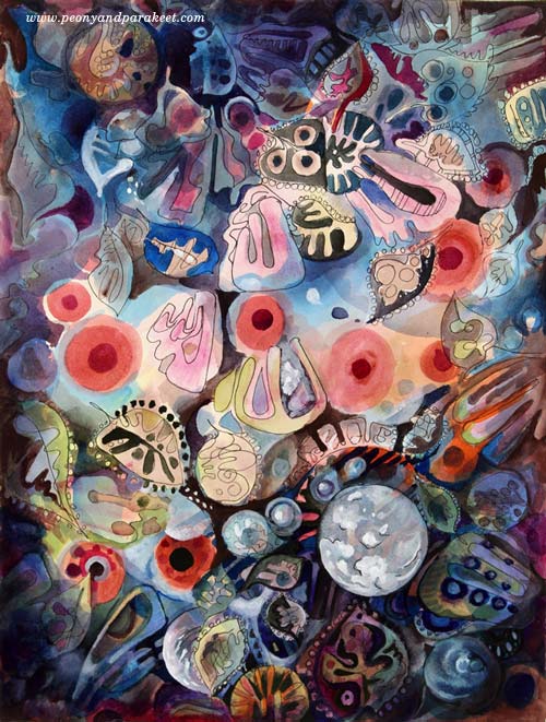
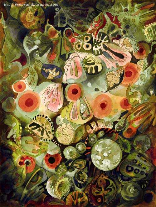
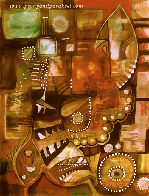
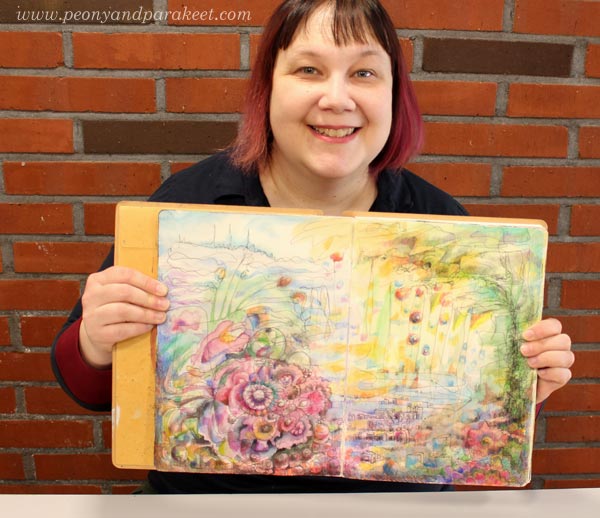
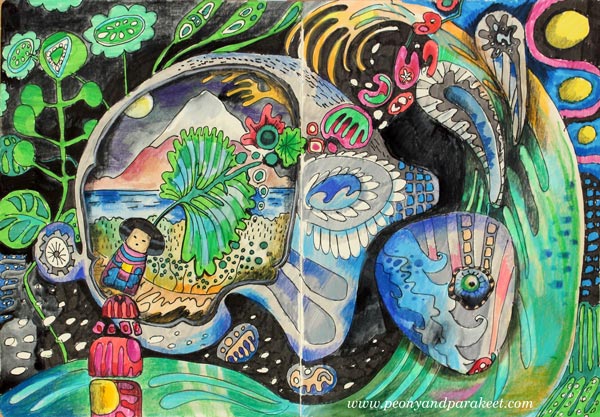
My comfort zone is getting inspired by design and translating that inspiration into art. So I made a mixed media painting that is inspired by the world of fashion, jewelry, lace, Renaissance murals, and botanical art. I call it “Lost and Found”. To embrace a designer’s approach to art, I also made two different color versions by processing the photo of the original artwork digitally in Photoshop.
Here’s Marine:

And here’s Botanical:
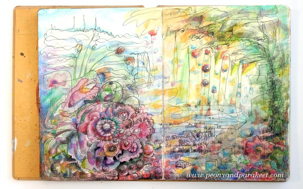
I don’t have many phase photos because I wanted to relax with that too but this is what I drew on my planner the previous day:

These quick sketches are the core of my creative process.
Another Painting with the Same Idea
I also made another design-inspired painting. The idea came from the ceramic art of the 1960s.
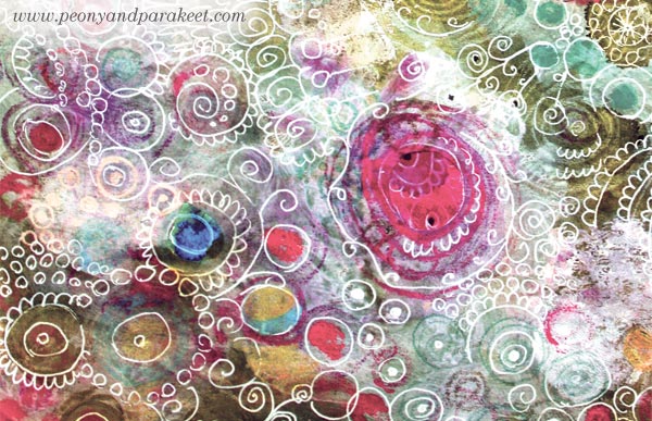
The photo below shows how the piece looked like before adding the decorative layers. Glowing watercolors remind me of the glazing used in ceramics. When this happens, I feel like I am a ceramic artist, playing with colors.
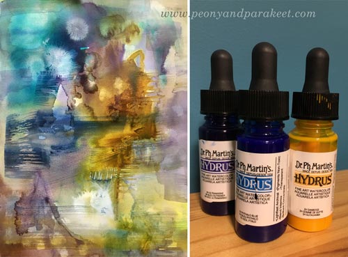
A student of mine kindly donated Dr. Ph. Martin’s Hydrus watercolors some time ago. First, I liked them, now I adore them. They are intensive and easy to use, and I especially love the coverage of white. I used Hydrus watercolors for “Lost and Found” too.
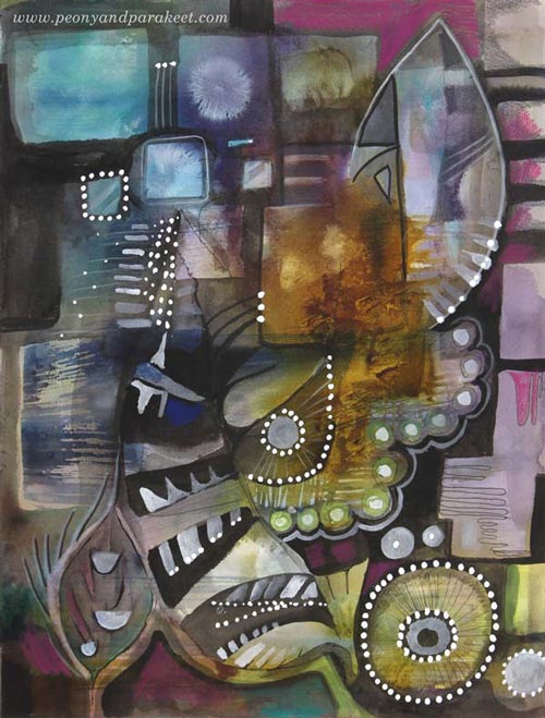
Here’s the finished painting called “Retro Living”. It is also a mixed media piece. I used colored pencils, PITT Artist Pens, and a correction pen for the last layers. I love these muted colors, so typical for the Finnish ceramics from the 60s. But then, I thought they might be too gloomy for many, so I made another version digitally that reminds me of furniture from that era:
Comparison
See my new gallery showing decorative art and designs from 2011 to this day. When I look at the newly-created pieces as a part of that collection, it looks to me like I have traveled a long journey in art. And I have – I just never thought that it would show in this decorative style as well. It makes me want to explore more of this and also, see exciting challenges in this direction too.
My challenge to you: Pick an old piece and make a new one using the similar techniques and style!
Let me be your mentor in art: Subscribe to my weekly emails!
Helene Schjerfbeck – Step-by-Step Formula for Her Style

In this blog post, I will show you how to create a stylish portrait and learn from a Finnish artist Helene Schjerfbeck (1862-1946).
The Famous Helene Schjerfbeck
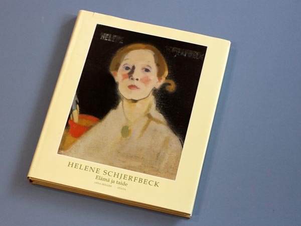
Helene Scherfbeck had an impressionistic and fairly detailed style. But during the years, she became a true expressionist, a master of expressing the most essential through simplifying. She painted a lot of portraits, and many of them have become very valuable. The Red Haired Girl II was sold for 1.5 million euros at Sotheby’s last year. One of my aunts admired Helene Schjerfbeck, and many years ago, she bought me a book about her paintings. The book is called “Helene Scherfbeck – Elämä ja taide” (Life and Art), and it’s written by Lena Holger. To be honest, I wasn’t a big fan of the style and didn’t even browse the book for years. But the more I have learned about art, the more enthusiastic I have become to study various styles. As I love to figure out a formula behind a style, it started to feel tempting to solve Helene’s secrets too.
Independent Visions – Helene Schjerfbeck in New York!
There’s also another reason why I am writing this. Currently, there’s a rare opportunity to see Finnish female masters in New York, USA. The Ateneum Art Museum, which is part of the Finnish National Gallery, displays an excellent exhibition at Scandinavia House from 29 April to 3 October 2017. The exhibition presents four early 20th-century Finnish artists from the Ateneum collection: Helene Schjerfbeck, Sigrid Schauman, Ellen Thesleff and Elga Sesemann. If you visit New York this summer, do go and see it, I promise you won’t be disappointed!
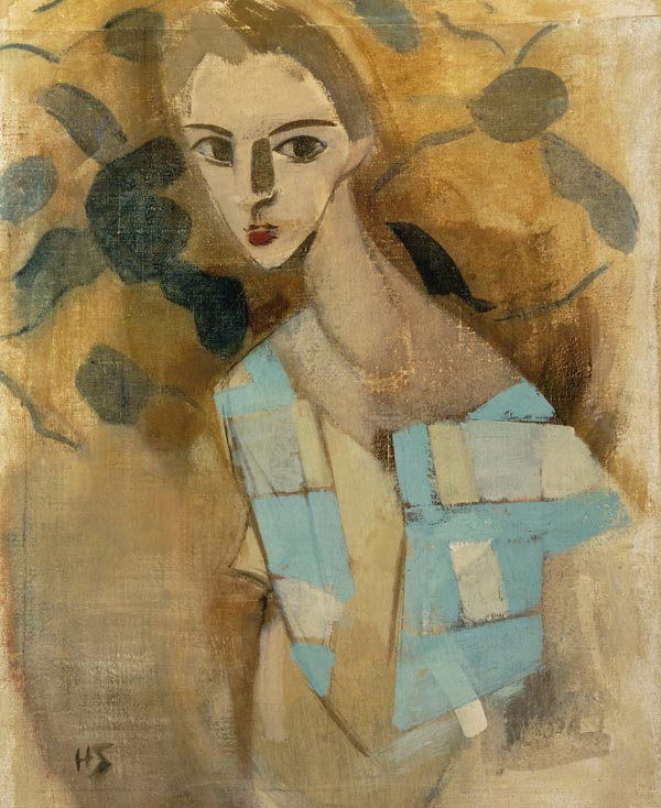
Here are a couple of Helene Scherfbeck’s paintings that you will see there.

I find the abstract nature of Helene’s style especially fascinating. The way she simplifies the spots where the light hits or where a shadow is formed is like she is building an abstract composition instead of painting a face.
Furthermore, the girl below is wearing a shawl that is like an abstract painting!
Mixing Helene Scherfbeck’s Style with My Personal Approach
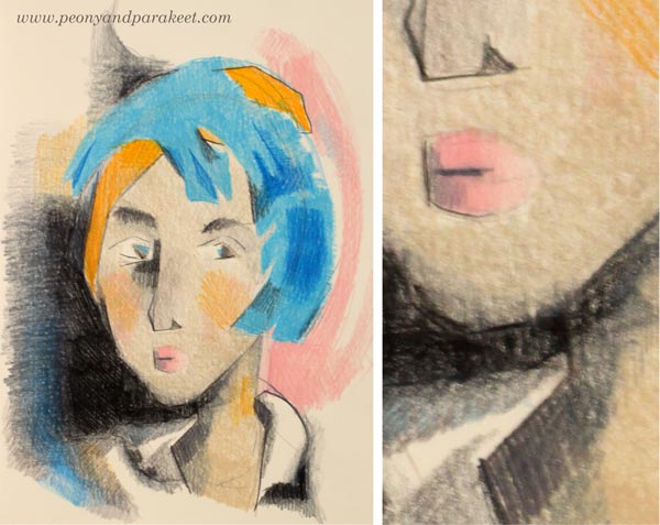
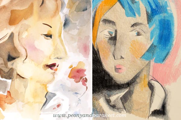
One primary factor in building a style is the shape of the elements. I for one love organic elements and flowing form. Simple rectangles are not as appealing to me as more complicated and diverse shapes. However, I wanted to add Helene’s twist to a couple of watercolor paintings. As Helene Scherfbeck also painted still-lifes, I decided to paint a woman with a flower or two. First, I made a tiny painting and played with layers to create angular shapes. Then I painted a bigger watercolor painting with familiar flowing shapes but using the insights that I had got by painting the first one.

After these two paintings, I was ready to record a simple formula for achieving Helene Scherfbeck’s style.
The Formula for The Modern Woman – Step by Step!
During this drawing process, improvise, but also check that your drawing is not symmetric. It makes the drawing dynamic and reduces stiffness.
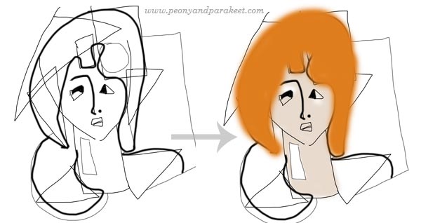
1) Draw a couple of arcs to create a face. Then add rectangles and triangles for hair. It is a fun and easy way to add hair without focusing on the shape of the head.
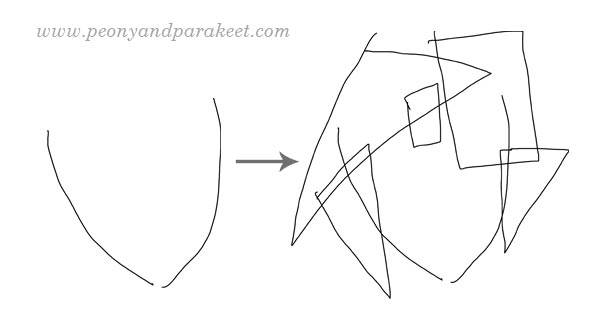
2) Add a neck and shoulders by drawing a rectangle and a couple of triangles that point to different directions. Then draw eyes, mouth, and other facial features. Use as many geometric shapes and simple lines as you can. After facial features, turn the work upside down and complement the drawing with geometric shapes so that it’s more like a balanced, asymmetric abstract painting than a portrait of a woman.

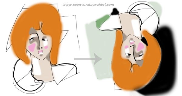
3) Soften the shape of the hair, the clothing, and some of the facial features. Then color the face, neck, and hair. Helene Scherfbeck often used grayish colors for the skin and a more striking color for the hair.
4) Add light and shadows on the face. Use mostly simple geometric elements. Then turn the work upside down and finish the abstract composition by using color to balance the painting. Remember to maintain the asymmetry!
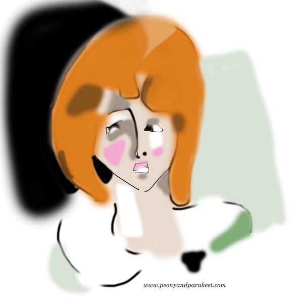
5) Remove some sketch lines and add more finishing details if needed. If you used long lines, make some of them shorter so that your drawing is not so stiff.
Helene Scherfbeck’s Style – The Combination of Simplicity and Softness
Even if Helene Scherfbeck’s style is very graphic, she also embraced uneven edges and soft color changes. This softness combined with distinct, even clumsy-looking geometric elements is the essence of her style.
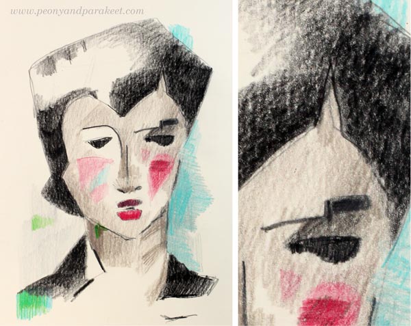
She also uses strong lines and bold colors to draw the viewer’s attention to the selected details. However, she does that very sparingly like there would be a limited storage of lines and pigments.
Find The Passion Behind Your Many Styles
I often find it distracting when people talk about their personal style like it would be the final destination for their artistic journey. They say tat once they have found their style, it would be like coming home and they would never need to go back to explore. I think it can be a harmful mindset. It leads to thinking that artists could be divided into three categories: a) those who search their style, b) those who stick with their style, and c) those who are afraid of going deeper because they don’t want to stop playing. That kind of controversy is not good at all! Going deeper allows, not prohibits, playing! Creative people are meant to travel spiritually!
Instead of searching for your perfect style, your final destination, connect with your passion! Your passion can be like a base camp for your explorations, energizing you to take up new challenges.
Sign up for The Exploring Artist to discover the passion behind your art
and to become more confident with the big word “artist”!
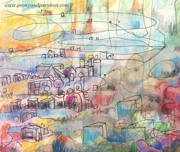
Don’t Just Create Circles! Moving on with Freehand Drawing
I have created this journal spread for the class Inspirational Drawing 2.0 where I teach freehand drawing that goes beyond just drawing circles. Don’t get me wrong; I don’t have anything against circles. I think that I, if anyone, have had a real love affair with circles. In fact, it was all I drew for a long time.
Circle Love
In 2010-2012, I spent most of my free time drawing circles.
I even went to a few craft fairs to sell – hand-drawn circles!
I firmly believed that if I create enough circles, I will find something new behind them. And yes, I slowly started to realize that there’s more than just making repeated circles that are more like backgrounds and patterns than expressive images. Now years later, I wish someone would have shown me how to move on – how to combine those repeating graphic shapes with lines that express more.
Do You Make Abstracts but Still Feel the Stiffness?
Circles and other geometric shapes are fun to create. But no matter how good I became in that, I never felt the same satisfaction that I felt when I was able to go beyond that. So when I meet people who say that they “make abstracts” and “want to get away from stiffness,” I totally get it. “I don’t really know what my abstracts represent,” says many who come to my classes. Drawing circles and playing with layers feels free first, but the more you want to express yourself, you need to explore more.
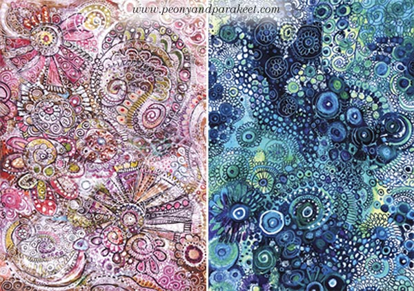
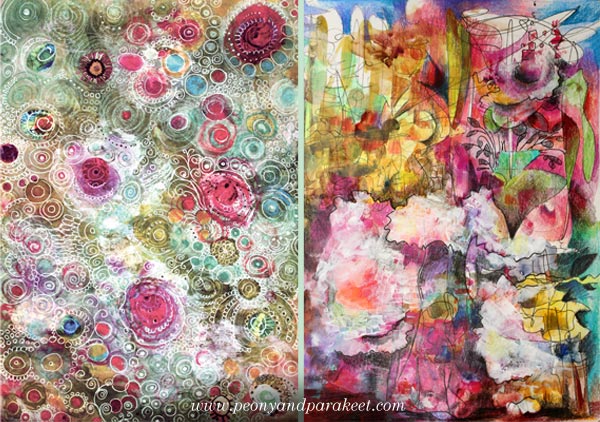
“More” doesn’t mean that you have to throw away what you have already learned. If you look at my two pieces, you can still see similarities. The first one made in 2011 called “Romance,” and the second in 2015 is called “Withering Peonies.” I called the first one “Romance” because I thought it’s all so romantic. But in the second one, I was able to express my love for peonies with much more expression without just drawing stiff flower-like shapes.
The satisfaction that came from being able to deliver a message, instead of just an atmosphere, was ground-breaking to me. My art became more powerful, impactful, it spoke not only to me but others as well.
That’s why I now teach
– how to open up and liberate the line
– how to communicate visually: create illustrations instead of backgrounds
– how to express inspiration and explore imagination in its full potential.
And that’s why my class Inspirational Drawing 2.0 exists.

Freehand Drawing Video – Create with me!
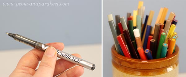
I have made a video where we start with geometric shapes and then move on to liberate the line. To create with me, you will only need a black thin-tipped drawing pen and colored pencils (or any coloring supplies).
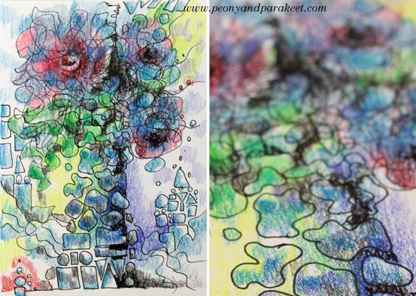
Here’s the little drawing that we will create together.
And here’s the video!
Inspirational Drawing 2.0
is now available as a self-study class! Buy here! (Update: August 17)
Let me be your mentor in art: Subscribe to my weekly emails!
Freedom and Fear of Drawing – with Students of Peony and Parakeet
I dedicate this blog post for drawing, but I want to talk about cross stitching first. It’s one of my long-time hobbies, and I find it relaxing. I don’t have to make any decisions, use any imagination, just follow the chart, and the result will be just like I wanted it to be. Cross stitching is like a simple house plant. If you give a little bit of time for it fairly regularly, it will grow even if it doesn’t feel like so at first.
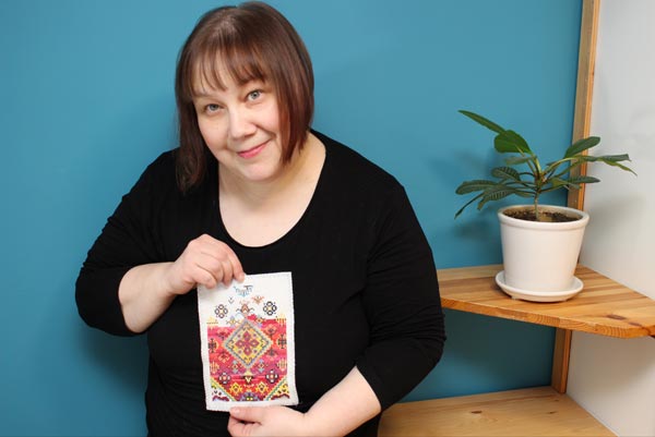
I can choose complicated charts or simple ones, and easily adjust the attention required for stitching. But there’s one problem that always remains: pixelation. Each image is made from single square-shaped stitches. No matter how complicated the design is or thick the fabric is, the pixelation is there.

Working with single stitches is not only a visual problem. It’s also a problem if we want to create more freely. Then we need a medium that allows faster and more flexible thinking. Like drawing. There are many kinds of drawing styles. When I want to experience creative freedom, I don’t do sketching using a pre-made model. (The photo shows a recent Renaissance-style painting in progress. I have designed it first in Photoshop.)

A Fear for Freedom – A Fear of Drawing
When I want to feel free, I don’t want models. Then it’s just a blank paper and a pen and a wish for a glimpse of imagination.
But freedom and fear are strangely connected. About three years ago, when I planned to leave my day job and start an art business, I warned myself. I told how I would no longer be anyone noticeable. I would have no office, no place to go every day, no colleagues to discuss with, no job title, no respect from others, no self-esteem. I would live in the darkest edge of the society and completely against the way of life I was taught. With these stories, I tried to prevent myself making the life change, and at the same time, I knew I had to try it. I had to turn the page and start a completely blank one.
I often connect with the same fear when I start drawing. That I am no one, that I have no power, that it is overwhelming and I don’t know what to do. But then, it’s the same gate that leads to the most wonderful feeling: the feeling of freedom.
Before I left my day job, I started to follow other self-employed women online. I listened to podcasts where they told their stories, and they all had one thing in common. They had put what they already know into use and then learned more. It made me list all the skills that I had and be more content about the decision I had made.
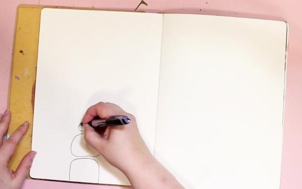
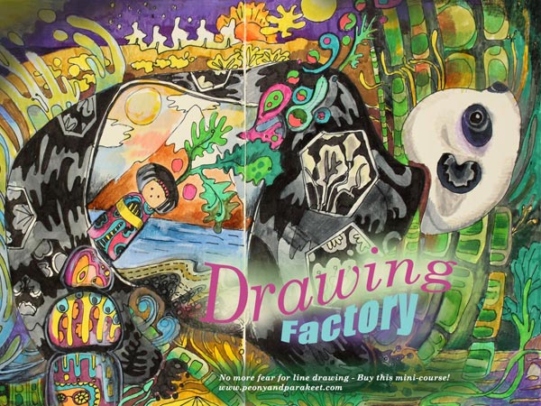
Drawing Factory Teaches You to Draw from Stick Figures
Still, on this day, I find it both assuring and inspiring to acknowledge what is already there before starting something new. So last year, I wanted to create a mini-course about line drawing, using the same philosophy. That was how Drawing Factory was born. It teaches you to start from stick figures and then move on to flowing lines and more imaginative illustrations.
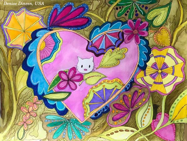
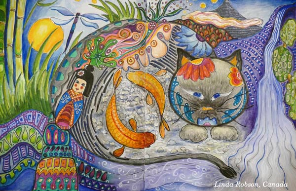
Student Artwork
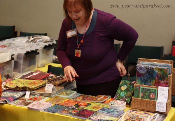
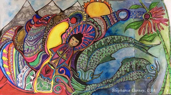
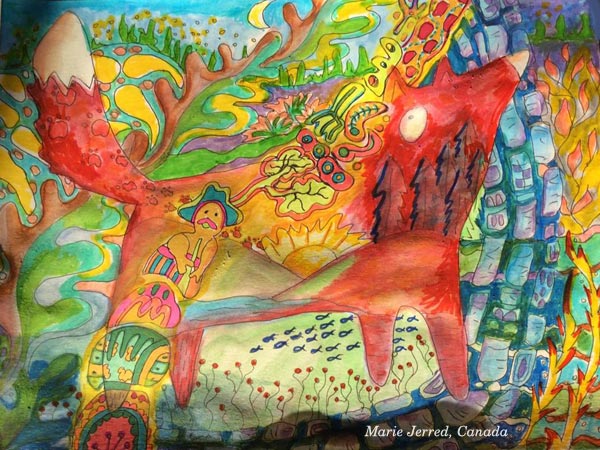
I offered Drawing Factory as a part of Imagine Monthly Fall 2016, the series of monthly mini-courses. See some of the gorgeous pieces that my students have made of the course! Another central theme in the course is Japan, the land of pretty details and high productivity and that has inspired Denise Dineen, Linda Robson, Christie Juhasz, Stepanie Carney, Marie Jerred, and Kathy Gallant, too.


Overcome Your Fears for Line Drawing – Buy Drawing Factory!
Drawing Factory is now available as a single self-study class. >> Click here to buy!
You can also buy the whole bundle of five art journaling classes, published last year as Imagine Monthly Fall 2016.

Thank you for supporting my journey now and during the last three years!