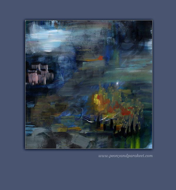
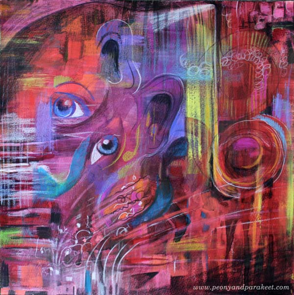
What Are the Cornerstones of Your Art?
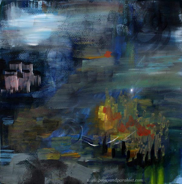
I have always loved abstract paintings. It occurred to me just recently that even if I rarely create realistic art, I rarely go to extremes in abstract. But then, what would prevent me from doing that, putting those cornerstones of my style to a new order.
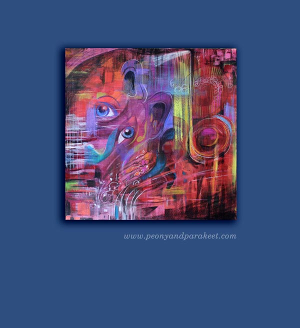
Namely, if you know what you love to create, why not play with that? Thick black color, sharp lines, dramatic color transitions, sense of movement and muted but distinct colors – those are what I always seem to aim.
This painting is called “Cornerstones” as I like this detail the most.
When you have your cornerstones set, you can feel free to experiment: use less of something, more of another thing, express deeper thoughts or become more playful.
My favorite supplies are watercolors, acrylic paints, and colored pencils. They can be seen as cornerstones as well. If I create something a bit different, it isn’t so scary when I use these old friends.
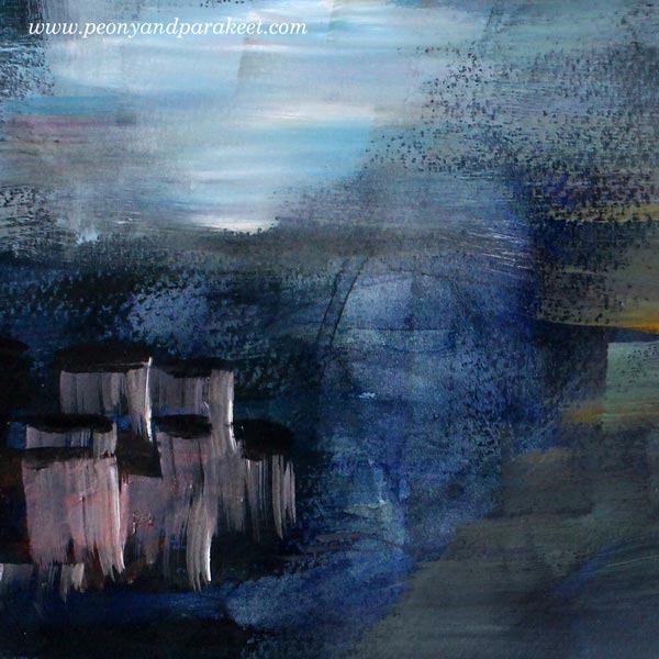
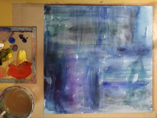
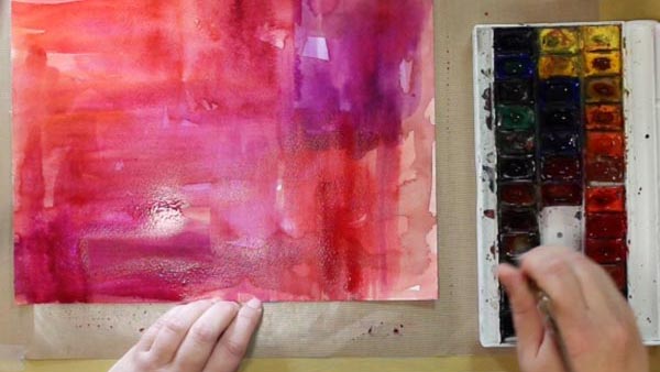
So I started the painting with watercolors. I had some leftover acrylic paints from other projects, so I stopped to watch the watercolored surface and tried to figure out how to create something a little bit different with them.
One thing that I love in acrylic paints is to have many colors on a brush at the same time and get delicious color effects.

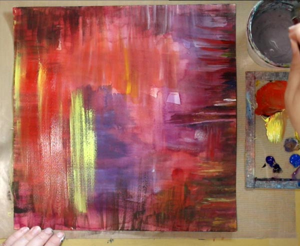
I worked with fairly thick brushes so no wonder when the artwork reached this point, I felt it needed some sharpness and movement.
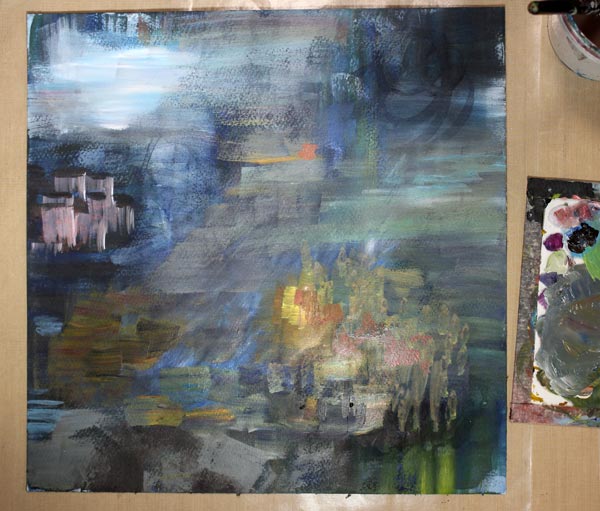
Then I remembered the photos that I love to shoot. I adjust the shutter speed low and move my camera to doodle with light. My photos are not brilliant, but I absolutely love playing with the camera this way. These photos make me think of bit streams and all the wonderful technical innovations.
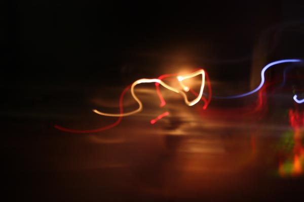
So I added a few sharp light details, and it was finished!
Subscribe to my weekly emails – Get a free mini-course!
Farewell to Summer with Watercolors
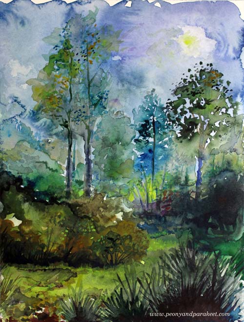
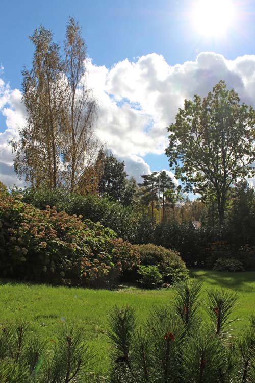
September has been surprisingly warm in Finland this year. I took a photo a couple of days ago and even if it’s warm and the sun is shining there’s a certain melancholy in the air.
I don’t usually mimic photos, but this time I made an exception. I used the photo about a half of the process and then finished the painting more freely. As I was recording videos for the upcoming painting workshop, I already had all the cameras and such in place. So I made a short video showing how I created the painting.
Painting with Watercolors – Watch the video!
It was still warm today. Stella was more than happy! Needless to say, she loves the sun.

Take Yourself to a Picturesque Watercolor Journey

Connect the dots between watercolor techniques and creative expression – Sign up for Watercolor Journey!
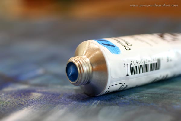
What Acrylic Colors to Buy?
This is a very practical blog post but let’s start it with my recent artwork, called “Tosca.” It is inspired by Giacomo Puccini’s opera. I went to see the opera last week and it was an experience that I wanted to communicate visually. The drama has always appealed to me and the contrast between the most beautiful sounds and the big emotions, often agony, was unforgettable.
Before the evening at the opera, I had just realized that I need to buy some more acrylic paints. I had run out of almost all the basic colors. I love Golden Heady Body Artist Acrylics, so I went to a local art supply store to get some. I know there are lists of what colors you should buy when buying the basics, but as my selection is a bit different, I thought I might not only share it but also give some general guidelines of what acrylic colors to buy. These can be applied to colored pencils and watercolors as well.
Guidelines that I Follow when Choosing Acrylic Colors
1) Always buy basic white and black. They give contrasts and are great for color mixes.
2) Never underestimate the number of yellows you need. I use yellows for everything. I love the color itself, and use it a lot for color mixes as well. I often make a mistake of adding too much another color with yellow and then I need to add some more yellow to get the right tone. So I need a lot of yellows!
3) Warm and cold tones of each primary color are usually enough. I don’t buy browns and greens unless I find a specific tone that I fall in love with.
4) Always include some personal favorites. When I open the box where I store the tubes, I want to become happy. Cerulean blue reminds me of the time when I painted icons. I think of the sky when I see it and it makes me feel creative and happy. Whatever the current color trends are, cerulean blue always feels great. When I buy colors, I think about creating as an experience and don’t just focus on what is generally recommended.
My Basic Collection of Acrylic Paint Colors
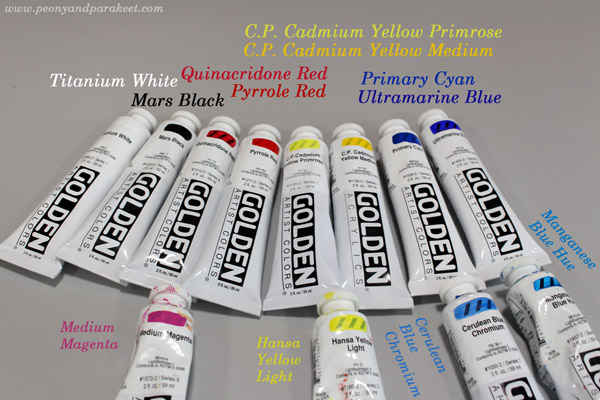
Basic Colors:
1) Titanium White – because it’s basic white
2) Mars Black – because it’s basic black
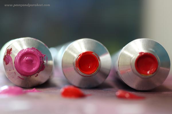
3) Quinacridone Red – because it is great for mixing pinks and purples
4) Pyrrole Red– because it’s fiery and pure warm red
5) C.P. Cadmium Yellow Primrose – because it’s ideal to get beautiful greens but it is still a strong pigment, not a mix
6) C.P. Cadmium Yellow Medium – because it’s the most beautiful warm yellow I know
7) Primary Cyan – because it’s basic and more affordable than many other blues
8) Ultramarine Blue – because I have used to using it for decades
Extra Colors:
1) Medium Magenta – because I like pinks
2) Hansa Yellow Light – because it is an affordable extra yellow
3) Cerulean Blue Chromium – because it makes me happy
4) Manganese Blue Hue – because I like turquoises
I also have some special effect tubes, for example, gold and silver and some odds and ends. The more I paint, the more I rely on basic pigments and don’t like to spend money buying color mixes in tubes or jars.
A Red Day
Sometimes one color seems to be more appealing than the others. This happened to me last week; it was “red red red” that I thought all morning.
Even if I had the new tubes and all, I started with watercolors and 12-by-12 inch watercolor paper. Playing with water is so liberating!
Then I changed watercolors to acrylic paints and turned the music on.
Puccini’s Tosca was playing in the background but as I had not visited the real performance yet. So I put this away to wait for the more detailed insight.
Colored Pencils Make the Details
A couple of days after seeing the opera, I was ready. I continued with colored pencils. They are wonderful art supplies. They are brilliant with watercolors, but they are ok with acrylics too of you create thin and even layers.
Subscribe to my weekly emails! Get a free mini-course Loosen Up!
Draw Your Own Coloring Page
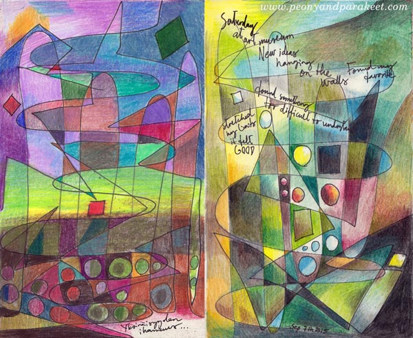
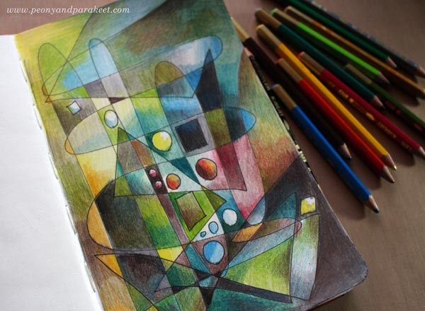
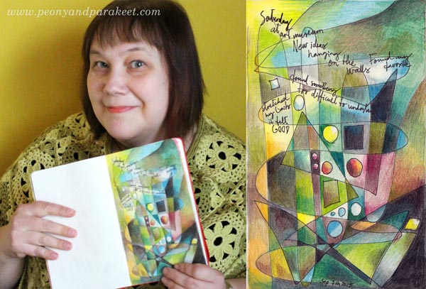
These two art journal pages have been made in the same way: drawing simple lines and shapes and then coloring them with colored pencils. This is a fun exercise especially for those who like abstract art and want to show it in their art journals, and for those who are into coloring but want to create more personal images.
A) Draw a Coloring Page!
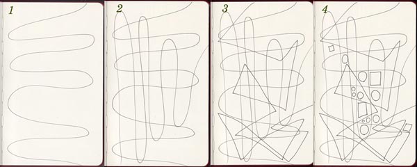
With a thin-tipped drawing pen, create lines and shapes:
1. Draw a wavy line across the page.
2. Draw another wavy line in the opposite direction.
3. Add 1-2 angular lines on the top. The example above has only one long angular line.
4. Add some circles and squares in an area where you want to turn the focus.
B) Color Freely!
Choose your color scheme and add layers of color.
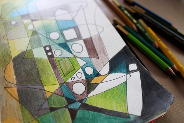
Add even more layers …
C) Add Journaling!
With a drawing pen, add your thoughts on the page. You can erase lighter areas for the journaling.
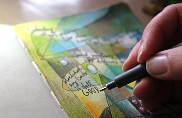
My page is about my latest visit to an art museum. They are such inspiring places!
Get more coloring instructions: Buy Coloring Freely!