Five Tips for Painting Nature’s Richness
This blog post is for you who want to create less stiff and more abstract art. First, I suggest rephrasing your goal. Say you want to get closer to nature – to paint nature’s richness!
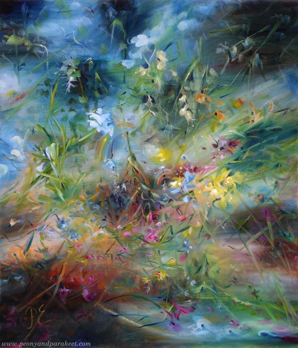
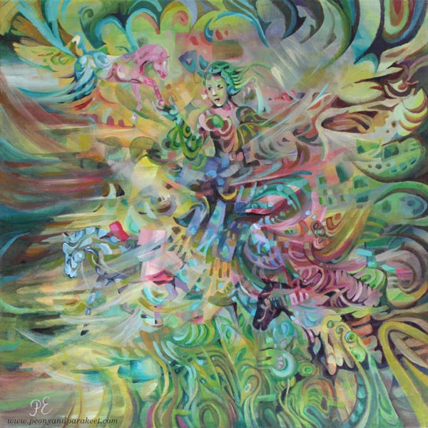
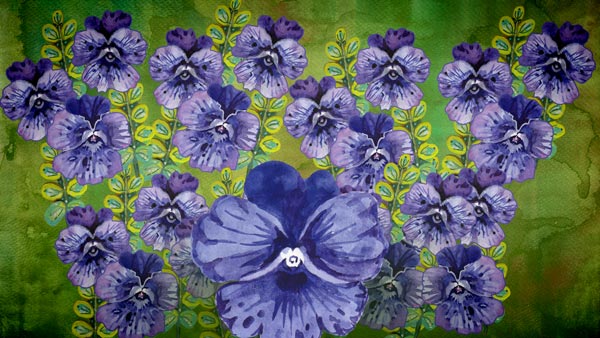
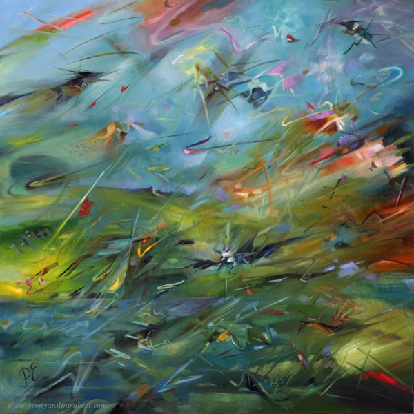
In this painting, flowers fly recklessly in every direction. This kind of disorder is part of nature’s richness. I used to think that it could be achieved by quickly throwing paint here and there, but I am much more successful when I create these beautiful messes in an orderly way.
Experiencing Nature’s Richness
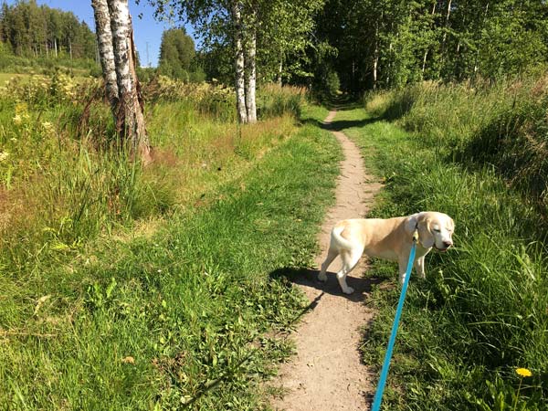
Although I live in a big town, there is a cornfield in our neighborhood. I often walk along the path that goes by it. In August 2020, I was walking with my dog Stella. When I reached the beginning of the trail, I was greeted by a magical sight. The surroundings of the path were full of butterflies!
I tried to take photos, but only close-ups were successful. Butterflies are such small and fast insects that they cannot be distinguished from a distance, even if there are many of them.
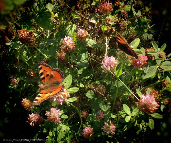
But the experience stuck in my mind. Now, years later, I wanted to capture it but in a bit different setting. I wanted to depict a situation where someone would throw a bouquet of flowers in the air and they would magically start flying in the air like butterflies.
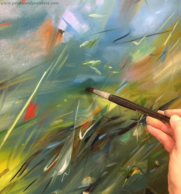
Working in Layers
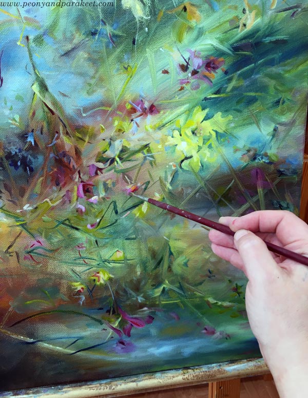
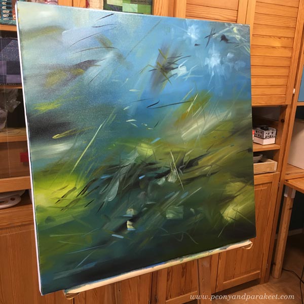
I started the painting by making a background for it. I painted a grid in the style of Paul Klee. I teach this beginning technique in the course Floral Freedom.
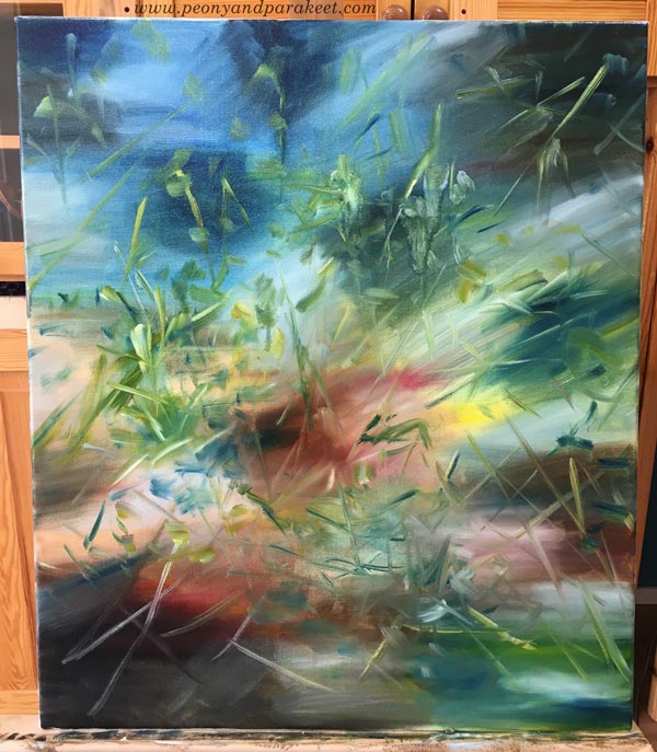
I then started to create nature’s richness on top of the grid with brushstrokes. I added flying flowers several times and dried every layer before starting a new one.
Taking Photos for Inspiration
I often take photos of plants and nature scenery. Even Claude Monet has said: “The richness I achieve comes from nature, the source of my inspiration.” I don’t use the photos as references but for teaching myself nature’s language. I examine an image to see nature’s richness, for example, the shapes that light throws and all the variation there is if you forget what the image represents.
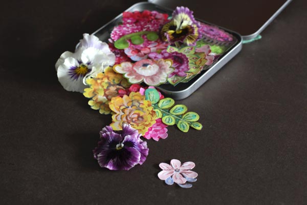
Take a look at this flower bouquet I put together for Midsummer: the flowers consist of several layers and have differences in size and shape.
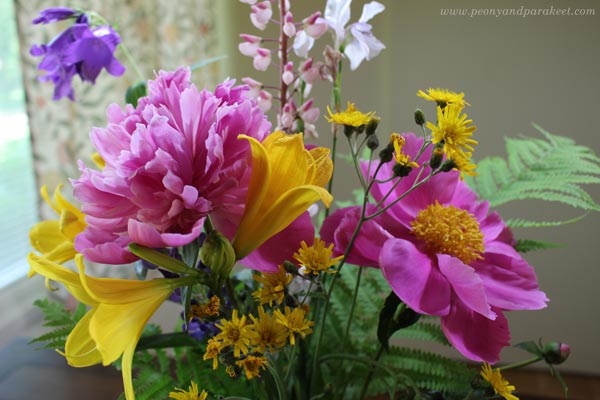
Think about one flower as a collection of strokes that form motifs.
Five Tips for Painting Nature’s Richness
When you add motifs on the background, remember nature’s richness and do otherwise than what you are used to:
- Don’t cover it all over again! Create a sense of depth by covering the previous layer only partly. This way, every layer has fewer motifs than the previous one. Paint the first motifs with muted tones and slowly introduce stronger colors.
- Don’t repeat the same thing! Get natural variation by painting many different repeating motifs. Change the sizes and distances of similar motifs so that they look more irregular. Use many brushes and think about every stroke as a word. How rich is your language?
- Don’t design fabric but tell a story! Make an expressive image, not only a surface pattern. Despite the chaos, make one area stand out. Make this focal point stronger by adjusting some other distinctive motifs so that they clearly point to it. Avoid spreading white spots everywhere. They distract the viewer and make the painting flat.
- Don’t leave your motifs lonely! Bring more unity by connecting motifs together. You can use lines, intersections, and surrounding space. Think about the painting as a collection of mini landscapes.
- Don’t hurry! Give your painting time to grow. Take breaks and keep your painting somewhere where you can observe it. You have probably already tried many times to paint quickly, now choose another way and slowly immerse yourself in the painting.
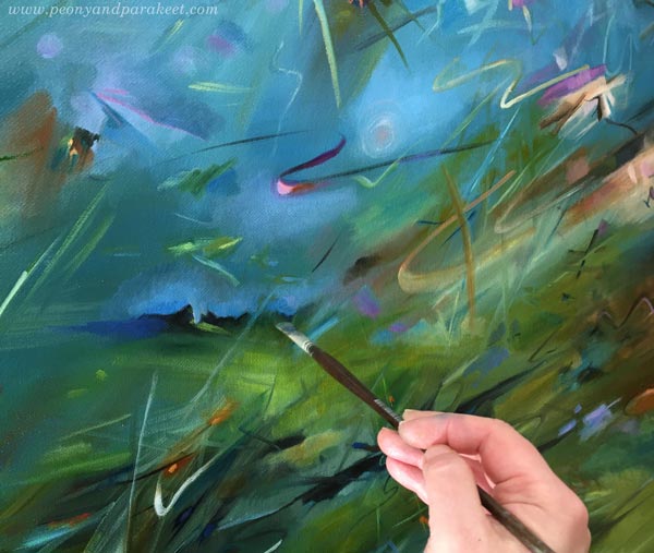
In this orderly way, the painting begins to look more and more finished naturally.
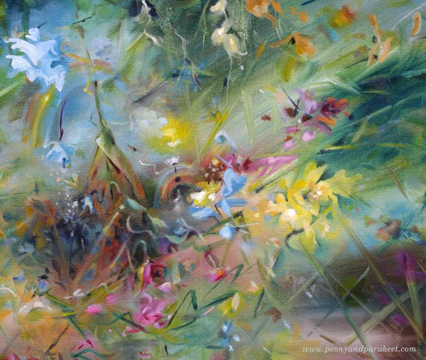
At the last layer, it takes some courage to paint larger and brighter motifs on top of smaller and more muted ones.
Nature’s Richness – Expressing Mortality in Immortal
A part of nature’s richness is to allow some flowers to fall and die, and some rise and fly. Dark colors, sad strokes, and downward lines all give power to the bright and happy ones. You can take your piece outdoors and see if it’s one with the surroundings. My course Floral Freedom is packed with techniques and further ideas.
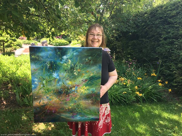
This painting “Immortal Bouquet” tells about the hopeless desire to live forever but also about the fact that life does continue when thinking about nature. An immortal bouquet is an unreal wish for the one who gathers the flowers, but on the other hand, it’s also true: flowers are reborn in nature every year.
What do you think?
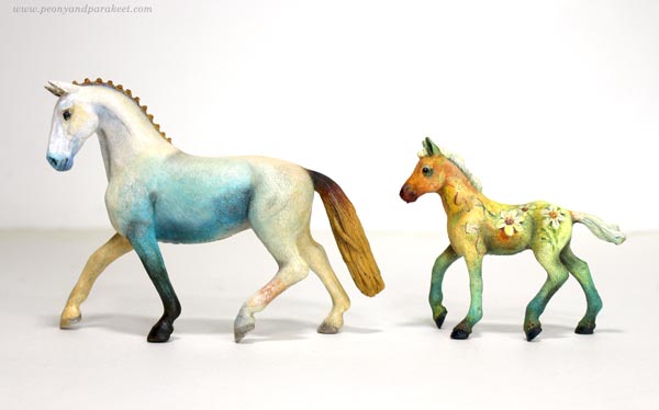
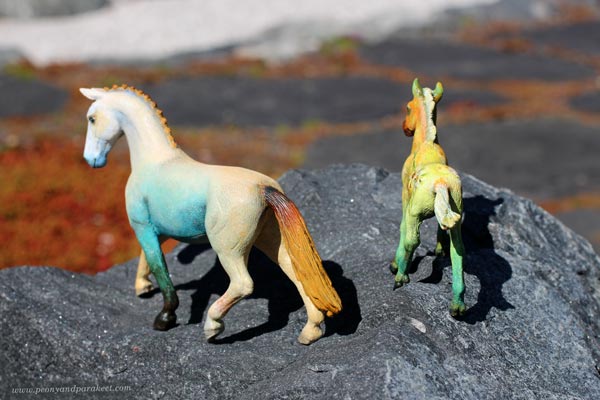
How to Paint a Fantasy Horse Figurine
This week, we apply art to something different than usual. We use our skills to transform a Schleich horse or other plastic figurine into a fantasy animal.
I have a soft spot for plastic horse collectors, and I follow many of them on Instagram. One of the most inspiring accounts is Lightning Leoo (@lightningleoo). Leo has organized community challenges on Instagram and Discord. I have participated in them a couple of times. Like Leo, most of those who customize collectible miniatures aim to make the animal look more realistic. However, I want to be more playful with colors and ideas.
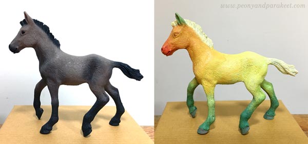
Step 1 – Choose a Theme and Paint the First Layer
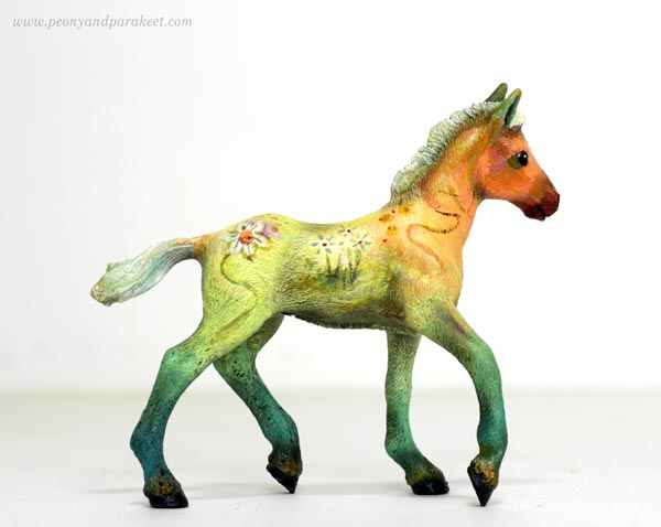
Start by choosing a theme that gives ideas for the coloring. The animal figurine here is a brown Schleich foal and my theme is daffodil. I used acrylic paints to make the legs green, the body yellow, the hoof orange-red, and the tail and the main white – just like the flower!
At this point, the animal doesn’t look nice at all, but that’s ok. The idea is just to cover the original paint and make a simple foundation for the decoration.
Step 2 – Add More Tones and Decorations
After covering the original color with the theme colors, mix more tones of those colors. For example, if you have used one green in the previous step, now mix more green tones – cooler and warmer, darker and lighter, brighter and more muted. Add slight variations of tones on the top of the first color layer so that what used to be one solid color has now a gradient of tones. This makes the color more natural. Note: you can use this technique in any art!
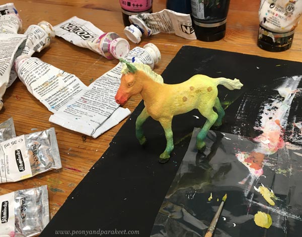
In this project, I created color mixes of all kinds of greens, oranges, yellows, and whites.
At this point, you can also start decorating the figurine and use these color mixes in decorations, eyes,You and other details.
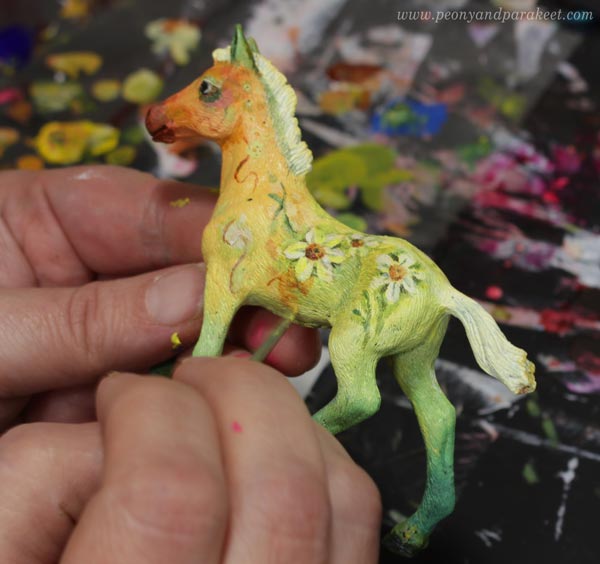
Get ideas for decorations from the theme! I painted small daffodils.
Step 3 – Optional – Add Shadows with Soft Pastels
Soft pastels make the figurine look more real and highlight the best parts. First, scrape them with a sharp blade to get color powder. Use a small brush to spread it where the shadows are, for example, where the leg meets the belly. You can also soften the color changes with pastels.
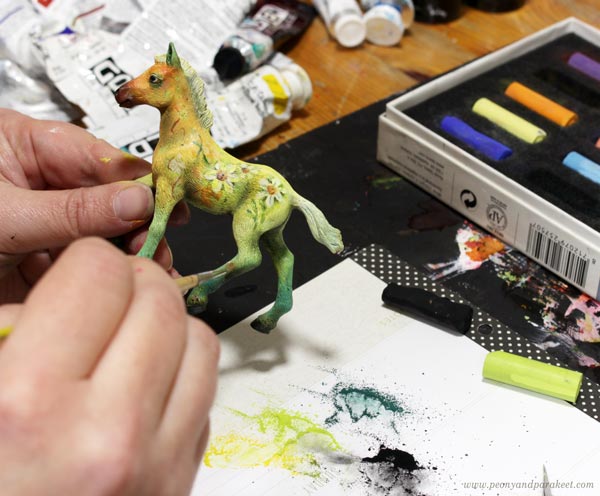
Attach the powder more permanently by spraying the fixative over it. Notice that after attaching the powder, you can continue with the finishing touches in acrylics!
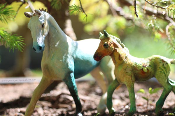
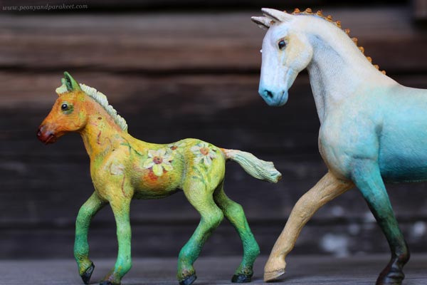
Step 4 – Take a Fantastic Photo!
We always should take a good photo of the finished work, but with a fantasy horse, it is very rewarding. Find a place where you can fool the eye about the scale and bend down to take a photo a bit upwards.
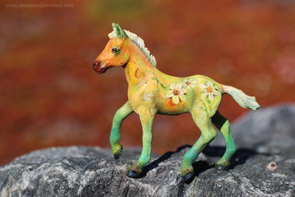
Another option is to make a gallery set up so that the background is white and the figurine is photographed like a piece of art.
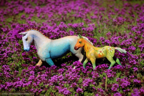
Another Example of a Fantasy Horse Repaint
Here’s a Schleich horse that is bigger than the Daffodil fowl. My theme for this one was peach. The decorations are simple, but there are many tones and lovely gradients.
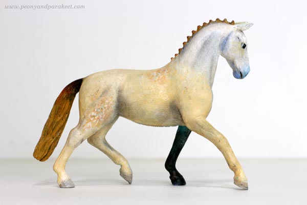
Making one foot in a different color adds drama and a bigger horse is easier to paint.
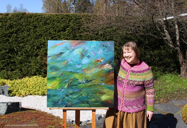
It was fun to photograph these two together!
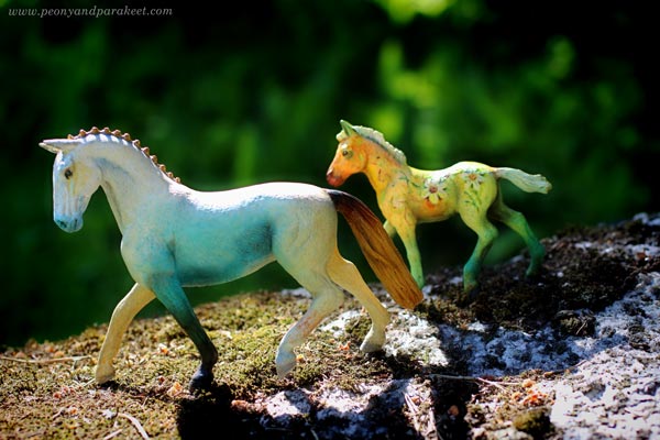
Natural light creates its own effects and makes the fantasy look real.
Horizontal lines in the background make the movement look more real.
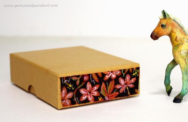
Gift Box for Fantasy Horse
These small fantasy horses are great for presents. I gave the fowl to my friend who owns not just a collection of plastic figurines but a real horse too. I found a sturdy box that I had got when ordering paint tubes.
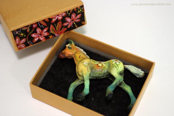
One side had writing on it, but I painted a floral decoration over it.
Creative Play as an Art Form
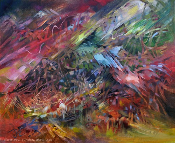
Playing has always been important to me. When I play, I get ideas that go beyond the ordinary and that combine different fields. In 2020, I even made a painting about the power of play called Steppe Wind.
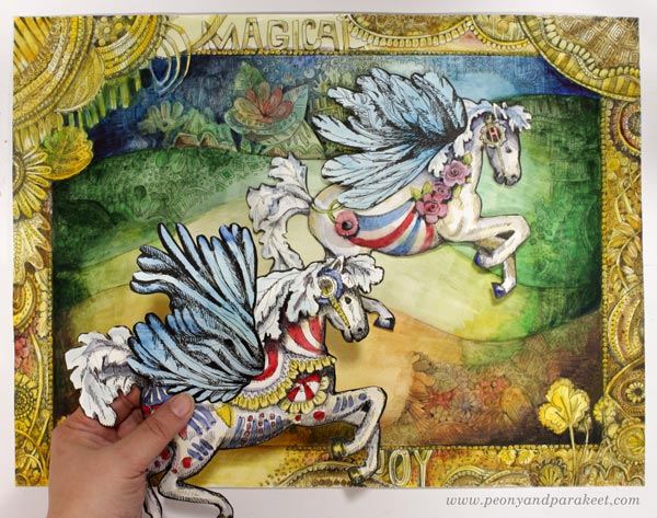
In the course Magical Inkdom, we draw and decorate paper horses and other animals.
By playing we can enjoy the beauty and be comforted. It’s like we enter the same big hall of art but from a different door. Then when it’s time to get more serious, we have new energy and new power to overcome our fears.
That’s why I want to bring up topics like painting and photographing figurines in this blog.
What do you think?
Beautiful Blog Post
This week is about creating beauty, and I have a beautiful blog post for you.
Violets on an Adventure
Ten years ago, an old yard tiling gave us a surprise. Renovating it had been on our to-do list, but there had been other things to do in the house. But we were lucky.
The violets planted in the pot had looked at the tiling and its gaps with completely different eyes. What an opportunity for seeds! So, the following year, we were able to enjoy the glory of flowers in the surprising place.
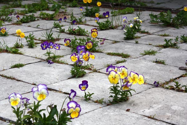
Creativity is a flower that wants to break free from its pot and get on an adventure. Abundance is allowed and ugliness can enable beauty.
A painting that starts with a few ugly brushstrokes can be decorated
to rich and beautiful.
Beautiful Decodashery
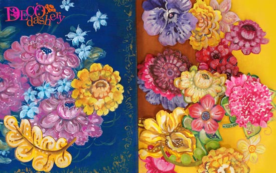
My online class Decodashery is about creating beauty that easily finds its purpose. This kind of art is not just fun to make but perfect for cards and gifts.
Decodashery is one of my personal favorites. The videos are inspiringly colorful and uplifting. You play with the tradition of decorative art and create beauty that people have always found attractive. >> Buy here!
Abstract Birds
There is a saying that if you don’t know what else to add “Put a bird on it!” But this week I want to talk about birds as the main object of the picture, not just as a decoration. This blog post is also about abstract birds and their connection with realistic bird art.
Here’s my new painting, also bird-themed!
The Love for Real Birds
As a child, I saw a lot of birds and at some point, I started to learn to identify them. Ornithologist sounded like a great word and I have always been fascinated by people who are extremely enthusiastic about something. I learned about birds from a bird book I got from my parents, which was illustrated with drawings. I also drew birds myself, and it’s quite easy to recognize them once you’ve once drawn every detail.
Since those times my knowledge has unfortunately deteriorated, and I never became an ornithologist! But even though I’m no longer good at identification, I know birds as animals well. After all, I have had pet birds for decades. At the moment I have two budgies, Leonardo and Primavera. Over time, my interest in wild birds has started to return and a dream has surfaced, which the newest painting “Kingfishers” also tells about.
Here’s how it started! Wild strokes here and there.
I think most of us have some relation to birds – what’s your story? Could you bring more of that to your art?
Dreaming of Birds
Ever since I was a child, I’ve wanted to see the kingfisher. In recent years, I’ve started imagining how one would sit on top of our mailbox on a summer’s day when I come down the hill towards home. And this spring I’ve started imagining kingfishers flying around the ditch along my walking path. I know that these are unlikely to come true, but they are still wonderful thoughts. Kingfishers are very rare here in Finland.
So when I started a painting inspired by the ditch, I wanted those kingfishers there. After all, I had already written “kingfisher” in my notebook earlier this year when I started planning the new series of paintings.
And when I researched the subject more, I found out that there are about 120 species of kingfishers. So I could paint many different ones in the same picture!
Birds by Von Wright Brothers
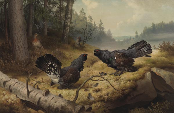
This month, I want to blog about art history too. And as a Finn, I have to introduce the brothers Magnus von Wright (1805–1868), Wilhelm von Wright (1810–1887), and Ferdinand von Wright (1822–1906). One of the most famous paintings here in Finland is “Taistelevat metsot”.
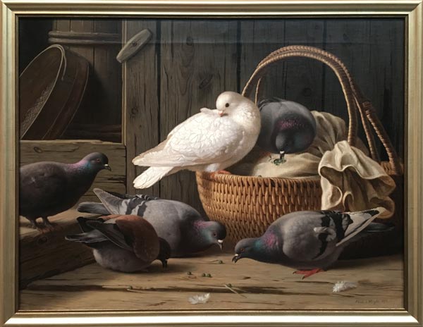
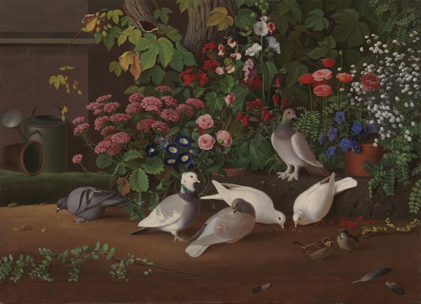
Von Wright brothers drew and painted huge numbers of birds and are remembered as bird artists. I saw this pigeon painting in the Ateneum Art Museum in 2018 when they had a big exhibition of von Wrights’s art.
For the Von Wrights, the recognisability of bird species was essential, and they also depicted birds from the perspective of their authentic living conditions and behavior.
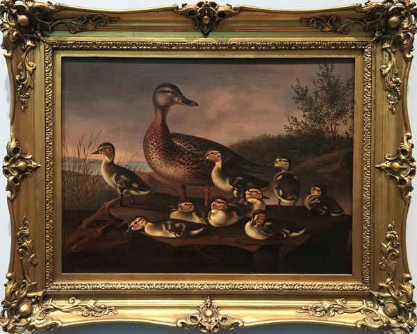
The paintings were very stylish and very aesthetic, but because of their accurate details, they also worked as scientific illustrations.
Unlike the von Wrights, I am not interested in the exact description of bird species, but rather in describing the vitality of life through birds.
Flying Birds and Their Abstract Shapes
I am especially fascinated by the ability to fly and I always try to look as closely as possible when I see a bird flying in the sky. When the bird flies high, its image breaks up and becomes an abstract composition. The flying bird serves us modern art in the middle of the mundane reality. A museum experience without visiting one!
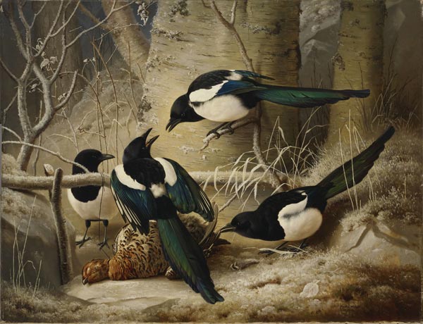
I often see finches and magpies here where I live. I think magpies are really beautiful birds and this painting of Ferdinand von Wright is fabulous even if its theme is a bit brutal.
Many blackbirds live in our garden and I have also painted them in 2021.
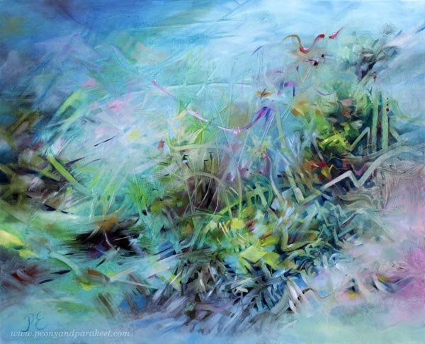
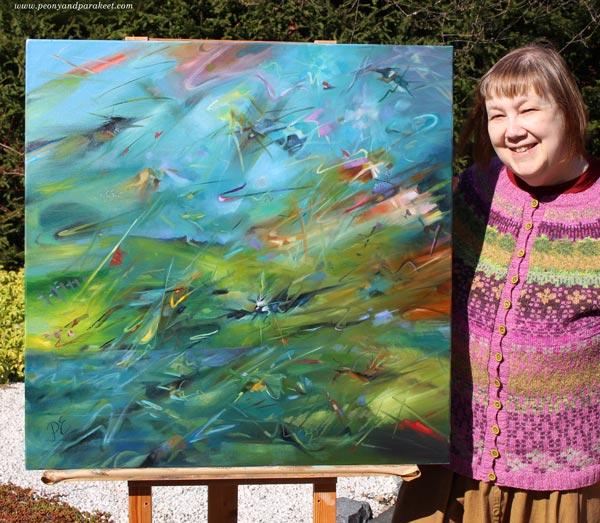
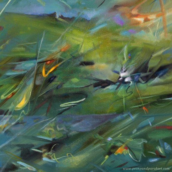
I find it fun to adjust abstract shapes so that they express the essence of the bird. Here’s the Kingfishers painting again, photographed by my husband in the front garden.
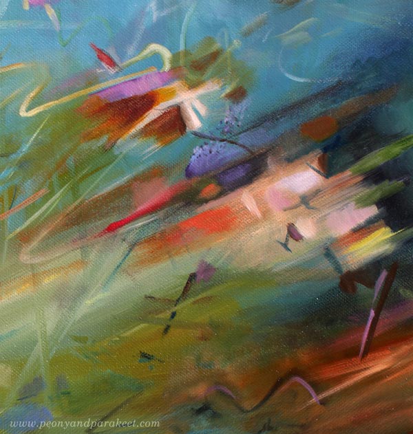
And here are some pictures of details so that you can examine brush strokes and abstract birds more closely.
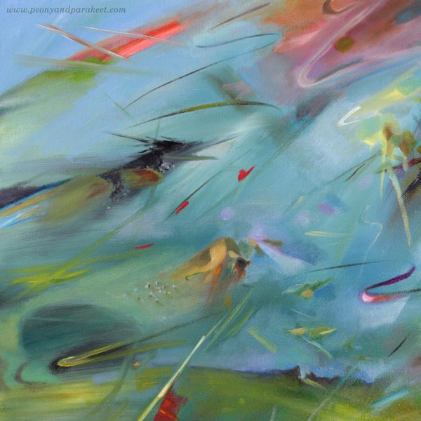
If you think about kingfishers, painting them can’t be just about flying near a stream, it has to be about catching fish too. To bring that up, the bird on the left below looks a bit like a fish.
Not So Abstract Birds to Get to Know Them
Of course, a flying bird can also be created so that it’s not abstract but has many decorative details. This project is from the course Animal Inkdom and is drawn in several sessions piece by piece so that it’s more manageable and fun.
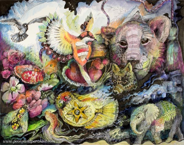
In the center is a bird that flies into the animal world. When re-examining this, I hope that over time I would paint all kinds of animals in my abstract style. It is often necessary to study the animal for a long time before an abstract can be derived from it.
The Connection Between Letting Go and Not Letting Go
So if you wish that your expression would be freer, one way is to go deep into the subject. Not just to look at what a kingfisher looks like, for example, but to live its life, experience a deep identification with it and look for forms that express that emotional connection.
Often both the forms and the connection are first found through creating art that is less abstract and more accurate. I think that it would have been quite easy for the Von Wright brothers to become abstract bird artists, but the time wasn’t right for them. They left a legacy though, and I am one of their followers.