Monet in the Box – Creativity and Shame
This week, I show my latest finished painting and talk about Monet and the hall of fame – no! – the box of shame!
Last week, I participated in an online event organized by the Finnish Illustration Association. One of the speakers was Eeva Kolu, who talked about maintaining balance in life, not letting work take over all of it. She referred to a book that she had written which is unfortunately available only in Finnish. It’s called “Korkeintaan vähän väsynyt” (free translation: A Little Tired At Most)
I have been listening to the book on daily walks, and even if I am not finished yet, I already like the inner dialog that it raises. It makes me stop to ponder, sometimes agree, other times disagree. It’s not only pleasant, and yet, it’s definitely worth reading. One of the things Eeva Kolu brings up is shame. She says that shame defines the size of the box where we live. The box can become so small there’s not much room for life.
Eeva Kolu made me think about all the things I am shame of. Surprisingly, one of them is central to my art.
My Relationship With Old Art
When I was in my twenties and thirties, all I wanted to see was contemporary abstract art. In museums, I rushed through the old paintings because representational and traditional art was for mediocre people, and I didn’t want to be one of them. I felt shame about my uneducated family and the lack of abstract thinking in the surroundings where I came from. I had a new life with higher education, and my love for mathematics was well aligned with geometric shapes and lines.
But age has made me understand more about my background and art as well. I have begun to love old art, and still, it’s something that causes me shame as well.
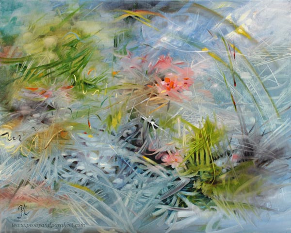
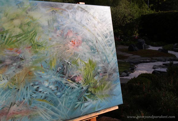
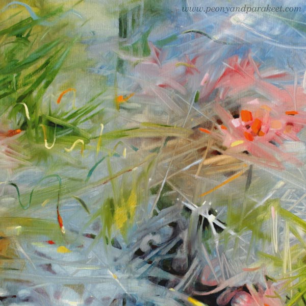
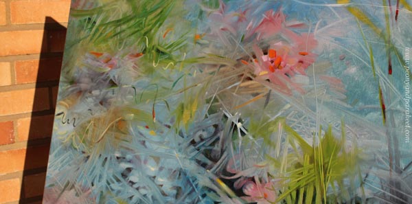
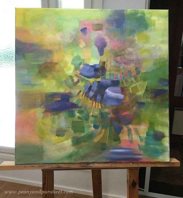
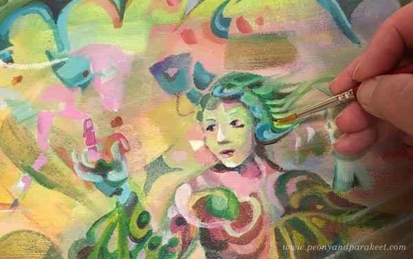
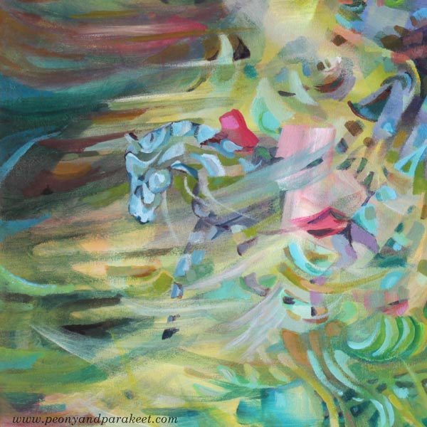
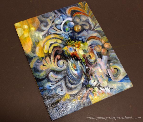
“Waterlilies,” my husband said when he saw this painting.
It made my box shrink. My intention was not to do any Monet. I just painted the dreamy blue that needed to come out, not make any imitation of anything.
I Kind of Hate Monet’s Waterlilies
I have seen them in National Gallery in London. They are captivating. People love them.
But instead of making what people easily love, I would like to be an artist who sees to the future. Who builds paintings that are like complex machines. I should be a Leonardo of this age, imagining something technical that engineers will skillfully implement someday.
But my art has a mind of its own. No, a mind of mine. Or would I dare to say: a mind of my shame. I am stuck to the past, so I paint the past. I reach the worlds that feel excitingly unknown first but turn out familiar once the painting is finished. I end up recreating instead of inventing. That’s my shame.
In my classes and in this blog, I talk about old art now and then. But compared to the amount I think about stiff renaissance portraits, romantic baroque sceneries, frilly victorian dresses, cubistic still-lives, and all the masterpieces from the 15th to 20th century, it’s very little.
“My Readers Want Their Art to Be Current”
That’s what I say to myself often. The readers – you – don’t like old art so I try not to write about it. And still, the expected goal to be current seems ridiculous sometimes. There’s a bridge between current and old, and it’s very difficult to be current without knowing what’s not.
That bridge – or should I call it a long historical timeline – is the place where my creativity naturally lies. My shame is also my utmost love. When I paint, I don’t think about Rubens, Monet, Picasso, or Kandinsky. When you love something deeply, with the skills, it comes out naturally.
“Everyone discusses my art and pretends to understand, as if it were necessary to understand, when it is simply necessary to love.”
Claude Monet
Monet’s attitude seems very unintellectual. And yet, if you think about what you create and have created, can you relate? That sometimes it’s necessary to omit the feeling of intellectual understanding, bypass the shame, and simply love – so, widen the box instead of trying to get out of it?
Thumbs up or down for talking about art history and old masters? Share your thoughts in the comments!
P.S. Claude Monet is “a guest teacher” in the class Floral Freedom!
Paint the Emotion – New Free Mini-Course!
Here’s a teaser, do subscribe!
If you have already subscribed, check your inbox, I have sent the course to you today!
Painting an Intuitive Fantasy
This week, I have a new fantasy painting, and I also share tips about selecting colors.
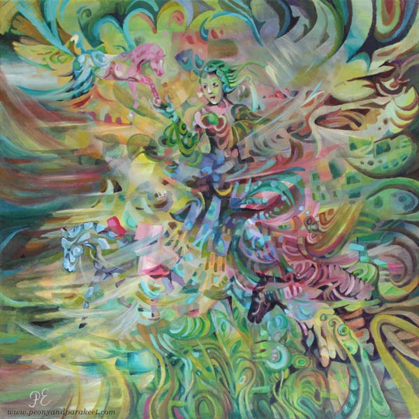
This painting is called “Arotuuli,” which is “Steppe Wind” in English. “Aro” must be one of the few words that are shorter in Finnish than in English, as Finnish words are often very long. We write compound words without space, so it makes words look even longer.
Intuitive Fantasy Painting – Two Tips for the Beginning
I like to paint intuitively, and even if this painting has horses and a woman, it started with random strokes and abstract blocks, and I had no other idea than a secret wish to be able to include a horse at some point.
Tip 1 – Dark and Light
When filling the canvas with color, I like to make dark and light color mixes so that the 3-dimensional effect tickles my imagination.
Tip 2 – Less Can Be More
I also like to pick a narrow selection of colors so that the elements look like they are exposed to the same light. In this painting, I mostly used Phthalo Turquoise, Alizarin Crimson, Yellowish Green, and Titanium White. When mixing colors, less can be more!
A Couple of My Favorite Colors
I am especially fond of Yellowish Green and Alizarin Crimson, and I recommend them warmly. Let’s talk about them a bit more.
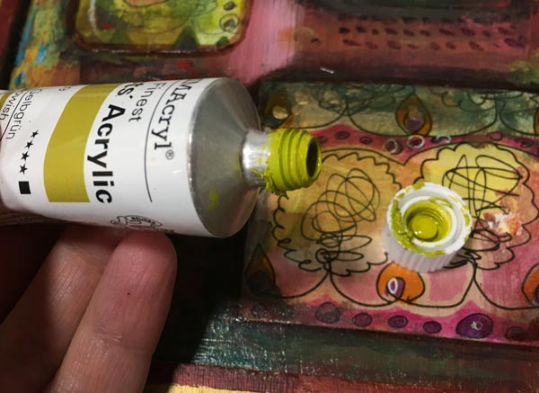
Color 1 – Yellowish Green
Yellowish Green is a color mix manufactured by Schminke Primacryl. I bought this tube because I love Daniel Smith’s Rich Green Gold in watercolors, and I wanted to have a similar tone in acrylics. I like colors that remind me of lemons and lime fruits – one of the most beautiful things in the world – and I always find use for yellows. This color is like two colors in one tube: it works very well with the mixes that require yellow, but it also produces beautiful greens with blues.
Color 2 – Alizarin Crimson
Alizarin Crimson is an ugly red. I don’t think you would buy it if you didn’t know more about it. It looks like dried blood but works very well with color mixes. White reveals its gentler side, and when mixed with blues, you can get beautiful blacks, browns, and dark purples. It produces a pleasant and quite sunny orange with yellows, and in general, it’s a workhorse, always willing to step in.
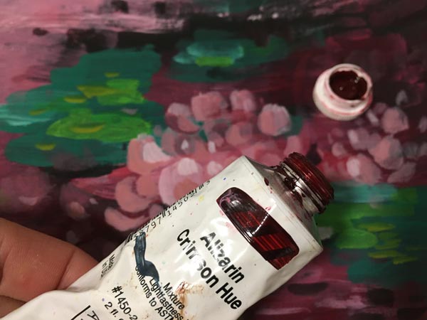
Alizarin Crimson was originally manufactured from madder, but these old organic dyes faded or changed within time, so nowadays we use synthetic substitutes. I found this color in oils first. Schminke’s oil paint is called “Alizarin Madder Lake”. My tube, manufactured by Golden, is “Alizarin Crimson Hue”. Alizarin Crimson is sometimes called “Madder Lake” or “Alizarin Red,” and the tone may vary. Pick the darkest and ugliest one!
If you are a color nerd, Bright Earth by Philip Ball is a comprehensive book about pigments and their origin.
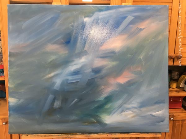
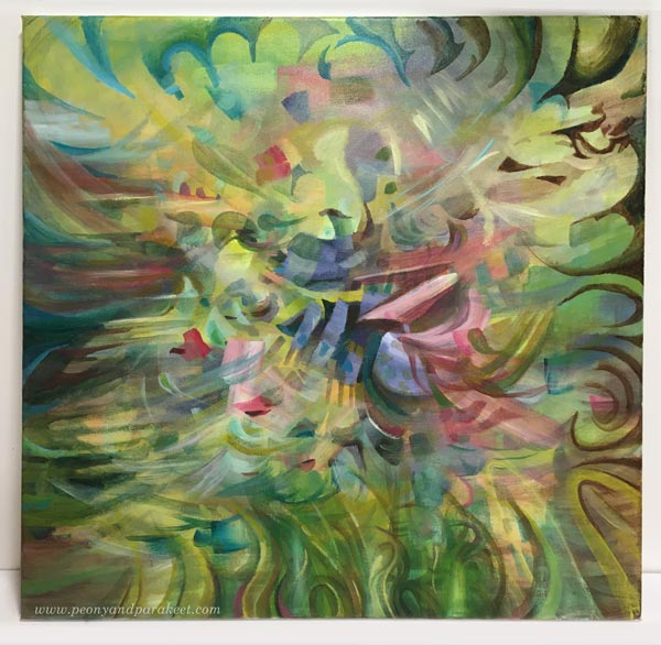
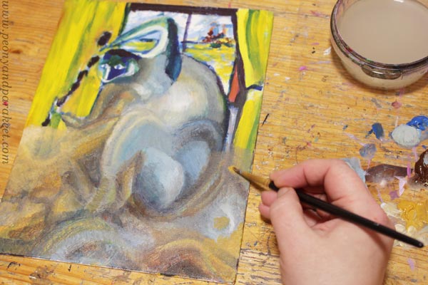
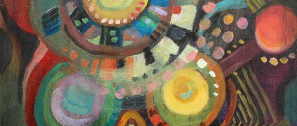
Here’s the painting before I started adding the figures. The image shows well how Yellowish Green and Alizarin Crimson work in color mixes.
Intuitive Fantasy Shape by Shape
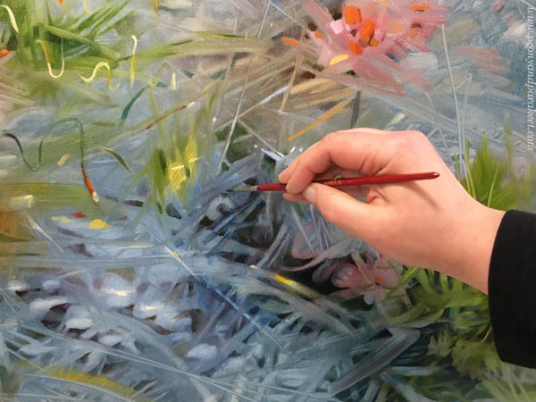
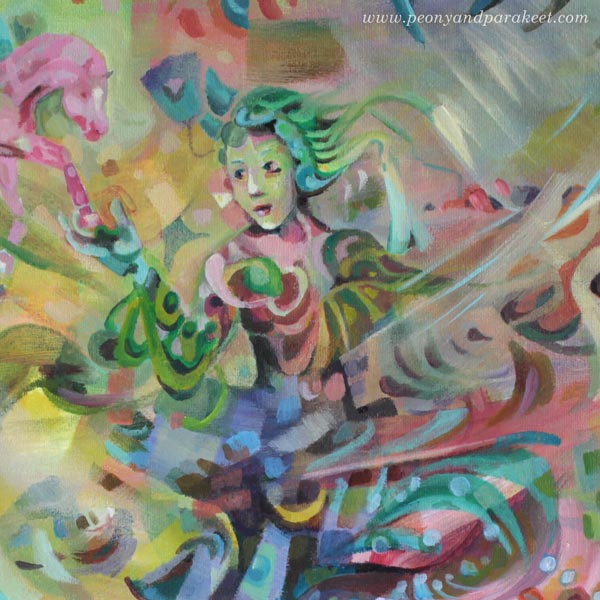
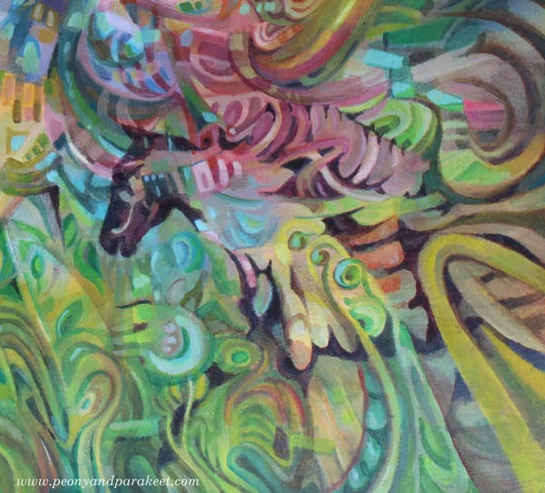
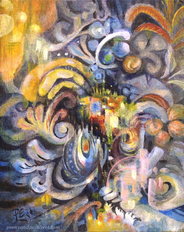
I painted the woman and the horses so that they are partly abstract and partly realistic. Some shapes exist just because they look beautiful, others because they are building blocks for the figures.
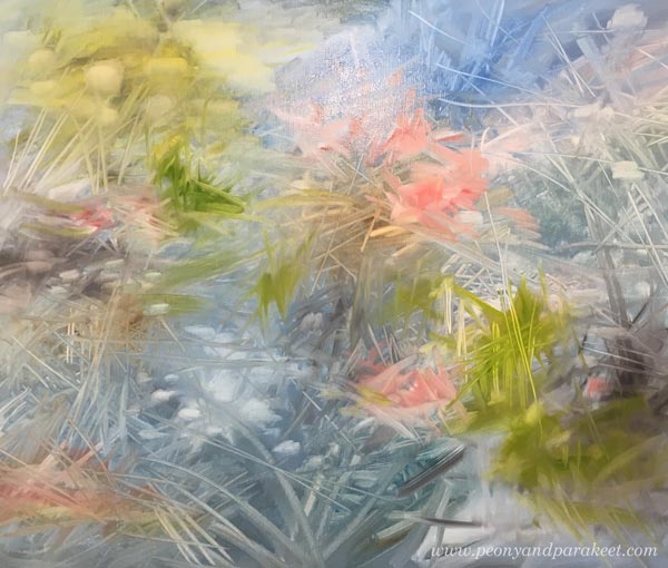
Here are some details of the finished painting. The more you zoom in, the more abstract the painting looks.
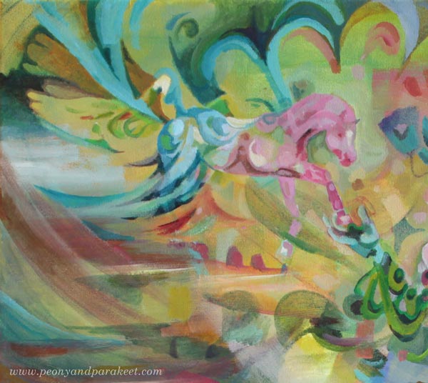
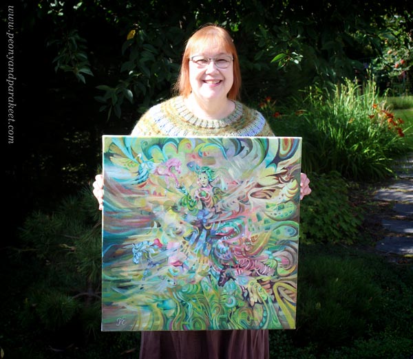
Here’s the whole painting again.
I wanted to keep the colors light and bright to create an airy impression.
Intuitive Fantasy Painting – Big or Small?
“Arotuuli” is one of my biggest paintings. It’s 60 x 60 cm (about 23,5 x 23,5 inches) and painted on a stretched, fairly thick canvas. I like painting on smooth surfaces. My style is detailed, and the coarse structure doesn’t go well with it. The painting was started about a month ago, and I took few-hour sessions now and then. It’s not as slow as you would think, because the small strokes aren’t as tiny as with small pieces. Sometimes we produce clumsy just because we select a small size. For me, the bigger size has helped to create dynamic scenes rather than static portraits. “Arotuuli” continues the previous bigger painting “Paratiisi / Paradise.”
But next week, something much smaller, even if I do have a new big canvas waiting!
Art Makeover – Revamp Your Old Paintings!
Let’s give an art makeover for an old painting! The idea for this blog post came last month when I was running out of paper. Instead of traveling to an art supply store, I stayed home as was advised, and found another solution: reusing old paintings!
My starting point was practical, but the benefits were spiritual – the journey that had ended, started again. I picked pieces that were made about 30 years ago – when I was in my 20s. At that time, I studied software engineering but still felt partly an artist.
Makeover Tip #1 – Change the Subject
The paintings from the 1990s look very different from my current work, but after examining old paint strokes, I did recognize myself. Although the strokes were rougher and the shapes simpler, they were still very much the same. The subject has changed, but my love for playing with shapes never went away.
Makeover Tip #2 – Save Something Old
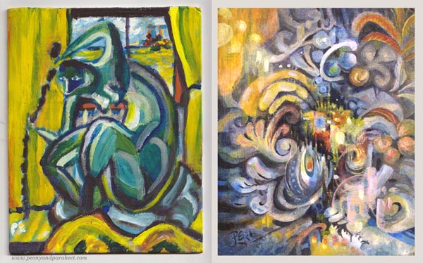
When revamping the painting, I like to save something from the original one. So here, I kept a part of the yellow curtain but altered its color with a thin layer of paint so that it fits with the new color scheme. Old curtain, new home.
Makeover Tip #3 – Change the Colors
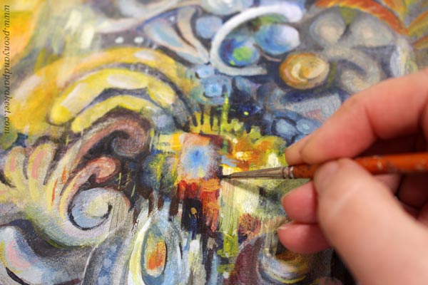
The old painting has screaming colors, but I wanted something more sophisticated for the revamped version, called “Ceruleana.” As the name suggests, the new painting is a tribute to Cerulean Blue.
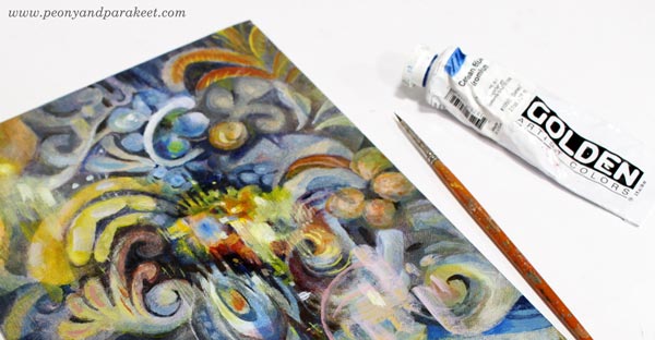
Cerulean Blue is an expensive but lovely color, especially when mixed with white. It makes every engineer a romantic and looks heavenly with ochre and yellow tones.
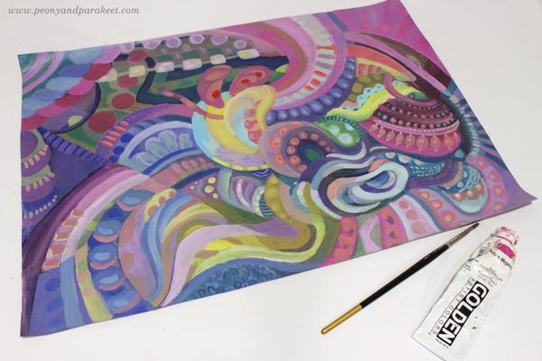
But this post is not only about blues and its hues, I have another example too! This one has a lot of Magenta (“Medium Magenta” of Golden Acrylics), and the colors are very different from the original muddy version.
Art Makeover Tip #4 – Change the Orientation
The original was an artistic self-portrait like the first one. I did those a lot back then, and in every picture, I tried to look a bit different. But my imagination never got this far! The revamped version is horizontal but here they are side by side so that you can compare.
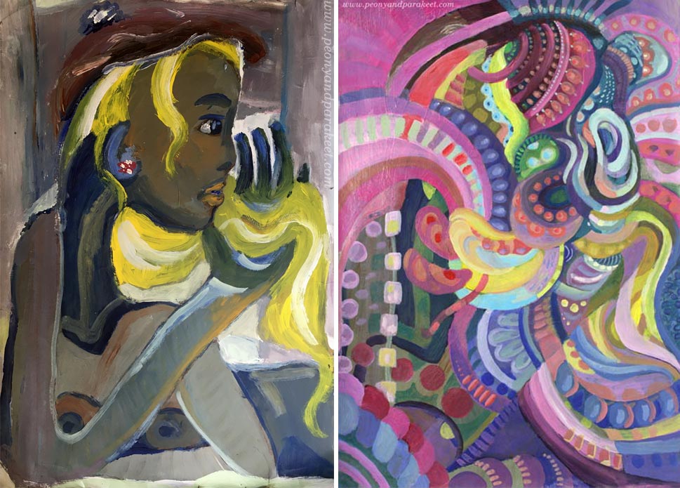
I like how the original version is still present in the new one!
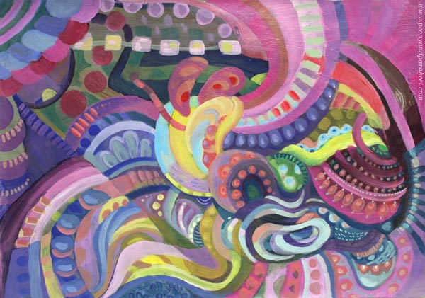
Makeover Tip #5 – Use the Old Painting as a Foundation
This magenta abstract was so much fun to make. The old painting was like a map that had roads and towns, and when trusting them to lead me to one place to another, I didn’t have to worry about composition or such. I picked the easy abstract painting style from my class Planet Color. The whole process was relaxing, and the painting is called “Cosytopia.” A place to escape the big bad world.
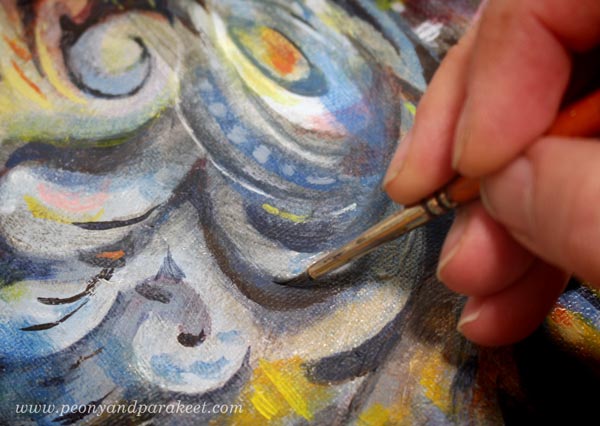
Extreme Art Makeover – Polish and Varnish!
Like in any makeover, why not do it to the very end! Take care that the brushstrokes are smooth where they need to be, and shapes stylish enough for a party.
If the painting has a sturdy background, varnish it too! Ceruleana was painted on a cardboard canvas, so I used a polymer varnish on it. Before the varnish, I added a layer of glossy gel medium. (A detailed post about varnishing)
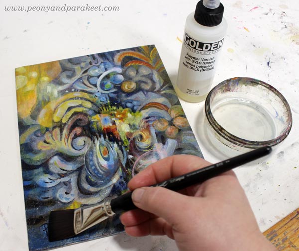
Glossy varnish makes colors glow beautifully. Even if this is an old revamped acrylic painting on cardboard, it may happen that someone someday says: “Oo-oh, it’s an oil painting, isn’t it?”
I hope this post inspired you to make the most of your supplies and past artistic endeavors!
Planet Color – Weekend Sale!
My beginner painting class Planet Color is for sale between May 28th to 31st! The normal price is 35 EUR, now only 25 EUR. >> Buy here!