Freely Born Watercolor Florals
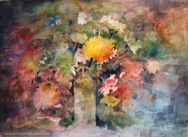
I love to paint flowers without reference photos. “What flower is that?” My husband asked when I showed a couple of my recent floral paintings to him. I had no idea! My florals are born
Watercolor Florals in Mixed Media
I have made these kinds of still lives for a long time, but I used to use acrylic paints, pencils, and pens too. Here’s one from 2016 (watch the process video).
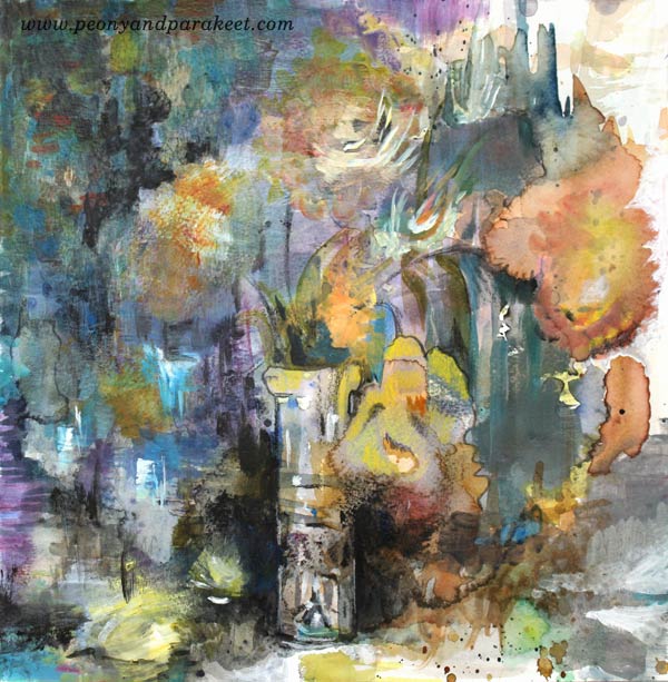
Now that my skills have grown, I don’t feel the need to use acrylic paint to cover up some parts or a pen to sharpen others. I can just throw paint and water and then work from that. This kind of art is often more “the art of seeing” than “the art of creating”. Imagination is the only limit!
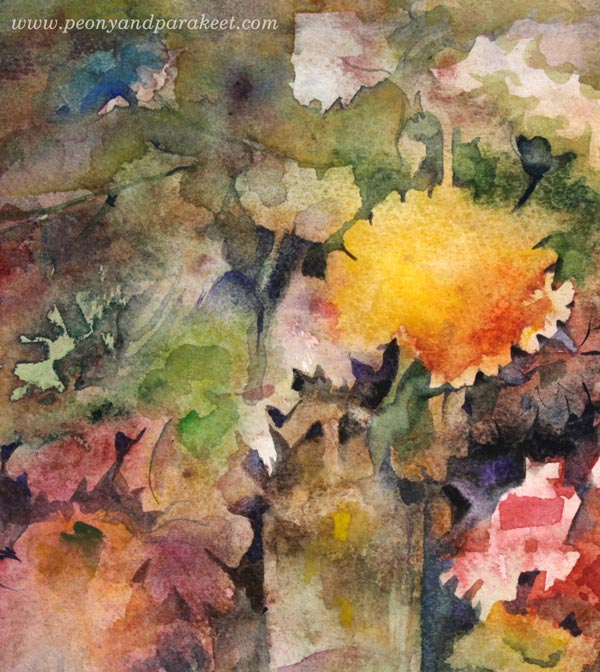
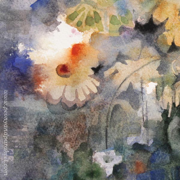
Painting a Layer by Layer
I
I also like to imagine how flowers drop off the vase and start growing from the ground. In this dream, the vitality that the flowers have is tremendous.
Water and Paper Paint Too!
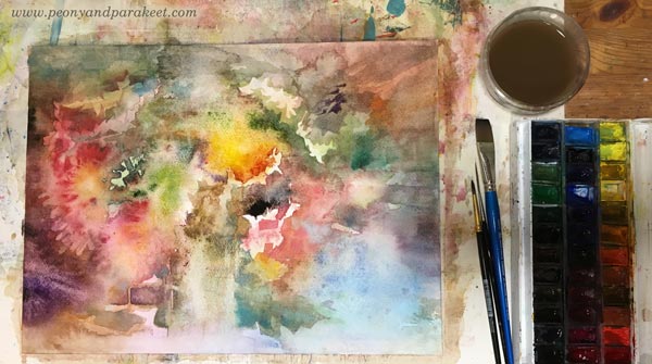
Sometimes I work with many projects at the same time. Often, I just leave the painting to dry and go to do other stuff. At the beginning, I usually feel unsure about the mess on paper, but become happily surprised when I enter the studio and see it dried. Water and paper play with the pigment as much as I do. I love this uncontrollable nature of watercolors that makes the process of painting more like sharing a discussion than giving a speech.
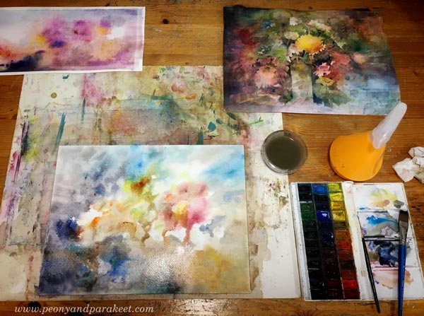
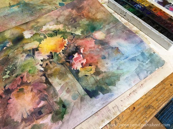
Look at that mess on paper and then the finished version!
My favorite details of this painting are the big white spot and the small flowers that bend down.
Coming Up – Floral Still Life Step by Step
Currently, I am making an extra lesson about this process of making a floral still life without reference photos. It will be available with the upcoming class Floral Fantasies in 3 Styles. The registration will open next week! I plan to make the new lesson a separate one so that if you have purchased the class before, you can buy the new lesson as an add-on when the class begins on April 29, 2019. Stay tuned!
Watercolor Inspiration – 5 Ideas and Techniques

Watercolor is a medium where I really want to grow my skills this spring. It’s so versatile and much quicker than oil painting, for example. It can be easily combined with drawings and and … Well, I think if you follow this blog, you also love watercolors! Here’s some watercolor inspiration!
1) Watercolor Bookmarks – A Small and Fun Project
Who wouldn’t like to get a hand-painted bookmark? Watch the video with practical tips for watercolor painting!
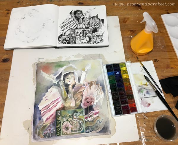
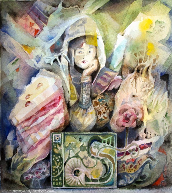
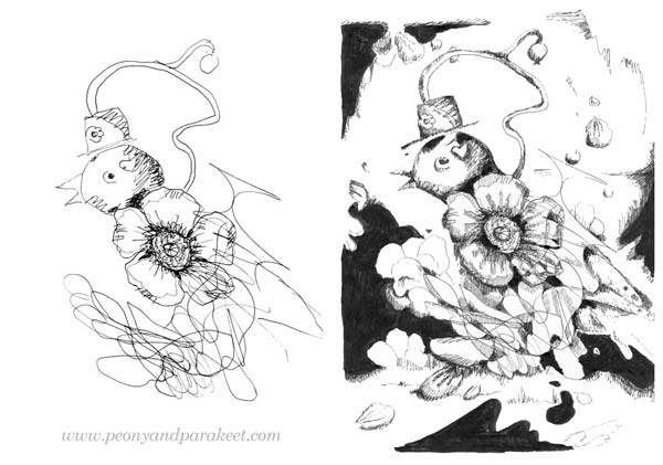
2) Illustration in Watercolor – Use a Drawing as a Starting Point
If you like to draw, pick one of your sketches and use that as a starting point. My drawing from last Inktober is very detailed, but I enjoyed painting it!

Here’s my setting. I kept the sketch visible most of the time but allowed my painting to evolve too. I didn’t use any pencil to copy the drawing, I just started painting with pale colors and made adjustments layer by layer.
Here’s the finished painting. When I drew the sketch, I wanted the person to look like she’s contemplating, and wasn’t quite happy with the face. But here, I was more successful the facial features. Colors also add to the expression.
What I really liked
3) Watercolor Sceneries – Play with the Level of Abstraction
Mastering watercolors is impossible without making most of the happy accidents and allowing abstract elements build the image. Try how abstract you can and want to go!
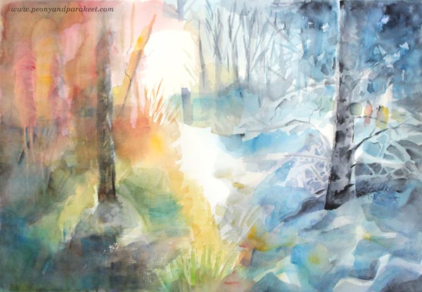
These images are from my class Watercolor Journey. The first landscape is quite realistic and representational. It’s easy to see that there are trees and the sun.
Here’s a more abstract version of the same project. Trees are not so clear anymore and the sun is more vague too, but on the other hand, it’s not as static as the previous one.
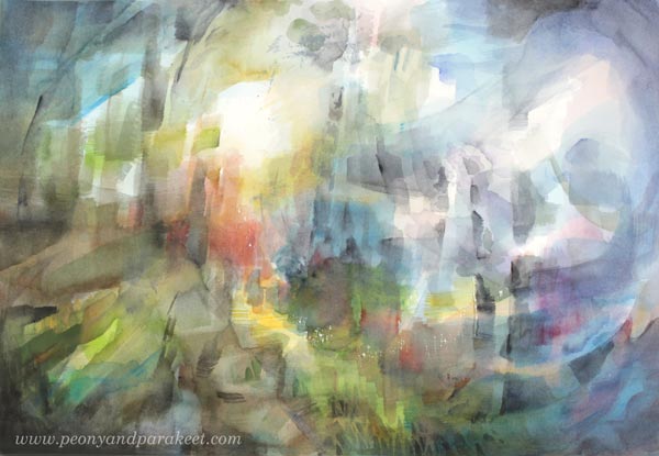
Which of the two do you like more? How far do you want to go in your paintings?
4) Intuitive Painting – Loosen Up by Starting with Three Photos
If you like to solve mysteries, here’s a project for you! Pick three photos and use one for each of the three first layers. Watch the video for more detailed tips and instructions!
I definitely did not see that there would be a fish in my piece when I started!
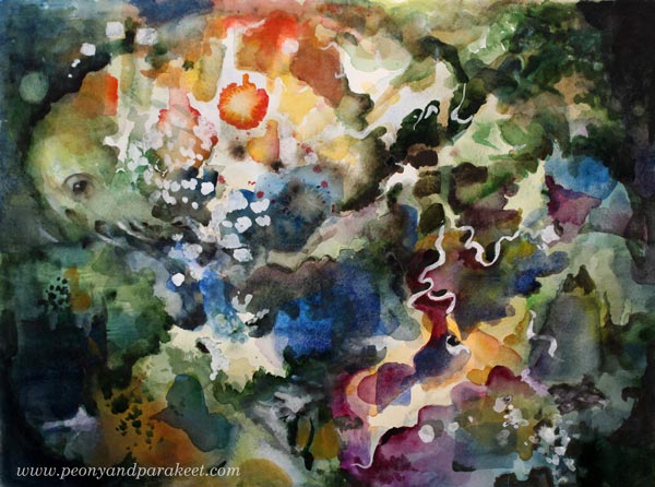
With watercolors, the art of seeing can be sometimes more important as the art of painting!
5) Watercolor Collage – Join my Class Animal Inkdom!
I have also used watercolors several times in my class Animal Inkdom. In Module 3 where we explore the underwater world, watercolors are a natural choice. For example, in this collage project watercolors have a central role. You will learn ways to draw fun and unique sea life animals, and make

Come to draw and paint with us in Animal Inkdom! You will get the published lessons (including Module 3) immediately after the registration, and you can start drawing and painting right away. Sign up for Animal Inkdom here!
How to Draw, and How to Enjoy and Keep Drawing
Yesterday, I ran a webinar about drawing. It’s always a lot of fun to talk about the topic I love so much. Thank you all who joined me!
The Joy of Drawing
I wanted to include the word “joy” in the title of the webinar because, in the end, it’s what keeps us drawing. I shared ideas about what supplies to use, what to draw, and how to solve those situations when you don’t grab a pen even if there’s a chance.
Unfortunately, the recording of the webinar wasn’t the best quality, maybe the snowstorm that has just blown over Finland had some effect on it. But luckily, I had some extra footage and I also made some more to compensate the parts that affected the experience. The video has a lot of ideas and examples, so it’s worth watching.
Animal Inkdom – Come to Draw with Me!
Let’s draw wild animals and decorate them with fun motifs and patterns. My new class Animal Inkdom is dedicated to the joy of drawing.
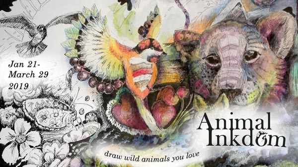
Animal Inkdom begins on Monday, January 21, sign up now!
Drawing Jewels and Flowers – Free 2-Part Mini-Course

I have been working with a 2-part tutorial about drawing jewels and flowers. Part 1 was published last week, and Part 2 is now available too! I will guide you to create a gorgeous jeweled bouquet with just pen and paper. You can color it with colored pencils, felt-tipped pens, or watercolors.

Get the free mini-course! – Subscribe to my weekly emails and draw with me!