Limited Creative Time – A Personal Story
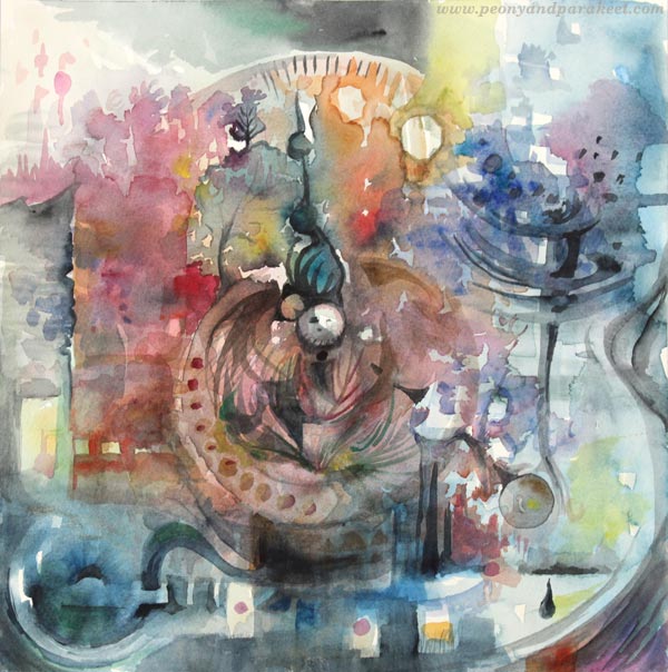
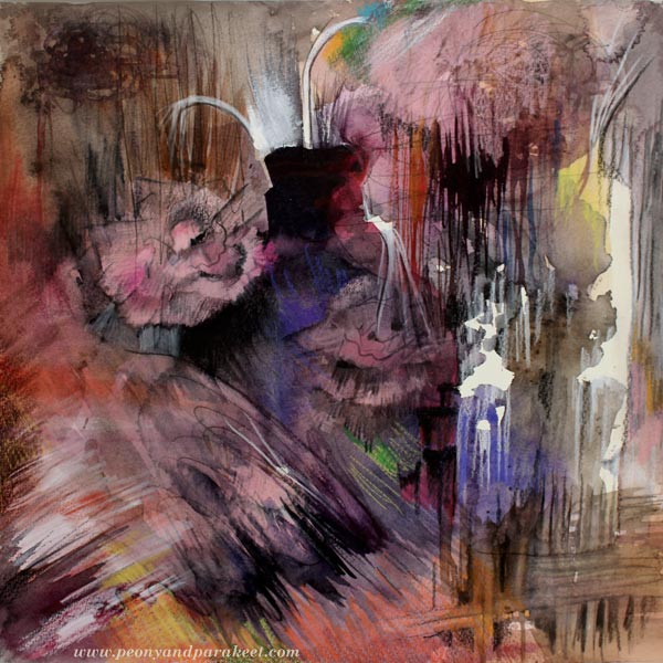
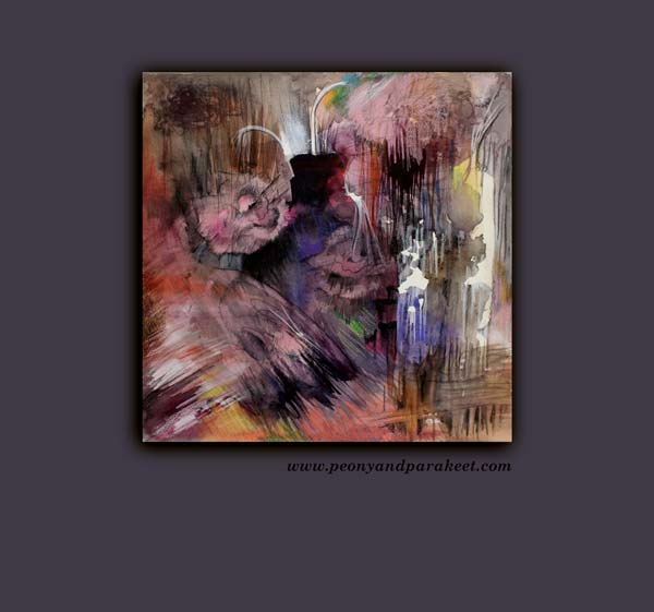
Here’s my latest watercolor painting “The Sense of Time”, made just a couple of days ago. I limited my creative time immensely when painting this. But this time I want to share the whole story, not just images of how I made the painting. At the same time, you will see some of my summer crafting projects and learn a couple of fun facts about Finnish summer.
Peonies Embrace the Midnight Sun
When people ask what would be the best time to come to Finland, I always suggest summer. Finnish summer begins in June and ends in August. In my opinion, the best month is July. Even in the south, where I live, you can experience the midnight sun, warmth and see the best in Finnish people. Like peonies, we are all introverts in the dark and cold winter, But when the sun comes up, it’s all smile.

Colors Compete with Shapes
My husband always has his summer vacation in July. As dog owners, our possibilities to travel are limited to day trips unless we take them to kennels or arrange somebody to look after them. As both of us love old art and antique, we always go to Billnäs and Fiskars for an antique fair. If you have watched a British television series Lovejoy, these are the places where you could see him and his assistants if they traveled to Finland. There are two antique fairs at the same time. They last 4 days and are packed with people selling and buying antique items in the middle of Finnish countryside. The fairs are partly indoors, partly outdoors and truly a collector’s heaven whether it rains or shines.
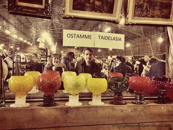
When looking at the sales tables, I always notice color first. My husband, a skillful woodworker, examines the shapes. Together we are unbeatable!
Art Rises from the Dollhouse
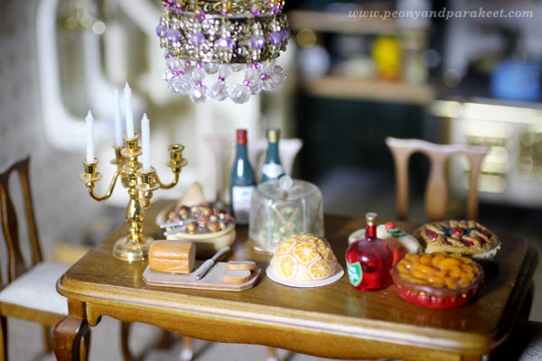
It was both unfortunate and fortunate that I found an old display cabinet from Billnäs. Fortunate, because it’s just what I had dreamed of for my doll collection. Unfortunate, because I didn’t have the space for the dollhouse anymore. I had to empty the tiny kitchen with miniature wine bottles and delicacies as well as all the other tiny rooms filled with similar items.
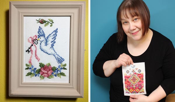
While taking the little paintings off from the walls, I realized that one of them wasn’t just printed image. It was a cross-stitch project that I had made years ago! I remembered not being very happy with it. When I started it, I thought that I could make more than one and then sell some. I didn’t have any pattern and the end result didn’t look as painterly as I would have wanted. So I gave up the idea of making more and placed the piece above the dining table, in the spot where it wasn’t as visible as other pictures. No wonder I had forgotten it!
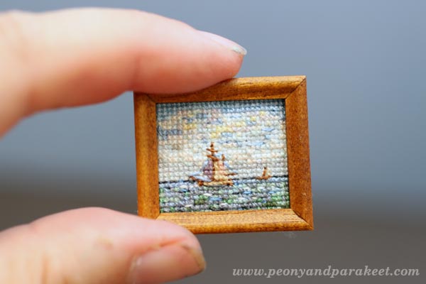
But now, it looks just perfect to me. Now I see more than just clumsy stitches. I see how my love to combine arts, crafts and design came out even when I was decorating a dollhouse.
William Morris Visits Ikea
One of my creative routines is organizing things. Even at antique fairs, I sometimes get the urge to rearrange items and I have to restrain myself. This spring, I was organizing a storage space of our house and found an old Ikea Moppe mini chest of drawers. Putting old stuff to use is a creative challenge that I am often willing to take. I went to Pinterest, saw boards like this and was ready to get started.
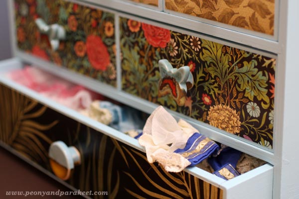
The first challenge was that I also wanted to use up old paints. The only paint with the suitable quality was baby blue. I wanted to place the mini chest in the library room near my doll collection and store fashion doll clothes in it. I had a hard time seeing baby blue suit to the style and color scheme of the library room. We have decorated the library room in the styles of 1890-1930s. The curtains have William Morris’s pattern. How could the Ikea mini chest ever with the style? Trusting that I could figure it out, I refused to buy new paint as I had another purchase in mind. I wanted to buy ceramic knobs for it.
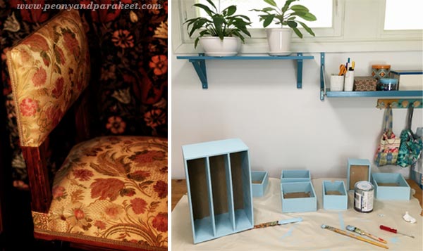
If I had to choose one material that I adore, it would be a difficult decision between ceramics and glass. But I think the winner would be ceramics. Even if I have never really dived deep into creating with clay, I love ceramic items. Especially if they are both decorative and expressive. I also like them to be a little rustic, have some handmade feel without being overly clumsy. The knobs I wanted to buy should also have some baby blue, some William Morris, look both old and modern and be traditional but somewhat innovative. Despite the high expectations, I optimistically began to search handmade ceramic knobs. It took a couple of days but my optimism paid off and I found just the perfect ones! They are made by an English woman living in Israel. Her Etsy shop is called “Clay is My Art”, a heaven for anyone who loves rustic, but sophisticated ceramics.

As you can see in the photo, I was able to find decorative papers that not only matched the knobs, they fit perfectly to the style of the library room. The papers with palm plants are leftover wallpapers. The other two are from my scrapbooking paper stash.
But wait, this story continues …
Leftover Flosses Praise the Pattern
Have you ever had anything in your home that was ok before you changed everything in its surroundings? My number one thing was a small key storage cabinet, which was fine in our old home on a muted dark red wall. But when placed on a bright yellow wall of our current home, it really bothered me. With the experience in cross stitching for dollhouses, I got an idea of stitching a dollhouse carpet pattern from Janet Granger‘s book Miniature Dollshouse Carpets.
It took all spring when working slowly but at the beginning of summer, I got it stitched. I also repainted the wooden parts. This time I did buy the dark green paint but this is still a project using leftovers. Namely, I didn’t just use the few colors set in the pattern. I used leftover skeins of embroidery floss creatively so that the carpet looks like an old antique one. I much prefer this look to using only a few colors.

The cabinet looks great on the yellow wall. I temporarily took it down for photographing it in a better lighting. There was also another reason, connected to the watercolor painting …
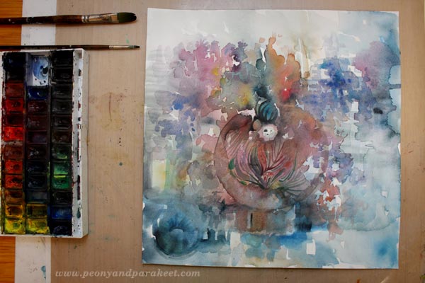
Limited Creative Time – Craft Projects Inspire the Painting
This time I had limited creative time. Before I started painting, I placed the three handcrafted items on the table in front of me. The key cabinet, the mini chest and the miniature cross-stitch work were all there to inspire me. Then I glanced my watch and gave myself 15 minutes to paint the first layer. Namely, I had another project in progress too. I was editing one of the videos for Imagine Monthly Fall, the art journaling class that begins on August 1st. Editing videos requires a lot of concentration and I wanted to keep the quality good by taking small breaks. So after 45 minutes of editing, I had 15 minutes for my painting, all day.
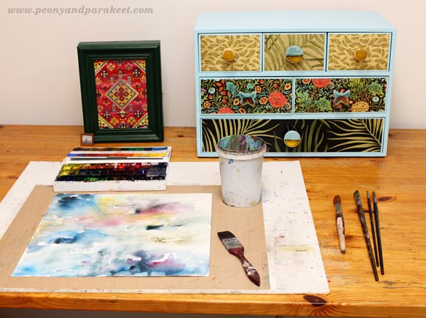
If you work in short periods of time like this, inspiration items become essential. Seeing the same objects again and again, even if you are not actually recreating any of them, maintains the focus and direction.
After four 15 minute sessions I was at the point where I had painted this and that with five different brushes but had no clue of what I was trying to express. It was fun to paint like this but clearly, I couldn’t finish the painting without setting up a longer session.
Finishing – Summing Up
I soon discovered that being so aware of the time had also affected the painting. I saw clocks and pointers which made me ponder about the concept of time. It flies so quickly in creative activities that it’s difficult to think about it as a simple measure. This, in turn, made me think about the antiques and how great designs last time. After my husband and I are gone, there will always be new enthusiasts who will drool over those Kaj Franck‘s bowls.
I often finish my watercolors with colored pencils to easily add new layers of details and decorative lines. But this time, I was reminded of my craft projects: “Make the most of what you currently have.” So I resisted the urge to go to another room and get the jars of colored pencils. It only took an hour to finish the painting.
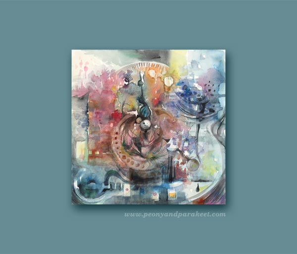
Some midnight sun, some glassware, mini horizons, small amounts of leftover colors, block shapes and last but not least: the description of how my inner artist sees the sense of time.
The Way I Process Ideas and Produce Classes
This blog post demonstrates how I work with ideas. It’s not only one idea that goes into one piece of work, it’s a collection of ideas that have different levels. Some are more abstract, others are more concrete. I believe that every good art class is filled with multi-level ideas that in turn, embark your own ideas. That’s why I never underestimate the importance of the background study that I do for my classes. I listen to audiobooks. I go to libraries to browse books. I collect Pinterest boards and inspirational items. I make sketches and paintings that I call pre-class paintings (yes, the one above is one of these). They prepare me to bring my best to the classes that I produce. They ensure that the class is not only about one whimsical thing that I fell in love with but about a holistic, yet clear and inspiring view to the subject. All in all, we all have limited creative time.
Sign Up for Imagine Monthly Fall!
Take your art to a new level by practicing drawing and painting with themes inspired by fine arts. Express prestigious nostalgia, impactful aesthetics, and futuristic imagination through art journaling. Let’s make idea-full art journal pages your channel to move forward in art making!
Imagine Monthly Fall 5 challenges, great community >> Sign up now!
Mid-Century Modern Style for Art Journals
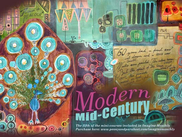
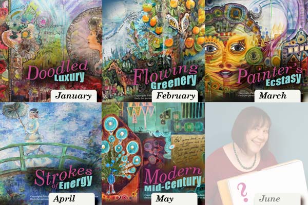
This spring, I have published a new art journaling mini-course each month for Imagine Monthly. May’s mini-course is called Modern Mid-Century. This mini-course is all about mid-century modern style. You can use it to create decorative art journal pages that are not only flowers and hearts but show a wider range of designs.
Discovering a Magic Formula of Mid-Century Modern
The main inspiration for the Modern Mid-Century mini-course came from Annikki Hovisaari’s ceramic Peacock (“riikinkukko” in Finnish). Annikki Hovisaari was a designer in the Finnish ceramic factory Arabia in 1960s. We have the peacock on the living room wall. I look at it each day, admiring. So much can be expressed with simple shapes and thin lines! The mini-course includes plenty of samples.
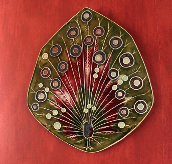
When I begin examining a new style, I try to see what’s essential there. What could be removed without changing the impression. And also: what could be added without loosing it. It’s like calculating a formula for a certain style. The secret is not trying to solve the whole big equation. It would be too difficult and highly argumentative. Even the experts of 20th century styles argue whether something is mid-century modern or not. I try to avoid that and just pick few of the central features. Then I focus on their relationship, forgetting the rest.
The best art classes give you ideas that you can expand and adjust to your liking. Whether you like mid-century modern or not, you can use the basic formula. With that, you can move forward towards your own ideas and aesthetics. This kind of conceptual approach will bring focus to more personal than to the style itself. Instead of trying to follow the style, you will be making new discoveries through it.
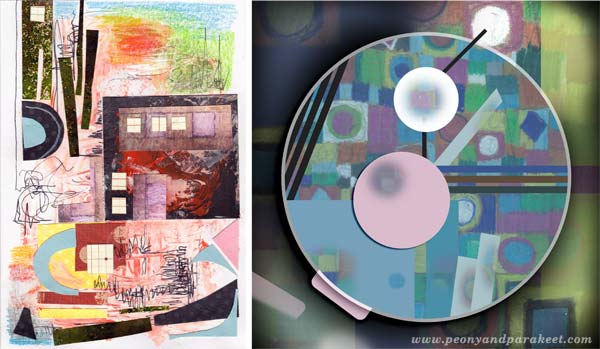
I made a couple of small pieces after finishing the mini-course. The first one, on the left below, is a birthday card made for my husband’s nephew. The second is a digital piece combining the idea of mid-century modern and the concept of a watch.
Create Your Own Mid-Century Modern Art
Sign up for Imagine Monthly! You will not only get Modern Mid-Century, but all the mini-courses published so far, immediately after the purchase.
Imagine Monthly also has a private discussion group at Facebook. It’s fun to see what everyone has created from the mini-courses. In the middle of the month, I also lead a discussion topic related to the month’s theme.
I believe that every art journal needs pages that are handpainted and handdrawn. It is joyful to browse pages that are more like illustrations than just layers of paint. With Imagine Monthly you will get new formulas for stretching your skills and discovering new techniques. Sign up now!
Tribute to Finnish Art Rugs
I made this painting just before Christmas but as it has a special story, I wanted to blog about it later when I had more time to write. Actually, I didn’t even plan for creating anything in the middle of holiday cleaning and cooking. But I just had to.
Finnish Art Rugs
Namely, my husband bought a wall art rug (“ryijy” in Finnish) from an online auction and it happened to arrive just before Christmas eve. We had been searching for one for some time. It had to suit with the colors and style of our living room and not be enormous (as many of them often are). We had a designer in mind too – Ritva Puotila, a Finnish woman who has recently designed carpets for her own company Woodnotes. In 1950-60s, she used to design beautiful, painterly Finnish art rugs. The rug that my husband found was her design called “Fireside Evening” and I think it looks wonderful in our mid-century modern living room (which has a fireplace in the opposite wall).
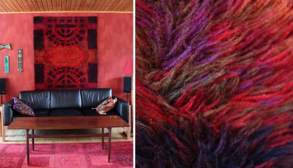
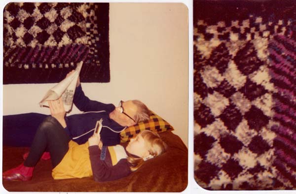
As you can see from the close-up photo, the rug is not only black and red but has many colors to create the painterly effect. At those times, in 1950-60s, wall rugs were fashionable in Finland and especially these kind of rugs that are as much modern art as home textiles. Many women bought the patterns and sewed or weaved their rugs by themselves. My mother was one of them. She chose a rug design called “Ruutrikki” (a made-up word that resembles “broken squares”) and the designer might have been Päikki Briha, if I remember correctly. Here’s an old photo of me and my father showing the rug in the background. That rug also has a lots of colors. It was difficult to zoom in, but hopefully you get the idea.
While touching and admiring our new red rug, I got very emotional. My mind was filled with mixed emotions. I was happy about the new art textile that would bring a warm atmosphere to our living room. On the other hand, while browsing the old photos, I saw people that have passed a way, photographed in front of my mother’s rug. When I remembered that many of those art rugs were sketched with watercolors and then transformed to a grid pattern, I just couldn’t help it. I had to take out my watercolor set and start a new painting even if it was getting late and I felt pretty tired.
Creating a Mixed Media Painting
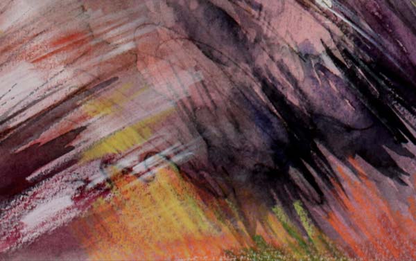
While painting, I didn’t think about anything particular, but of course, the rugs found their way to the end result …

The painting turned out to be some kind of still life with a dark vase and few sad-looking carnations. Carnations were my mother’s favorite flowers and my father used to buy them for her every year, at their wedding anniversary.
If you look at Finnish art rugs at my Pinterest board, many of them have some kind of melancholy in them. Maybe it’s caused by a combination of muted colors, high contrasts and simplified, abstract approach. These were the elements that used in my painting too.
I finished the painting with colored pencils and named it as “Ryijyneilikat” – “Rug Carnations”. They are imaginary flowers that grow downwards, that are not used to be centerpieces, that blend in the background. They enforce other elements of the still life to step up and go forward. Just like my modest mother did for her children.
Create midcentury modern designs from simple shapes!
See more of my living room and get step-by-step introductions!
>> Buy Modern Midcentury!
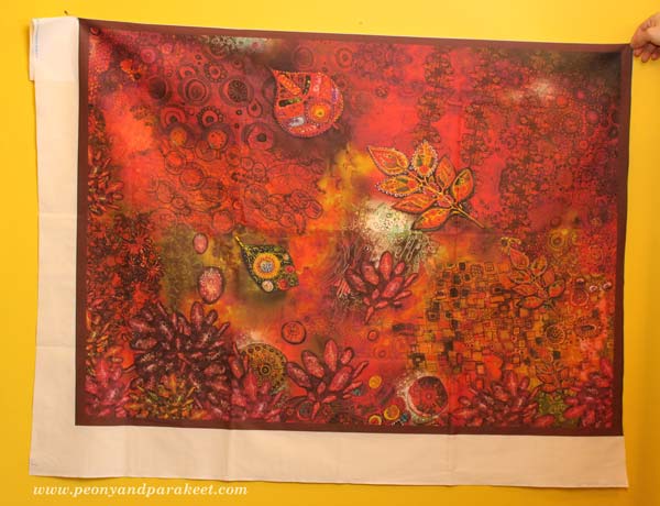
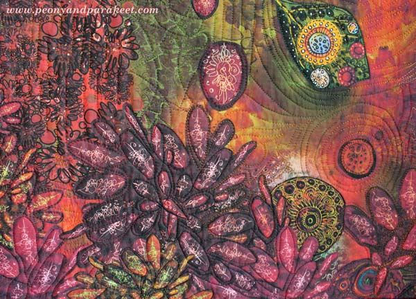
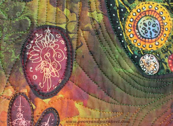
Art Quilts in a Modern Way

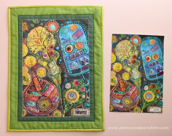
Here’s something that I have wanted to show you for a long time! I have been working with a custom order which made me think of a new idea: to create fabric prints and make quilted wall hangings from them. This idea is very versatile as you don’t have to be a quilter, you can print your art on fabric and use it for bags, purses, clothes – anything!
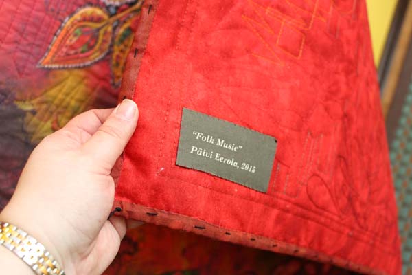
The artwork above has been composed digitally of various art pieces that I have made. The person who ordered the wall hanging is a fan of modern folk music and the color red. (If you have not listened to modern folk songs, try Hanneke Cassel for example!)

I created one new collage piece for the artwork. All the other details are picked from my archives.
It was pretty exciting to send the artwork to Spoonflower. When I received the fabric, the print quality was really sharp and detailed! I already knew from the previous experiences that big areas of black don’t print well, so I avoided those.
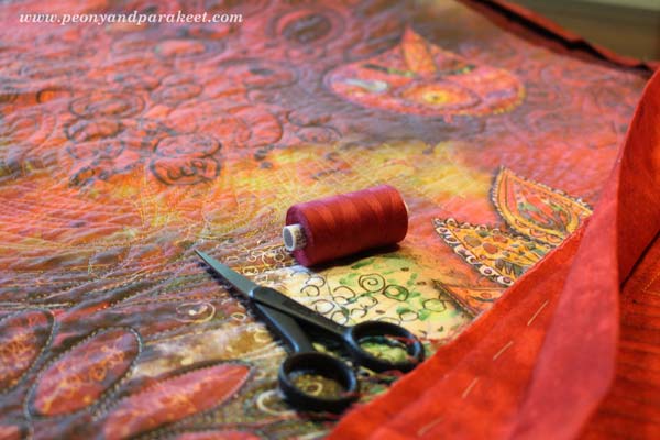
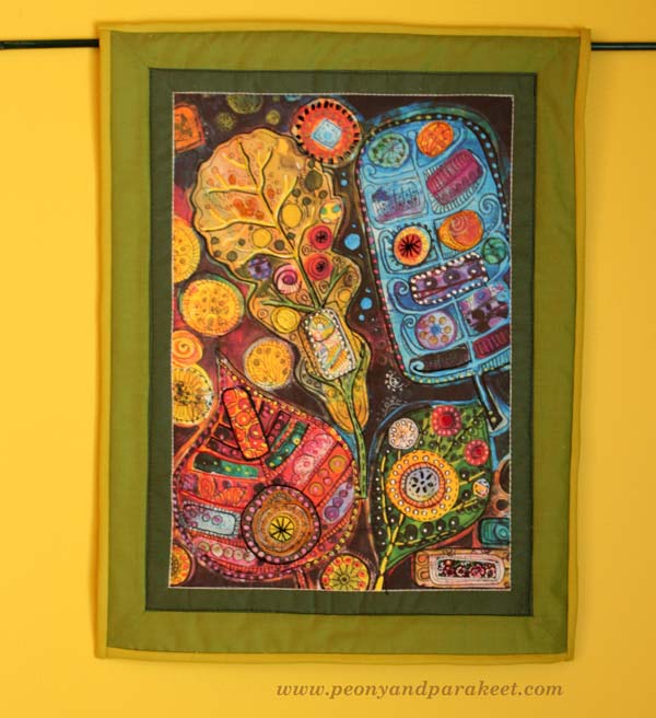
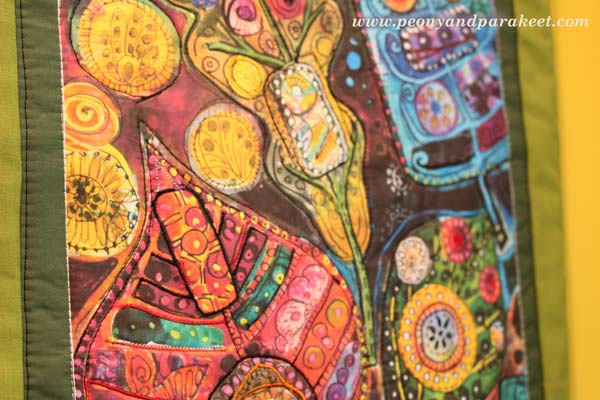
If you are a quilter, you know that the fabric will look so much better when quilted! I sandwiched cotton wadding, two layers of fusible interfacing and backing fabric and took out my sewing machine.
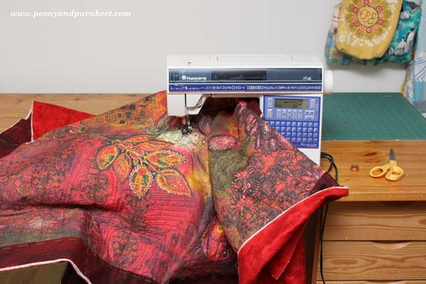
I am not very experienced with free-motion quilting using the free-motion foot, so I used even-feed foot instead. But with patience, I was able to create quilting that enhanced my brush strokes.
The finished quilt is about 45 x 39 inches.
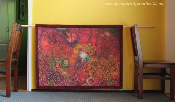
I used various colors of shiny embroidery threads for quilting. Using black thread brings the real black that was not produced by digital printing.
Quilting on watercolor!
Entering the flow state when playing modern folk was in the center of my inspiration.
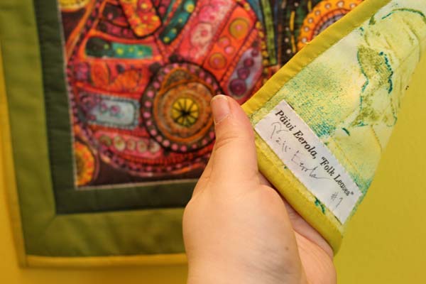
I added the label to the printing file too.
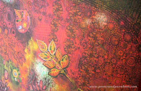
Here’s another project that I actually made earlier to test the idea. This one does not contain much digital processing, I only took a good photo of the original art and enhanced it a little bit.
I think this artwork looks really good on fabric! The actual idea when creating the original was to mimic hand embroidery! Read about creating the original artwork: When Pens Replace Needles
I added some embroidery before quilting but found out that quilting works well as decoration.
A printed fabric label can be found from here too.
I also have more fabric prints waiting to be transferred into art quilts!

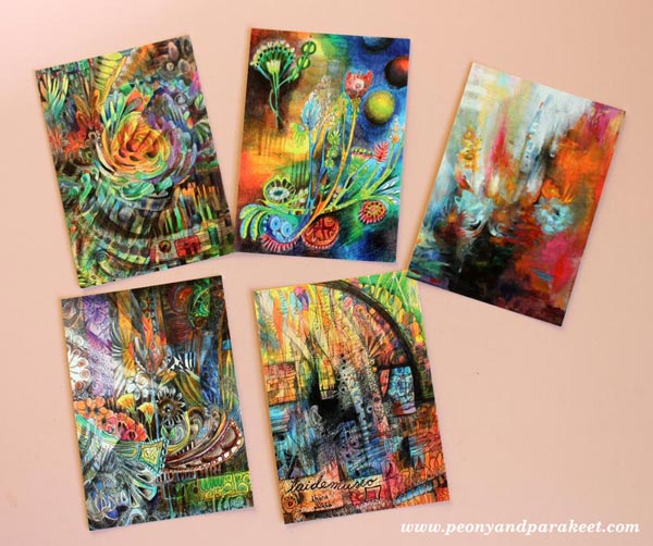
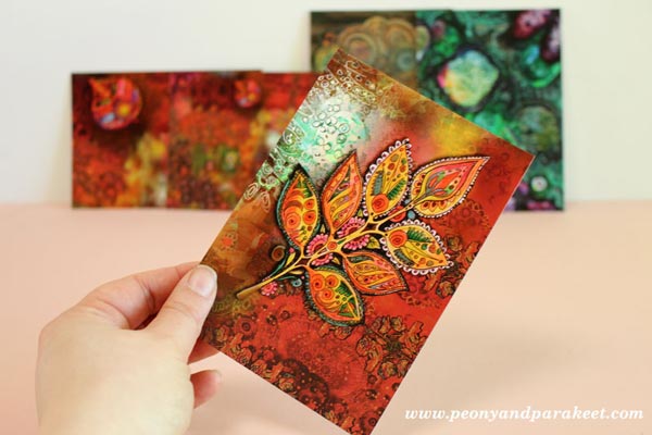
Paper prints news: New card sets have arrived at my Etsy shop.
Life can never be too colorful!
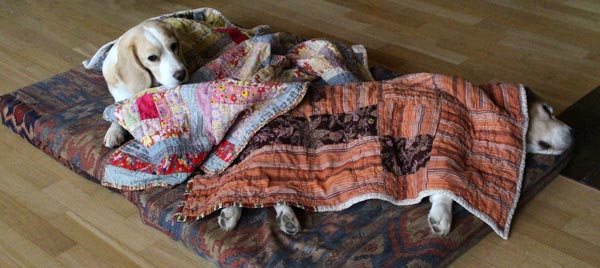
Stella and Cosmo send their greetings to all artists and quilters: Have a relaxing weekend!
Let me be your art teacher: Subscribe to my weekly emails!