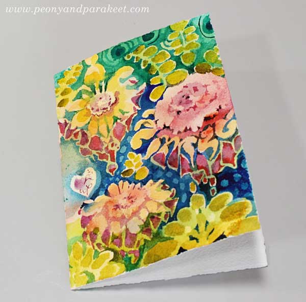
Ornamental Flowers – Paint with Me!
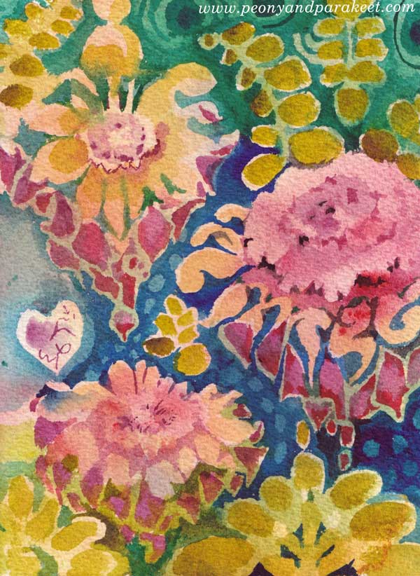
This week, I have a video tutorial for you! Let’s paint a watercolor card that’s like a piece of beautiful floral wallpaper. Watch the video!
Flowers have always been my favorite, but now even more than ever. I hope you’ll enjoy painting this!
Floral Fantasies – Weekend Sale!
I am also happy to announce that Floral Fantasies – my flower painting class is now available again!
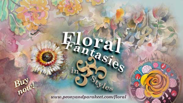
Honestly, this is the class to take when you want to become a floral painter + it’s for sale April 23-26 (PDT)! >> Buy here!
Bright and Decorative Art Style
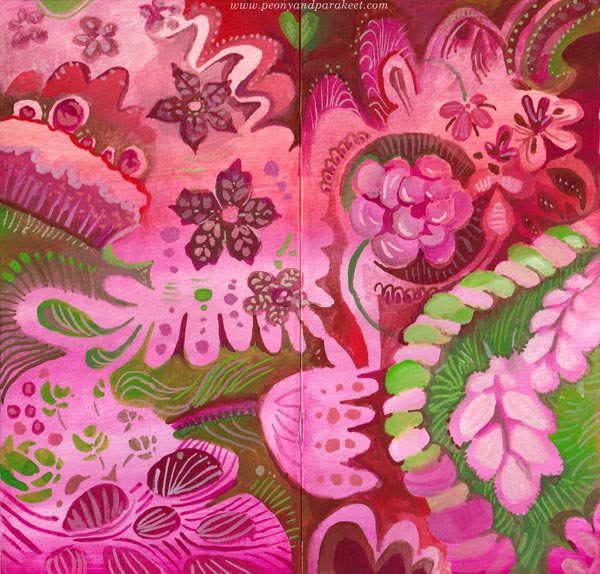
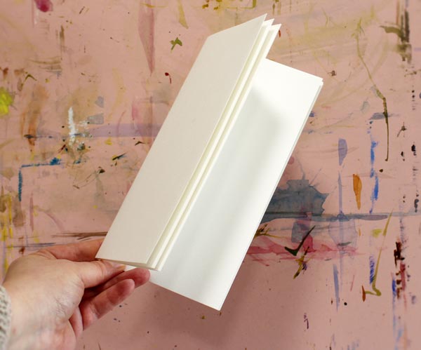
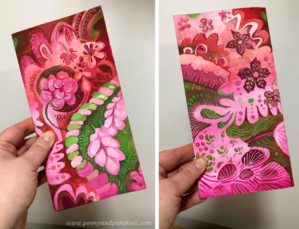
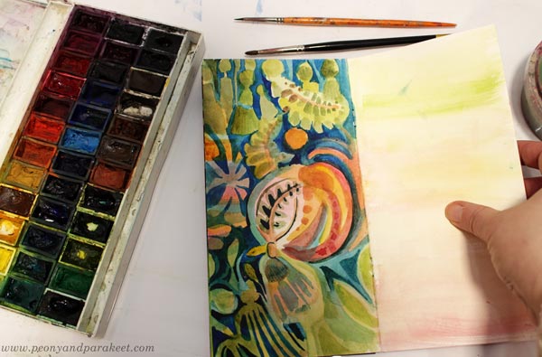
This week, I needed colors that are so sweet that they almost taste on the tongue! I found a little watercolor notebook from my paper stash and made a gouache painting on the covers.
Painting the Covers
I used a limited palette of gouache paints – pinks, reds, and greens, and made pastel hues by mixing them with white.
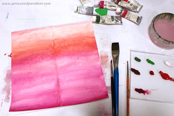
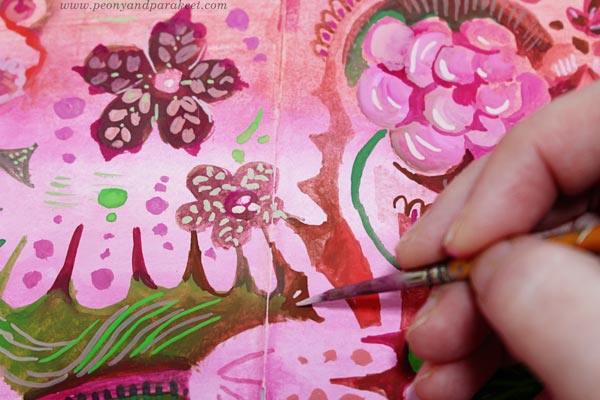
After painting the background, I filled the covers with decorations.
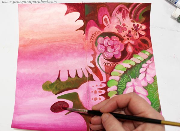
Making all the little dots and lines was both calming and refreshing. The darkness of the world faded away!
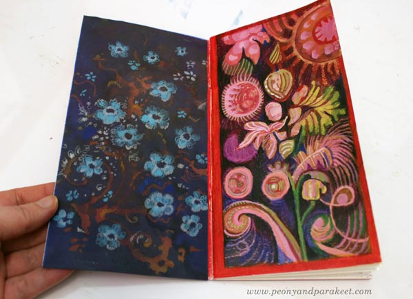
Here’s how the covers look when the journal is closed. Isn’t that sweet?!
Inside: Decorated Papers and Flowery Shapes
I also decorated an inked paper and taped it on the inside of the cover. Flowers are easy to make with colored pencils!

I also combined gouache paints and colored pencils and made a mixed media drawing on the opposite page.
Inspiration from the Movie Emma
A couple of weeks ago, I watched the movie called Emma, and the beauty of it blew my mind. I love Jane Austen’s stories and had planned to go to a movie theatre to watch it, but they closed. Fortunately, it became available on iTunes, and within 48 hours of the renting period, I was able to watch it twice! I have always enjoyed examining decorative tapestries, furniture, clothing, and such, so I took my time, especially on the second time, stopping the movie now and then just to admire the beautiful sceneries, interiors, and dresses.
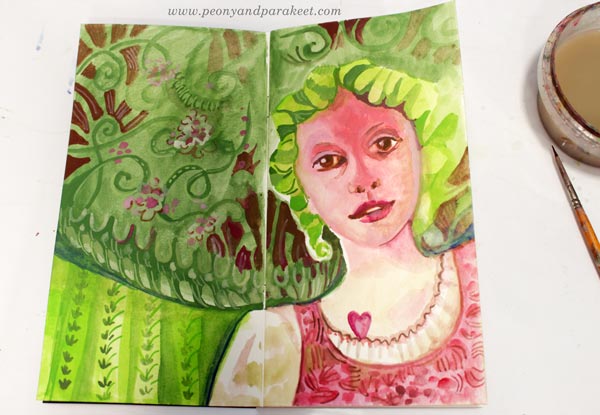
Here’s Emma’s friend Harriet and all kinds of decorative elements from my imagination.
Decorative Art Style – Fun to Design, Fun to Paint!
This year, I have been practicing pattern design, trying to make at least one pattern per month. I have used my watercolor paintings as an inspiration.
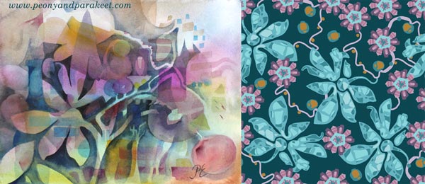
These design ideas go back to my paintings as well. I have really enjoyed making them more decorative now.
I feel like I am connecting the dots between the many styles that I am fond of. It’s like William Morris, Marimekko, and decorative Russian metal trays are coming together. My detailed style to draw and the intuitive style to paint seem to integrate, and it all feels so effortless and fun. I am going to do more of this kind of decorative art style projects – I hope they inspire you too!
Related Blog Posts
>> From Art Journaling to Pattern Design
>> Paint Your Mental Images – Love for Russian metal trays
>> 8 Style Tips from the Students of Peony and Parakeet – William Morris inspired art journal spreads
Bloom and Fly – Sign up for My Classes!
Sign up for any of my classes, and become a member of my active community for the rest of this year!
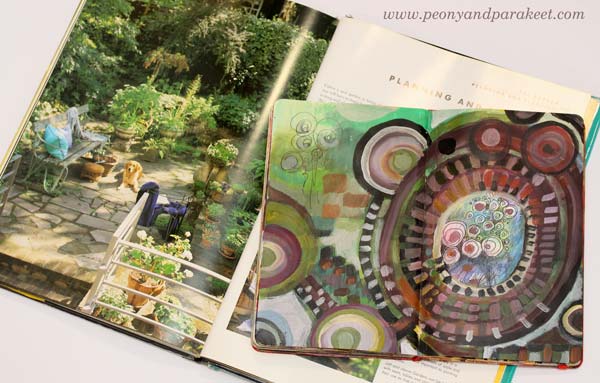
Using Color Schemes from Home Decor
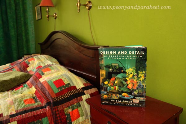
In the early 1990s, I bought an interior design book from the UK. It’s called “Design and Detail” and it’s written by a famous designer Tricia Guild. She was not as well-known as she currently is back then, and I hadn’t known her before I saw the book.
Creating Art by Using Color Schemes from Home Decor
I felt drawn to the interior color schemes and the decorating style presented in Tricia Guild’s book. Never before had I felt such a strong appeal to home decor. I knew I liked to be surrounded by strong colors, but I had never seen them used in such a powerful way. Since then, my every home has had elements and spaces inspired by the book. Whether I lived in a small single room as a student, in a flat or a house, I have always browsed the book when I’ve needed inspiration for interior color schemes.
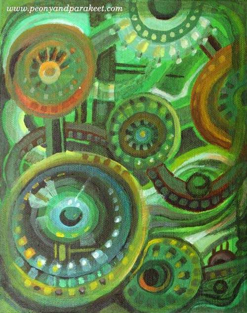
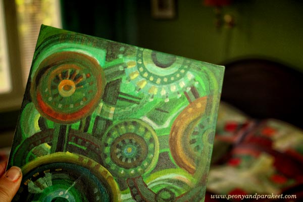
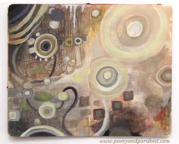
Last week, I saw a picture that had one of the color selections that are presented in “Design and Detail.” It was the combination of green and black including a little bit off-white, yellow and muted orange-red. We already have that color scheme in our bedroom but at that moment, I wanted to play with those colors again. So I started a painting that has green and black and followed the instructions from my upcoming class Planet Color!
Once it was finished, I painted more interior color schemes from the book. Again, I used the 7-step method from Planet Color. I had so much fun creating these!
Warm and Inviting Colors
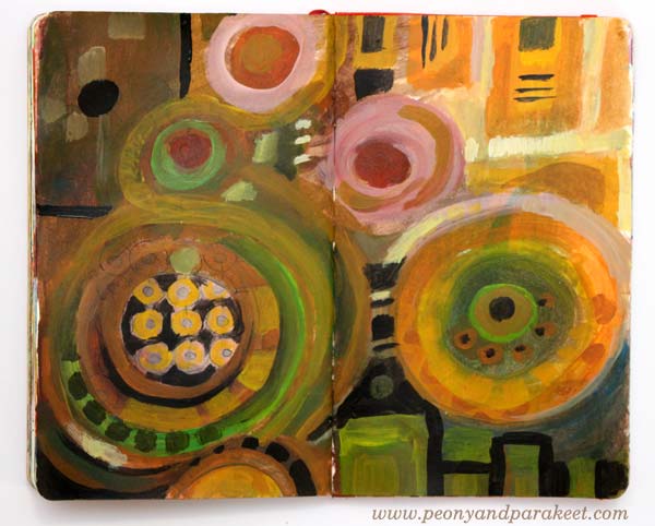
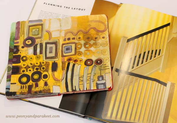
The dining area in Tricia Guild’s book looks very cozy. The striking combination of yellow and black is balanced with earthy colors and then brightened with a few warm, bright spots.
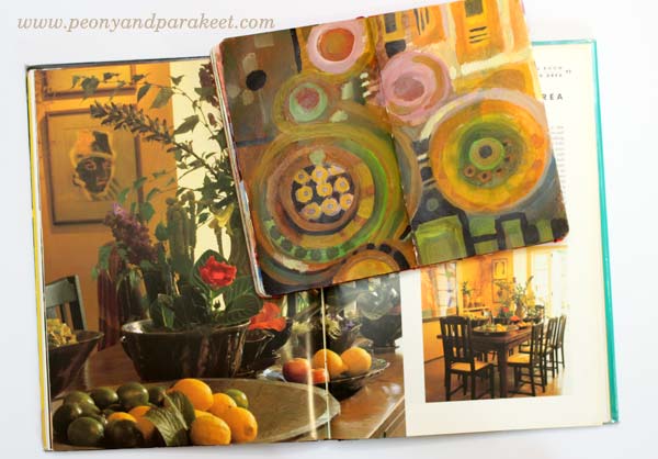
My art journal spread is inspired by the flowers and vases. It also plays with angled and round shapes as seen in the dining room.
Whites and Neutrals
I am definitely out of my comfort zone when using pale colors in larger quantities whether it’s creating art or home decor. But I wanted to try to get inspired by Tricia’s master bathroom. It was surprisingly easy when I focused on expressing the textures shown in the photo. The narrow color scheme also made me focus on adjusting the colors only slightly.
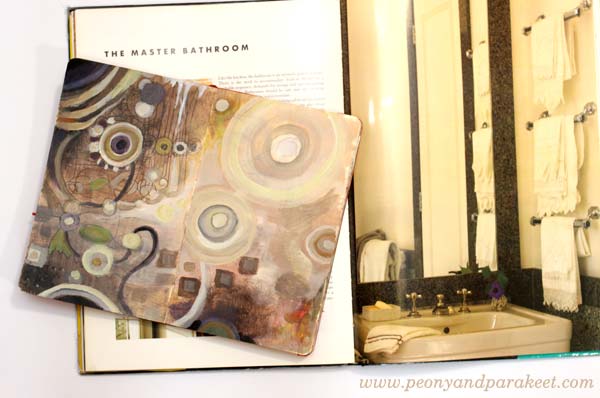
It is surprising how many tones can be created from a very restricted color palette. I also quite like the red/orange spot on the right and how it balances the upper left corner. When using neutral colors, even the smallest colorful detail can make a difference.
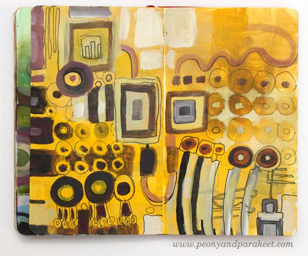
Many Shades of Yellow
I had a bedroom that had quite a lot of warm yellows when I was a child. But before “Design and Detail,” I never thought I could have bright yellow walls. But during the years, I fell in love with the warm yellow shade that I call “Tricia Guild’s yellow.”
In the art journal spread, I played with various shades but six years ago, when we moved to our current house, I wanted to have that particular “Tricia Guild’s yellow” on a wall.
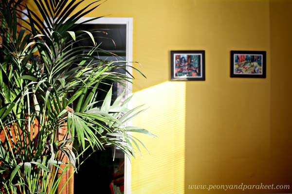
Even if there were tens of yellows available as paint, “Tricia Guild’s yellow” wasn’t found in the color charts. I thought people must think I am mad being surrounded by all the yellows and shaking my head. Then I just picked one that was closest and we started painting. But it wasn’t the right shade and after one layer, it felt too warm. After carefully analyzing the yellow in the book and comparing it with the wall, I decided to add warm black to adjust the tone. And so we got “Tricia Guild’s yellow”, just the perfect tone on the wall!
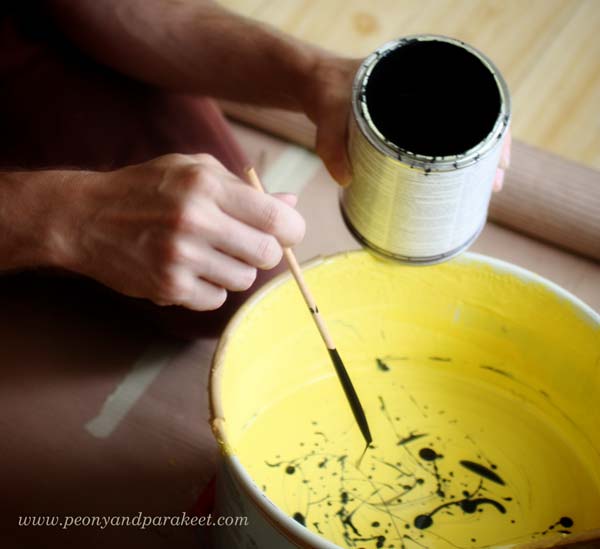
This story shows how many colors there are in the world and how little you experiment with if you are using only ready-made colors. Start mixing your colors! It is a reason why I built Planet Color, my color-oriented workshop!
Colors from Potted Garden Using Leftover Paint
After creating so many paintings, I ended up having some leftover paint on the palette. I decided to use the paint by getting inspired by exteriors too.
Expressing a potted garden with circles is easy. Angular tiles are also easy to add to the picture.

Sign up for Planet Color!
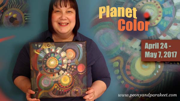
Take your favorite interior design book, or Pinterest board, or any source that inspires you with color, and sign up for Planet Color! I’ll show you how to experiment with colors so that your painting is more than just a selection of color samples. I’ll show how you can make colors interact and how to enjoy adding more instead of just making a mess! And if you are more of a minimalist, you can omit some steps of the process and create a simple yet eye-catching painting! Reserve your spot now!
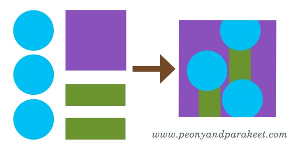
What to Create from Simple Shapes? 6 ideas
When I catch myself building a visual image in my mind, I say to myself that my hands have to process the idea first. The idea can be a decorative design or a new painting or anything visual. When my mind is vigorously trying to create images that I would be happy with, my hands don’t understand my mind at all. My mind is a fool and my hands are ruthless.
In my mind, I can easily miss the elements that are needed for building the beautiful image. If I imagine a scene, the details that make the scene look so wonderful, are not all there. My mind only has a glimpse. The connection from the mind to the hands feels easier if it’s the other way around. The hand draws a couple of circles and the mind gets creative with them. This way building the bridge from my mind to my hands seems to work much better. Big pictures, personal stories, attractive designs are not born in my mind first. They are born in a conversation that is led by my hand drawing with pen on paper.
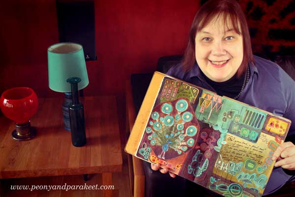
But hands don’t decide when to get started, the mind does. This is why I will give you few ideas to start the conversation between your hands and your mind. Like this, this and this post, this blog post is illustrated by my students. The art journal pages that you see here have been made at Modern Mid-Century art journaling class.
1) Build ornaments by grouping simple shapes.

Nel Wisse has created colorul clusters and then grouped them to bigger ornaments.

2) Create a surface pattern and cut a shape from it.
For example, see Darci Hayden’s cat and the stairs! Shapes that include patterns look always fascinating. (More patterned paper ideas)

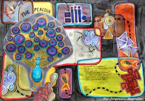
3) Play with Sizes and Layers

Cut some elements smaller and add dimension to your page by playing with layers.
Sue Jorgensen has a good variety of both large and small elements.
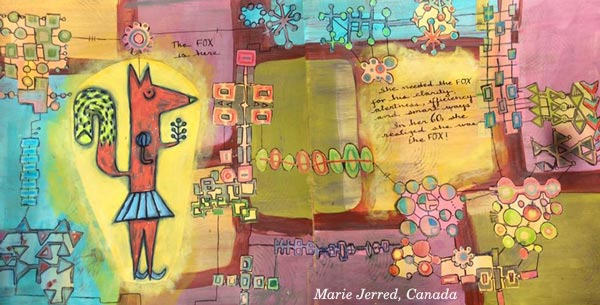
4) Build a map, a house or a room plan

A clear hierarchy between the elements pleases also your left brain.
Marie Jerred’s fox is in the middle of an adventure!
Stephanie Carney’s Flamingo is just entering a house of dreams.

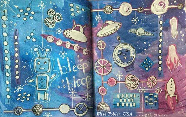
5) Express Micro or Macro World
Both micro and macro biology deal with basic shapes. Explore either molecules or satellites!
Susan Prothero’s micro world is captivating.

Elise Tobler‘s space is full of life!
6) Find a connection to a story
Explain what you associate with the shapes and then move on to a more illustrational approach. Elaine Wirthlin’s spread is an awesome example!

Buy the class: Modern Mid-Century!
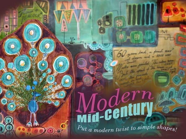
Designers in 1950s and 1960s (like Annikki Hovisaari from Finland and Lisa Larsson from Sweden) truly knew how to play with simple shapes. Modern Mid-Century is a self-study art journaling class where I am inviting you to my living room and showing inspiring examples from the middle of the 20th century. Then I will help you to design your own unique motifs and build a collage that is both decorative and expressive.
Modern Mid-Century
Start playing with simple shapes! >> Buy Now!