
Make Old Art Journal or Sketchbook New Again
This week, I have a 1-minute video about revamping my old art journal!
This sketchbook is from 2018, back when I was practicing different portraits and creating a course called Innovative Portraits. There’s still plenty of empty space left in the book.
My Old Journal and How the Cover Was Decorated
My old art journal is from The Pink Big. I decorated the cover around 2020.
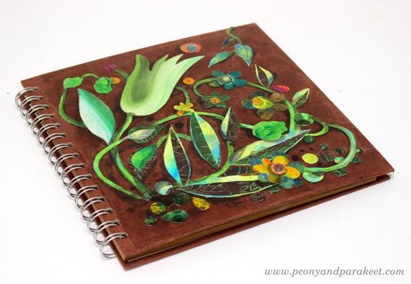
I cut hand-painted papers, added shadows, and protected the collage with gel medium. See an old blog post about how to create the collage!
Now I brought the book back out to start filling it up again.
Oil Pastels in A Journal
The first page was done with smudgy oil pastels, so I left the opposite page empty.
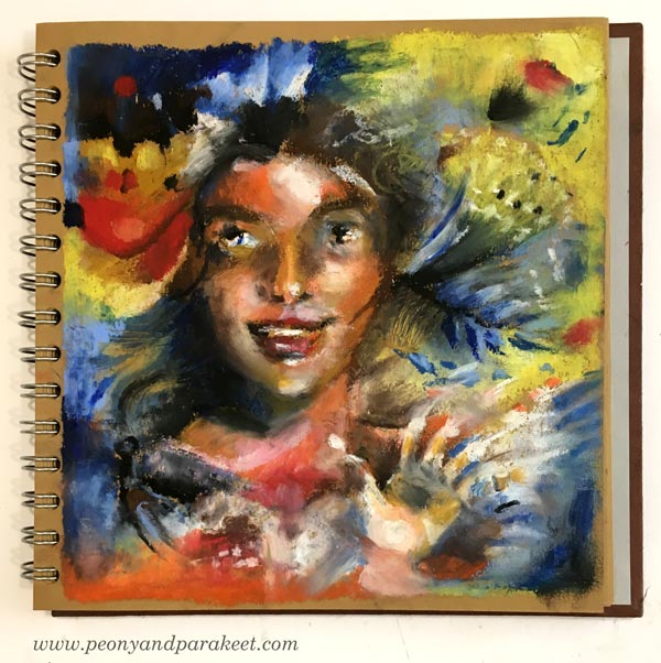
Oil pastels are fun, but maybe not the most practical for journals. See an old blog post about ideas for using oil pastels!
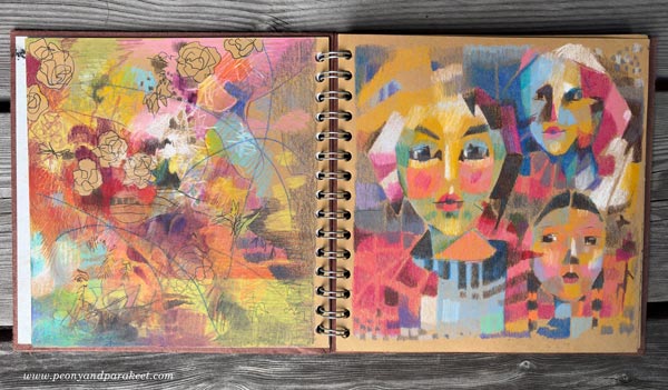
Abstract with Colored Pencils
On the next page, I made an abstract drawing using colors that go well with the original 2018 page.
Fun with Sakura Gel Pens
These brown pages are great for trying out gel pens. I made a new drawing on the opposite side.
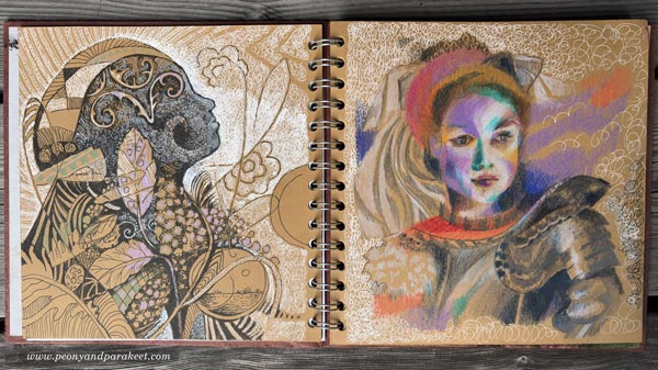
My newest course Drawing Soulfully is about drawing all kinds of lines, and it was fun to use those techniques here.
Flowers and Fabric with Colored Pencils
I placed a paper sheet to protect the previous page, and then colored flowers with colored pencils. The opposite page only had three faces, so I added flowers there, too. I love historical styles, so the main figure got a big, decorative sleeve with dramatic folds.
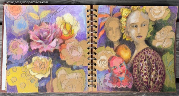
The next spread is already waiting! I hope this inspired you to make an old art journal or sketchbook new again and use your past pages as inspiration.
P.S. You can still sign up for Drawing Soulfully! >>Sign Up Now!
Artist Vlog – Day in the Life of an Artist
This week, you get to see my day from morning to evening! I’m walking the dogs, painting in oil and watercolor, taking care of my orchids, editing course videos, etc. I hope you enjoy this kind of documentary-style artist vlog!
The black journal that I used in the video is the Dylusions Creative Journal.
Remember to sign up!
Drawing Soulfully – Sign Up Now!
Awaken your line and find a way to your style!
Drawing Soulfully begins on August 25, 2026. >> Sign Up Now!
Starting a New Sketchbook with Botanical Art
This week, I share how I am starting a new sketchbook!
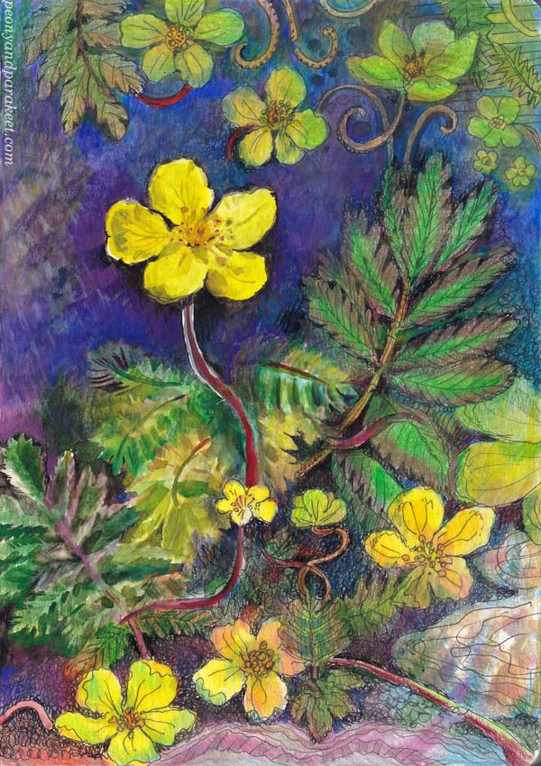
Eged’s silverweed (meriketohanhikki in Finnish)
Starting the Dingbats Pro Green Beetle Notebook
For a long time, I’ve been looking for a sketchbook that works well with both pens and watercolors. I’ve used Fabriano’s thick (200 gsm) Accademia drawing paper for individual drawings for years. But now that I’m gathering material for a new painting series, I really wanted to create my work in a book instead of keeping loose sheets in a folder. Flipping through a book’s pages just feels so much nicer than turning plastic sleeves in a binder.
I noticed that a Finnish stationery shop, Vihkokauppa, had added the Dingbats Pro Green Beetle Notebook to their range. The product description said that the maker spent a long time developing the paper to make it suitable for watercolors. I don’t live near the shop, so I took a chance and ordered it online.
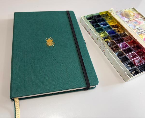
I was lucky. Based on the experience so far, the paper is truly great! It’s thin enough (160 gsm) so the notebook doesn’t feel bulky, but thick enough to hold water. The pages are wonderfully smooth and work great with fineliners and colored pencils. Because of its size (B5), it’s also a good fit for my new course, Drawing Soulfully, if you prefer to do your course drawings in a book.
Moving Away from Procrastination
I have a few topics I want to explore before starting my next series of big paintings. I have a short list, and I’ll share my ideas in future blog posts. These are mostly things I have wanted to explore more deeply for quite some time, but have procrastinated on for some reason. It’s time to stop that procrastination! Building the new course, Drawing Soulfully, has given me a lot of energy for that, and I hope that the course will inspire you too!
One of the topics on my list is plants. The exact species doesn’t matter, though of course I prefer to see the plant with my own eyes first. Plants have such interesting shapes and details that I want to add to my artistic repertoire. So now, when I was starting a new sketchbook, my first project was to pick a plant and draw it.
I took a few photos of a cute yellow-flowered plant during a little getaway in June, and later identified it at home. The silverweed made it as the very first entry in my new sketchbook!
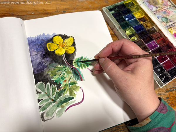
I started the drawing without any pencil sketching, going straight in with watercolors. For the main flower, I followed one of my photos quite closely, but after that, I let go and worked more freely.
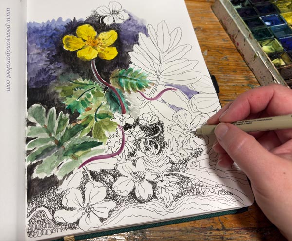
I think the soft feel of watercolors and the precision of fineliners go together so well. I just love drawing with thin pens.
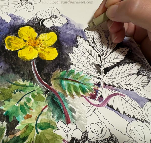
Using only a little water with thin brushes makes me feel like I am a decorative painter in the 18th or 19th century! I also made some notes about the plant on the opposite page.
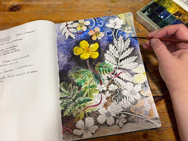
Having the black-and-white parts on the page didn’t bother me at all, so I actually thought about leaving the page like that—half black-and-white.
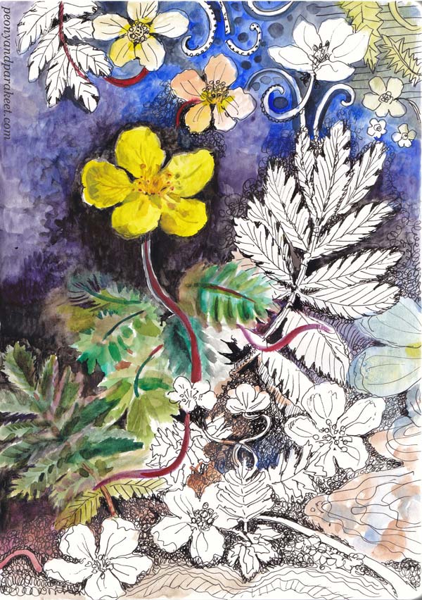
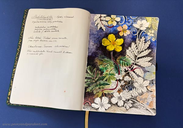
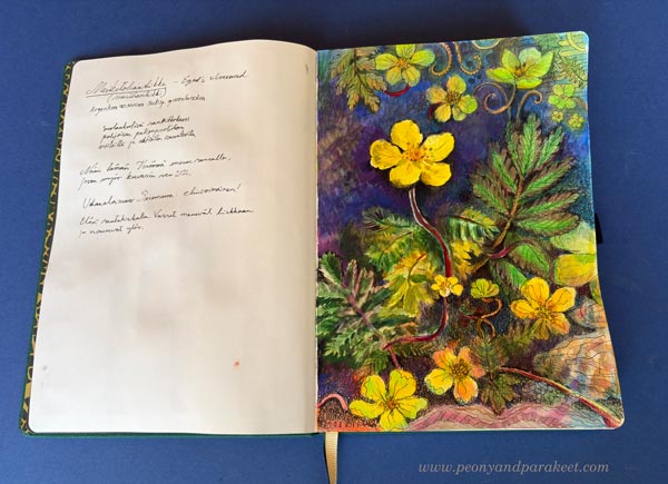
The next day, however, I decided to color in the black-and-white parts with colored pencils to bring more life and atmosphere into the drawing. It didn’t even take long, since the drawing itself and part of the coloring were already done.
Starting a New Notebook – Watch the Video!
I recorded a few short videos while working. In the video below, you can see the notebook and how the first page came together. You’ll also see the watercolor swatch grid I made at the front of the book.
Even if the starting point is botanical, the finished drawing can be expressive rather than stiff. I hope all of this inspires you to draw more, and maybe you are starting a new sketchbook/art journal too!
For the Love of Drawing
Don’t forget to sign up for the new course Drawing Soulfully! In the short video below, I talk a bit more about the love for drawing and what the course is all about.
Drawing Soulfully – Sign Up Now!
In Drawing Soulfully, we work with and without photos but always with a creative approach.
Drawing Soulfully begins on August 25, 2026. >> Sign Up Now!
Layered Painting – The Many Details of Golden
Layers make a painting. My newest layered painting, Golden, is surprisingly a rebirth of an older piece of mine.
From Gossamer to Golden
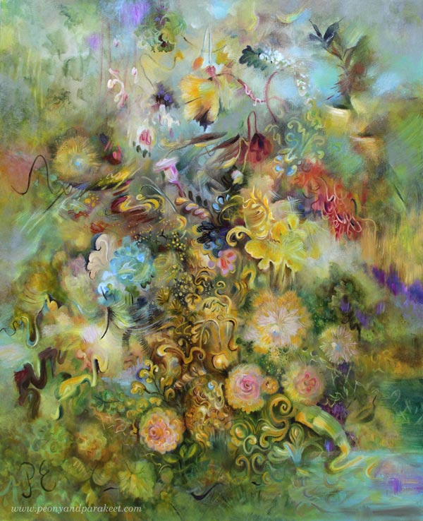
The painting behind Golden was Gossamer.
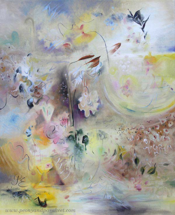
Gossamer started as a test. I wanted to see if I could finish a painting in one go and with a more minimalist, modern style. I thought it turned out pretty nice.
But after looking at Gossamer for a while – especially the top-right corner – ideas started flowing. A beautiful tulip bloomed in my front yard. I found myself missing a sold painting called Elixir. And I got hooked on the hit song Golden (specifically the version performed at the Oscars).
So, I made a promise to Gossamer: “Even though most of you will be covered up, you’re going to be reborn as something even better.”
I bet Gossamer had its doubts at this point!
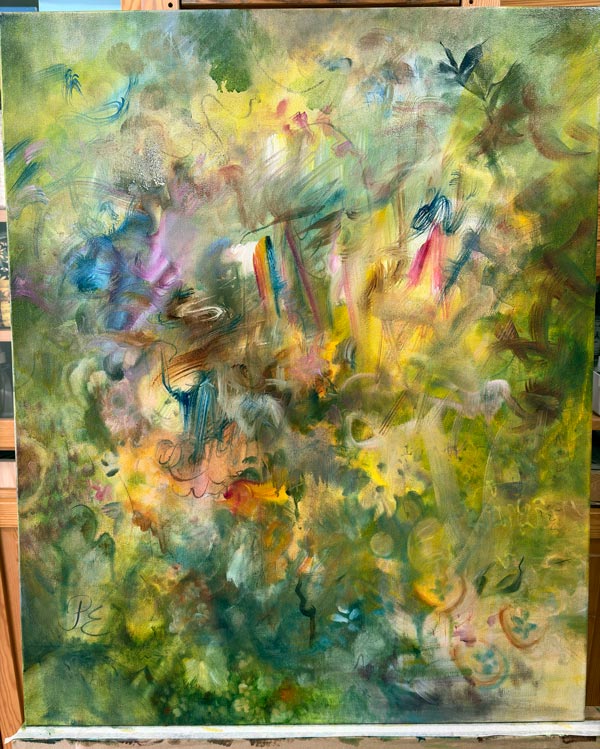
Layered Painting
Here’s a short video of one of the painting sessions in May.
It took almost three months, but layer by layer and detail by detail, Golden appeared.
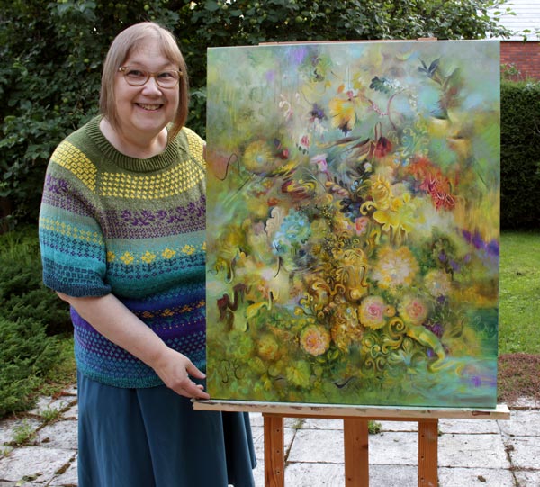
Here are some photos of the finished details.
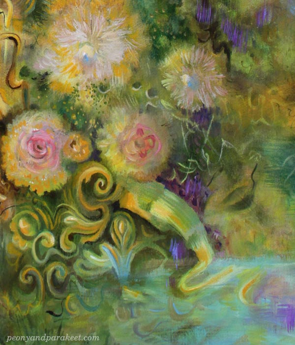
I like to use a lot of lines when I paint.
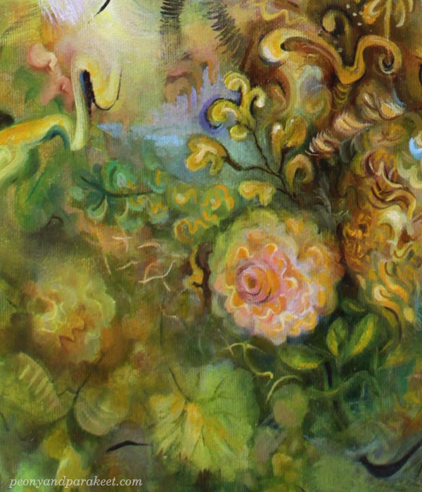
The secret of easy layering: Any blurry spot looks sharp when there are lines on top.
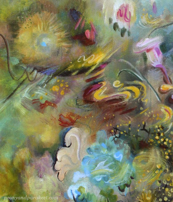
Drawing has improved my motoric skills so that I can easily paint all kinds of elegant shapes with a thin brush.
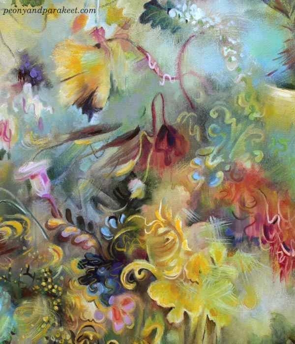
Here is a short video where you can see this layered painting even closer.
My long history of drawing influences my paintings, and Golden is no exception. I love a lively, soulful line, and all the different textures and tones you can create with it.
Drawing Soulfully – Sign Up Now!
Drawing Soulfully begins on August 25, but the early-bird sale is now on!
Get 20 EUR OFF! >> Sign Up Now!
The sale ends on July 26, 2026, at midnight PDT.