Intuitive Art Journaling
Art is more than re-coloring what we already see. This week, I talk about intuitive art journaling and inspire you to follow your spirit and create more freely.
Even if we continuously grow our skills as artists, the joy of art-making disappears if we use too much reasoning. It’s good to practice the technical skills, but it’s also important to arrange time for the intuitive ideas to emerge.
Two Words – “Intuitive Power”
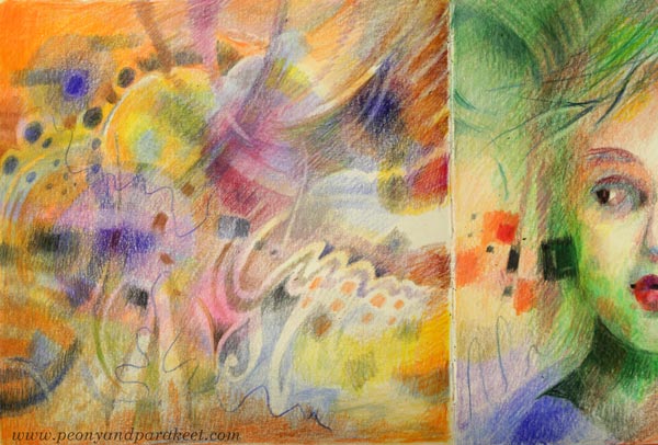
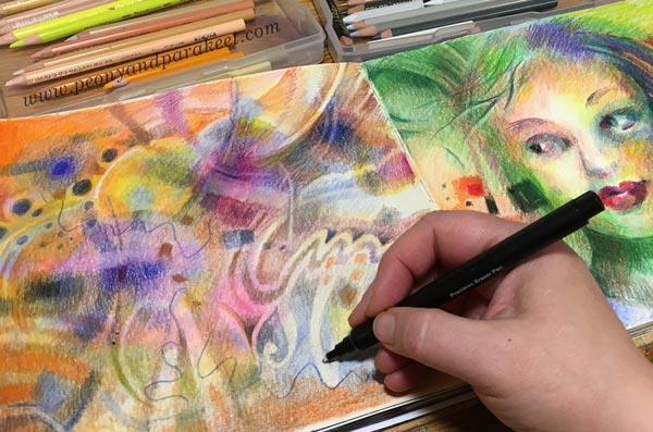
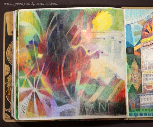
“Intuitive power” – these words suddenly came to mind when I looked at my colored pencils recently. I have been painting a lot, and it has made me miss my colored pencils, those powerful helpers! So, while working on the last pages of my Dylusions Creative Journal, I have been spending some quality time with them.
I started with a house, but then moved on to color more freely. I wanted to catch the atmosphere of that place rather than stay in the material level, drawing windows and such.
The longer I have been an artist, the more I have wanted to work with invisible things. More than tangible things, I want to express the spirit and the complexity of the world that can’t be photographed. I want to create images that are more like keys to many questions rather than direct answers to one.
Intuitive Artist
Even if I have embraced and used the word “intuitive” for over ten years, I have now realized that it’s not just one word of the many, it’s “the word” for me. And I don’t mean to narrow myself with the word, but to expand my thinking and creating in the direction that feels natural to me.
More than a building, I want to visualize the spirit of the place – the sensations that it causes in me.
More than a face, I want to visualize the spirit of the person.
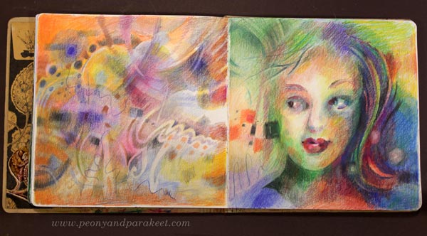
Art Journaling Without Words
Rather than words, intuitive insights can come up as pictures. So, intuitive art journaling can be as simple as creating a series of drawings. The connection with a certain color can be enough to get started.
Color is a hole, and if you jump in, you enter the immaterial world. Colored pencils are the easiest tools for breaking the ice between the inner and outer.
“Intuitive power” – what do these words evoke in you?
Making The Art Journal More Magical
I have been working on my square-sized art journal again. This week, I share a couple of magical art journal projects that include hand-drawn collage pieces.
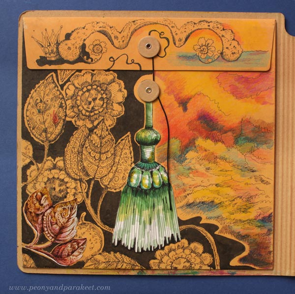
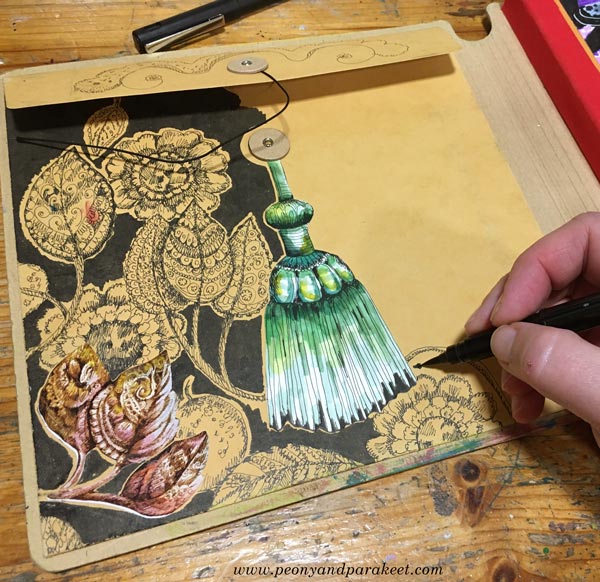
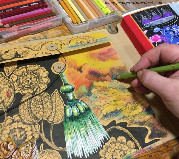
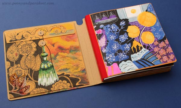
My journal is Dylusions Creative Journal. The first project is the decoration of the pocket envelope that’s on the backside of the front cover.
The Magical Mindset for Art Journaling
My journal is almost full, but I have decided not to hurry with the last pages. Recently, I have started to think that using what I have is better for me. That if I rush with the last pages and buy a new journal, it’s not as good as if I slow down and fully honor those few blank pages. You could call this a magical mindset because it makes you appreciate what you already have: skills, little drawings, time, blank paper.
With the magical mindset, you don’t just look forward and think what you could have. Instead, you look back and focus on how you can take the old to the next level.
So, I went to my boxes of joy – the boxes that store my handdrawn collage pieces – and picked a set of leaves from a few years ago and glued it on the envelope. The leaves are a print and smaller than the original drawing. I love some of my handdrawn pieces so much that I have scanned and made prints of them.
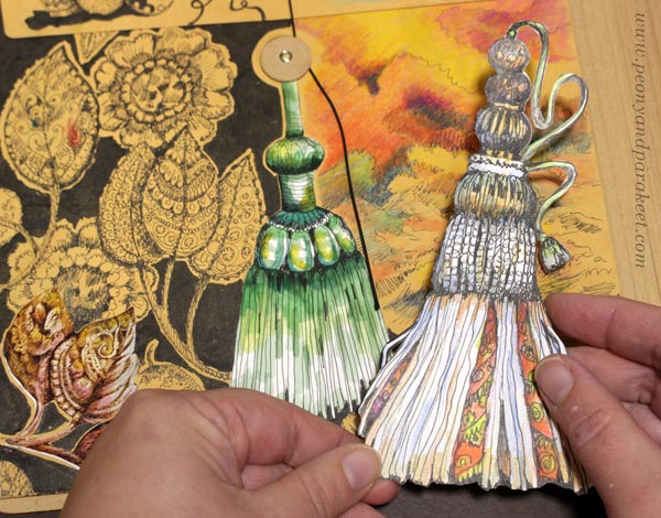
I drew some more leaves and then glued the tassel which is an original drawing too. The tassel divides the image in two parts. I drew and colored a seascape on the right side of the tassel.
I love the oldfashioned and luxurious look of the envelope now. The inside cover was made earlier with markers.
I had two tassels to choose from. I love them both.
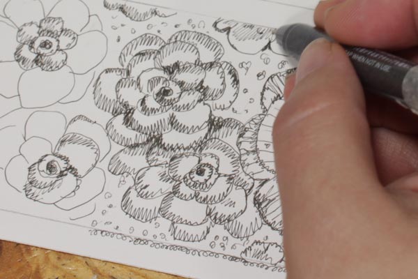
Magical Stripes on Art Journal Page
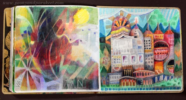
The second project is a page with hand-drawn collage pieces. The idea here is to draw stripes and then decorate them. I made my page so that some of the decorations extend over the stripes.
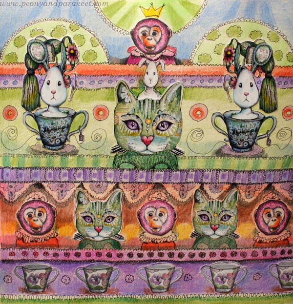
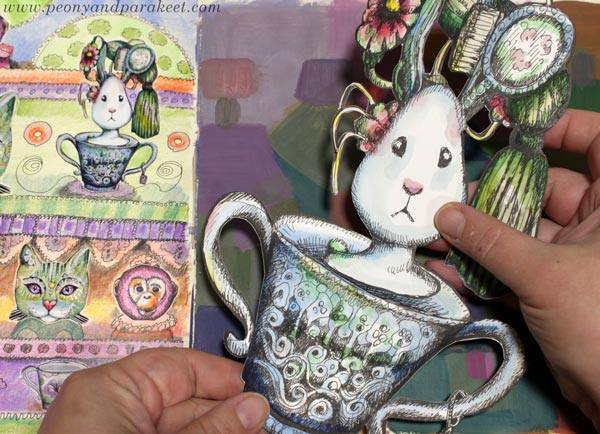
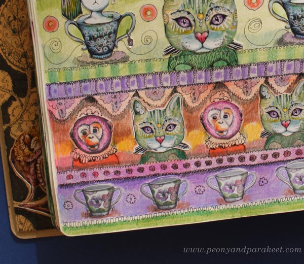
The teacups, the heads of the cats, monkeys and rabbits are prints made from bigger hand-drawn pieces. The rest is drawn with a black drawing pen and colored with colored pencils.
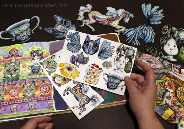
Here you can see the print sheets that I have made for myself and the original drawings. These are all drawn for the courses Magical Inkdom and Animal Inkdom. I had so much fun making these courses. The details are magical and I think the stripy page became magical too.
The rabbit and the teacup are two separate pieces.
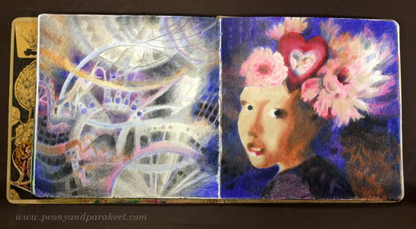
I have randomly created on the pages over the years. The page on the right is painted and very different in style, but I think these are just layers of time. Like home, an art journal can have some old pieces, some newer ones, and some that connect all the years. I started my journal in 2020.
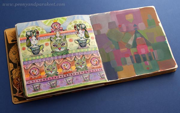
The abstract house could be the place where this magical tea party happens.
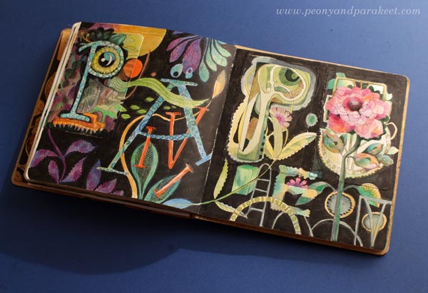
Magical Letters
In the previous blog post “Mini Drawings on Art Journal Pages“, I showed a spread that was still in progress. That’s finished now. I think letters on the black background with some leaves and flowers look magical too.
I hope these projects inspired you to make your art journal more magical!
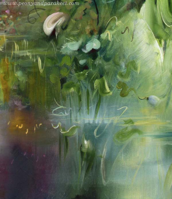
Following the Inner Color
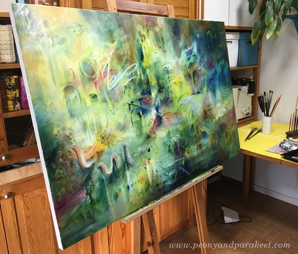
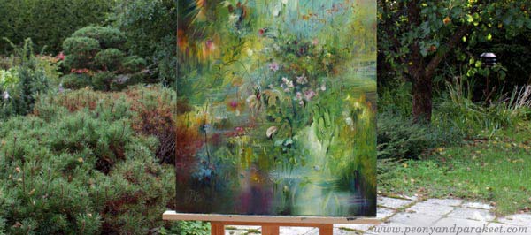
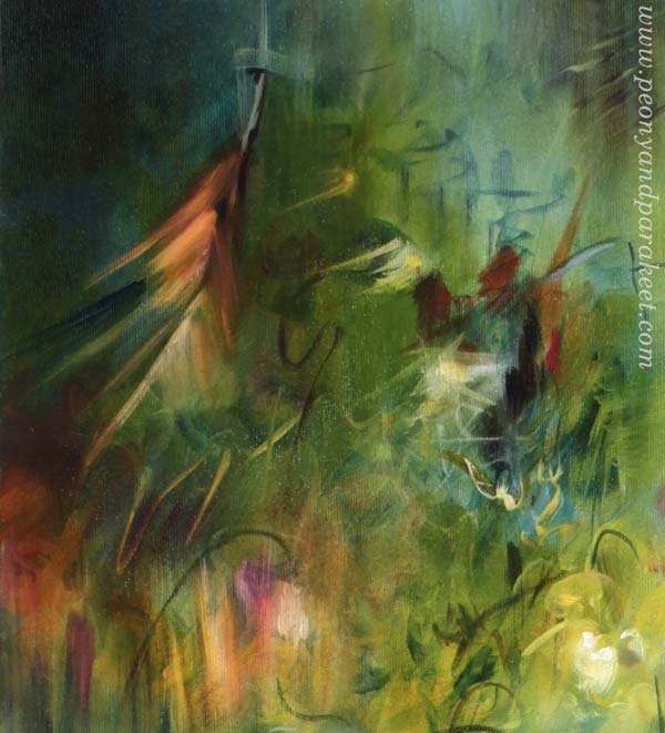
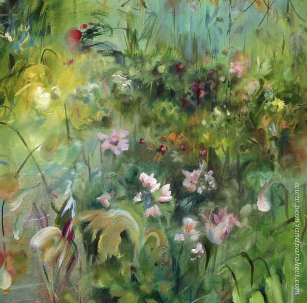
Here is my latest completed oil painting “Elixir.” I start my abstract paintings with the idea that I follow an inner color.
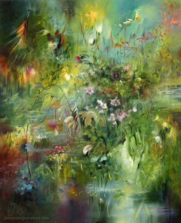
Color Chooses Color
The inner color is the color I feel drawn to, so I tend to pick and mix the first colors intuitively. And then, they wish for other colors to accompany them.
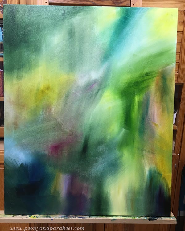
Colors also evoke shapes, and the shapes bring in more colors. A raw and bright color selection changes slowly to a more sophisticated one. In this color-driven technique, the inner color changes as the painting matures.
I try to give my painting enough time to find its own soul and paint several sessions, letting the paint dry between them.
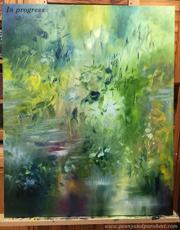
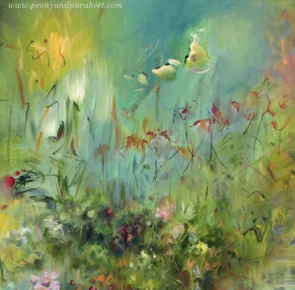
First a Child, Then a Teenager
When the painting is only a child, I don’t care about the composition or what it will represent. I don’t want to force a short childhood or early adolescence. When puberty begins, it’s tempting to call the painting finished. But only then does she begin to find her own, unique mission and get prepared for a long life.
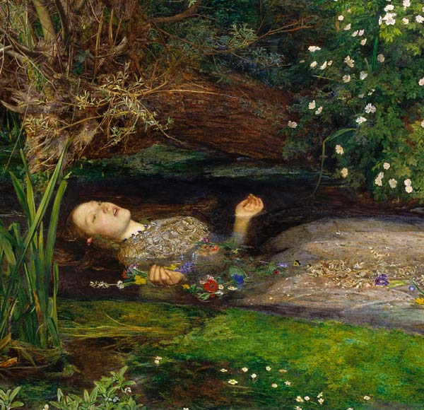
Teenagers often tell how they want to be called. When this painting was still unfinished, she was Ophelia because she saw herself as John Everett Millais’s painting from the 19th century.
I usually give the final name only when the painting is almost finished. Then I know what I want to emphasize with the name. Maybe we humans should get our final name a little later too?
Early Goodbye
I take pictures of my canvas paintings outside if possible, because that’s where the light is most natural. My husband often acts as my assistant and holds the painting against the wind. Most of the time, I end the photoshoot by saying to him, “Hey, come take a picture of us together!”
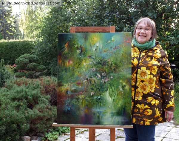
Since I sell all my paintings, this is the moment when I’m saying a mental goodbye to them. I assure them: “You’ll be fine. Everything’s going to be fine.” Even though I often miss my paintings, I don’t tell them. I feel like their mission is bigger than mine, and my job is to deliver all this for others, not for myself.
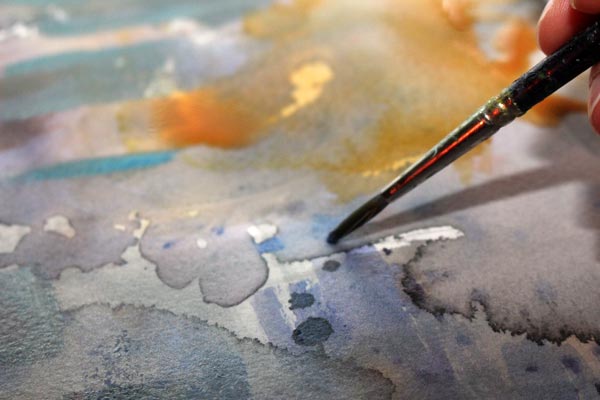
I have practiced most of my oil painting techniques in a quicker medium, so in watercolor!
Wild Garden – You Can Still Hop in!
In Wild Garden, we will paint freely, intuitively, and expressively in watercolor from Sept 22 to Nov 14. We will begin with floral greeting cards and gradually move forward in expression.
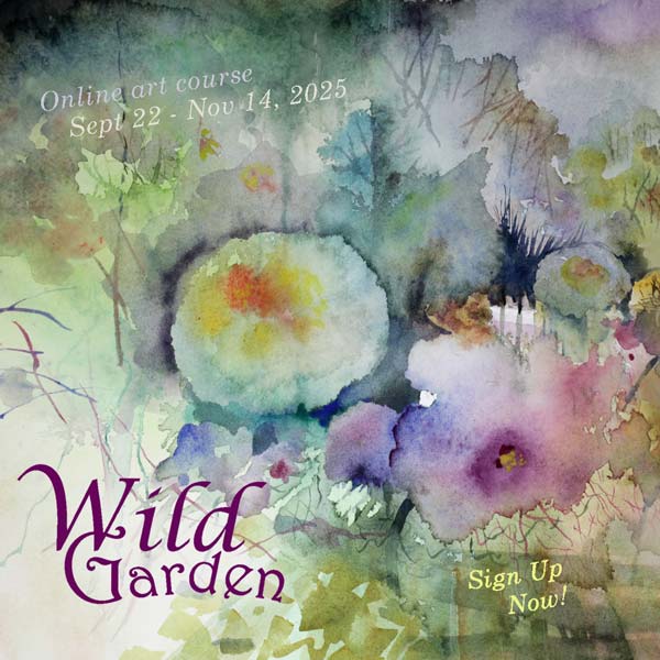
The course has just started but you can still hop in!
>> Sign up now!
How Realistic Should Your Art Be?
In this post, I divide visual art into two parts. The division is a bit extreme, but it helps us to ponder about this: How realistic should my art be?
Realistic or Abstract?
Realistic expression emphasizes drawing, while abstract work more often emphasizes painting.
When we draw realistically, we express things through the external world.
When we paint abstract, we use shapes and colors more freely so the tools for expression come from the inner world.
Realistic art can still express the inner world and abstract art the outer world – it is more about the means than the actual content.
It’s good to alternate between the realistic and the abstract approaches, even if one of them would feel more natural. Here’s why:
Two Extremes – Same Result
First, imagine a person who only draws representational pictures.
The danger is that the longer she continues on this path, the narrower her perception of reality becomes. All the leaves are green, the roads are brown, and the flowers are red and yellow. Everything is outlined with a pen, and the outlined shapes are then colored. When she creates freely without references, her shapes become more and more similar to each other. There is only one kind of leaves and the flowers are always drawn in the same way. When she repeats the same thing long enough, the expression gets narrower and narrower.
The person wonders why drawing no longer brings excitement and joy, even though she actually draws exactly what feels most natural to her.
Second, imagine a person who only paints abstract.
The danger is that the longer she continues on this path, the narrower her perception of reality becomes. The person begins to repeat a very limited number of shapes and colors without realizing it. All the spots are vague and quite the same size. The person begins to wonder if her output is something really fine and profound or just a random mess. Her motoric skills and the use of colors fall short because she does not really have a reference point: after all, she is only painting the stream of consciousness.
The person wonders why painting no longer brings excitement and joy, even though she actually paints exactly what feels most natural to her.
Creative Block
They say that there are only two ways to live your life. One is as though nothing is a miracle. The other is as though everything is a miracle.
The two imaginary people have the same problem: their art no longer have miracles. They have stayed in their current comfort zone for too long.
How to Move Forward?
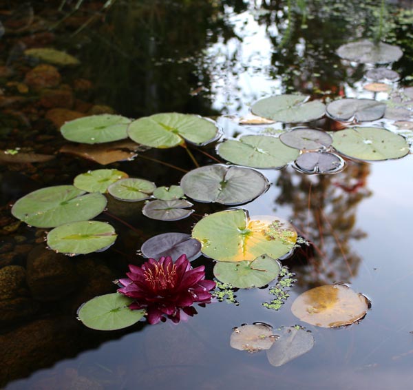
In this photo, you can see both abstract and representational elements; there’s very little division.
Ask, what is truly real?
- How do light and shadows express the object?
- How abstract is the nature of light? Look for motifs and patterns created by light.
- How light, on the one hand, blurs the boundaries of objects and, on the other hand, highlights details?
- How multi-colored nature is? Even a piece of grass contains a huge number of tones.
- Develop your eye and hand to embrace subtle diversity! Simple leaves or circles don’t express it.
Wassily Kandinsky has said:
“The observer must learn to look at the picture as a graphic representation of a mood and not as a representation of objects. “
Learning New Things Keeps the Artist in You Alive
It’s good that, from time to time art-making involves discomfort, questioning, and wondering about reality from strange perspectives. And when art starts to take you away from yourself, that’s not a bad thing either. Once you open up to what feels silly, scary, and not allowed, you’ll find that you’re closer to yourself and to humanity than ever before.
So, how realistic should your art be?
More realistic than what you currently create.
Pablo Picasso has said:
There is no abstract art. You must always start with something. Afterward you can remove all traces of reality.
Wild Garden – You Can Still Hop in!
In Wild Garden, we will paint freely, intuitively, and expressively from Sept 22 to Nov 14. We will begin with floral greeting cards and gradually move forward in expression.
The course has just started but you can still hop in!
>> Sign up now!