Begin Like a Crafter, Finish Like an Artist
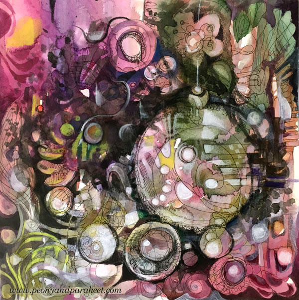
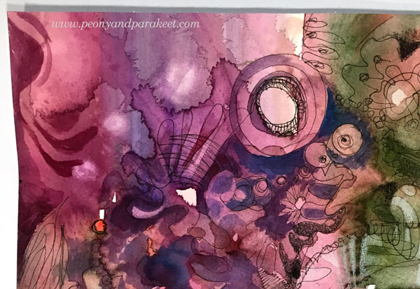
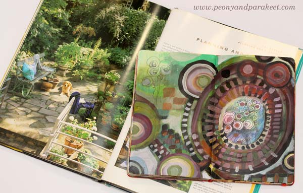
Here’s what I made today: a mixed media painting with a Christmas theme. When I began creating, I had no idea that this will express the season. I didn’t even start with a blank paper but cut a piece of a big pre-painted watercolor paper. It had just careless splotches of color, and I had painted it months before to wait for the right moment. I had just enjoyed knitting some old sock yarn into socks, so I thought to use up that paper with the same mindset: using what I already have and making that more inspirational.
Begin Like a Crafter
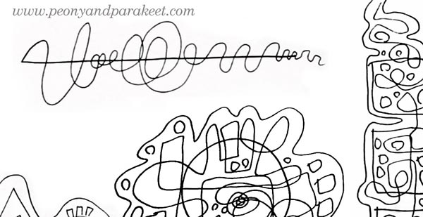
I picked a black Zig drawing pen and started doodling without any idea in my mind. I often think about knitting or crocheting when I doodle. I feel more like a crafter than an artist at the beginning of the process. Exploring the paper with a pen is like crocheting with a hook and yarn. It’s much more relaxing than trying to find a grand idea first. When you start as a crafter, you are ready to do the work. You don’t expect miracles to happen, you know you just have to keep on going, and it will get easier after a while.

After filling most of the paper with crossing lines, I felt that there was a lack of connection between the drawing and the background painting. They looked like they were two separate layers, each made by a different person. But because I had used a good quality watercolor paper, I was able to add water and wipe off color here and there so that the layers began to interact.
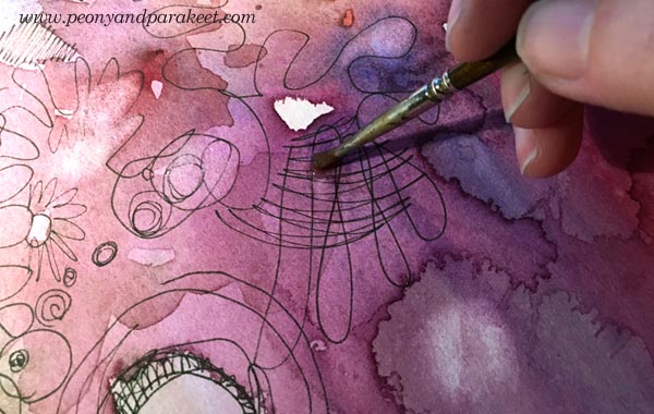
Again, I felt like a crafter adding stitches that would tie the two layers together. I also used white and black colored pencils to enhance the effect.
Find Routines that Start the Change
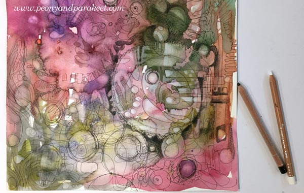
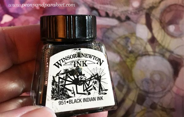
Working with black is my thing. It always brings in more excitement, more drama, and my identity begins to change from a crafter to an artist. This time, just holding a black pencil, made me want to start painting. I picked few bottles of India ink first.
My brush felt stiff, and the shapes that I painted were controlled and modest. But I knew I just had to keep going. There were times when I stopped too soon, and I have seen that happening to many people too. When you stop too soon, you are still too much of a crafter. You try to focus, and you don’t feel like doing anything risky.
I changed to white acrylic paint to get more ideas and contrasts. There were some round shapes on the paper, but I had no idea what they could be.

Finish Like an Artist – a) Do Something Risky
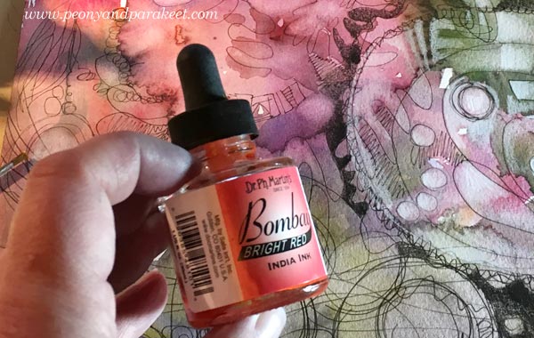
After spending some time painting, I was ready to take risks. All I needed was to choose a little black ink bottle and turn on Jean-Michel Jarre’s Stardust, a song that always gets me into the flow. Uncontrollable black brush strokes felt scary, and of course, there’s a risk of “ruining everything”. I often set an area, where I don’t go. This time I decided to be as wild as I want but leave the center of the biggest bubble alone.
Before doing this phase, I convince myself that my subconscious knows what I could bring up from the mess because I have been staring that for a while already. I often repeat the words “trust” and “knowledge” before I turn to the music. I try to be as quick as I can and focus on adding more speed to my brush. This short phase where I leave the crafter behind is the most enjoyable thing in creating. I feel free while pushing the limits of my creativity.
Finish Like an Artist – b) Bring in the Intention
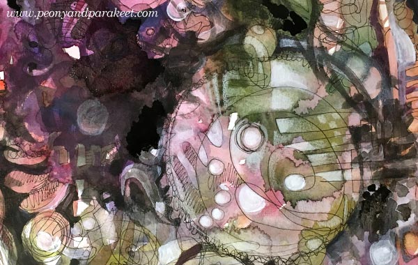
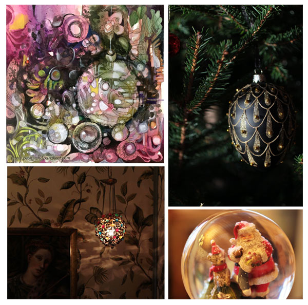
After adding those black strokes and splotches, I knew what I was expressing: holiday decorations on this black Christmas. In the southern Finland where I live, all the snow melt away just before Christmas Eve. I had taken photos just a couple of days ago that connect well with the painting. In this last phase, I try to find the fastest and most natural route to finishing the painting and focus more on composition and clarity than trying to make the image other than what it seems to be already. Accepting that my image can go to the area that is unknown to me at the beginning of the process, allows me to be less stiff.
I find it so fascinating that art is a combination of knowledge and letting go. There are clear guidelines for communicating visually such as how to set your composition. And still, it’s also about taking all that knowledge and jumping into the unknown. Every day, I want to know more and then, relax more!

First Lesson of Inspirational Drawing 2.0 – Start with a Mood, Finish with an Image!
Like knitting starts from the first stitch, drawing starts from the first line. Somewhere between the lines the transformation happens and the crafter changes to an artist. The ideas grow with the imagination. Moods turn to motifs, motifs to modules, modules to streams, streams to images.
The first lesson of Inspirational Drawing 2.0 will be published on January 1st. This is the class you don’t want to miss! Every lesson takes you further in enjoying drawing from inspiration and imagination! I will help you create unique art in unique ways that will make you absorb the knowledge and then let your ideas grow.
Enjoy drawing from inspiration and imagination!
>> Sign up for Inspirational Drawing 2.0
Pointillism – A Quick Way, Step by Step!
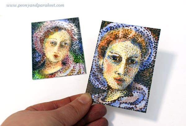
I am honored to be one of the guest artists in Documented Life Project this month. I was given a theme (pointillism) and a project type (artist trading card, ATC). As long as I followed those, I could do anything with any supplies. These kind of challenges are fun because you get such enough restrictions to get started but can still create freely. However, I have one fixation with artistic trading cards. I like them to be portraits, either humans or animals.(See ATCs in this post, for example!) So I chose a very traditional subject, women from the past.
Pointillism Can Be Tedious!
Like most of us, I have always admired Georges Seurat‘s paintings. In the 1980s, a Finnish illustrator made images that were composed of small points. It might have been an artist called Osmo Omenamäki. As a teenager, inspired by him and Seurat, I decided to be a pointillist artist too. I picked my felt-tipped pens and started to draw dots. Oh my! I was barely able to finish a postcard size drawing. I couldn’t believe how many small dots are needed to fill even a small blank area! I was almost traumatized by that experience!
So now, over 30 years later, I didn’t even think about creating the project with felt-tipped pens only. ATCs are small, but not that small! However, with felt-tipped pens, it is easy to make intentional tiny dots in a variety of colors. But I also needed something else to make the coloring faster. Colored pencils leave the spots visible, and they are easy to control. So I chose them to fill the blanks between the dots.
Practicing – Spots with Many Colors
Before the actual project, I practiced my ideas. I made the dots using a variety of colors and then added more colors with colored pencils.

Because the colors in dots weren’t as important as coloring with colored pencils, I got an idea of using brown shades only. It would be like an underpainting, a technique that old masters often used in portraits. They painted shadows with umber and then applied the rest of the colors so that the shadows showed through. So I will show you how you can do a similar kind of “under-dotting” and then apply the actual colors with colored pencils!
1) Under-Dotting with Felt-Tipped Pens
You will need four shades of felt-tipped pens for this step. I use Faber-Castell PITT Artist Pens in colors “Light Flesh”, “Green Gold”, “Raw Umber” and “Caput Mortuum”. I didn’t use any model like a photo but just created intuitively, making the features more accurate color by color.
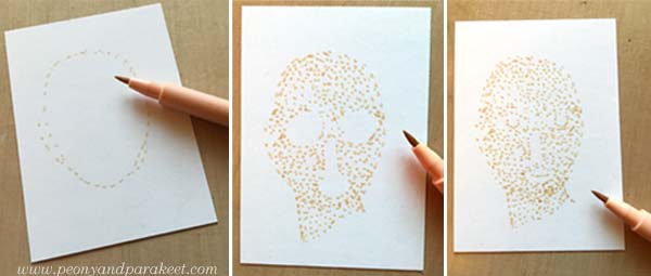
With the palest of color, sketch an oval using small dots. The liberating thing here is that when you start with a pale color and make little dots, you can make many “mistakes” and correct them as you go. One spot in a wrong place can be easily changed! Fill the oval with dots so that you leave blank space where you plan mouth, eyes, and nose to be. When they seem to be in place, add some dots for details. Don’t worry if your woman looks pretty ugly. This is just the first layer!
Change to darker shades and add shadows to the face. Then sketch the hair and clothes using little dots only.
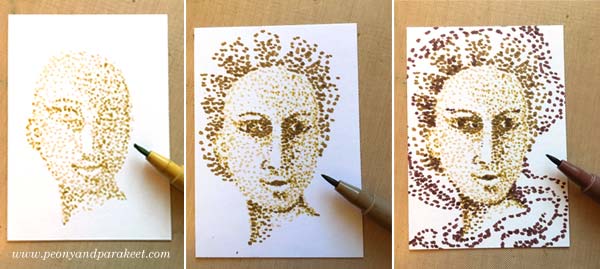
Every shade adds a little bit more to the image.
2) Basic Coloring with Black and Colored Pencils
Now add black spots to the darkest of details. Old portraits often had a dark background, so I added black spots there too.
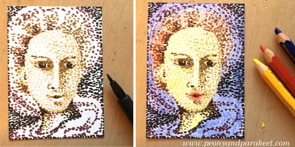
Using colored pencils, color the card so that white shows only where you want to have it in the end. I used Caran d’Ache Pablo pencils in blue, red and yellow. Remember that you can mix colors by layering. You can get many beautiful tones from the primary colors.
3) More Liveliness with Colored Pencils
Finally, add shadows so that the details look 3-dimensional. If you only have primary colors like I had, you can get a dark background by adding blue, red and yellow layers there. If your portrait looks too dark, use an eraser to lighten and soften the colors.
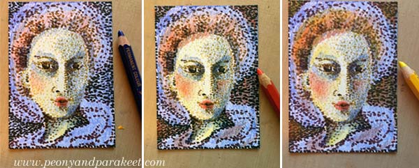
In the end, check the facial features of your woman. Add small lines where you want to turn the attention. Don’t draw the lines near the nose but on the lips and the eyes.
Celebrating Blurriness
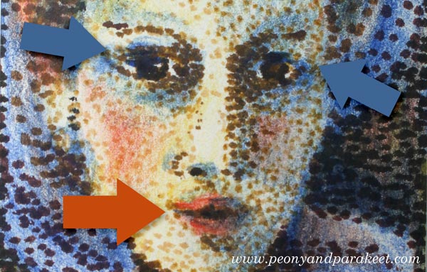
Here are my finished cards again. I think they look delightfully blurry!
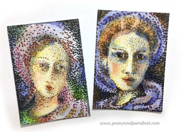
The more I want to reduce stiffness in my art, the more I feel the need to embrace blurriness. With blurriness, I also feel more self-acceptance, more ease with errors, more open to possibilities.
Reducing stiffness is one of the main themes in my newest class too. The class is called Inspirational Drawing 2.0 and it’s about drawing from imagination and inspiration. Watch the introductory video below!
Inspirational Drawing 2.0: Liberate your line and sign up now!
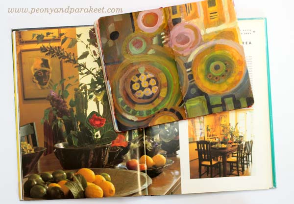
Using Color Schemes from Home Decor
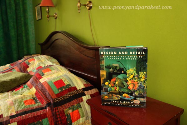
In the early 1990s, I bought an interior design book from the UK. It’s called “Design and Detail” and it’s written by a famous designer Tricia Guild. She was not as well-known as she currently is back then, and I hadn’t known her before I saw the book.
Creating Art by Using Color Schemes from Home Decor
I felt drawn to the interior color schemes and the decorating style presented in Tricia Guild’s book. Never before had I felt such a strong appeal to home decor. I knew I liked to be surrounded by strong colors, but I had never seen them used in such a powerful way. Since then, my every home has had elements and spaces inspired by the book. Whether I lived in a small single room as a student, in a flat or a house, I have always browsed the book when I’ve needed inspiration for interior color schemes.
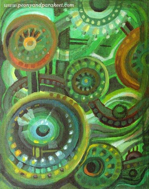
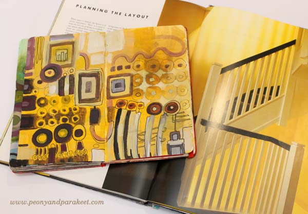
Last week, I saw a picture that had one of the color selections that are presented in “Design and Detail.” It was the combination of green and black including a little bit off-white, yellow and muted orange-red. We already have that color scheme in our bedroom but at that moment, I wanted to play with those colors again. So I started a painting that has green and black and followed the instructions from my upcoming class Planet Color!
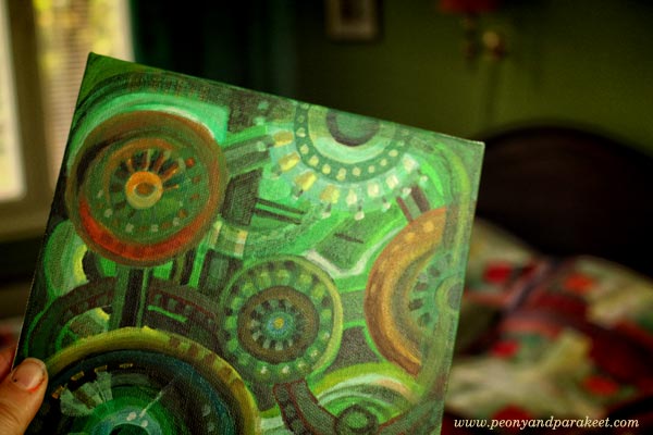
Once it was finished, I painted more interior color schemes from the book. Again, I used the 7-step method from Planet Color. I had so much fun creating these!
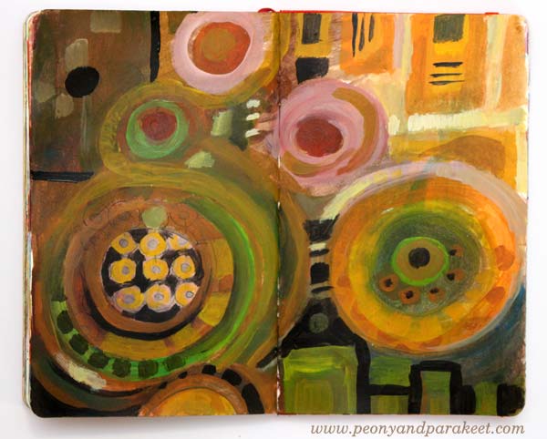
Warm and Inviting Colors
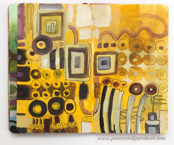
The dining area in Tricia Guild’s book looks very cozy. The striking combination of yellow and black is balanced with earthy colors and then brightened with a few warm, bright spots.
My art journal spread is inspired by the flowers and vases. It also plays with angled and round shapes as seen in the dining room.
Whites and Neutrals
I am definitely out of my comfort zone when using pale colors in larger quantities whether it’s creating art or home decor. But I wanted to try to get inspired by Tricia’s master bathroom. It was surprisingly easy when I focused on expressing the textures shown in the photo. The narrow color scheme also made me focus on adjusting the colors only slightly.
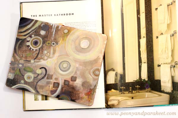
It is surprising how many tones can be created from a very restricted color palette. I also quite like the red/orange spot on the right and how it balances the upper left corner. When using neutral colors, even the smallest colorful detail can make a difference.
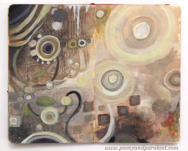
Many Shades of Yellow
I had a bedroom that had quite a lot of warm yellows when I was a child. But before “Design and Detail,” I never thought I could have bright yellow walls. But during the years, I fell in love with the warm yellow shade that I call “Tricia Guild’s yellow.”
In the art journal spread, I played with various shades but six years ago, when we moved to our current house, I wanted to have that particular “Tricia Guild’s yellow” on a wall.
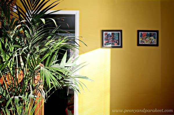
Even if there were tens of yellows available as paint, “Tricia Guild’s yellow” wasn’t found in the color charts. I thought people must think I am mad being surrounded by all the yellows and shaking my head. Then I just picked one that was closest and we started painting. But it wasn’t the right shade and after one layer, it felt too warm. After carefully analyzing the yellow in the book and comparing it with the wall, I decided to add warm black to adjust the tone. And so we got “Tricia Guild’s yellow”, just the perfect tone on the wall!
This story shows how many colors there are in the world and how little you experiment with if you are using only ready-made colors. Start mixing your colors! It is a reason why I built Planet Color, my color-oriented workshop!
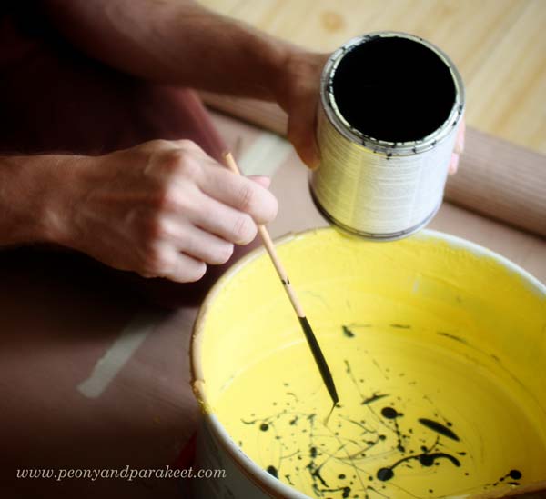
Colors from Potted Garden Using Leftover Paint
After creating so many paintings, I ended up having some leftover paint on the palette. I decided to use the paint by getting inspired by exteriors too.
Expressing a potted garden with circles is easy. Angular tiles are also easy to add to the picture.

Sign up for Planet Color!
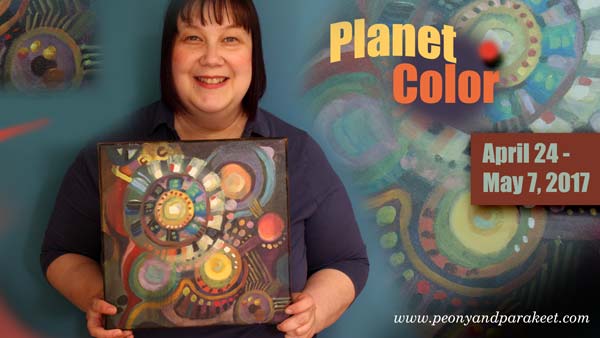
Take your favorite interior design book, or Pinterest board, or any source that inspires you with color, and sign up for Planet Color! I’ll show you how to experiment with colors so that your painting is more than just a selection of color samples. I’ll show how you can make colors interact and how to enjoy adding more instead of just making a mess! And if you are more of a minimalist, you can omit some steps of the process and create a simple yet eye-catching painting! Reserve your spot now!
Tribute to Georgia O’Keeffe

When walking the dogs, I wondered what could I take with me for the next painting. I saw a fallen oak leaf and felt a bit melancholic; it’s time to say goodbye to summer. Then I did exactly what Georgia O’Keeffe, an American artist (1887-1986), would have done: I picked up the leaf and once got home I painted it! Here’s how I got to know more about her and her painting style.
Portrait of an Artist: A Biography of Georgia O’Keeffe
When so many of the participants of Imagine Monthly, my monthly art journaling class, named Georgia O’Keeffe as a favorite artist, my project during the summer was to get to know her better. I only knew that she had painted large flower paintings and some abstracts. But I didn’t know anything specific about her background and about her way of working. So I purchased a book about her life. It’s written by Laurie Lisle, and it’s called “Portrait of an Artist: A Biography of Georgia O’Keeffe.” I bought an audio version so I could listen to it while I paint. I don’t recommend the book to anyone who wants to read an entertaining novel. I think it’s more like a historical study. But for anyone, who wants to learn the facts, it’s excellent.
Georgia O’Keeffe’s Mindset
There are two things that I have thought a lot after reading the book. First is Georgia O’Keeffe’s personality. Apparently, she was not a very social person and quite straightforward in her sayings. Second is how her photographer husband supported her both by being her manager and her muse. I don’t think Georgia would have discovered her painting style without the discussions with her husband related to photography. These two facts make me believe that her mindset was very analytical. Even if she was a visual artist, she also was a scientist in her closed personal world. She examined plants like they were scientific specimens. It was like she could measure beauty and then create a new version of it. The more I listened to her life story, the more fascinated I became about her.
Those who live in the UK or are visiting the UK: There’s a big exhibition of Georgia O’Keeffe at Tate Modern until October 30!
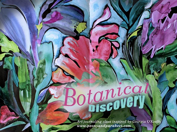
Botanical Discovery – Create Unique Collage Art!
As a part of Imagine Monthly Fall 2016, I have published a class where you can create botanical art inspired by Georgia O’Keeffe. It has directions on how to cut organic shapes from watercolored papers and build a painted collage out of them. Sign up for Imagine Monthly and get this class immediately after registration!
Painting an Oak Leaf – Watch the video!
The oak leaf shown at the beginning of the page is an acrylic painting on an art journal. I made it as a tribute to Georgia O’Keeffe and recorded a short video of the process. In the video you see me painting with a broad brush and flowing strokes. This is one of the techniques that I’ll show more in depth in my upcoming workshop Nature in Your Mind. I hope to see you there too!
Create collage art inspired by Georgia O’Keeffe:
>> Buy Art Journaling Bundle 2!