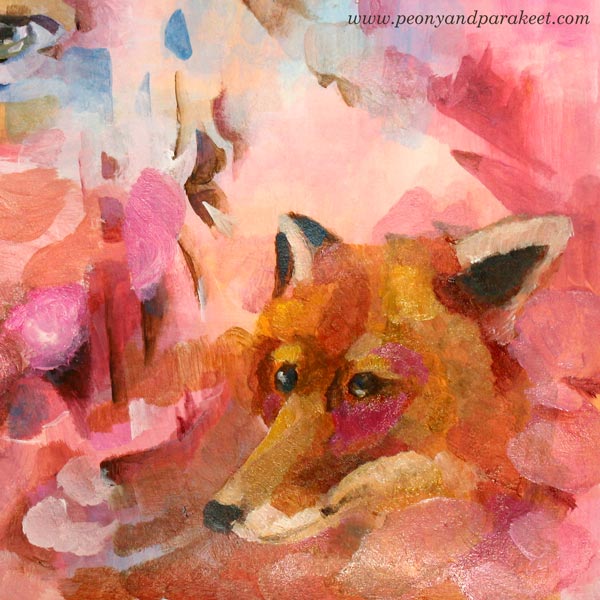
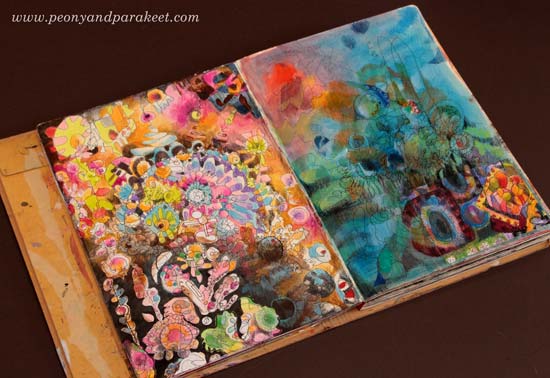
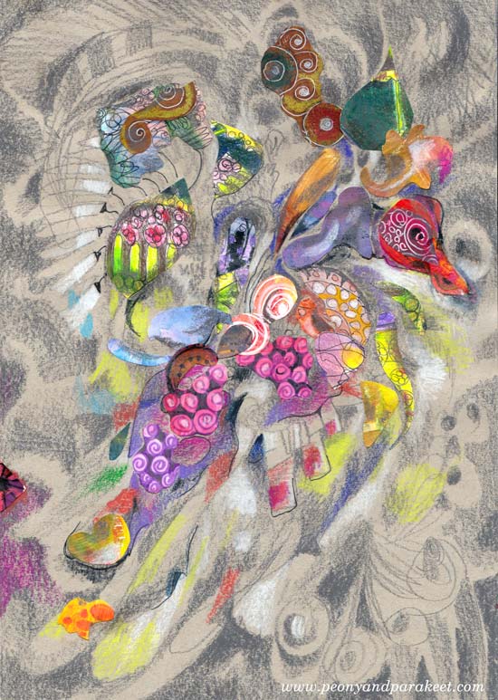
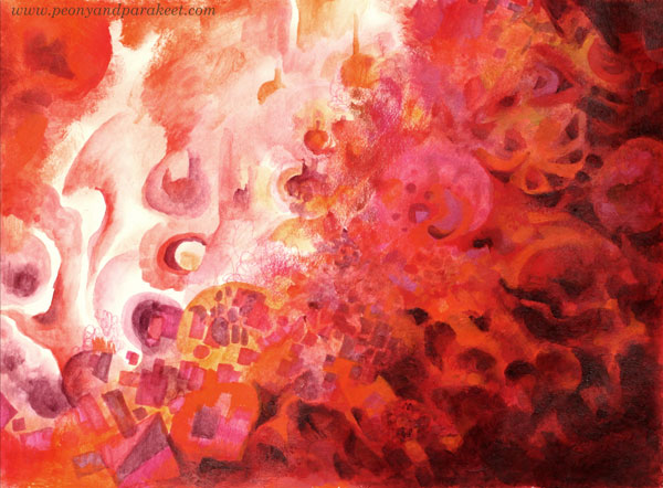
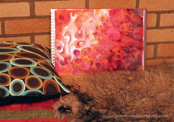
Expressing Mystery – Self-Portrait as a Fox
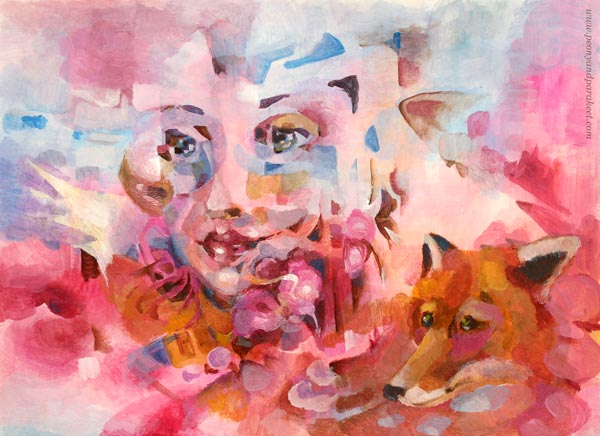
In my latest webinar, I showed some unconventional ways to make portraits. This week, I show how to build the sense of mystery for a portrait. Here’s my sample project, an acrylic painting that I made on a sketchbook. It’s called “Self-Portrait as a Fox.”
In Finnish, we have a saying “ketunhäntä kainalossa” – “to have a foxtail under the arm.” It means that someone tries to hide the true thoughts or goals, and you are noticing it. So it’s like a mystery that’s partly revealed without intention to do so. When building a mystery for the portraits, you somehow have to show that foxtail – to reveal a part of the mystery. Otherwise, the viewer doesn’t realize there’s any mystery at all. Think about leaving the fox out of the portrait above and just trying to express it all with the eyes. It wouldn’t have the same effect.
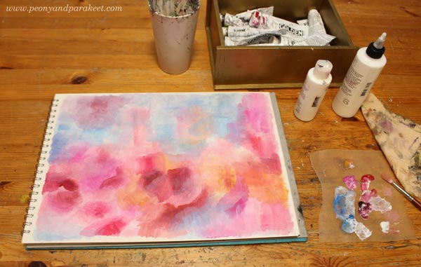
Expressing Mystery 1 – Start with a Mysterious Space
The lighting has a lot to do with mystery. Think about mysterious scenes in the movies – the light plays an important role there. Instead of trying to add spots of light after adding the face, start by painting the space where all happens.
Expressing Mystery 2 – Discover Facial Features
Once you have painted the background full of fun details, try to see a person there. You don’t have to see the whole face, but a cheek, an eye or a nose is enough. Add more facial features so that you can better see the face. Don’t outline everything. It’s a mystery, remember! The face should look like it rises from the background.
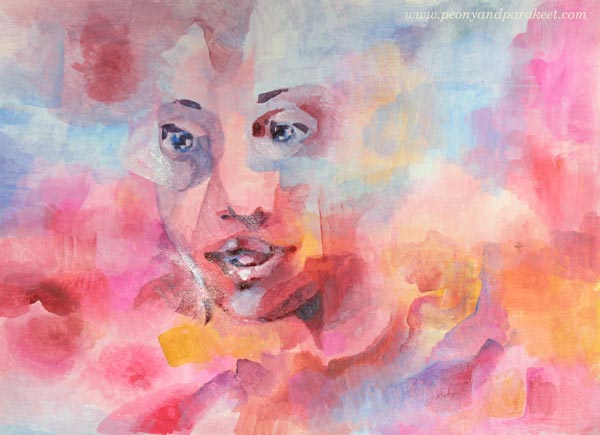
I rarely get the facial features to look mysterious enough at this point. I suggest that you don’t even bother to try. Just make it clearer where the person is. For this project, I didn’t use any reference images for the face. If you do, use the reference to get some ideas, but don’t make the face too defined.
Expressing Mystery 3 – Connect the Face and the Background Together
Now add more elements to the background. Add geometric shapes to outline hair and to dig out other interesting stuff. You don’t have to know the mystery yet. Keep the process mysterious enough!

To me, it usually happens that if I don’t know the mystery, I don’t have the idea of the facial expression either. I covered the mouth so that I don’t focus too much on that. Working with acrylics is easy because you can always add new layers.
Expressing Mystery 3 – Add Symbolic Elements
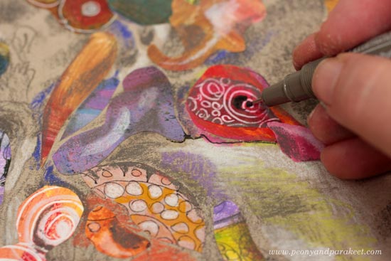
Boost the mystery by adding symbolic elements that create tension for the person. I chose a fox and a rose.
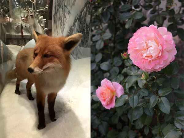
To maintain the mysterious atmosphere, I painted the fox and rose petals so that they partly disappear into the background.
If you use reference photos pick just some details that you replicate more carefully. Put the reference photos away after a while so that they don’t dictate you and reduce the mysterious feel.
Expressing Mystery 4 – Finish the Facial Features
Build connections between the elements and the face by adjusting the facial features. Think about something happening at the scene and the reaction that it embarks. Here, the woman and the fox react differently. The woman looks surprised, but the fox doesn’t. If I had continued with this setting, I would have also added the element that causes the reaction toHowever the picture.
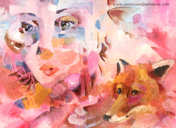
However, I was not satisfied with the idea of the woman and the fox reacting differently. So I repainted the nose and the mouth and made the face shorter so that the woman looks as conniving as the fox. Now the focus is on what they think and initiate.

Expressing Mystery 5 – Repeat Some Shapes and Colors
To make the painting more unified and to highlight the mysterious feel, add similarities between the biggest elements. I made some of the triangles resemble the fox’s ears, and continued the fox so that there’s the tail too. The tail is very similar to the woman’s hair. This kind of vagueness – when the viewer doesn’t fully see what belongs to where – also adds to the mystery.

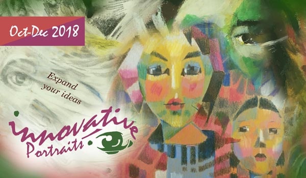
I hope you enjoyed these tips, and hopefully, I will see you at Innovative Portraits as well!
Innovative Portraits – Refresh the Way You Make Portraits!
In the new upcoming class Innovative Portraits, we will discover new paths to painting and drawing portraits. This class is about increasing artistic looseness, adding more style by using shapes and colors, and inventing ideas so that you never wonder what to put in the background. >> Sign up NOW!
Innovative Portraits includes a 3-month membership in my art community Bloom and Fly so you will also get monthly live sessions and weekly feedback Tuesdays. >> Sign up NOW!
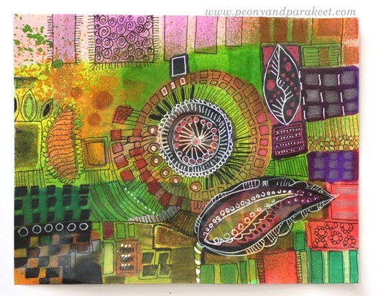
Colored Pencil Collages – Playing with Color
Fall in love with colored pencils and make the most of your paper stash! I also recommend these classes:
1) Collageland – save time and effort by creating textile-inspiration with pens and paper
2) Inspirational Drawing – for you who wants to say: “I can draw!”
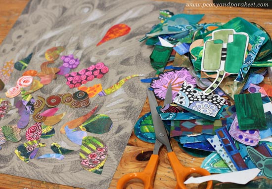
The Fun Process of Colored Pencil Collages
Here’s is an art journal page that started as a sad one. First, it only had some carelessly drawn lines. Months went by before it got some paint to accompany the doodles. After another long wait, it got some depth with colored pencils. It still looked unhappy, so I glued a piece of hand-decorated paper to cheer it up. Today, I found it again and was surprised how finished it looked.

This is often the way I make art journal pages: little by little, random lines, using up extra paint on the palette, saving a piece of paper from my stash. It’s a very unintentional process but after those finishing touches are added, it’s all good.
My Hand-Decorated Paper Stash
I have been doing this for a long time: making my collage papers and also saving the tiniest pieces. No matter what my main art projects are, there seems to always have time some scrap paper fun even if it’s sometimes just picking a small piece and gluing it on an art journal without analyzing what and why.

Colored pencils are one of my favorite supplies and I also have papers decorated with them. When I go through my paper stash, I often add some colored pencils on painted ones just to make them more valuable in my eyes. Then I also have some true treasures – papers that only have colored pencils on them. They take more time to make, and to me, they are like silk and others are more like cotton, the basic stuff.
Using Imagination with Colored Pencil Collages
When I am playing, odd is good. Paper pieces sometimes have a mind of their own, and strange results may appear! Here’s an art journal page called “Three Sisters”. It started with paper scraps but really came to life when I added colors to the background with colored pencils. See how I used many colors for the background so that it completed the composition and made the piece more cheerful.
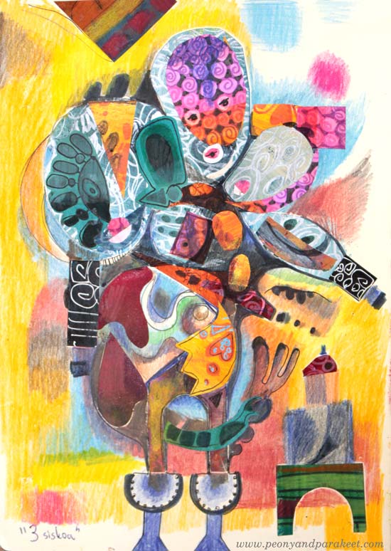
This collage started with a quite traditional idea. I wanted to make a doll. But when the doll got more heads, I followed the imagination instead of trying to stick with the original thought.
Start with the Expressive Background!
Create Step by Step!
Try this process if you often ponder these questions:
a) what to put in the background?
b) how to express with color?
In this process, you will start with the background so that it creates a structure for the rest of the work. A grey paper enables you to use color for expression rather than trying to tone down a screaming scene when using only “beautiful” tones.
Supplies: Grey Paper, Colored Pencils, Paper Scraps
You will also need gel medium or paper glue for attaching the collage pieces, and a black drawing pen for finishing touches.

Step 1 – Coloring Freely
With white and dark grey (or black) colored pencils doodle random shapes. Fill some shapes by drawing, add shading, and have fun by playing with color values. Change the orientation once in a while so that your imagination keeps on going.
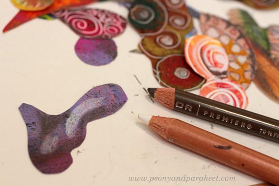
Step 2 – Cut Tiny Collage Pieces
The pieces for this step can be really small ones, and you can cut them even smaller. Here’s one piece from my stash and I cut a smaller shape out of it!

Don’t worry about the composition yet, just cut so many small pieces that you have a collection to choose from.
Step 3 – Add Some Light and Shadows to Collage Pieces
With the white and dark grey (or black) pencils, add some shadowing around the edges and some highlights with white. All the pieces don’t necessarily need this but it makes solid-colored pieces look much more interesting.
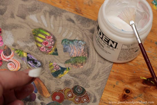
Step 4 – Glue the Collage Pieces
Use the background as a support structure and an inspiration source for your collage! If you have problems with composition, go through my free mini-course Loosen Up and follow the tips there!
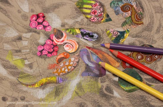
Step 5 – Add More Color with Colored Pencils
This step integrates your collage pieces with the background.
Step 6 – Draw Final Details with a Drawing Pen
Add some loose lines and dark details with a black drawing pen.
Here’s my finished piece, a fantasy creature!
Some Papers Last Longer than Others
I intended to cut some motifs out of this paper but maybe next time. Too precious for now! It’s inspired by Collageland.
Create Handmade Collage Art to Build Your Visual Dreamland – Buy Collageland!
How to Add Depth when Creating Abstract Mixed Media Florals

When I started drawing and painting as an adult, it took quite a long time for me to understand the power of creating visual depth. Before that, every time I wanted to highlight a particular element, I added more lines to it and it just looked stiffer and stiffer. When you add depth, your art is not like a sentence where every word is underlined.
Instead, your art becomes more like a paragraph that invites the viewer to dig deeper.
How to Add Depth – Create with Me!
In the video, I create a floral painting without any reference photos and give you some basic tips along the way. I use a mixed media approach and combine pens with paints to make the job easier!
Come and Create Unique Floral Treasures!
Level up your skills, find the process you love and let flowers show the way to expressive art! You don’t want to miss this class!
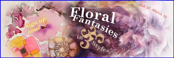
Floral Fantasies in 3 Styles begins on Feb 19th – sign up now!
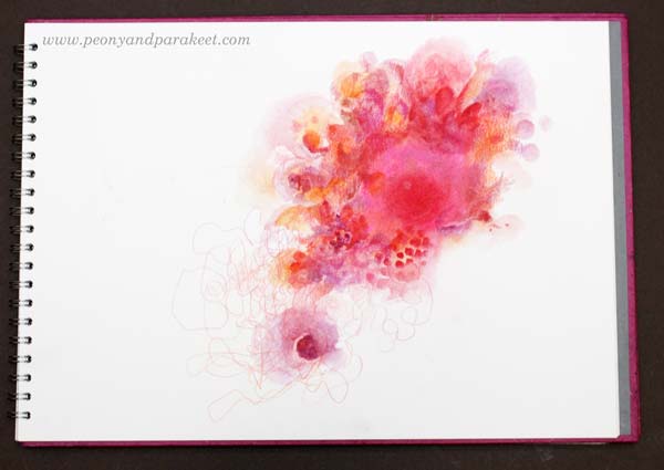
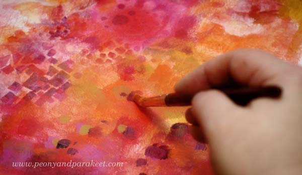
Passion for Color? – Try This Method!
Create a color-focused art journal page! You can choose as many supplies as you want but just one color!
Step 1 – Pick Your Color!
What color speaks to you today? Red, blue, yellow, green, brown, black … Pick any that you feel drawn to! Collect the art supplies that you have in that color!
In most mornings, after taking the dogs out, I go to my studio and start creating sketches, or art journal pages, or continue paintings in progress. I often make a hot beverage called Sunny Grapefruit. I have bought it from a tea shop, but it doesn’t contain any tea, just fruits, and lemongrass. I sit down in an Ikea chair found at a flea market. I have painted it and put a sheep fleece on it, so it’s warm and cozy. All this warmth made me think about red.
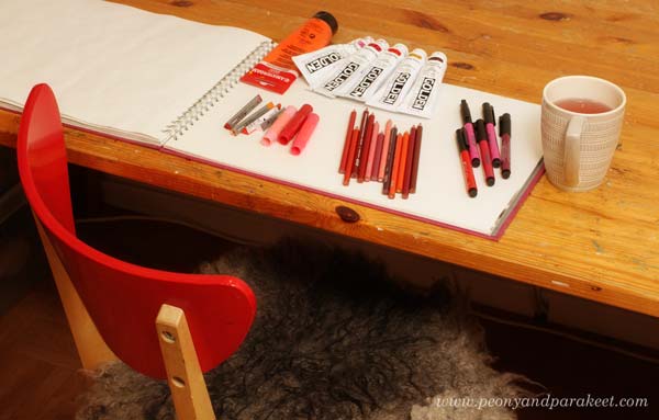
I chose the supplies so that they were all various tones of red ranging from orange to pink.
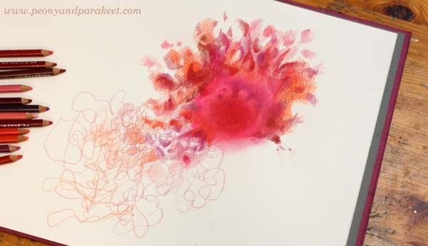
Step 2 – Source of Energy
Your color is the source of energy. Pick any coloring supply and make a simple circle somewhere on the page! However, don’t begin in the middle! Your work will look more expressive if you don’t make it symmetric.

I colored a soft circle with a couple of Faber-Castell Gelato Sticks.
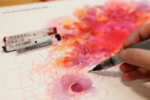
Step 3 – Radiating Power
Add more color to the circle with different supplies! Imagine that your passion radiates strength. Use your imagination to color shapes and lines that are connected to the circle. Again, keep the design asymmetric.
I used colored pencils and thought about the sun and the fire. You can use your imagination based on the ideas that the color evokes. For example, if your color is blue, you can think about waves and the energy and the movement that they contain. Don’t overthink; it’s just a start! Usually, we get conventional ideas in the beginning but then become more inventive as the work progresses.
Step 4 – Explosion and Spin-Off
Change the supplies again, and imagine an explosion of energy. Let your circle grow but also become less solid. Create a spin-off that has a life of its own.
I used Derwent Artbars and water. I could have used watercolors instead, but nowadays, I often find it quicker to grab some Artbars and use a water brush when I am creating a mixed media piece.
Step 5 – Look Around!
So far you have focused on one area of the page. Now imagine, that the explosion reveals some of the surroundings. Add some pale elements but don’t cover the whole page.
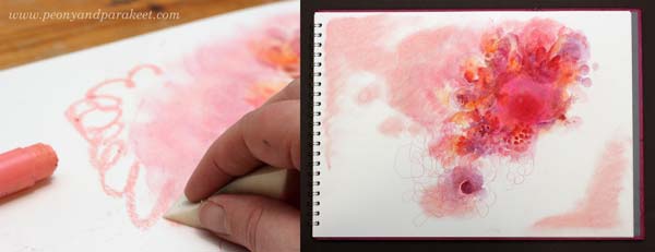
I just made some soft splotches with Faber-Castell Gelatos. Notice how my explosion travels diagonally across the page and reveals areas that are also diagonal but in the reverse direction. Diagonals make the image look dynamic.
Step 6 – Birth
Color clearly-defined shapes that connect the energy source and the spin-off. Imagine that something concrete is born out of the explosion and moves forward.
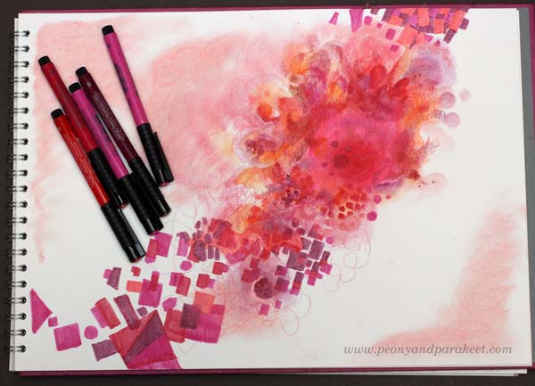
I colored geometric shapes with Fabel Castell PITT Artist Pens. To highlight the movement, I make the shapes cross over each other. I also add bigger shapes that are shown only partly so that it looks like they are flying away.
Step 7 – Mountains
Color a big area of the page so that it’s like mountains have grown to your page. Again, keep one part of the page blank. Add some color to the other side of the blank area too so that the blank area is like a gulley between the mountains.
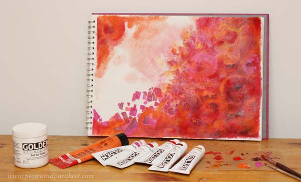
If you have acrylic paints, now it’s a good time to use those. Painting is quicker than coloring with pens, and you can also create layers easily.
I use gel medium to make the acrylic paint more fluid and translucent. I also use two brushes so that there’s more variation in the brush strokes.
Step 8 – Jump!
Imagine being up in the mountains, looking down to the gulley. When you jump, you begin to see that the blank area also contains wonders. The fall is not so high than what you first expected. Softly color some vague shapes in the blank area.
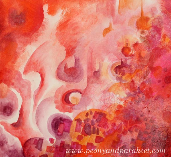
I used Derwent Artbars and water.
Step 9 – Test and Adjust!
When creating abstract art, I find it practical to test it based on how well it fits with other patterns, textures, and shapes. I placed my sketchbook near the fireplace where we have a place to watch the fire. To me, it looks like my page doesn’t have enough contrast.
So I add some alizarin red which is very dark and some lighter orange to finish the mountain area.
Now the contrast looks better.
Learning to Create – Using a Model, “How To,” or a Method?
There are many ways to learn:
a) Watching someone create and then following it accurately. This way you will create something that you wouldn’t have thought of figuring out yourself. The downside is that your expression and imagination has very little space to come through. You are learning technical skills mostly. Sometimes it can happen that you don’t know why you do what you do.
b) Learning how to use certain supplies in a certain manner. This makes you learn the characteristics of a certain art supply and the techniques that you can use. You can then use the techniques to produce your unique art. The downside is that if you don’t connect with your imagination, you lose the joy of creating. You know why you do what you do but don’t know where else you could use it.
c) Following a method that connects you with your imagination. This gives you preliminary ideas that you can then expand to fit your thoughts and to grow your style. The downside is that if you have no idea how to use the supplies, it will take up your energy.
My Methods
As a teacher and a mentor, I focus on the methods that grow the expression and imagination. Even if I value knowledge and techniques, my strength is in innovating new methods that help you to connect with your creativity. I have heard many say that when they analyze someone’s art, it’s easiest to focus on the technical part. I agree. There are more rights and wrongs to catch. But after creating in a very disciplined manner for the last year, I have come to this conclusion both as an artist and as a mentor: I want to grow my skills to all directions, but if I had to pick one, it would be imagination.
Boost Your Visual Imagination!
Without imagination, we just go around the same circle. We don’t feel free, and we end up believing that there’s one more technical trick around the corner that will change the game. But it’s the imagination that will do that. That’s why I don’t select students based on their supplies, or the technique or style they use. Together, we share our love for making the invisible visible and learning to use the techniques to serve that.
Boost your imagination by joining my community Bloom and Fly! We’ll start with a method for your creative goals, then pick easy ideas from Rococo, explore abstracts together, etc. I will help you to express yourself so that it’s adventurous and imaginative! >> Sign up here!