Pop Music in Art Journal
This week – turn some pop music on and start art journaling!
Since I started working full-time as an artist in 2014, my taste for music has gone wider. Listening to different genres has enriched not only my life but also my art. Music has taken me to all kinds of visual worlds. Even one sound can bring color or a shape to mind.
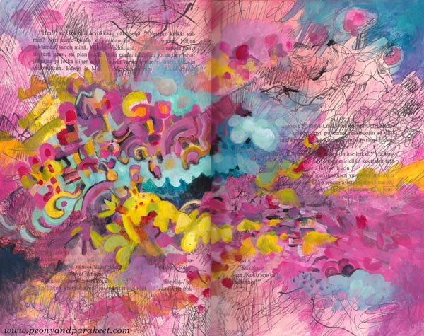
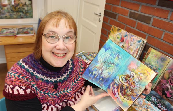
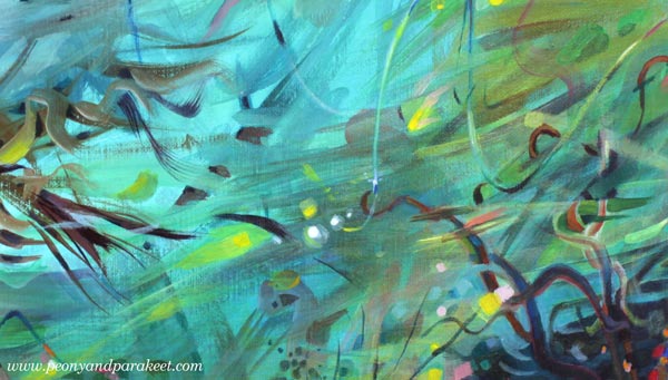
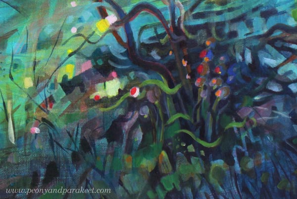
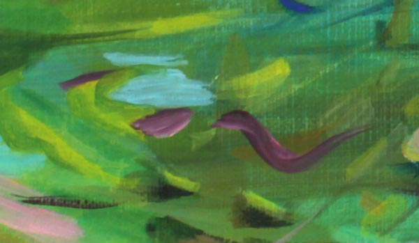
I have an old book as a music-inspired art journal. I like how the variety of music is shown on its pages. Now I wanted to make a spread inspired by Asian pop.
Sometimes Music is a Human, Other Times a Machine
Asian pop music is fun to listen and very easy-going – like an acquaintance who is always ready for a visit to a candy shop and to have a light conversation about current movies.
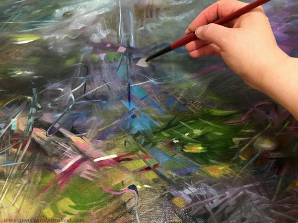
But when I paint big paintings, I prefer music that’s more like a vehicle – no melodies, only interesting sounds that make me go deeper and deeper in concentration.
Without a repeating chorus and clear rhythm, I don’t feel the need to express the music or paint at its speed. That’s how I have become a fan of contemporary classics that I used to find too boring.
Pop Music in Art Journal – Playtime with a Friend
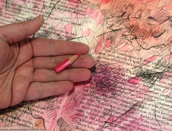
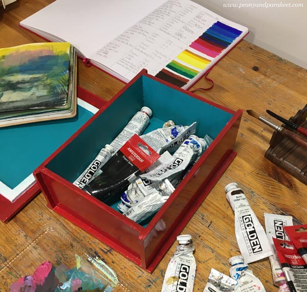
But this week, I wanted my friend back. I went to the Finnish radio website and turned on the newest of “Papananaaman K-Pop Show” which plays current Asian pop. My candy store was the box where I keep my red, pink, purple, and orange colored pencils.
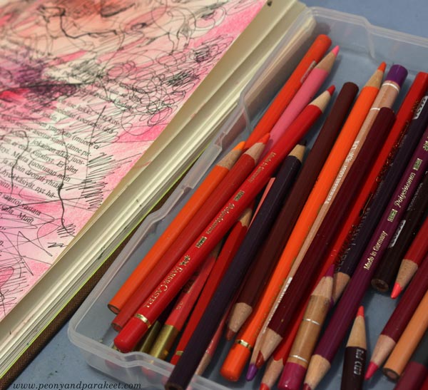
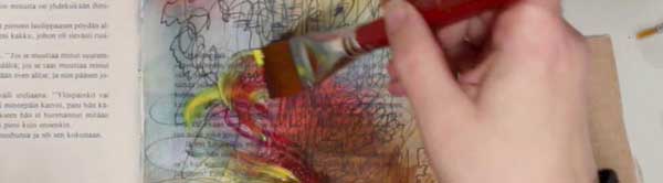
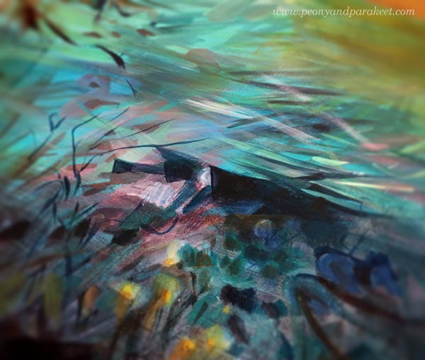
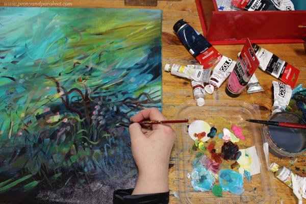
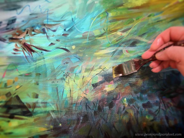
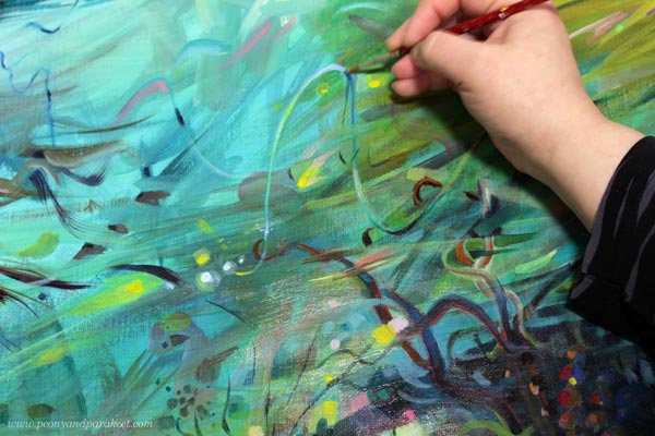
My music-inspired pages are in the “beautiful mess” style that I show step-by-step in an art journal mini-class called Music. It’s relaxing to create step by step and not worry too much about the “proper” supplies. I played with black pens, stamping inks, and the shortest pencils.
When I create canvas paintings, I use oil paints, but acrylics are great for this kind of messy play.
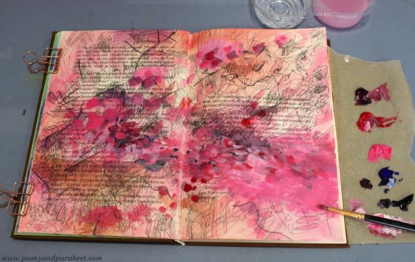
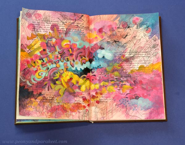
The spread started as red, but I then introduced a wider range of candy colors gradually. This mono-tone approach is great when you want to keep things simple first, and then splash the colors in.
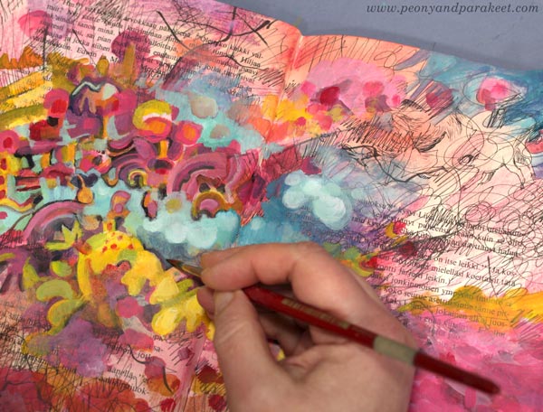
I like the candy colors and the informal look of the finished spread – pop music in an art journal!
I showed the spread to my Blythe dolls and they also gave their approval: “If that’s how you see Asian pop, we can live with that.”
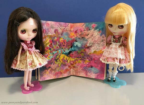
Maybe these dolls have made me listen to Asian pop in the first place! One thing so often leads to another.
Music in Art Journal – Step by Step!
The art journal mini-class Music is now available as an individual class. But you have to be quick – it will go away on Feb 7! >> Buy here!
Start a Music-Inspired Art Journal!
In 2020, I made a mini-class for a collaboration project that included several artists. Each picked a topic that raised the feeling of gratitude.
I chose music. I had just seen a documentary about a musician called Avicii. He was a young Swedish boy who got into composing electronic music and, within a few years, became a world star. His story ended too soon, though.
This month, I read a biography about Avicii. The book had more explanations for why the life that everybody envied was unbearable. But still, his music feels pure and bright.
When I hear A Sky Full of Stars, I am a little girl on a cold Tuesday evening in Eastern Finland. After participating in an icon painting group, I walked down the snowy hill looking up. The starry sky was blue-black, I realized. Not black like for those who glance carelessly or blue like for those whose skies were always blue. Working with colors had made the world look more beautiful.
What song takes you back in time?
What colors do you find there?
Avicii composed dance music but was inspired by folk songs and old pop music that his father used to play. He open-mindedly mixed different styles and genres.
Which things can you bring from the past to refresh your art?
Which ideas from your queue could you combine?
Avicii started a song from a few sounds and short melodies and then layered them together.
Pick a pen and scribble something small along with your favorite music, then layer colors on the top!
So, I suggest starting a music-inspired art journal!
I can now offer the class from the collaboration of 2020 individually. Only 15 EUR (about 17 USD), but be quick, the class is available for purchase only today to Feb 7!
New Free Mini-Course for Subscribers
Great news! I have updated the free mini-course “Paint the Emotion” and it’s now called “Color the Emotion.” I have added a new project with colored pencils and more talk about how to approach art-making. The mini-course is about 40-minutes long and it’s available for all the subscribers of my weekly emails.
Here I am talking about the free mini-course in a video:
P.S. If you are already subscribed, no worries! I will send you an email today with the link to the mini-course!
Design Principles Translated to Intuitive Painting
This week, I talk about design principles for intuitive painters. This is for you who paint because it’s a spiritual act!
While making this acrylic painting, I thought about how intuitive painters often feel a disconnection with general art advice like “make sure you have a focal point.” Even if I teach online classes, I often find advice that solely focuses on the technical part misleading because it talks so little about artistic expression and the experience of making art. Design principles can be like a bible for technically oriented people and a blank book for those who want to approach the subject more emotionally. But it doesn’t have to be like that!
Design Principles and Intuitive Painting
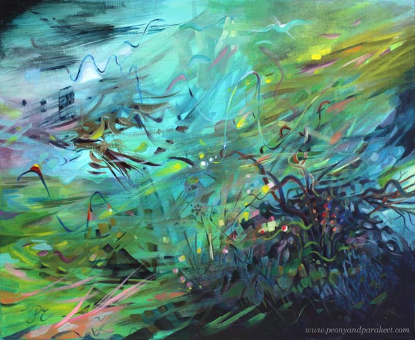
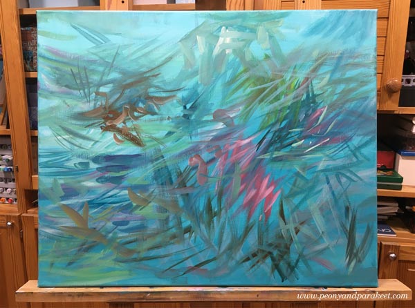
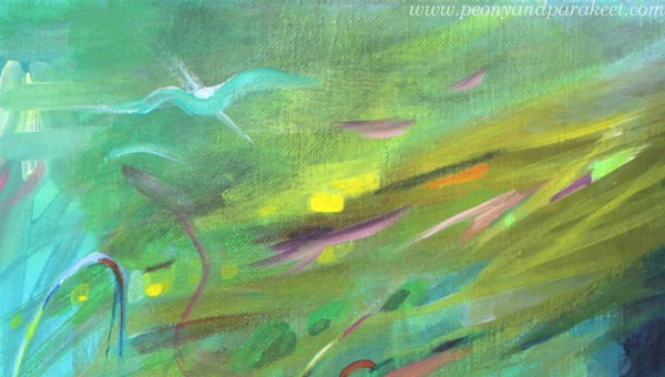
Intuitive painting differs from following a predefined idea, a reference photo, or a sketch. Let’s take the focal point as an example. Intentionally, you should start what matters the most and make it noticeable. This way, you have a clear focal point, and your painting delivers a clear message. But when you paint intuitively, there’s no message when you begin. The painting process is about connecting with your spirit and being open to what wants to come out. Here’s what my painting looked like after the first layers. Yes, there’s some resemblance with the finished piece, but not so much that the advice would make sense.
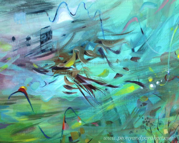
The focal point (the small pale yellow rectangle in the dark area) and its supporting element, the row of white dew drops, were added much later. Here are the dewdrops and the many layers more closely.
On the other hand, I don’t agree with those who say that lighting candles and taking a spiritual mindset should be enough. There are also those who believe in natural talent – that you either can or can’t paint – which I most strongly oppose.
For me, intuition is about bringing knowledge and creativity work together and listening to what they have to say. When I want to move forward, sometimes it’s about growing my knowledge, sometimes increasing my creativity, but often it’s also getting better at listening – quietly observing what the painting wants to become.
When I notice a shape that looks like it’s whispering to me, I want to strengthen it. And sometimes, these shapes later disappear under new ones, but they still showed me the way.
Let’s go through 7 design principles and translate them from intentional to intuitive painting.
#1 Emphasis
In intuitive painting, aiming for emphasis is often about finding a suitable title and adjusting the painting to express the title. For me, painting is quite far before the first ideas about the title come up. However, the first ideas are usually the most conventional ones, so I keep painting and diving deeper.
I thought this piece was finished, when it looked like this. The title that I had in mind was “Windy Tales” or “Wind Blows in a Fairytale.” But it was still too generic, so I kept asking: What fairytale?
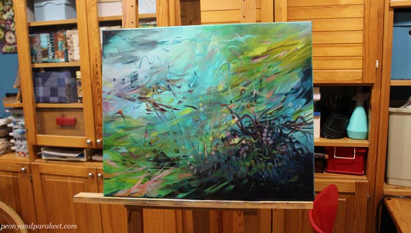
After the painting session, knitting late at night, I got the answer: Snowwhite! So next morning, I added some more white and other colors of Disney’s Snowwhite.
I feel that these small adjustments released the spirit of the painting.
Intuitive doesn’t have to mean fast. We can take breaks and let our intuition and connection grow between the sessions.
#2 Balance and Alignment
The emphasis needs extra effort, but balancing is what we do naturally and so much that it suffocates expression. Be aware that “intuitive” often become “balanced” and nothing else.
The easiest way to balance a painting is to make it symmetrical. So taking an asymmetrical approach – even just for a couple of layers – makes you more expressive than any meditation! Imagine a horizontal and a vertical line in the center of your work and force yourself away from constant balancing strokes.
So for intuitive painters, getting off-balance is more important than creating a balance right from the beginning. In the end, you can balance the image with a few strokes if needed.
#3 Contrast
Intuitive painters have a strong connection to colors. I often begin with a specific color combination in mind, and colors feed my ideas. Yes, I like pinks, turquoises, bright yellows, bright greens … but I also have to remind myself that like a spring flower, a spirit of the painting rises slowly from mud.
This design principle is not so much having different colors, but having differences in lightness and darkness. For intuitive painters, it means that we have to process colors that we lay on the painting. So not just squeeze tubes, but to create our own color mixes so that the spirit is not only on the paper or canvas but also on our palette.
When we slowly create the color mixes, we have time to connect with the tone, adjust its darkness, seek for the genuine response that has a longer-term effect than what has been industrially produced.
#4 Repetition
The best way to think about repetition is to express echo. Instead of constantly balancing your painting by looking at the big picture, focus on one shape that you have just painted and imagine its spirit. How would the shape echo itself?
The echo is never identical to the original spirit. The echo is weaker, and there’s never just one sound, but a few.
#5 Proportion
In intuitive painting, we paint energy. Energy gathers to form cells, then clusters that get bigger and bigger. It’s easiest to see these clusters by looking at the painting from a distance or by taking a photo and reducing it.

If your painting is full of clusters, all the energy is static, and you need more openness in shapes and lines. If all the clusters are similar in size, then the overall energy is impermanent and less powerful.
#6 Movement
Intuitive painting connects us with the tradition of storytelling. We don’t just deliver a spirit but a story about its power. In visuals, we can build paths from one element to another so that the eye can effortlessly move around the painting like it’s listening to an impactful story.
Rather than painting separate elements, connect them with lines or layering one slightly over another. Make sure that all your elements are not round and stop the eye, but pointed that move the eye forward and build flow and movement. So, when you feel the connection with the painting, create connections visually too.
#7 White Space
Intuitive painting is less about arranging space and more about filling space, but white space is still relevant if you think about it as breathing. A painting doesn’t only need a spirit – it needs to breathe. If you paint boldly, everything bland will help with breathing. Adding muted yellows around a bright yellow spot makes the yellow spot breathe.
Design Principles Apply To All Art
So, you see, intentional and intuitive painting are not so different after all. The process and the values are a bit different. Still, it’s like humans – we come from different countries and cultures, speak different languages, but with some translation, we can feel togetherness across the borders.
If you like this article, you will love my class Floral Freedom! There I translate Paul Klee’s technical and Wassily Kandinsky’s spiritual teachings so that you can paint abstract florals freely. >> Buy Here!