
Create Doodled Luxury!
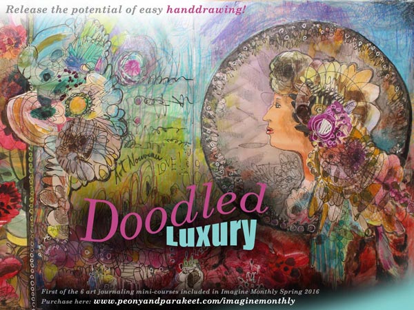
Happy New Year everyone! With the new year, a new class has started. Imagine Monthly is a series of 6 mini-courses, released one by one from January to June. Imagine Monthly is a bit different than my other online workshops. It has a slower pace and you can sign up even if the class is already running. January’s mini-course “Doodled Luxury” has just been released. You will get it right away after signing up!
Why This Course?
I wanted to start the series of 6 mini-courses by showing the potential of free hand drawing. For many, drawing is about being able to copy something realistic but there’s so much more that you can do with flowing lines. I think drawing should be redefined and enabled for everyone. It’s my mission to enable you to enjoy drawing and have a great time with your growing imagination! (Want to ponder more about the ability to draw? Read this blog post: “Can You Draw?”)
Creating with Luxury in Mind
When developing “Doodled Luxury”, I spent a lot of time thinking about the concept of luxury. I think it’s not just something to buy, it’s more about creating something unapologetic and self-sufficient. Something which makes you feel rich in a way that has very little to do with money.

While experimenting with the techniques used in “Doodled Luxury”, I created an art journal spread that summarizes the ideas that I had in my head: bringing a clear focal point, getting inspired by the many layers of luxurious clothes, letting quantity increase the quality.
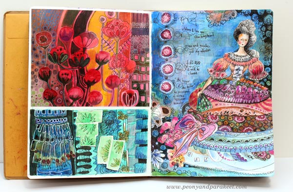
The spread above is just a background study for the course, but I wanted to show it as an example of how your art journal can contain “idea boxes” which in turn can lead to more advanced ideas like this one:
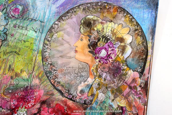
This Alphonse Mucha inspired collage has influences from Marie Antoinette’s period. Can there be anything more luxurious than art nouveau combined with rococo, expressed by hand-drawn elements? Doodling truly can produce luxury when there’s more than enough of it!
Experience the power of simple handdrawing and other easy techniques
Buy Imagine Monthly!
Find Your Art Journaling Inspiration!

After stretching my limits at the last blog post, I felt the need to go back to basics. I picked my Moleskine Watercolor Notebook and made three spreads by just answering the question: what does continually inspire me?
The short answer is: I am constantly inspired by the history of decorative art. I believe that it’s important to respond to the question on a general level like this. If you only list specific artworks and other artists, there may be less room for personal interpretation. If you define yourself too tightly through others, you can find it hard to figure out what to create next and how to find your personal style.
My Art Journaling Inspiration Sources
I am constantly inspired by embroidered fabrics and wool rugs from the first half of the 20th century.
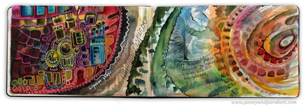
I am constantly inspired by art glass, fabric prints, and the way these characteristics are seen in today’s street fashion, especially Japanese street fashion.
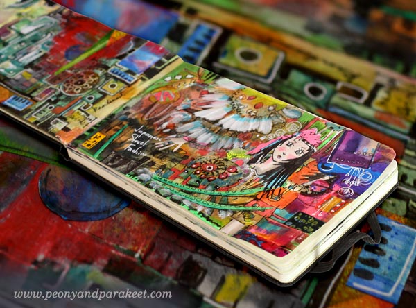
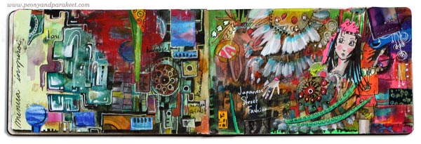
I am constantly inspired by Russian decorative plates, European Art Nouveau and the way they combine drama with natural colors and shapes.
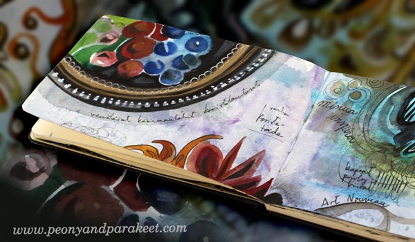
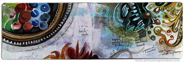
Even if I don’t have the ability to paint decorative plates or the looks to wear Japanese street fashion, I can use them as a constant source of inspiration. I can let them show in art journals and other artworks, often in a way that is less literal but still obvious for myself.
The history of decorative art fills my mind with values that I can resonate with. They are understanding nuances, focusing on details, telling stories that last time, uplifting people with beauty and spirituality and integrating production with technology. It may not be the whole big picture of the subject, but it is how I look at it. That in turn, inspires me to create art, to blog and to deliver new techniques and workshops.
Let art journaling make you happy – fill your pages with subjects that truly inspire you!
Monthly art journaling inspiration: Sign up for Imagine Monthly!
Look Back to See Your Artistic Style!

We often search for something new: new art techniques, new ideas, new approaches. When I pulled out a worn-out cardboard box filled with my old drawings and paintings, they all felt very familiar at first. I saw only the obvious: a skill level, a theme or technique. But when I stopped looking at the pieces individually and started grouping them, new insights occurred.
1) Look for Repeating Elements and Themes
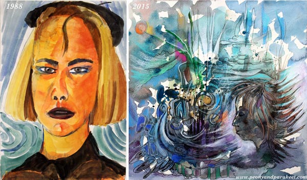
In 1988, when I was 19 years old, I made a watercolor painting called “Self-Portrait as an Artist.” Soon after that, I went to study computer engineering, and art didn’t seem so important anymore. But now, when working full-time in art, I love to compare these two paintings. There are 27 years between them, but they still relate to each other. It is interesting to see how my understanding of being an artist has changed. The importance of ideas, visions, and expression has grown, and the ego and stereotyped appearance have shrunk. I see similarities too: color choices, dynamic lines and dramatic atmosphere, foundational elements of my artistic style.
If you are hoping to find a new style, it is easy to miss that most of the elements are already there, just a little bit of fine-tuning is needed!
2) Combine Past Ideas
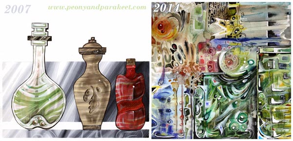
In 2007 I began studying industrial design. One of the courses taught us to draw various materials like glass, wood and plastic. After seven years I realized that I could use that kind of imitations for more expressive art too. I could play with the proportions and compositions. I also understood that I could use the things learned in the past, more widely and more freely. Instead of having only some ideas and simplifying those, I can have hundreds of ideas and combine most of them!
If you don’t know what to create next, combine what you have done before to a single artwork!
3) Embrace Your Roots

In 1985 I made this watercolor painting and remembered my family liking it. For me, it was important that this image came out of my imagination, it wasn’t made by following a photo or anything. It was born surprisingly easily, and I felt a bit puzzled: “So quick, and everybody likes it!”

In 2014 I worked with a similar theme and again, with watercolors. This painting contained more emotion than the old one. This painting was about leaving back a certain phase in life and entering a new one. However, when I look at both of them now, I think about my country, Finland, and its nature. This country is a land of forests and lakes and for Finnish, it is natural to use them as symbols in self-expression too. I can’t escape my roots and the older I become; I don’t even want to.
When you look back at your work, what kind of themes and changes do you see? Could you create collections showing art that tells your personal stories and your journey to your current artistic style? See also the post about stretching your artistic style!
Subscribe to my weekly emails – Get a free mini-course!
The Essence of Your Art
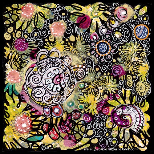
I found this old collage piece when I organized my archives. It is a design that I have used as a part of the fabric called Flow. As art journaling cute little girls with lovely little animals, is so popular nowadays, this made me think: what’s the essence of art is for me. And also, I would love to hear what it is for you!
For me, it’s not the play, even if I love playing. It’s not the colors even if I am totally for them. It’s not even the circles, my favorite shapes. I might aim for the certain styles, I love art nouveau and expressionism, for sure. But the essence of everything is that I want to create “everyday icons”, the images that make me stop, drop everything mundane and get in touch with my the inner thoughts.
Technically compositions, colors, shapes, styles, etc. create that. But when I am happy with the result, I do not think about those anymore. I think about what I feel and think right now and where it can take me.
The best thing is that everybody can create their personal icons, sacred images, mandalas, whatever you want to call them. They don’t need to be connected to any religion. They can just be connected to experiences, moments or beauty which uplift your spirit.
This is what I thought when I saw this old artwork. And now I wonder, what can I do better. How can I make this blog be the place for anyone to stop, then start creating – the essence of their art!
Subscribe to my weekly emails – Get a free mini-course!