Art Journaling with Colored Pencils
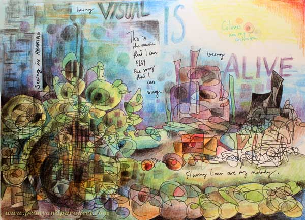
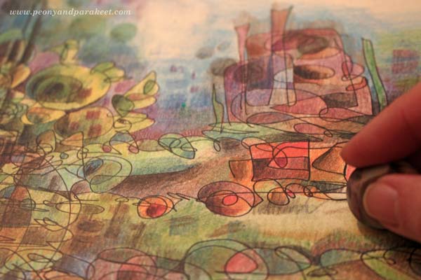
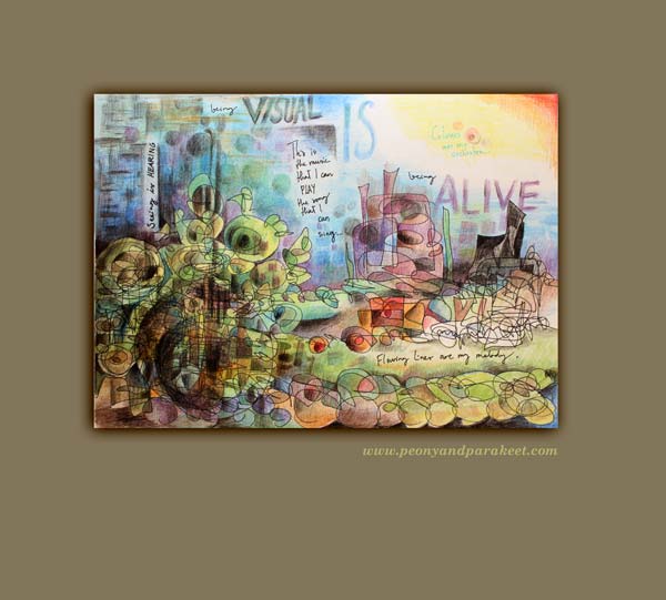
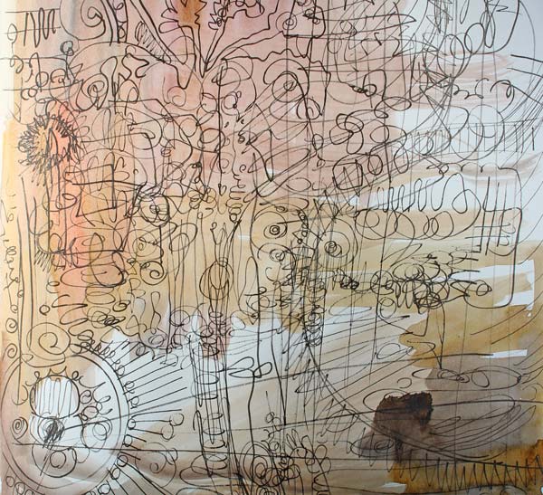
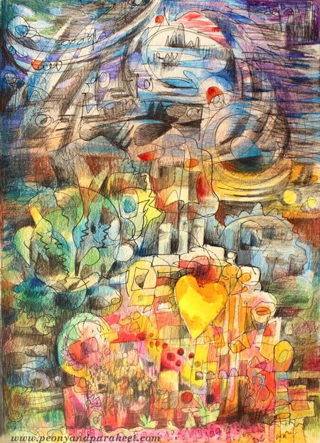
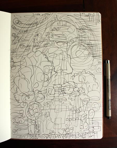
My latest art journal page started with new colored pencils and rambling thoughts of the latest news from Helsinki: the architecture competition of Guggenheim Museum has ended and now there’s a big debate whether the city of Helsinki should finance the museum or not. I did not mean to include the winner building on the page, but you know how it goes: once you think something, it will appear! See the black element on the right!
Cretacolor Aqua Monolith Watercolor Pencils
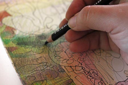
Last Monday I went to the biggest art supply store in Helsinki to buy some paper and see if they had any Cretacolor Aqua Monolith Watercolor Pencils. I had bought one pencil about a year ago just to see how it works. After many months, I noticed the growing use of that pencil. So now I was thinking to buy a couple more. It turned out that they did not sell the pencils individually anymore, so I bought the smallest set of 12.
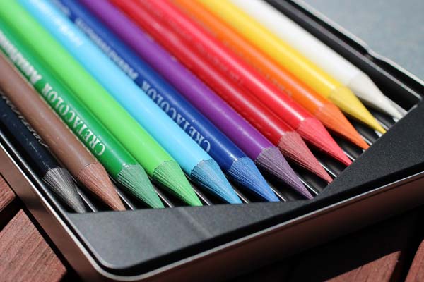
As you can see from the picture, these pencils are nothing like ordinary colored pencils! They are not wooden at all; they only have a thin lacquer coating! For me, it took some time to get used to how they feel when holding them. But once I got over it and started treating them as any pencil, (pressing lightly and creating multiple thin layers), I noticed that they work great. These pencils are soft enough to make the coloring pleasurable but not too soft for detailed work.
It is fascinating that you can also use shavings if you add a little bit water to them!

My art journal page was made without water – these watercolor pencils work well that way too.
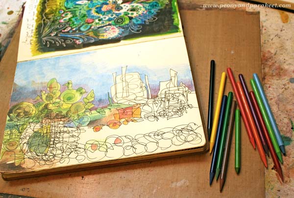
All of my colored pencils fit in two jars as I usually use them all at the same time, no matter what their brand or type is.
Adding Journaling to the Page
I was drawn to green tones even if I was thinking of the city view. There’s something magical when the tourists arrive Helsinki in the spring. They make shy and withdrawn Finnish people more friendly and helpful. When the hard winter is over, everybody is willing to make a fresh start.
While continuing the coloring of the page, I thought about cultural institutes and their events. Whether it is a city full of tourists or a concert hall full of audience, it feels alive and uplifting. It gives me energy and inspiration to create once I get back home. I felt drawn to the word “alive” and decided to add some words to the page too. By erasing some areas after coloring, I created areas for writing.
For me, being alive is a visual thing. When I am using my senses, I see images. When I draw the images, I feel alive.
Create an art journal page with colored pencils and words by answering:
What does make you feel alive?
Subscribe to my weekly emails and get a free mini-course!
Inspirational Adjectives for Your Art
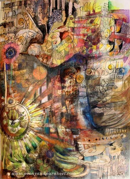
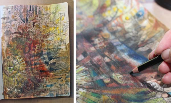
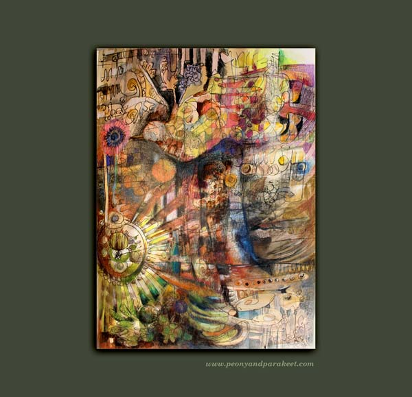
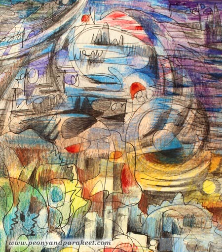
This art journal page is called “Introvert.” I made it while thinking about how much I enjoy spending time alone. My love for sharing and interacting are not the only things that make me; I am also an introvert who needs time to ponder and visualize what’s going on in my inner world. I find it often difficult to express myself in writing, so I like to create an image first and then write down the thoughts. Usually, my thoughts have moved forward and become clearer after processing them visually.
My Inspirational Adjectives
When I begin creating and while I am creating, I often get inspired by single adjectives. The same words continue to fascinate me, at least for a while, before I have found new ones. These words challenge me to both start and finish the artwork.
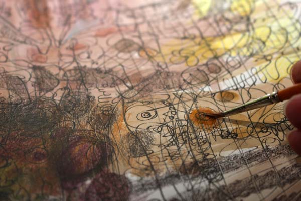
These are my current adjectives: “imaginative”, “forward-thinking”, “avant-garde”, “visionary”, “historical”, “futuristic”. I am especially fascinated by the words that are somewhat opposites like “historical-futuristic” or which describe a new kind of idea like “forward-thinking – imaginative”. While creating the page, I introduced the word “introvert” and got inspired by the word pair “visionary – introvert”. Brown watercolor felt just the right choice to express those words!

I continued with the black pen, not worrying about what to draw. Namely, it’s difficult to express “visionary” without first having something to look at!
It was a warm summer day, so I took my colored pencils outside and started coloring carelessly.

After a while, I added some watercolors with a thinner brush.
How to Choose Your Words?
Some people think that art is a set thing. But pre-named styles and standards don’t define it adequately. On a general level, yes. But when creating art, your uniqueness should be your standard. Thus your adjectives should be set so that you respond to them emotionally. They should make you feel not only excited but also a little bit scared. For example instead of “caring” you might choose “sensitive” or “connected”. Think about your personality and what you value. Don’t take the first words that come to your mind. Seek for specific words that define the adjectives more accurately.
Express Your Adjectives!
Start seeing and enhancing your words, your personality, and your values in what you create. Whatever your piece looks like when you are in the middle of the creative process, think about those adjectives and find ways to express them.
“Introvert” instantly brought black color to my mind. “Visionary” made me look for circles like eyes. As there’s something mystique in the combination of those adjectives, I set a quite dark and little bit dramatic color scheme.
When you focus on things that excite and scare you, your art becomes more meaningful. It can bring new kinds of thoughts and ideas not only for you but also for others. Everybody doesn’t need to know your adjectives. Art can often be interpreted in many ways. But your creativity is most powerful when it’s focused, and few inspirational words can bring that focus!
Subscribe to my weekly emails – Get a free mini-course!
Art Journal about Love for Home!
I am honored to be the featured artist in Documented Life Project this week! The theme is Hometown inspiration: “There is no place like home”. This, if any, is suitable for me and for my art journal! I had a stay-at-home mother and we did not travel much as a family. Probably because of that, I have always loved being at home. When I worked away from home, I missed it all the time. Nowadays, especially every morning when I wake up, I am extremely grateful to be able to work from home!
Let’s create an art journal page to celebrate home!
1) Background – Outside from Home
How do your surroundings look like when you are not at home?
Bring those things to the background of your page!
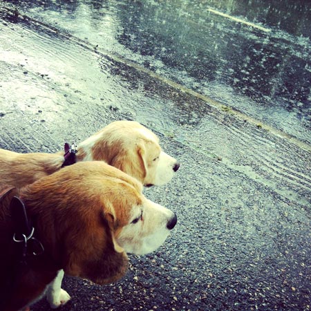
I thought about the situations when arriving home is most appealing. The house, and the living room couch, looks the most welcoming after walking the dogs on a bad weather.
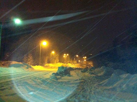
Being a dog owner and living in Finland, I have been in the middle of snow storms, pouring rain and everything between.
2) Focal Point – Inside Your Home
Pick some of the items from your home which represent your love for home!
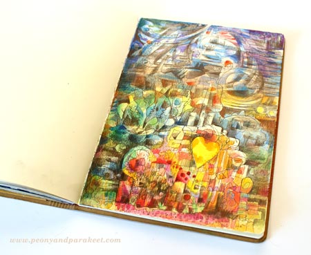
I wanted to express the experience of staying inside, feeling happy, warm and safe from the blowing winds. A couch and house plants are good symbols for that.
3) Location, Location!
Create the page where you feel most at home!
We, visual people, are often very easily affected by the environment where we create. To make sure that the page would express of a warm and comfortable place, I created the page by sitting on the living room couch.
4) Start by Drawing Freely
Draw and doodle on the page. Don’t worry too much about the end result!
5) Add Color (+ 3 new ideas)
To make sure that your page expresses an experience and is not only a static illustration, add few new thoughts and ideas when coloring the page.
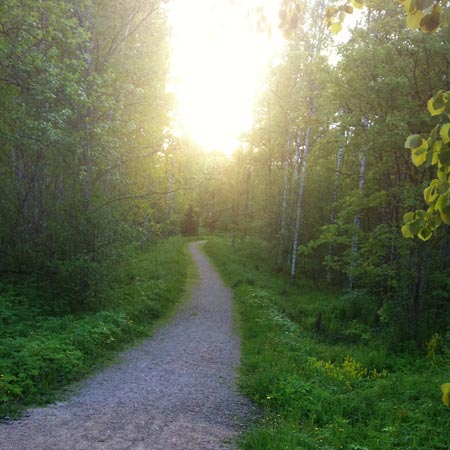
1st: For me, the first idea was the green color. Namely, living in Finland is not only enduring snow and rain. Now in summer, we have daylight almost through the night. Actually, if you read this on 20th June, we Finnish will be celebrating Midsummer, one of our biggest holidays.
This photo was taken just a week ago when walking the dogs 11 pm in the evening.
2nd: My second new idea was that home is not only a house or an apartment. It is a mental state. When I feel at home, my cup gets filled, I become peaceful and energetic at the same time.
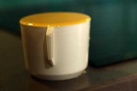
The combination of peace and energy looks yellow to me. So I made sure that the focal point has a lot of yellow. I also cut a yellow heart and glued it to the page with a gel medium.
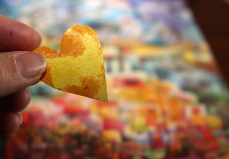
3rd: Where ever we go, we always carry a piece of home with us. My third idea was to add some red spots to the background to express that.
Boosted Expression
When you bring new ideas and thoughts on the theme while you are creating, you are not only making the page look more lively and expressive. You are also allowing your thoughts to move forward with creating.
Supplies Used
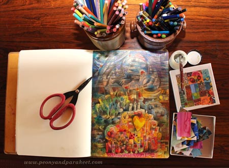
A black drawing pen (Micron 0.8 mm), colored pencils, a piece of scrap paper and some gel medium were the only supplies used on this page.
Subscribe to my weekly emails – Get a free mini-course!
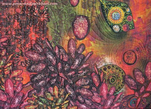
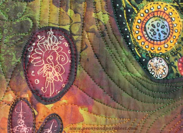
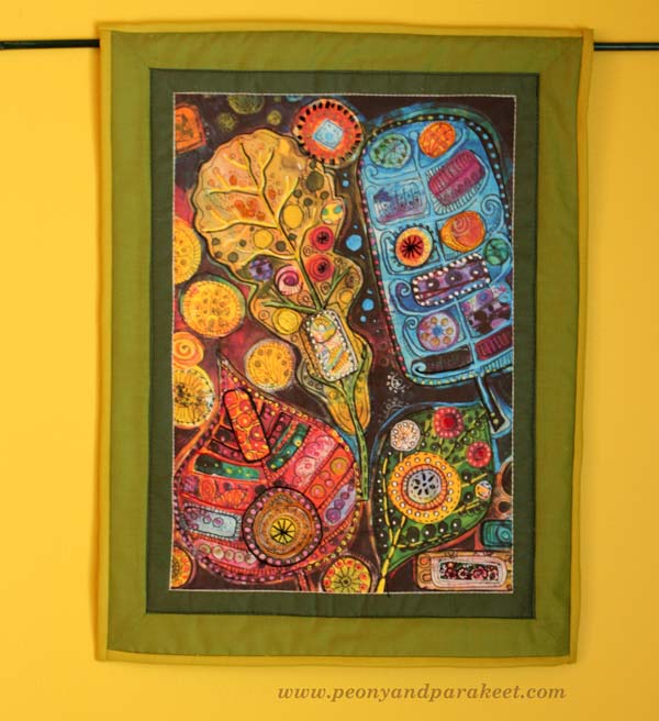
Art Quilts in a Modern Way

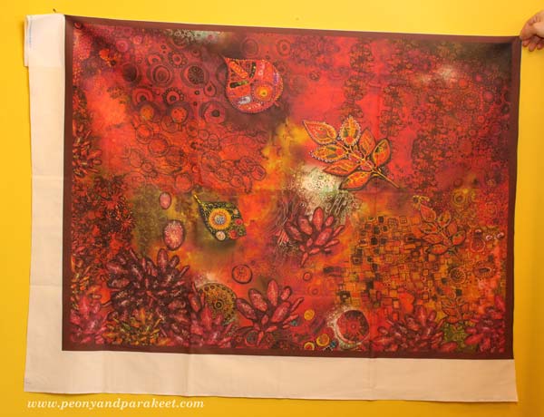
Here’s something that I have wanted to show you for a long time! I have been working with a custom order which made me think of a new idea: to create fabric prints and make quilted wall hangings from them. This idea is very versatile as you don’t have to be a quilter, you can print your art on fabric and use it for bags, purses, clothes – anything!
The artwork above has been composed digitally of various art pieces that I have made. The person who ordered the wall hanging is a fan of modern folk music and the color red. (If you have not listened to modern folk songs, try Hanneke Cassel for example!)

I created one new collage piece for the artwork. All the other details are picked from my archives.
It was pretty exciting to send the artwork to Spoonflower. When I received the fabric, the print quality was really sharp and detailed! I already knew from the previous experiences that big areas of black don’t print well, so I avoided those.
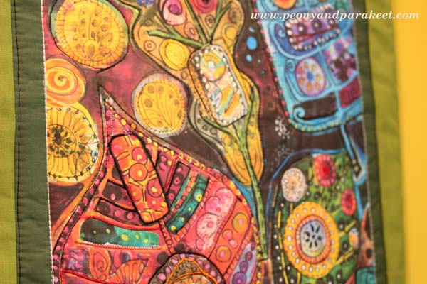
If you are a quilter, you know that the fabric will look so much better when quilted! I sandwiched cotton wadding, two layers of fusible interfacing and backing fabric and took out my sewing machine.
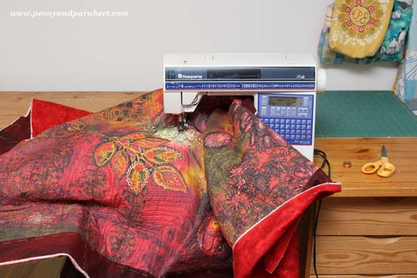
I am not very experienced with free-motion quilting using the free-motion foot, so I used even-feed foot instead. But with patience, I was able to create quilting that enhanced my brush strokes.
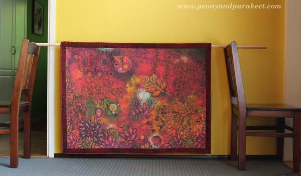
The finished quilt is about 45 x 39 inches.
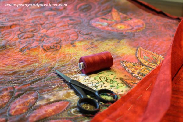
I used various colors of shiny embroidery threads for quilting. Using black thread brings the real black that was not produced by digital printing.
Quilting on watercolor!
Entering the flow state when playing modern folk was in the center of my inspiration.
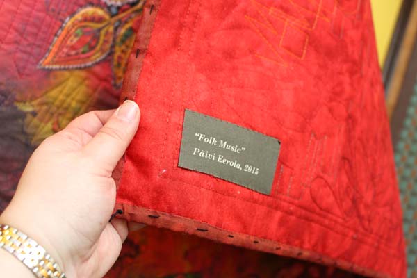
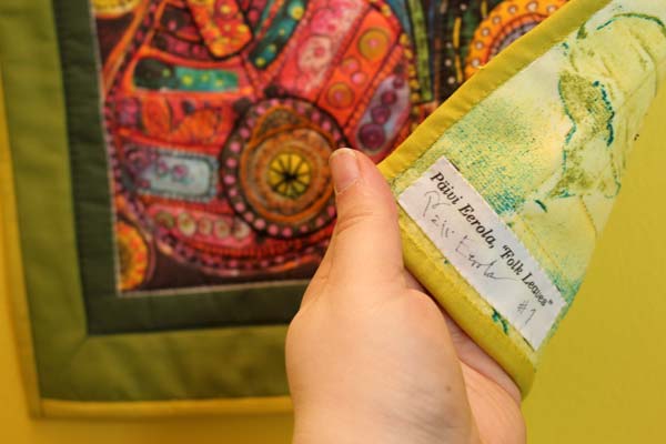
I added the label to the printing file too.
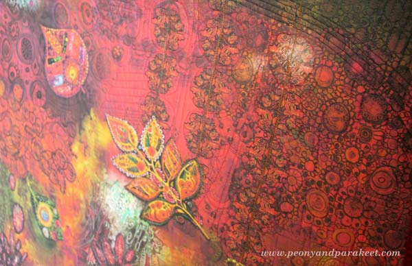
Here’s another project that I actually made earlier to test the idea. This one does not contain much digital processing, I only took a good photo of the original art and enhanced it a little bit.
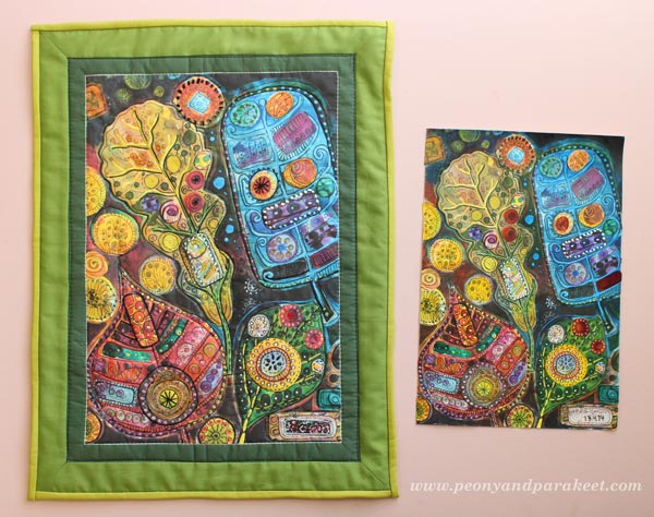
I think this artwork looks really good on fabric! The actual idea when creating the original was to mimic hand embroidery! Read about creating the original artwork: When Pens Replace Needles
I added some embroidery before quilting but found out that quilting works well as decoration.
A printed fabric label can be found from here too.
I also have more fabric prints waiting to be transferred into art quilts!

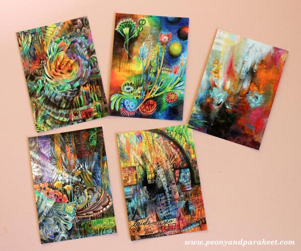
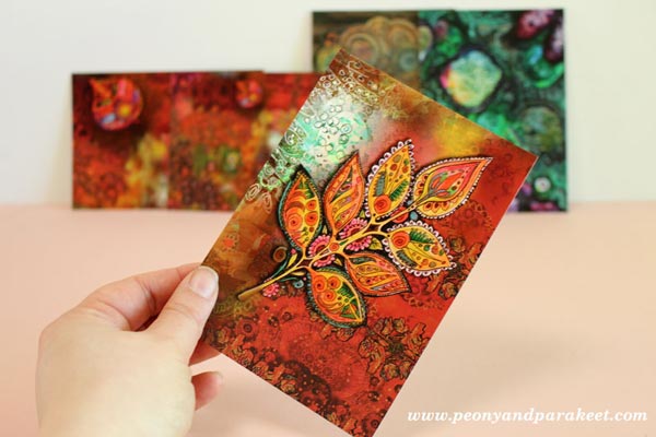
Paper prints news: New card sets have arrived at my Etsy shop.
Life can never be too colorful!
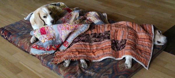
Stella and Cosmo send their greetings to all artists and quilters: Have a relaxing weekend!
Let me be your art teacher: Subscribe to my weekly emails!