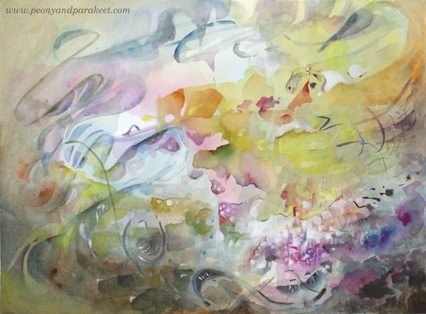
Abstract Portrait – Paint with Me!
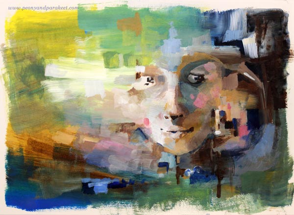
Here’s a quick abstract portrait from my sketchbook, painted with acrylic paints in 45 minutes. I didn’t use any reference photos for this one but just played with the shapes.
Create an Abstract Portrait – Watch the Video!
Get tips, ideas, and inspiration for your abstract portrait. Watch the video!
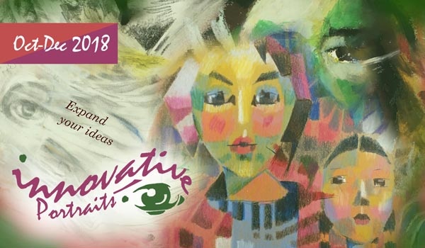
Innovative Portraits – Buy Now!
Innovative Portraits is about discovering new paths to painting and drawing portraits. Increase artistic looseness, find ways to get the proportions with ease, add more style by using shapes and colors, and invent ideas so that you never wonder what to put in the background. >> Buy NOW!
Varnishing, Framing, and Celebrating Your Best Paintings
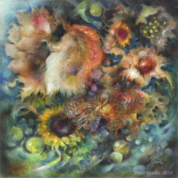
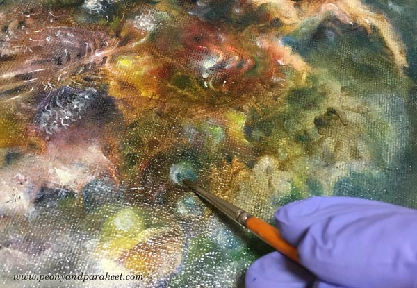
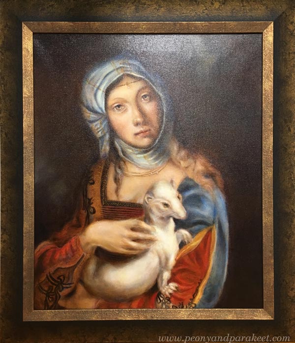
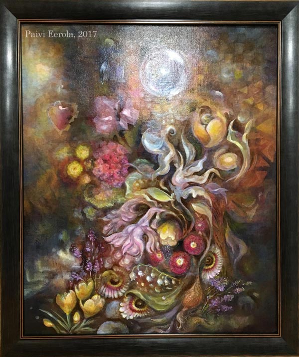
I have finished an oil painting called “Temptation.” I started it at the beginning of this year and after tens of painting sessions and weeks of drying time, I finally got it finished, varnished, and framed. So it’s time for celebration! So, the theme for this blog post is our best work, and especially our best paintings.
I have been planning this post for well over a year to get all the images I want to show you, and the experiences that I want to share with you, so I am happy that with the latest painting, the time has come for this article too!
Best Work – How to Know?
In art, there are very few absolute rights and wrongs, so this question can have many answers. But here’s how I know when I have produced my best work:
1) Time: I have worked on the painting for tens of hours and tens of sessions. Even if some artists work quickly, in general, most people underestimate the time that professional artists spend with their pieces. Overworking is rarer than underworking!
2) Message: I know why the painting exists. I can start a painting without a specific idea in mind, but when the painting progresses, I need to find a connection and a story to be able to make all the decisions needed.
3) Details: I have paid attention to every area of the painting. Some areas can be freer or less detailed than others but they have to be aligned with the overall message of the painting, supporting the most important areas.
Best Work – Test!
I have a couple of tests that I always use for my best work. Try these!
A) Do you want to hang your painting on your wall?
Here, I mean your painting, on your wall in your home. When I use this test, I don’t imagine anyone else’s home or anyone else’s wall. If I don’t want the painting on the wall, it’s likely that no one else will either.
B) Do you see your painting as a treasure?
Place the painting on the table, walk away from the room, and then come back and glance at it. If your instant reaction is that there’s a valuable item on the table, the painting is close to the finish. Here, the difficult thing is that you need to recognize your reaction quickly and glance at the painting from a distance. The further away you can be and get the impression of a treasure, the better. When I use this test, I try to alienate myself from the painting before entering the room.

When you have produced a painting that meets your criteria, why not varnish, frame and celebrate it?! These are all important steps to me. Let’s start with varnishing!
Before Varnishing – Take Photos!
Varnishing makes the painting harder to photograph because it will have glares more easily. If you have produced your best work, you will also want to get good photos of them! I use a tripod when taking photos, and if the weather is good, I take the photos in natural light.
Varnishing an Oil Painting – The Traditional Way
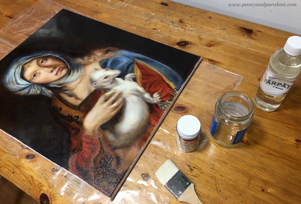
Oil paintings are tricky to varnish because they dry slowly. The drying time depends on how thick the layers are and how much drying time there has been between them. In any case, it’s months, and it can be more than a year! With “Gypsy Madonna,” I waited for nine looooong months. Every layer had dried a week or more, and they were very thin, so based on the advice that I got, that would be enough.
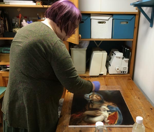
I bought Rublev Conservar Dammar Gloss Varnish with UV protection and applied it with a broad and soft goat bristle brush.
Always when varnishing, it’s good to:
1) double-check and follow the instructions of the specific product that you use. Don’t rely on the instructions that come with the bottle but go to the manufacturer’s website to see if there’s more advice.
2) apply a small amount of varnish and keep the layer thin.
3) let the previous varnishing layer dry properly before adding a new layer. Usually, a couple of layers are needed.
4) if possible, reserve a brush for varnishing only
Varnishing an Oil Painting – A Quick Solution
Luckily, there’s an alternative for traditional oil varnishes. It’s called Gamvar Picture Varnish. I got to know about it from my artist friend Eeva Nikunen. She has also made a process video about using Gamvar.
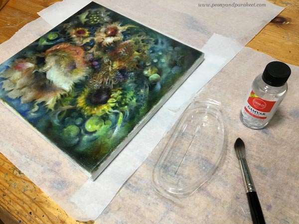
This medium only requires the surface to feel dry. So it can be applied after a few weeks after finishing the oil painting. I used Gamvar for the first time now, and because it’s thicker, it’s much easier to handle than the traditional varnish. Spreading Gamvar is more like rubbing with small strokes than painting with long strokes. A little sturdier brush works better here. I used a watercolor brush.
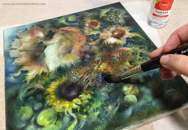
The pleasure of varnishing is the same regardless of the medium. The colors become more vibrant, and the painting begins to shine. I prefer using glossy to matte varnishes because I love the extra glow!
Varnishing an Acrylic Painting
Varnishing is not just for oil paintings! You can varnish acrylic paintings as well, just remember that they have their own products. I mostly use Golden acrylic paints, so when varnishing acrylic paintings, I have also used products of the same brand.

First, I add a layer or two of gel medium (Golden Soft Gel Gloss) before I begin the varnishing. Gel medium separates the paint layers from the varnishing layer. I mix some water with the gel medium to make it more fluid so that the brush strokes don’t show so well. I use a broad and flat brush and let every layer dry before adding a new one. It’s good to wait at least a day because polymer products can feel dry even if they haven’t dried properly yet.
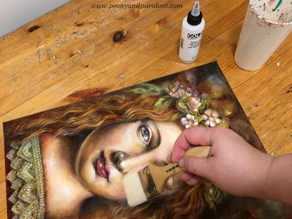
Then I add 1-3 layers of Golden’s glossy polymer varnish. It has to be mixed with water, and every layer has to dry 3-6 hours before adding a new one. I try not to put too much pressure on the brush so that the brush strokes won’t show.
I think that after varnishing, the increase of the vibrancy is as visible as with oil paintings. Definitely worth the effort!
Celebrating the Finished Painting – Framing
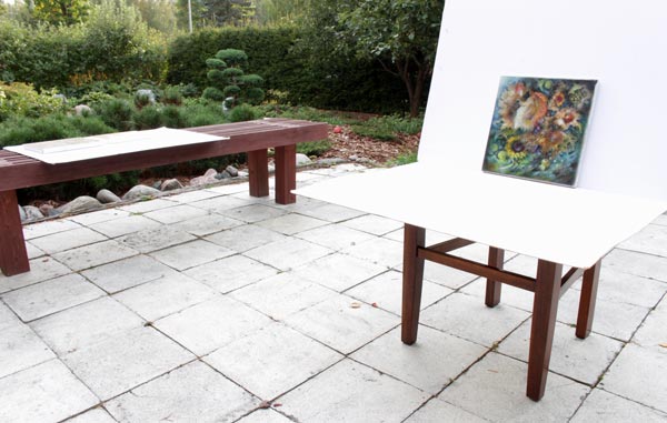
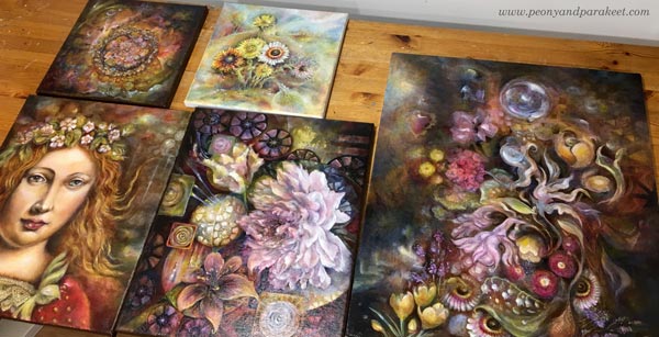
If my opinion, the best way to celebrate the finished painting is to get it framed. If varnishing is the makeup, framing is the dress. The impact of the frame is incredible when it fits well and continues the personality of the painting. Sorry about the glare in the sample images!
I use a local professional framer because I love the quality. I chose an old-fashioned and heavy frame for the Renaissance-style painting, and it made it look like an old masterpiece. Without frames, the image was much more modest.
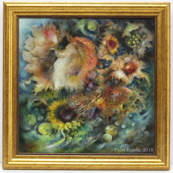
For this acrylic painting, I chose a dark frame that makes the colors shine.
If the frame were lighter, the dark colors of the background would have got more attention, and the result wouldn’t be as harmonic.
Today, I got “Temptation” from the framer. Because this painting is like a collection of treasures, I wanted the frame to be luxurious too.
Celebrating the Finished Painting – Music!
I also like to celebrate my best pieces by listening to some music when admiring them. I try to find a song that is aligned with the painting and it’s often a song that I have already listened when working on the piece. For “Temptation”, the song is Musetta’s aria from Puccini’s opera “La Boheme”. After exposing the painting to the critical eye for so long, it’s time to forget the struggles and enjoy the accomplishment. I find this combination of musical and visual pleasure one of the best joys in life.
I hope you too will celebrate your best work!
P.S. “Temptation” is now available in my art store, see more detailed photos there!
How Inktober Helped Me To Cure a Creative Block
This month, I am participating in a daily drawing challenge called Inktober. My goal was to make 10 ink drawings based on the first ten official prompts. I have passed the goal, and now I am trying to make as many as I can. As an experience, this challenge has had a ground-breaking effect on me. With Inktober prompts, I have discovered a creative block and cured it!
Supplies
For the first five drawings, I used black pens and inks from the stash. My illustrations have been quite detailed, so they take a lot of ink. I have made some purchases and will need more pens if I keep going. Here’s what I have currently in use!

I make the drawings on Nuuna Square Bang Sketchbook. It is 9,5 x 9,5 inches, which is a good size for daily work. The basic pens are Copic Multiliners. The tip sizes that I now have are 0.1, 0.3, and 1.0. I am planning to purchase 0.05 too because I like to draw small elements! I also have a Pentel brush pen for larger areas. I love this pen. It is refillable and comes with extra ink tanks. The brush is wonderfully soft and precise and the ink flows effortlessly.
My Expectations – Stretching to a More Masculine Zone
I started the challenge with an open mind. Building Watercolor Journey was a huge workload. I wanted to make a comprehensive class, and it took a lot of my time during the summer. Now when I got the self-study version available, I wanted to reward myself by taking part in the challenge. My idea was to draw what I love, the only limitations being that I had to use black ink and follow the prompts.
Because Inktober is mostly for fantasy artists, the themes are very different than what I would choose. Many of the prompts are about the darker side of life, but I thought that little stretching would do me good. The biggest fear that I had was that the people who follow me on social media would totally ban me. I knew that because of the prompts and the black ink, my work would look more masculine than before. But I didn’t expect anything ground-breaking to happen regarding my style or visual voice. But something did happen, quite unexpectedly.
Discovering a Creative Block
When I picked a pen and started drawing the first image, I heard myself saying: “Paivi, be careful.” The tone was gentle but the voice was definitely of my inner critic. And as soon as I wondered what I should be careful about, an old drawing came to my mind. It was a black ink drawing as well, an exercise for the first class that I took in industrial design. We had to make a series of images showing the product, and mine was a hilarious collection of detailed drawings showing all the enthusiasm I had for industrial design back then. I don’t remember the exact words that my teacher used but I got the message that it was all wrong, a bit pathetic even. I should be more systematic and not so decorative.
It was a critique that was beneficial for an industrial designer but totally irrelevant and wrong for a person who is more of an artist and illustrator. But back then, I was not able to see that the direction that I was heading was different so I took it deep into my heart. I also remember some other situations during my studies when I was accused of being too decorative. That was good for me back then, opening my eyes for expressing the form instead of the surface only. But now when working in the field of art, the situation is different.
So when I heard the whisper to be careful, it meant that I should not be too decorative when drawing industrially manufactured items like syringes that I intended to include in the first drawing. Becoming aware of this block has turned a new page in my artistic path.
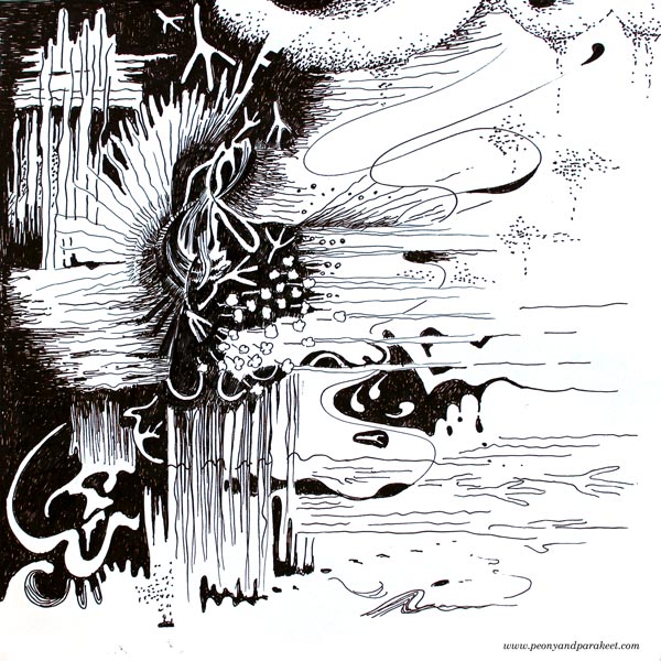
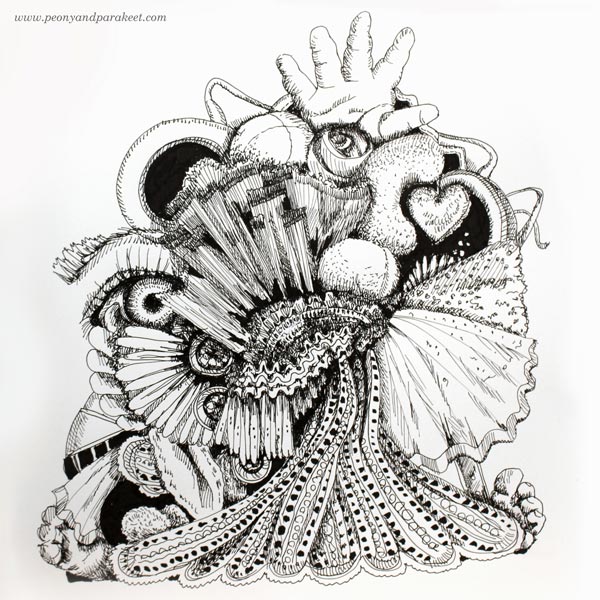
Inktober #1 – Poisonous
Maybe sometimes we think that something is poisonous when it’s not?

While drawing the first entry for the challenge, I allowed myself to be as decorative and detailed as possible. I accepted the union of industrial objects and more abstract elements and went with the flow. Here’s to those past student years!
Inktober #2 – Tranquil
To me, tranquility and yarn go hand in hand. In the evenings I like to knit, cross-stitch, or quilt to calm myself down. So it’s like the threads and yarn tie little moments happened during the day together. The day that felt chaotic in the afternoon becomes tranquil and meaningful before I go to sleep.
The second insight came with the second prompt. I haven’t even considered myself a surreal artist, but the drawing came out so naturally that it started to make sense.
Inktober #3 – Roasted
After starting to work from home, I have been forced to get deeper into the world of cooking. I have made some disastrous meals because I don’t like to follow recipes and don’t have much experience either. But now, after four years, I have found a way that works quite often. I buy good ingredients. I study several recipes and then figure out what my version could be. I use a timer a lot, just because I am often in my thoughts and don’t realize how minutes fly. I like roasted vegetables, especially roasted carrots, so this is for them!
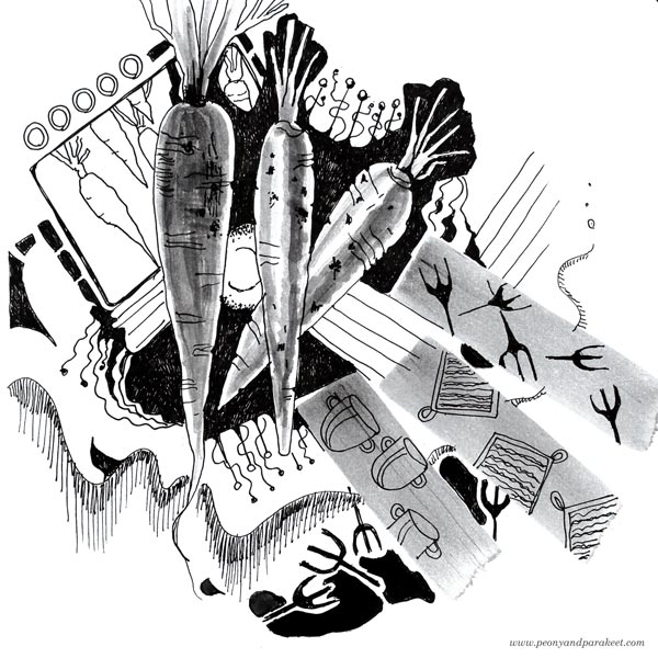
With the third prompt, I wanted to try if I could make something out of less romantic subjects that I would normally choose. Here, I found drawing the oven most inspiring which was an interesting observation. Is the industrial designer raising her head?
Inktober #4 – Spell
I connect the spell with the atmosphere of the inner world. It could be like a cloud hanging over the scenery, sending sounds and lighting candles. I haven’t been a big fan of fantasy novels or such, but when I am creating, the fantasy can easily take over!

The prompt was a weird one for me, but the result is the old average. It didn’t feel so comfortable anymore. Something was lacking there.
Inktober #5 – Chicken
Something big is happening and the change feels scary.
– “I can’t do it! I have to protect what I already have.”
And then the whole universe shouts “Chicken!”
You can’t stop the change. You need to follow the eggs.

The fifth drawing started as a funny one, but at the end, it felt like it was speaking about me. Consciously, I didn’t have any idea what had changed but it felt that I can’t keep on creating like before.
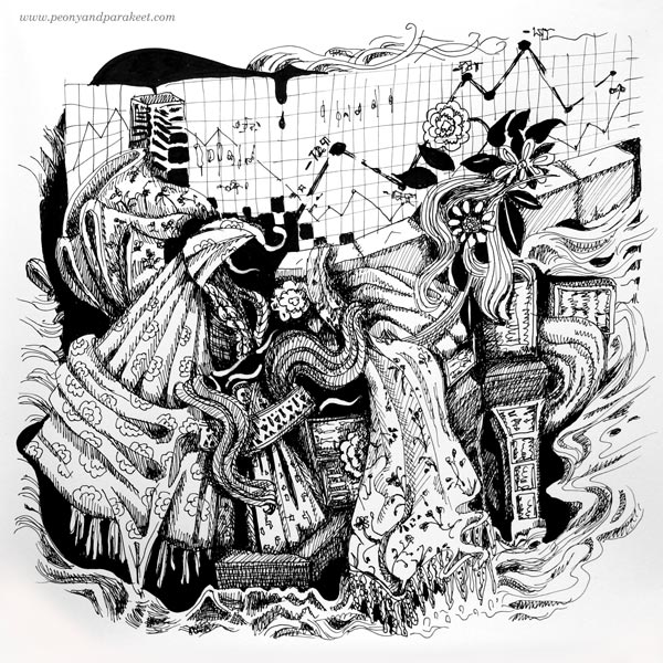
Inktober #6 – Drooling
When your mind is drooling for beauty so that you feel you are eating all the forbidden fruits.
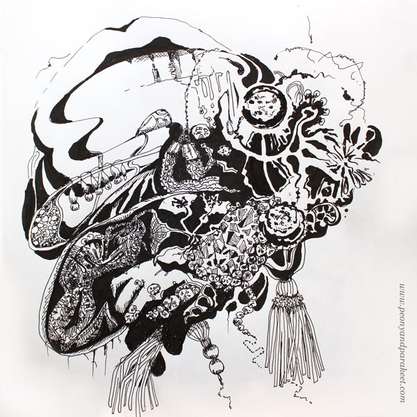
In this drawing, it became visible and clear to me that my creative block had forbidden me to draw decorative items that I adore. I love high fashion, jewelry, elegant fabrics, tassels, pearls, fur, you name it. I don’t grave them so that I would like to wear or own them but my world of fantasy never has a lack of this luxury. I have always thought this is a superficial characteristic in me, but this attitude feels too restricting now when I am more conscious of it.
Inktober #7 – Exhausted
Here’s how I define the exhaustion of the 21st century: You have done too much, and it feels like you have done nothing yet. You have too much stuff to sort out, and it feels like you haven’t got all you need. You are at the bottom of the big pile, and the clock is ticking: “Don’t forget! You are late!”

When drawing like this, I feel the satisfaction that I have never had before. It’s not that this way of expression would be technically more brilliant than my best work so far or superior to what everybody else does. It’s just that it’s like looking myself in the mirror, seeing all the goods and bads, and accepting what’s there. Isn’t it so that no matter how much you admire other artists if you imagine their work to be yours, it feels empty or defective in some ways? At least to me, there are hundreds of artists that I admire passionately and would happily hang their paintings on my walls, but if I were the one creating them, my fingers would itch to change something.
Inktober #8 – Star
Even if I work from home and live an extremely boring life (if you look at it from outside that is), I am a nomad, we all are. We get it when Harley-Davidson advertises motorcycles with the slogan: “Everything you need, nothing you don’t.” It’s about The Freedom – a full-designed package of service including a couple of woven carpets, one string of prayer flags, five long minutes of photographing bokeh and flares on the mountains, a ride downhill feeling a warm wind and hearing the sound of the beautifully polished engine. Some change the motorcycle to a horse or even to a Corvette, but it’s all the same, here’s to The Freedom!
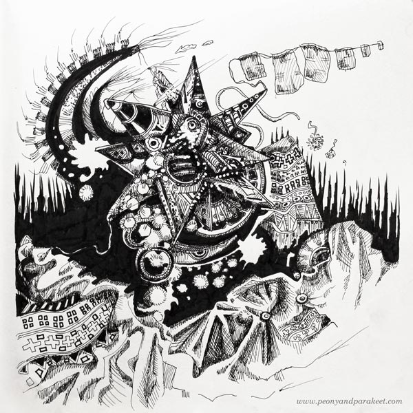
During the challenge, I have not only found new ways to draw, but I have also discovered that I am bursting with stories! Most of the stories are connected with items that have a symbolic meaning to me.
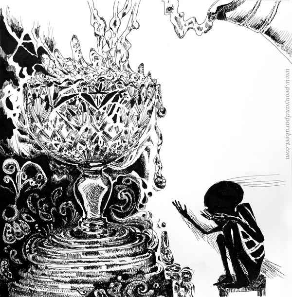
Inktober #9 – Precious
We get excited about a new thing. The next thought is that we need the products. All the products. Happened to me so many times! But hey, let’s not get lost in the products. Discovering yourself is more precious than any product.
What if the challenge wouldn’t have the restriction of supplies, and what if it wouldn’t be specifically for inks, related to my creative block? It’s possible that nothing would have changed. Seeing the stream of simple drawings and how they change one after another, has brought such clarity that I wonder how many times the creative blocks hide under products. When I have bought a new set of this or that, have I subconsciously avoided the block?
Inktober #10 – Flowing
In the Renaissance, the strong currency called Florin enabled the birth of financial professionals like bankers. Today, their working environment looks very different, and the change may feel vast, but that’s only if we keep our perspective narrow.
The facts:
Renaissance was about 500 years ago.
The age of the earth: 4,5 billion years.
The age of our universe: 13.8 billion years.
Here’s to honor all who work in finance but also to remind how money is just a tiny island in the flowing ocean of time.
As a former engineer, I believe in the power of knowledge. But it’s new that I want to express that in my art too!
Inktober #11 – Cruel
Life can be cruel. It throws more and more for those who already have plenty while those who have nothing can’t get anything.
This prompt was not an easy one. I felt sadness and shame. But once I got the idea, I had to draw it out.
Inktober #12 – Whale
Love makes us brave. No matter how timid we are, we can do anything for those who we love.

During Inktober, I have found a way to connect the things that I love from storytelling to decorative designs and illustrational art. So far, it has brought a new sense of happiness in my artistic path. It’s also a scary feeling – what will happen next, what will I do with all these? Time will tell!
You can follow my entries daily (as long as I can keep up) on Facebook or on Instagram.
Watercolor Wisdom – 6 Techniques that You Need to Try Before Giving Up!

This week I am writing to you who have always liked the idea of using more watercolors but whose experiments don’t often last long. Try these techniques to keep going and not giving up!
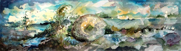
1) Doodle with a Brush
Dip a thin brush into the paint and start doodling! Add more paint to some areas so that the thickness of the line varies and evokes new shapes.
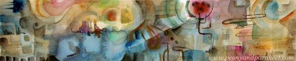
I have also used acrylic paints for finishing this piece called “Netfishing.”
2) Doodle with Masking Fluid
I don’t often recommend purchasing more art supplies to boost the motivation, but with watercolors, I highly recommend buying masking fluid. For example, Daniel Smith has a masking fluid that comes with handy applicators. You can just pick the bottle and start doodling. And while you are doing that why not fill the whole paper with them! Then add several layers of paint and remove the fluid gradually.
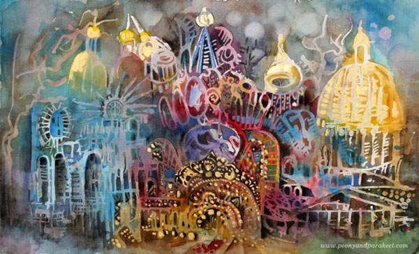
I have also used golden acrylic paint and colored pencils in this piece, called “Three Churches of St. Petersburg”.
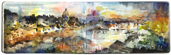
3) Add Geometric Shapes to a Scenery
If all the elements are realistic, defined and “make sense,” you are underestimating the potential of watercolors. An easy way to push beyond the conventional is to add geometric shapes to a realistic theme, for example, to a scenery.
You can also paint vice versa: start with the geometry and then make it look like scenery.
4) Leave Blank Spots to Express the Light
Think about your painting as a collection of layers. Paint 6-10 layers so that every layer is a bit smaller than the previous one. Leave blank spots when painting the first layer. Focus on tiny details in the last layers. Let every layer dry before adding a new one.
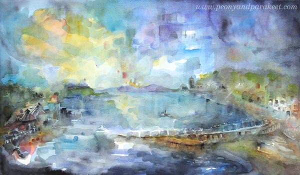
5) Add Muddy Colors to Make the Brights Shine
Don’t be afraid of dark areas. If your work looks unfinished or the colors don’t shine no matter how much you add them, the solution is to add more really dark areas.
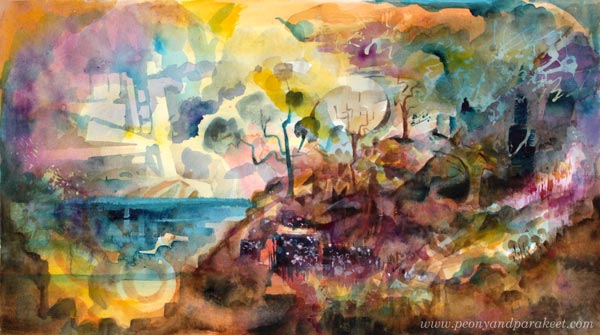
There are a lot of browns, greys, and blacks in these two small sceneries which make the color glow!
6) Pick One Dominating Color, but Use Many Tones of It
When applying paint on paper, add small drops of other colors too. Use the transparency of watercolors to get new tones: add watery paint, let dry, repeat!
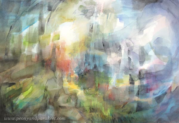
“Oban,” a small town in Scotland that left an impact on me. I could have painted the sky solid blue, as well as the water, but adding more variation of the color makes this painting.
Watercolor Journey – More Watercolor Wisdom for Self-Study!
The pictures and tips of this blog post are picked from my class Watercolor Journey. In this class, you will learn how to use the techniques and the imagination to express energizing sceneries. The fun thing is that these sceneries can be either realistic, or imaginative, or anything between. Sometimes the scenery is born with the technique. Other times painting is more about reconnecting with a happy memory. I have tried to make the videos as inspiring as possible so that you and your watercolors become a better match after each one.
>> Buy Watercolor Journey!