Building and Breaking – Revealing Artistic Potential
This week, I talk about the hidden potential behind artworks and how we can reveal that by not only building but also breaking.
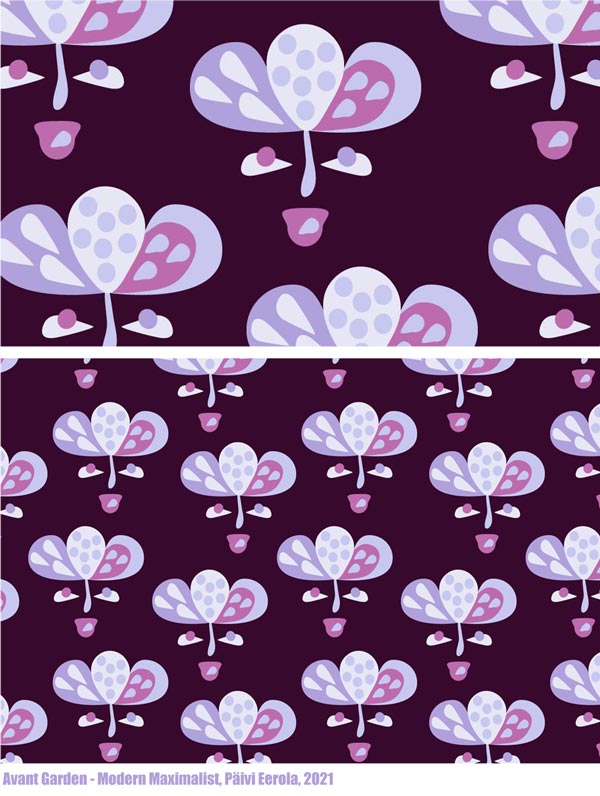
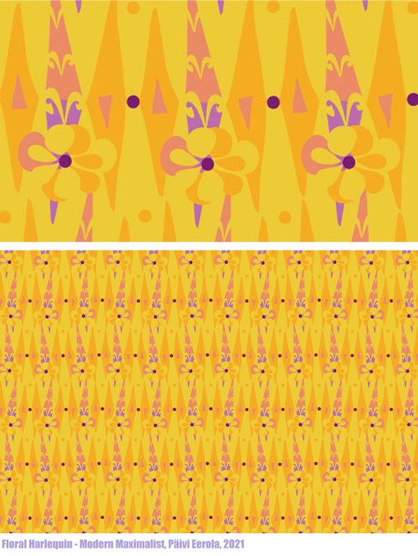
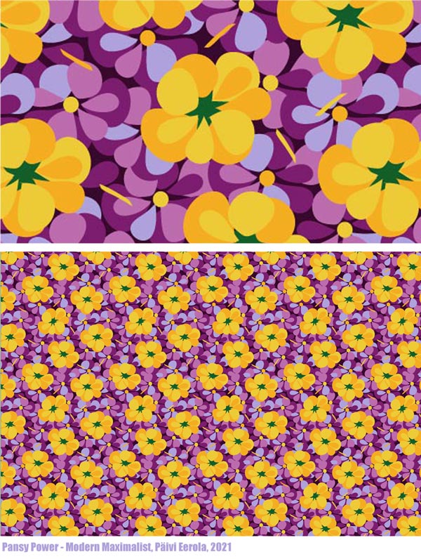
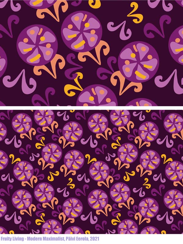
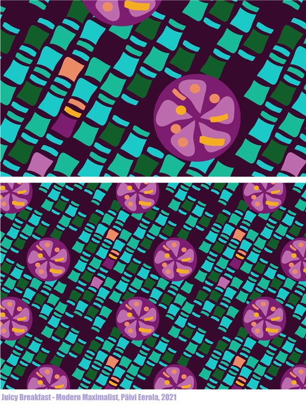
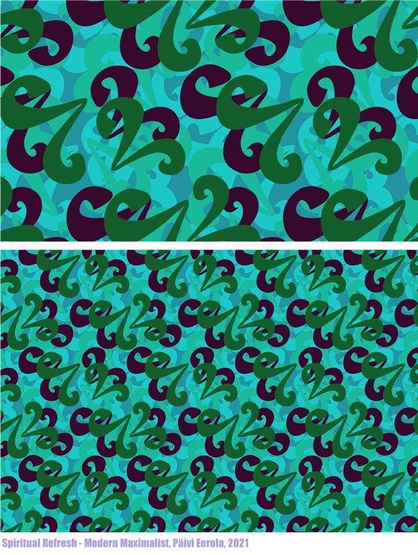
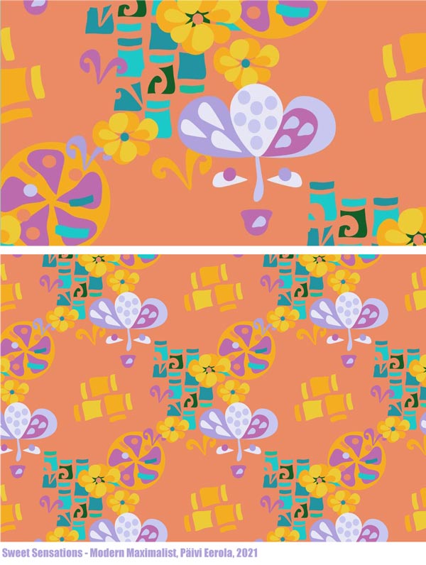
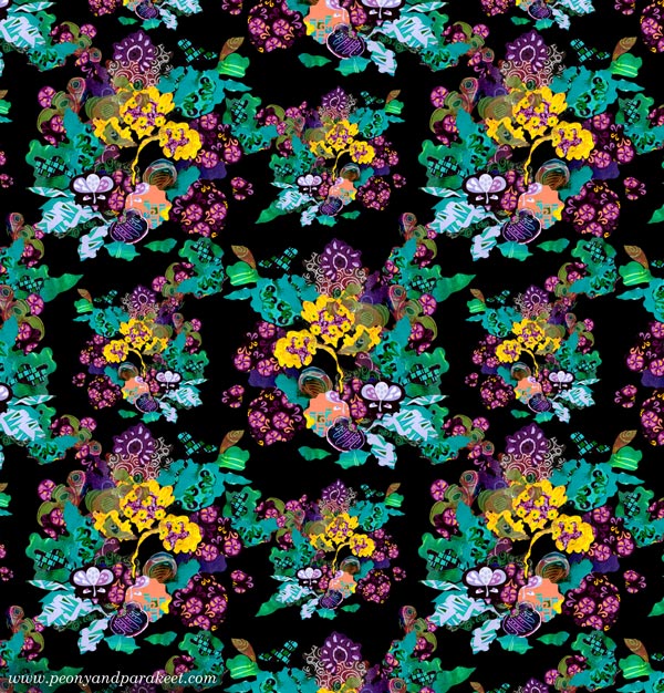
Modern Maximalist
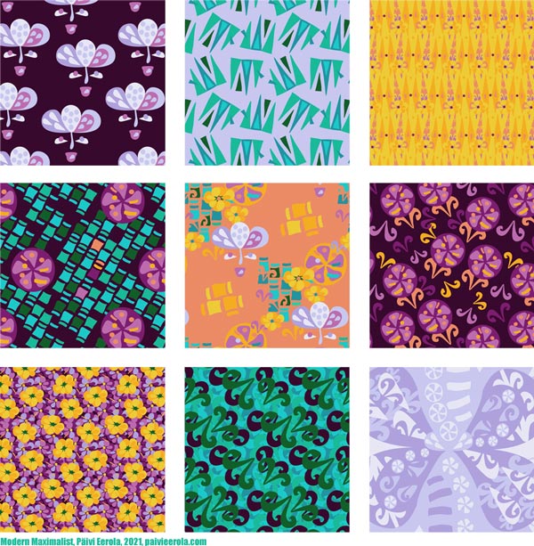
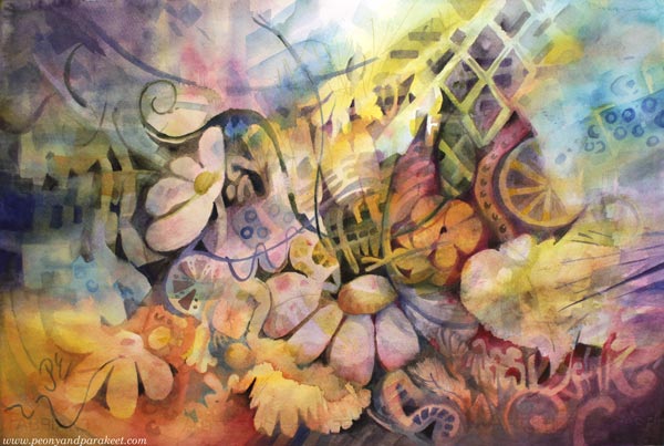
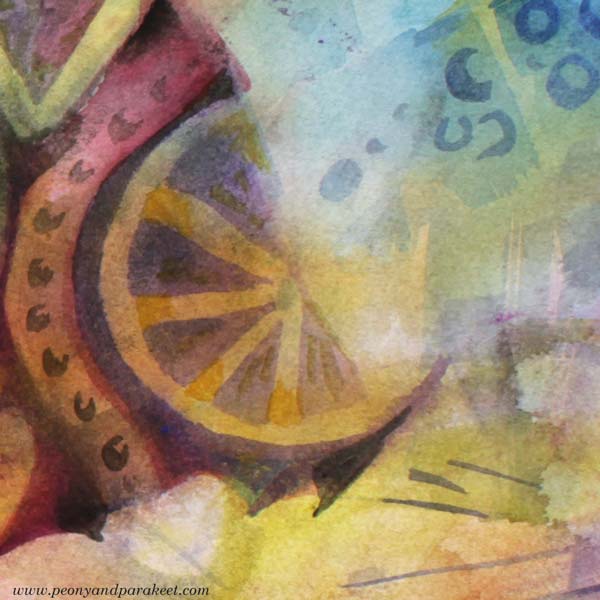
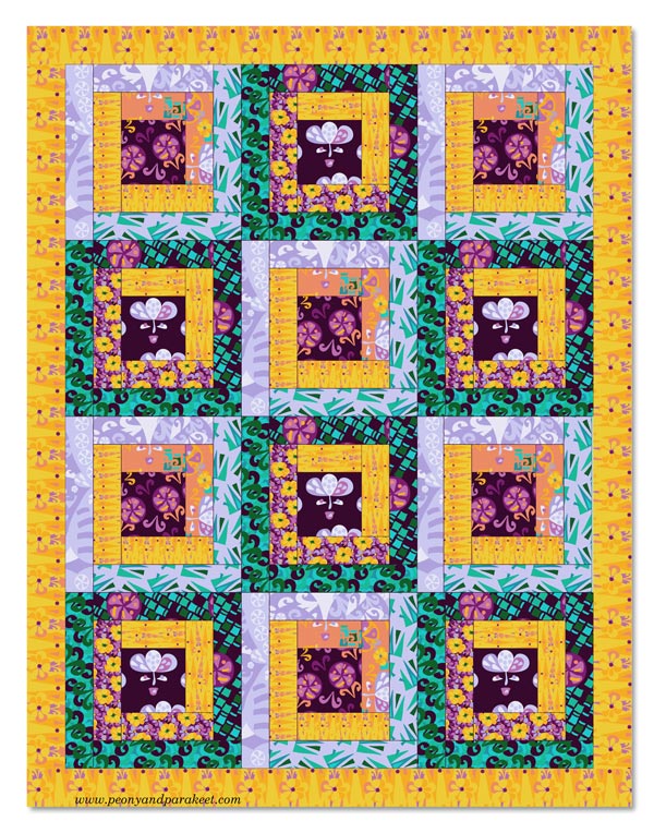
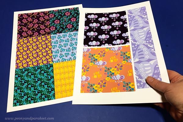
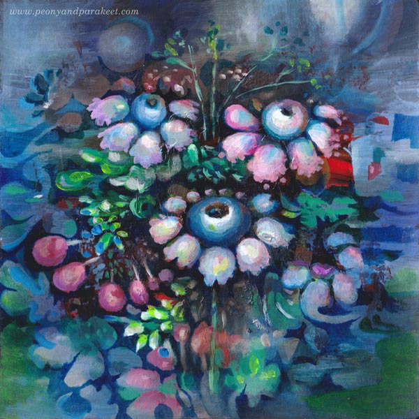
I have just designed a collection of surface patterns called Modern Maximalist. It’s drawn digitally in Adobe Illustrator and more modern than my work usually is. However, I love modern, especially the 1960s and 1970s styles. I was born at the end of the 1960s, live in a house built in the same era, and my love for retro has been too hidden in my art. But still, I didn’t want to design the collection based only on the images of others, but to build a bridge from my art to design. So, most of the motifs were based on this watercolor painting that I made a couple of weeks ago!
More Artistic Potential by Building and Breaking
Often when we create art, we build. We communicate the big picture and compose bits and pieces so that they work together. We get happy accidents (and sometimes some not-so-happy ones) and aim to make an image where the overall atmosphere takes over the details.
But to reveal more, we also need to break. Then the romantic flower that was painted to represent a dreamer, becomes a more stylish and symbolic figure.
Yellow flowers and all the yellow washes can be more geometric when they are away from the big picture.

The juicyness of the fruits and other decorative details can be reorganized.
Picking Ideas from Other Images
We can also add more fuel, and break and pick from other images. This design called “List Maxima” uses motifs from the painting, but also the idea of a list that came from playing with the name of the collection, and fashion pictures that showed puffy and full dresses of the maximalist style.
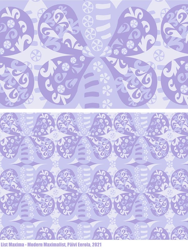
By breaking and picking, we also develop our ability to curate – to see which inspiration suits what we have already done. It’s an essential part of a style-development and and growing artistic vision.
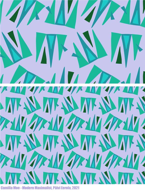
I saw a pleated skirt on Prince Charles’s wife Camilla Parker-Bowles, not a maximalist style at all, but wonderfully modern so I broke and picked the image and got creative from that.
Artists often say to me: “I need to focus!” But by focusing on narrowing, we non-creatively force ourselves to do one thing. By breaking and picking, we can curate all kinds of inspiration and be creative so that it grows our artistic vision.
Revealing the Artistic Potential
No matter where you are in your artistic journey, your art benefits from the idea of building and breaking. Build to go deeper into the experience and break to reveal more ideas and potential! In practice, building often means painting, and breaking is often connected to drawing – even if, of course, you can use any techniques that suit you.
What was first a watercolor painting, could now be a quilt!
Building and breaking can alternate endlessly when we combine new ideas and results with old ones.
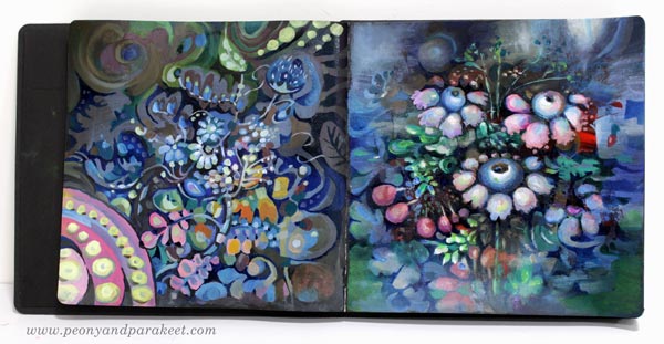
Here I am breaking and picking to create something new into my art journal.
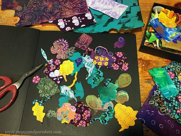
Here’s what I built by cutting and glueing new prints and old hand-decorated papers.
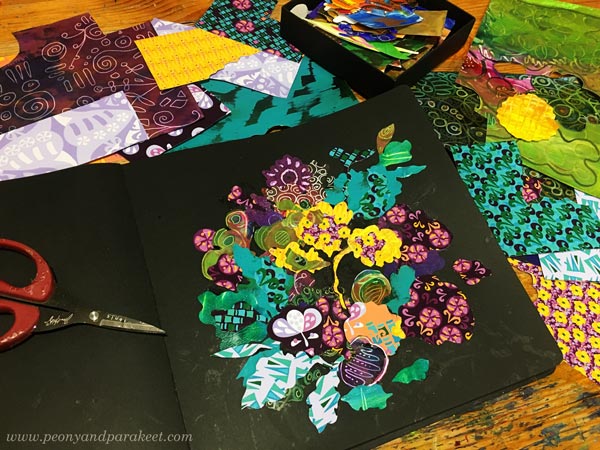
And I couldn’t resist checking if this could work as a repeat too!
I hope you found this post about building and breaking inspiring!
Need help for finding your artistic potential and building artistic vision? Sign up for my coaching program called Artistic Vision!
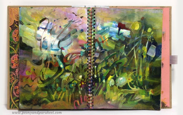
Using Leftover Paint – Messy Backgrounds and Beyond
This week, I show one of my art journals in the video and share ideas for what to create from messy backgrounds.
After a painting session, there’s usually some leftover paint on a palette. I try to squeeze the tubes carefully, and sometimes I put the paint in a box with a lid, but most often, I grab an art journal and wipe off the extra paint from the brushes and palette. If I am tired, I just spread the paint carelessly. If I still have energy, I add details to a page that already has some color. When I don’t like something in the next session, I paint new strokes over it.
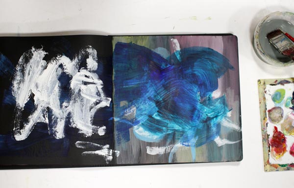
Many Rounds – Some Quicker than Others
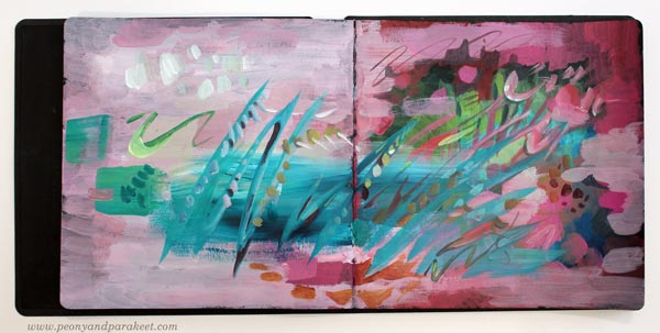
I rarely make a page at one go. This spread has oil paints, and it took ages to finish it. But it didn’t matter, because I was practicing for the class Decodashery, and I needed time to dig into the heart of decorative painting style.
However, the one below is more abstract, and it was really quick!
Messy Backgrounds and Beyond – Watch the Video!
In the video, I show messy pages and not so messy pages of my current art journal and how I finished the spread above. Watch the video!
Even if bigger paintings are my main work, art journal pages are an important part of my creative process. It’s like yin and yang! I need the mess-making to find joy in working with details.
Art Inspired by Music
In the video, I mentioned the idea of visualizing a musical landscape and a melody. Music is the theme in my mini-course for Gratitude Junk Journal 2020 as well. This online workshop has 12 instructors, and it begins on Nov 1st, 2020. Register in October to get 20% off. Enter JOY2020 at checkout. >> Buy Here!
Art Journaling, Music, Giveaway!
In this blog post: A new class for art journalers and absolute beginners + a giveaway!
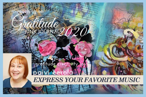
For a long time, I have been thinking about creating an art journaling class that would be geared for absolute beginners. Art journaling is where my creative rise started 10 years ago, and I still want to stay in touch with that. So when Tiare Smith asked me to join her Gratitude Junk Journal 2020 program, I was happy to say yes. We have 12 instructors, and each of us has picked a theme for a page. Mine is Music, and I absolutely loved making the class. It was a chance to express my gratitude for another inspiring art form, and help others do the same.
Gratitude Junk Journal – More About My Class
With this class, you’ll create music-inspired art journal pages based on one song or a collection of songs, learn about the similarities between music and visual art, and express togetherness – something we never have enough as artists and as human beings. We’ll first paint a musical landscape and then continue with the melody. I’ll show several examples and inspire you to try different songs for a page. My class includes scribbling, doodling, inking, coloring, and painting. It has 3 videos (about 1 hour total), but you’ll also get 11 more classes with the price.
Gratitude Junk Journal 2020 begins on Nov 1st
Register in October to get an early Bird Special of 20% off with code JOY2020 at checkout.
>> Buy Here!
Enter the Giveaway!
I also have one spot of Gratitude Junk Journal 2020 to give away! Leave a comment with your email in this post! (The email field won’t be published, but it helps me to contact the winner). In the comments, tell us one song that inspires you to create!
I will randomly pick a winner between those who wrote the name of a song. One entry per person, please! The last day to enter is October 7th (PDT), 2020. If you have purchased the class and win the spot, you will get a refund, so don’t worry about waiting too long!
>> Buy Here!
Expressive Abstract Style Tutorial – Paint a Beautiful Mess!
This week I have a video about painting in an expressive abstract style. It’s a very contemporary style which many artists have nowadays. It’s based on loose strokes, and I guess it’s the style that many who are not so much into art say that even a child can do it, but it’s not quite like that! Watch the video!
Are you interested in creating abstract art? Do you wish to learn more about abstract art in my blog and in my classes? Leave a comment!