How to Freely Express Sunshine
This week is about the sun! Let’s dive deeper into how to express sunshine when you want to create freely without reference photos. My example is an oil painting, but you can apply the tips to any supplies.
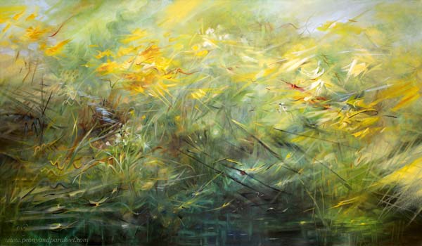
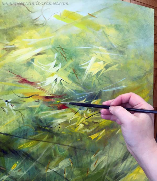
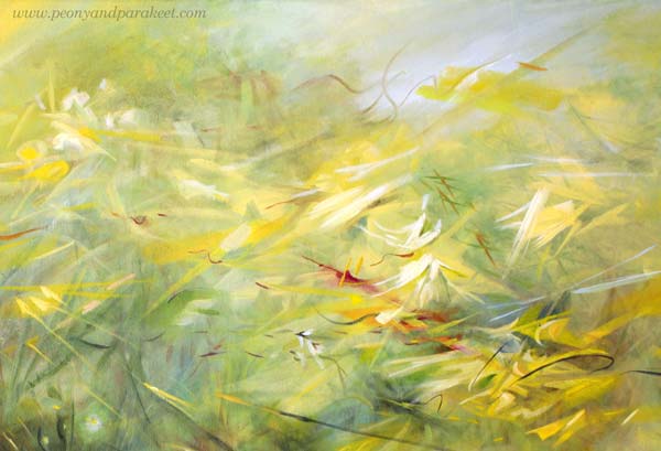
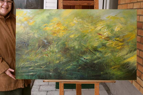
Here’s my newest painting that begins the new series where I explore the stars and planets of the Milky Way. The subject of the first one is, of course, the sun! I named the painting “Runaway Sun” – “Karannut aurinko” in Finnish because I wanted to express sunshine in a dynamic way.
Closed or Open?
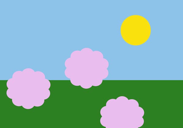
Often we paint or draw the sun as a static yellow spot in the blue sky, but I feel that the sun is different. It’s not a closed circle but a very open one. It’s radiating and moving, making things appear and disappear.
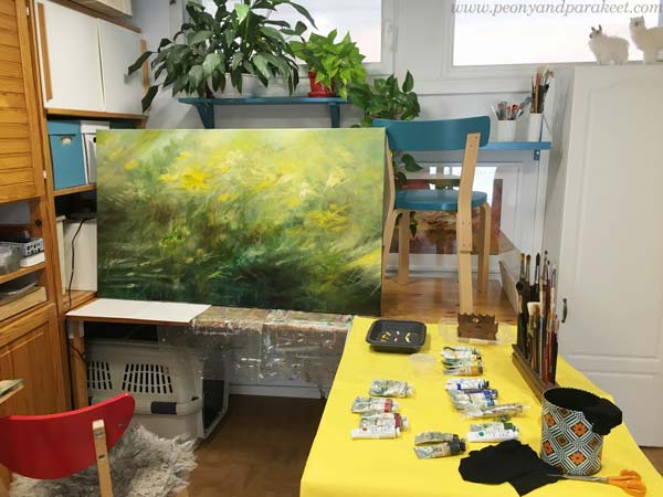
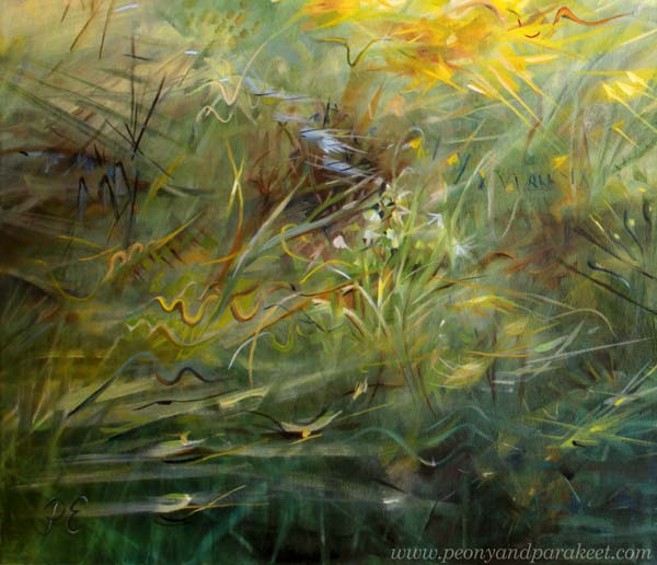
The painting was only a green mess when I took the picture above. “Oh no, the photo of Stella failed badly!” I thought when looking at it. But then, bad photos are the best. They challenge us to see what the world really looks like. Here, the sun has swallowed Stella and entered the room like a giant animal, so it’s not a little closed spot at all.
Isolated or Impactful?
The sun is the star, and the earth belongs to its solar system. The earth could be seen as a toy and the sun as the one who plays the game.
But in our art, the sun often has very little effect on its surroundings. We isolate the sun and keep it far away. For example like this:
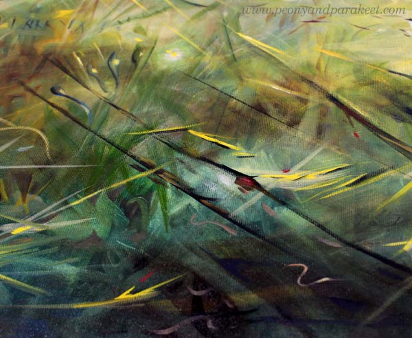
But the sun impacts everything. It travels in the scenery like a runaway that goes here and there, but it’s impossible to catch as a single being.
When my painting progressed, it got strong differences between light and darkness. The sunny look requires shadows too!
Is the Sun a Thing or a Person?
Art is only a technical skill as long as you think about drawing or painting things. But if you treat the elements as living beings of some kind, the game changes. When your paper or canvas is filled with people or animals, not just shapes or flowers, everything gets more exciting and it’s easier to express sunshine too.
So, ask: Who is this person called Sun? How does she impact everybody in this piece?
Some will love it, and some will escape from it.
Yellow or White Sunshine?
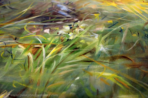
Some people get any yellow for the sun, and some select their yellow carefully. But I think that one yellow is never enough, and without white, the sun doesn’t shine.
I usually work with a limited set of colors, but I change the tubes every session. So, if I use Indian Yellow in one session, for example, I switch to Lemon Yellow in the next. I do the same for other colors as well. When I create new color mixes from different base colors, my paintings will get a huge variety of tones and look more natural.
I try to always mix some color to most whites so that the variety of pastel tones is present too.
I also add color to blacks or make my own blacks. Browns and blues make wonderful darks!
Does It Express Sunshine? Test!
I like to do a test for all my paintings where I lay them on the table, walk away from the room, and then get back.
I wrote about the test in this blog post too.
By resetting my mind, I try to get an immediate impact of how the painting affects the surroundings and whether it’s captivating enough. The sunny painting should draw attention and warm the room.
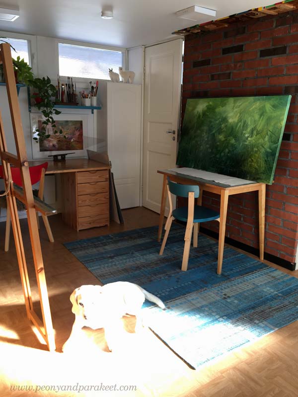
Here’s my little studio one night with other paintings that are still in progress.
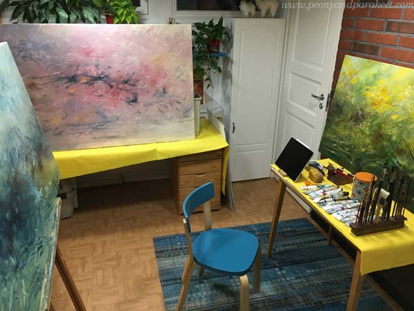
The paintings are too big for my little studio, but I have decided to manage!
Sunshine to Your Weekend!
I hope this post inspired you to bring more sunshine to your art!
Happy Easter!
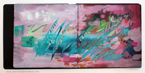
Using Leftover Paint – Messy Backgrounds and Beyond
This week, I show one of my art journals in the video and share ideas for what to create from messy backgrounds.
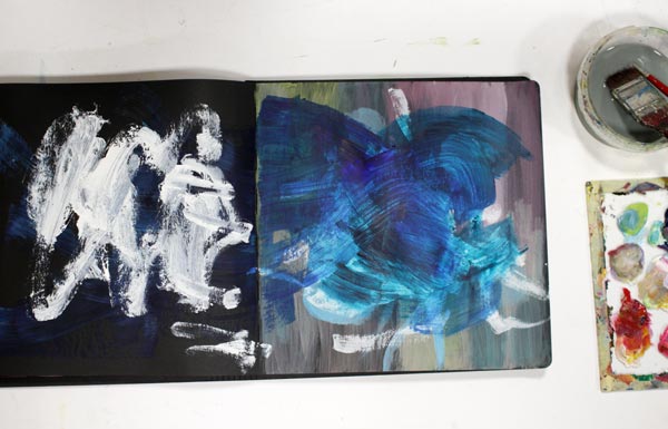
After a painting session, there’s usually some leftover paint on a palette. I try to squeeze the tubes carefully, and sometimes I put the paint in a box with a lid, but most often, I grab an art journal and wipe off the extra paint from the brushes and palette. If I am tired, I just spread the paint carelessly. If I still have energy, I add details to a page that already has some color. When I don’t like something in the next session, I paint new strokes over it.
Many Rounds – Some Quicker than Others
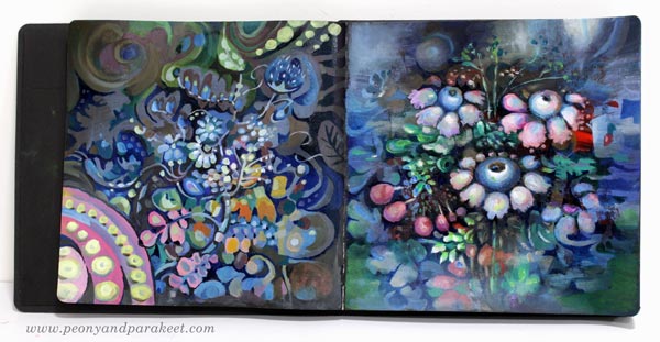
I rarely make a page at one go. This spread has oil paints, and it took ages to finish it. But it didn’t matter, because I was practicing for the class Decodashery, and I needed time to dig into the heart of decorative painting style.
However, the one below is more abstract, and it was really quick!
Messy Backgrounds and Beyond – Watch the Video!
In the video, I show messy pages and not so messy pages of my current art journal and how I finished the spread above. Watch the video!
Even if bigger paintings are my main work, art journal pages are an important part of my creative process. It’s like yin and yang! I need the mess-making to find joy in working with details.
Art Inspired by Music
In the video, I mentioned the idea of visualizing a musical landscape and a melody. Music is the theme in my mini-course for Gratitude Junk Journal 2020 as well. This online workshop has 12 instructors, and it begins on Nov 1st, 2020. Register in October to get 20% off. Enter JOY2020 at checkout. >> Buy Here!
Making of a Miniature Painting
This week, I have a new miniature painting and share tips for making small-sized paintings in general.
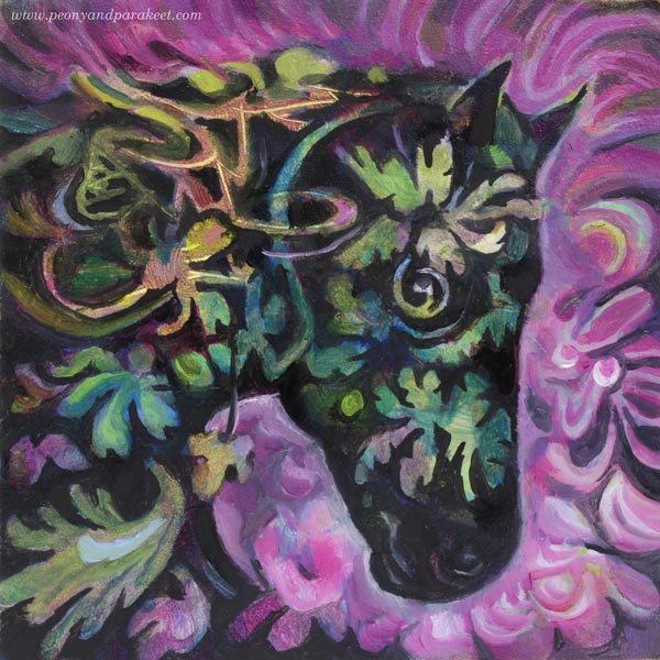
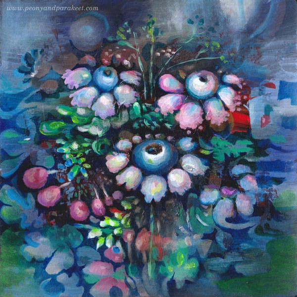
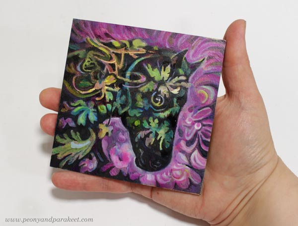
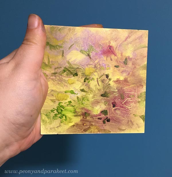
Let me introduce Ebony, my newest miniature painting! It’s only 10 cm x 10 cm (4 inches x 4 inches). The size shows better in the photo below.
This is an oil painting, and it took over a month from start to finish, but just because I let each layer dry properly. There’s about a week drying time between each layer. If you use acrylic paints or watercolors, the process is much quicker!
The Beginning – Making Not So Beautiful Mess
As usual, I didn’t have any particular idea for the painting when I started. Here’s how the painting looked after a couple of layers.
My surface here is Ampersand Gessoboard Panel. It’s very smooth and thus suitable for small details. I had bought a pack of four over a year ago. I finished the first one last year, see this blog post!
When making an abstract mess, I don’t usually settle for pretty little messes, but make the mess more layered. When the mess is as ugly as I can bare, it begins to talk to me. It came to my mind, that the random strokes could be mane, and there could be a horse coming up.
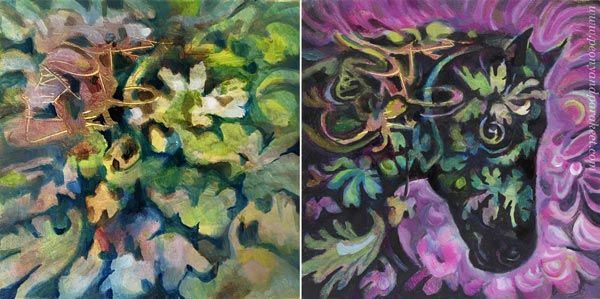
Using Negative Painting to Dig Out the Spirit
I like to use negative painting a lot. So here, I painted the background first so that it defined the head of the horse. When painting the surroundings, you slowly get closer to the actual spirit. It’s like taming a wild animal!
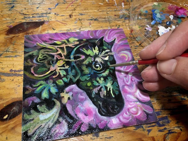
Ebony is now a gentle soul, and she reminds me of Black Beauty, the television series in the 1970s. I watched every episode and it inspired me to play with plastic horses.
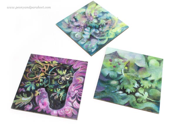
I still have two more panels to finish. I think I will dig out horses or other animals from their messes so that I get a small series of miniature paintings.
My Four Tips for Painting in Miniature
- Start boldly and enjoy all kinds of mark-making and color play. If you are painting on paper, you can start with a bigger piece, and then cut it into smaller ones.
- Make a few big shapes that contain smaller ones. In my painting, the horse is one big shape, the background another. Let smaller shapes break the borders of the bigger shapes so that the image doesn’t look stiff.
- The negative painting technique where you paint the surroundings of the shape enables you to paint delicate shapes easily. Magical Forest is the class to take for mastering this technique!
- We hold miniature pieces quite close when looking at them, so the quality of brushwork matters. Use thin paint, small brushes and even magnifiers if needed. Taking photos and zooming them helps to see the details too. Decodashery is the class to take for making the best out of every stroke!
Drawing Small
Of course, your miniature artwork doesn’t have to be a painting, but a drawing! For me, drawing has been in a significant role in becoming a better painter. It can be just free drawing like in Inspirational Drawing, or more intentional practice like in Animal Inkdom and Magical Inkdom. I use both approaches in painting too.
I hope you enjoyed this week’s project. Do you like painting or drawing in small size?
3 Tips for Improving Busy Mixed Media Pieces
This week, I have a revamped old piece, and share three tips about making busy mixed media pieces more attractive for the viewer.
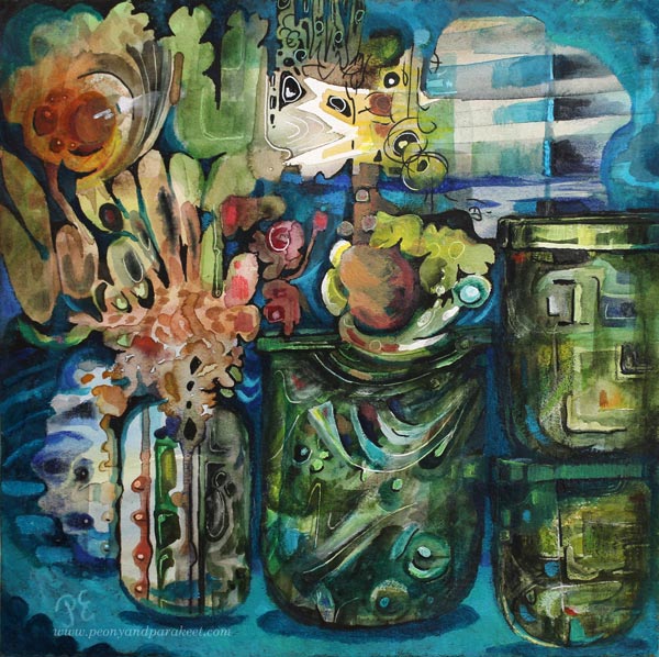
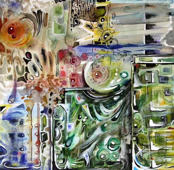
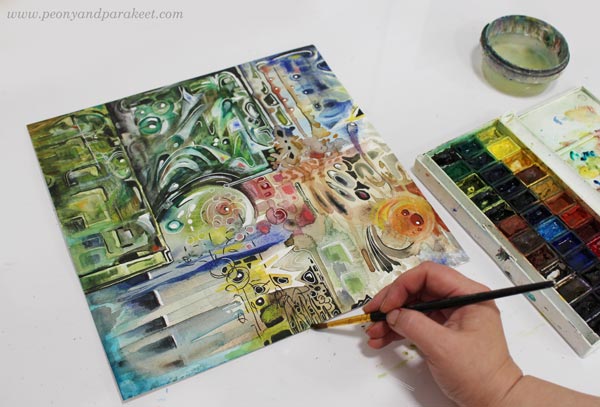
The image above is a revamped version of the busy mixed media piece below. It’s 12 by 12 inches, and I originally made it back in 2014 for a blog post about how to paint glass.
I visited the Finnish Glass Museum a couple of weeks ago, so this piece felt really inspiring again! Let’s dive deeper into how I changed it.
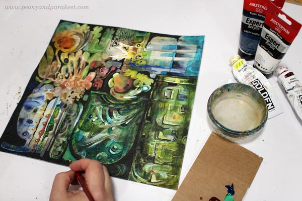
Tip #1 – Cure the White Spot Fever
Back in 2014, I had fallen in love with all kinds of white pens, paints, and correction fluids. A little dot here, another there, and the element looked prettier. But adding dots and spots also make the piece busier. For the viewer, it’s like trying to find its way through crowded streets where everyone is trying to get the attention: “Hey, hey, hey, you there, look at me!”
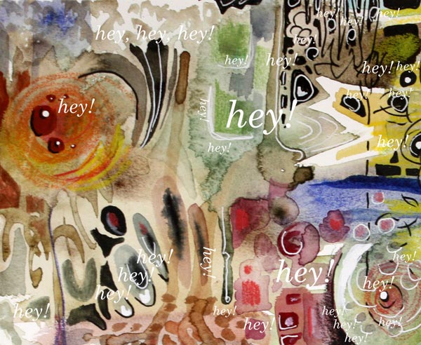
When you are a doctor for the white spot fever, start by toning down all the spots that are located near the edges. We want to steer the eye to the middle first, so the edges don’t have to be so eye-catching. If this is the first time you work on this job, watercolors can be a good choice. Even if the pigment wouldn’t stick on all the surfaces, you get the impression of how the piece looks if you make the edges less noticeable. Turn the piece upside down, so that it’s easier to focus on the task, and not look at the big picture.
Of course, your pieces can have fever, even if it’s not the white spot fever. The general advice for any fever is to remove all the eye-catching small elements that are located near the edges.
Tip #2 – Form Friendships between Elements
Often when we don’t feel connected with the image, the image itself doesn’t express connection. When the elements are floating separately, there can be a lonely undertone in the whole piece. On the other hand, if there is no contrast between the elements, the image can look busy no matter how connected the elements are.
Here are my two versions side by side. In the old version, there are big glass jars, but the contrast between them is not very clear. There are a lot of small shapes that are floating lonely.
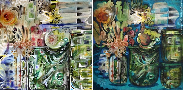
At best, adding connections make the image to deliver a message. When I looked at my piece, it was unclear to me what it was about. In the old blog post, I had written: “It’s about parents trying to protect their children. The parents have good intentions, and they do their best, but in the end, they have to let the child step into the world. I have painted two glass vases to represent the parents. The child sees the world through the parents, and even if they want to protect the child, they are fragile too.”
But now, I found the element that looked like jaws most intriguing. It seemed to be a rising spirit, a small but powerful baby dragon, which only needed a neck to become a central element.
I used dark india inks and black pen to quickly sketch how I would connect the elements, and then continued the work with acrylics and lighter colors. I broke the biggest jar near the edge to two jars so that they won’t compete with the focal point so much.
Tip #3 – Make a Highway for the Viewer
Busy pieces often have so many paths for the eye that it’s not clear where to start and how to continue. The best thing is to be clear and make a highway that goes around the image. The viewer can then take smaller scenic routes around the details, but there’s always the big safe road to return to that leads to the main attractions.
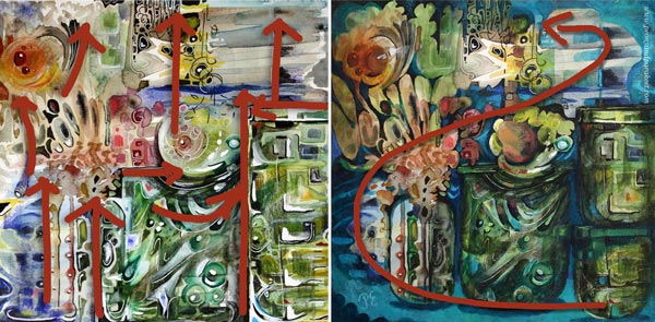
Building a highway requires that you know what your main elements are. After finding the spirit of the jar, I made the red circle communicate with it. Now I added a couple of white spots so that it looks like there’s a voice or a reflection flying between the two. So there’s use for those white dots, just use them sparingly and near the places where you want to lead the eye!
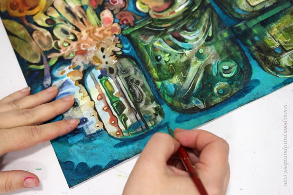
With turquoise tones, I painted a route from the right bottom corner to the two central elements. I also added more depth to the image by painting shadows. Shadows would be my fourth tip, but it’s worth a separate post, so I will get back to it sometimes later.
No More Busy Mixed Media!
I named the revamped version as “Song of Glass” because it’s now about finding the singing spirit of the silent jars.
I hope you found this post helpful for busy mixed media pieces. See my classes for more handy tips and advice!