
Getting Inspired by Removing the Obvious
This week, I have finished the first painting of the new series, enabled by the grant that I got from Arts Promotion Centre Finland. This is the second blog post of this project, see the first one here!
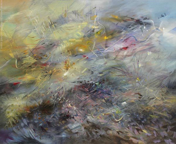
I wanted to combine two different styles for the painting.
Struggling with Differences
First, I wanted to honor Sandro Botticelli, a masterful painter from the Italian Renaissance, and include some of his colors and ornaments. I especially like the pastel colors in his paintings. Yellow ochre and ultramarine blue look beautiful in the mixtures. Botticelli’s painting The Madonna of the Pomegranate was my main inspiration for the color scheme. I also listened to Renaissance choir music and imagined how he felt when he painted and analyzed his work.
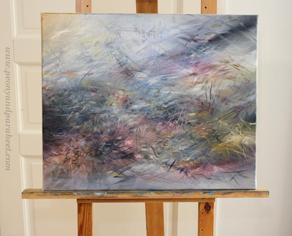
I also had another tutor, Wassili Kandinsky, from the 20th century. I reread his books On the Spiritual in Art and Point and Line to Plane and imagined him talking about releasing the inner sound of a shape.
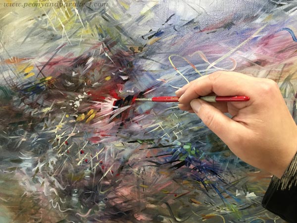
But knowledge and advice and all the left brain stuff can only help to a certain point. When focusing on facts and words, I lost not only Botticelli’s and Kandinsky’s voices but my own too. I ended up making too bold moves and the spirit of the painting was lost.
Indoors – Outdoors
Fortunately, I had to take many sittings because dogs require pauses. It feels that I am constantly moving from indoors to outdoors nowadays!

Then it hit me, that painting, life, and spirituality are not about defining two states like outdoors and indoors. I can bring indoor elements like lamps with outdoor elements like trees. Botticelli broke the division by painting decorative flowers that continued from the grass to clothes.
Removing the Obvious Limitations
And if indoors and outdoors can be one, why not break other obvious limitations too – for example, combine science and beliefs in the same painting.
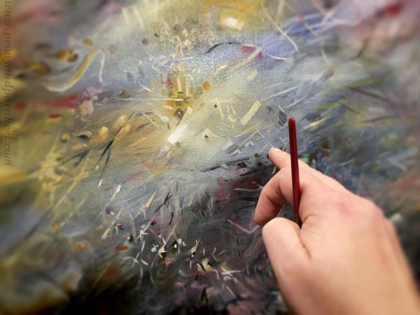
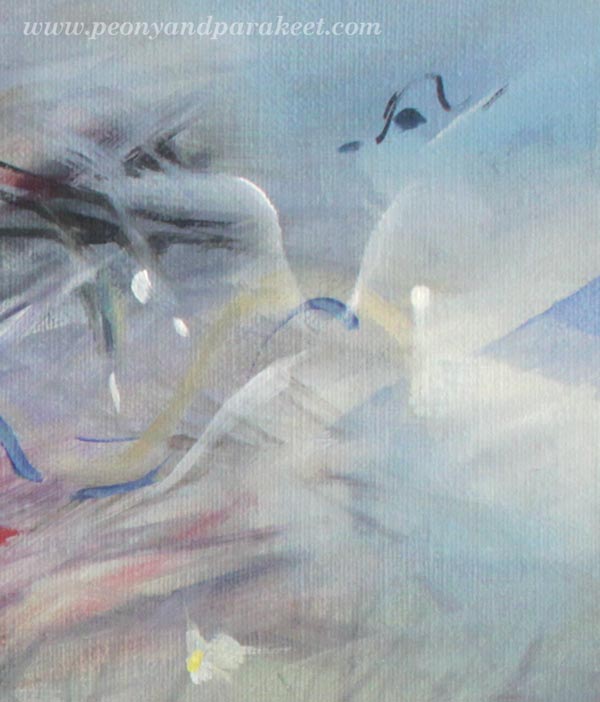
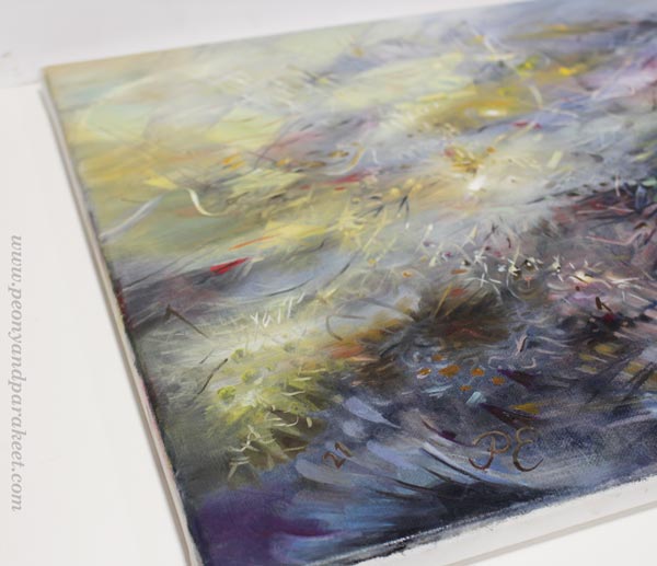
So I painted a chandelier, Botticelli’s divine rays, a light bulb to honor Thomas Edison, a tiny cross to represent spiritual beliefs. I allowed one association to freely lead to another. My mind was exploding when I thought about light and its all interpretations.
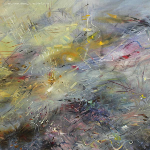
Some people collect chandeliers, others search for a proper lightbulb in a supermarket. Sometimes we believe in science, other times we have different beliefs. Some see angels instead of flowers. Sometimes we need darkness to see light, and other times we may need more light to the lightness. Light can be glitter that saves the day or a more permanent feeling of hope. Art and spirituality don’t have to be separate from the rational and mundane, but they can be the glue between the inner and outer world. We can remove the obvious, and express the diverse experience instead of a single thing.
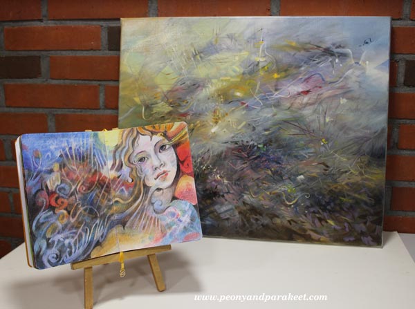
Releasing the Inner Sound
In the light of removing the obvious, Kandinsky’s idea of releasing the inner sound can simply mean this:
Make subtle changes to an element
so that the obvious interpretation becomes vaguer
and a variety of new ideas are raised.
What could “removing the obvious” mean to you? Tell me what you think!
Art Journey to Spirituality – Let’s Begin!
This week, we will begin a journey to express spirituality through art. Think about this and the upcoming blog posts as an interactive diary that you can adapt to your own work. The idea is to question and examine first and then intuitively find more truths.
Introduction to the Journey
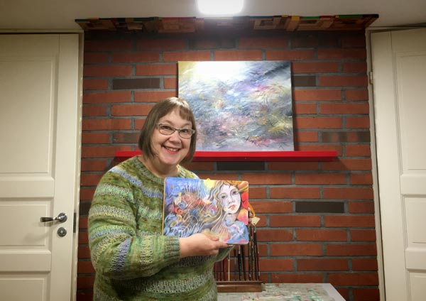
As I wrote last week, I have got a grant from The Arts Promotion Centre Finland to create a series of paintings and write about the process.
In the series, I will dive deeper into Wassily Kandinsky’s idea of unleashing the inner sound of form (check the class Floral Freedom). I will also examine the art of the 16th and 17th centuries and get influences from there. My paintings will express spirituality, but they won’t be subject to any particular worldview or religion.
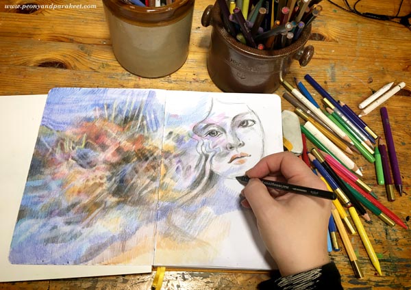
I will work both systematically and intuitively. I will create studies in my colored pencil diary that help me to build a formal language for each intuitive painting (check the class Intuitive Coloring).
I hope this 3-month project inspires you to start an art journey to your spirituality! Take a bit of time for it every week, have a sketchbook or an art journal, maybe create a few paintings too. You can also write down names, quotes, and personal thoughts. The idea is to keep ideas and associations flowing while art gets created!
I hope to hear your thoughts in the comments! If you want more social support, purchase any of my classes and you will get to my community Bloom and Fly for the rest of the year. We will have discussions about this project in the Facebook group of the community.
Ok, let’s begin!
How to Define Spirituality
First, let’s ask what spirituality is! Google replies:
“the quality of being concerned with the human spirit or soul as opposed to material or physical things.”
But as artists, we don’t have to obey any general answer. Rather, it’s expected that our art expresses our personal points of view. I also believe that any word can start a journey. The first answer is just a ticket, and the answers get deeper piece by piece.
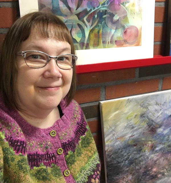
Connection, empathy, and understanding – I imagine squeezing these three words in my hands like they would be paper tokens. I want to connect with artists in the past, empathize with their shapes, and understand how to go deeper. But instead of getting overly serious, I also want to learn to play. The goal is to create a spectrum rather than one truth.
What three words would you pick as your tickets to a spiritual journey?
Meeting Sandro Botticelli
The first painting of the series will be the one that started last July. It was then black and white, an underpainting only.
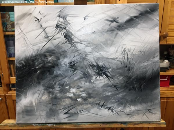
This week I got back to it and brought in more colors.
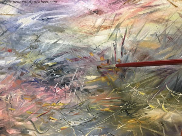
Even if the painting is not finished yet, the colors took me to meet the first companion of my journey – Sandro Botticelli.
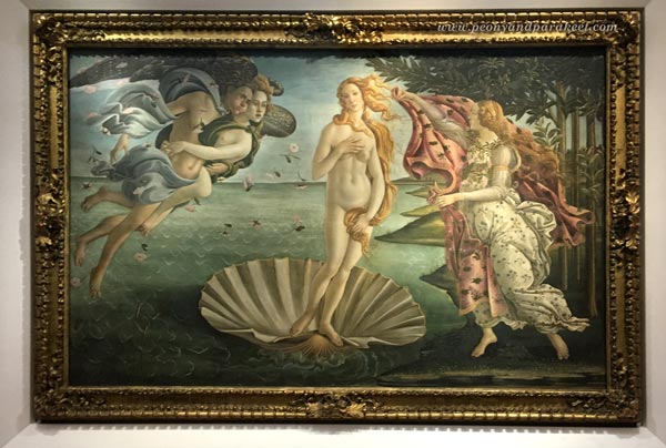
Sandro Botticelli (1445-1510) was an Italian painter. I have seen his famous paintings Primavera and The Birth of Venus in the Uffizi Gallery, Florence, but many other pieces inspire me too.
Botticelli equals perfection in many ways. His shapes and lines are so flawlessly beautiful that they make me shiver. He didn’t paint alone but had apprentices. I wonder what it would be like to work in his workshop – trying to paint a curvy line that would get his approval! Botticelli was born again in the 1850s when the Pre-Raphaelites found him. The easy way to fall in love with Botticelli’s work is to look at, for example, Evelyn de Morgan’s (1855-1919) romantic ladies. After those, it’s easy to greet Sandro too.
Botticelli’s Spirituality
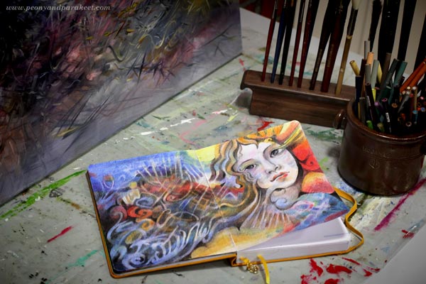
I made this little study of Botticelli’s style in colored pencils to examine how his shapes are. It’s often good to let the hand think instead of using only the mind.
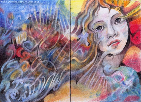
When I imagine discussions with Botticelli, he whispers out romantic mysteries. “Your stories would make great plays,” I tell him. But what interests me most is not the characters themselves, but how ornamental their speech is and how much in detail he describes their clothing and the overall setting.
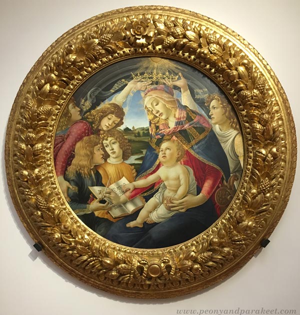
I think the spiritual in Botticelli is the way he empathizes with things. For example, how a thin vail looks like the extension of the soul. Or how the flowers that are on the ground continue on the dress and fly in the air. Sandro’s people look immersed in their surroundings.
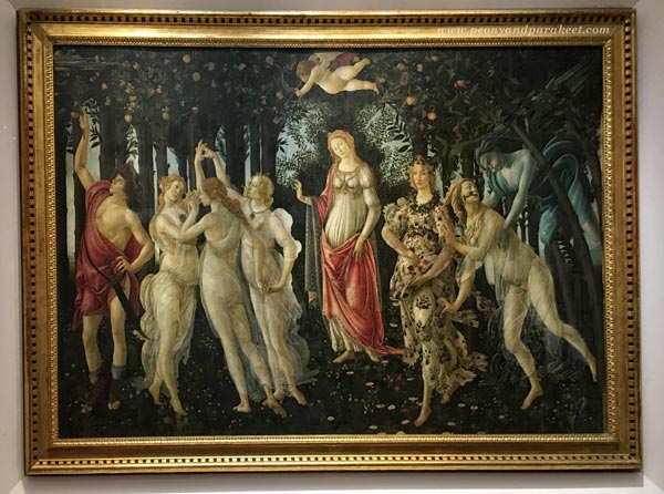
Like Wassily Kandinsky would say, they seem to be not watching something as outsiders but being an integral part of the overall experience. I hope that this understanding will somehow help me to finish the painting!
Tell me, who is the first companion in your art journey to spirituality? Botticelli or somebody else?
Colored Pencils Revisited – A Story Behind Intuitive Coloring
This week, I have a personal story about my newest online art class Intuitive Coloring.
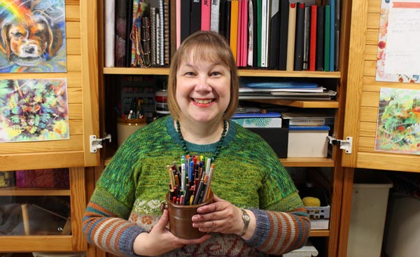
In 2014, I made a business plan to quit my day job. My goal was to teach online art classes, and I listed titles that sound funny now, like “Colored Pencils Revisited.”
I presented the plan to a local business advisor. Even if she didn’t know much about teaching internationally, she felt that I should do it.
“If you fail, you won’t fall from high,” she said,
referring to my modest list of investments and expenses.
Starting small is a beautiful thing. To gather what you have and mix it with something new. To revisit what mattered once and find a new intuitive way to do it again.
Revisiting – What Mattered and Still Does
As a child, I ran a craft shop in the attic. I remember the excitement when I heard my sisters on the steps and the satisfaction when my sister held a simple crochet chain and said: “Oh, Paivi, this is so long that it should be priced higher,” laying much more coins on my hand than expected.
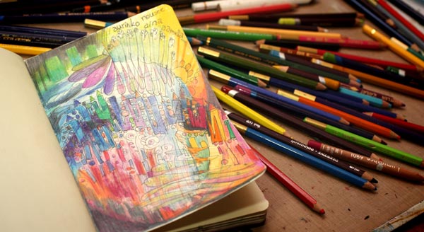
I also remember the joy when my mother had just sharpened colored pencils. They were in a small open plastic box and ready to be picked. Many of them were too short to go to the sharpener, so my mother had used a knife. She did that weekly because the pencils got used all the time.
I guess Intuitive Coloring could also be called Colored Pencils Revisited.
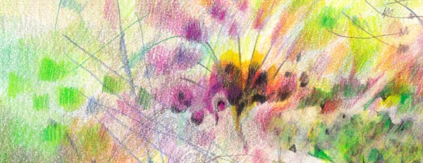
With the pencils, we will revisit the inner attic and connect with what matters.
It’s a small risk and a small investment, but still, something that can start small and grow bigger.
Intuitive Coloring will begin on Monday, Sept 20. Sign up now!
Pick your pencils and come to color with us!
>> Sign Up Now!
Starting a Colored Pencil Journal
This week, I started a project that I have been thinking about for quite a while: a colored pencil art journal! I hope this post inspires you to keep a visual journal too.
From Mundane to Fantastic
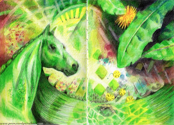
The idea of this journal is to connect everyday events with the world of fantasy. I want it to be a visual diary that is inspired by the ordinary but still goes beyond it. I
Books and Pencils
I have kept small art journals before too, and they still feel inspiring many years later. The two old art journals below are Moleskine sketchbooks.
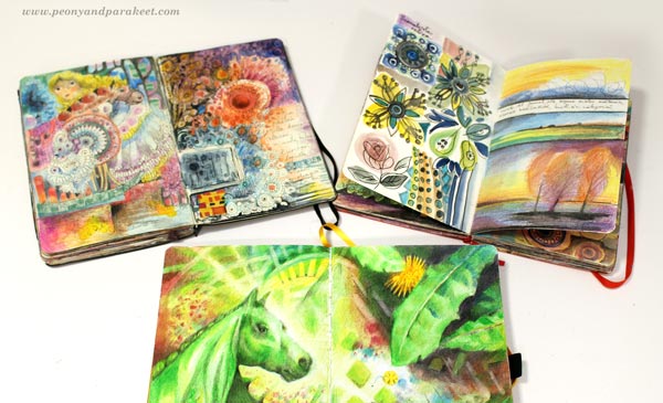
The new one is a blank notebook from Archer & Olive. I chose it because I really like Archer & Olive as a company, and I’ve grown to like their bright white paper for bullet journaling. The size of the new notebook is A5 (5,75 x 8,25 inches), so a little bigger than the old sketchbooks but still very manageable.
When ordering the notebook, I got a discount code, so click here to get 10% off if you haven’t purchased from Archer & Olive before.
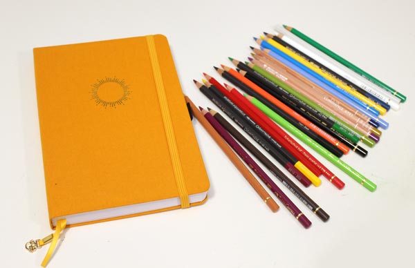
I have been purchasing new pencils too. Yesterday, I went to Helsinki to visit art supply stores and got some colored pencils – a mixed selection to expand my knowledge of different brands. So far, I have mostly used wax-based pencils like Prismacolor Soft Core and Caran d’Ache Luminance, but now I also got oil-based Faber-Castell Polychromos pencils. I also bought some Caran d’Ache watercolor pencils and more Luminance that has been my favorite so far. I have always mixed all kinds of pencils in my drawings and continue to do so!
Starting a Colored Pencil Journal
I usually fill an art journal by choosing the pages randomly. But because this journal is about my everyday life, I wanted it to be chronological and start from the first spread. It’s exciting to see how it will change and what kind of secondary stories the images will tell.
What to Draw First?
I suggest you let your journal develop intuitively so that you move from one association to another and mix all kinds of ideas together. So often, the fantasy is in the mix, not in the single element.
My first ideas: a horse and moss greens. A horse because I love to draw them and moss because currently, our garden has plenty of it. We like it more than grass, so we are not complaining!
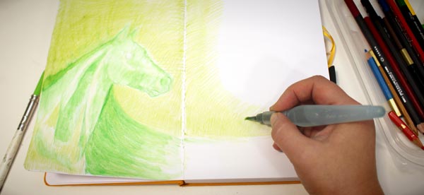
I don’t use water often, but now with the thick 160gsm paper, I smoothened the strokes of the bottom layer with a water brush. After drawing the moss horse, dandelions and all kinds of weeds came to my mind. Namely, while watching the puppy, I have been weeding almost daily and thinking that weeds are quite pretty too.
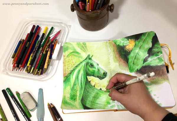
Let the Ideas and Associations Flow!
Then, of course, there’s this puppy, Saima! She makes me look at the leaves, twigs, stones, everything that she can find on the ground. My favorite moments in creating are those when I focus on the details and forget the surrounding world. I think Saima does the same many times in a day. For her, reality feels like a fantasy. We, adults, need to find the fantasy in our minds.

I tried Derwent’s burnishing pencil for the first time and quite liked it.
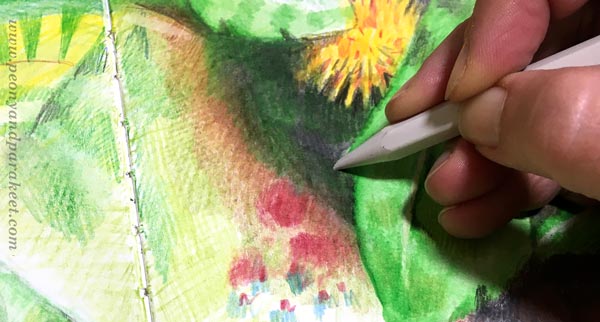
I was also inspired by rain, the wet tiles in the backyard, sunny mornings, and how I love old portrait paintings even if I can’t fully understand why. My favorite fruits are lemons, and it will be exciting to see how many times they reappear in the journal.
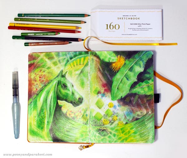
A spread with pencils is not a big project like a canvas painting, but can still feel satisfying, especially when the journal progresses.
What do you think?
P.S. For more colored pencil inspiration, remember to sign up for Intuitive Coloring!